AI label
The AI label indicates an instance of AI in the UI. It enables AI transparency through the visual recognition the AI icon and is the key pathway to AI explainability by acting as the trigger for the explainability popover.
Live demo
This live demo contains only a preview of functionality and styles available for this component. View the full demo on Storybook for additional information such as its version, controls, and API documentation.
Accessibility testing statusFor every latest release, Carbon runs tests on all components to meet the accessibility requirements. These different statuses report the work that Carbon has done in the back end. These tests appear only when the components are stable.
For every latest release, Carbon runs tests on all components to meet the accessibility requirements. These different statuses report the work that Carbon has done in the back end. These tests appear only when the components are stable.
Overview
The AI label is more than just an indicator of AI instances in the UI. It’s also a consistent pathway to AI explainability. Its behavior is flexible enough to cooperate with the behaviors and interactions within existing products.
The AI label is intended for any scenario where something is being generated by or with AI to reinforce AI transparency, accountability, and explainability at any interface level. This also enables more effective recognition and recall of AI instances in a way that is identifiable across any IBM product.
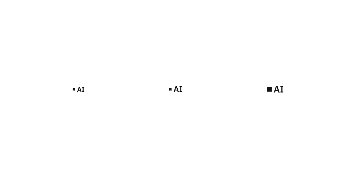
Variants
| Variant | Purpose |
|---|---|
| Default | The default AI label used in most components and container type use cases. It can be used for both broad and focused AI instances. |
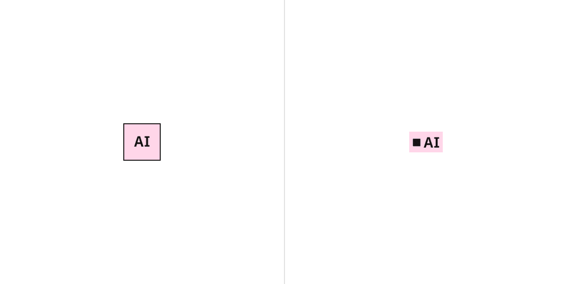
| Inline | A specific type of AI label used only in small focused AI instances and often paired inline with text content. |
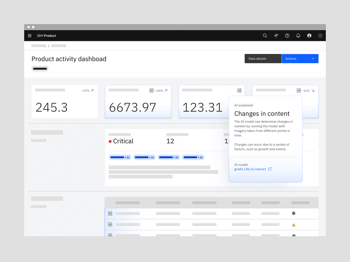
Default (left), Inline (right)
When to use
Mark AI-generated content
AI transparency is key, and the AI label is an accessible, interactive element that marks any AI instance presented in the interface.
Provides a consistent visual reference point for AI
For recognition and recall, users need a consistent, identifiable visual reference to look to when they need to understand more details about how the AI was built.
A pathway to explainability
Users must clearly understand how to access more details about how an AI was built. By providing a bridge to explainability from the AI label, users are given a recognizable location to learn more about the AI model.
When not to use
Don’t use the AI label as decoration
These are strictly intended to indicate any time a modality or component is using AI.
Don’t modify AI label behaviors
The AI label is intended as a pathway to explainability. Any additional behaviors can set unclear and inconsistent expectations.
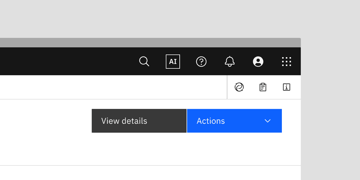
Don’t use the AI label as a trigger for AI actions
The AI label is not a UI icon and should not be used with buttons or other call-to-actions to trigger an AI action like “regenerate.” Those type of AI actions will have their own UI icons.
Formatting
Anatomy
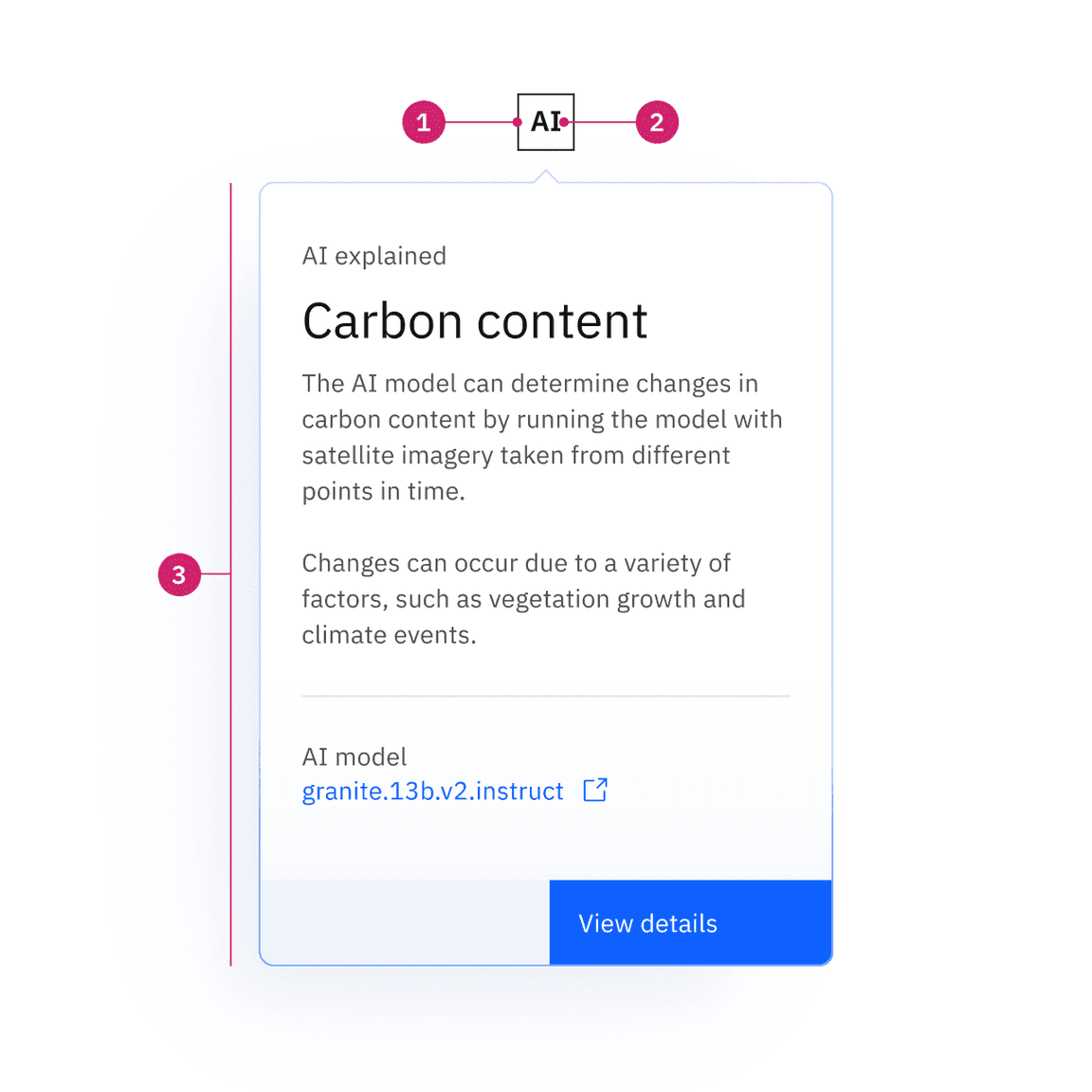
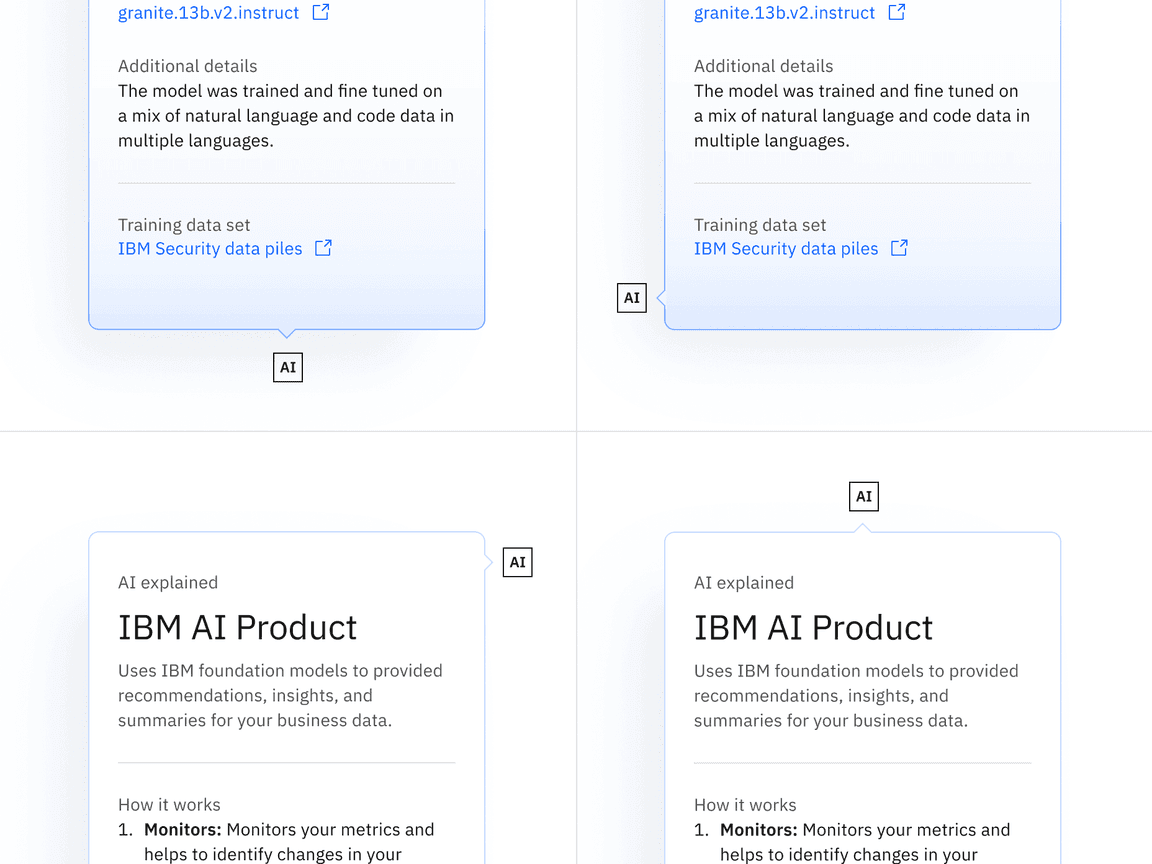
- AI indicator / button: indicates AI is present and is the button trigger for the explainability popover. It can be either the default or inline variant.
- Text label: the text abbreviation for artificial intelligence which can be translated as needed.
- Explainability popover: Area that contains AI explainability content and interactive elements.
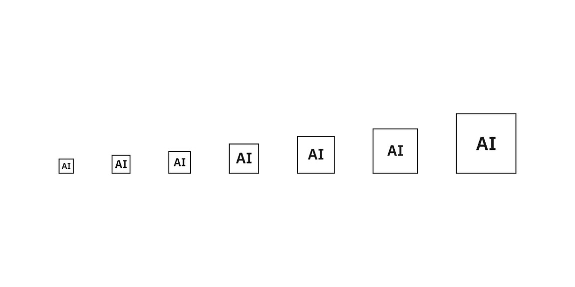
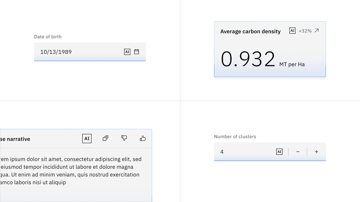
Sizing
Default sizes
The default AI label spans the range of UI icons and pictogram sizes. Which size to use is determined by the prominence and hierarchy of the area it is in or by its neighboring content such as other buttons. When placed next to other ghost icon buttons we typically recommend going down one size from the button size so they are optically weighted the same.
| Default size | Height (px/rem) |
|---|---|
| Mini | 16 / 1 |
| 2x small (2xs) | 20 / 1.25 |
| Extra small (xs) | 24 / 1.5 |
| Small (sm) | 32 / 2 |
| Medium (md) | 40 / 2.5 |
| Large (lg) | 48 / 3 |
| Extra large (xl) | 64 / 4 |
Inline sizes
The size of the inline AI label text should match the size of the text it is placed inline with. For example, when inserting the inline AI label into a table row with 14px font size, you match it with the medium-size inline AI label that also has a 14px font.
| Inline size | Height (px/rem) | Use case |
|---|---|---|
| Small (sm) | 16 / 1 | Paired with 12px type |
| Medium (md) | 18 / 1.125 | Paired with 14px type |
| Large (lg) | 22 / 1.375 | Paired with 16px type |
Placement
The AI label should be placed in consistent locations based on modality to help users identify AI presence in the interface. Consistent placement reinforces recognition and recall for users. The instructions for these placements assume a left-to-right reading order. If right-to-left then these placements should be mirrored.
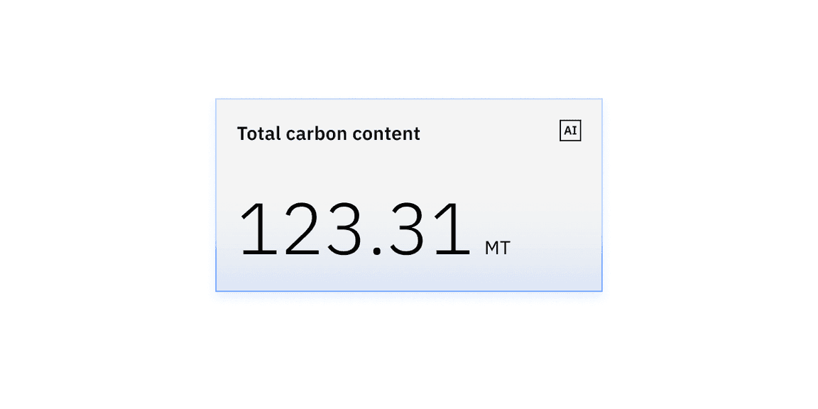
In containers
The AI label should be placed in the upper right of the container with appropriate margin. Never place the AI label flush to the edges of a container.
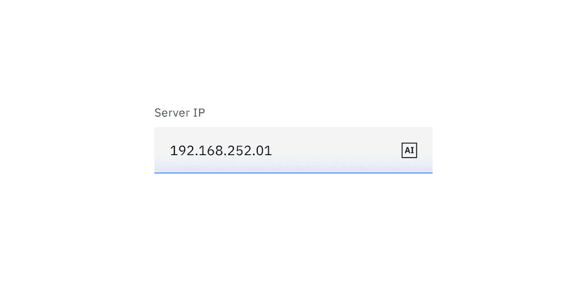
In inputs
Place AI labels on the right side and in the middle of any form inputs (dropdowns, text or number input, etc.).
With other icons
If other icons are present alongside the AI label, then the AI label should be placed in the far left position of the icon group.
The exception is when the icon has an interaction state that alters its size or position, like an expandable search or toggle-able sort. In these instances, the AI label is placed to the right of these exceptions but still to the left of other icon types.
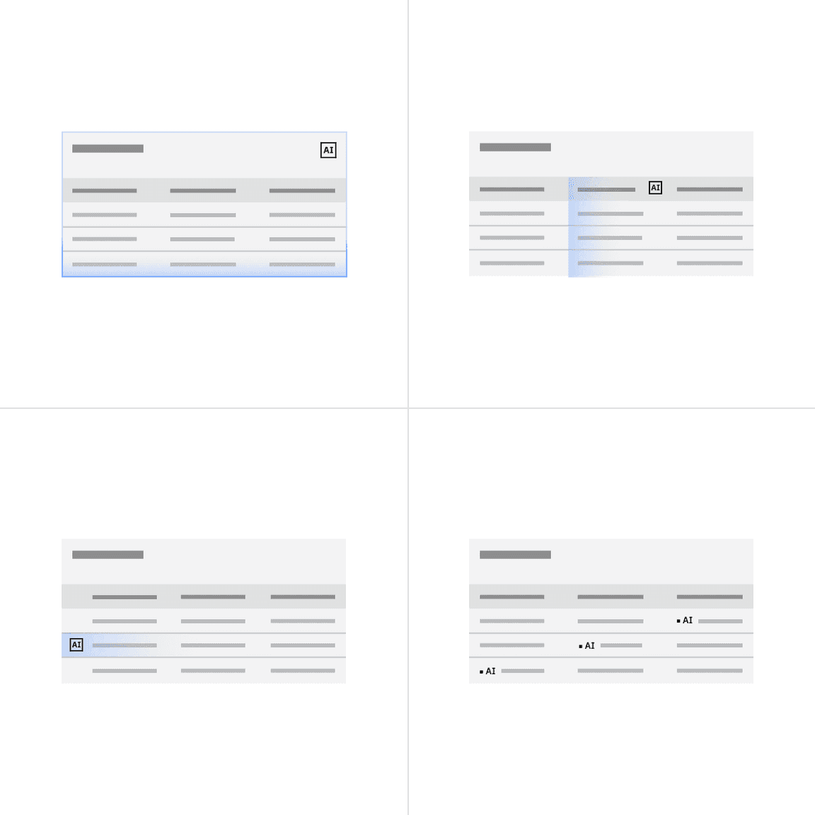
In data tables
Where the AI label is positioned inside of a data table depends on which parts of the data are AI generated. For more details, see the AI presence section on the data table component page.
- If the whole table has an AI presence, then place the AI label in the top right of the table header.
- If a whole column has an AI presence, then place the AI label in the far right of the column header. The sort icon of the table column will now appear to the left of the AI label.
- If a whole row has an AI presence, then place the AI label to the far left of the row and to the left of any selection or expansion controls.
- If a single cell has an AI presence, then place the AI label inline and left to the cell text.
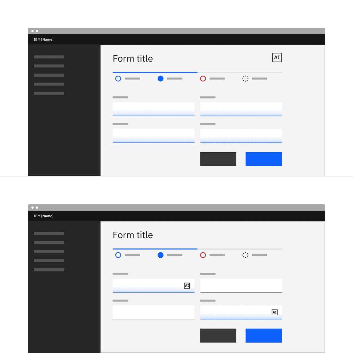
In forms
Where the AI label is placed in a form can vary depending on if the AI presence is across the whole form or just in certain parts of the form. For more guidance, see the AI presence section on the form component page.
- If the entire form has an AI presence, then place the AI label in top right of the form header.
- If only some parts of the form have an AI presence then the AI label should be embedded in the components or sections that are AI-generated.
Levels of visibility
The AI label might appear at multiple levels of a page, or it might appear only once. The content in the AI explainability popover might be focused on a single AI instance or broadly address multiple instances. All scenarios are acceptable and possible, but the level of visibility depends on the need for explainability and/or the need to distinguish AI content from human content.
| Visibility level | Usecase |
|---|---|
| Focused | Use for individual occurrences of AI within a section |
| Broad | Use for summarization of AI usage across a section of a page. |
Use a focused AI label:
- When the user needs to have an individual AI instance explained.
- When the user needs to distinguish between AI and non-AI content.

An example of focused AI labeling inside single cells in a data table.
Use a broad AI label:
- When users don’t need specific explanations of AI on a per-instance level.
- When the user doesn’t need to act on AI at an instance level.
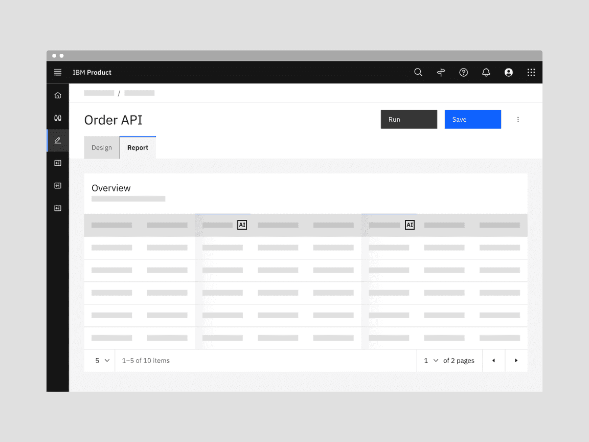
An example of broad AI labeling on a whole column in a data table.
Using both focused and broad AI label
Use both focused and broad AI labels when AI surfaces throughout the experience, but:
- Individual AI instances still need to be explained.
- The user needs to distinguish between AI and non-AI content.
- The user needs to act on AI at an instance level.
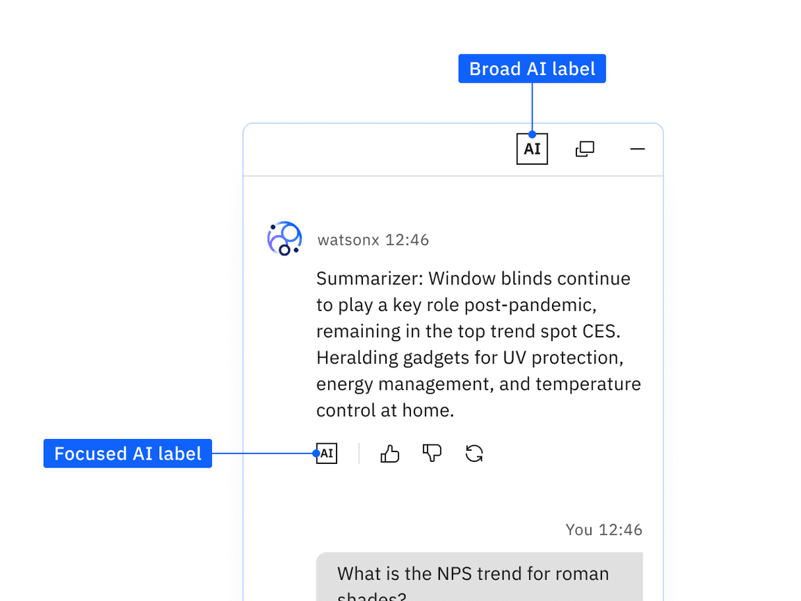
An example of broad AI labeling on the whole chat conversation but focused AI labeling on a single message.
Content
Localization
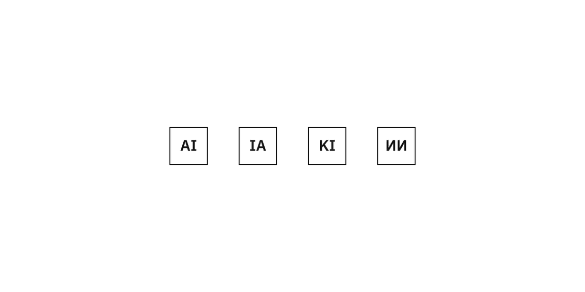
The abbreviation
AI
artificial intelligence
- in Chinese, Indonesia, Italian, Japanese, Korean, Spanish LAAI
- in European Spanish, Brazilian Portuguese, France FrenchIA
- in GermanKI
- in Russian, BulgarianИИ
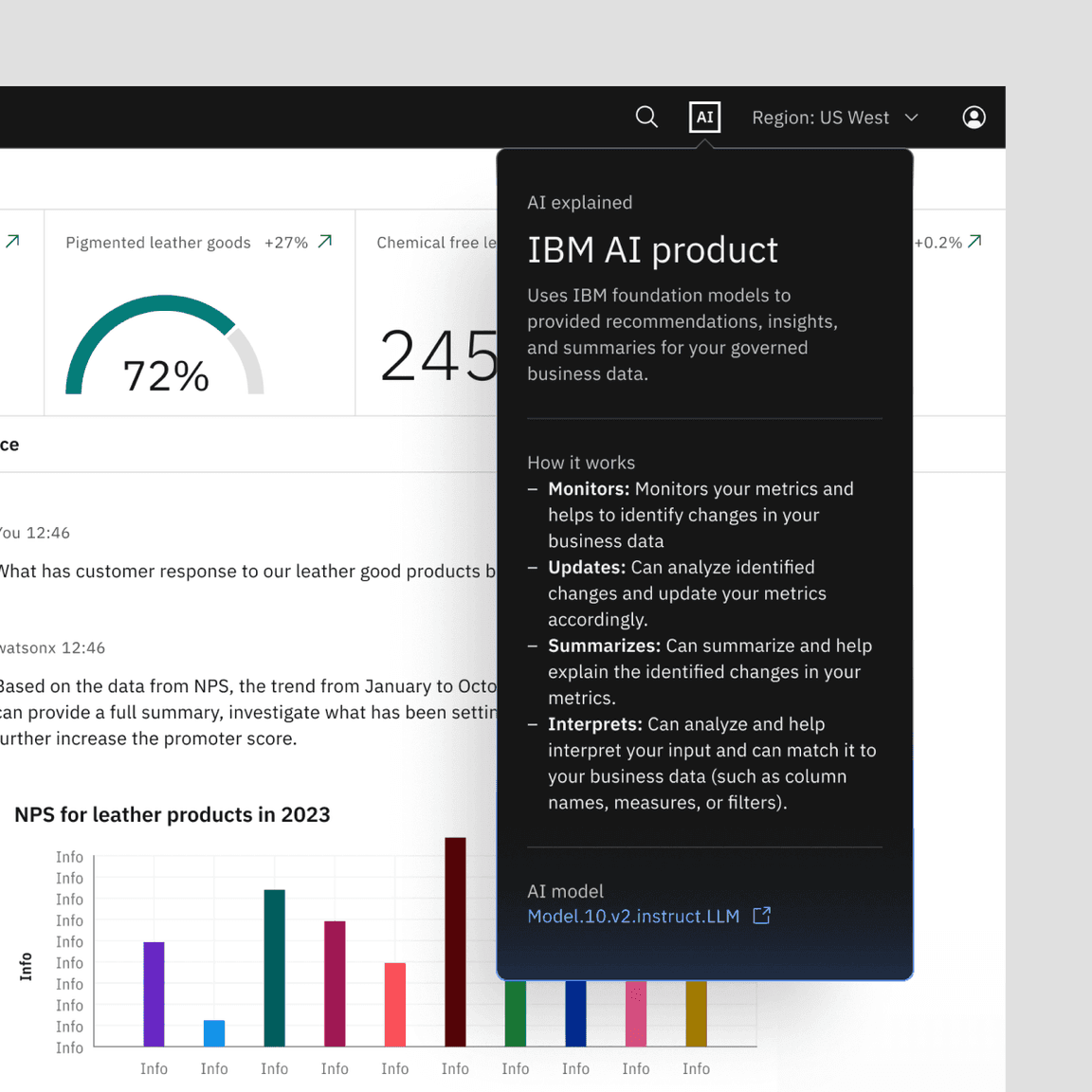
Explainability template
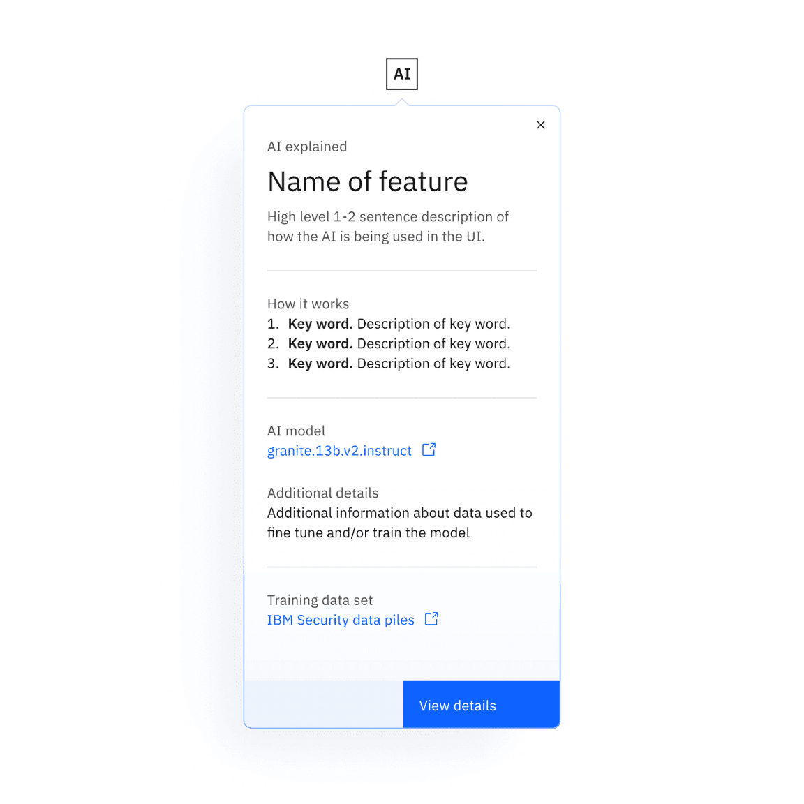
The explainability popover is a configurable content area. Carbon for AI provides a recommended content template for creating your explainability content. The template is split into four main content sections:
- Overview
- Supporting details
- Artifacts and resources
- Additional actions
For IBMers only: For more information and guidance on designing content for your explainability popover, see the AI explainability popover pattern on Design for AI.
Behaviors
States
AI label has three interactive states: enabled, hover, and focus. The AI label should never be disabled as part of a disabled or read-only state. Learn more about states on the style tab.
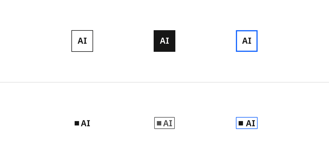
Enabled (left), hover (middle), focus (right)
Clickable areas
In the default AI label, the clickable area is limited to the icon without any additional external coverage, such as in an icon-only ghost button. The inline AI label will have a small amount of extra padding around it included in the click target area.
Explainability popover
The popover is the first layer of explainability that is accessed by clicking the AI label. This provides a consistent up-front way to access explainability with the ability to dig into more details on-demand. Use this popover any time AI needs to be explained in your experience.
Opening and dismissing the popover
The AI label is the trigger that opens explainability popover. The interaction works like a toggletip where the popover remains open until the user clicks or tabs away from the AI label. For a details on the keyboard interactions of the explainability popover, see the accessibility tab.
Popover orientation
The popover should auto-position itself to the best orientation on the screen so that it does not appear out of view for the user. It follows the same alignments as the primitive caret-tip popover.
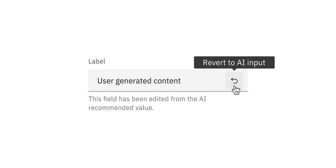
Revert function
Users can manually override AI-suggested content, but they should always be able to programmatically switch back to the initially suggested AI content. In these instances, when the content is overridden by the user, the AI presence styling is removed and the AI label is replaced by a “revert” action icon-only button. If a user activates the revert action, the AI-generated content will reappear, along with the AI presence styling and AI label.
Related
Guidelines
Components
- Checkbox
- Data table
- Date picker
- Dropdown
- Form
- Modal
- Number input
- Popover
- Radio button
- Select
- Tag
- Text input
- Tile
Design for AI
For IBMers only
Feedback
Help us improve this component by providing feedback, asking questions, and leaving any other comments on GitHub. For IBMers only: Questions and feedback can be directed to Slack in the channels #carbon-design-system or #carbon-for-ai.