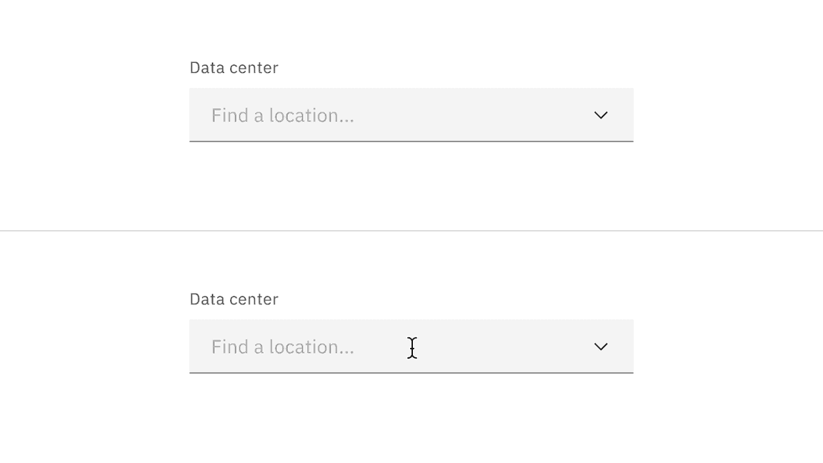
Dropdown
Dropdowns have a list of options that a user can select from. These selections can fill in a form, filter, or sort content.
- Live demo
- Overview
- Formatting
- Content
- Universal behaviors
- Dropdown
- Multiselect
- Combo box
- Modifiers
- AI presence
- Related
- References
- Feedback
Live demo
This live demo contains only a preview of functionality and styles available for this component. View the full demo on Storybook for additional information such as its version, controls, and API documentation.
Accessibility testing statusFor every latest release, Carbon runs tests on all components to meet the accessibility requirements. These different statuses report the work that Carbon has done in the back end. These tests appear only when the components are stable.
For every latest release, Carbon runs tests on all components to meet the accessibility requirements. These different statuses report the work that Carbon has done in the back end. These tests appear only when the components are stable.
Overview
There are three different variants of dropdowns that support various kinds of functionality—dropdown, multiselect, and combo box.
When to use
Dropdowns can be used in forms on full pages, in modals, or on side panels. The dropdown component is used to filter or sort contents on a page. It is a stylized version of the select component, and can be styled as needed.
When not to use
Limited options
It is best practice not to use a dropdown if there are two options to choose from. In this case, use a radio button group instead.
Nesting
Do not nest dropdowns or use them to display overly complex information. Keep option selections as straight forward as possible.
Form-based or mobile platform
Consider using a select if most of your experience is form-based or frequently used on mobile platforms. The native HTML select works more easily when submitting data and is also easier to use on a mobile platform.
Variants
| Variant | Purpose |
|---|---|
| Dropdown | Allows the user to select one option from a list. |
| Multiselect | Allows the user to select multiple options from a list and filter. |
| Combo box | Allows the user to either select an option from a large list or type in their own custom value. |
Formatting
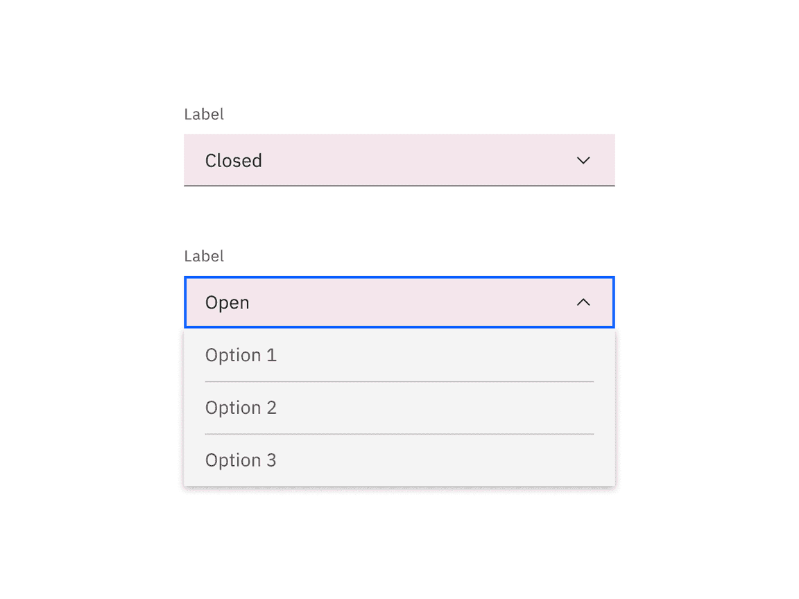
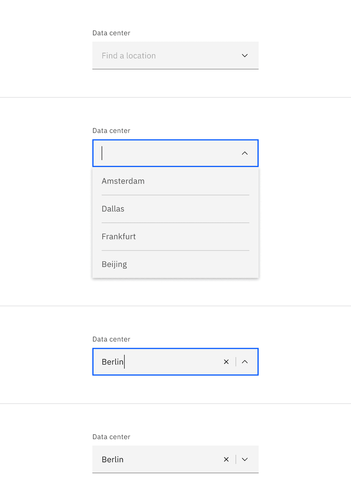
Anatomy
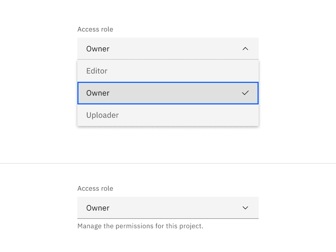
Dropdowns are composed of four distinct sections—assistive text like labels or helper text, a field, a menu, and options contained within the menu. Labels and helper text can guide the user to make an informed decision when making a selection.
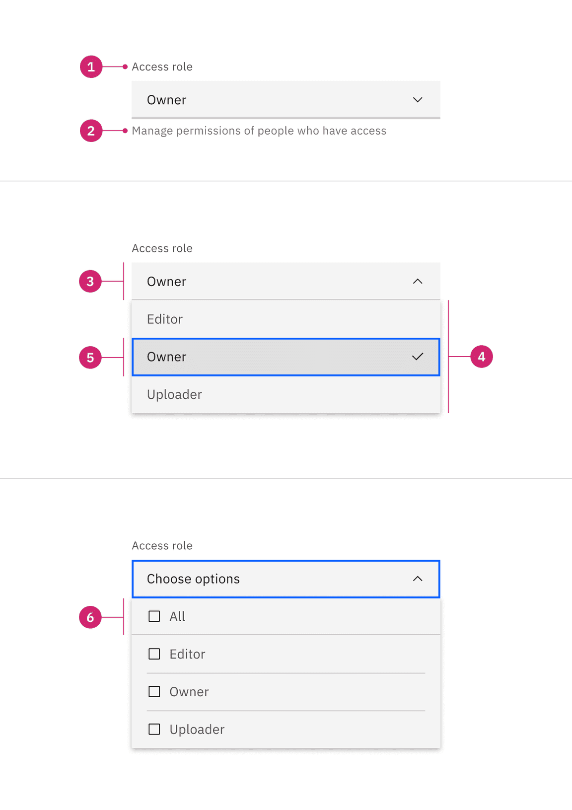
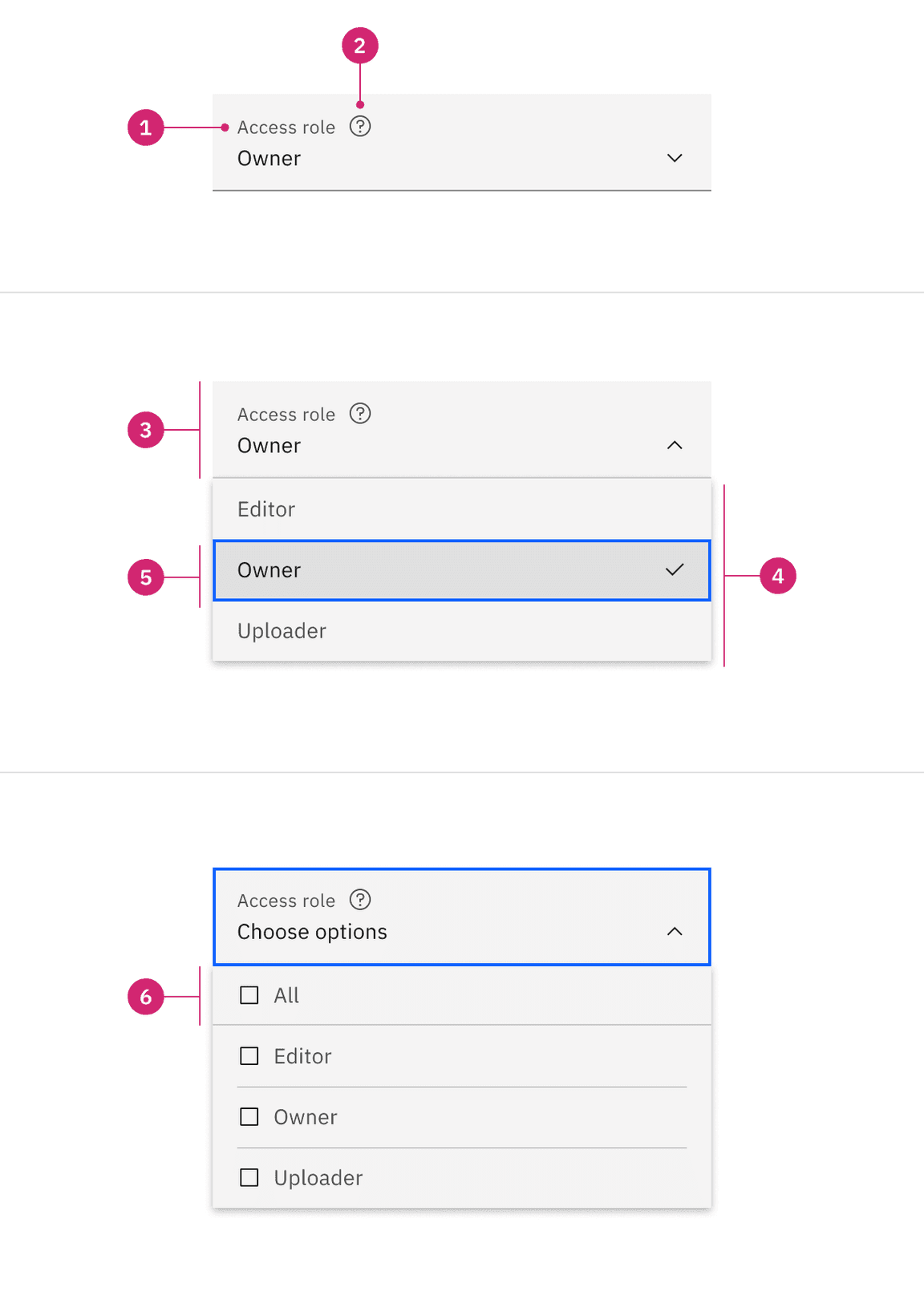
- Label: Text that informs the user what to expect in the list of dropdown options.
- Helper text: Assistive text to help the user choose the right selection.
- Field: Persists when the dropdown is open or closed.
- Menu: A list of options to choose from, displayed as an open state.
- Option: A choice for the user, shown with other choices in a menu.
- Parent checkbox: Used to select all the options from within the menu in multiselect dropdowns.
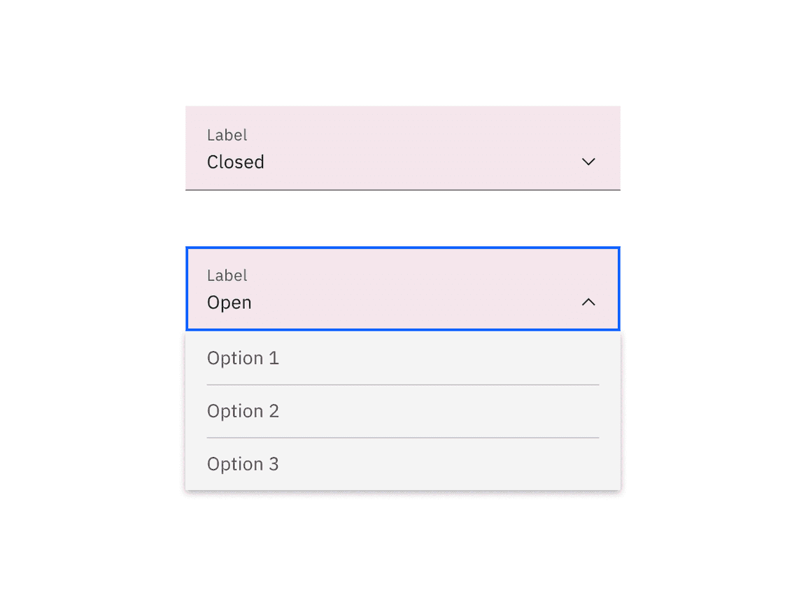
Styling
There are two styles of dropdown inputs: default and fluid. They share the same functionality but look visually different, influencing where to use them.
| Style | Appearance | Use case |
|---|---|---|
| Default | A traditional style where the label is positioned outside and above the input field. | Use when white space is needed between input components or in productive moments where space is at a premium, and smaller components are needed. |
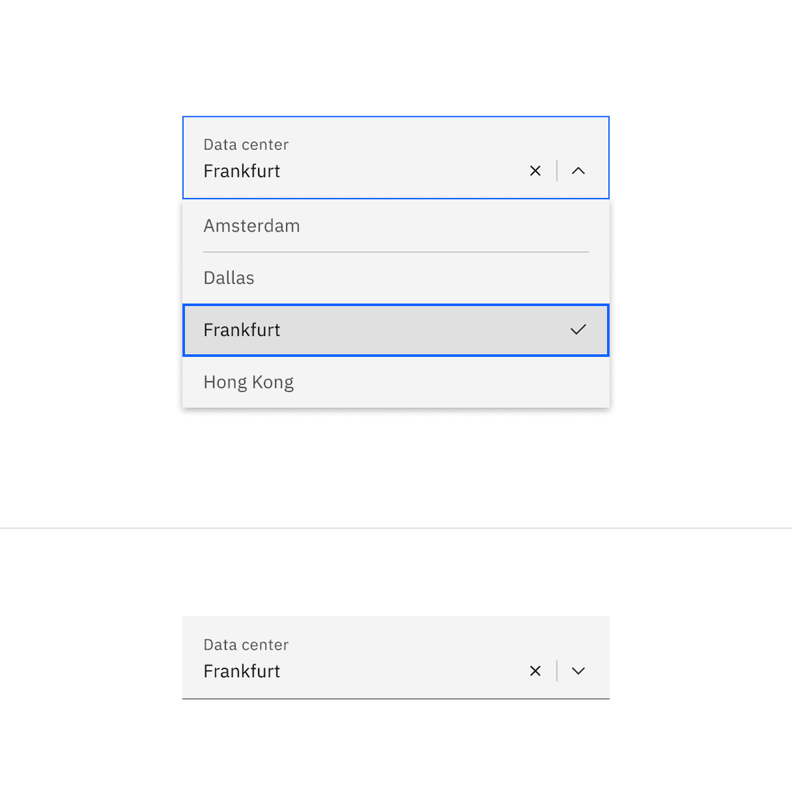
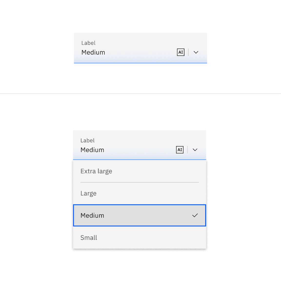
| Fluid | An alternative style where the label is placed inside of the input field and is stacked inline with the user input text. | Use in expressive moments, fluid forms, contained spaces, or attached to complex components, like a toolbar. |
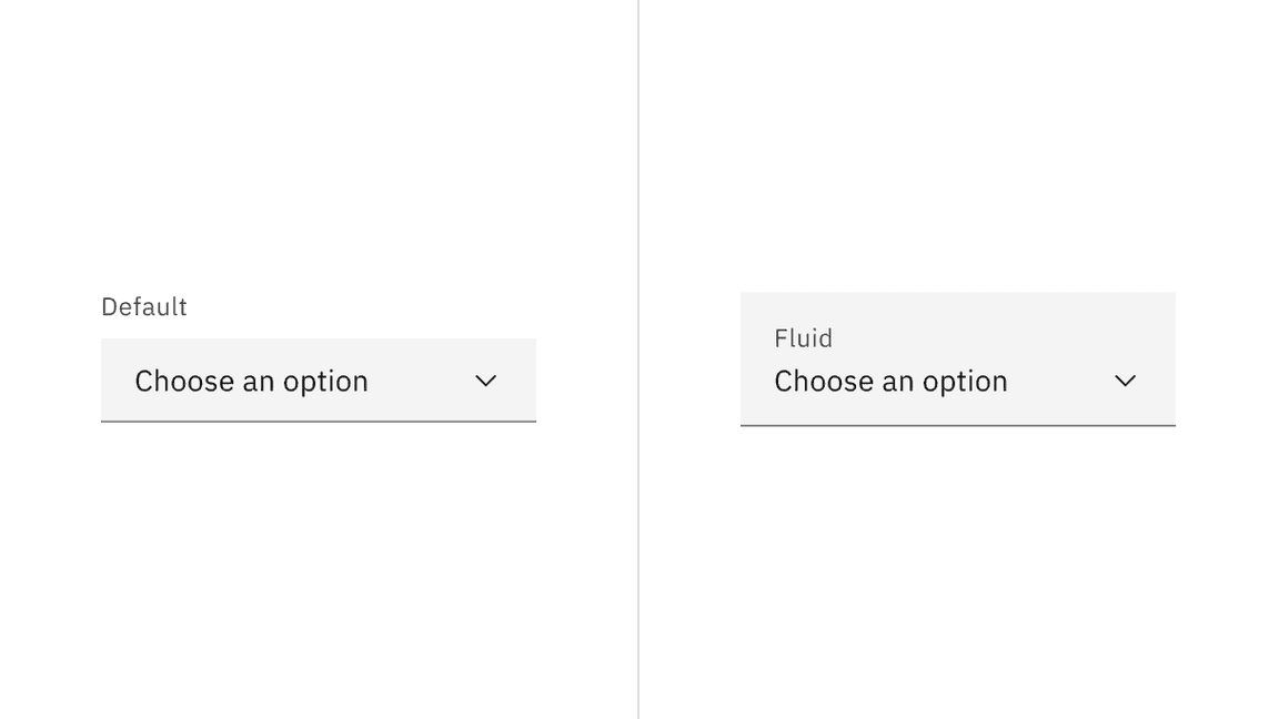
A default style input is shown on the left and fluid style is on the right.
Sizing
There are three default dropdown height sizes: small, medium, and large. Supporting three different dropdown sizes gives you more flexibility when structuring layouts. However, use a consistent size for all form components on the same page. For example, if you are using a medium size dropdown also use the same size text inputs, buttons, and so on. When in doubt, use the default medium size height.
| Size | Height (px/rem) | Use case |
|---|---|---|
| Small (sm) | 32 / 2 | Use when space is constricted or when placing a dropdown in a form that is long and complex. |
| Medium (md) | 40 / 2.5 | This is the default size and the most commonly used size. |
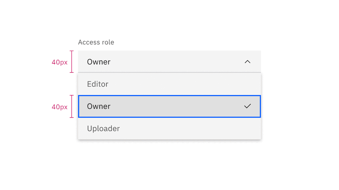
| Large (lg) | 48 / 3 | Choose this size when there is a lot of space to work with. This size is typically used in simple forms or when a dropdown is placed by itself on a page, for example as a filter. |
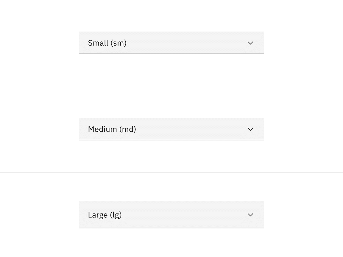
When the menu is open, each option in the menu should be the same height as the field.
Fluid inputs heights
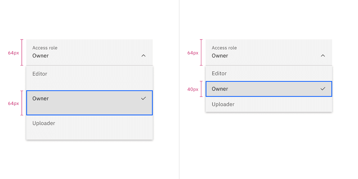
In the fluid dropdown, there is only one input height but there are two menu item sizes–default and condensed.
| Fluid size | Height (px/rem) | Use case |
|---|---|---|
| Default | 64 / 4 | Use when there are fewer menu options in expressive moments. |
| Condensed | 40 / 2.5 | Use when there are many menu options so more can be viewed at once without scrolling. |
Width
There is no minimum or maximum width for a dropdown. The width can be customized appropriately for its context.
Placement
Field containers should vertically align with other form components on a page. Whether it aligns flush to grid columns or hangs in the gutters depends on the style of dropdown you are using.
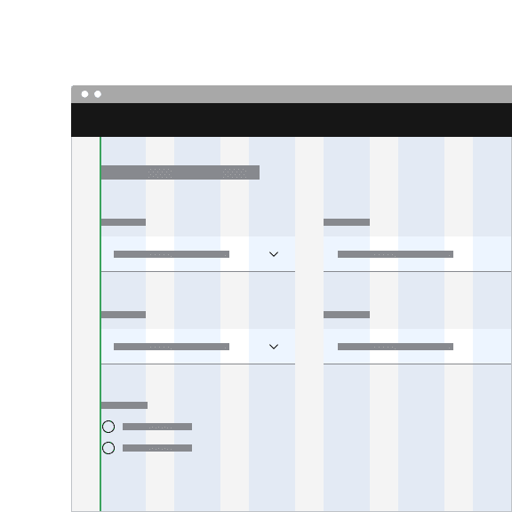
Do align default style dropdown containers flush to the grid so the input label aligns with other type on the page.
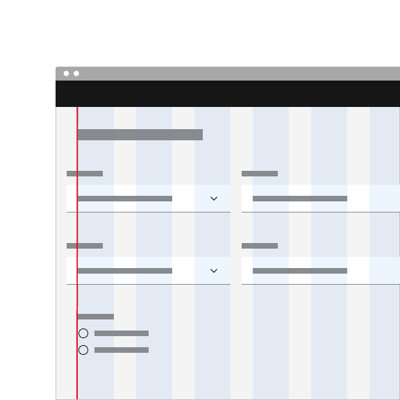
Don't hang default style dropdowns into the grid gutters.
Do place fluid components flush to on another with no spacing between them.
Do not use fluid components with vertical or horizontal spacing between them.
Content
Main elements
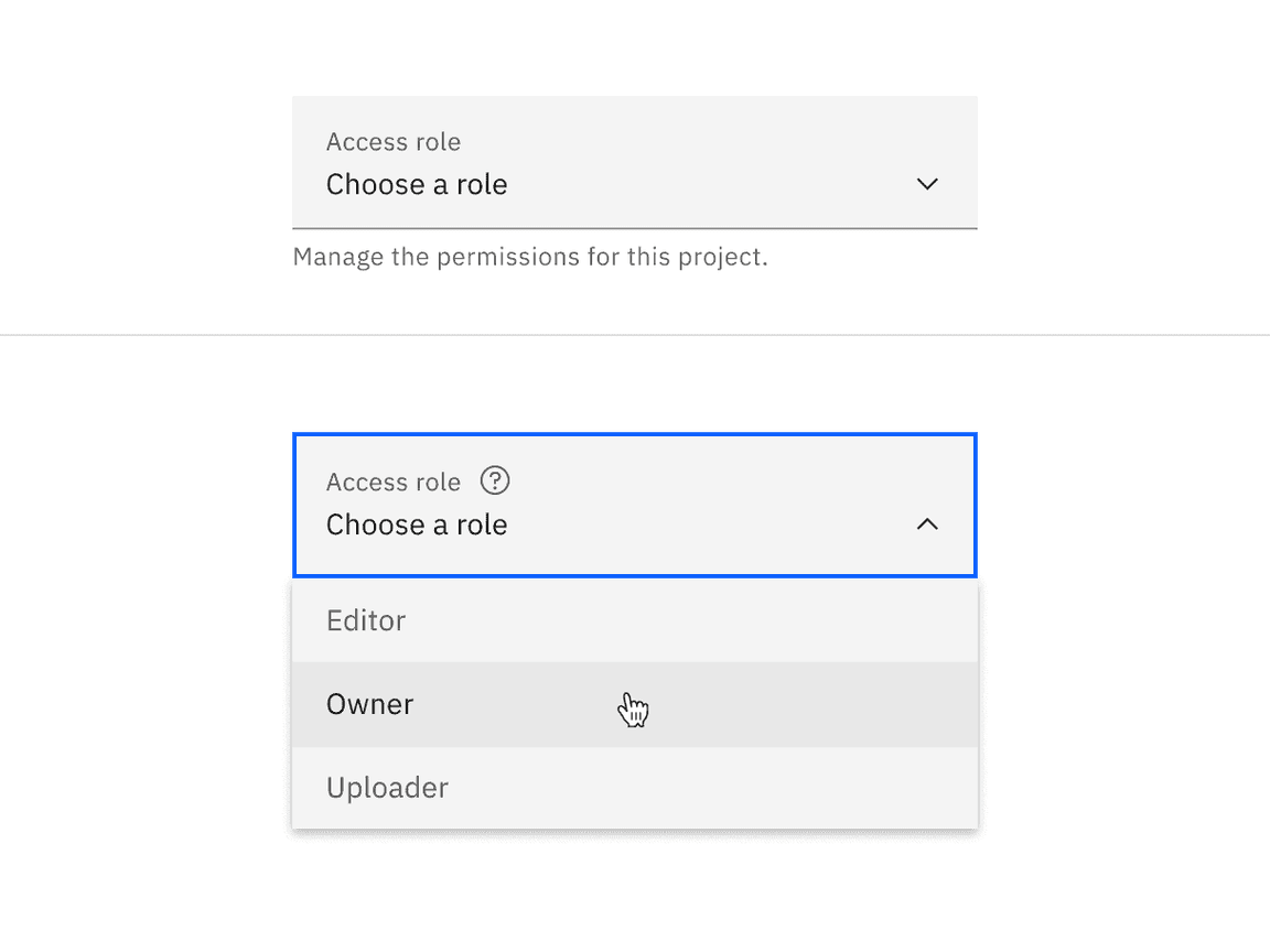
Label text
- Label text informs users what to expect in the list of dropdown options.
- Keep the label text short and concise by limiting it to a single line of text.
- Do not remove label text in favor of using placeholder text in the dropdown field. Labels are always strongly encouraged to be included when possible.
Helper text
- Helper text is pertinent information that assists the user in choosing the right selection from the dropdown menu.
- Helper text is always available when the dropdown field is focused and appears underneath the label.
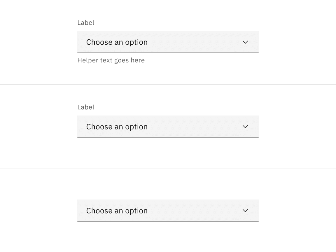
Field placeholder text
- Placeholder text is optional to display in the dropdown field if no option has been selected yet from the list. Do not put important information in placeholder text because the text disappears once an option is selected from the list. Reserve important information for dropdown label text or helper text, which always remains visible.
- Use clear and concise placeholder text in the dropdown field to indicate how to interact with the dropdown. For example, “Choose an option” is commonly used as placeholder text in dropdowns.
Option text
- Dropdown option text should be brief, accurate, and not descriptive.
- Never use decorative images or icons within a dropdown.
- We recommend presenting the options in alphabetical order.
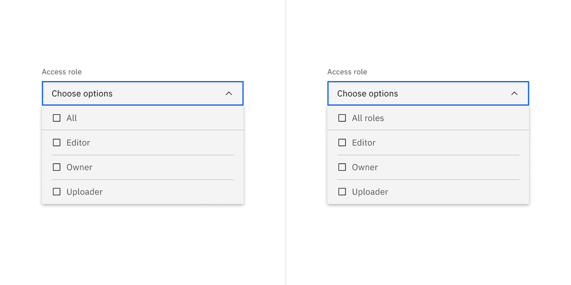
Parent checkbox text
- Since the parent checkbox text is one among the options, do not describe it as an action.
- Use the word “All” to describe the parent checkbox.
- Alternatively, add a secondary descriptive word, for example, “All roles,” to describe the options in the menu.
Optional versus required fields
Dropdowns can be labeled as either optional or required depending on several factors. For more information, see the form Usage tab guidance.
Overflow content
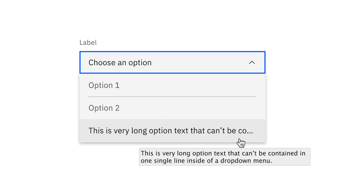
Avoid multiple lines of text in a dropdown. If the text is too long for a single line, add an ellipsis (…) for overflow, and use a tooltip to display the full text—preferably a Carbon tooltip for keyboard accessibility where possible.
Further guidance
For further content guidance, see Carbon’s content guidelines.
Universal behaviors
The behaviors listed in this section are universal across all of the variants. For behaviors that are unique to each variant, see the sections below.
Direction
A dropdown can open up or down depending on its position on the screen. For example, if the dropdown appears at the bottom and close to the edge of the interface, the menu expands upward to avoid being cropped. By default, our dropdowns open downward.
Elevation
The dropdown menu has a style called
box-shadow
0 2px 6px 0 rgba(0,0,0,.2)
Scrolling behavior
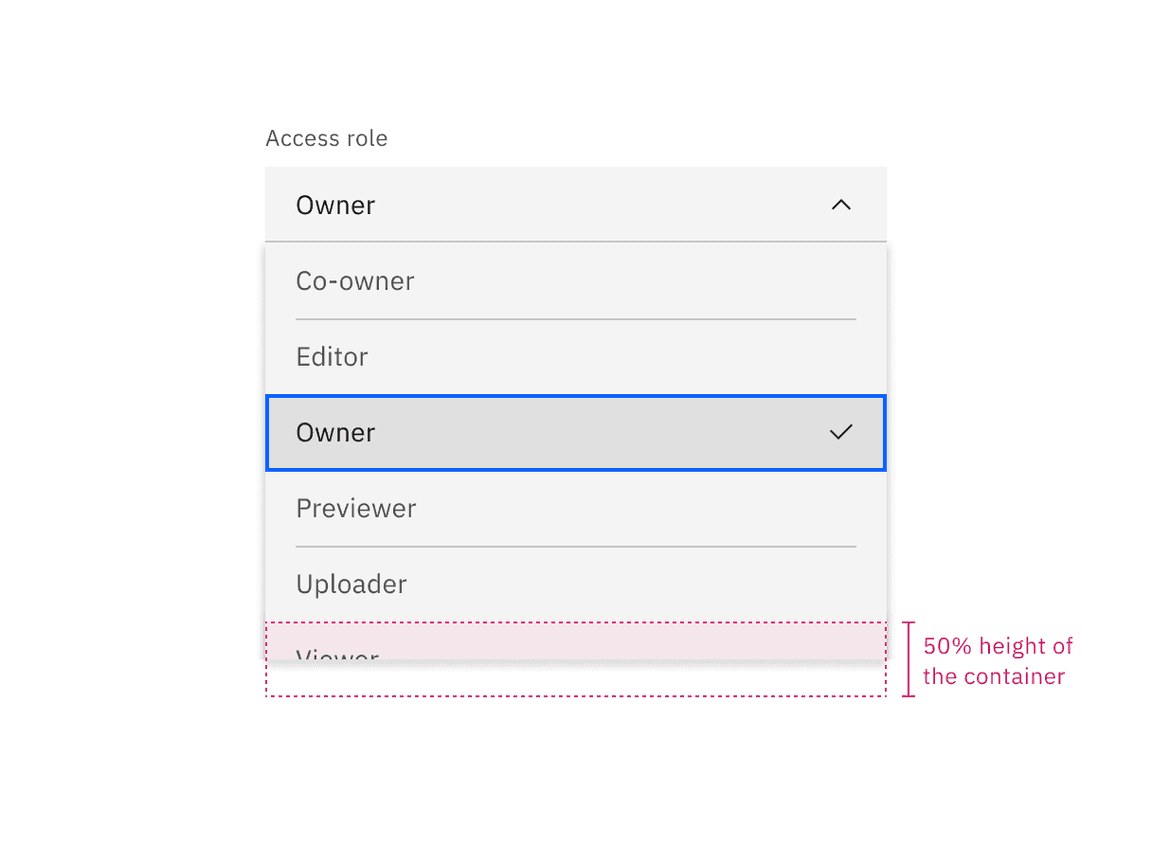
Scroll bars may not always be enabled so we recommend showing 50% of the last option’s container height to indicate there is more to see within the menu. We recommend starting a scroll at the sixth option in the menu list, but this may vary based on your specific use case.
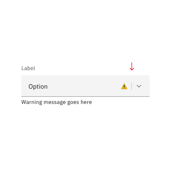
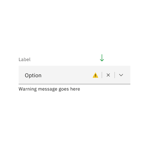
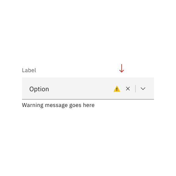
States
Dropdowns, combo boxes, and multiselects have a series of states for both their fields and menus: enabled, hover, focus, error, warning, disabled, skeleton, and read-only. For more information on states, visit the interactive states guidance on the style tab.
Vertical dividers in input fields
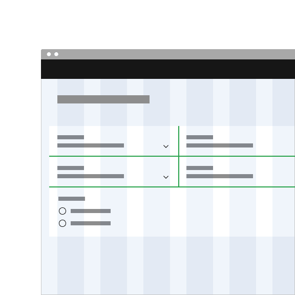
Vertical dividers act as a visual separator between interactive elements in an input field. These vertical dividers are only present between two interactive elements, they should not be introduced between non-interactive elements like error states, other non-interactive icons, or buttons.
A divider will also be present to the left of the leftmost interactive item set, even if it’s next to a non-interactive item.
Do introduce a vertical divider between two interactive elements in an input field.
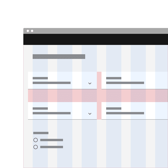
Do not introduce a vertical divider between interactive and non-interactive elements in an input field.
Do introduce a vertical divider to the left of the leftmost interactive set in an input field.
Do not use vertical dividers inconsistently in the same icon set, where some icons have vertical dividers and some do not.
Do introduce a vertical divider to the left of the leftmost interactive set in an input field.
Do not use vertical dividers inconsistently in the same icon set, where some icons have vertical dividers and some do not.
Interactions
Mouse
Users trigger a dropdown menu to open by clicking the chevron icon or clicking anywhere within the field. Users can close the menu by clicking the chevron icon or clicking outside of the menu.
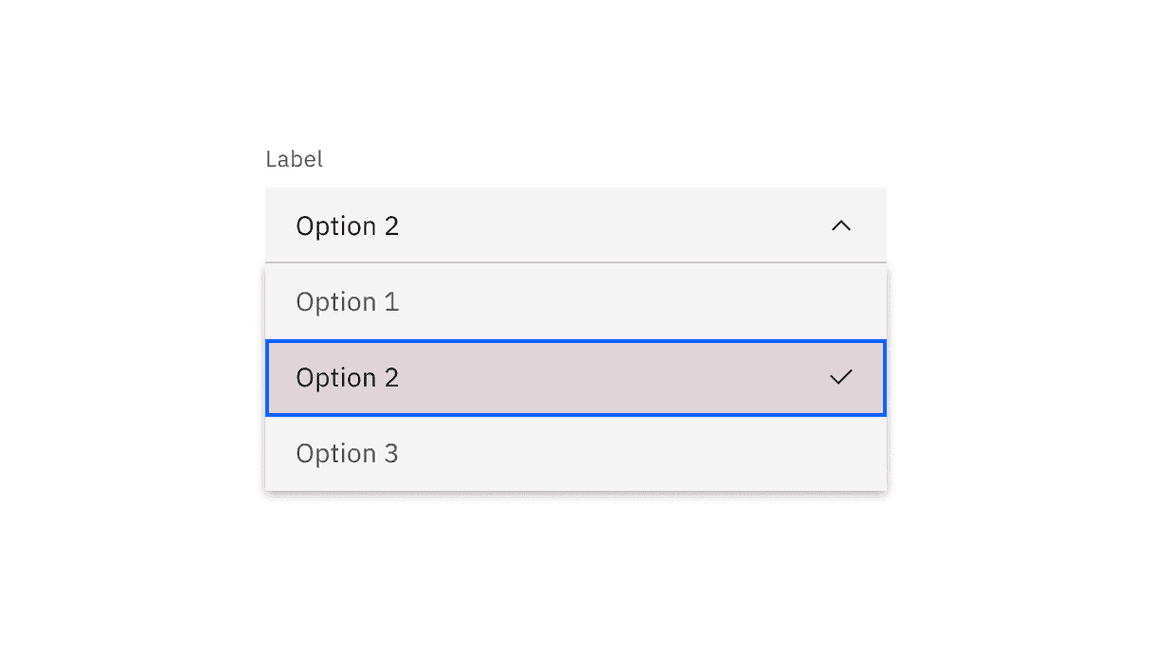
- To select an option the user can click anywhere inside an option container.
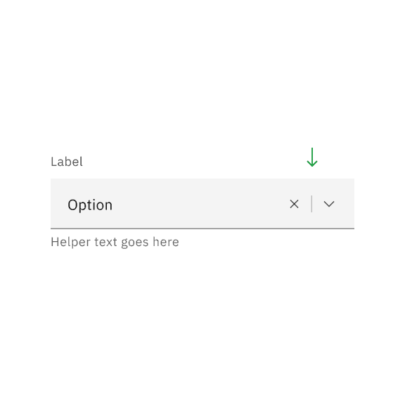
- To clear all selected options from a list in a dropdown, click the “x” icon next to the value inside the tag.multiselect
- To clear a selected value in a or a filterable multiselect dropdown, click the “x” icon to the right of the field input text.combo box
Keyboard
A dropdown component and its variants multiselect and combo box are reached by
Tab
Up
Down
Dropdown
Use a dropdown when the user needs to select one option from a list of predefined options. Dropdowns are the optimal default option to provide alternative choices. They are also a good choice when screen space is limited.
- Selecting an option from the menu closes it and the selected option text replaces the placeholder text in the field and also remains as an option in place if the menu is open.
Multiselect
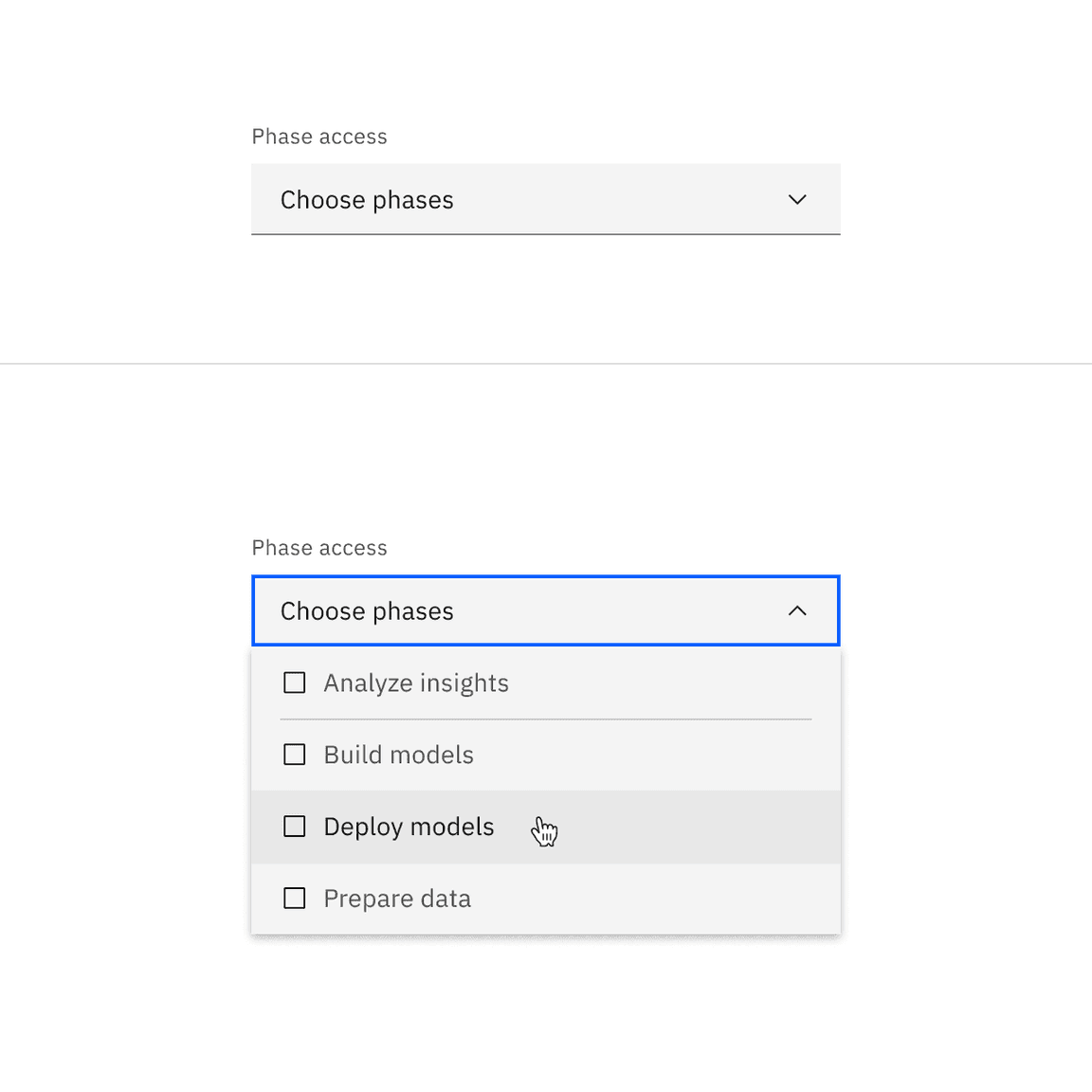
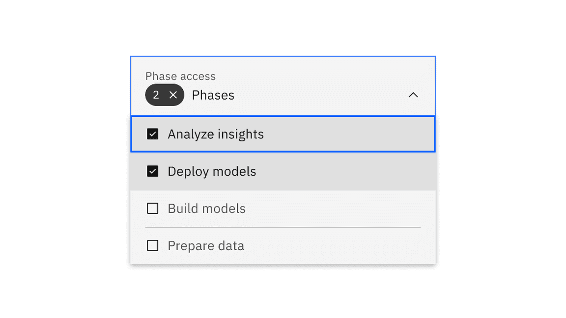
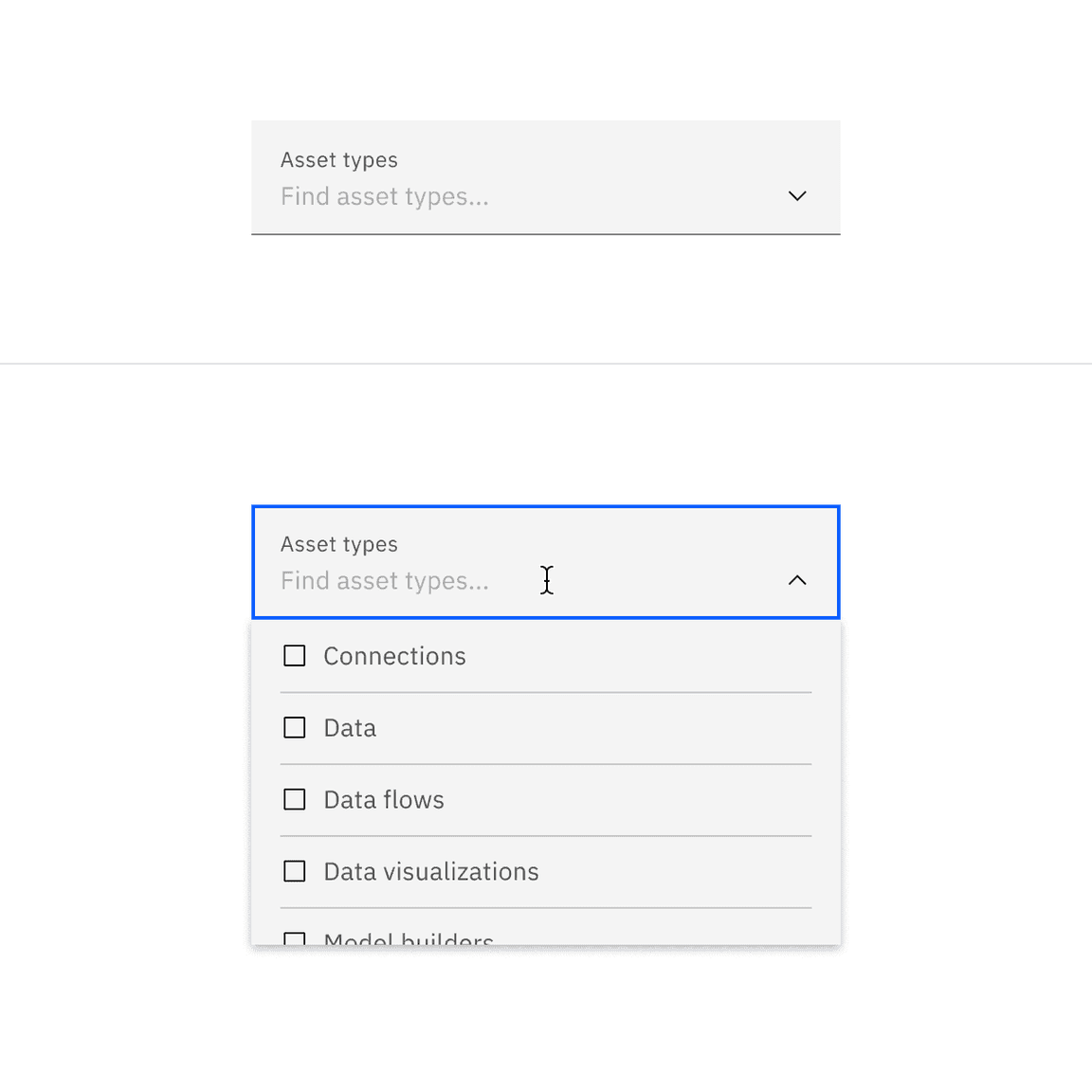
Use a multiselect when the user needs to select multiple options from a list of predefined options. Multiselects are a good option when the user needs to filter or sort content on a page based on multiple criteria. A checkbox icon is included for each option in the list to enable multiselection.
Making a selection
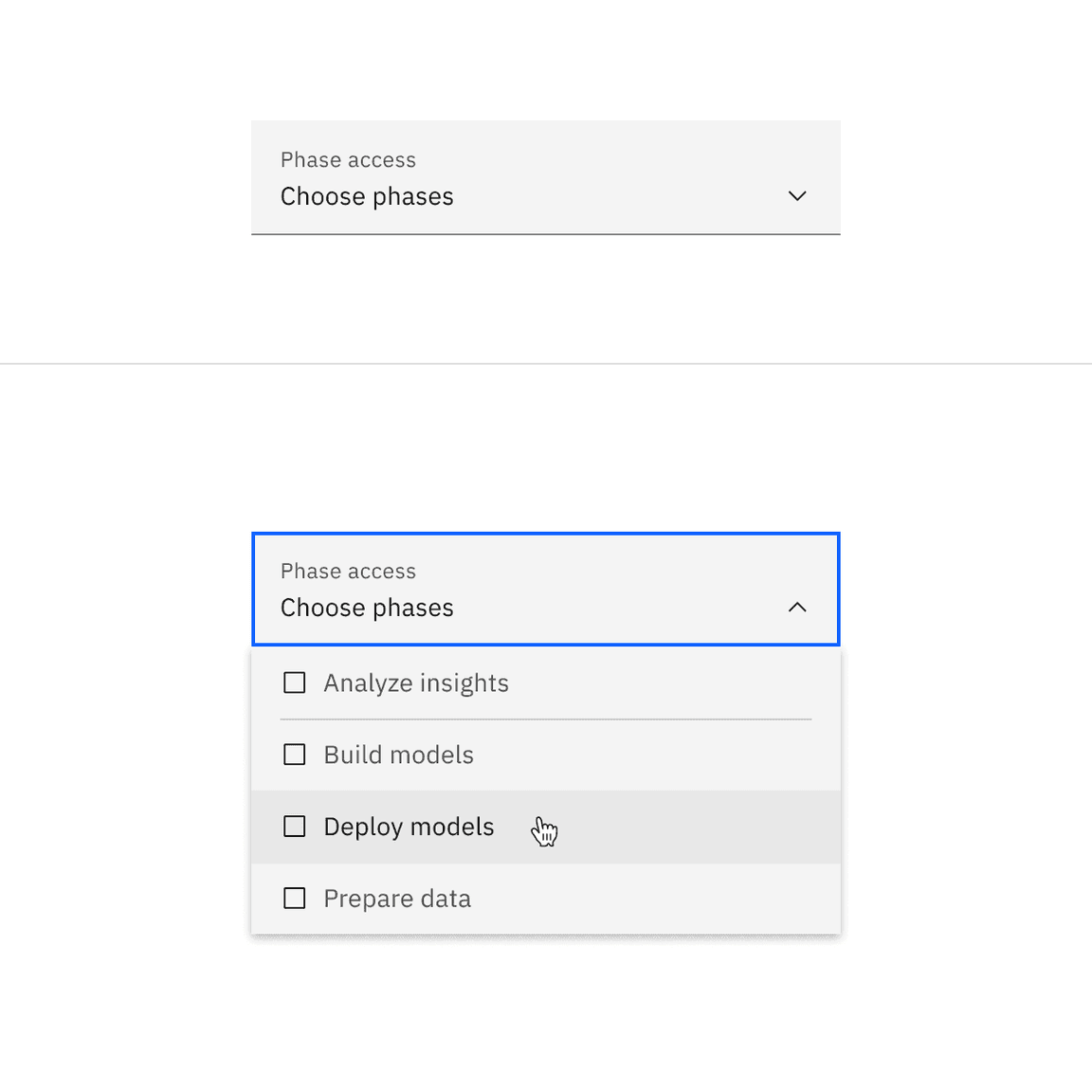
- By default, the dropdown displays any placeholder text in the field when closed. Activating a closed field opens a menu of options.
- Each option contains a checkbox input to the left of the option text.
- The menu stays open while options are being selected. The menu closes by
clicking the field or outside of the dropdown, or by pressing or tabbing away from the component.Esc
Feedback
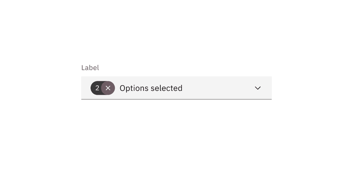
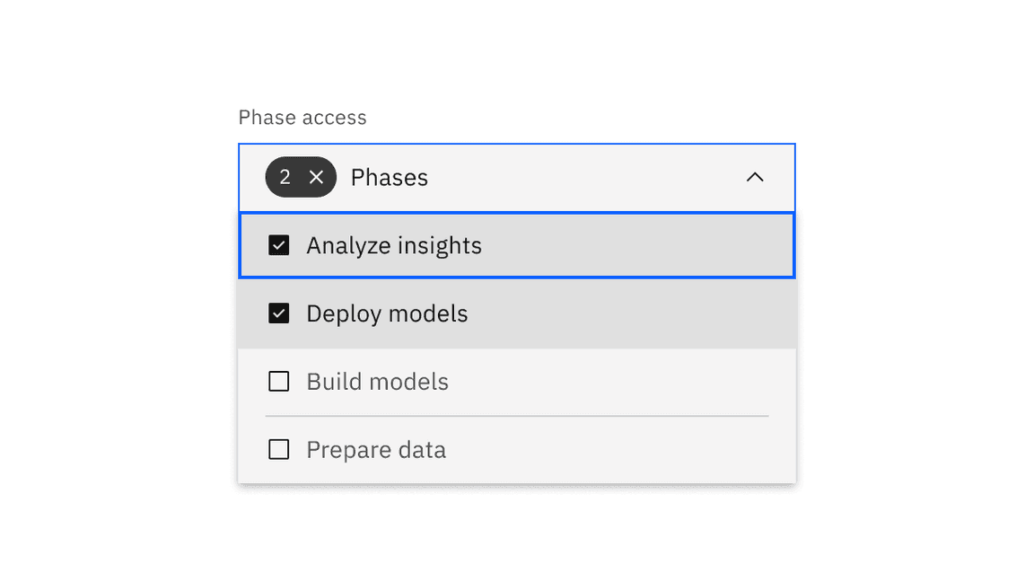
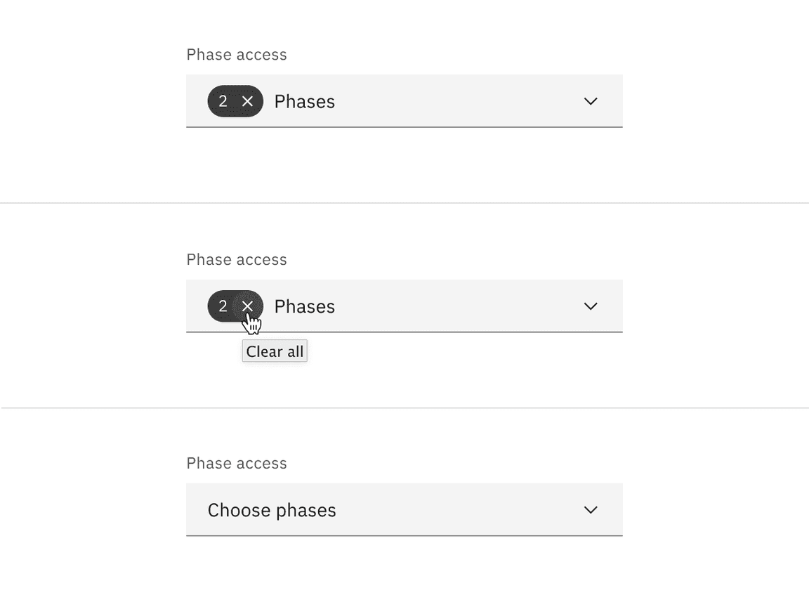
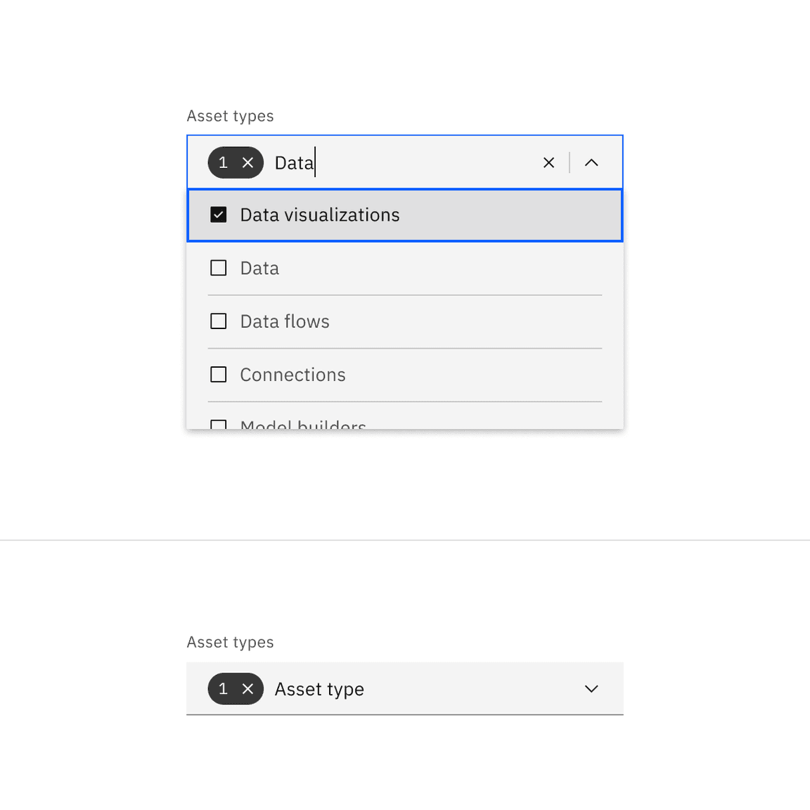
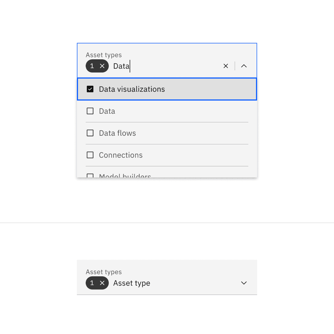
- Once options have been selected from the menu, a tag appears to the left of the text in the field containing the total number of selected options, and also provides a functionality to clear all the selected options.
- The placeholder text can change to text that better reflects what is selected.
- Selected options shift to the top of the menu in an alphanumeric order when revisiting the menu after closing it.
- Unlike dropdown and combo box, the menu does not close once the user makes selections. Because multiple selections are possible, the user needs to click outside of the dropdown or on the parent element to close the menu.
Selecting all
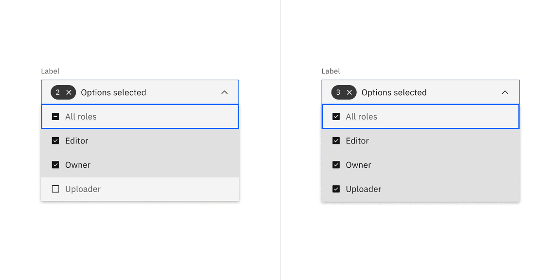
The parent checkbox associated to the parent option makes it possible for the user to select all options from the list. Although the parent checkbox element is used only for multiselect dropdowns, it is not mandated to be present in all multiselect dropdowns.
- The bottom stroke for the parent option has no padding and bleeds to the end of the dropdown menu.
- The background fill for the all button does not change when selected and will continue to have the same background as the enabled state
The parent checkbox has a third indeterminate state and appears when some and not all options have been selected.
- Clicking on the indeterminate state clears all options.
- Clicking on the unselected checkbox selects all options.
- Clicking on the selected checkbox clears all options.
We recommend not to use the parent checkbox in scenarios like filters when choosing all and choosing none means the same.
Clearing all
To clear all selected options from a list, hover over the filterable tag and click the “x” (or
close
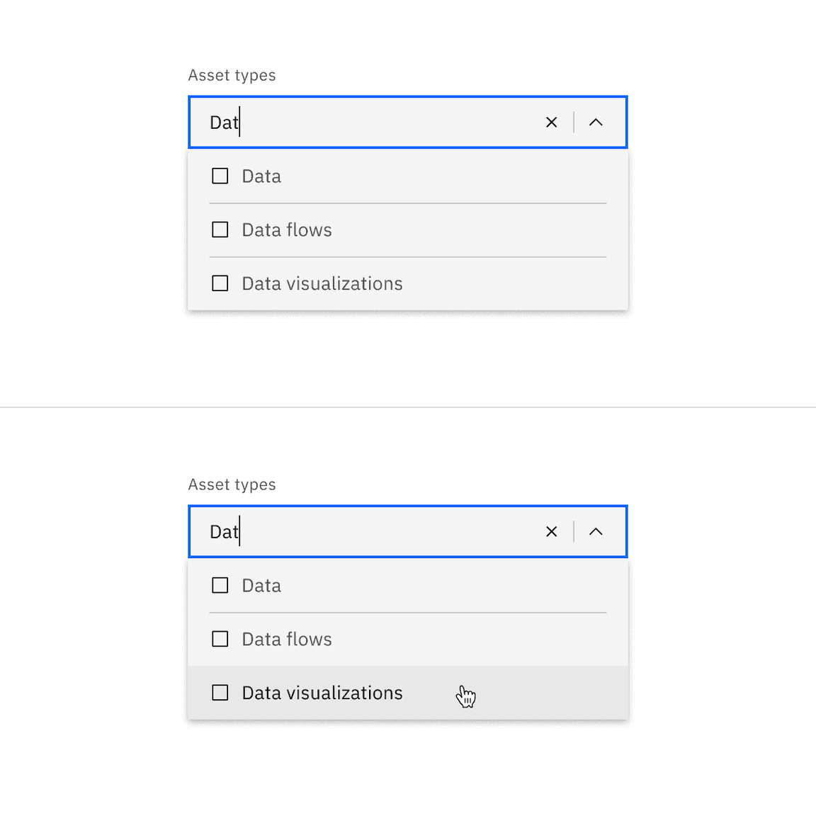
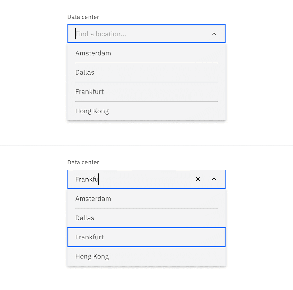
Filtering
Use filtering to narrow down a long list of options to find the option you want to select.
- By default, the filterable multiselect dropdown displays placeholder text in the field when closed.
- When hovering over the field, a text cursor appears.
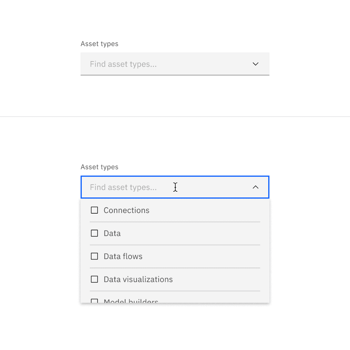
- The menu opens by clicking anywhere in the field and you can start typing to filter the list of options. The options that start to match your entry remain in the list while other existing options are temporarily removed.
- After typing text in the field, the close (x) icon appears to the right of the text in the field. This clears any text that’s been entered in the field.
- Once options have been selected from the menu, a tag appears to the left of the text in the field containing the total number of selected options. The placeholder text can change to text that better reflects what is selected.
- Selected options shift to the top of the menu in alphanumeric order.
- Like the default multiselect dropdown, the menu does not close once the user makes selections.
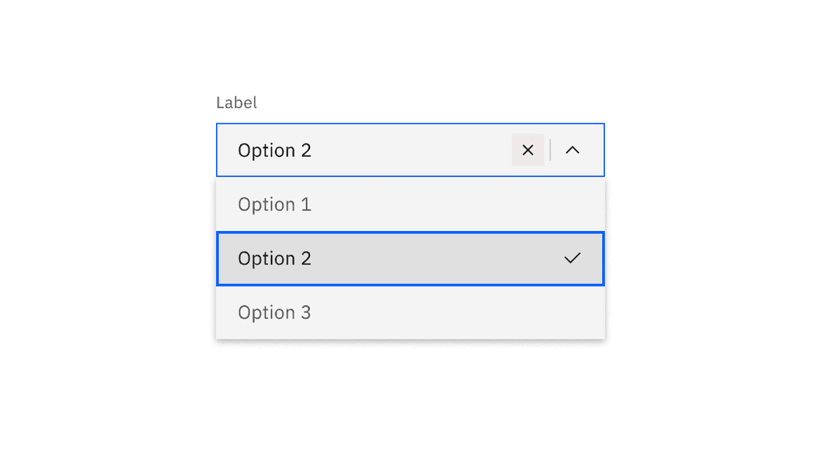
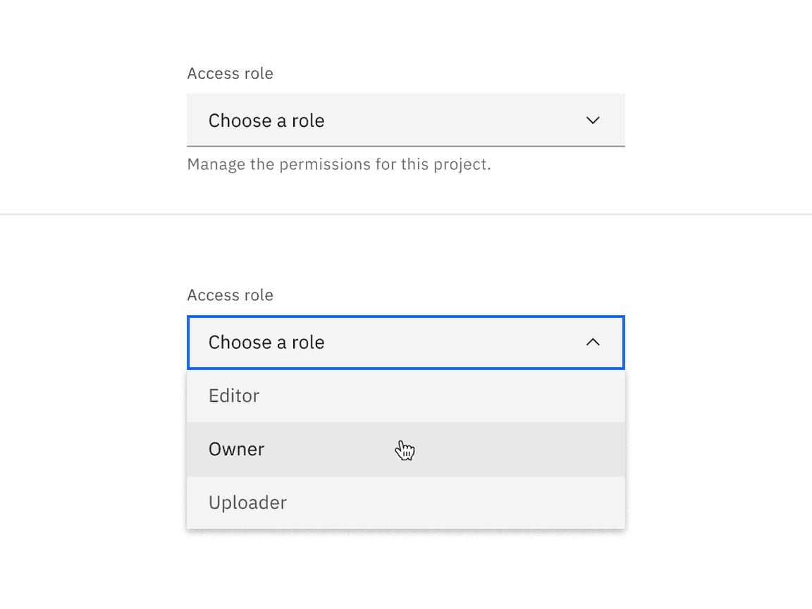
Combo box
Use a combo box when the user needs to select one option, but the list of options may be very long or not predefined. Combo boxes allow the user to either select from a list of suggested options or type in their own custom value. Combo boxes are useful when the data populating the list may come from a database.
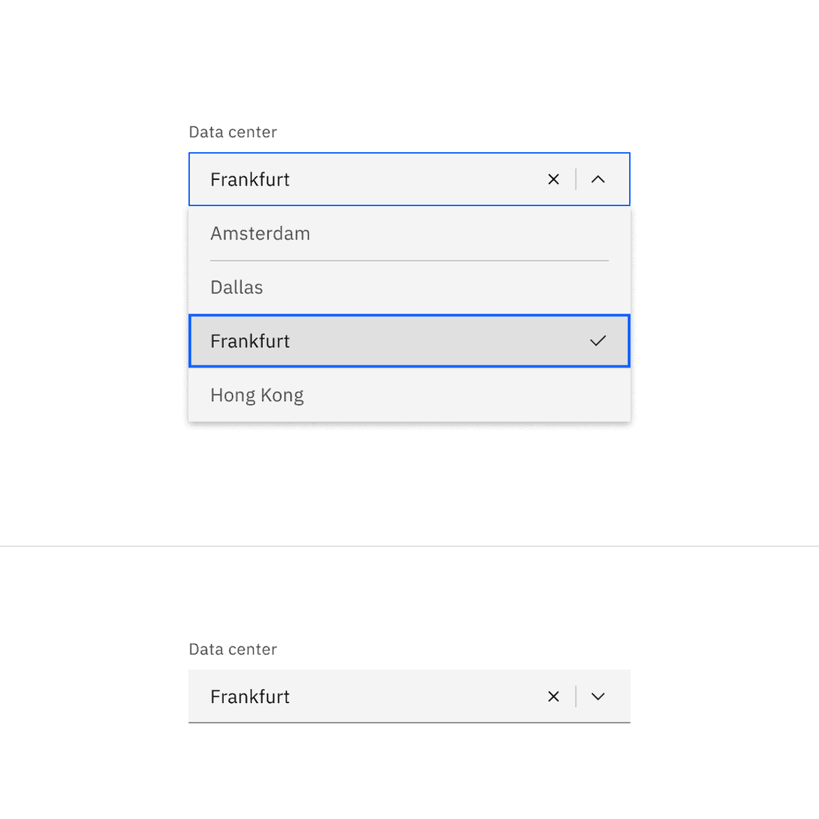
- The menu opens by clicking anywhere in the field, allowing users to type and sort through the list of options. The best-matching option is highlighted as users type.
- A close (x) icon clears the input, and autocomplete refines options as users type.
- Selecting an option closes the menu and the selected option replaces the placeholder text.
Entering a custom value
In a combo box, users can type in a custom or unique value that is not included in the list of predefined options.
- If the desired option isn’t available in the list, users can start typing their custom value directly in the field, filtering out options as they type.
- To save the new custom value, click outside the field with the mouse or press
orTabon the keyboard.Enter
- Once saved, the placeholder text changes to display the custom typed value.
Modifiers
Inline
When placing a dropdown inline with other content use the inline modifier. If adding a visual label to an inline dropdown it should appear inline to the left of the dropdown. If there is no visual label present you must supply an appropriate accessibility label to the inline dropdown. Note that inline is only a modifier for dropdown and multiselect components, and it does not include filtering functionality.
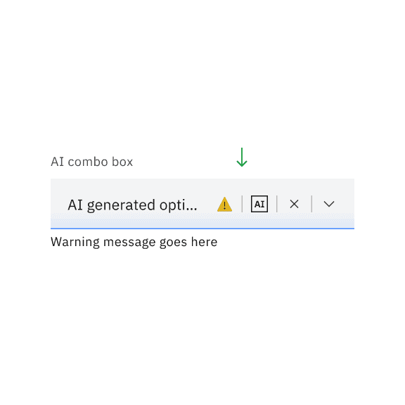
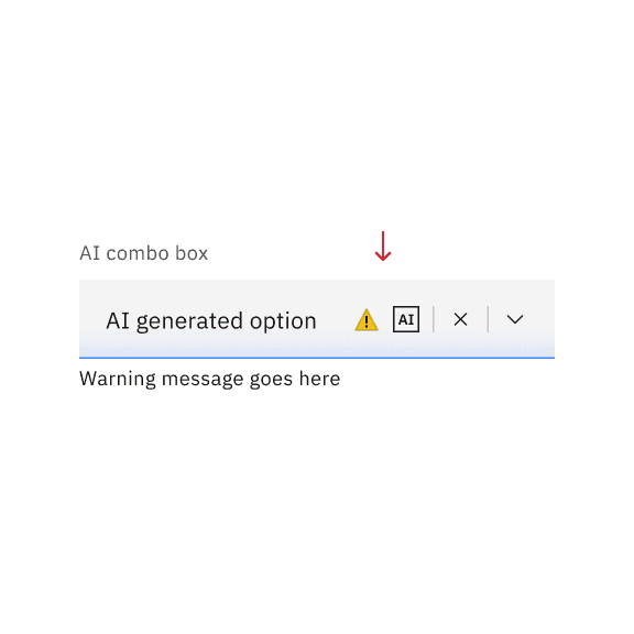
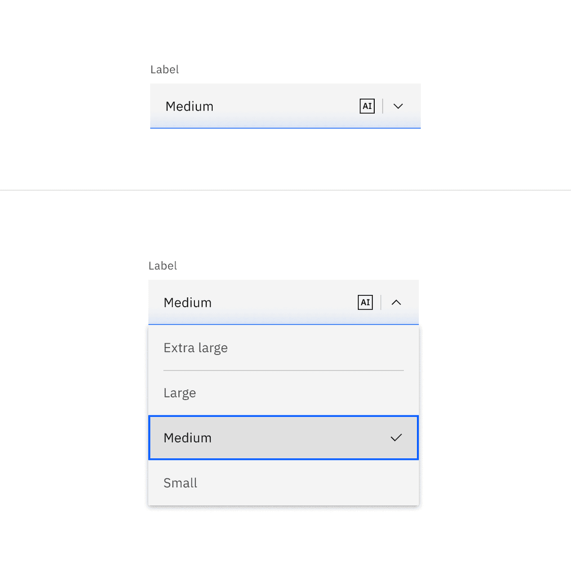
AI presence
Dropdown and its variants have a modification that takes on the AI visual styling when the AI label is present in the input. The AI variant of these components function the same as the normal version except with the addition of the AI label which is both a visual indicator and the trigger for the explainability popover.
For more information on designing for AI, see the Carbon for AI guidelines.
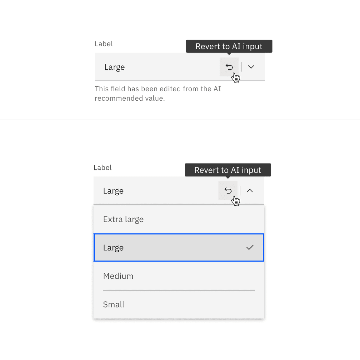
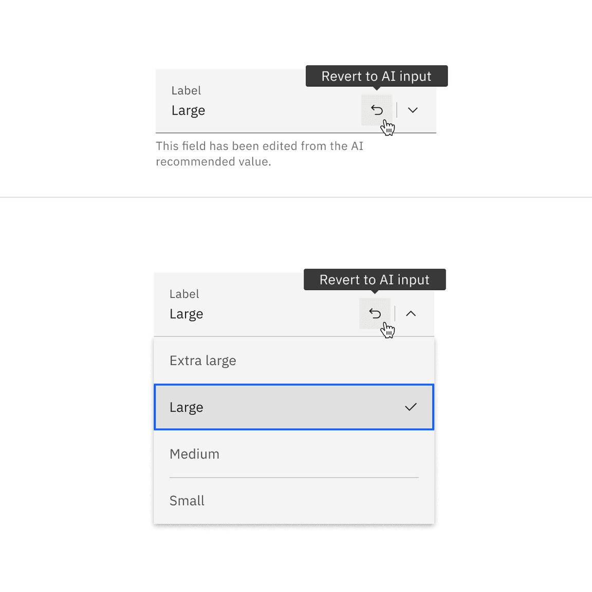
Revert to AI
A dropdown can toggle between the AI variant and the non-AI variant depending on the user’s interaction. If the user manually overrides the AI-suggested content then the input will change from the AI variant to the non-AI variant. Once edited, the user should still be able to switch back to the initially AI generated content via a revert to AI button.
Related
Checkbox
Checkboxes are used when there are multiple options to select in a list. Users can select zero, one, or any number of options. For further guidance, see Carbon’s checkbox.
Form
A form is a group of related input controls that allows users to provide data or configure options. For further guidance, see Carbon’s form.
Radio button
Radio buttons are used when there is a group of mutually exclusive choices and only one selection from the group is allowed. For further guidance, see Carbon’sradio button.
Dropdown versus Select
Dropdown and select components have functionality and style differences.
- The underlying code of a dropdown component is styled to match the design system, while the select component’s appearance is determined by the browser being used.
- Use a dropdown component in forms, to select multiple options at a time and to filter or sort content on a page. The select dropdown does not have filtering or multiselect functionality.
- Use a select dropdown component if most of your experience is form based. Custom dropdowns can be used in these situations, but the native select works more easily with a native form when submitting data.
- Use a select dropdown component if your experience will be frequently used on mobile. The native select dropdown uses the native control for the platform which makes it easier to use.
Dropdown versus Combo box
While the dropdown and combo box look similar they have different functions.
- With a dropdown list, the selected option is always visible, and the other options are visible by clicking and opening the list.
- A combo box is a combination of a standard list box or a dropdown list that lets users type inside the input field to find an option that matches their inputted value.
References
Angie Li, Dropdown: Design Guidelines (Nielsen Norman Group, 2017)
Feedback
Help us improve this pattern by providing feedback, asking questions, and leaving any other comments on GitHub.