Form
A form is a group of related input controls that allows users to provide data or configure options.
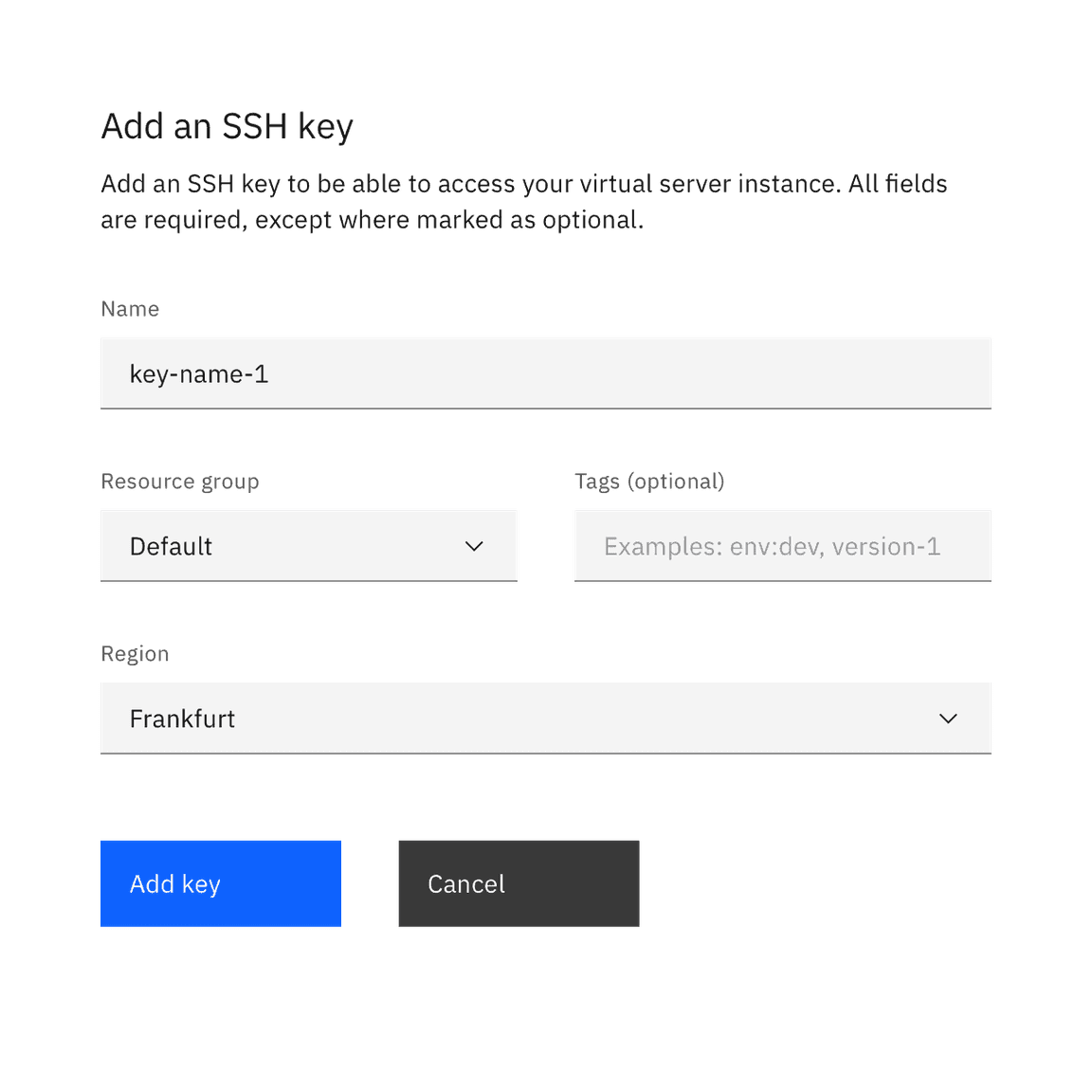
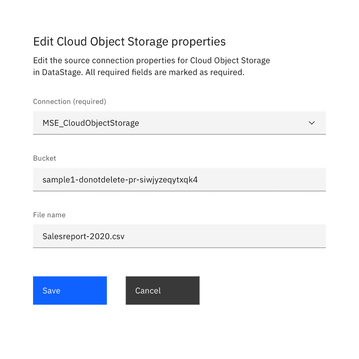
Live demo
This live demo contains only a preview of functionality and styles available for this component. View the full demo on Storybook for additional information such as its version, controls, and API documentation.
Accessibility testing statusFor every latest release, Carbon runs tests on all components to meet the accessibility requirements. These different statuses report the work that Carbon has done in the back end. These tests appear only when the components are stable.
For every latest release, Carbon runs tests on all components to meet the accessibility requirements. These different statuses report the work that Carbon has done in the back end. These tests appear only when the components are stable.
Overview
The form component is configurable to fit various use cases and layouts. It is purposely simple out of the box, and users are responsible for configuring it to suit their needs. For in-depth design guidance on the different ways to configure and extend a form, see the form pattern.
Formatting
Anatomy
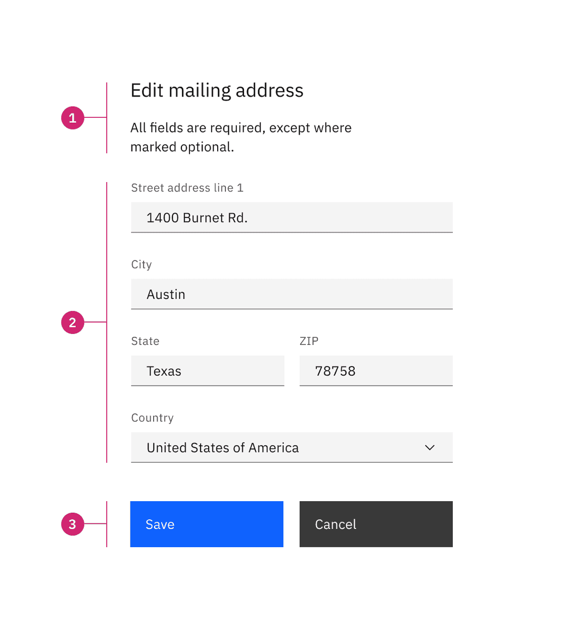
- Header (optional): The addition of a title and description as a header that can provide the user with additional context or instructions.
- Form body: Area where users provide information. Information can be entered through various input fields, including text fields, checkboxes, and many other types. Input components contain labels and helper text that the user submits correct data.
- Footer: Provides actions that allow users to submit or cancel the data entered in the form.
Styling
Forms can use two styles of inputs: default and fluid. They share the same functionality but look visually different and have different alignment rules.
| Style | Appearance | Alignment | Use case |
|---|---|---|---|
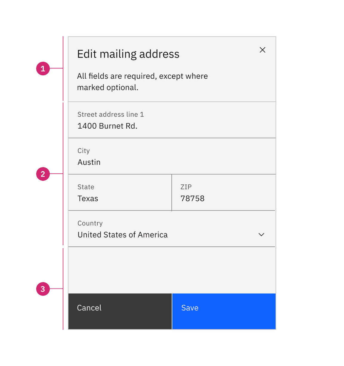
| Default | Uses a traditional style of input where the label is positioned outside and above the input field. Default forms can use any of the three default input field sizes: small (32px), medium (40px), or large (48px). | Form inputs are equally stacked with 32px/2rem padding separating each component. | Use when white space is needed between input components, if smaller components are required, or in productive moments like in complex forms. |
| Fluid | An alternative input style where the label is placed inside the input field and aligned with the user input text. Fluid inputs only have one size at the height of 64px. | Form inputs are stacked flush to one another with 0px of padding between them. | Use in expressive moments or where larger form components can aid in emphasizing the featured form. |
Alignment
In a form, input components should vertically align with all other form components. Whether a form aligns flush to grid columns or hangs in the gutters depends on the style of form input you are using as well as the gutter mode. Default forms typically use a wide gutter mode and align flush to the grid columns prioritizing vertical label alignment. Fluid forms use the condensed grid and can hang into the gutter without causing label misalignment. Fluid forms are architectural and remain cohesive by never allowing vertical or horizontal space between inputs.
Do align default form inputs and labels to the grid columns using the wide gutter mode.
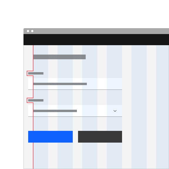
Don’t hang default inputs into the grid gutters. Doing so will cause labels to misalign with other form elements.
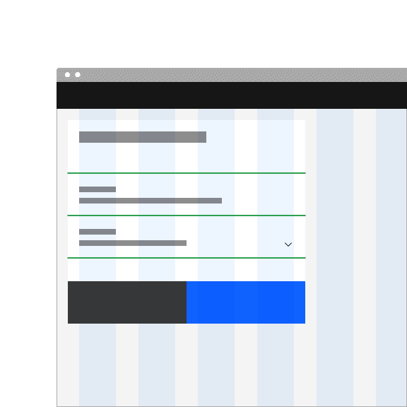
Do stack fluid components flush to one another with no spacing between them using the condensed gutter mode.
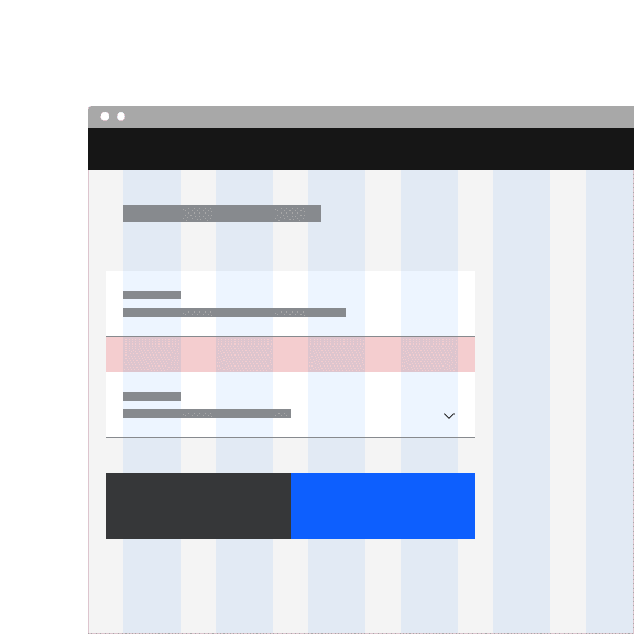
Don’t add vertical or horizontal space between fluid components. Fluid forms are architectural and should remain a cohesive unit.
Two column forms
If a form has more than one column, then the columns should be proportional and align to grid columns when possible. The space between form columns is determined by the gutter mode you are using; default forms use the wide gutter mode with 32px padding between form columns, versus fluid forms use the condensed gutter mode with 1px padding. The narrow gutter mode (16px) is typically not used in forms as it often places the text in the gutter.
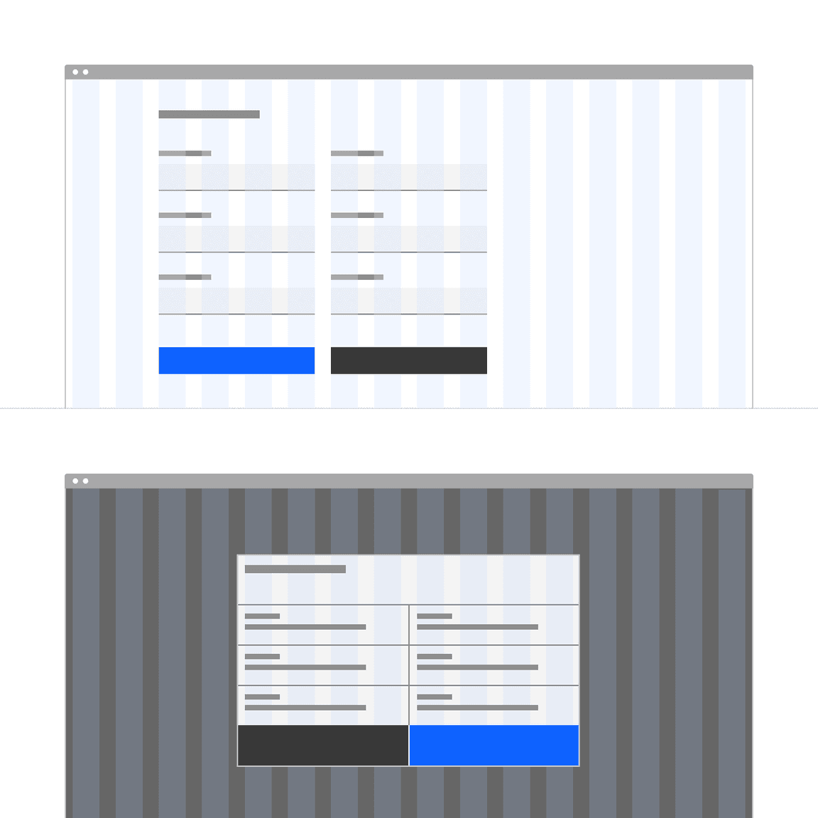
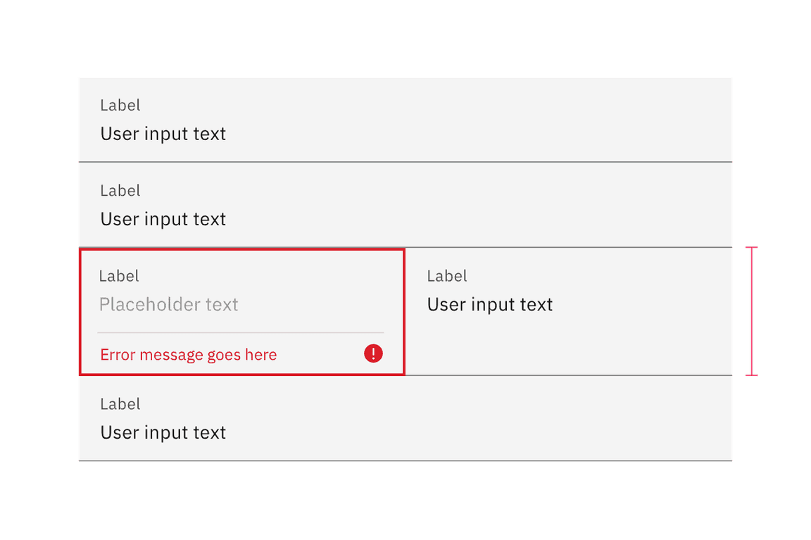
When using two columns, the row should respond as a group. For example, if the left column form item becomes invalid and pushes form content down to accommodate space for an error message, then the accompanying right form item will also grow to account for the needed space.
Vertical spacing
The typical recommended vertical spacing between components is 32px. For all guidance and recommendation for spacing for forms, see the form pattern.
Content
Labels
Effective labeling helps users understand what information to enter into a text input. Text fields should always have a label. There are rare instances where the context of an input negates the need for a visible label, but we advise you to consult an accessibility expert before proceeding with a label-less design.
Best practices for labels
- Use sentence-style capitalization for all labels except for product names and proper nouns.
- Keep the label short and concise.
- Do not use colons after label names.
Default values
Where possible, add programmatic assistance. Detect and pre-fill inputs to reduce errors and save time. When the software can’t determine the value that belongs in an input, use type-ahead to make suggestions. Use sentence-case for default values, detected values, and auto-completion text.
Helper text
Optional helper text is pertinent information that assists the user in correctly completing a field. Helper text should always be available when the input is focused. It is often used to explain the correct data format. Helper text appears as persistent text under a default input (helper text is not available in fluid input, which uses tooltips instead). Helper text is the preferred method of assisting users because it is always visible for the user to reference without additional effort.
Best practices for helper text
- Use sentence-style capitalization, and in most cases, write the text as full sentences with punctuation.
- When used, helper text that appears persistently underneath the field is replaced by an error or warning message if a state change occurs.
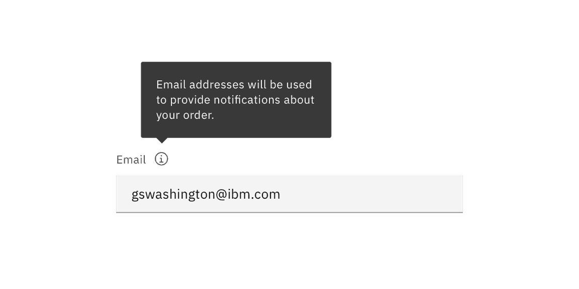
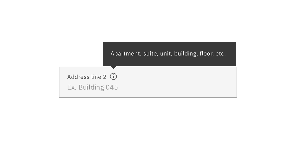
Tooltip help
Tooltips can be added inline with a form label if additional non-pertinent information is needed to assist the user in correctly completing a field, such as context setting. Tooltip content may include more in-depth information about the field or the options the user is choosing from. Links to additional information or references may also be included if needed. In certain situations where complex instructions or additional context would be appropriate, tooltips can be used in addition to the helper text. However, it is recommended that all pertinent assistive information to form completion—such as format content—be presented simply and directly as helper text under the field and not be in a tooltip.
Tooltips in fluid components
Fluid inputs are an exception to the no critical information in tooltips rule. Due to their architectural nature, fluid inputs do not provide the allotted space under the field needed for helper text. All assistive text whether pertinent or additional, is provided through a tooltip when using fluid inputs.
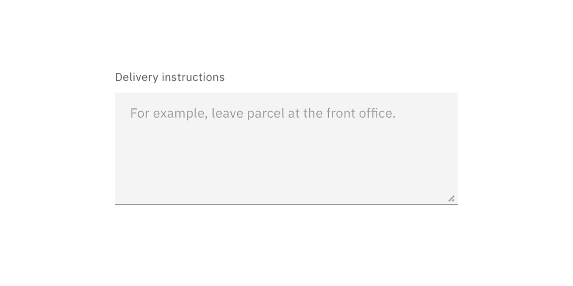
Placeholder text
Optional placeholder text is text that appears inside an input field at a lower contrast than the user input text. It provides hints or examples of what to enter. Placeholder text disappears after the user begins entering data into the input. As such, it should not be used as a replacement for a persistent label nor should it contain crucial information. Sometimes providing an example of the kind of thing the user might enter is useful. Using certain examples as placeholder text is allowed but it still should not contain essential information.
Best practices for placeholder text
- Use sentence-style capitalization, and in most cases, write the text as a direct statement without punctuation.
- Placeholder text is not required and by default not shown in text input fields.
- Placeholder text can be harmful to user interactions and should only be added when necessary.
Further guidance
For further content guidance, see Carbon’s content guidelines.
Behaviors
Optional versus required fields
Forms items can be labeled as either optional or required depending on several factors. A common distinction in IBM products for using required or optional is the forms complexity.
- Simple forms - generally shorter and/or user- or consumer-oriented; such as sign-up and contact forms and checkout screens. Most of the fields will tend to be required.
- Complex forms - generally longer and product-oriented; contain properties and settings that are used to configure Enterprise software. Although they will usually contain at least one required field, the majority of the fields will tend to be optional.
Note if the majority of the fields are required or optional, as the overall number of form fields for your entire product should inform your treatment. The pattern used should be consistent throughout your product, or at minimum, consistent between all of the same types of form within your product.
- If the majority of the fields are required, mark only the optional field labels with (optional).
- If the majority of the fields are optional, mark only the required field labels with (required).
Form controls
Carbon provides a variety of data input components that enable a user to enter or select data. The components are divided into three different interaction types.
| Type | Overview |
|---|---|
| Free form inputs | Free-form text inputs are the most commonly used components in forms. They allow a user to enter any configuration of letters or numbers. Common free-form inputs include: text input and text area. |
| Selection controls | Selection controls offer users a selection from pre-determined options. Common selection controls include: checkboxes, radio buttons, file uploaders, toggles, and select lists (combo box and multiselect). |
| Bound entry controls | Bound entry controls allow users to input numeric data, like dates and times and may restrict user input to a certain range. Common bound entry controls include: number input, date picker, and slider components. |
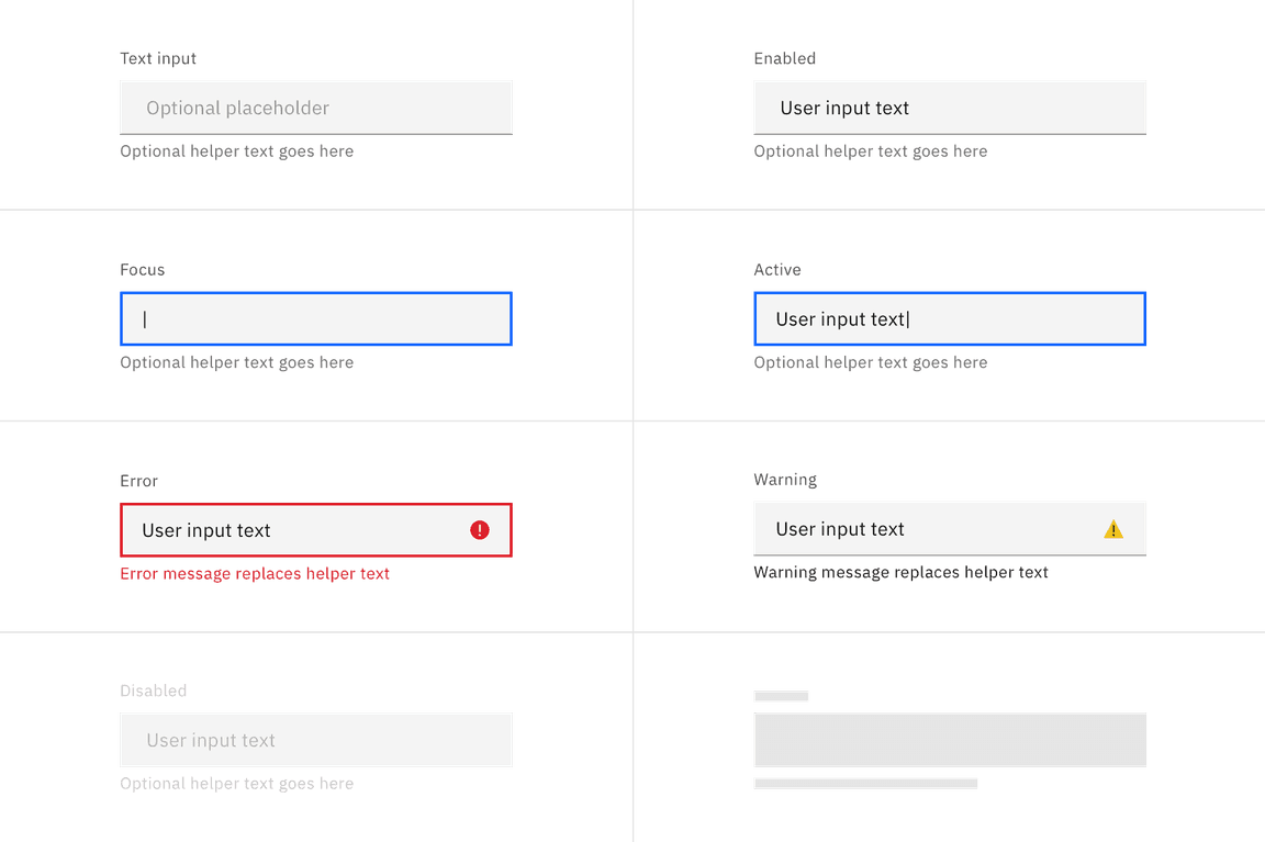
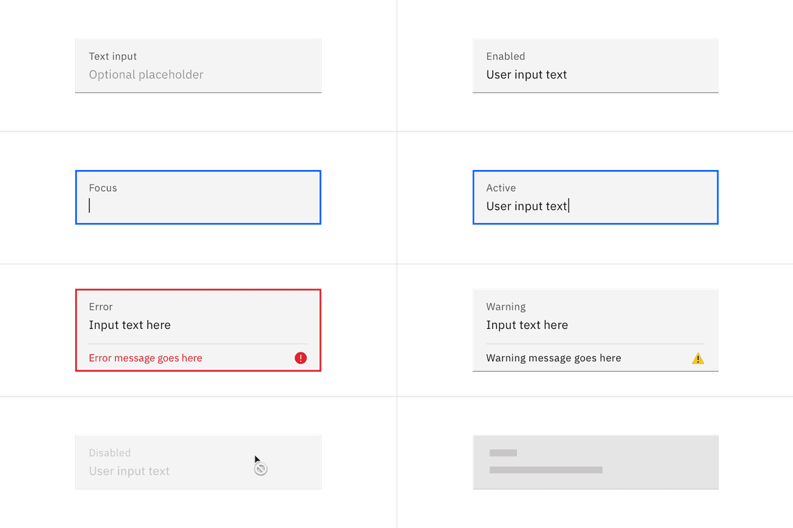
States
The following are common states that can be applied to components when used in a form.
| State | When to use |
|---|---|
| Enabled | When a text input is live but a user is not directly interacting with it. This is commonly referred to as the default or normal state of the component. An enabled text input field can contain no content, placeholder text, or user generate content. |
| Active | When a user is actively typing content into the field. |
| Focus | When a user
|
| Error | When the user input is invalid or a required text input has not been filled in. It can also be triggered due to a system error. This state requires a user response before data can be submitted or saved. |
| Warning | When you need to call the user’s attention to an exception condition. The condition might not be an error but can cause problems if not resolved. |
| Disabled | When the user is not allowed to interact with the text input due to either permissions, dependencies, or pre-requisites. The disabled state completely removes the interactive function from a component. The styling is not subject to WCAG contrast compliance. |
| Skeleton | Use on an initial page load to indicate that the text input has not yet fully loaded. |
| Read-only | Coming soon! |
Additional guidance
The form pattern provides additional and elaborative guidance to the information found with the form component. Below is a list of key sections available in the pattern.
| Topic | Overview |
|---|---|
| Buttons in forms | Provides guidance on button alignment, emphasis, placement, and naming in relation to a form. |
| Errors and validation | Effective and immediate error messaging can help the user to understand the problem and how to fix it. |
| Form layout | Additional guidance around layout, spacing, and columns in a form. |
| Designing for longer forms | Techniques to help make longer forms less overwhelming, including guidance for accordion and multistep forms. |
| Form variants | Forms may be presented as dedicated pages, side panels, or dialogs depending on the use case and the situation. |
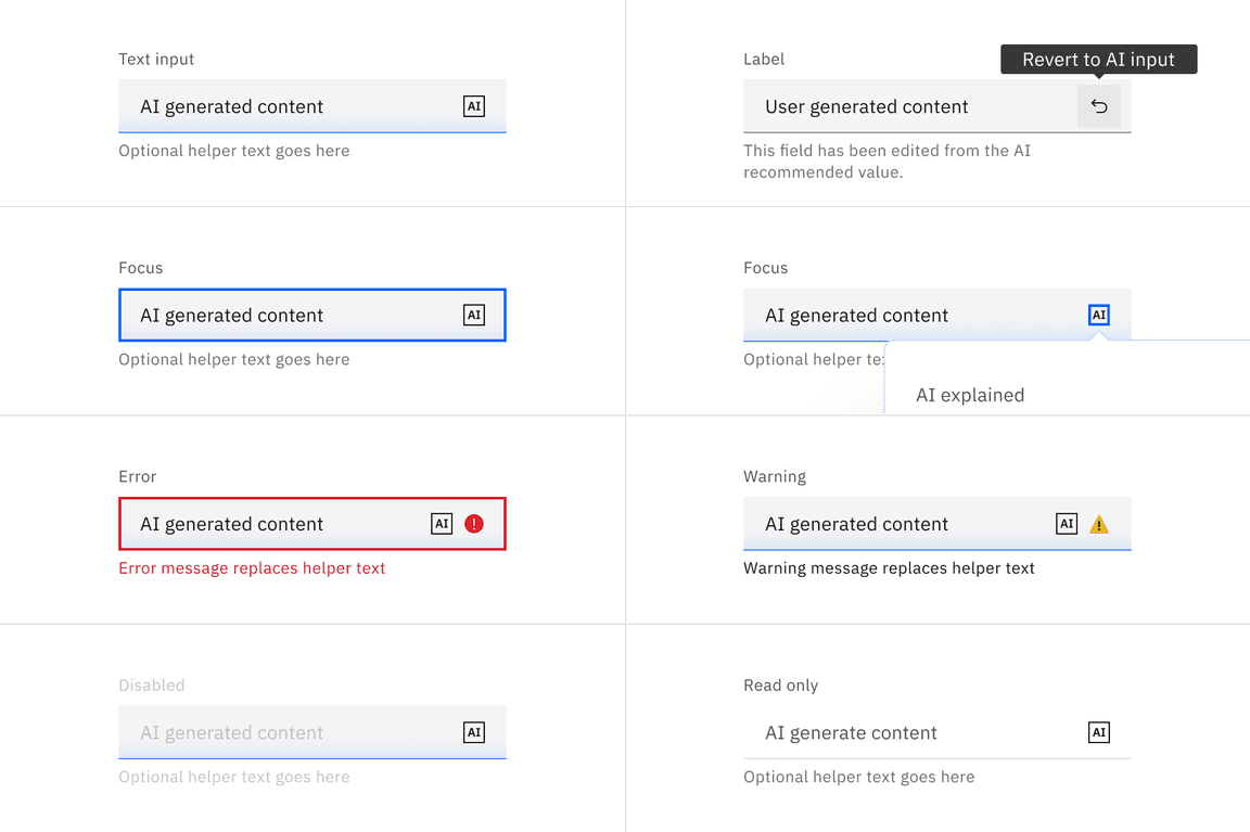
AI presence
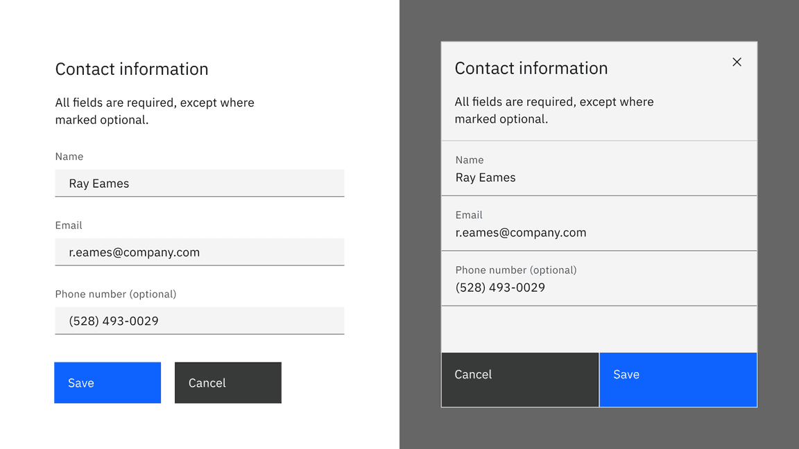
Form has a modification that takes on the AI visual styling when AI is present in the form. The AI variants of a form function the same as the normal variants except for the addition of the AI label, which is both a visual indicator and the trigger for the explainability popover.
The AI presence in form can appear in two ways: broadly, over the whole form, or focused, just in certain parts of the form. When the entire form is styled for AI, it indicates to the user that AI is present in all aspects of the form. If only a limited amount of the form content is generated by AI, then only those components should receive the AI presence styling, not the entire form.
For more information on designing for AI, see the Carbon for AI guidelines.
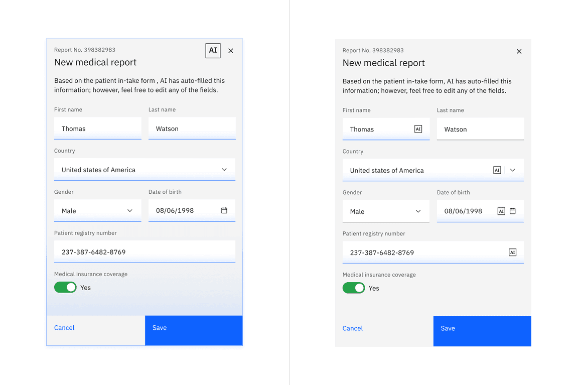
Example of form with full AI presence on the left and component based AI presence on the right.
Related
Components
Patterns
Feedback
Help us improve this component by providing feedback, asking questions, and leaving any other comments on GitHub.