Accordion
An accordion is a vertically stacked list of headers that reveal or hide associated sections of content.
Live demo
This live demo contains only a preview of functionality and styles available for this component. View the full demo on Storybook for additional information such as its version, controls, and API documentation.
Accessibility testing statusFor every latest release, Carbon runs tests on all components to meet the accessibility requirements. These different statuses report the work that Carbon has done in the back end. These tests appear only when the components are stable.
For every latest release, Carbon runs tests on all components to meet the accessibility requirements. These different statuses report the work that Carbon has done in the back end. These tests appear only when the components are stable.
Overview
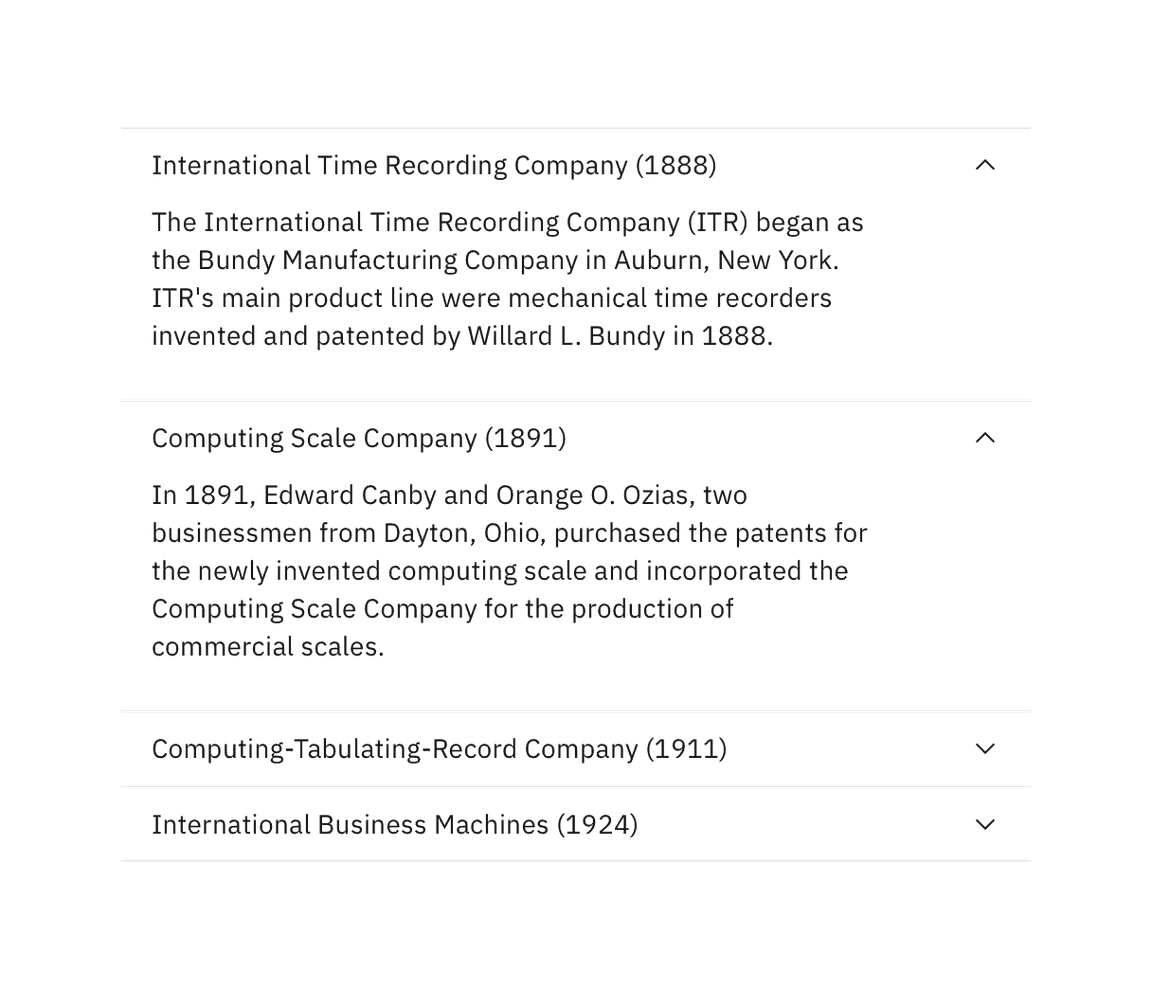
The accordion component delivers large amounts of content in a small space through progressive disclosure. The header title gives the user a high level overview of the content allowing the user to decide which sections to read.
Accordions can make information processing and discovering more effective. However, it does hide content from users and it’s important to account for a user not noticing or reading all of the included content.
When to use
- To organize related information.
- To shorten pages and reduce scrolling when content is not crucial to read in full.
- When space is at a premium and long content cannot be displayed all at once, like on a mobile interface or in a side panel.
When not to use
- When organizing large amounts of information that can be nested, consider using tree view instead.
- If a user is likely to read all of the content, then don’t use an accordion as it adds the burden of an extra click; instead use a full scrolling page with normal headers.
Formatting
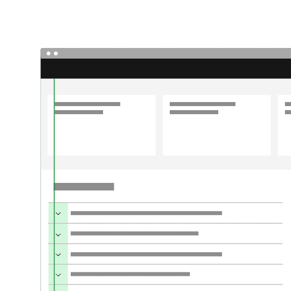
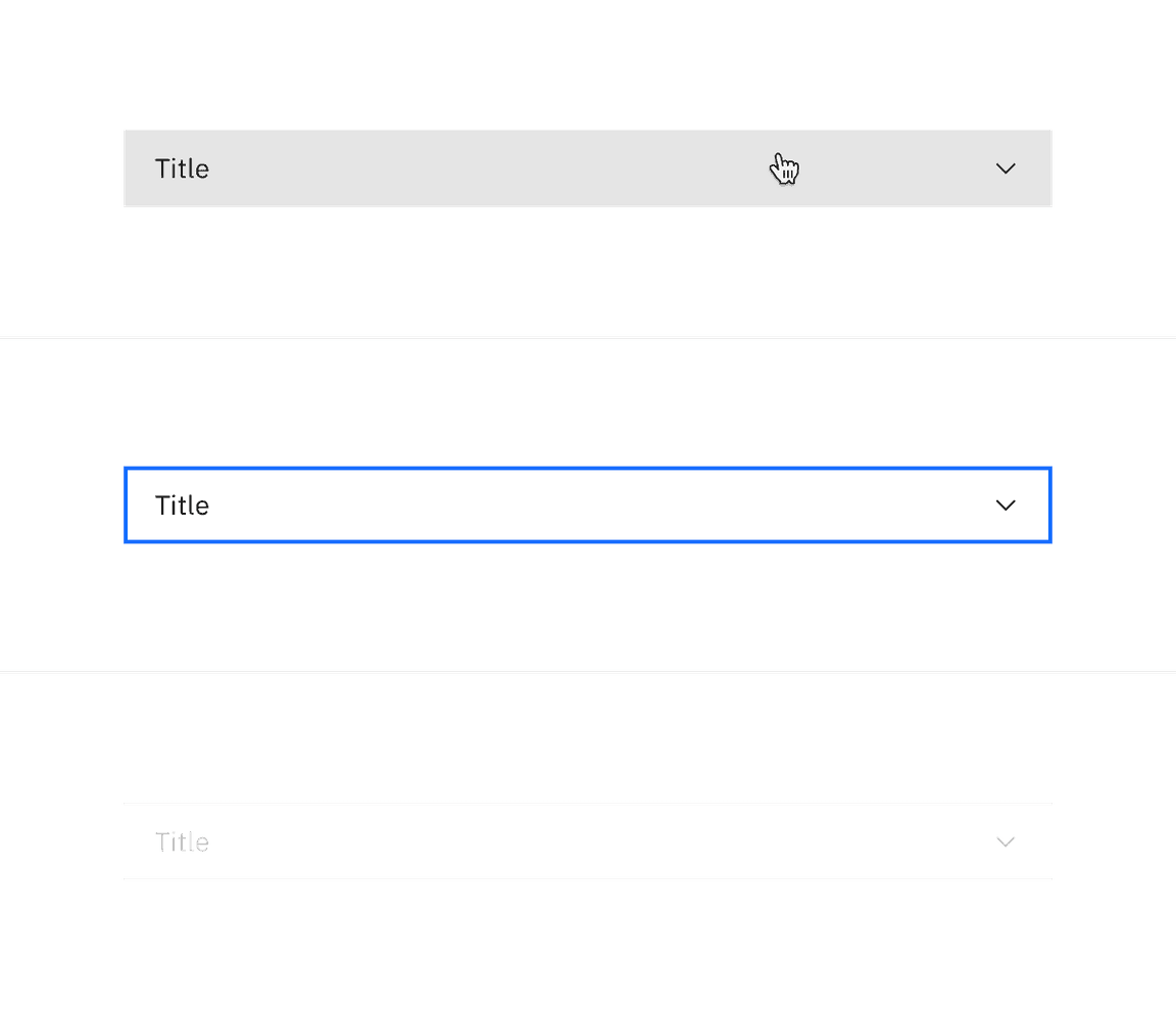
Anatomy
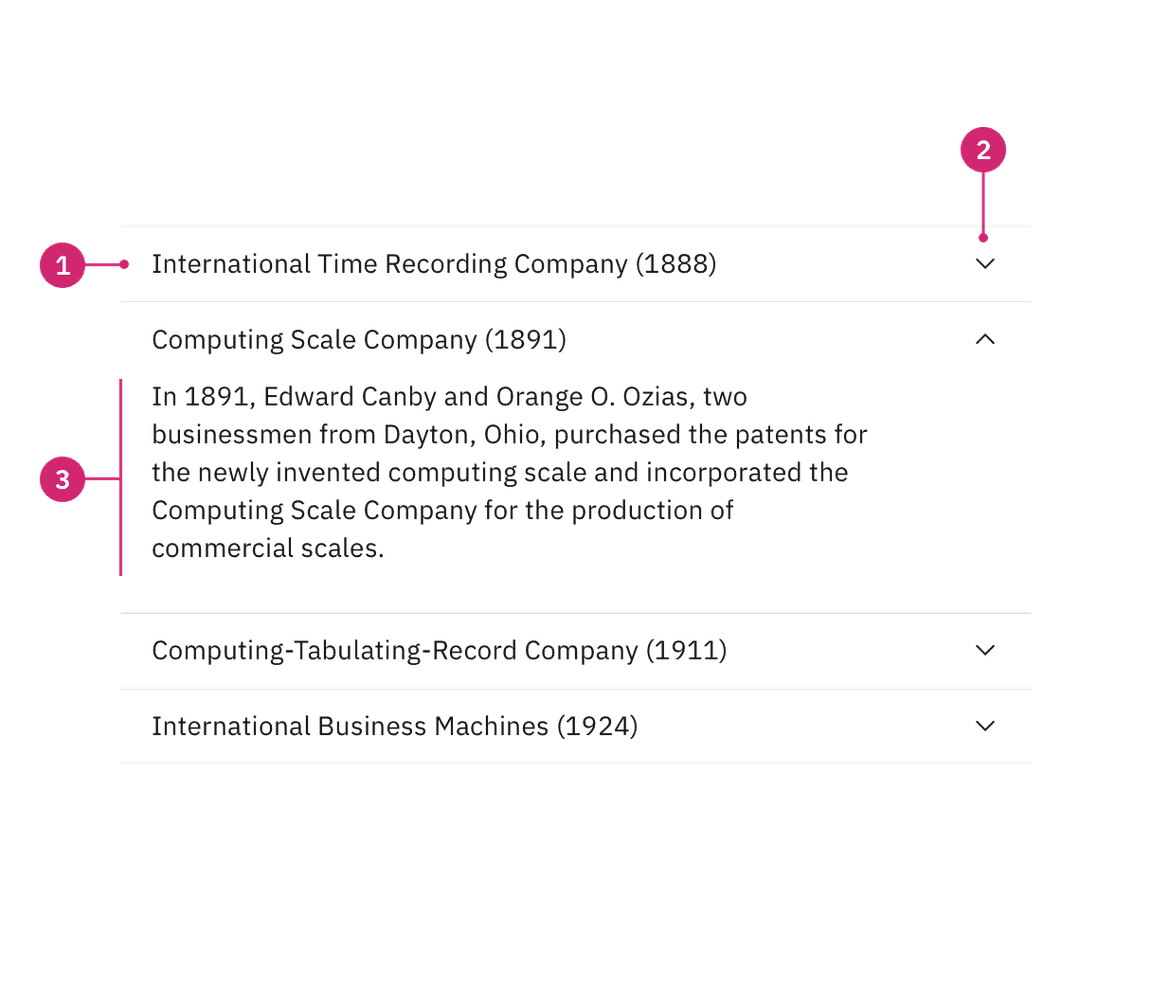
- Header: contains the section title and is control for revealing the panel.
- Icon: indicates if the panel is open or closed.
- Panel: the section of content associated with an accordion header.
Alignment
Flush alignment
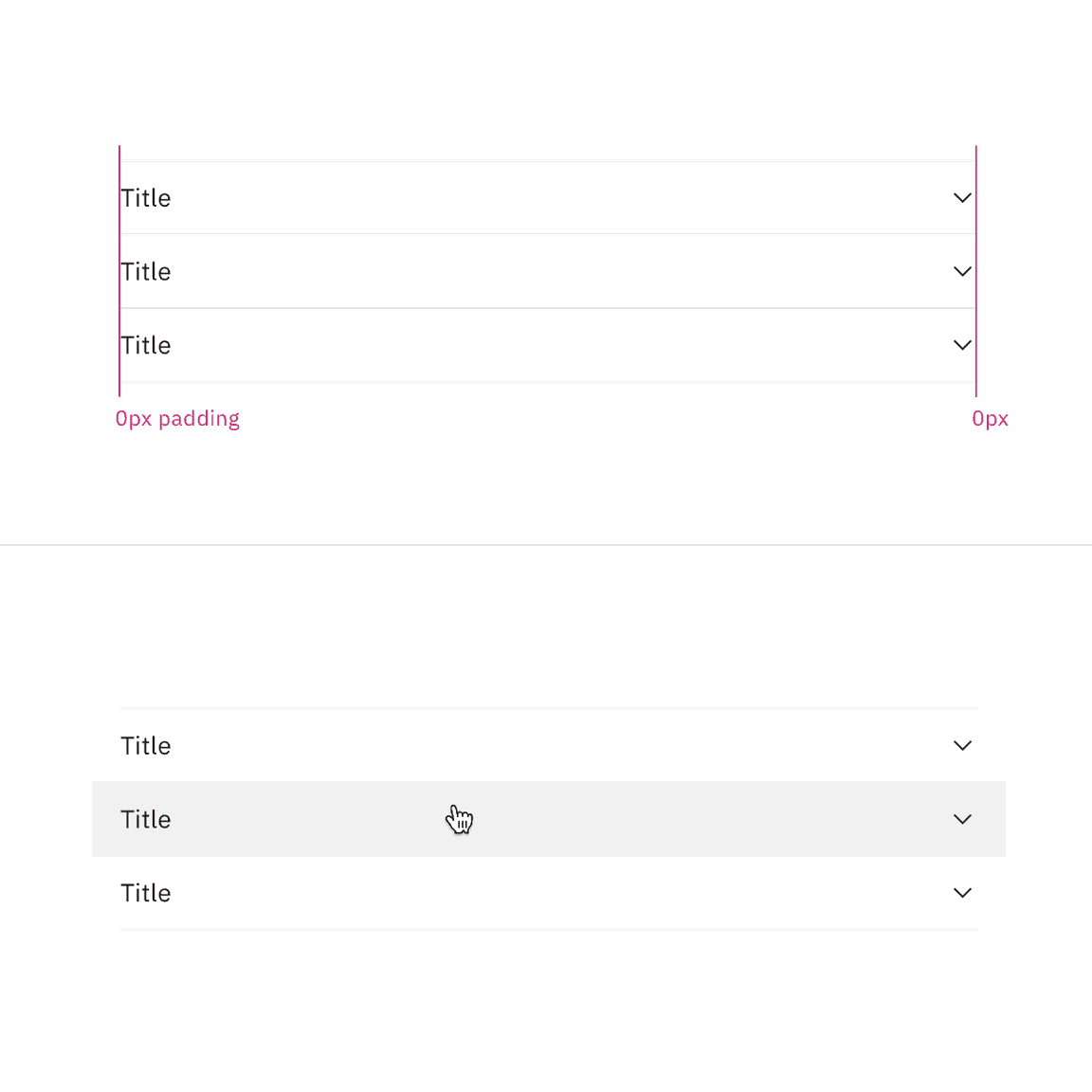
Use flush alignment when designing within smaller spaces on a page such as side panels or sidebars to achieve better text alignment with other content. Flush alignment is also used to help avoid converging rule lines between components that are close to each other on a page.
Flush alignment places the row title and chevron icons with 0px padding, keeping them flush to the rule dividers. For hover and focus interactive states, the left and right padding receives an additional 16px padding.
Icon alignment
By default the chevron icon is placed on the
end
start
However, in some rare scenarios, the accordion may be modified to place the icon in
start
end
In most cases, use the default end icon alignment to keep accordion text aligned with other content on the page.
In rare cases, you can place icons on the start side for tree like functionality.
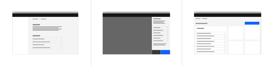
Placement
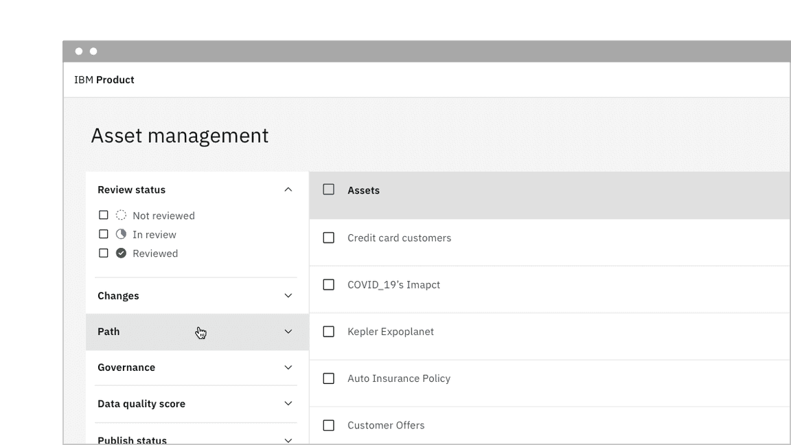
Accordions can be placed with main page content or placed inside of a container such as a side panel or tile.
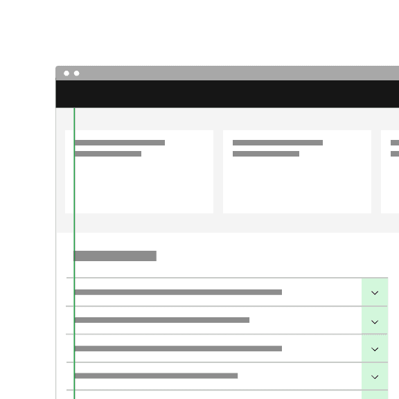
Grid placement
When placing an accordion on the 2x Grid with its default alignment, the indented title and content align to the grid columns, and the top and bottom borders hang into the gutter. However, the accordion can be modified to have a flush alignment where the titles and content are instead flush aligned with the top and bottom borders having 0px padding.
Content
Main elements
Title
- The title should be as brief as possible while still being clear and descriptive.
- Each title should be wrapped in a role heading (h1-h6) that is appropriate for the information architecture of the page.
Body copy
- Content inside of a section may be split into paragraphs and include sub-headers if needed.
Scrolling content
When the accordion content is longer than the viewport the whole accordion should vertically scroll. Content should not scroll inside of an individual panel. Content should never scroll horizontally in an accordion.
Further guidance
For further content guidance, see Carbon’s content guidelines.
Behaviors
States
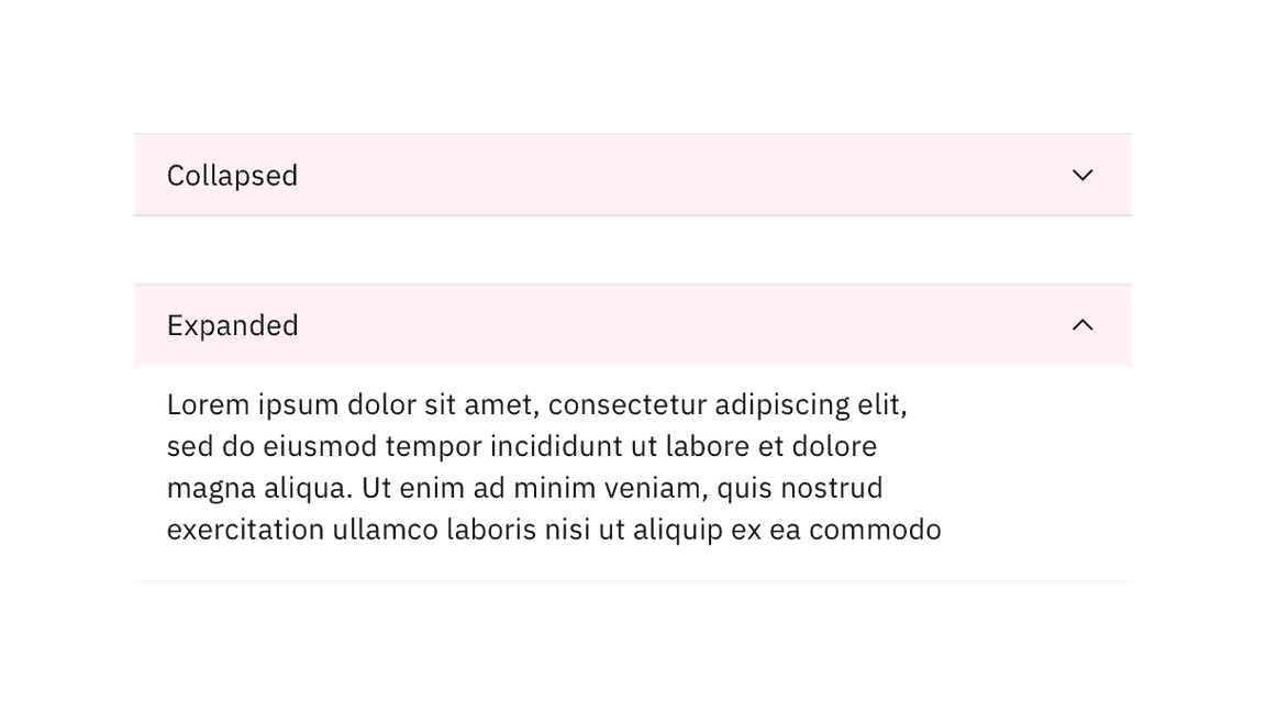
The accordion component has two main states: collapsed and expanded. The chevron icon at the end of the accordion indicates which state the accordion is in. The chevron points down to indicate collapsed and up to indicate expanded.
Accordions begin by default in the collapsed state with all content panels closed. Starting in a collapsed state gives the user a high level overview of the available information.
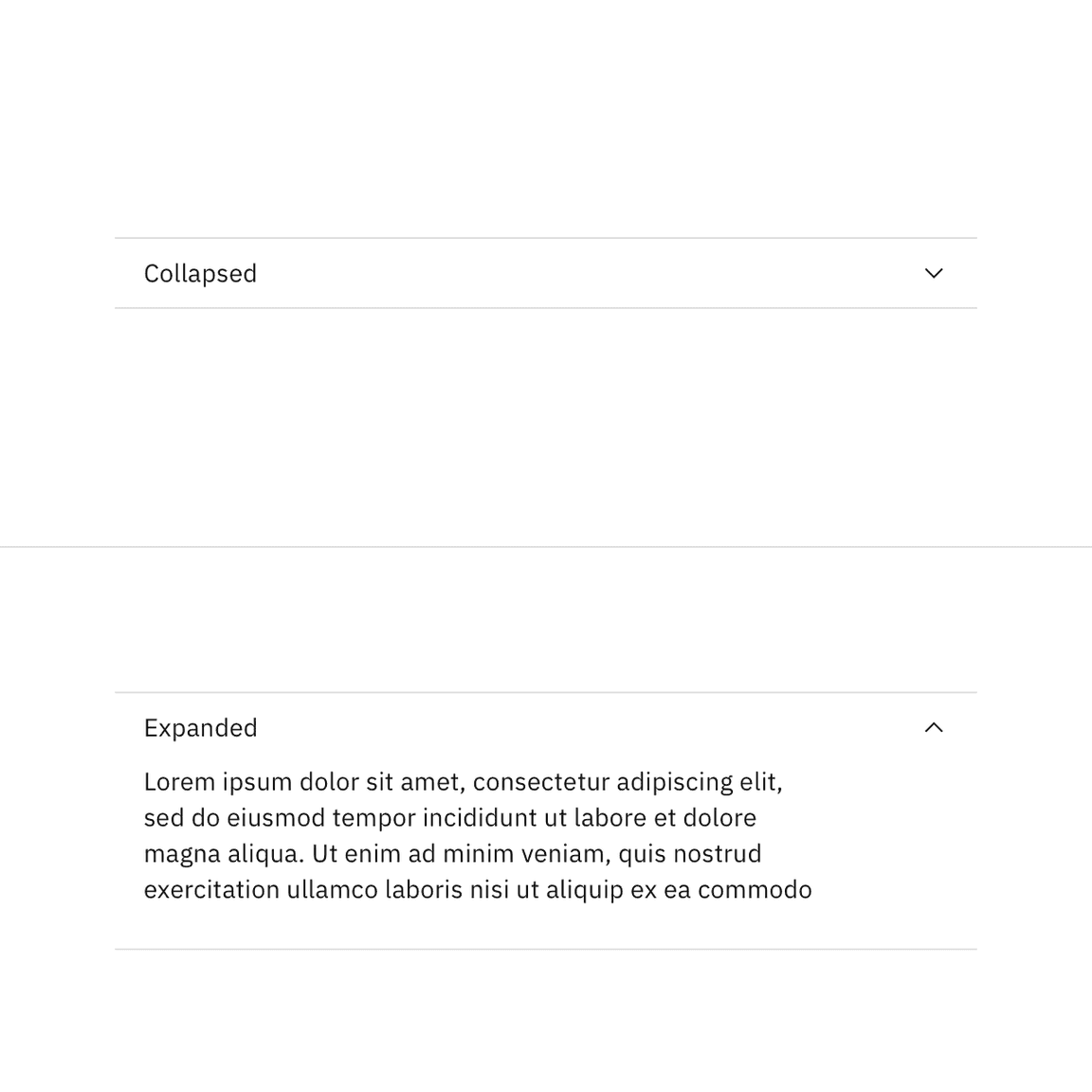
A user can then independently expand each section of the accordion allowing for multiple sections to be open at once.
In addition to the collapsed and expanded states, accordions also have interactive states for focus, hover, and disabled. See the style tab for more details.
Interactions
Mouse
Users can trigger a state change by clicking on the chevron or clicking anywhere in the header area.
Keyboard
Users can navigate between accordion headers by pressing
Tab
Shift-Tab
Enter
Space
Related
The following components are additional ways to organize content. Consider the type and length of content you are working with when choosing a content container. Longer form content may benefit from tabs or a content switcher while very short content might do better in a structured list.
- Content switchers allow users to toggle between two or more content sections within the same space on the screen.
- Progress indicators guide users through any linear, multistep task by showing the user their completed, current, and future steps.
- Structured lists group content that is similar or related, such as terms and definitions.
- Tabs organize related content by allowing the user to navigate between groups of information that appear within the same context.
- Tree view is a hierarchical structure that provides nested levels of navigation.
References
- Hoa Loranger, Accordions Are Not Always the Answer for Complex Content on Desktops (Nielsen Norman Group, 2014)
Feedback
Help us improve this component by providing feedback, asking questions, and leaving any other comments on GitHub.