Accordion
Color
| Element | Property | Color token |
|---|---|---|
| Title | color |
|
| Content | color |
|
| Icon | fill |
|
| Header | border-top |
|
| background | Transparent | |
| Panel | border-bottom |
|
| background | Transparent |
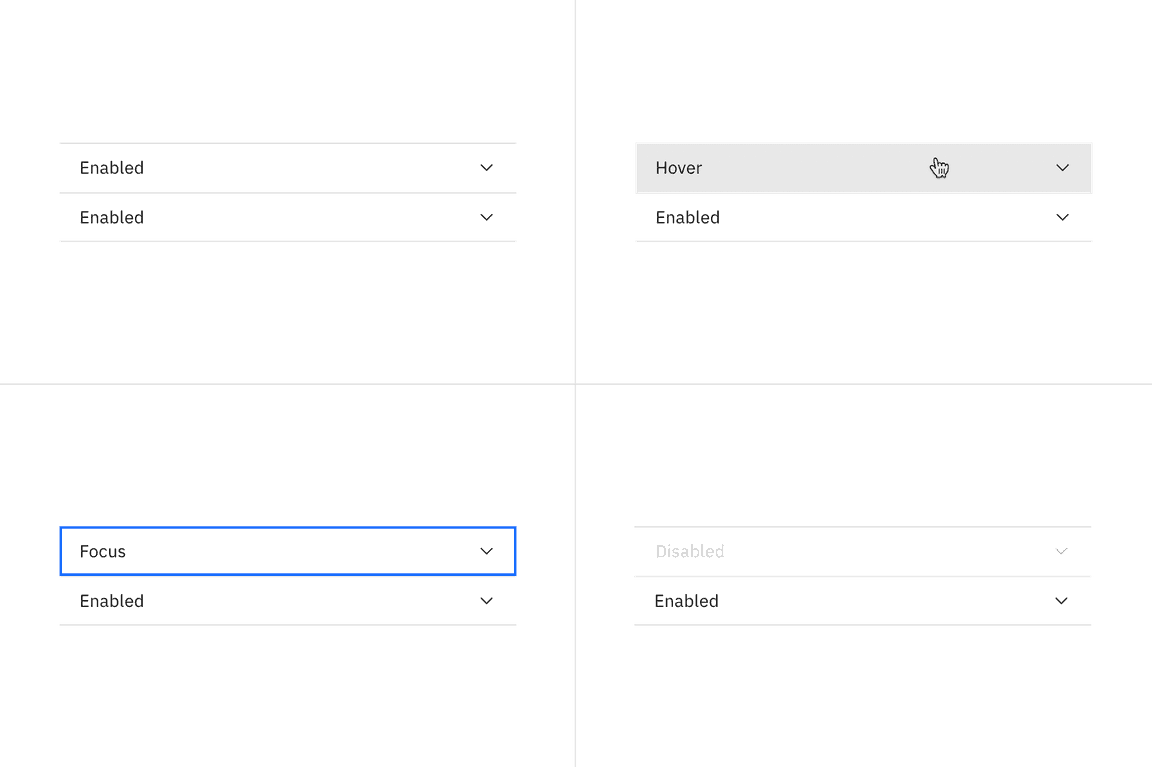
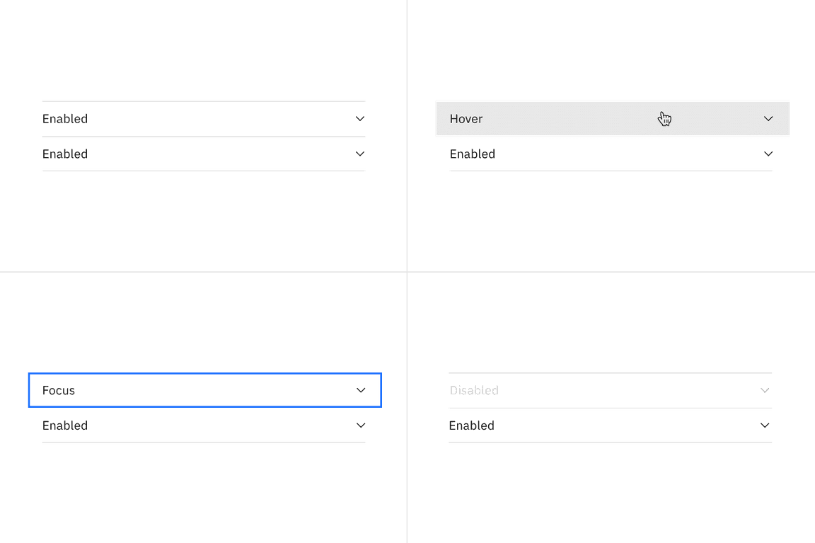
Interactive states
| Element | State | Property | Color token |
|---|---|---|---|
| Header | Hover | background |
|
| Focus | border |
| |
| Disabled | border-top |
| |
| Title | Disabled | background |
|
| Icon | Disabled | fill |
|
Typography
All accordion titles are set in sentence case. See the accordion content guidelines for more details.
| Element | Font-size (px/rem) | Font-weight | Type token |
|---|---|---|---|
| Title | 14 / 0.875 | Regular / 400 |
|
| Content | 14 / 0.875 | Regular / 400 |
|
Structure
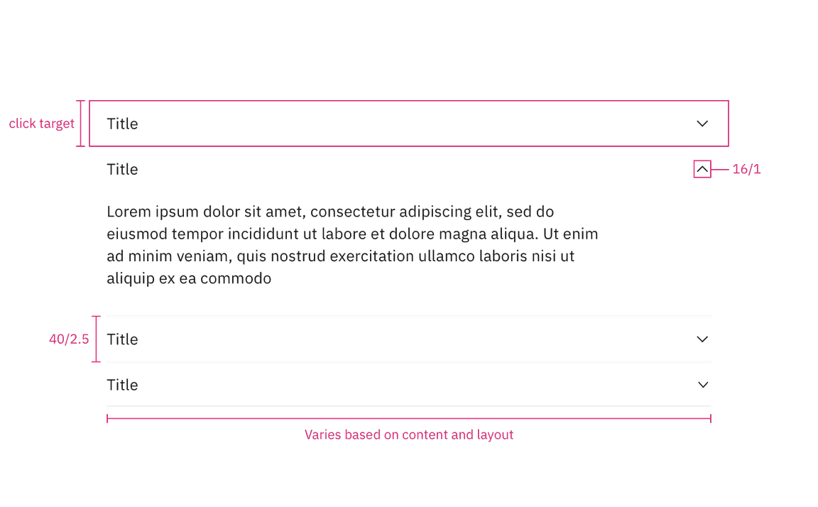
There is no max-height for an open panel but an accordion may scroll if constrained by vertical space. The width of an accordion varies based on the content, layout, and page design. The icon used in the header is a
chevron
Default alignment
| Element | Property | px/rem | Spacing token |
|---|---|---|---|
| Header | height | 40 / 2.5 | – |
| Item | border-top | 1 | – |
| Title | margin-left | 16 / 1 |
|
| Panel | padding-top | 8 / 0.5 |
|
| padding-bottom | 24 / 1.5 |
| |
| padding-right | 25% | – | |
| padding-left | 16 / 1 |
| |
| Icon | size | 16 / 1 | – |
| padding-right | 16 / 1 |
|
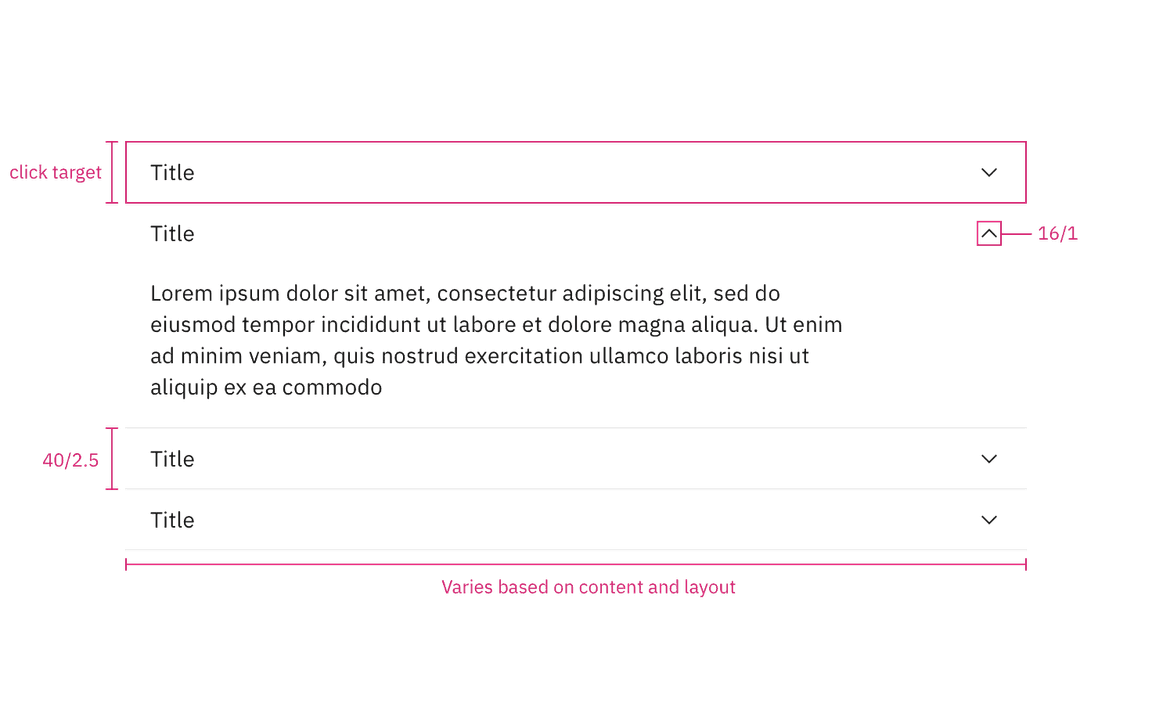
Structure measurements for default accordion alignment. | px / rem
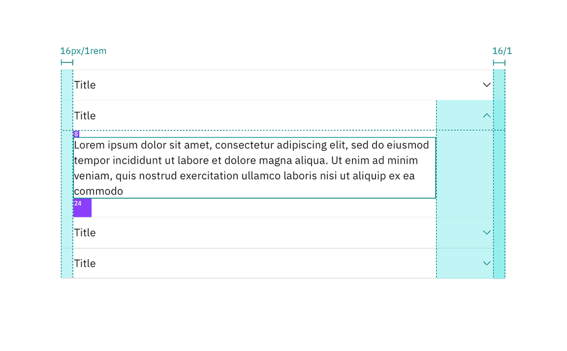
Spacing measurements for default accordion alignment. | px / rem
Flush alignment
| Element | Property | px/rem | Spacing token |
|---|---|---|---|
| Header | height | 40 / 2.5 | – |
| Item | border-top | 1 | – |
| Title | margin-left | 0 | – |
| Panel | padding-top | 8 / 0.5 |
|
| padding-bottom | 24 / 1.5 |
| |
| padding-right | 25% | – | |
| padding-left | 0 | – | |
| Icon | size | 16 / 1 | – |
| padding-right | 0 | – |
Structure measurements for flush accordion alignment. | px / rem
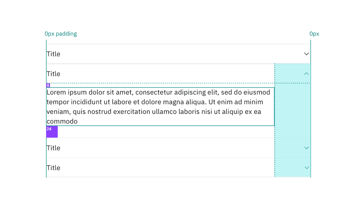
Spacing measurements for flush accordion alignment. | px / rem
Margin right
Accordions have a variable right margin that changes based on its width. Accordions that are 640px and wider have a
margin-right: 25%
margin-right
Body copy, including titles, in an accordion always follows the margin-right rules. However, inputs and other components may still expand to the full width of the accordion panel.
| Accordion width | Margin-right | Spacing token |
|---|---|---|
| > 640 | 25% | – |
| 420-640px | 64px / 4rem |
|
| < 420 | 16px / 1rem |
|
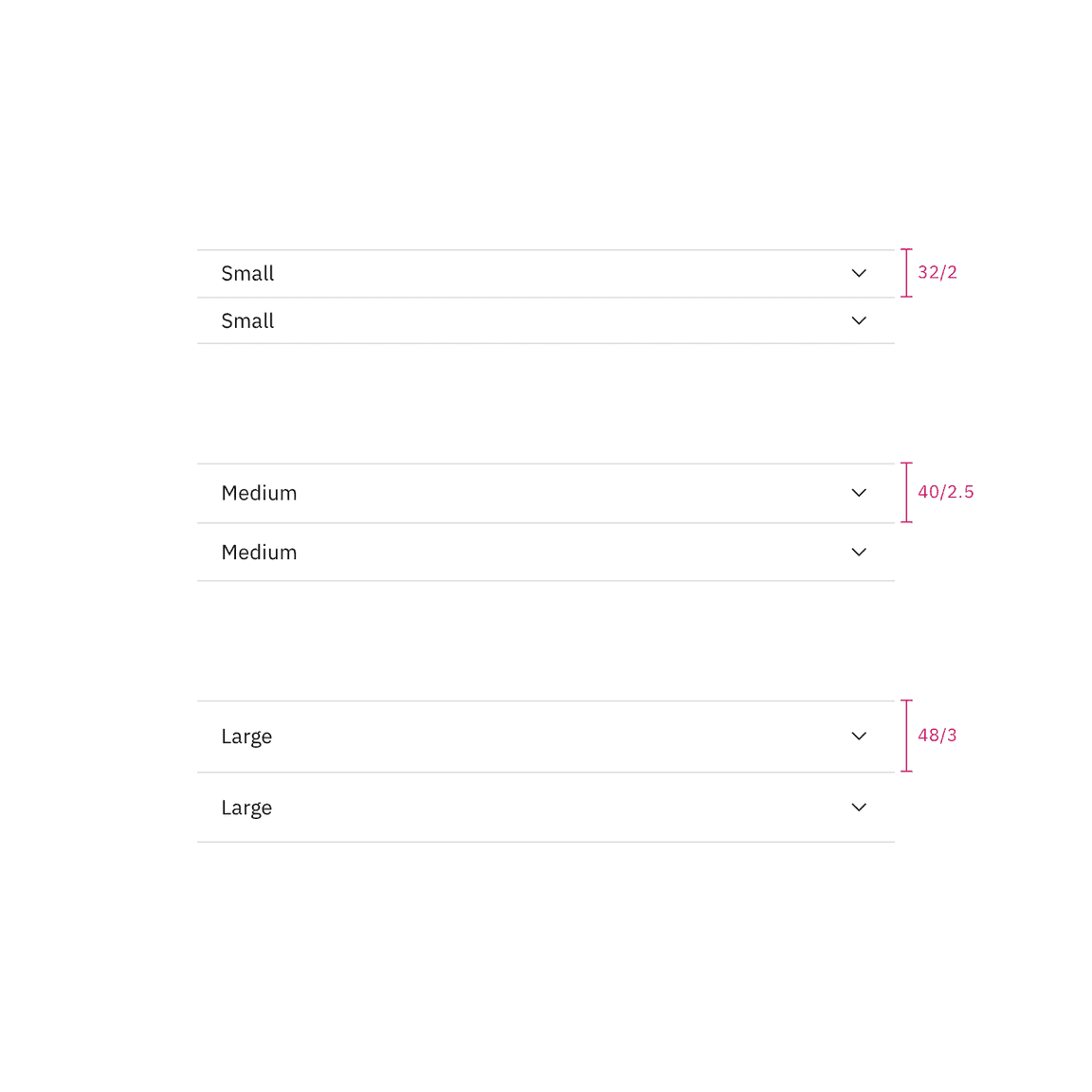
Sizes
| Element | Size | Height (px/rem) |
|---|---|---|
| Header | Small (sm) | 32 / 2 |
| Medium (md) | 40 / 2.5 | |
| Large (lg) | 48 / 3 |