Tile
Tiles are a highly flexible component for displaying a wide variety of content, including information, getting started, how-to, next steps, and more.
- Live demo
- Overview
- Variants
- Formatting
- Content
- Base
- Clickable
- Selectable
- Expandable
- AI presence
- Related
- References
- Feedback
Live demo
This live demo contains only a preview of functionality and styles available for this component. View the full demo on Storybook for additional information such as its version, controls, and API documentation.
Accessibility testing statusFor every latest release, Carbon runs tests on all components to meet the accessibility requirements. These different statuses report the work that Carbon has done in the back end. These tests appear only when the components are stable.
For every latest release, Carbon runs tests on all components to meet the accessibility requirements. These different statuses report the work that Carbon has done in the back end. These tests appear only when the components are stable.
Overview
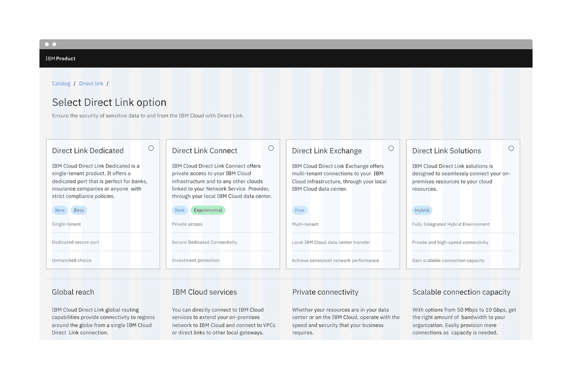
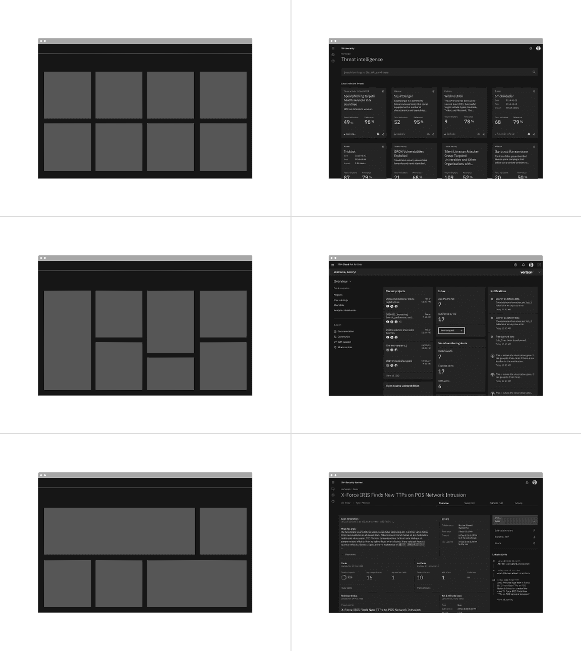
Tile is a component that can contain various content and nested components and can have interactive functions. Tile is often laid out in groups, is a different color than the UI background, and responds to the grid. Tiles have no pre-set styles and are purposely flexible so product teams can determine their tile content for specific use cases.
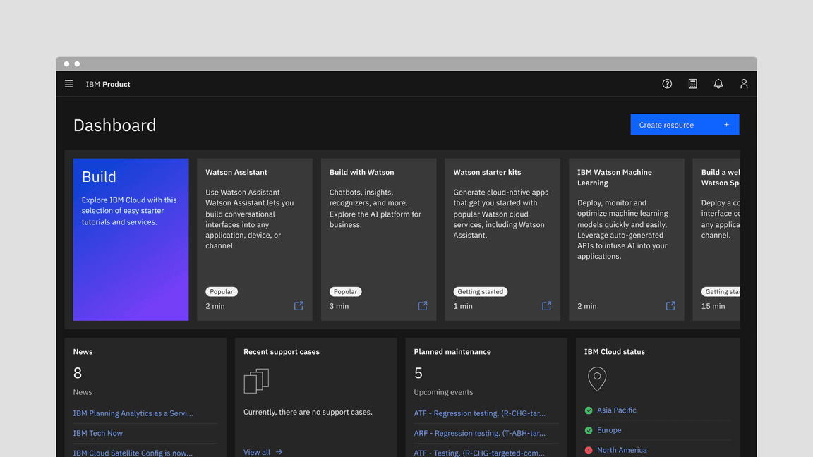
Example of the tile component in a UI
Tiles versus cards
Tiles are simple and foundational. Cards can be very complex. Cards are built upon the tile foundation and have various patterns of information hierarchy, multiple actions, overflow menus, selectable features, etc. Carbon does not have a card pattern, but we link out to several card patterns within our pattern asset library (PAL) ecosystem below:
- Productive versus Expressive cards (Carbon for IBM Products)
- Dashboard cards (IBM Sustainability Software Design)
- Cards (Carbon for IBM.com)
When to use
Tiles are reusable components that provide shortcuts to building cards and other modules. Use tiles to group related information in flexible containers. Here are some common use cases for when to use tiles:
- To contain related groupings of information or actions
- To guide users to take actions or navigate
- To present options for single or multiple selections
- To hide or show large amounts of content
When not to use
Tiles reside on the same plane as the page background layer and do not have elevation. Tiles organize essential information and have the same visual hierarchy as content on the same page.
Do not add a drop shadow to tiles and use them to reveal secondary information, actions, or notifications. Use modals, popovers, and dialogs that have elevation and are appropriate for this use case instead.
Variants
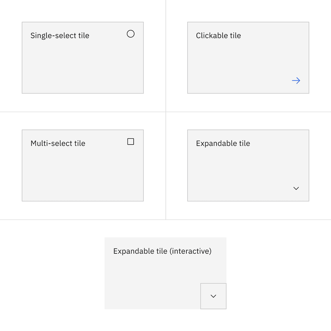
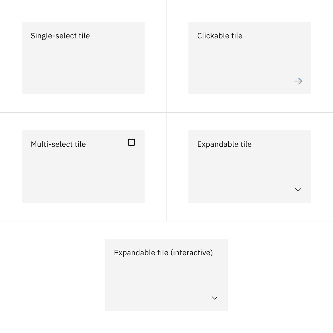
Tiles can have different functions and are implemented in four ways: base, clickable, selectable, and expandable. These tile variants are flexible to support various use cases when building more complicated card features.
| Variant | Purpose |
|---|---|
| Base | For high-level, short, and digestible content pieces such as features, plans, or services offered. |
| Clickable | For prompting an action, navigating or directing to other pieces of information about the subject matter. This variant has an available feature flag. |
| Selectable | For presenting options to a user in a structured manner, such as a set of pricing plans. This variant has available feature flags. |
| Expandable | For hiding and revealing a large amount of content to focus on specific pieces of information. This variant has an available feature flag. |
Feature flags
Feature flags have been added to the clickable, selectable, and expandable variants of tile to improve accessibility and changes its visual appearance, not its functionality. For code-specific feature flag information, refer to the Code tab. These current variants of tile are not being deprecated, but teams are encouraged to use the feature flag tile for their products moving forward. Once the next major release (v12) is released in the future, these feature flags will become the default version of the component.
The following are the feature flag changes made to tile.
- A border has been added to the clickable, selectable, and expandable variants of tile to visually indicate they are operable.
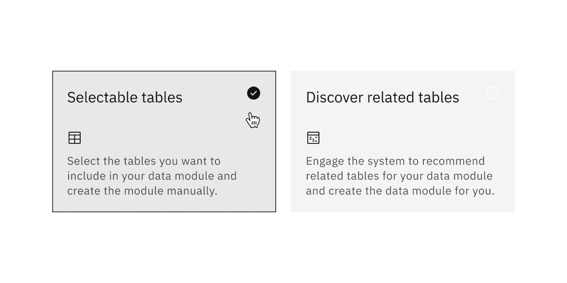
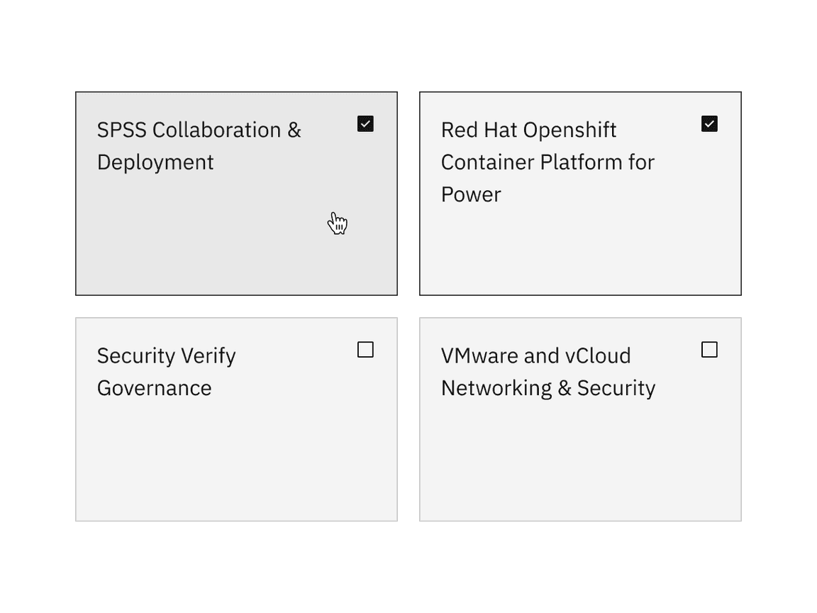
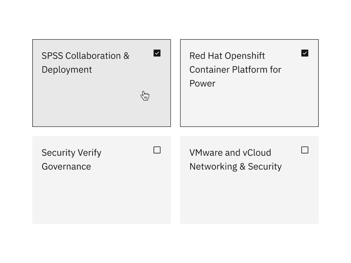
- Single-select tile icons have been changed from checkmark icons to radio button icons, where as multi-select tile icons have been changed from checkmark icons to checkbox icons. These icons appear in the enabled state instead of only on hover before making a selection.
Formatting
Sizing
Tile width varies depending on the three basic gutter modes: wide, narrow, and condensed. Tile height varies depending on the content placed within it while using spacing tokens and following aspect ratios. The minimum tile height is a 2:1 aspect ratio. As the content grows, set vertical spacing between sections within the content area.
Alignment
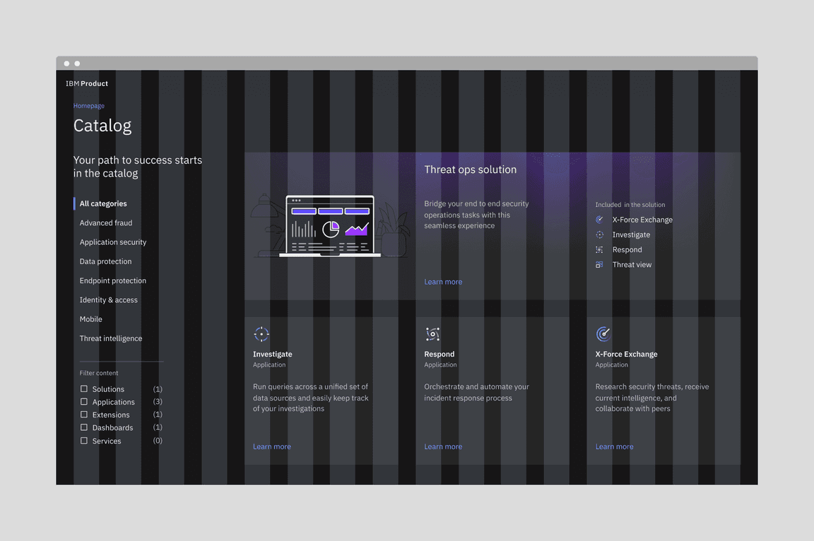
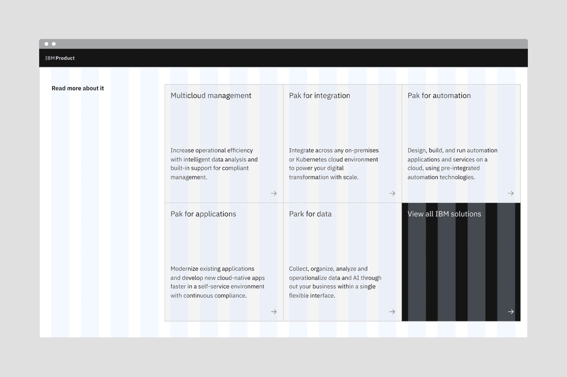
Tile groups
Tile groups are helpful when aligning tiles that have a strong relationship. Tile groups usually flow horizontally from left to right and have hierarchical importance, similar to navigation or catalog tiles.
Example image of tiles on the wide grid
Example image of tiles on the narrow grid
Example image of tiles on the condensed grid
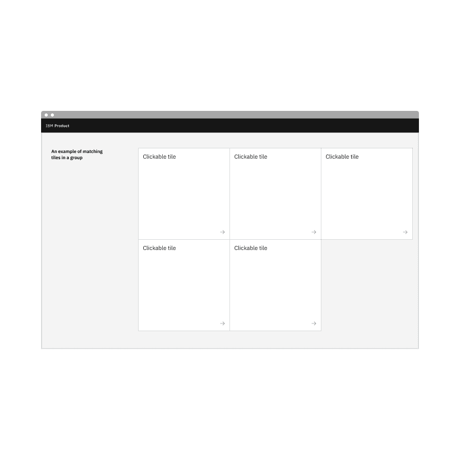
Do match the tile variants in groups.
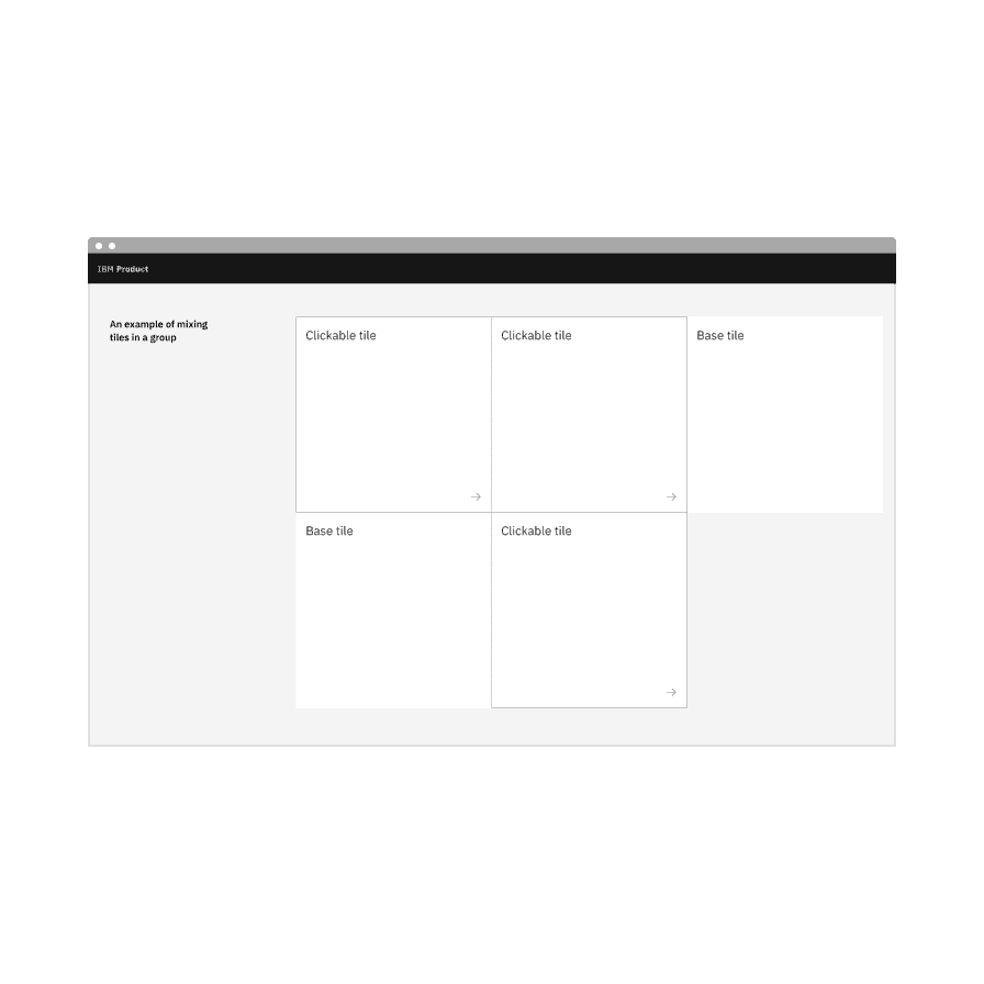
Do not mix different variants of tiles in groups.
Layout
There are three basic layouts for tiles: standard, vertical masonry, and horizontal masonry. The standard layout is the the most commonly used.
- In a standard layout, tiles are the same in height and width as all other tiles in the group.
- In a vertical masonry layout, tiles can vary in height, but are consistent in width.
- In a horizontal masonry layout, tiles can vary in width; different rows of tiles may vary in height, but tiles within a row should be consistent in height.
Examples of standard, vertical masonry, and horizontal masonry tile layouts
Content
Main elements
Tile text
Tile text can vary based on the content. It can consist of heading text, body text, label text, and include interactive elements.
Further guidance
For further content guidance, see Carbon’s content guidelines.
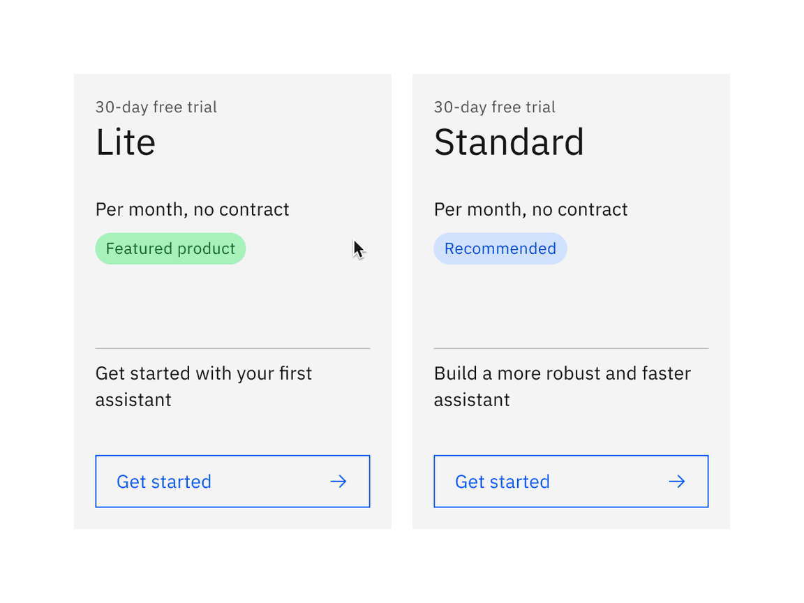
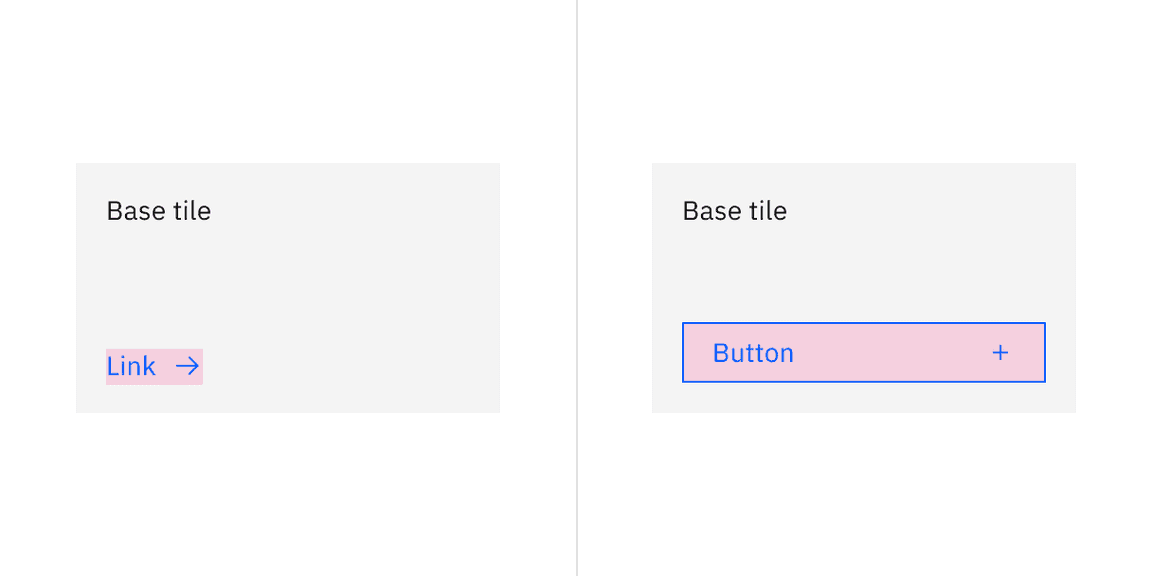
Base
Base tiles are used to display information to the user, such as features or services offered. Base tiles are often seen on marketing pages to promote content or on highly interactive dashboards. These tiles can have internal calls-to-action (CTAs), such as a buttons or links.
Example of base tiles
Anatomy
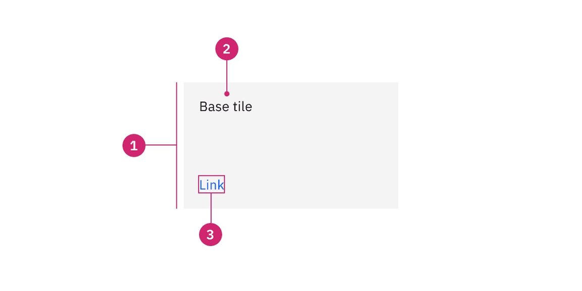
Anatomy of base tiles
- Container: Contains all content in a tile.
- Text: The text in a tile.
- Interactive elements (optional): Elements like links or buttons in a tile that are interactive.
Alignment
When placing interactive elements within base tiles, place links at the bottom left of the tile and span buttons in width at the bottom to indicate call-to-action items.
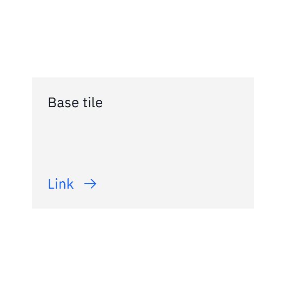
Do left align the link at the bottom of the base tile.
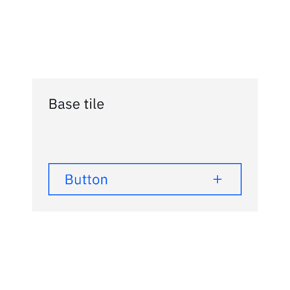
Do span the button in width at the bottom of the base tile.
States
Base tiles only have an enabled state because they are not operable by a mouse or keyboard. For more information about base tile states, see the Style tab.
Interactions
Mouse
Base tiles are not operable by a mouse unless they contain interactive elements within them. Interactive elements can be clicked on and activated.
Keyboard
- Base tiles do not receive focus unless they contain interactive elements.
- moves focus forward through interactive elements within base tile in a logical order.Tab
- +Shiftmoves focus backward through interactive elements within base tile in a logical order.Tab
- activates the base tiles interactive elements.Enter
Clickable areas
Base tiles can have interactive elements within them, like links or buttons, which can be clicked on.
Clickable areas of base tile with interactive elements
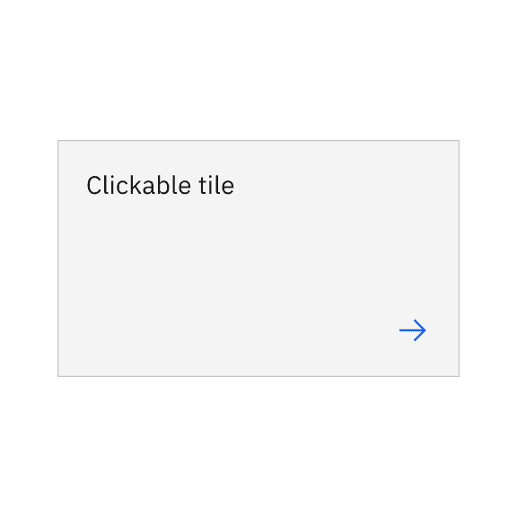
Clickable
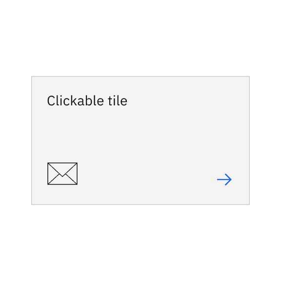
Clickable tiles can be used as navigational elements that redirect the user to a new page. In these situations, the entire tile is in a clickable state. Due to accessibility concerns, clickable tiles cannot contain separate internal CTAs but can contain pictograms, icons, or media such as illustrations or images.
Clickable tile has an available feature flag.


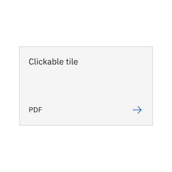
Anatomy
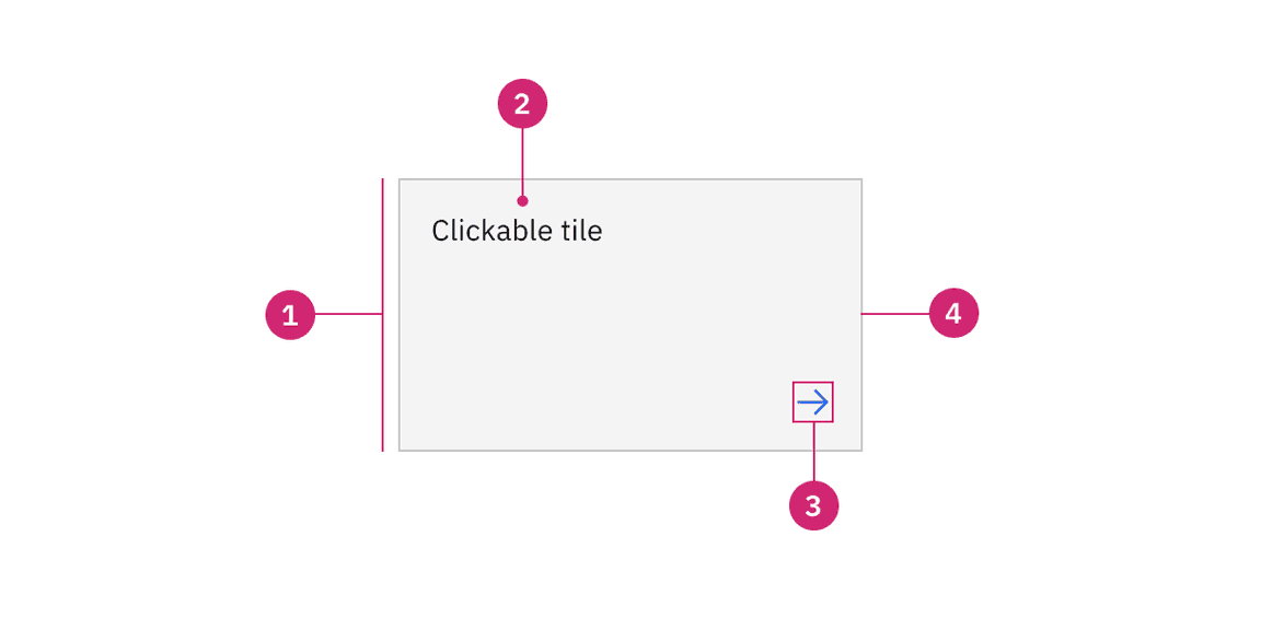
Anatomy of clickable tile with the feature flag enabled
- Container: Contains all content within a tile.
- Text: The text within a tile.
- Icon: The icon that visually indicates the tile is navigational.
- Border: The border that visually indicates the tile is interactive.
Alignment
Icons
On clickable tiles, use the arrow icon paired with the
$icon-interactive
Do right align the arrow icon when it is by itself.
Do right align the arrow icon when there is additional text.
Do right align the arrow icon when there is a decorative icon or pictogram.
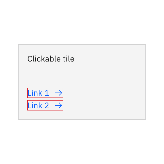
Do not add interactive links or components on clickable tiles.
States
Clickable tiles have enabled, hover, focus, and disabled states. For more information about clickable tile states, see the Style tab.
Interactions
Mouse
The clickable tile is triggered by clicking anywhere within the tile container.
Keyboard
- moves focus forward through clickable tiles in a logical order.Tab
- +Shiftmoves focus backward through clickable tiles in a logical order.Tab
- activates the tile and navigates you to its destination.Enter
Clickable areas
Clickable tiles can be triggered by clicking anywhere on the tiles container.
Clickable areas of clickable tile with the feature flag enabled
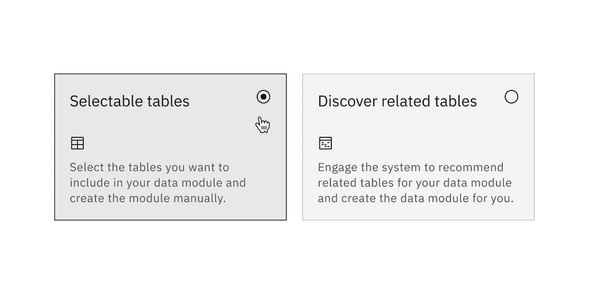
Selectable
Selectable tiles are used to present different options for users to select from. Selectable tiles can contain internal CTAs, like links to documentation, if the CTA is given a click target of its own in addition to the tile’s click target. Selectable tiles can either have single-selection or multi-selection.
Selectable tile has available feature flags.
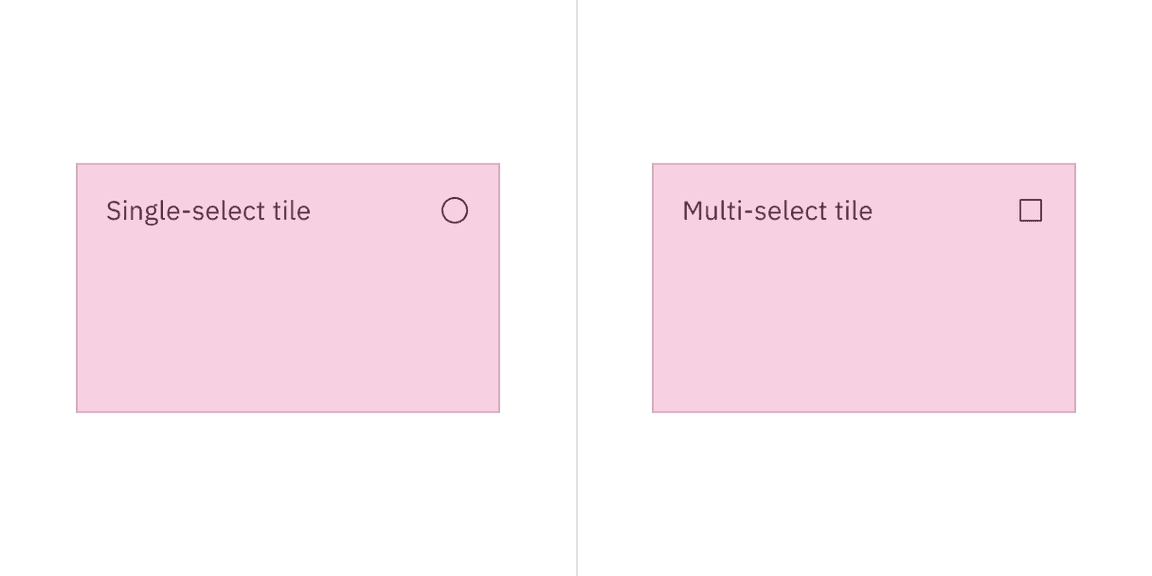
Single-select
Use single-select tiles when the user can only select one tile from a tile group.
Multi-select
Use multi-select tiles when the user can select multiple tiles from a tile group.
Anatomy
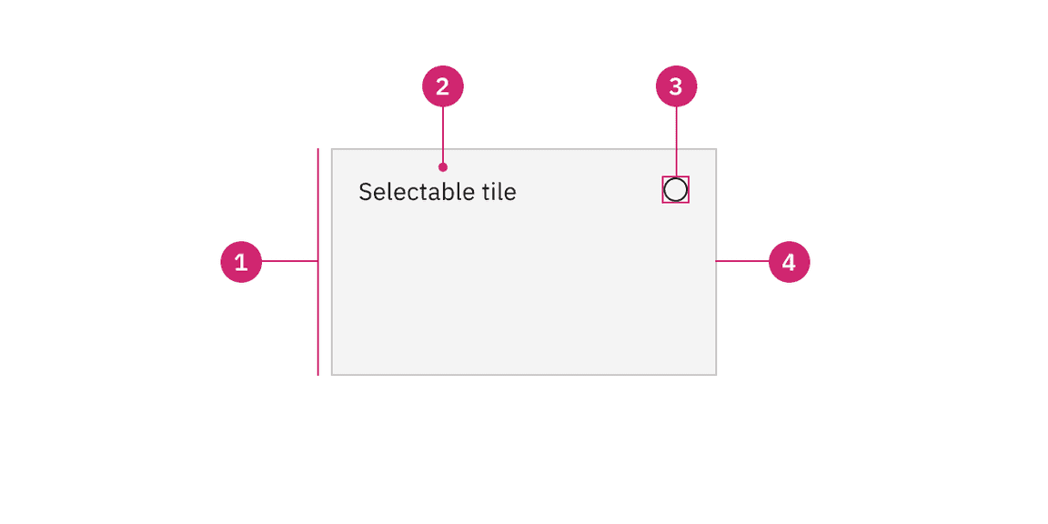
Anatomy of selectable tile with the feature flags enabled
- Container: Contains all content within a tile.
- Text: The text within a tile.
- Icon: The radio or checkbox icon that visually indicates the tile is selectable.
- Border: The border that visually indicates the tile is interactive.
States
Selectable tiles have enabled, hover, hover selected, selected, focus, and disabled states. For more information about base tile states, see the Style tab.
Interactions
Mouse
The clickable tile is triggered by clicking anywhere within the tile container.
Keyboard
- moves focus forward through selectable tiles in a logical order.Tab
- +Shiftmoves focus backward through selectable tiles in a logical order.Tab
- selects the tile.Enter
Clickable areas
Selectable tiles can be selected by clicking anywhere on the tiles container.
Clickable areas of selectable tile with the feature flags enabled
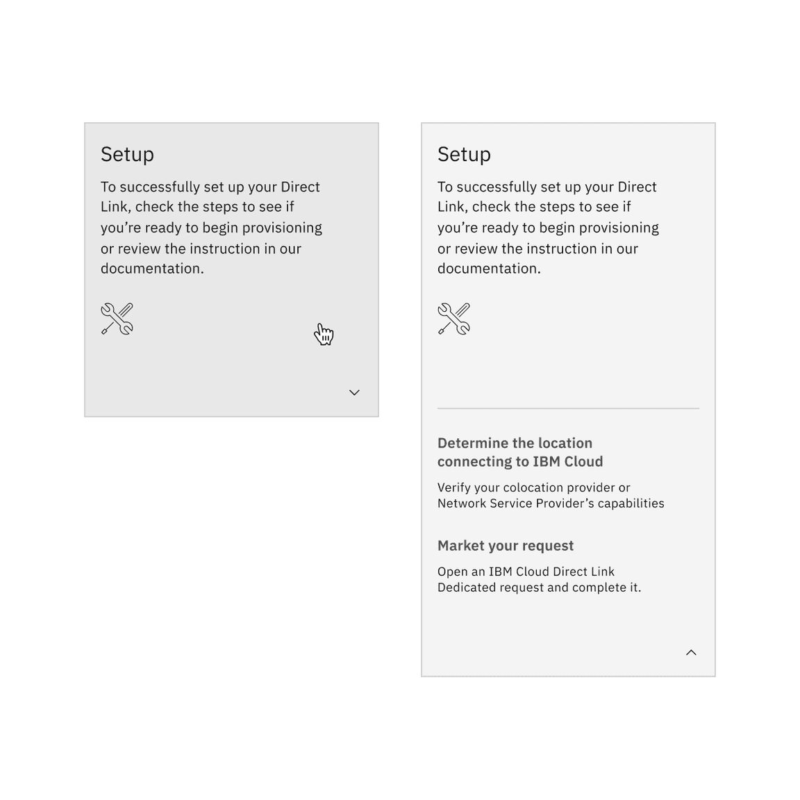
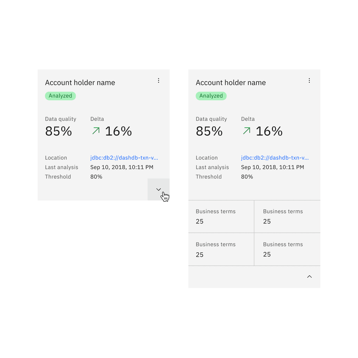
Expandable
Expandable tiles are used to reveal or hide additional information to the user and can be expanded and collapsed differently depending on their content. If an expandable tile does not have interactive elements, clicking anywhere in the tile expands and collapses the tile. If an expandable tile has interactive elements, the chevron icon button expands and collapses the tile.
Expandable tile has an available feature flag.
Without interactive elements
Use the container expansion functionality to expand and collapse the tile when there are no interactive elements.
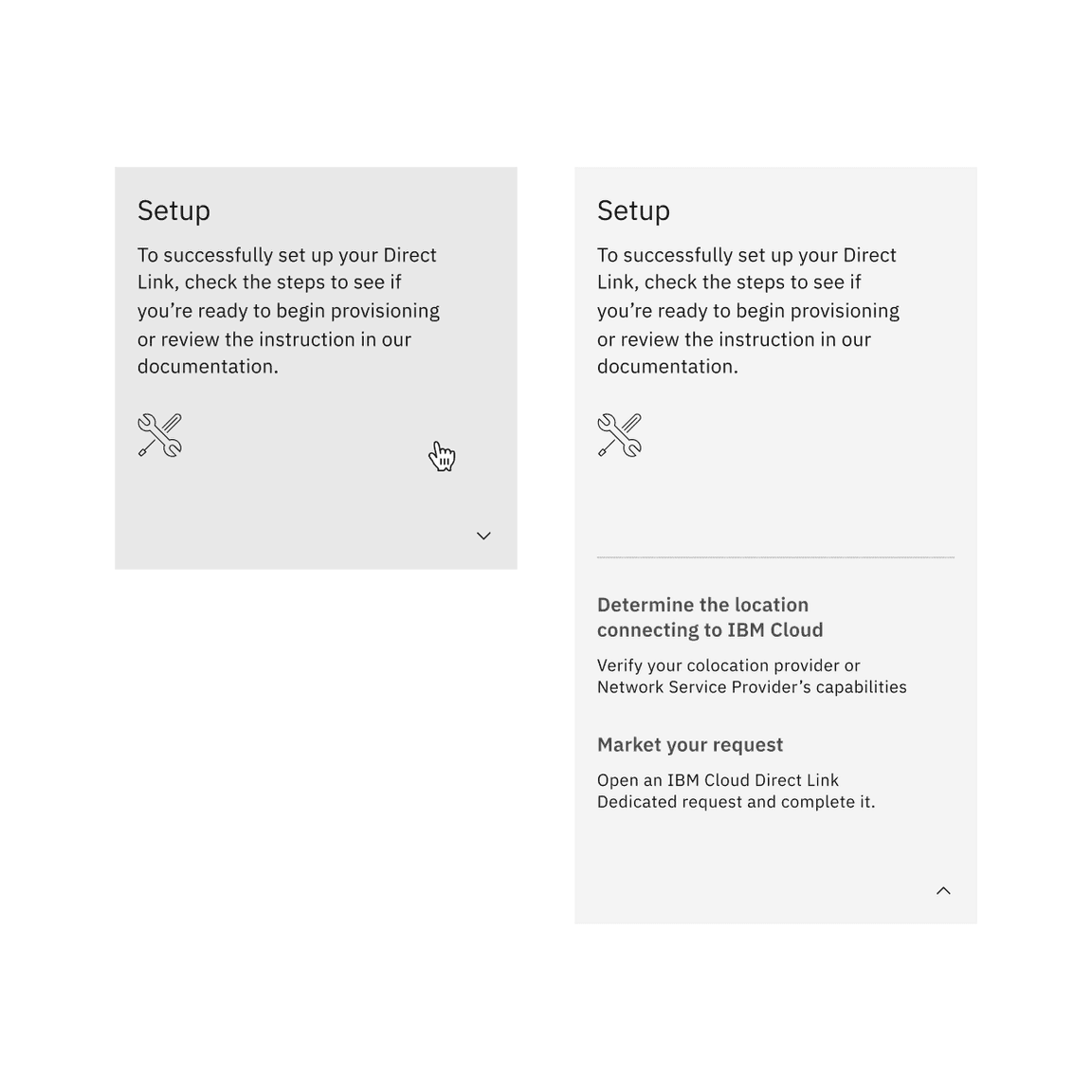
With interactive elements
Use the button expansion functionality to expand and collapse the tile when including interactive elements.

Anatomy
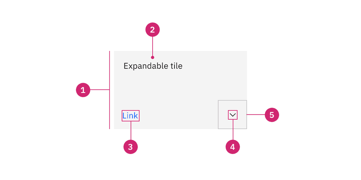
Anatomy of expandable tile with the feature flag enabled
- Container: Contains all content within a tile.
- Text: The text within a tile.
- Interactive elements (optional): Interactive elements like links or buttons placed within a tile.
- Icon: The icon that visually indicates the tile is expandable.
- Border: The border that visually indicates the tile is interactive.
States
Expandable tiles have enabled, hover, focus, and disabled states. For more information about expandable tile states, see the Style tab.
Interactions
Mouse
- Without interactive elements: The tile is expanded by clicking anywhere within the tile container.
- With interactive elements: The tile is expanded by clicking on the button in the bottom right of the tile.
Keyboard
- moves focus forward through tiles. If there are interactive elements,Tabmoves focus forward in a logical order.Tab
- +Shiftmoves focus backward through tiles. If there are interactive elements,Tabmoves focus forward in a logical order.Tab
- expands and collapses the tile.Enter
Clickable areas
If the expandable tile does not have interactive elements, it can be expanded or collapsed by clicking anywhere on the tiles container. If the expandable tile has interactive elements, it can be expanded or collapsed by clicking on the button in the bottom right corner. Interactive elements within a tile can also be clicked on and have their own click targets.
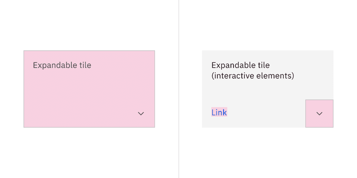
Clickable areas of expandable tile with the feature flag enabled
AI presence
Tile has a modification that takes on the AI visual styling when the AI label is present in the container. The AI variants function the same as the normal versions except with the addition of the AI label which is both a visual indicator and the trigger for the explainability popover.
For more information on designing for AI, see the Carbon for AI guidelines.
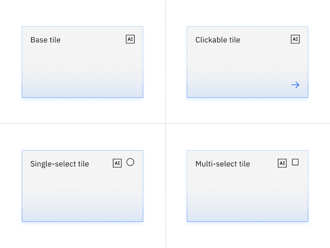
Base, clickable, and selectable tiles with AI presence and feature flags enabled
Related
Grid
To learn more about how to build tiles correctly on the grid, see Carbon’s 2x grid.
Aspect ratio
The aspect ratio is important when building tiles and images. For further guidance, see Carbon’s aspect ratio and its implementation.
Buttons
When in doubt, use full-span button alignment within tiles. For further guidance, see Carbon’s buttons.
Link
Link has variants depending on the context. For further guidance, see Carbon’s link.
Spacing
Spacing helps deliver clear and functional layouts. For further guidance, see Carbon’s spacing.
References
Hagan Rivers, Interactions design with cards/tiles (Medium, 2017)
Feedback
Help us improve this component by providing feedback, asking questions, and leaving any other comments on GitHub.