Button
Buttons are used to initialize an action. Button labels express what action will occur when the user interacts with it.
- Live demo
- Overview
- Formatting
- Content
- Universal behaviors
- Primary button
- Secondary button
- Tertiary button
- Ghost button
- Danger button
- Modifiers
- Related
- References
- Feedback
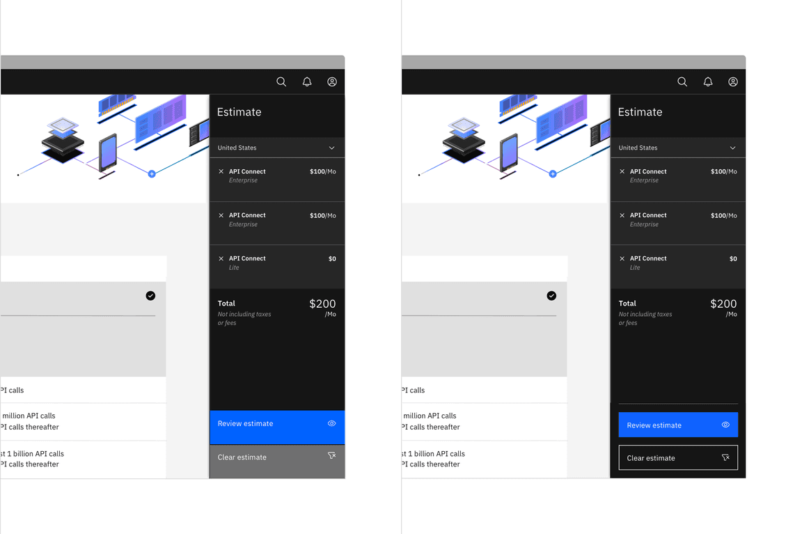
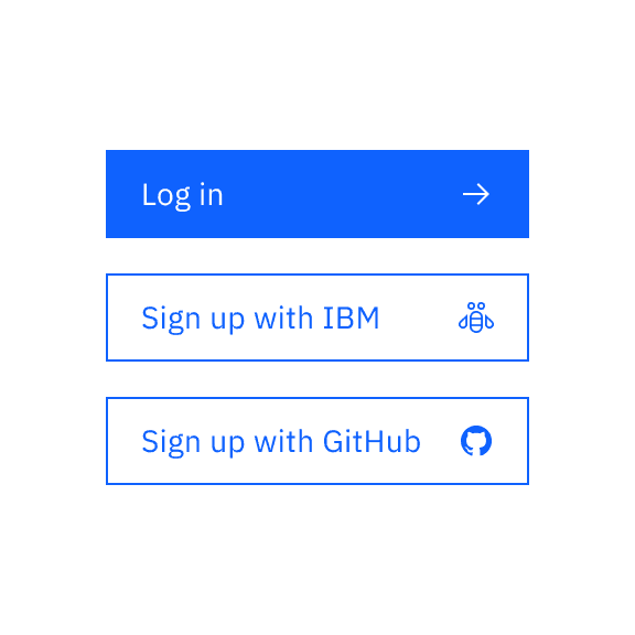
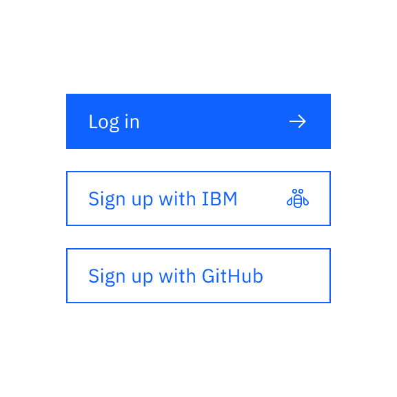
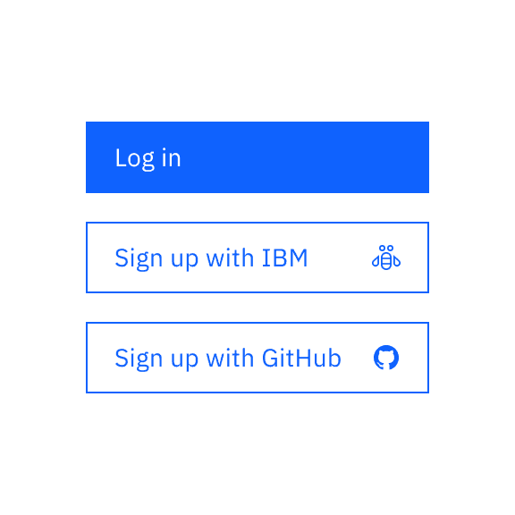
Live demo
This live demo contains only a preview of functionality and styles available for this component. View the full demo on Storybook for additional information such as its version, controls, and API documentation.
Accessibility testing statusFor every latest release, Carbon runs tests on all components to meet the accessibility requirements. These different statuses report the work that Carbon has done in the back end. These tests appear only when the components are stable.
For every latest release, Carbon runs tests on all components to meet the accessibility requirements. These different statuses report the work that Carbon has done in the back end. These tests appear only when the components are stable.
Overview
Buttons are clickable elements that are used to trigger actions. They communicate calls to action to the user and allow users to interact with pages in a variety of ways. Button labels express what action will occur when the user interacts with it.
When to use
Use buttons to communicate actions users can take and to allow users to interact with the page. Each page should have only one primary button. Any remaining calls to action should be represented as lower emphasis buttons.
When not to use
Do not use buttons as navigational elements. Instead, use links when the desired action is to take the user to a new page.
Variants
Each button variant has a particular function and its design signals that function to the user. It is, therefore, very important that the different variants are implemented consistently across products to convey the correct actions.
| Variant | Purpose |
|---|---|
| Primary | For the principal call to action on the page. Primary buttons should only appear once per screen (not including the application header, modal dialog, or side panel). |
| Secondary | For secondary actions on each page. Secondary buttons can only be used in conjunction with a primary button. As part of a pair, the secondary button’s function is to perform the negative action of the set, such as “Cancel” or “Back”. Do not use a secondary button in isolation and do not use a secondary button for a positive action. |
| Tertiary | For less prominent, and sometimes independent, actions. Tertiary buttons can be used in isolation or paired with a primary button when there are multiple calls to action. Tertiary buttons can also be used for sub-tasks on a page where a primary button for the main and final action is present. |
| Ghost | For the least pronounced actions; often used in conjunction with a primary button. In a situation such as a progress flow, a ghost button may be paired with a primary and secondary button set, where the primary button is for forward action, the secondary button is for “Back”, and the ghost button is for “Cancel”. |
| Danger | For actions that could have destructive effects on the user’s data (for example, delete or remove). Danger button has three styles: primary, tertiary, and ghost. |
Formatting
Anatomy
A button’s label communicates the action that is performed when the user interacts with it. In an icon only button, that has no label, the icon must accurately represent what the button does.
In a Carbon button, the label is always left-aligned, not center-aligned. The icons in a button with a label is right-aligned but in an icon only button, the icon is centered.
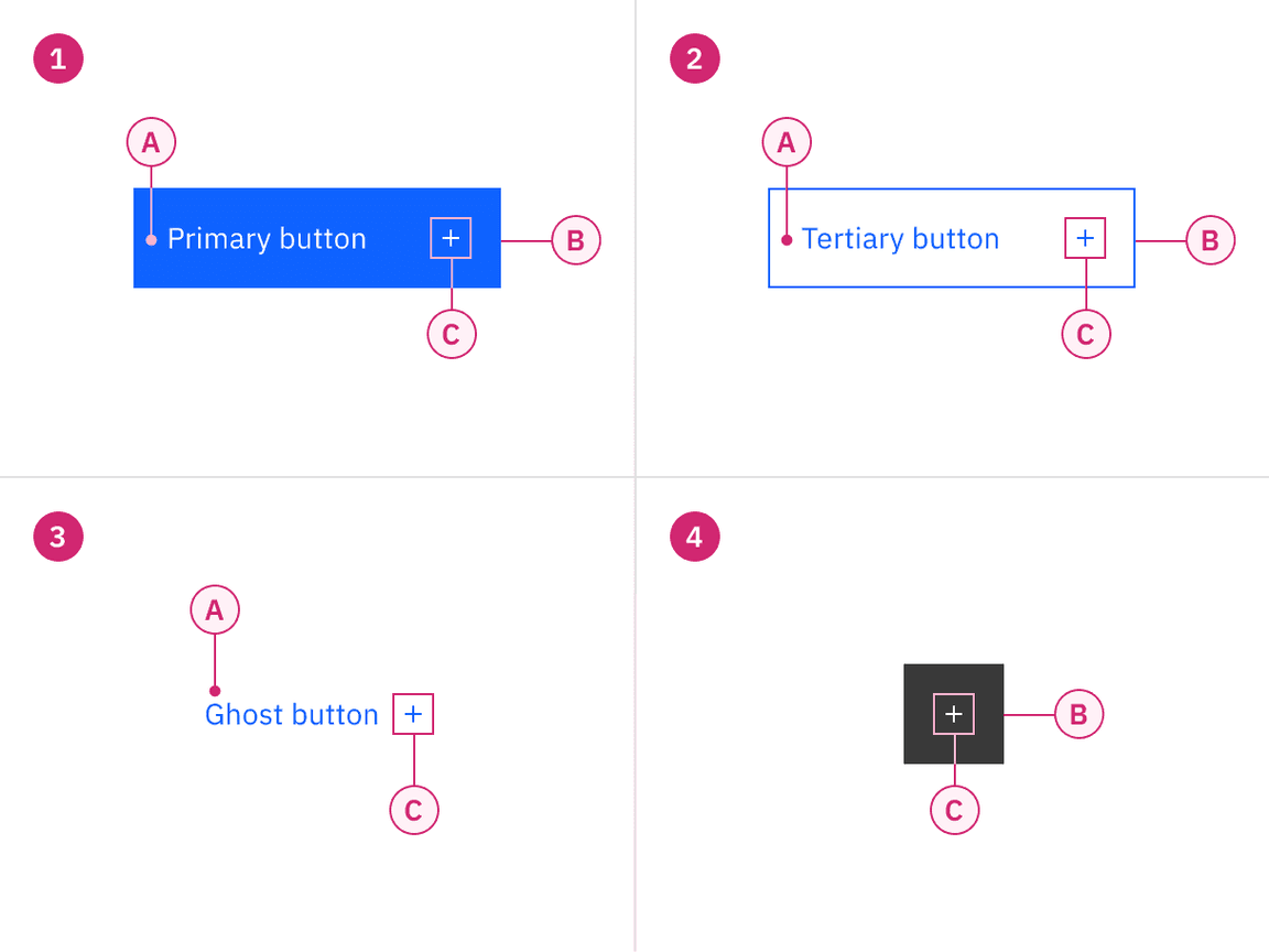
Anatomy of buttons
1. Button
A. Label
B. Container
C. Icon (optional)
3. Ghost button
A. Label
C. Icon (optional)
2. Tertiary button
A. Label
B. Container
C. Icon (optional)
4. Icon button
B. Container
C. Icon
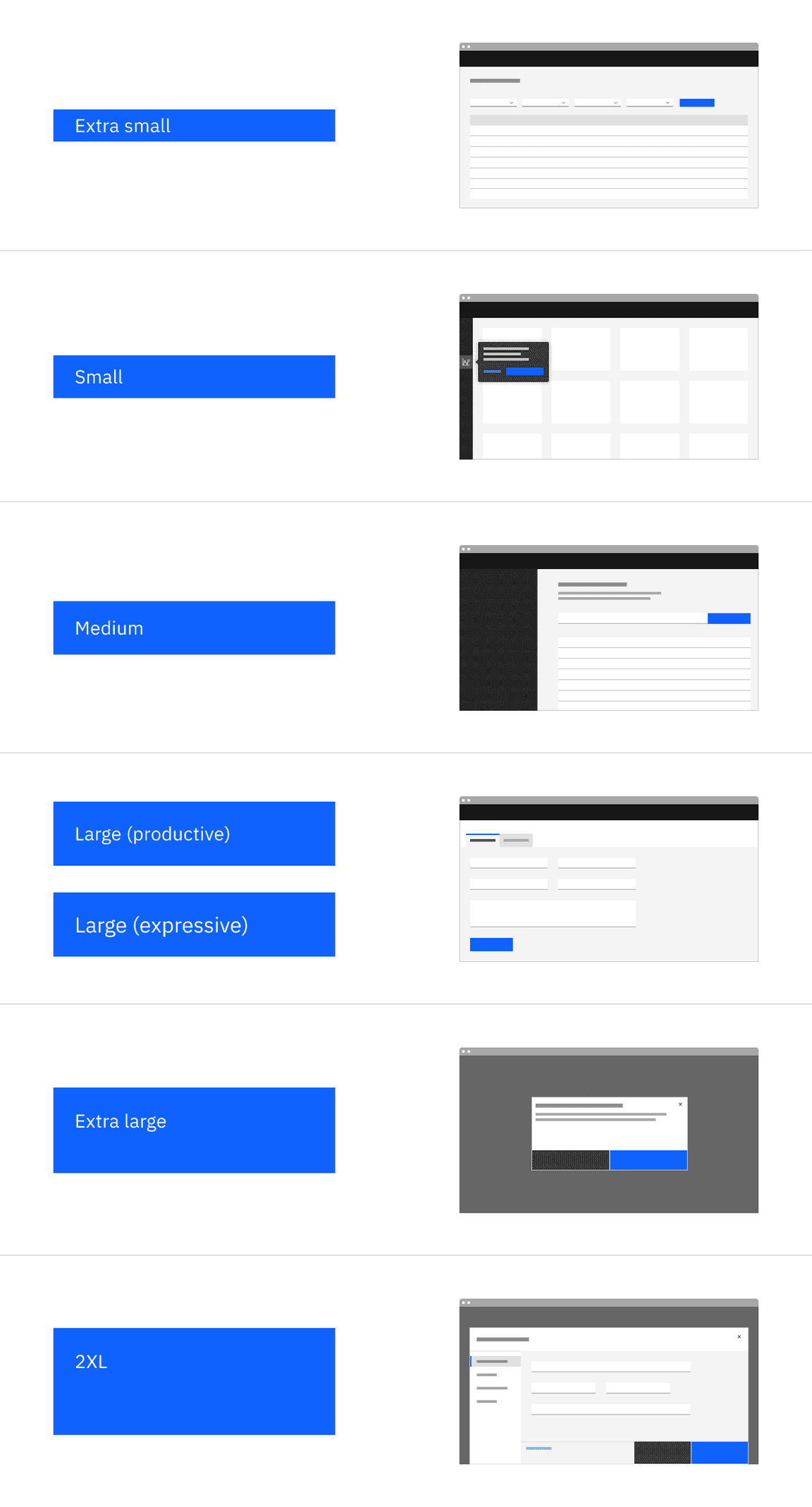
Button sizes
The button is available in seven different sizes: extra small, small, medium, large (productive), large (expressive), extra large, and 2XL. The table below adds more context around the use case for each size. For guidance on button heights, see Size on the Style tab.
We do not recommend mixing different button sizes in #button-groups.
| Button size | Use case |
|---|---|
| Extra small | Use when vertical space is limited or in areas with a confined layout. |
| Small | Use when buttons are paired with 32px small sized input fields. |
| Medium | Use when buttons are paired with 40px medium sized input fields. |
| Large (productive) | This is the most common button size in software products. Pairs with 14px body copy. |
| Large (expressive) | The larger expressive type size within this button provides balance when paired with 16px body copy. Used by the IBM.com team in website banners. |
| Extra large | Use when buttons bleed to the edge of a larger component, like in the context of modals, side panel and narrow tearsheets. |
| 2XL | Use when buttons bleed to the edge of a full-screen component, like in the context of large tearsheets. |
Sizes of buttons in relation to its usage.
Emphasis
You don’t necessarily need to use the buttons in the order that their labels imply. Although secondary buttons have less visual prominence because they are less saturated than their primary counterparts, they are still tonally heavy. If your layout requires multiple actions—as is the case with some toolbars, data lists and dashboards—low emphasis buttons (tertiary or ghost) may be a better choice.
The most important thing is to establish a visual hierarchy between the buttons in your UI. Keep these best practices in mind.
A single, high-emphasis button
As a general rule, a layout should contain a single high-emphasis button that makes it clear that other buttons have less importance in the hierarchy. This high-emphasis button commands the most attention.
Multiple button emphasis
A high-emphasis button can be accompanied by medium- and low-emphasis buttons that perform less important actions. Keep in mind that you should only group together calls to action that have a relationship to one another.
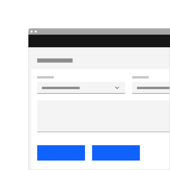
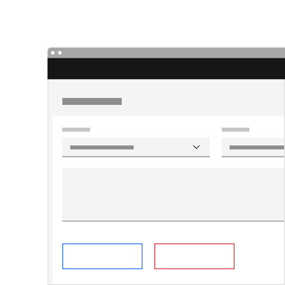
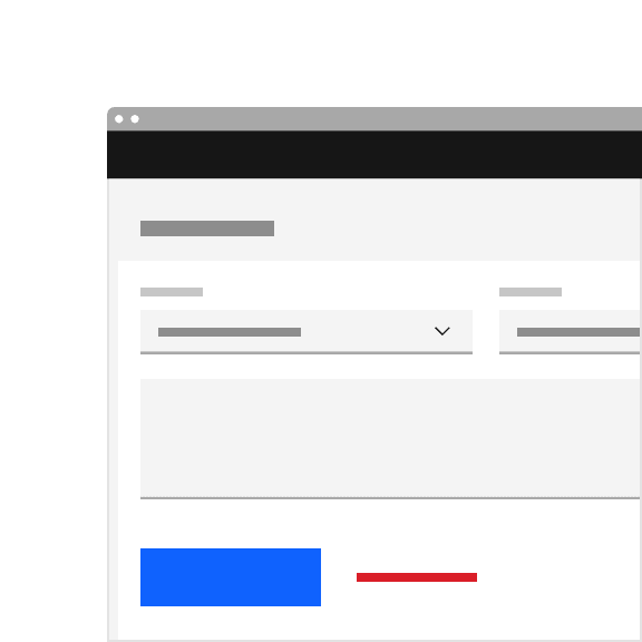
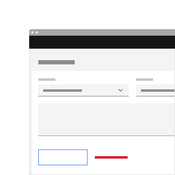
Do use high-emphasis and medium-emphasis buttons in a button group.

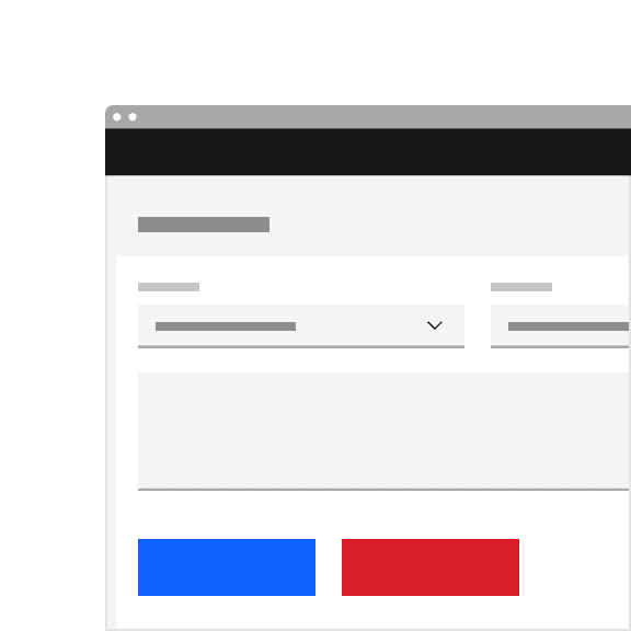
Do not use two high-emphasis buttons in a button group.
Alignment
Alignment refers to whether the buttons are aligned to the right or the left of a window, container, or layout. Buttons are unique, more so than any other component, in that their alignment depends on where they appear and whether or not they’re contained within another component.
As a general rule, on full-page designs, the primary button is on the left side of the page. When the browser window is large and the user is scrolling to read, it’s best to have the primary button where the user’s attention has been focused all along. Whereas in wizards, where a user is progressing through a series of steps or dialog windows, the primary action traditionally sits at the bottom right. Buttons within components such as notifications, search fields, and data tables are also right-aligned.
In some cases a button group—or even a single button in the case of a side panel or small tile—may span the entire width of a window or container. Typical nested button locations include:
- Banner calls to action
- Dialog windows
- Wizards
- Forms
- Cards
- Toolbars
Alignment of buttons across various layouts.
| Alignment | Use case |
|---|---|
| Left-justified | Banner call to actions, in-page forms, and nested buttons in components like tiles. |
| Right-justified | Inline notifications, inline field buttons and data tables, progressive forms, wizards, and single-button dialogs. |
| Full-span | Dialogs, side panel, and small tiles; currently Carbon does not offer a way to implement full-span buttons in code, without an override as mentioned here, they max out at 320px. |
Fixed width button
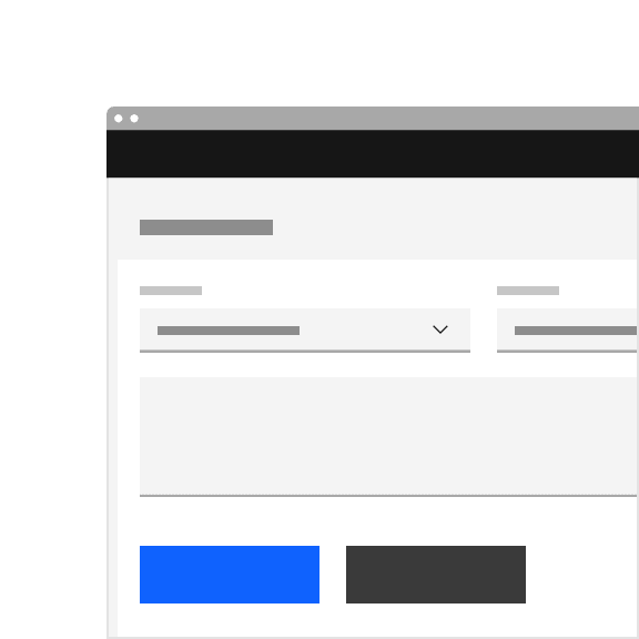
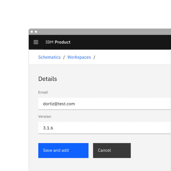
Button alignment is also closely related to whether the button is treated as a fixed or a fluid element within a layout. When we say “fixed,” there is a fixed padding of 16px to the left and a 64px padding to the right of the button label. The button label determines the button’s width. Refer to the Style tab for more guidance.
Example of a fixed width primary button in a layout.
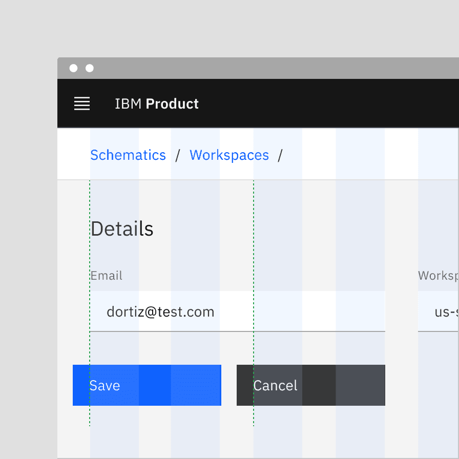
Hanging versus non-hanging button alignment
Hanging button alignment is when the button label is aligned to the grid rather than the container. This alignment should be used to group sections between components and buttons that directly affect each other.
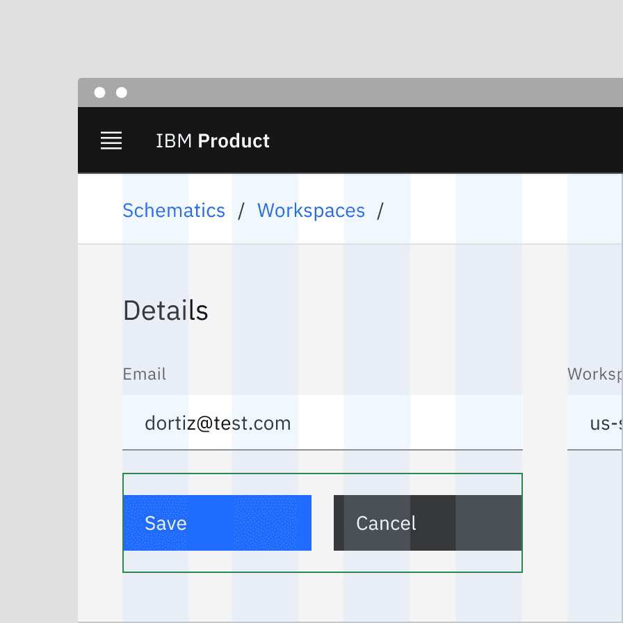
Non-hanging button alignment is when the button container is aligned to the grid. These rules apply to buttons with a visible container. For buttons that don’t have a visible container in the default state, such as ghost button and danger ghost button, refer to ghost button alignment.
Example of a fixed width button’s hanging alignment.
Example of a fixed width button’s non-hanging alignment.
Fluid width button
There is a hybrid scenario where a floating primary, secondary, or tertiary button can span a designated number of columns on the responsive column grid, giving it a fluid width. These are called “fluid width buttons.”
Fluid width buttons are always preferable to fixed width default buttons in a layout. When possible, set the button container’s relative position to the responsive layout grid and match the button width to the width of other elements on the page. Ideally, when using groups of related buttons (not including ghost buttons unless in a tearsheet or modal), they should all be the same width. See button groups below for more detailed information.
Example of a fluid width primary button matching the width of a card in a layout.
Button groups
Button groups are a useful way of aligning buttons that have a relationship. Group the buttons logically into sets based on usage and importance. Too many calls to action will overwhelm and confuse users so they should be avoided.
As mentioned in the Emphasis section, you don’t necessarily need to use the buttons in the order that their labels imply. Either a secondary or a tertiary button can be used in conjunction with a primary button. In fact, due to the visual weight of the secondary button, it’s recommended to use tertiary or ghost buttons in layouts with more than three calls to action.
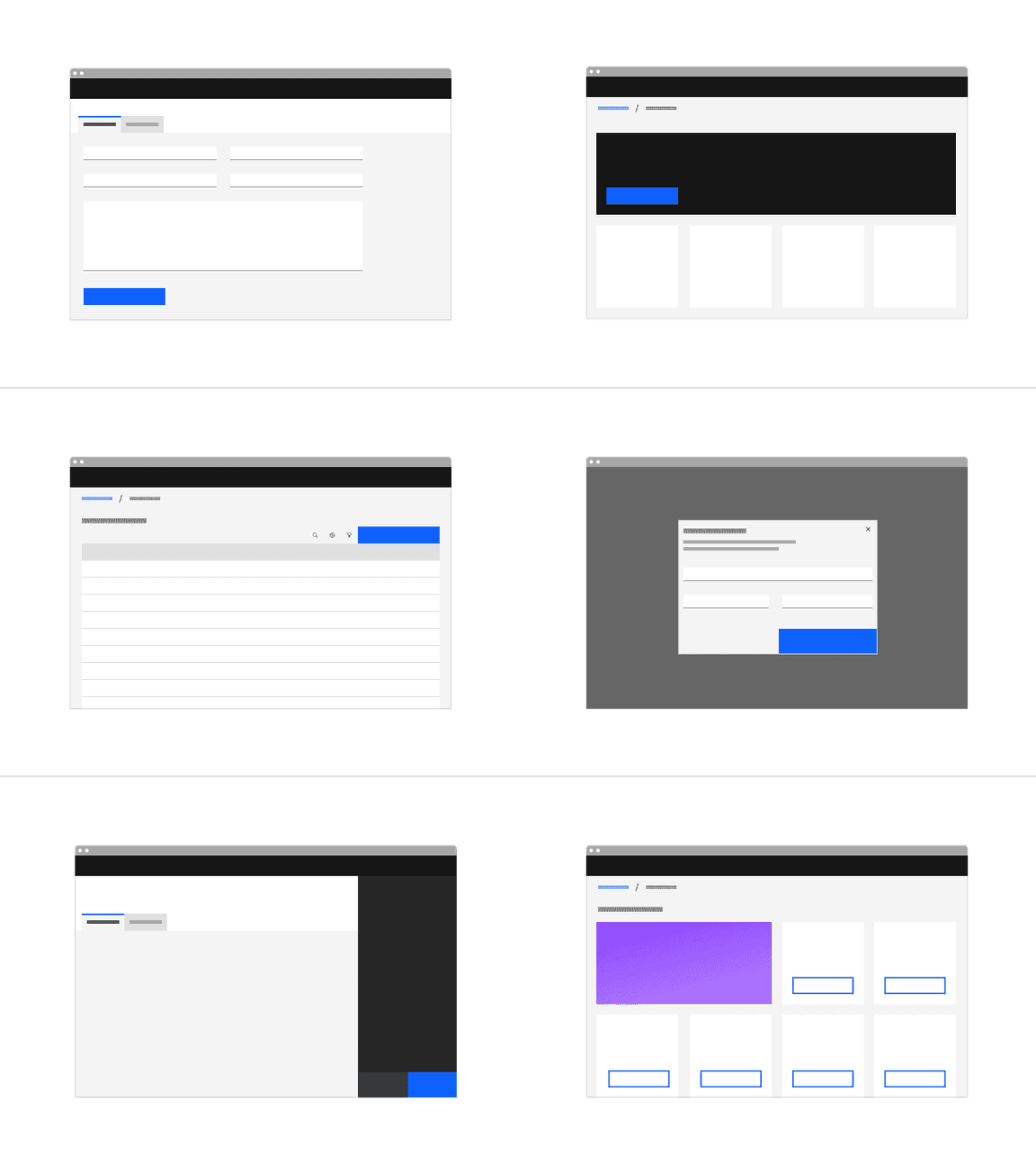
Example of button groups in a UI.
Button groups versus menu buttons
Button groups should be used when there are either two or three actions that a user needs to consider. Any more than three actions should be grouped meaningfully using menu buttons, to reduce the amount of space these actions take up on a page. Alternatively, for interfaces that need many common actions or functions, consider using a toolbar.
Do use menu buttons to group meaningful actions being applied to the same data.
Do not use many individual buttons applying to the same data.
Button width in button groups
When using groups of related buttons (not including ghost buttons), they should all be the same width. The width of all the buttons is usually determined by the longest button label.
Note: We recommend following this guidance for both the toolbar and the batch actions toolbar as well.

Example of button width in button groups.
Do apply the same width to all buttons in a group, even if they don’t bleed.
Do not make buttons in a group different widths.
Hanging versus non-hanging fluid width button group alignment
This can be achieved in one of two ways, both of which are acceptable. The first approach involves using the narrow gutter mode. In this situation, each button would be set individually on the column grid.
Note: Carbon developers are working on the narrow gutter mode, currently left-hanging buttons can only be achieved with an override.
Some products don’t want to hang their buttons into the gutter, but still want a 16px distance between buttons. This can be achieved while maintaining same-width buttons by treating the button group as a single object (rather than two separate entities) on the grid. Each button will essentially span 50% of its container with a programmatic 16px gutter between them.
Example of hanging buttons in a button group.
The button group is treated as one element on the grid to achieve a 16px gutter between the two, without the gutter hang.
Fluid button groups
When we say “fluid,” we mean that the button becomes a part of a larger, compound component by bleeding to two or more edges of its container. Rather than defining the fluid button in columns or mini units, its width is defined as a percentage (often 50%) of the container’s width.
Within the layout of a page, primary, secondary, or tertiary variants of buttons can have fluid widths. In more contained spaces, like in tearsheets or modals, a ghost button can have a fluid width when paired with other buttons in a group. Also, as a general rule, fluid buttons are never left-aligned in a layout or a container—they’re either right-aligned or span the full width of the container.
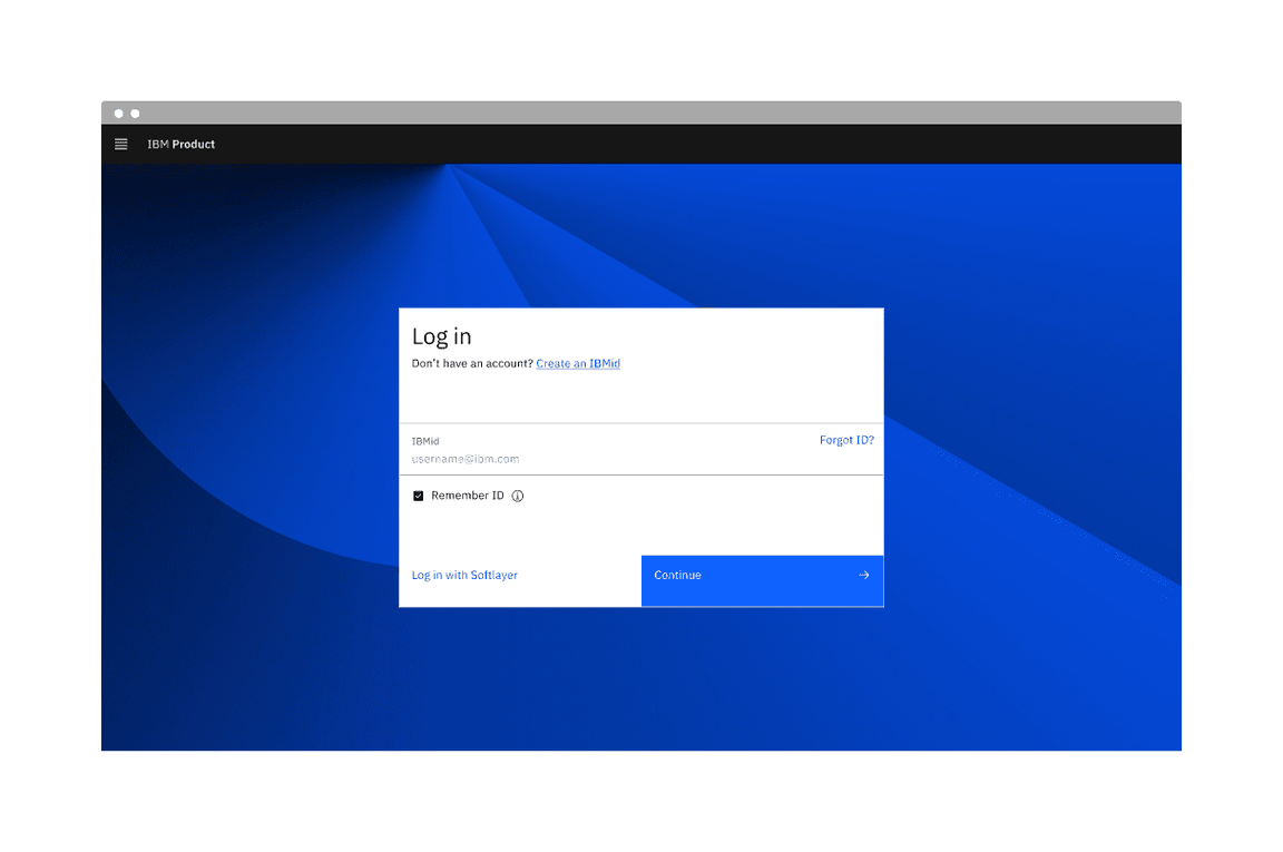
Login screen using a fluid input field and a fluid button.
Do bleed ghost button hovers when they are paired with other fluid buttons.
Do not use a tertiary button in a fluid application.
Fluid button border
There is a 1px border between all fluid buttons that use the
$button-separator
Example of $button-separator token border between fluid buttons.
Horizontally arranged groups
When using multiple buttons, the position of the primary button adheres to the alignment guidance above. To sum up, a primary button will be left-aligned and positioned to the left of the secondary/tertiary button on full-page designs. The primary button will be right-aligned and appear to the right of the secondary/tertiary button within wizards and dialog windows.
Vertically stacked button groups
Typical product landing pages have buttons side by side. However vertical button groups are also common in products, to save real estate in narrow columns and occasionally side panels.
These stacked buttons can act as fluid buttons bleeding into the side panel, or they can have a 16px spacing surrounding the side panel. The 16px spacing allows the use of a tertiary button in the vertically stacked button group. In these instances, the primary button is always on top and the secondary or tertiary button is below.
Note: Experimenting with stacked fluid buttons would require an override to the existing code.
Button group combinations
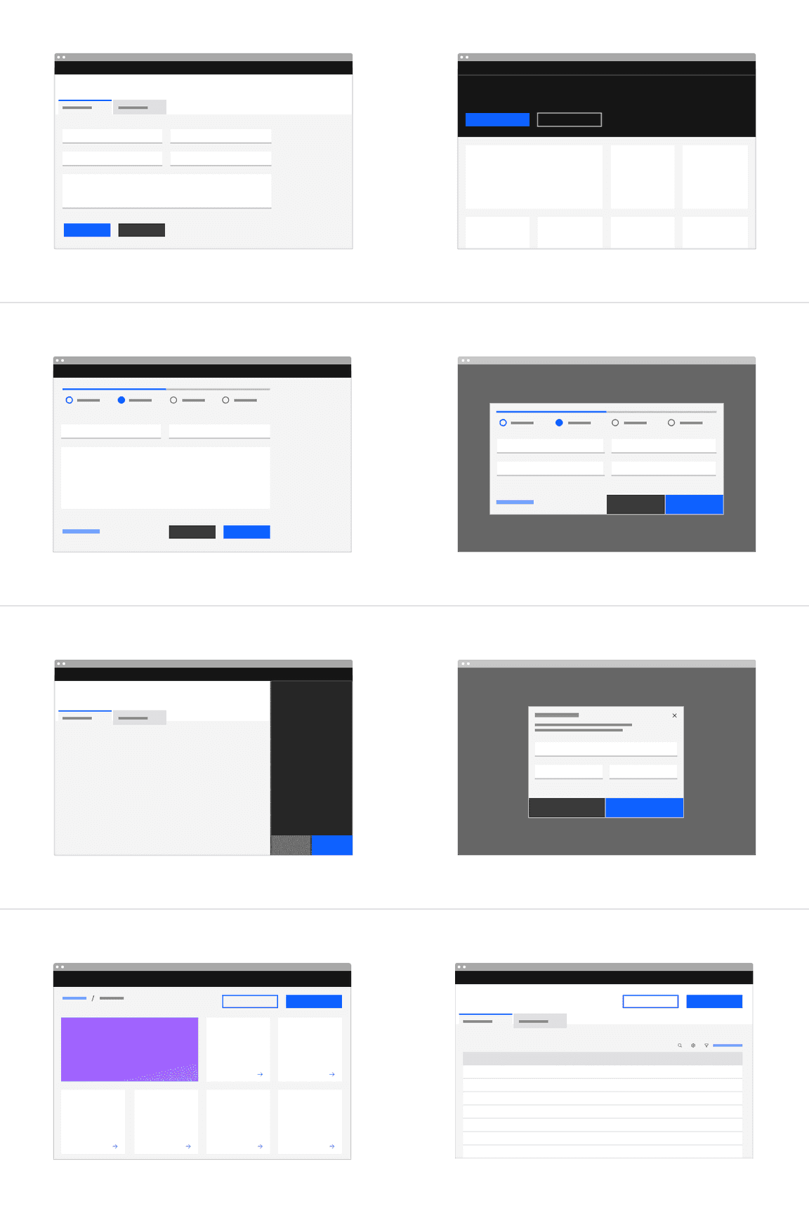
Button groups can consist of different button variants depending on the product use case. We recommend the following combination of button groups.
| Number of buttons | Recommended combinations |
|---|---|
| 2 |
|
| 3 |
|
| Number of buttons | Recommended combinations |
|---|---|
| 2 |
|
| 3 |
|
Button group combinations to avoid
Button groups can consist of different button variants depending on the product use case. We recommend avoiding the following combination of button groups.
Do not use two high-emphasis buttons in a button group.
Do not use two high-emphasis buttons in a button group.
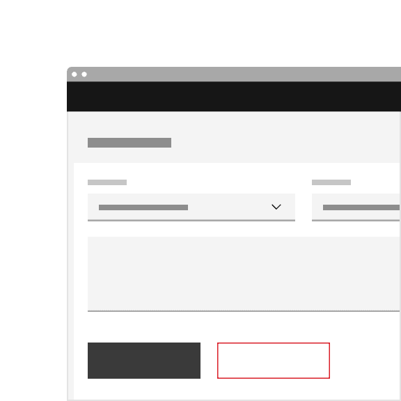
Do not use the secondary button in conjunction with non-primary buttons.
Do not use tertiary and danger tertiary buttons together.
Do not use primary and danger ghost buttons together.
Do not use tertiary and danger ghost buttons together.
Content
Main elements
Button label
A button’s label is the most important element on a button, as it communicates the action that will be performed when the user interacts with it. Buttons need to be clear and predictable.
Button labels should clearly indicate the action of the button. To provide enough context, use the {verb} + {noun} content formula on buttons except in the case of common actions like “Done”, “Close”, “Cancel”, “Add”, or “Delete”.
There are exceptions to this rule for situations in which button length could cause problems in compact UIs or negatively impact translation, but the {verb} + {noun} formula is still best practice.
By default Carbon uses sentence case for all button labels.
For consistency, see Carbon’s content guidelines for a list of recommended action labels.
Do use the {verb} + {noun} content formula in buttons whenever possible.

Do not use only a noun as a button label.
Do left-align the label in a button, even if the button is wide.
Do not center align the label in a button, even if the button is wide.
Internationalization (RTL)
For right-to-left (RTL) languages, the entire button is mirrored horizontally. The label is right-aligned and the icon is left-aligned.
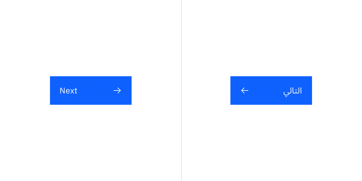
Primary button without and with RTL.
Overflow content
When the button’s label is too long to fit within the available space of the button, the label should overflow and wrap to the second line. We do not recommend truncating a button label.
As mentioned above, it is best practice to keep button label succinct and follow the {verb} + {noun} content formula.
Do wrap the button label to a second line if there’s overflow content.
Do not truncate the label of a button if there’s insufficient space inside the button.
Further guidance
For further content guidance, see Carbon’s content guidelines.
Universal behaviors
Primary button focus
The primary button is the default action. When dialogs appear, the primary button typically takes focus. On a form, if focus is on a component that is not actionable with the
Enter
Enter
Primary button takes default focus when there’s no other actionable component in a dialog.
States
The default and interactive states of buttons should follow the button Style tab guidelines.
Interactions
Mouse
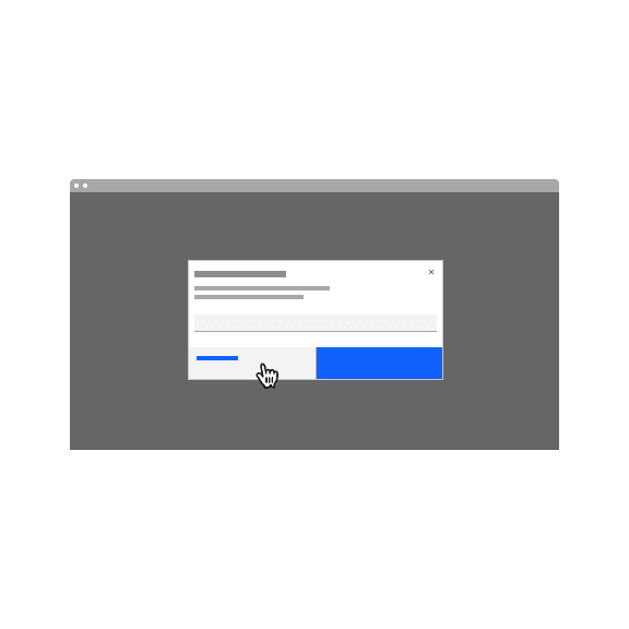
Users can trigger a button by clicking anywhere within the button container.
Mouse interaction for button.
Keyboard
Users can trigger a button by pressing
Enter
Space
Loading
Buttons can have inline loading that provides visual feedback that the action is in process. The button would be disabled when inline loading is in progress.

Inline loading in the context of a button.
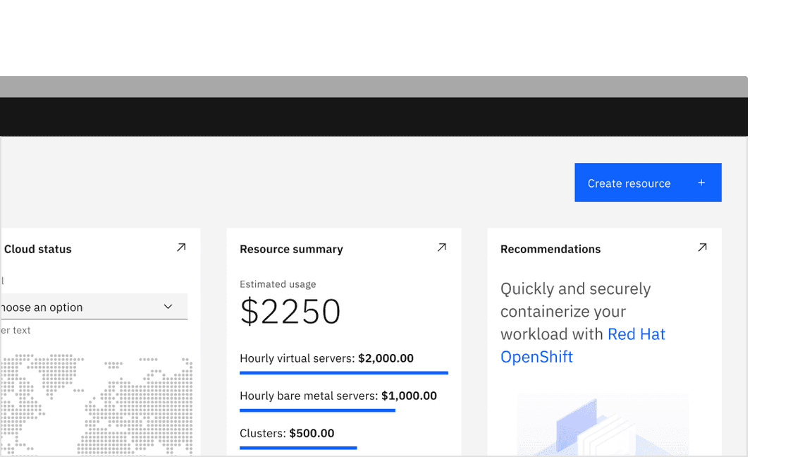
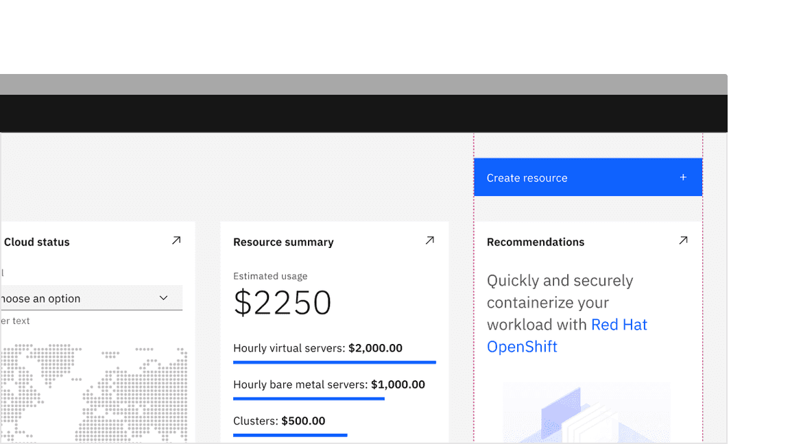
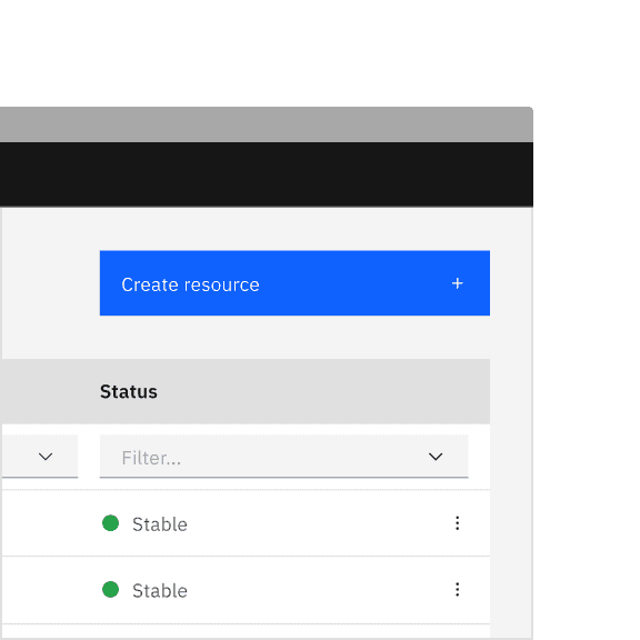
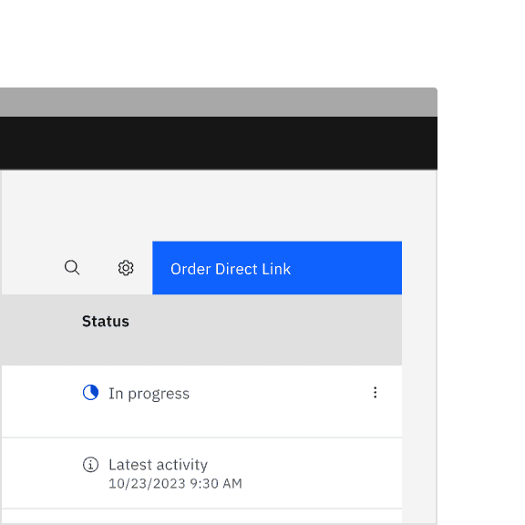
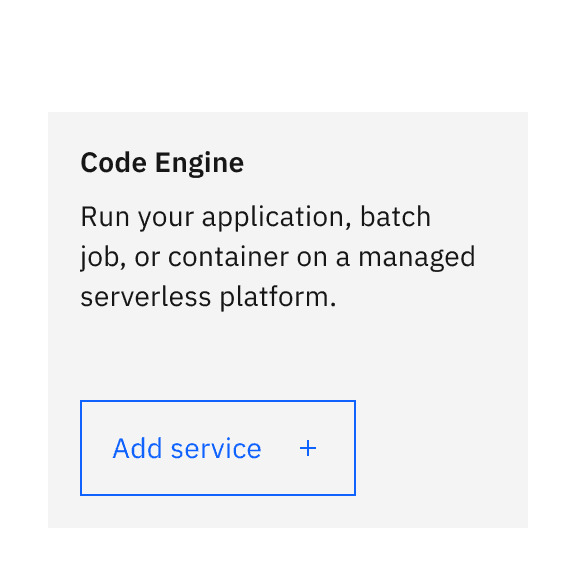
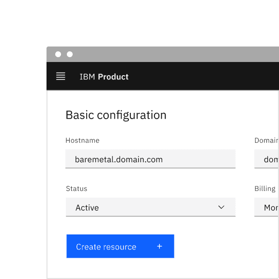
Primary button
Primary button is used for the principal call to action on the page. Primary button should only appear once per screen (the only exceptions are temporary flows with primary actions). Primary button helps give the user focus and gives them context behind the expected next step.
Primary button in the context of a product UI.
Temporary flows with primary action
There may be times when there is a primary button on a page, but through interaction with the page content, another flow may be launched that has its own primary button. Temporarily, there may be two primary buttons on a page.
In this case, a user has triggered something with an intention to focus on another flow, therefore temporarily having two primary buttons on a page is acceptable. This is the only scenario where having two primary actions on a page is advised.
A temporary user flow where a data table with primary action has an open side panel with its own primary action.
Best practices
Not every page needs a primary button
Sometimes the primary purpose of the page is to interact with other components or read over content, rather than to trigger an action. In this case, use tertiary and ghost buttons for these supporting actions or experiences.
The primary intent of this page is to present content, with actions like filtering and editing represented by tertiary and ghost buttons.
Secondary button
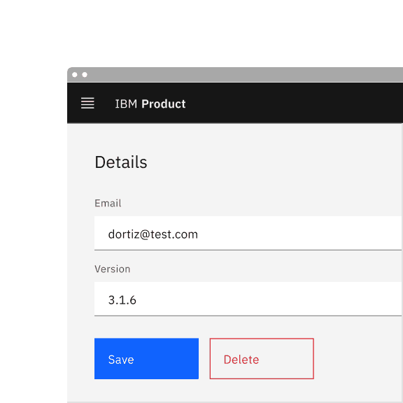
As mentioned in the emphasis section, secondary buttons are tonally heavy but have less visual prominence than their primary counterparts due to their lower saturation. As a result, secondary buttons are intended to be used in conjunction with a primary button. When used in a pair, the secondary button executes the set’s negative action, like “Cancel” or “Back.”
Secondary button in the context of a product UI.
Secondary buttons should not be used in isolation or for a positive/primary action. See button groups for more guidance on how to use secondary buttons.

Do use the secondary button in conjunction with the primary button.
Do not use the secondary button in isolation or for a positive/primary action.
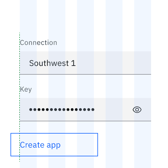
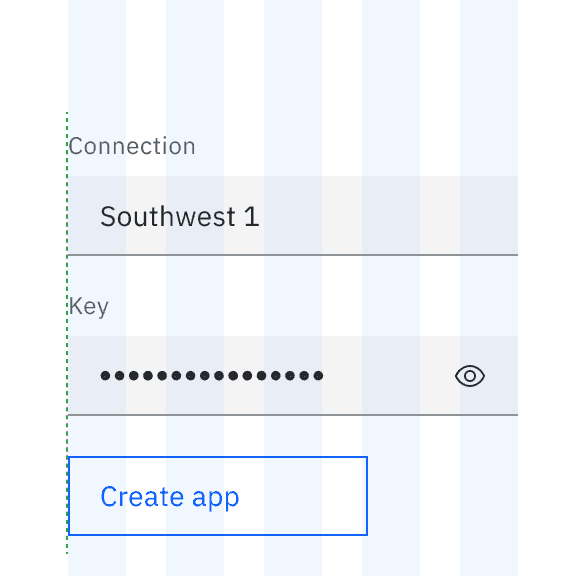
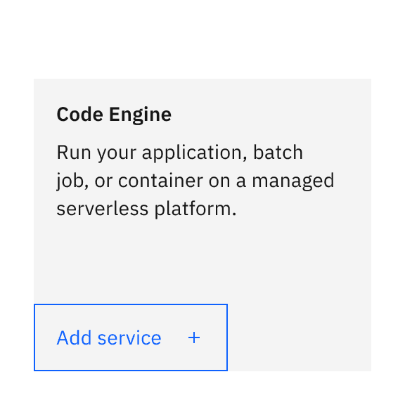
Tertiary button
Tertiary buttons have less prominence than a primary button and slightly more prominence than a ghost button. Tertiary buttons work well on their own or as part of a button group.
Tertiary button in the context of a product UI.
Tertiary buttons should stay aligned with the content of the page. Always make sure the tertiary button has adequate padding on all sides. As mentioned in the fluid button guidance, tertiary buttons should not be used in fluid arrangements.
Do align the tertiary button with the rest of the content.
Do not use a tertiary button in a fluid arrangement.
Best practices
Tertiary buttons for page headers
It is challenging to use a primary button in the header of a page because the content beneath the header is probably going to have a primary action, or will in a future release. Even if the the button in the page header is not styled as a primary button, it has significant prominence due to its hierarchical placement at the top.. Therefore, it is advised to use a tertiary button for page headers.
If it is determined that the button in the page header, across all tabs, should be primary, ensure none of the content below the header contain another primary action.
Do use a tertiary button in the page header if there is a primary button in the content section.
Do not use a primary button in the page header and the content section.
Tertiary buttons in button groups
In button groups, where there is one primary and two other actions with shared importance, consider using tertiary buttons.
Example of tertiary buttons used in button groups.
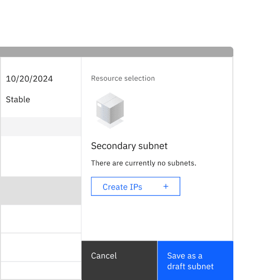
Tertiary buttons in empty states
For empty states that appear on pages that already have the primary action defined, a tertiary button is the ideal solution to launch a new task flow.
Example of a tertiary button used with empty state content.
Ghost button
Ghost buttons have the least prominence among the button variants. Ghost buttons are more subtle, making them ideal for supplementary actions. They work best when they are flush against a container or horizontally grouped with other elements.
Ghost button in the context of a product UI.
Aligning ghost buttons
Ghost buttons work well when aligned to a corner of a container. The general rule for vertically aligning a ghost button with other content is to ensure its label aligns with the text elsewhere on the page.
Do align the ghost button label with the rest of the content.
Do not align the edge of the ghost button with the rest of the content, even if it looks partially aligned.
Ghost buttons can be useful for small supplementary actions in side panels. In this context, extending the width of the ghost button to the full width of the container makes this treatment seem intentional. Aligning to the full width of a container is only recommended when the containers are smaller in size such as a side panel of 480px (medium) and below.
Do extend the ghost button to the full width of the side panel.
Do not leave a ghost button hanging halfway within the side panel.
Ghost buttons can also be aligned horizontally and inline with other components on the page.
Example of a ghost button aligned horizontally and inline with a component.
Best practices
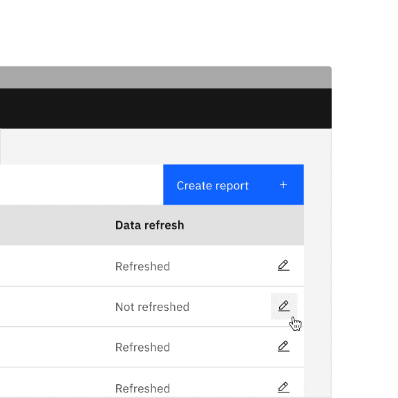
Ghost buttons for data table actions
Buttons in the table toolbar are often depicted as a primary button, but this might not always be the case. Use a ghost button instead if there is another button on the page that requires primary styling.
A ghost button represents the data table’s primary action to avoid conflict with the primary button in the page header.
Ghost buttons in productive cards
In dashboards with multiple productive cards, ghost buttons work well as they draw less attention than a tertiary button. For a ghost button to appear aligned in vertical arrangements within a container, it is recommended that it touches at least two edges of the container.
See the cards component for more details.
Example of a ghost button used in cards.
Ghost button used as a cancel action
Ghost buttons work well as a cancel button in progressive flows, as they draw less attention; users have to purposefully find and click the button to cancel. In tearsheets, the buttons are fluid, which wouldn’t be a suitable application for a tertiary button.
Example of ghost button used in a modal.
Danger button
Danger button is used for actions that could have destructive effects, such as “Delete”, “Remove”, or “Stop”.
The danger button has three different styles: primary, tertiary, and ghost. Determining which danger button style to use will depend on the level of emphasis you want to give to the destructive action. Destructive actions that are a required or primary step in a workflow should use the primary danger button style. However, if a destructive action is just one of several actions a user could choose from, then a lower emphasis style like the tertiary danger button or the ghost danger button may be more appropriate.
Danger button in the context of a product UI.
Do use a tertiary danger button for lower emphasis destructive actions.
Do use a ghost danger button for lower emphasis destructive actions.
Modifiers
Button with icon
Icons can be placed next to labels to clarify an action and call attention to a button. However, icons should be used sparingly, as overuse can create visual noise and make an experience less usable. If you use a button with an icon in one part of your UI it does not mean that you need to add icons to all other buttons.
- Use a 16px icon within buttons; use a 20px icon within the large expressive buttons.
- Icons are distinguished by their solid shape and knocked-out details.
- Icons should always appear to the right of the label.
- Icons used in buttons must be directly related to the action that the user is taking.
- Icons must match the color value of the label within a button.
Do place the icon on the right side of the button after the label.
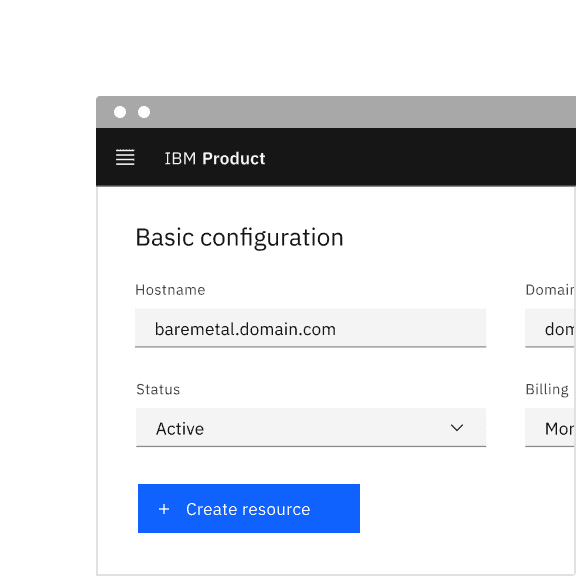
Do not place the icon to the left of the label on the button.
Do use 8px spacing between the label and the icon in a ghost button.
Do not leave too much space between the label and the icon in a ghost button.
Universal actions with well-established icons
When deciding whether to add an icon to a button, it’s important to consider how recognizable the icon is and whether, in other contexts, a similar icon may be used for a different meaning. We want to avoid the same icon being used for completely different actions.
For this reason, we have defined a set of universal actions suitable for adding an icon alongside the button label. These have clearly defined and widely recognized icons within IBM Software and beyond.
Icons that are not in this list can be used in buttons, as long as the icon clearly conveys the intended action. To determine the expected use of an icon, check its name in the Carbon icon library.
| Name of action | Associated icon | Name in icon library |
|---|---|---|
| Create/Add | Add | |
| Edit | Edit | |
| Copy | Copy | |
| Delete | Trash can | |
| Remove | Subtract alt | |
| Export | Export | |
| Upload | Upload | |
| Download | Download | |
| Play/Start | Play | |
| Pause | Pause | |
| Stop | Stop outline | |
| Refresh | Restart |
Do you think a universal action with a clearly defined icon is missing? Let us know here.
Do not use a defined icon to represent a different universal action
Using icons in the above list for other actions can confuse the expected outcome and experience.
Do use a defined icon to represent a universal action.
Do not use an icon for an action that would not be associated with it.
Launch icon
The launch icon should be used on any call to action that launches the user into another tab (whether the content of the new tab is part of the same product or an entirely separate web resource). Buttons and links requiring the launch icon are often found in the UI left navigation area, side panel, cards, and modals. The target destination of the launch action should be made clear to the user through the button or link label and the surrounding context.
For IBMers only: See the navigation labels of our content guide.
Example of a tertiary button with icon indicating that clicking the button would launch a new page.
Be consistent with icon usage for buttons in a button group
Using icons in button groups is optional. We recommend showing an icon for each button in a button group or showing no icons for consistency. A benefit of pairing an icon with a button label is that it visually describes its action and directs more attention to it. However, in some cases, using too many buttons with icons in a group can create unwanted noise in the UI and tend to overcomplicate a simple experience.
Only use icons in button groups for the universal actions listed in the table above or for other actions where a particular icon is commonly paired and associated.
Do follow a consistent approach across button groups when introducing icons.
Do follow a consistent approach across button groups when introducing icons.
Do not introduce icons only for a few buttons in a button group.
Do not introduce icons only for a few buttons in a button group.
Use the default variation for all icons
The Carbon library contains filled variants of a few icons. Since not every icon has this variation, we advise using the default option for all icons (the only exception is status icons, which have their own defined icon to use). Default icons are named after their action.
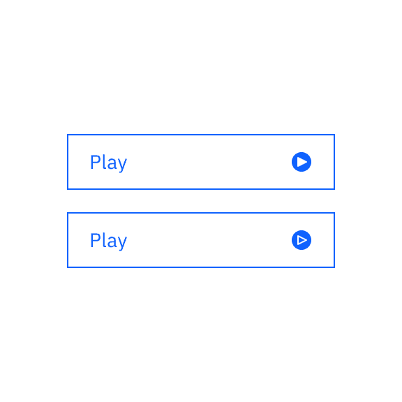
Do use the default icon which is “Play”.
Do not use the filled icon variations.
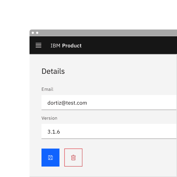
Icon only buttons
Icon only buttons allow users to take actions, and make choices, with a single tap. Icon buttons can take the form of a primary, secondary, tertiary, or ghost variant but most commonly will be styled as primary or ghost buttons.
Icon only buttons should be used sparingly. “For most situations, users learn correct interpretations better with text alone than with icons alone.” — Wiedenbeck, S (1999). For this reason, using icon only buttons is recommended for the following use cases:
- The icon must be standardized and recognizable without label or must represent an action with a strong visual attribute, such as a pin icon for a pinning action.
- There is insufficient space and multiple actions, therefore a toolbar using icon buttons is required. See the toolbar component for more details.
Example of an icon only ghost button in a toolbar showing a tooltip on hover.
Tooltips for icon only buttons
Regardless of how recognizable an icon may or may not be, or whether that action lies within the universal actions list, a tooltip is always required with text explaining what the icon button would do if clicked.
Example of an icon only ghost button showing a tooltip on hover.
Colors of icon only ghost buttons
Carbon builds type, color, and spacing tokens into its components, improving the ease of component usage. Do not change the color token for icon only ghost buttons. The same applies for specifications across components. Learn more about icon only ghost button colors in the Style tab.
Do use the system’s defined color for ghost icon only buttons.
Do not change the color for ghost icon only buttons.
Danger buttons cannot be used in an icon only form
Danger can be a critical action and should be applied to a button that holds higher emphasis along with a visual label. As mentioned in the danger button guidance, it is best to use a danger button in a primary, tertiary, or ghost button form.
Do use a visual label in a danger button for a destructive action.
Do not use a danger button in an icon only form for a destructive action.
Related
References
- Mehmet Goktürk, The Glossary of Human Computer Interaction, Chapter 37 (The Interaction Design Foundation)
- Jakob Nielsen, OK-Cancel or Cancel-OK? The Trouble With Buttons (Nielsen Norman Group, 2008)
- Artem Syzonenko Buttons on the web: placement and order (UX Collective, 2019)
- Wiedenbeck, S (1999). The use of icons and labels in an end-user application program: An empirical study of learning and retention. Behavior & Information Technology, 18(2), p68–82
Feedback
Help us improve this component by providing feedback, asking questions, and leaving any other comments on GitHub.