Button
Design annotations are needed for specific instances shown below, but for the standard button component, Carbon already incorporates accessibility.
What Carbon provides
Carbon bakes keyboard operation into its components, improving the experience of blind users and others who operate via the keyboard. Carbon incorporates many other accessibility considerations, some of which are described below.
Keyboard interactions
Buttons can be reached by
Tab
Space
Enter
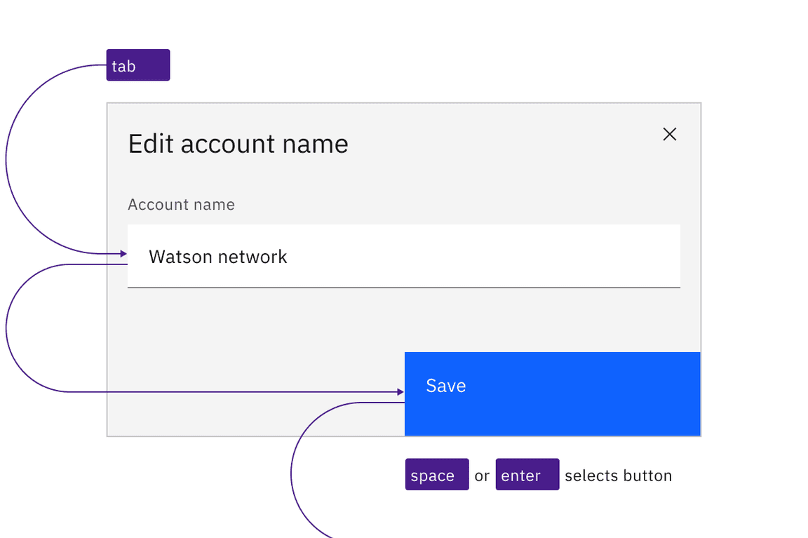
Carbon buttons retain expected interactions.
Behavior
Icon-only buttons, which do not persistently display a text label, expose their label on hover and focus. When icon-only buttons are used to open menus, they are treated as separate components in Carbon. See Dropdown and Overflow menu.
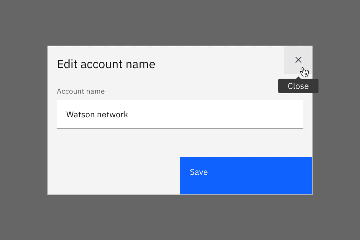
Icon-only buttons have their labels exposed automatically on hover and focus.
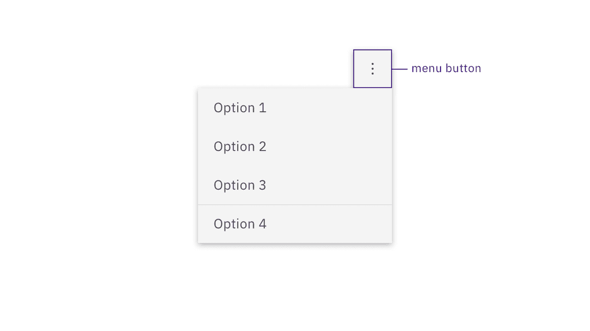
Buttons that open menus are separate components in Carbon.
Design recommendations
Design annotations are needed for the following instances.
Labeling
When buttons do not have a persistently displayed label, they must be annotated with a label that will be exposed on hover or focus.
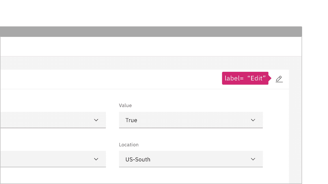
Annotate the label for icon-only buttons so the proper tooltip appears.
Development considerations
Keep these considerations in mind if you are modifying Carbon or creating a custom component:
- Where links have been ‘repurposed’ as a button, they need to be coded so the
key can also activate (since links are only activated by default bySpace).Enter
- Toggle buttons can be accessibility supported by changing the value of
betweenaria-pressedand"true"or with a change of name that reflects a change in the icon shape (for example: “play” / “pause” )"false"
- See the ARIA authoring practices for more considerations.
Accessibility testing statusFor every latest release, Carbon runs tests on all components to meet the accessibility requirements. These different statuses report the work that Carbon has done in the back end. These tests appear only when the components are stable.
For every latest release, Carbon runs tests on all components to meet the accessibility requirements. These different statuses report the work that Carbon has done in the back end. These tests appear only when the components are stable.
Latest version: | Framework: React (@carbon/react)
| Component | Accessibility test | Status | Link to source code |
|---|---|---|---|
| Button | Test(s) that ensure the initial render state of a component is accessible. | Passes all automated tests with no reported accessibility violations. | GitHub link |
| Tests that ensure additional states of the component are accessible. This could be interactive states of a component or its multiple variants. | Passes all automated tests with no reported accessibility violations. | ||
| Tests that ensure focus is properly managed, and all interactive functions of a component have a proper keyboard-accessible equivalent. | Passes all automated tests with no reported accessibility violations. | ||
| This manual testing ensures that the visual information on the screen is properly conveyed and read correctly by screen readers such as JAWS, VoiceOver, and NVDA. | A human has manually tested this component, e.g. screen reader testing. |