Checkbox
Checkboxes are used when there are multiple items to select in a list. Users can select zero, one, or any number of items.
Live demo
This live demo contains only a preview of functionality and styles available for this component. View the full demo on Storybook for additional information such as its version, controls, and API documentation.
Accessibility testing statusFor every latest release, Carbon runs tests on all components to meet the accessibility requirements. These different statuses report the work that Carbon has done in the back end. These tests appear only when the components are stable.
For every latest release, Carbon runs tests on all components to meet the accessibility requirements. These different statuses report the work that Carbon has done in the back end. These tests appear only when the components are stable.
Overview
Checkboxes are used for multiple choices, not for mutually exclusive choices. Each checkbox works independently from other checkboxes in the list, therefore checking an additional box does not affect any other selections.
When to use
Forms
Can be used in forms on a full page, in modals, or on side panels.
Filtering and batch action
Used to filter data either on a page, in a menu, or within a component. Checkboxes are found in Data table for batch editing purposes.
Terms and conditions
Turning the checkbox input on or off can indicate whether you agree to the terms.
Lists with sub-selections
Used when there is a parent and child relationship. You can use a parent checkbox to make a bulk selection of all list items. Unchecking the parent deselects all of the list items. Alternatively, you can select children individually when the parent is not selected, which is where the indeterminate state comes in to play.
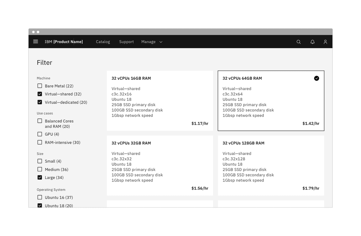
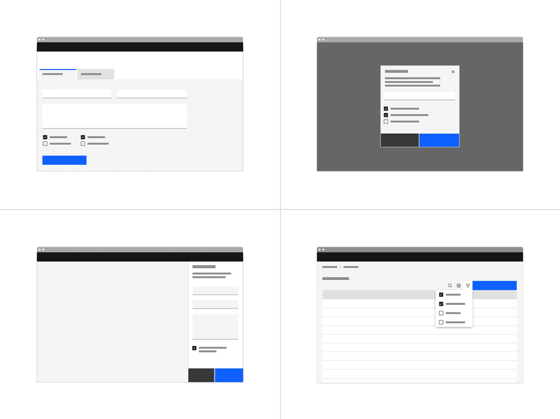
Example of a full page filter list
When not to use
If a user can select only one option from a list, radio buttons should be used instead of checkboxes. Checkboxes allow the user to select multiple items in a set whereas radio buttons allow the user to select only one option.
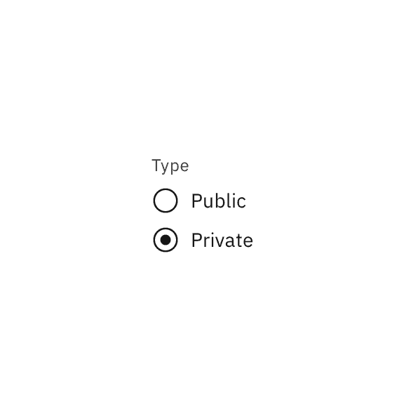
Do use radio buttons when only one item can be selected.
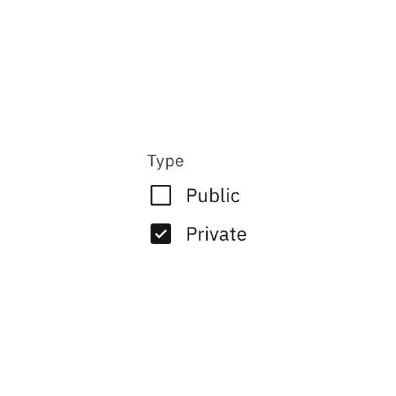
Don't use checkboxes when only one item can be selected.
Formatting
Anatomy
The checkbox component is comprised of a checkbox label and a checkbox input. If there is a group of checkboxes, a group label can be added.
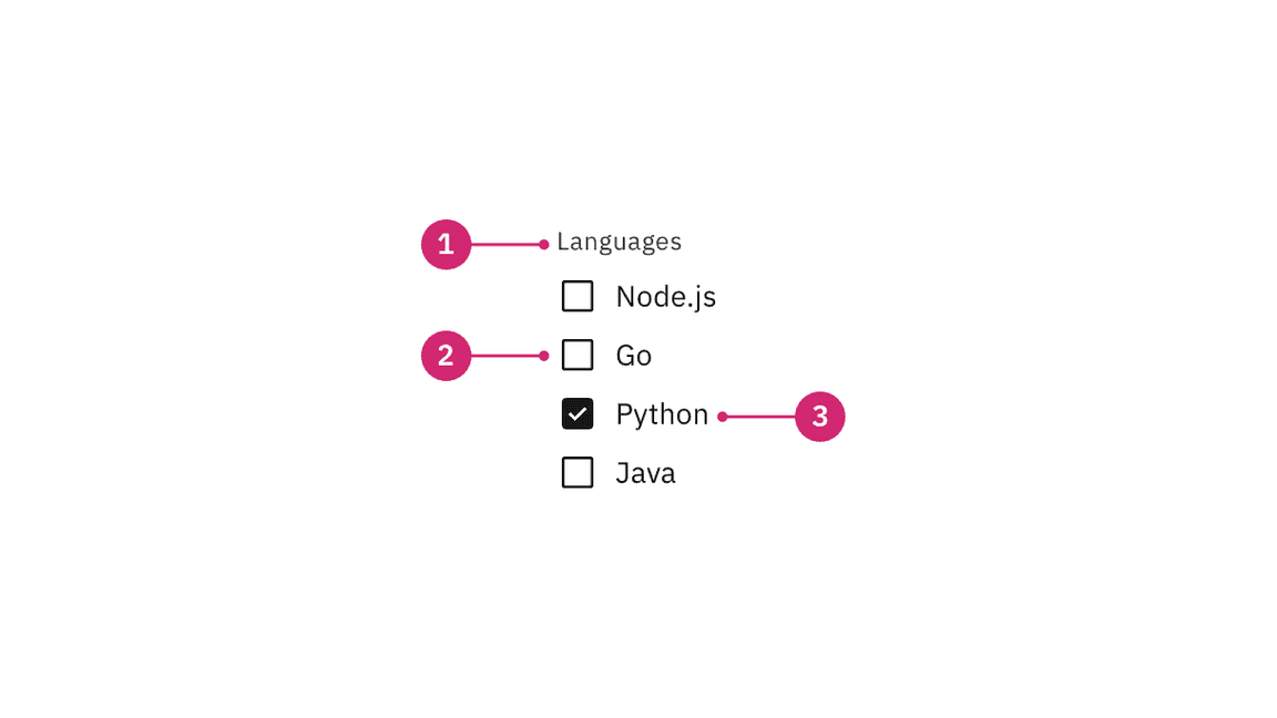
- Group label (optional): Communicates what needs to be selected below.
- Checkbox input: A checkbox input indicating the appropriate state. By default it is unselected.
- Checkbox label: Describes the information you want to select or unselect.
Alignment
Checkbox labels are positioned to the right of their inputs. If there is a checkbox grouping, they can be laid out vertically or horizontally depending on the use case and the structure of the UI. When possible, arrange the checkbox and radio button groups vertically for easier reading.
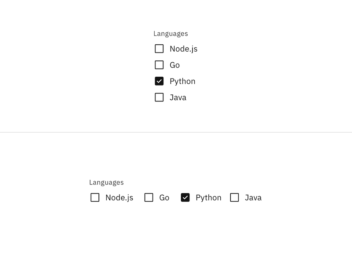
Vertically stacked versus horizontal alignment
Placement
The checkbox component is often used in forms. Forms can be placed on a full page, in a modal or in a side panel. A checkbox can also be used for agreeing to terms and conditions or to filter information.
Checkboxes in a form should be placed at least 32px (
layout-03
layout-02
layout-01
For more information on spacing in forms, see our form style guidance.
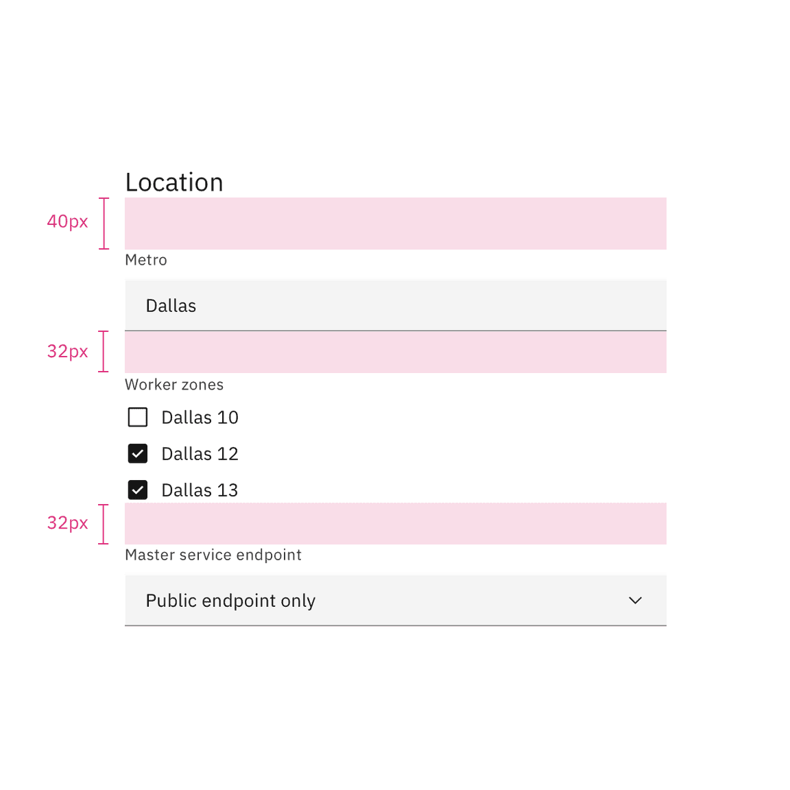
Spacing between a checkbox and other components in a form
For more information about spacing for the checkbox component itself, see the style tab.
Content
Main elements
Group labels (optional)
- In most cases, a set of checkboxes is preceded by a group label to provide further context or clarity.
- A group label can either state the category of the grouping or describe what actions to take below.
- Use sentence case for group labels.
- In some cases, a group of checkboxes may be within a larger group of components that already have a group label. In this case, an additional group label for the checkbox component itself is not needed.
Checkbox labels
- Always use clear and concise labels for checkboxes.
- Labels appear to the right of checkbox inputs.
- Regardless of whether the label is visible in the interface, a label is always needed in code, whether it’s for one checkbox or a group of them. See the checkbox code tab for more information.
Overflow content
- We recommend checkbox labels being fewer than three words.
- If you are tight on space, consider rewording the label. Do not truncate checkbox label text with an ellipsis.
- Long labels may wrap to a second line, and this is preferable to truncation.
- Text should wrap beneath the checkbox so the control and label are top aligned.
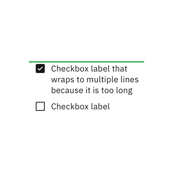
Do let text wrap beneath the checkbox so the control and label are top aligned.
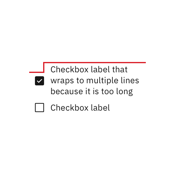
Do not vertically center wrapped text with the checkbox.
Further guidance
For further content guidance, see Carbon’s content guidelines.
Behaviors
States
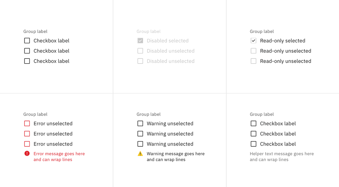
The checkbox input allows for a series of states: unselected, selected, and indeterminate. The default view of a set of checkboxes is having no option selected.
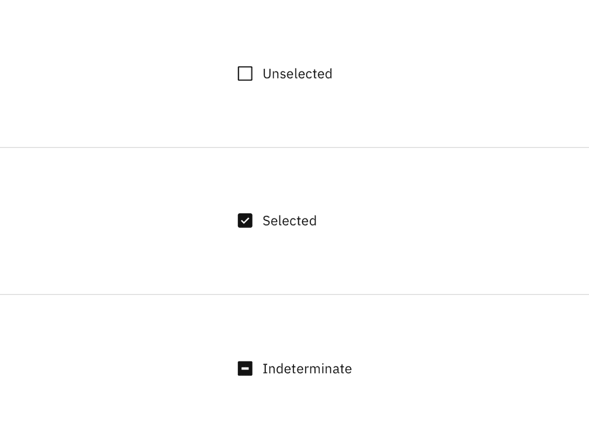
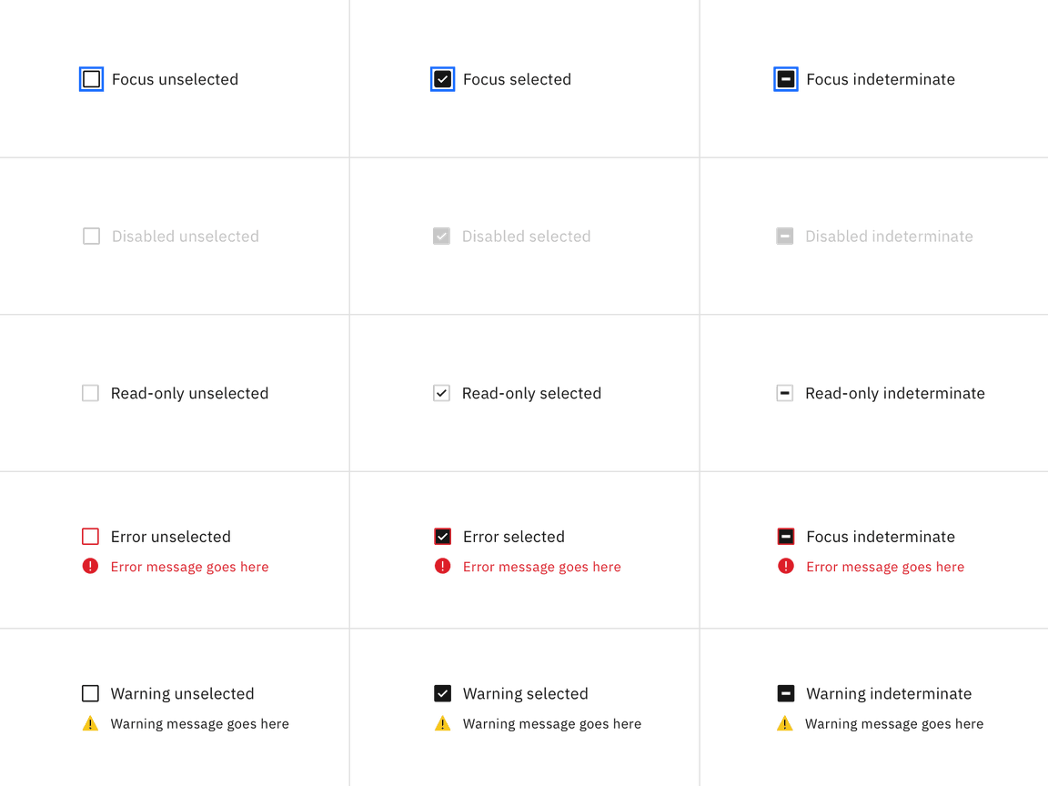
Use the indeterminate state when the checkbox contains a sublist of selections, some of which are selected, and some unselected. In addition to unselected, selected, and indeterminate states, checkboxes also have states for focus, disabled, read-only, error, and warning. When deciding whether to use a disabled or read-only state for checkboxes, see our Read-only states pattern guidance.
Group states
Checkbox groups can receive the following states: read-only, disabled, error, and warning, as well as the addition of helper text.
Nesting
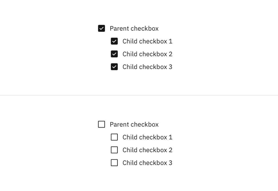
Checkboxes can be nested when a parent and child relationship is needed. Users can either select an entire set of options or only a subset.
Checking the parent checkbox automatically selects all of the nested children checkboxes. Unchecking the parent checkbox automatically deselects all of the children checkboxes.
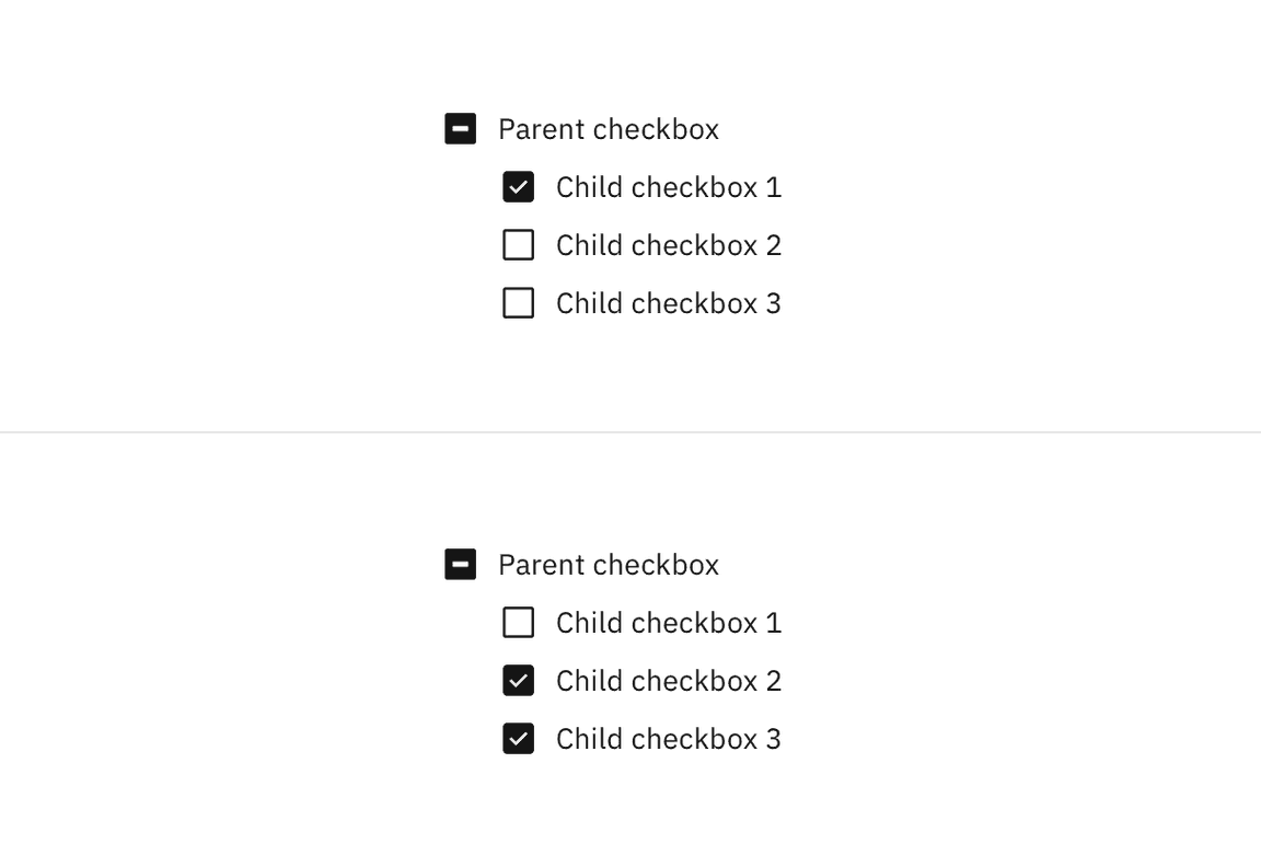
Checking a child checkbox, if at least one other child checkbox is not selected, automatically puts the parent checkbox into the indeterminate state. Unchecking a child checkbox, when all other children checkboxes remain selected, switches the parent checkbox from the default checked state to the indeterminate state.
Interactions
Mouse
Users can trigger an item by clicking the checkbox input directly or by clicking the checkbox label. Having both regions interactive creates a more accessible click target. The only hover effect when the mouse is placed over the target is a pointer shape change.
Keyboard
Users can navigate to and between checkbox inputs by pressing
Tab
Shift-Tab
Space
AI presence
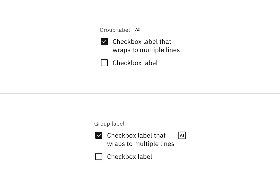
Checkbox has a modification that embeds the AI label when AI is present in the control. The AI variant functions the same as the normal version except with the addition of the AI label which is both a visual indicator and the trigger for the explainability popover. The AI label can be placed on the checkbox group label or on individual checkbox labels.
For more information on designing for AI, see the Carbon for AI guidelines.
Related
Checkbox versus radio button
Radio buttons represent a group of mutually exclusive choices, while checkboxes allow users to select one or more checkboxes from a group. In use cases where only one selection of a group is allowed, use the radio button component instead of the checkbox.
Checkbox versus toggle switch
Toggle switches are preferred when the resulting action will be instantaneously applied, without the need for further confirmation. By comparison, checkboxes represent one input in a larger flow which usually requires a final confirmation step.
Tables
See the data table component for guidance on how to use checkboxes within a table.
References
Feedback
Help us improve this component by providing feedback, asking questions, and leaving any other comments on GitHub.