Read-only states
Read-only states are applied to components when the user is allowed to review but not modify the component. It removes all interactive functions from the component.
Overview
A read-only state is applied only to components the user can modify when toggled to enabled. Read-only states are considered active, and the data they contain can be used in an application’s processes. This state change transforms a component’s purpose to be purely informative rather than interactive.
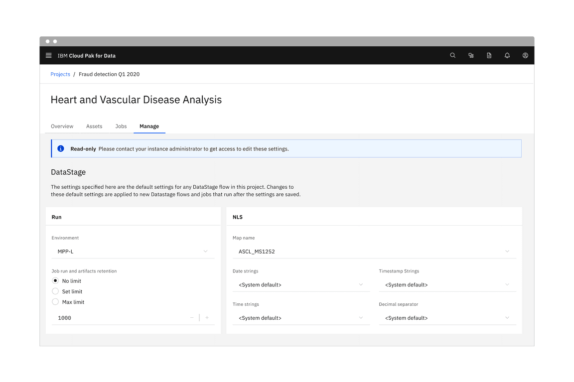
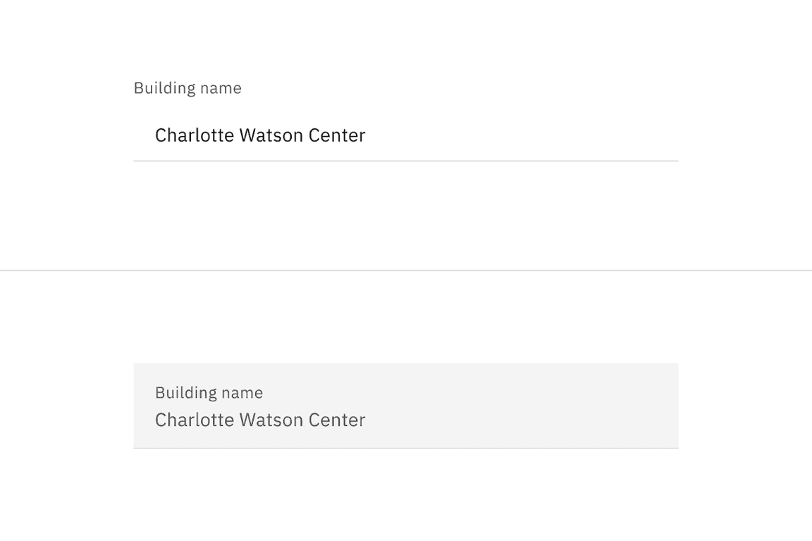
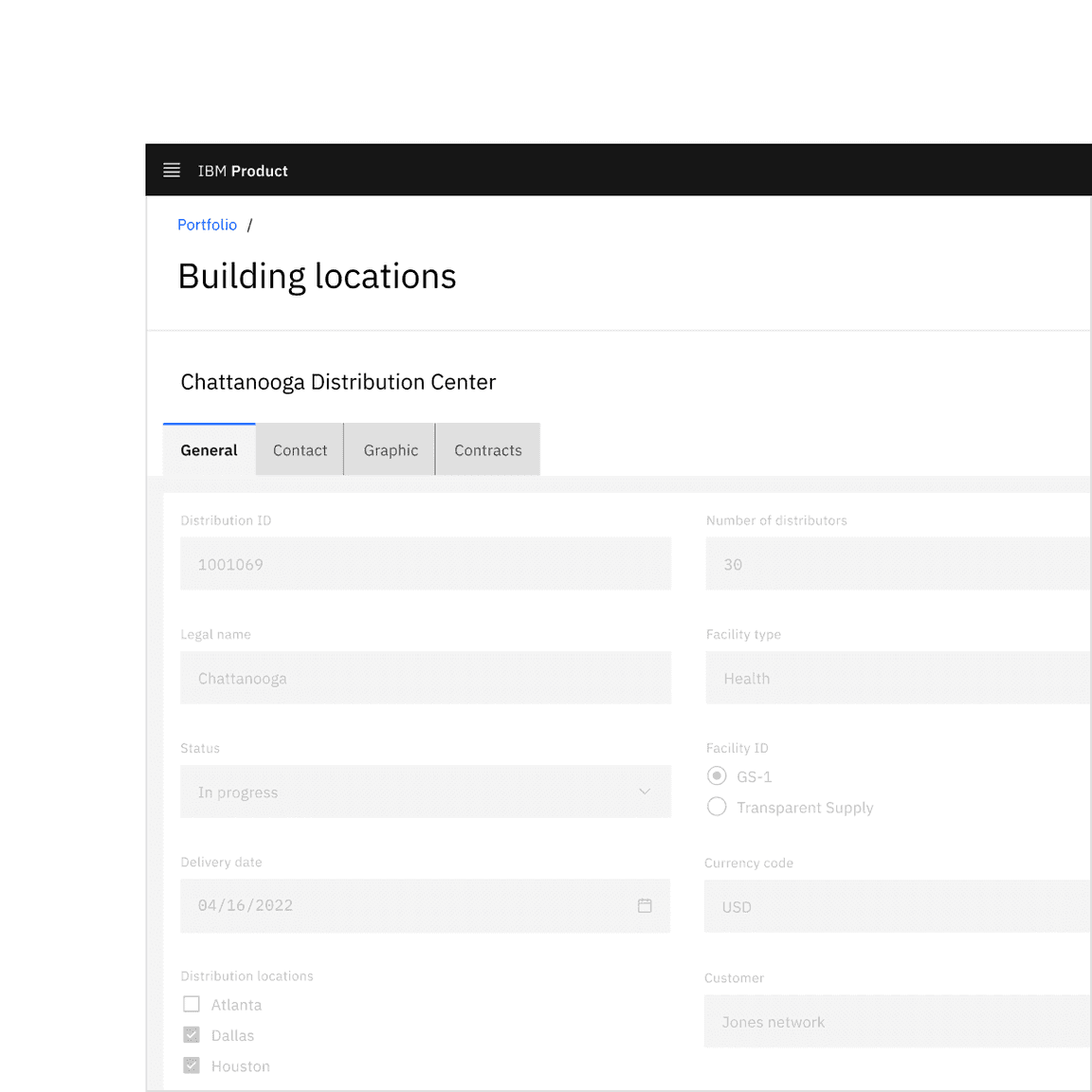
Form component read-only states in context.
When to use
There are three main use cases that initiate a read-only state:
| Use case | Description |
|---|---|
| Application process | An application’s process temporarily restricts a user from modifying the component until the process completes. |
| Locked | An application restricts the number of users that can modify the component at the same time. |
| Permissions | A user’s credentials allow them to view the component but not modify it. |
When not to use
- If the component does not have an enabled state, do not use a read-only state to display static information.
- As an alternative to a disabled state, read-only and disabled states serve different purposes. For example, when a component is temporarily unavailable pending user actions or decisions (such as completing a form or choosing an option), the component’s state should be temporarily disabled, not read-only.
- If the component would otherwise be disabled, components in a disabled state should not change to a read-only state.
Formatting
Anatomy
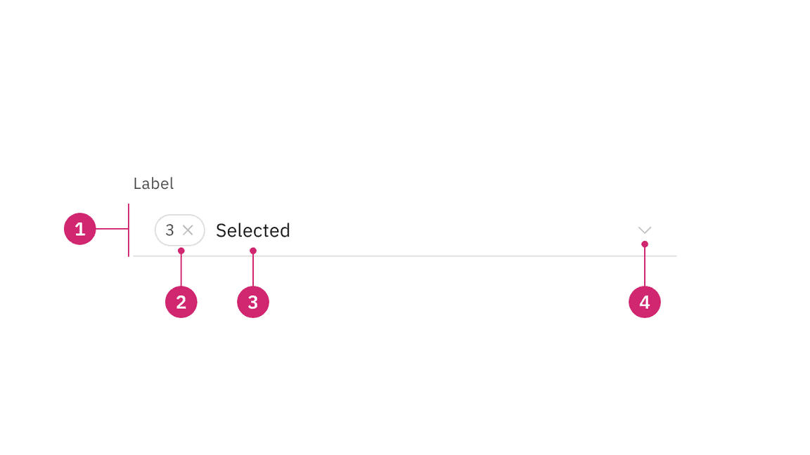
Read-only state anatomy.
- Background color change: Having a transparent background for fields.
- Border color change: De-emphasizing selection and clickability to make information more readable.
- Text color no change: Text color remains the same as in the enabled state and should still pass 4.5:1 color contrast rules.
- Icon color change: Keeping embedded icons in the component for context but displaying that icons are not interactive with color and cursor changes.
Visual guidance
Read-only states use subtle changes to a component’s style to emphasize critical information and de-emphasize or remove icon signifiers.
Structure
Components should maintain the same structure and spacing used in the component’s enabled state. In most cases, elements in the enabled state are present in the read-only state.
Selection controls
Selection controls offer users a selection from pre-determined options. Common selection controls include: checkboxes, radio buttons, toggles, dropdowns, selects, combo boxes, and multiselects.
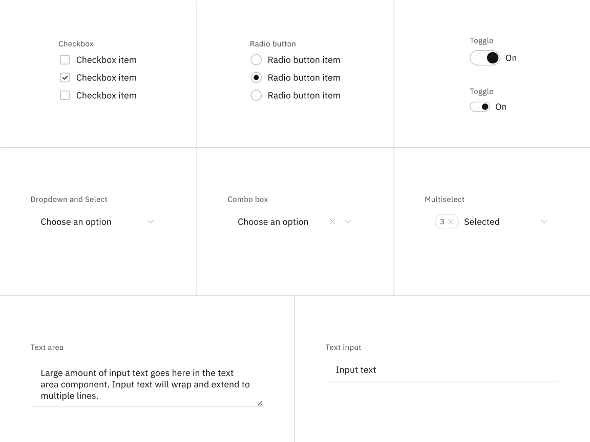
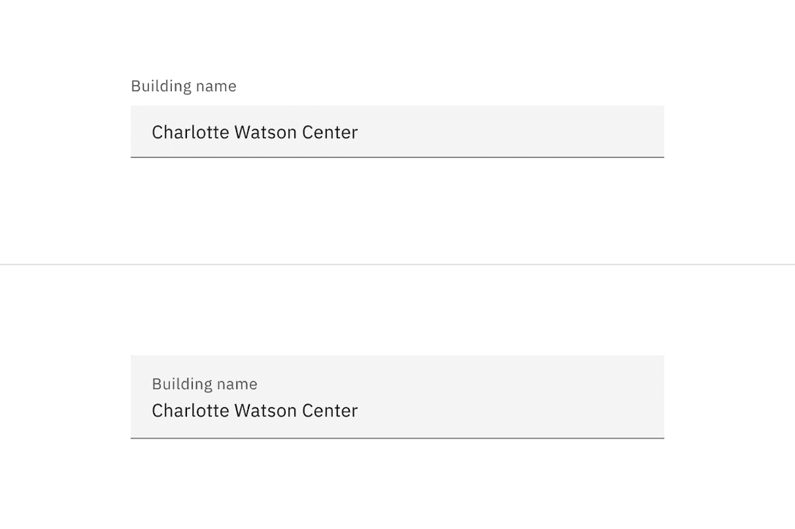
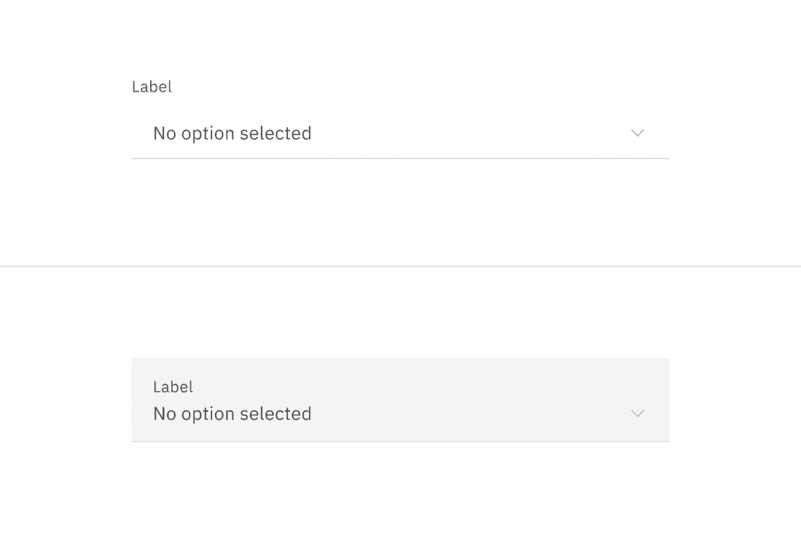
Read-only states for selection controls.
Bound entry controls
Bound entry controls allow users to input numeric data, like dates, times, and numeric values. Common bound entry controls include: number inputs, sliders, date pickers, and time pickers.
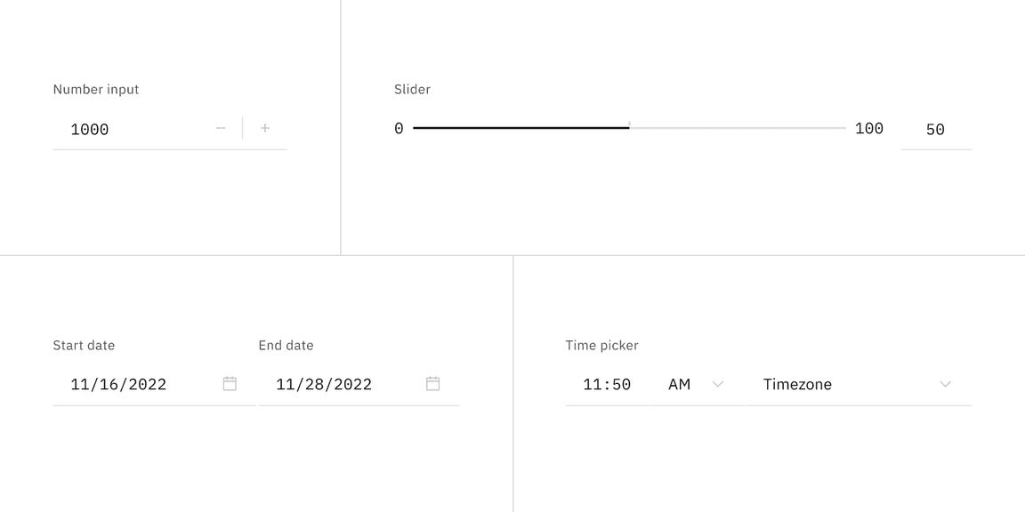
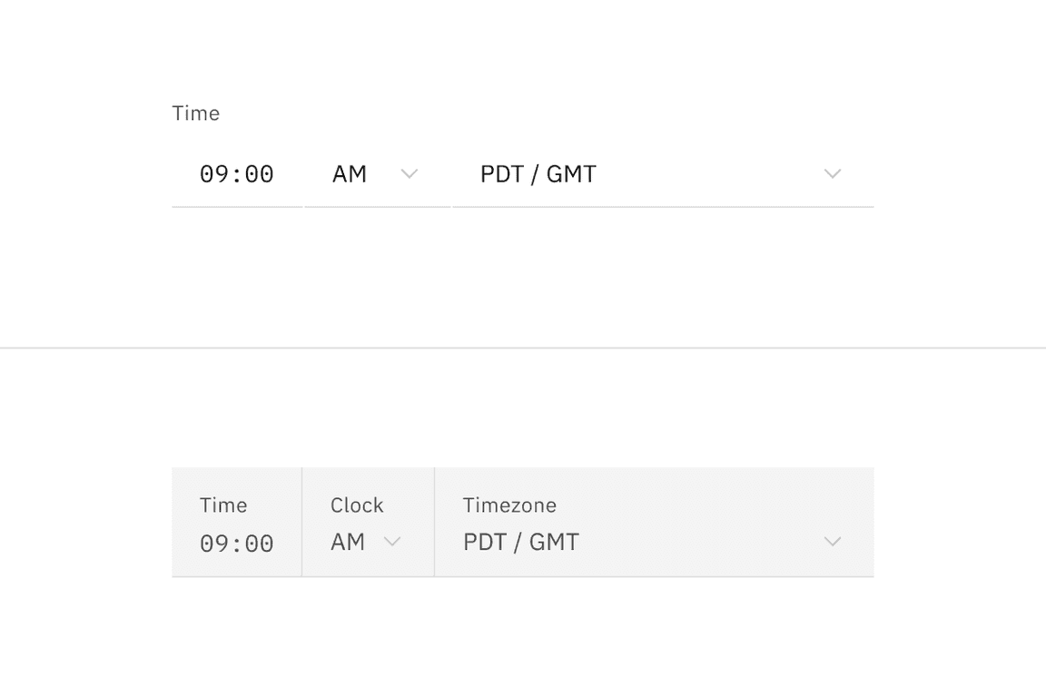
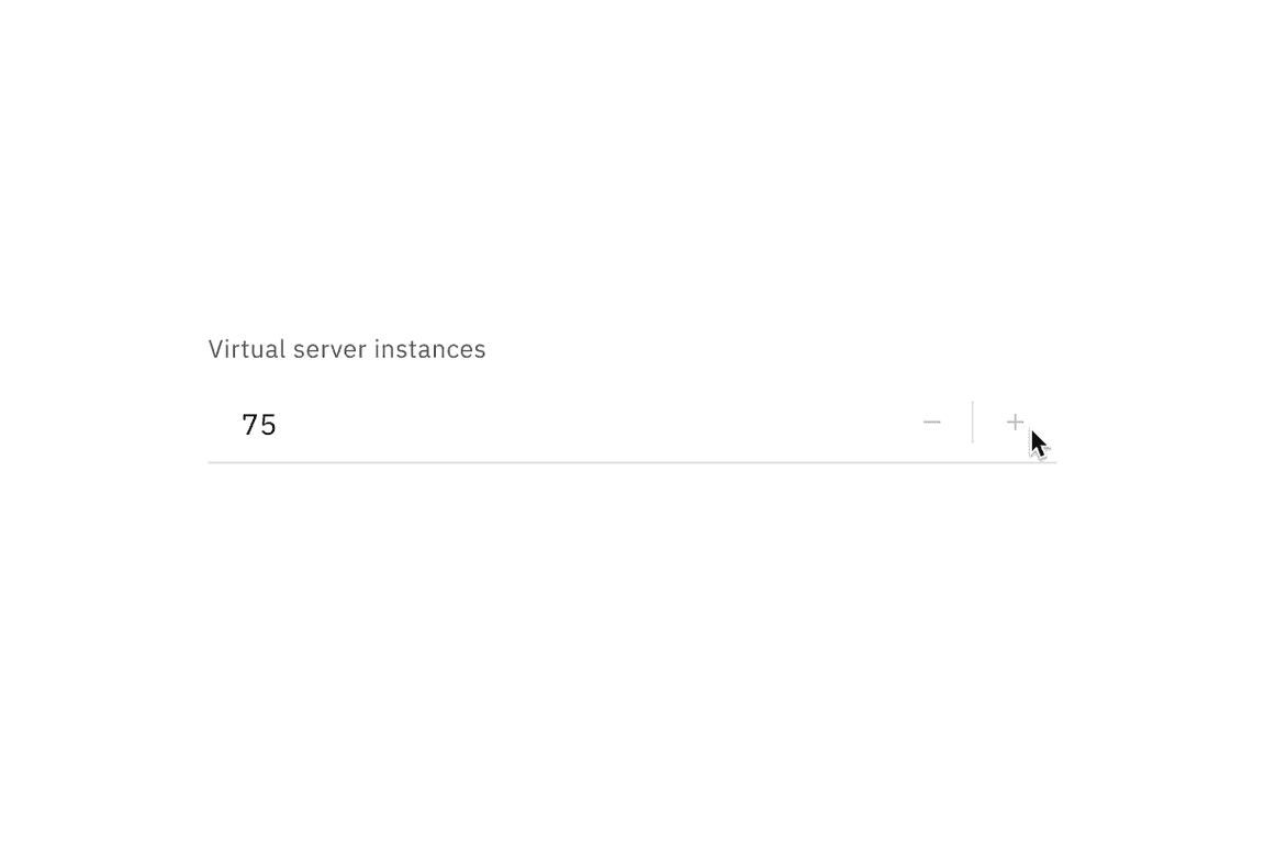
Read-only states for bound entry controls.
Interactive elements
Interactive elements included in a component’s enabled state should be removed or modified for its read-only state. Changes to color are used to indicate a modification to interactive elements and a change in their purpose from interactive to informative. Color changes to field backgrounds, interactive elements, and icon signifiers are used to de-emphasize unavailable affordances in a component’s read-only state. The color of key informational elements (text, icons, and visualizations) should remain the same as the component’s enabled state. Below are a few examples of components comparing their read-only and enabled states.
Component fields
The default style component field background colors blend in with the overall UI or layer background for read-only states, whereas fluid component field backgrounds retain the same enabled state background color.
Component borders
In some cases, the border of controls in components changes color to emphasize selected items for read-only states and de-emphasizes control interactivity.


Component icon signifiers
Signifier icons included in a component’s enabled state, like chevron arrow icons, close icons, and calendar icons, should use the
$icon-disabled
Best practices
State readability
Don’t use a disabled state for components if they need to be read by the user. Unlike read-only states, disabled states are not read by screen readers and do not pass visual contrast, making them inaccessible if they need to be interpreted.
Read-only viewports
Do maintain a component’s disabled state when in a read-only view. Don’t change a component’s state from disabled to read-only because of an active read-only view; some states should remain disabled depending on the use case.
Disabled versus read-only states
Do use a disabled state when a component is temporarily unavailable pending user action. Don’t change a component’s state from disabled to a read-only state. Alternatively, don’t use a read-only state to replace a disabled state.
Do use if the component is not interactive but should be read by the user.
Don’t use disabled states in place of read-only states.
Interactions
Mouse
The arrow cursor reinforces that a component is in a read-only state and is not interactive. The cursor’s state reflects a component’s shift in focus from interactive to informative.
Read-only state arrow cursor.
Keyboard
Interactive operations included in a component’s enabled state should be removed or modified for its read-only state. The component should remain navigable with a keyboard.
Content
Components should include the same content used in the component’s enabled state. However, when the content in the enabled state is instructive, like a dropdown with no current selection, the content may need to change to be informative.
Accessibility
When considering keyboard accessibility, it can be helpful to distinguish between navigation and operation. A component that can be reached by keyboard is navigable. Read-only components remain navigable so that users can review the information they contain. This contrasts with disabled components, which cannot be reached by a keyboard. However, read-only components are not operable, meaning users can neither manipulate nor alter their values.
Related
Components
Patterns
Carbon for IBM Products
References
- MDN contributors, HTML attribute: read-only, (Mozilla Developer, 2022)
- Aaron Gustafson, Web Forum Conundrum: disabled or read-only?, (2017)
- W3 Schools, HTML Input Attributes, (2022)
Feedback
Help us improve this pattern by providing feedback, asking questions, and leaving any other comments on GitHub.