Number input
Number input lets users enter a numeric value and incrementally increase or decrease the value with a two-segment control.
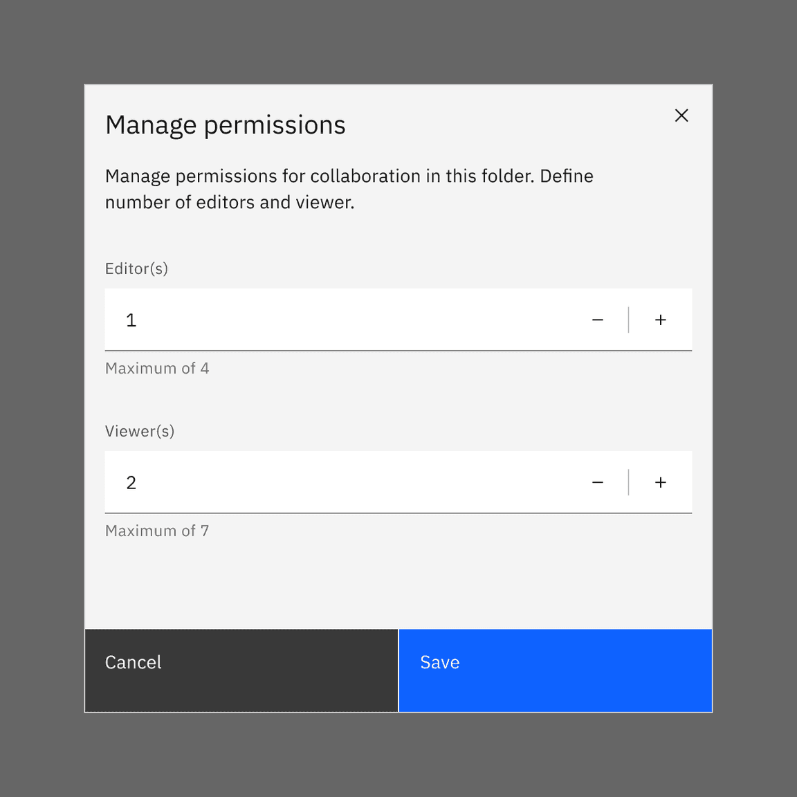
Live demo
This live demo contains only a preview of functionality and styles available for this component. View the full demo on Storybook for additional information such as its version, controls, and API documentation.
Accessibility testing statusFor every latest release, Carbon runs tests on all components to meet the accessibility requirements. These different statuses report the work that Carbon has done in the back end. These tests appear only when the components are stable.
For every latest release, Carbon runs tests on all components to meet the accessibility requirements. These different statuses report the work that Carbon has done in the back end. These tests appear only when the components are stable.
Overview
Number inputs are similar to text inputs, but are used to specify only a numeric value. Number inputs incrementally increase or decrease the value with a two-segment control. Number input reduces input efforts for adjusting small values.
When to use
- The user needs to input a numeric value
- Adjusting small values when increasing or decreasing them requires only a few clicks
- When users may not know exact values and only want to change the values that are relative to its current state
When not to use
- It is best practice not to use number input if large value changes are expected. For example, when the value sets from 1 to 30, number input is not a great option because it requires many clicks to reach 30. In this case, use slider when numeric values are large or when there is a wide range of numeric options.
- It is also best to avoid number input for continuous variables such as prices, distances, lengths, or human heights. When the exact value is important to specify within a wide range, use text input instead.
Formatting
Anatomy
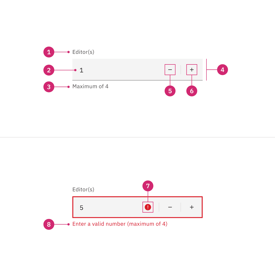
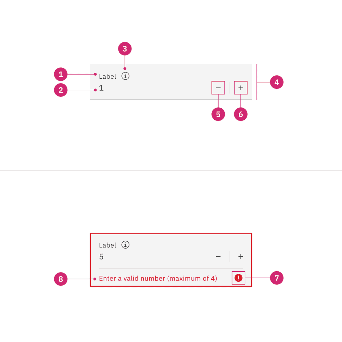
- Label: Text that informs the user about the content they need to enter in the field. It is required unless you get an approved accessibility exemption.
- Numeric value: The value changes when user enters a value into the field or uses the subtract or add controls.
- Helper text: Assistive text that can provide additional aid or context to the user. Often used to explain the correct data format.
- Field: The container in which a user enters data.
- Subtract icon: This icon triggers decremental values.
- Add icon: This icon triggers incremental values.
- Status icon: Indicates the state of the number input, either error or warning.
- Error or Warning text: It replaces the helper text when an error or warning state appears.
Styling
There are two styles of number inputs, default and fluid. They share the same functionality but look visually different, influencing where to use them.
| Style | Appearance | Use case |
|---|---|---|
| Default | A traditional style where the label is positioned outside and above the input field. | Use when white space is needed between input components or in productive moments where space is at a premium, and smaller components are needed. |
| Fluid | An alternative style where the label is placed inside of the input field and is stacked inline with the user input text. | Use in expressive moments, fluid forms, contained spaces, or attached to complex components, like a toolbar. |
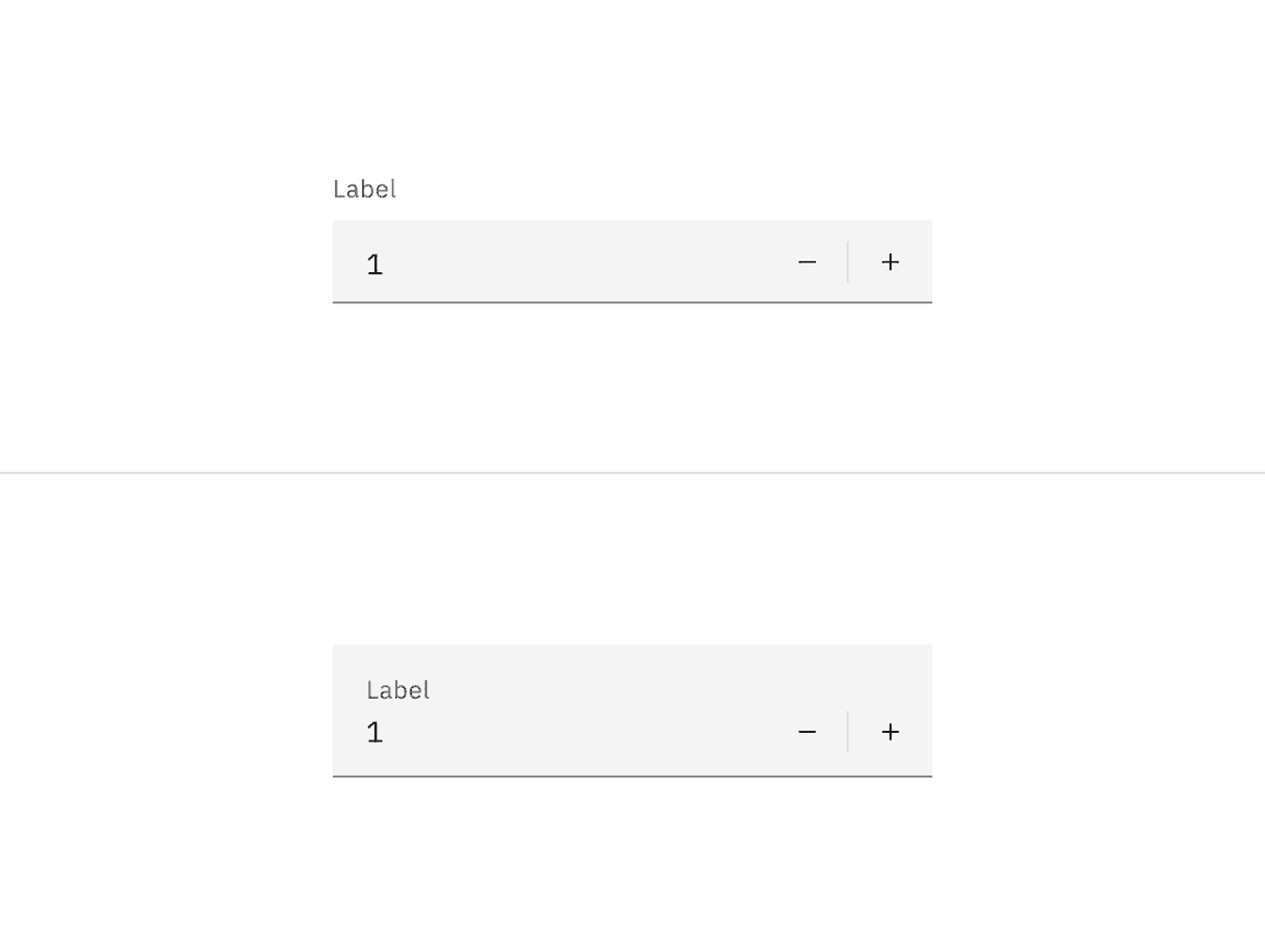
A default style input is shown on the left and fluid style is on the right.
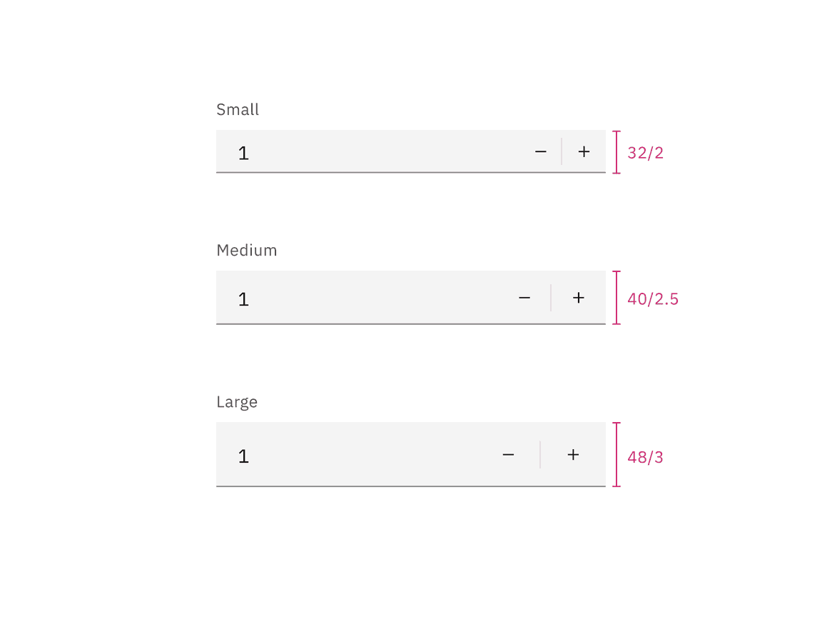
Sizing
Default input heights
Number input has three sizes default input heights: small, medium, and large. The width varies in size based on content, layout, and design.
| Size | Height (px/rem) | Use case |
|---|---|---|
| Small (sm) | 32 / 2 | Use when space is constricted or when placing a number input in a form that is long and complex. |
| Medium (md) | 40 / 2.5 | This is the default size and the most commonly used size. When in doubt, use the medium size. |
| Large (lg) | 48 / 3 | Use when there is a lot of space to work with. The large size is typically used in simple forms or when a number input is placed by itself on a page. |
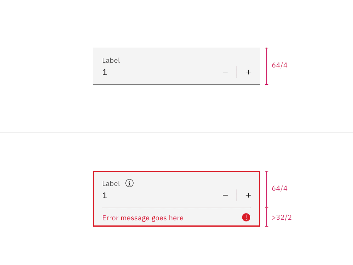
Fluid input heights
There is only one fluid input height and it is visually larger than the default heights. The input is a set height of 64px except when a warning or error message has been added to the bottom.
Content
Main elements
Label
- Always include a label so that users know how to complete the field
- Keep the label short and concise
- Use sentence-style capitalization for the label
Do include a label
Do not hide a label that helps user understand the context of number input
Helper text
- Indicates the input value if it has a maximum or minimum
- Helper text is optional but if present will be replaced by warning and error messages when needed
Overflow content
Label, numeric value, and helper text should be short and not exceed two lines.
Behaviors
States
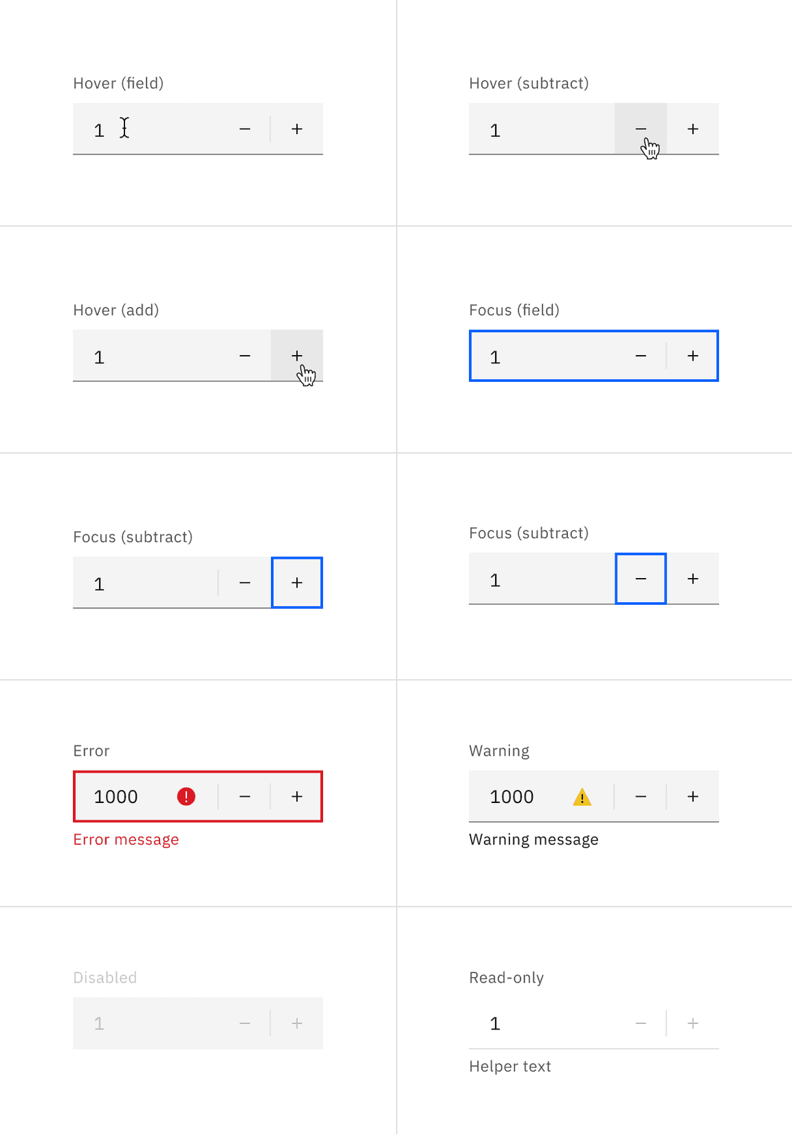
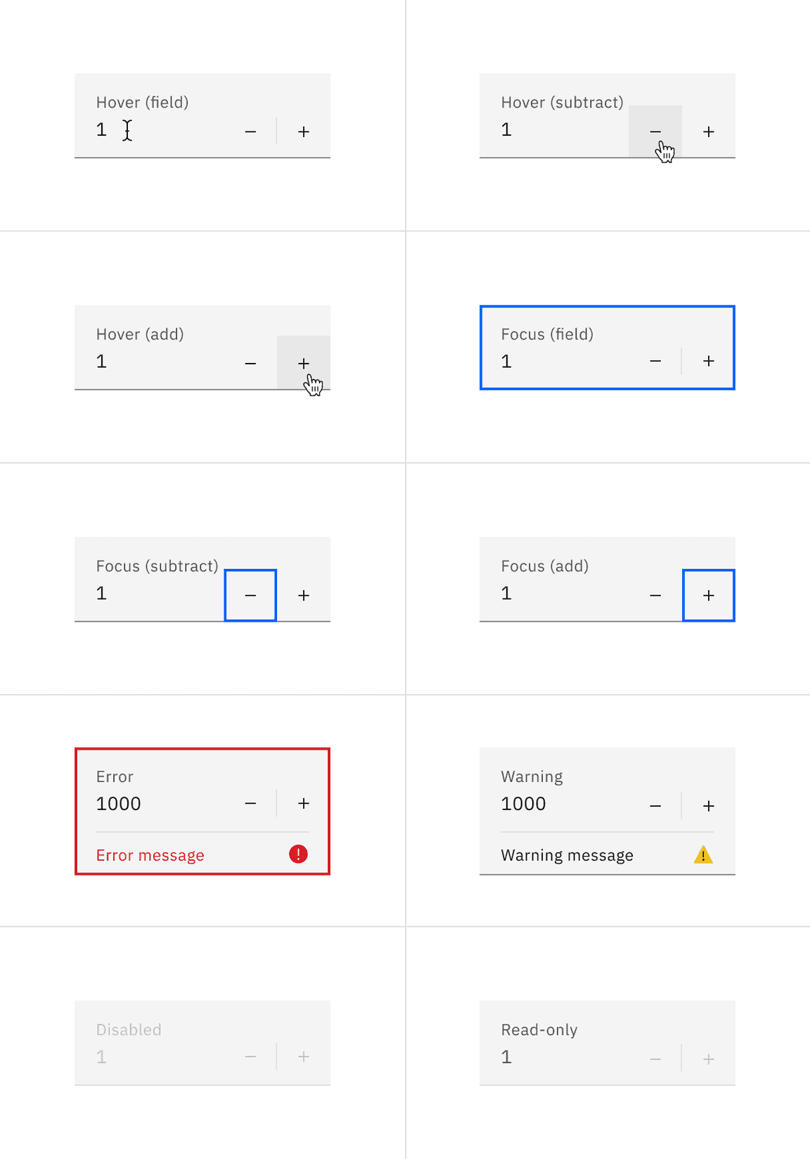
The number input has a series of states for both field and controls elements: enabled, hover, focus, error, warning, disabled, and read-only.
| State | When to use |
|---|---|
| Enabled | When the number input is live but a user is not directly interacting with it. This is commonly referred to as the default or normal state of the component. An enabled number input field should contain a default value. |
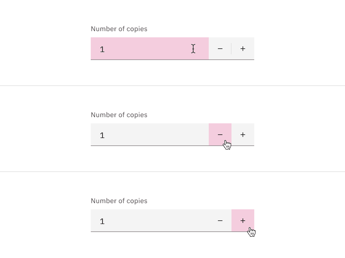
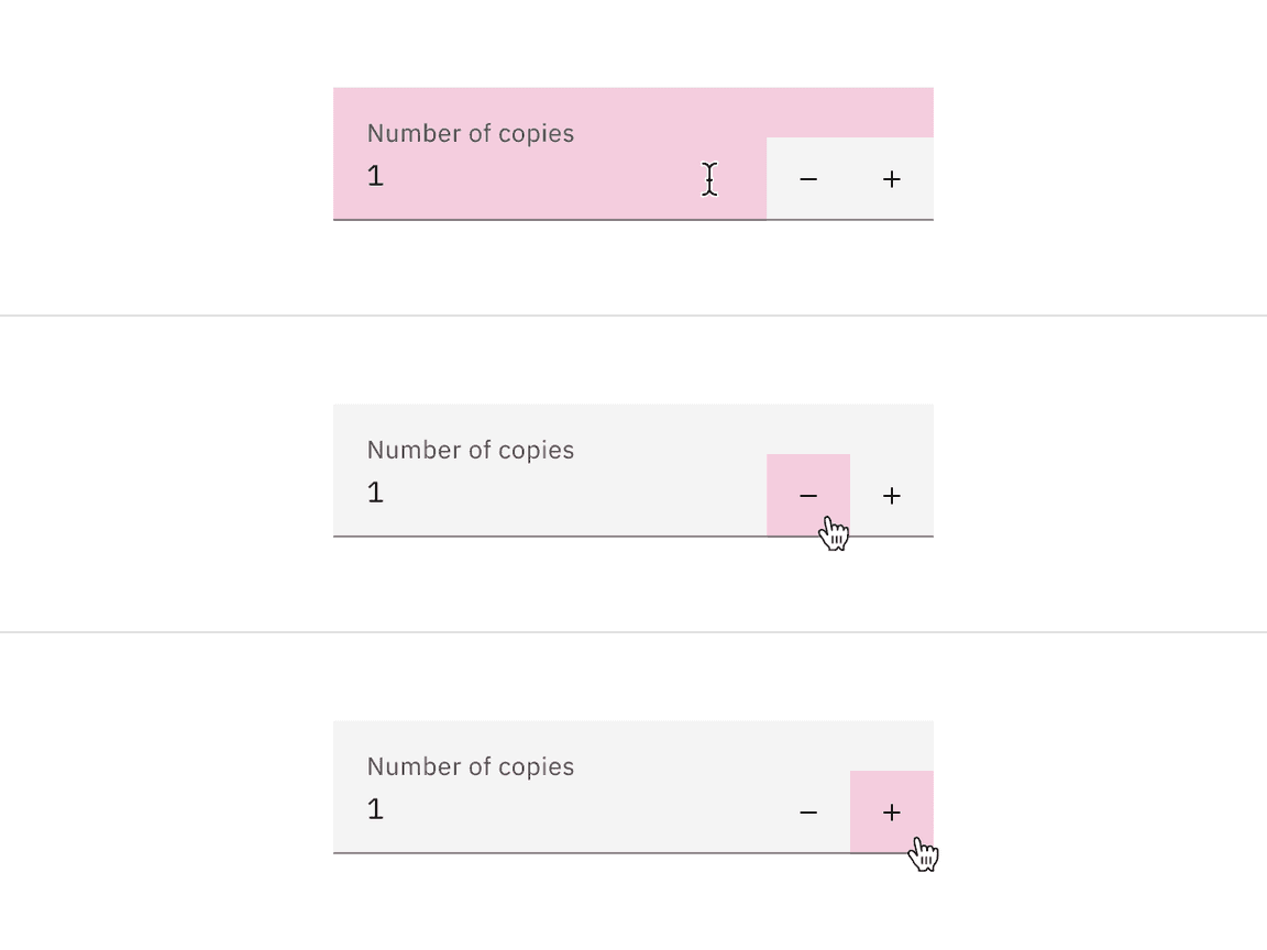
| Hover | When a user’s mouse cursor is hovering over the field or the button controls. |
| Focus | When a user tabs to or clicks on the number input, the field or controls become focused, indicating the user has successfully navigated to the component. |
| Error | When the required number input has not been filled in. It can also be triggered due to a system error. This state requires a user response before data can be submitted or saved. |
| Warning | When you need to call the user��’s attention to an exception condition. The condition might not be an error but can cause problems if not resolved. |
| Disabled | When the user cannot interact with a component and all interactive functions have been removed. Unlike read-only states, disabled states are not focusable, are not read by screen readers, and do not need to pass visual contrast, making them inaccessible if they need to be interpreted. |
| Skeleton | Use on an initial page load to indicate that the number input has not yet fully loaded. |
| Read-only | When the user can review but not modify the component. This state removes all interactive functions like the disabled state but can still be focusable, accessible by screen readers, and passes visual contrast for readability. |
Interactions
Mouse
Users can click on the input field and change the value by typing inside the input field. Users can also increase or decrease the values by pressing on the add or subtract icon controls.
Keyboard
Users can navigate to the number input field by pressing
Tab
Up arrow
Down arrow
Validation
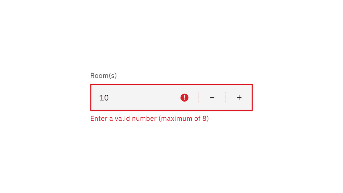
Invalid
An error state is triggered if the data is invalid or a required field is left empty. Error states have three visual indicators to signify invalid content: a red border, an error icon indicator, and an error message.
Default values
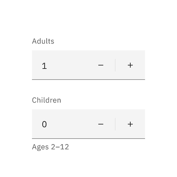
Numeric input should always have a default. The default will usually be ‘1’. Sometimes, you will have input value defaulted to ‘0’. For example, when booking a hotel room, it may set the default number of adults as ‘1’ and the default number of children as ‘0’.
Do set a clear default that most users are likely to select
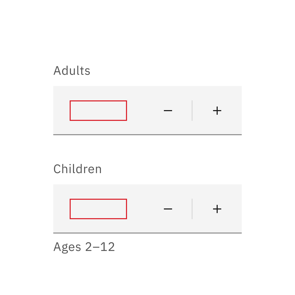
Do not leave value input blank
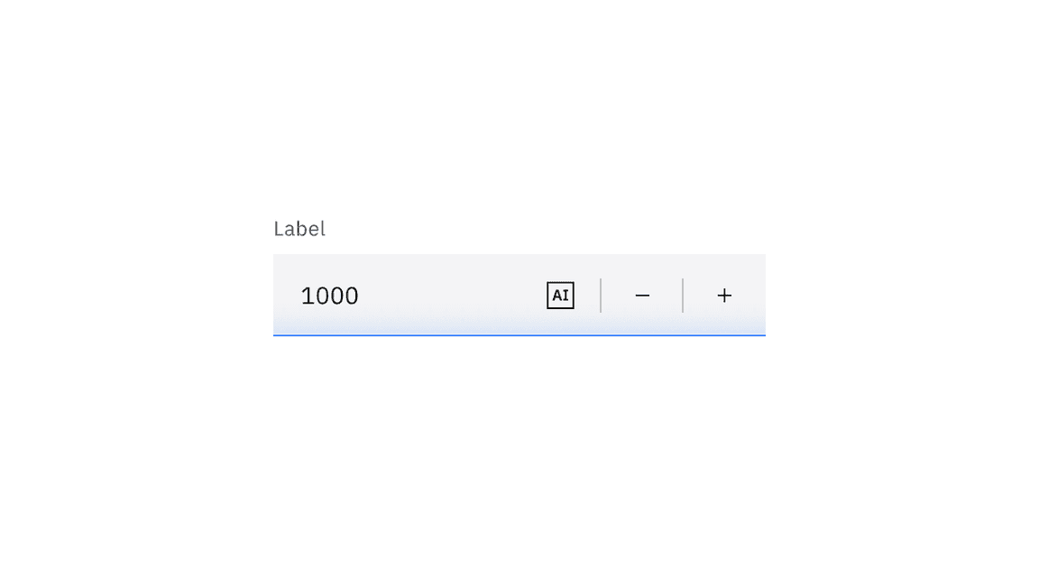
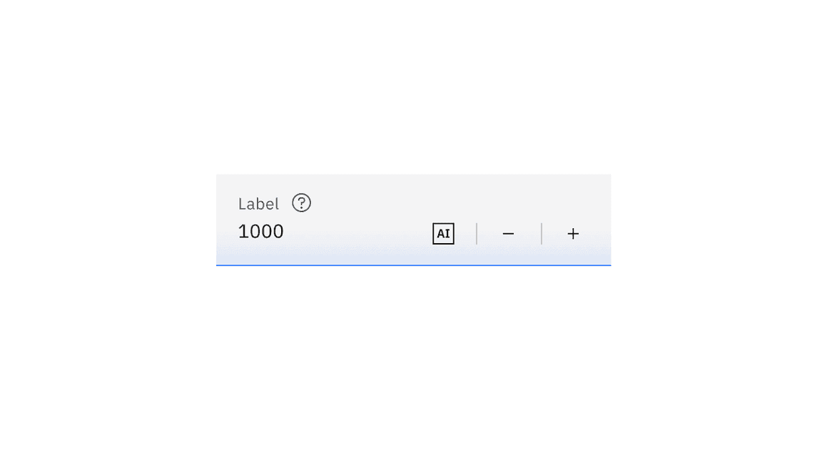
AI presence
Number input has a modification that takes on the AI visual styling when the AI label is present in the input. The AI variant of number input functions the same as the normal version except with the addition of the AI label which is both a visual indicator and the trigger for the explainability popover.
For more information on designing for AI, see the Carbon for AI guidelines.
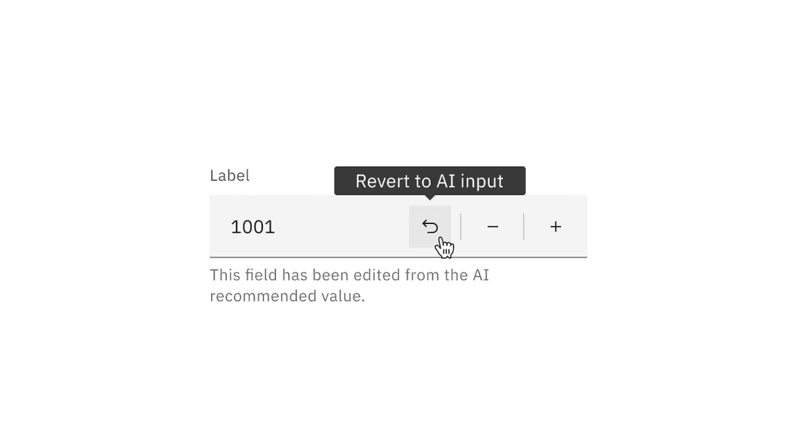
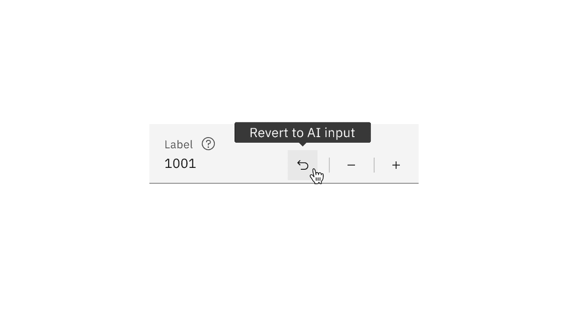
Revert to AI
A number input can toggle between the AI variant and the non-AI variant depending on the user’s interaction. If the user manually overrides the AI-suggested content then the input will change from the AI variant to the non-AI variant. Once edited, the user should still be able to switch back to the initially AI generated content via a revert to AI button.
Related
- Use slider when numeric values are large or when there is a wide range of numeric options.
- When the exact value is important to specify within a wide range, use text input instead.
References
Yuxuan (Tammy) Zhou, Design Guidelines for Input Steppers (Nielsen Norman Group, 2018)
Feedback
Help us improve this component by providing feedback, asking questions, and leaving any other comments on GitHub.