Button label should be set in sentence case, with only the first word in a
phrase and any proper nouns capitalized.
Element
Font-size (px/rem)
Font-weight
Type token
Button label
14 / 0.875
Regular / 400
$body-compact-01
Copy to clipboard
Button label (expressive)
16 / 1
Regular / 400
$body-compact-02
Copy to clipboard
Structure
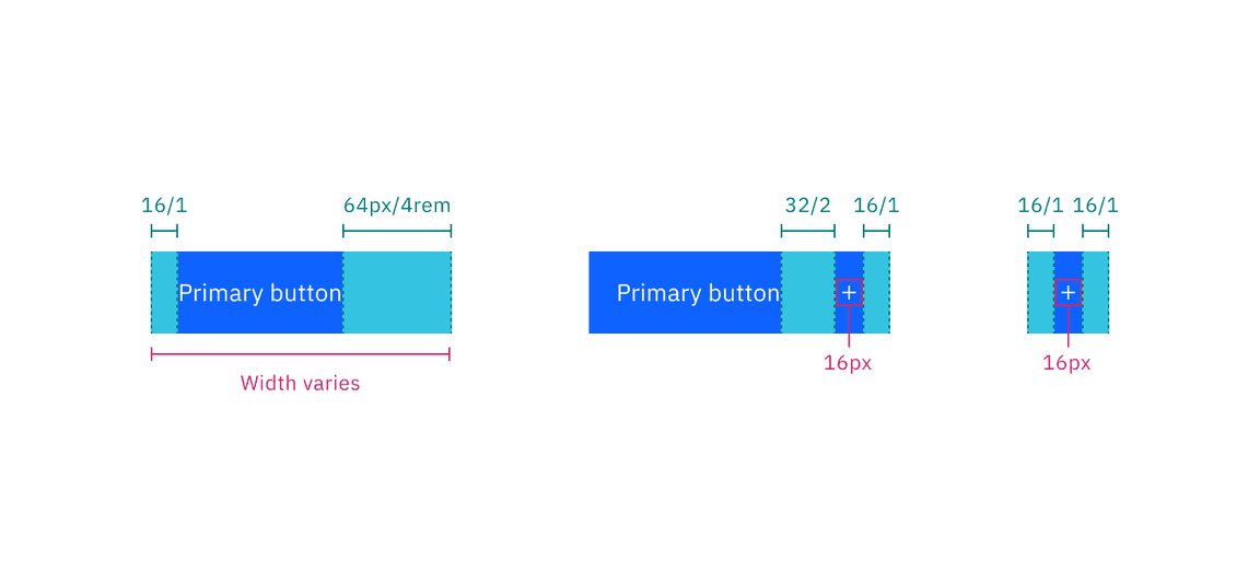
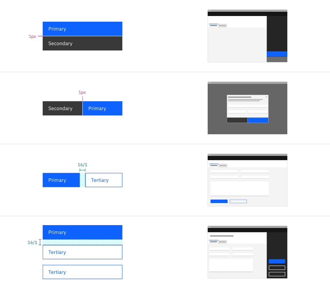
Primary, secondary, tertiary, danger primary and danger tertiary button follows
the same structure measurements. A button cannot have label or any element
within 16 pixels / 1 rem of its borders. For a button with an icon, the space
between the button label and the icon must be greater than or equal to 16 pixels
/ 1 rem. This is to accommodate for instances where two or more buttons with
icons appear together.
Button structure
Element
Property
px / rem
Spacing token
Button without icon
padding-left
16 / 1
$spacing-05
Copy to clipboard
padding-right
64 / 4
$spacing-10
Copy to clipboard
Button with icon
padding-left, padding-right
16 / 1
$spacing-05
Copy to clipboard
spacing
32 / 2
$spacing-07
Copy to clipboard
Icon only button
padding-left, padding-right
16 / 1
$spacing-05
Copy to clipboard
Icon
svg
16 x 16
–
Icon: expressive
size
20 x 20
–
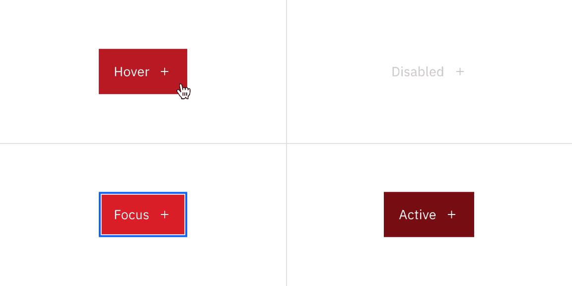
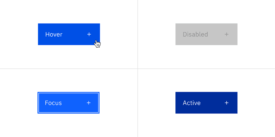
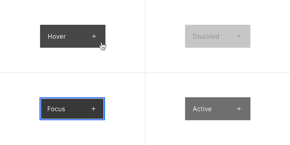
Focus
box-shadow: inset
1px
–
Structure measurements for a button | px / rem
Ghost button structure
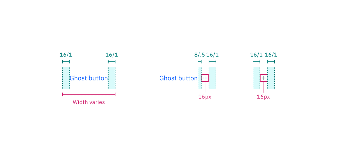
Ghost and danger ghost button follow the same structure measurements.
Element
Property
px / rem
Spacing token
Ghost button without icon
padding-left, padding-right
16 / 1
$spacing-05
Copy to clipboard
Ghost button with icon
spacing
8 / 0.5
$spacing-03
Copy to clipboard
Ghost icon only button
padding-left, padding-right
16 / 1
$spacing-05
Copy to clipboard
Structure measurements for ghost button | px / rem
Button groups structure
The following specs are not built into any of the button components but are
recommended by design as the proper distance between buttons.
For button groups, the primary button is positioned on the outside of the set,
while the secondary button is positioned inside.
Element
Property
px / rem
Spacing token
Button groups
border (fluid)
1px
–
spacing (fixed)
16px
$spacing-05
Copy to clipboard
margin-left, margin-right
0
–
Structure measurements for button groups | px / rem
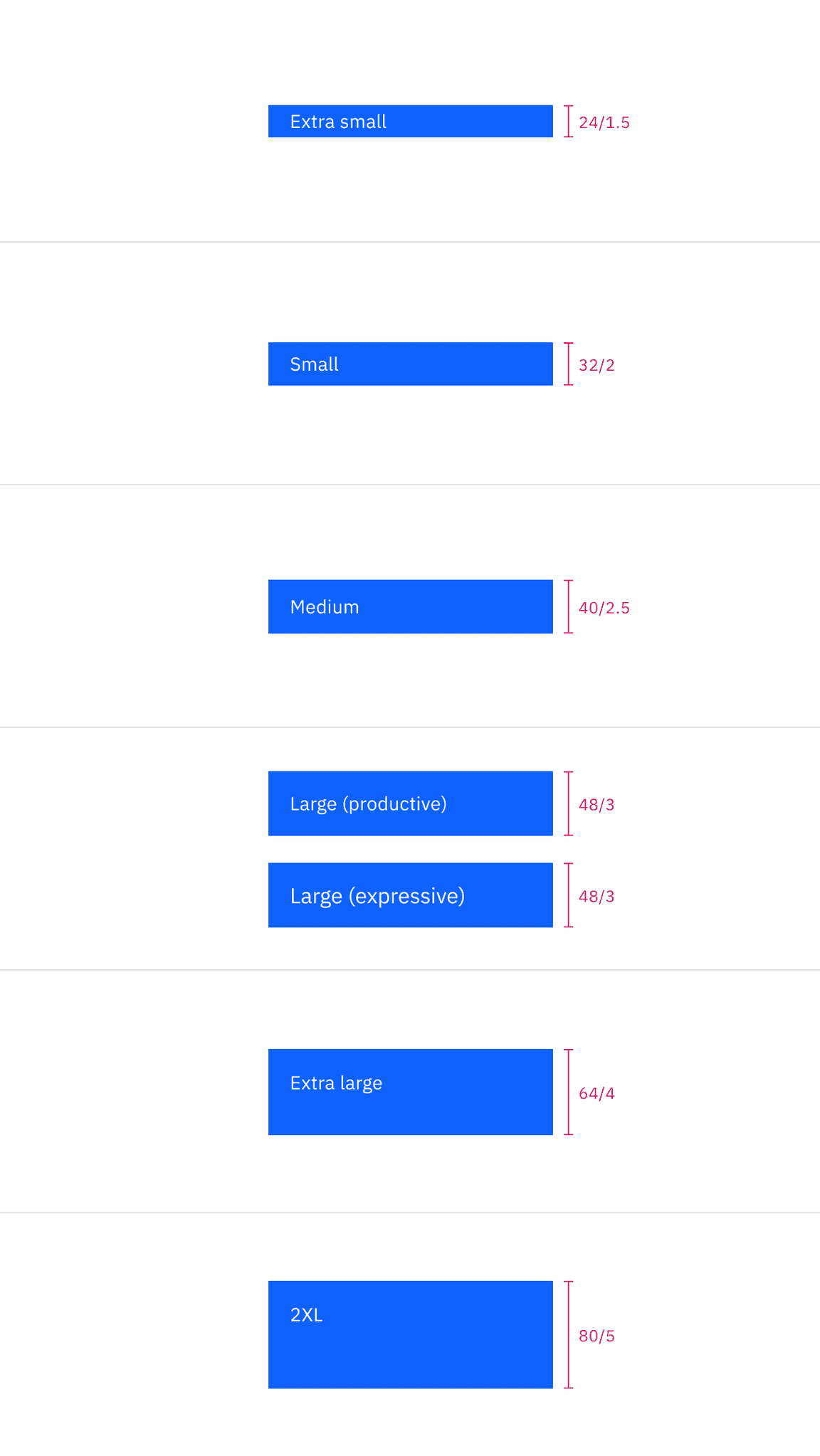
Size
There are seven button sizes: extra small, small, medium, large
(productive), large (expressive), extra large, and 2XL. The large
(expressive) button is used in editorial and digital marketing experiences. See
Button sizes on the Usage tab for more
information about specific use cases for each button size.
Variant
Size
Height (px / rem)
Button
Extra small
24 / 1.5
Small
32 / 2
Medium
40 / 2.5
Large (productive)
48 / 3
Large (expressive)
48 / 3
Full bleed button
Extra large
64 / 4
2XL
80 / 5
Button sizes
Feedback
Help us improve this component by providing feedback, asking questions, and
leaving any other comments on
GitHub.
