Select
Select allows users to choose one option from a list of values.
Live demo
This live demo contains only a preview of functionality and styles available for this component. View the full demo on Storybook for additional information such as its version, controls, and API documentation.
Accessibility testing statusFor every latest release, Carbon runs tests on all components to meet the accessibility requirements. These different statuses report the work that Carbon has done in the back end. These tests appear only when the components are stable.
For every latest release, Carbon runs tests on all components to meet the accessibility requirements. These different statuses report the work that Carbon has done in the back end. These tests appear only when the components are stable.
Overview
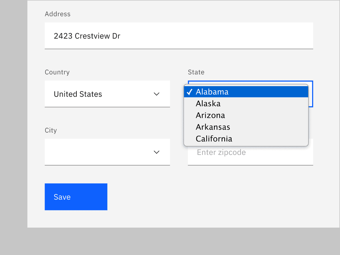
The select component collects user-provided information from a list of options. Selects are usually used in forms where a user submits data and chooses one option from a list.
When to use
-
Use the select component inside a form where users are selecting from a list of options and submitting data.
-
When the experience is mostly form-based.
When not to use
It is best practice not to use a select if there are fewer than three options for selection. In this case, use a radio button group instead.
Select versus Dropdown
While the select and dropdown components look similar, they have different functions.
-
A select presents a list of options from which the users can select only one item from that list. It works best in forms when users choose an option from the select list and submit data.
-
A dropdown presents a list of options that users can select one or several options from that list. Dropdown options are used for taking an action, filtering, or sorting existing content.
Another important difference between the two components is the underlying code. The select list appearance will be determined by the browser being used, while the dropdown list can be styled as needed.
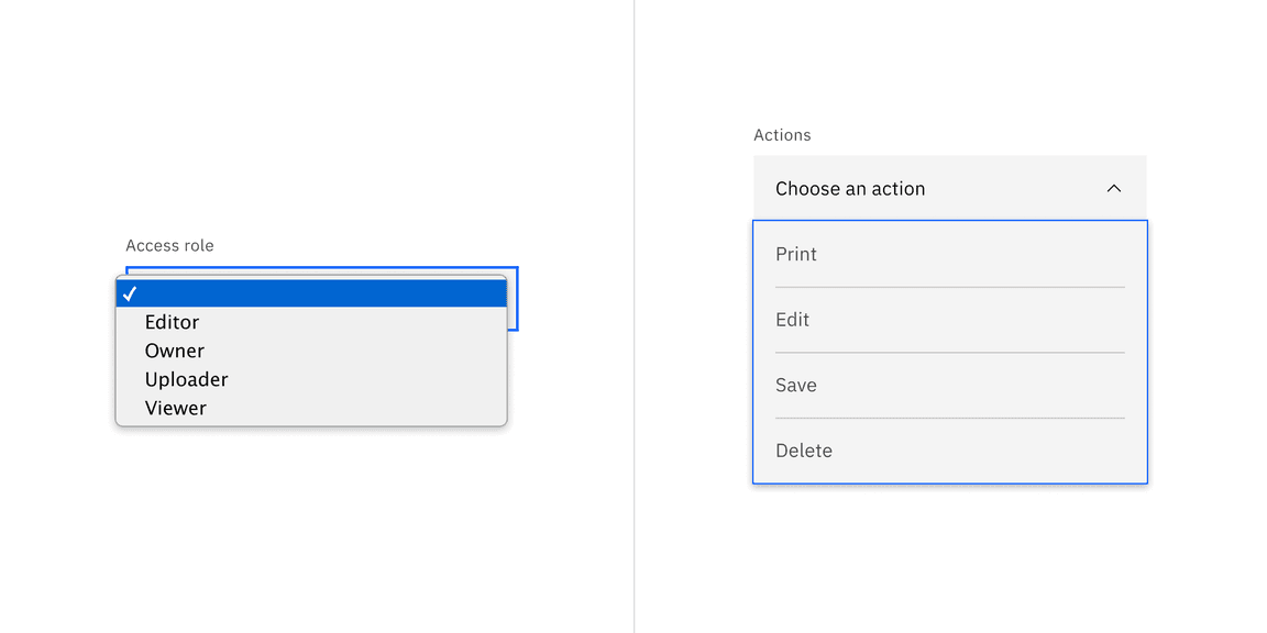
Example of a select list of options for data submission on the left versus a dropdown list of actionable options on the right.
Variants
| Variant | Purpose |
|---|---|
| Default | Typically used in forms with a variety of other components. |
| Inline select | Used when there are multiple select fields within a form. |
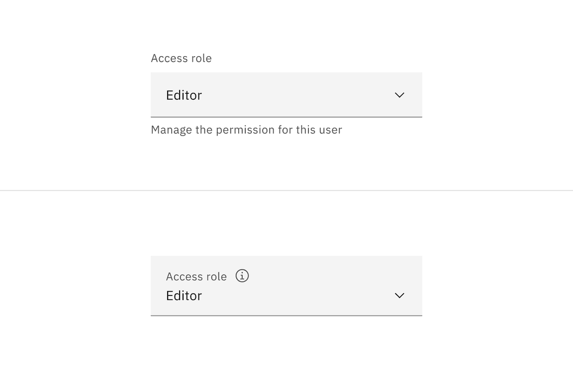
Default select
Default selects are used in forms with other components.
Inline select
Inline select is useful when you have multiple select fields within a form. Inline selects have less visual weight on a page because they are borderless.
Formatting
Anatomy
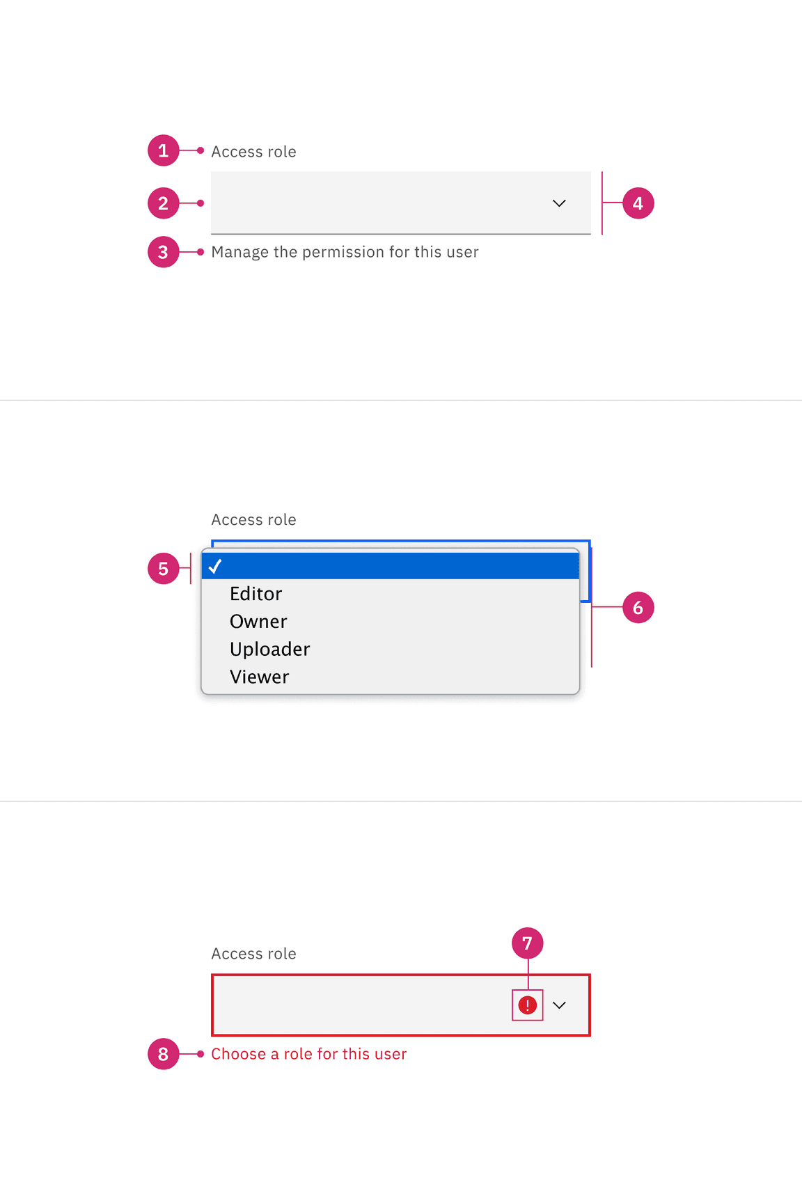
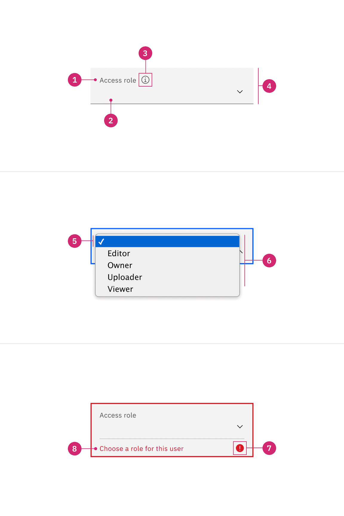
- Labels: Text that informs the user what to expect in the list of dropdown options.
- Default option: An empty option selected by default. The user can decide whether to choose a different option from the list. Depending on the use case, this defaulted behavior can be modified to be a prefilled selection to the first option in the list, which is typically shown in alphabetical order, or the prefilled selection could be a frequent or commonly used option that is on the list.
- Helper text (optional, except for error and warning): Assistive text to help the user choose the right selection. Helper text is shown in a tooltip for fluid styles.
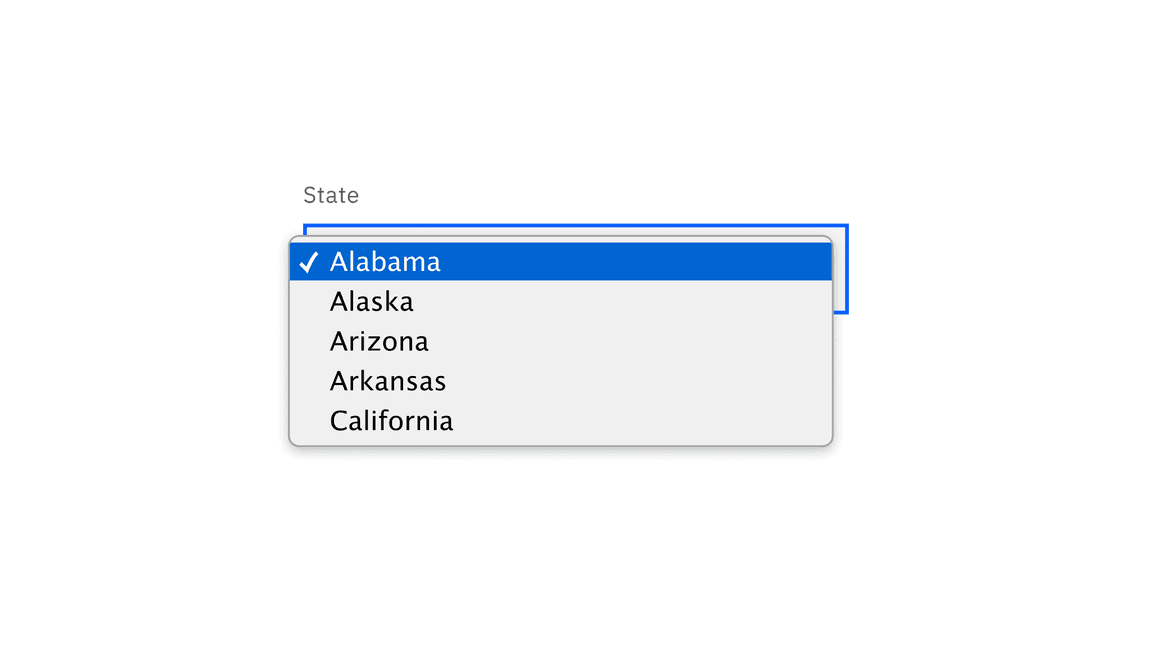
- Field: Persists when the dropdown is open or closed.
- Option: A choice for the user, shown with other choices in a list.
- List: A list of options to choose from, displayed as an open state.
- Status icon: Indicates the state of the select, either error or warning.
- Error or Warning text: Replaces the helper text when an error or warning state appears.
Styling
There are two styles of select inputs, default and fluid. They share the same functionality but look visually different, influencing where to use them.
| Style | Appearance | Use case |
|---|---|---|
| Default | A traditional style where the label is positioned outside and above the input field. | Use when white space is needed between input components or in productive moments where space is at a premium, and smaller components are needed. |
| Fluid | An alternative style where the label is placed inside of the input field and is stacked inline with the user input text. | Use in expressive moments, fluid forms, contained spaces, or attached to complex components, like a toolbar. |
Sizing
Default input heights
There are three default select height size for both variants: small, medium, and large. Supporting three different select sizes gives you more flexibility when structuring layouts. However, use a consistent size for all form components on the same page. For example, if you are using a medium size select also use the same size text inputs, buttons, and so on. When in doubt, use the default medium size height.
| Default size | Height (px/rem) | Use case |
|---|---|---|
| Small (sm) | 32 / 2 | Use when space is constricted or when placing a select in a form that is long and complex. |
| Medium (md) | 40 / 2.5 | This is the default size and the most commonly used size. When in doubt, use the medium size. |
| Large (lg) | 48 / 3 | Use when there is a lot of space to work with. The large size is typically used in simple forms or when a select is placed by itself on a page. |
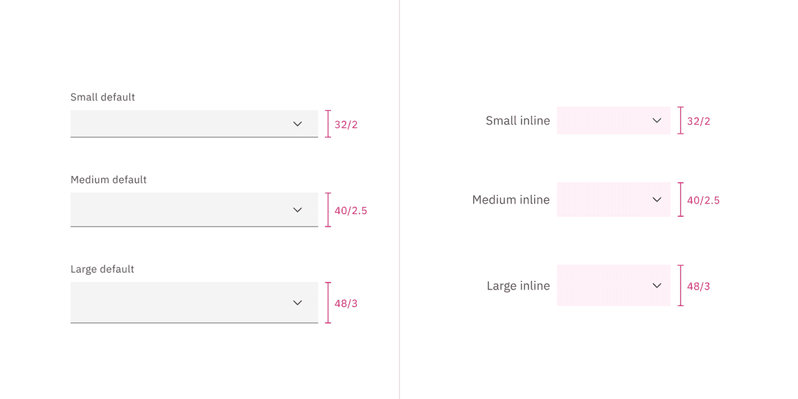
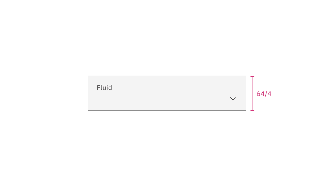
Fluid inputs heights
In the fluid select, there is only one input height. The list height is controlled by the browser.
Width
There is no minimum or maximum width for a select. The width can be customized appropriately for its context.
Content
Main elements
Label
Concise labels for text and data inputs help users understand what information is being requested of them.
- Labels inform users what to expect in the list of select options.
- Labels are not helper text; be succinct. Use one to three words only.
Helper text
- Helper text is pertinent information that assists the user in choosing the right selection from the select list.
- Helper text is optional but replaced with warning or error text when these states appear.
List order
If applicable, the list should be in alphabetical order or in increasing order relative to the content. Otherwise, the order of the select list should be based on the frequency of use.
Universal behaviors
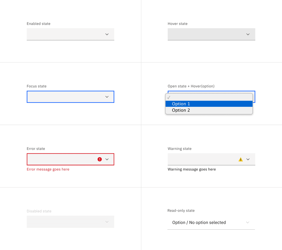
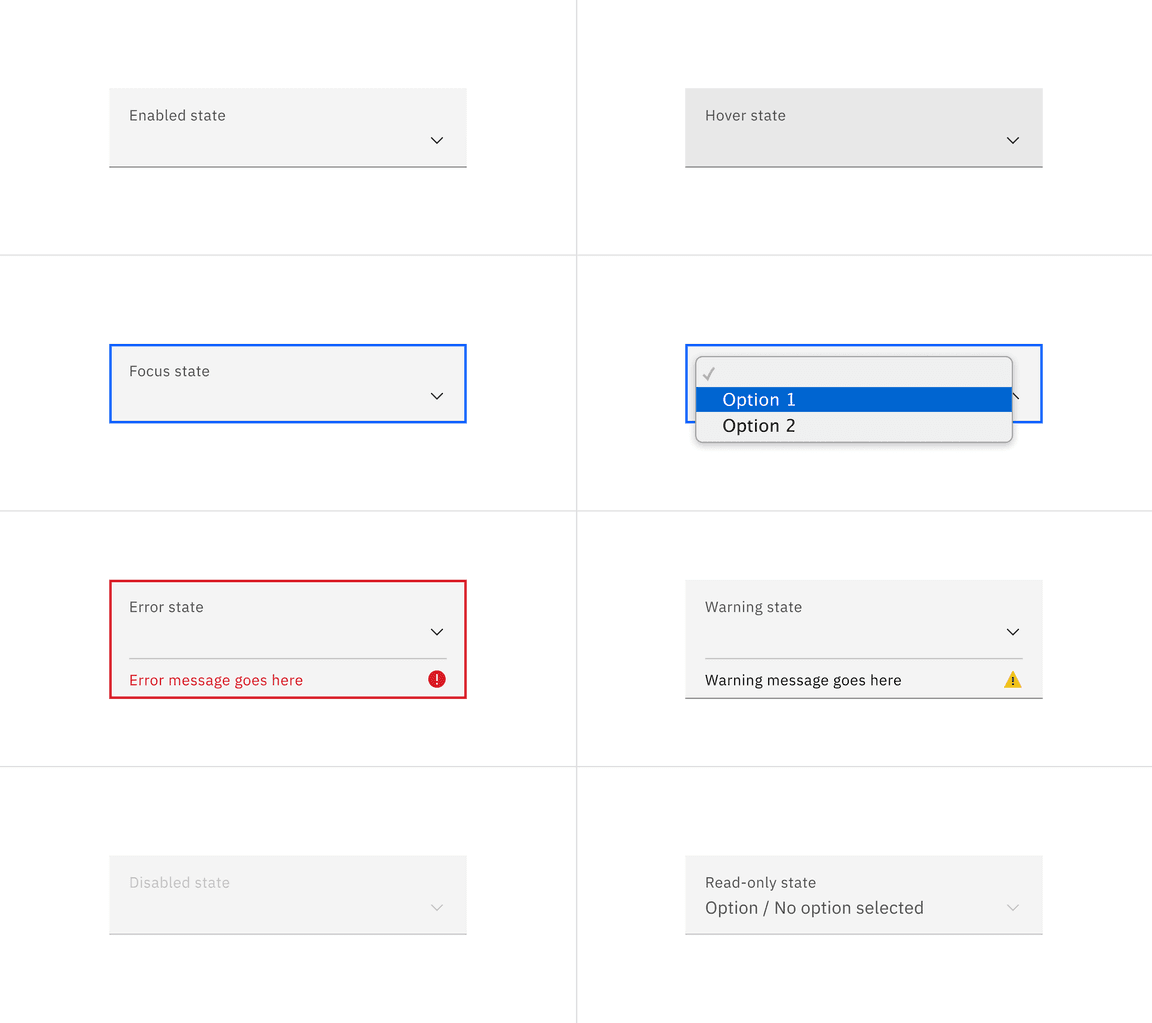
States
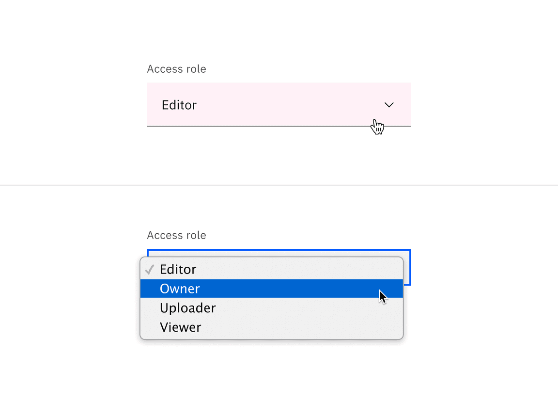
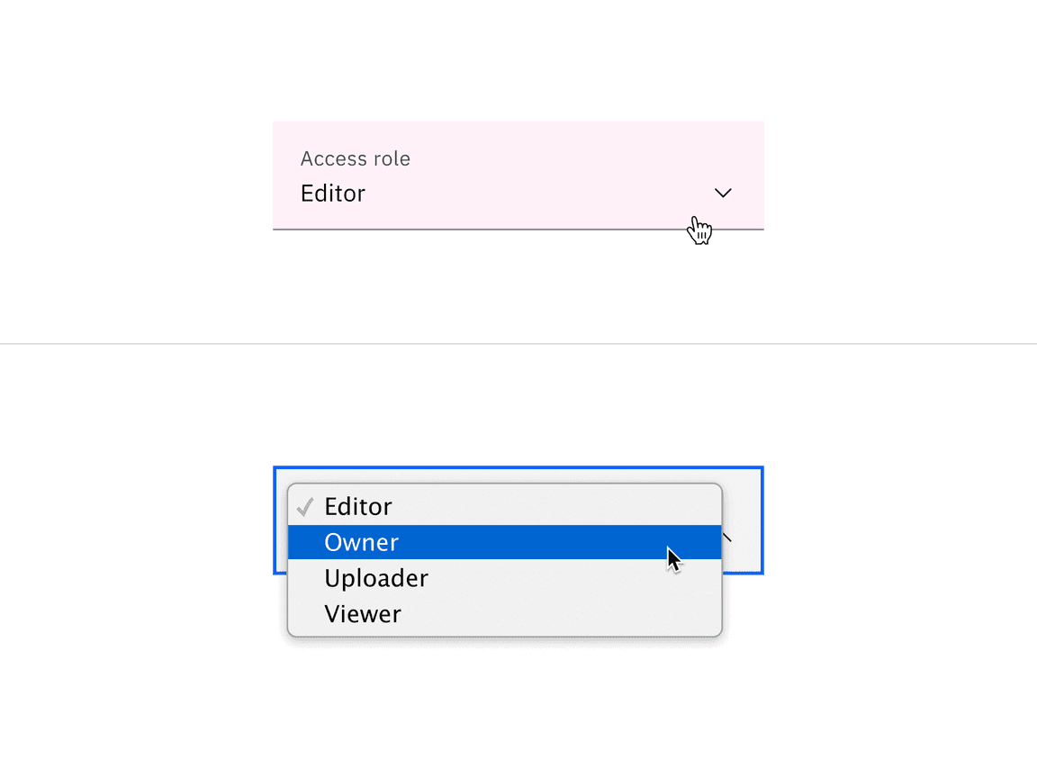
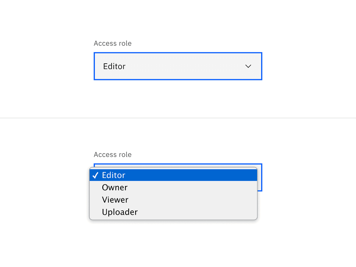
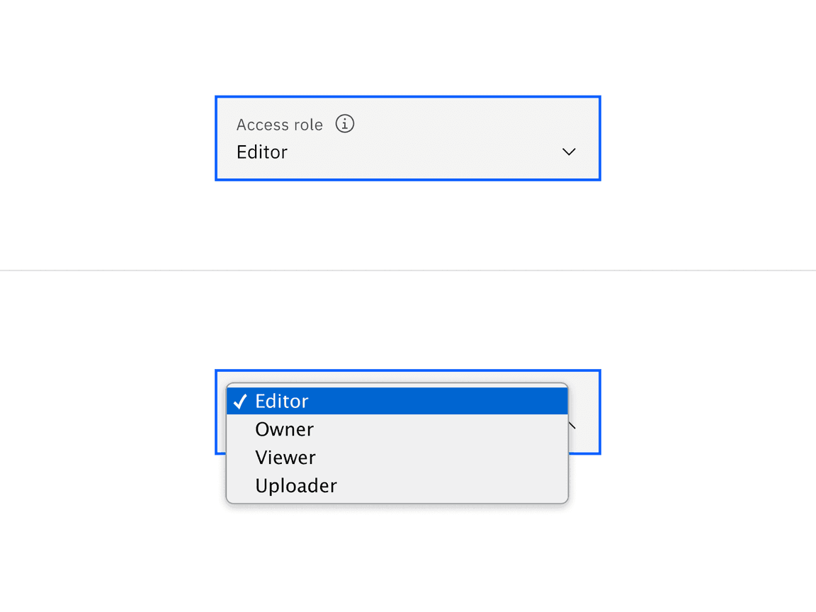
The select has multiple interactive states for both default and inline variants: enabled, hover, selected, focus, open, error, warning, disabled, skeleton, and read-only.
| State | When to use |
|---|---|
| Enabled | When the select is live and a user is not directly interacting with it. This is commonly referred to as the default or normal state of the component. An enabled select field should contain a default value. |
| Hover | When a user’s mouse cursor is hovering over the field. |
| Selected | When a user opens the list and selects an option within the list. |
| Focus | When a user tabs to or clicks on the select field, the field becomes focused, indicating the user has successfully navigated to the component. |
| Open | When a user opens the list. |
| Error | When a select component marked as “required” has not had an option selected. It can also be triggered due to a system error. This state requires a user response before data can be submitted or saved. |
| Warning | When you need to call the user’s attention to an exception condition. The condition might not be an error but can cause problems if not resolved. |
| Disabled | When the user cannot interact with a component and all interactive functions have been removed. Unlike read-only states, disabled states are not focusable, are not read by screen readers, and do not need to pass visual contrast, making them inaccessible if they need to be interpreted. |
| Skeleton | Used on an initial page load to indicate that the select has not yet fully loaded. |
| Read-only | When the user can review but not modify the component. This state removes all interactive functions like the disabled state but can still be focusable, accessible by screen readers, and passes visual contrast for readability. |
Interactions
Mouse
Users can open and close the list by clicking the chevron icon or clicking anywhere within the field. To select an option, the user can click anywhere inside an option list.
Keyboard
- The dropdown field is the element that receives focus. All keyboard interactions happen from this element.
- Users can open the list by pressing ,Space, theEnter, or theDown arrow.Up arrow
- Users can move the highlighted option to the next option by pressing the
.Down arrow
- Users can move the highlighted option to the previous option by pressing the
.Up arrow
- Users can close the list by pressing ,Escape, orSpace.Enter
Validation
Invalid
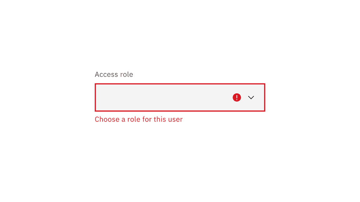
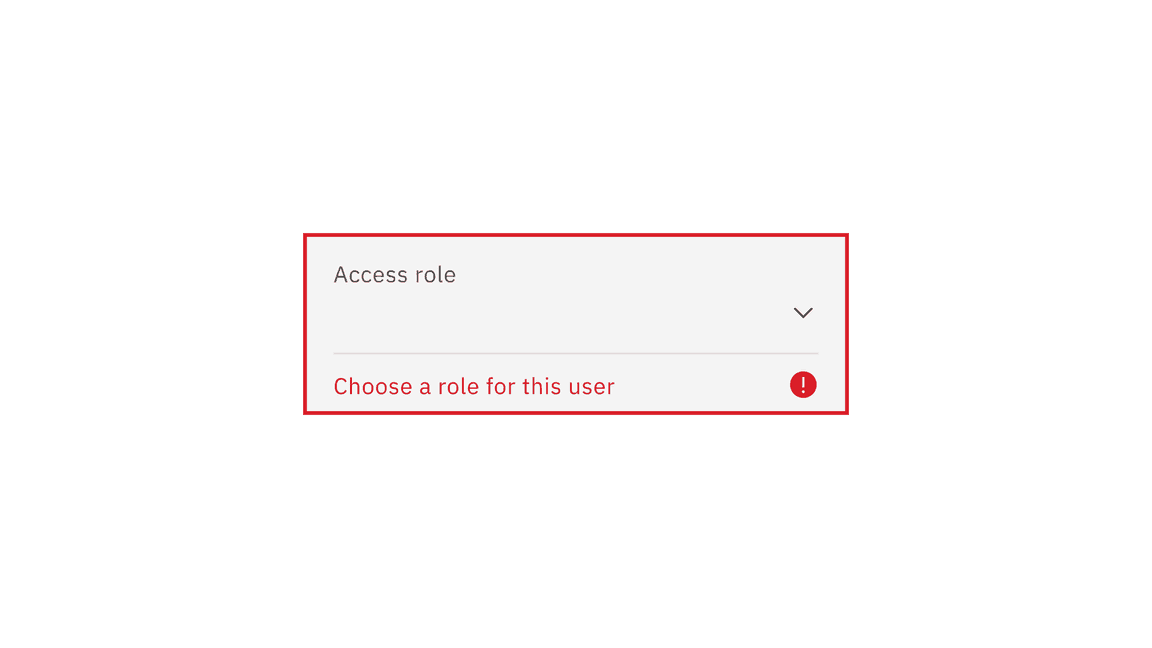
Real-time validation helps to streamline the process of filling out a form. The error state is triggered if the data is invalid or a required field is left empty. The error state has three visual indicators to signify invalid content: a red border, an error icon indicator, and an error message.
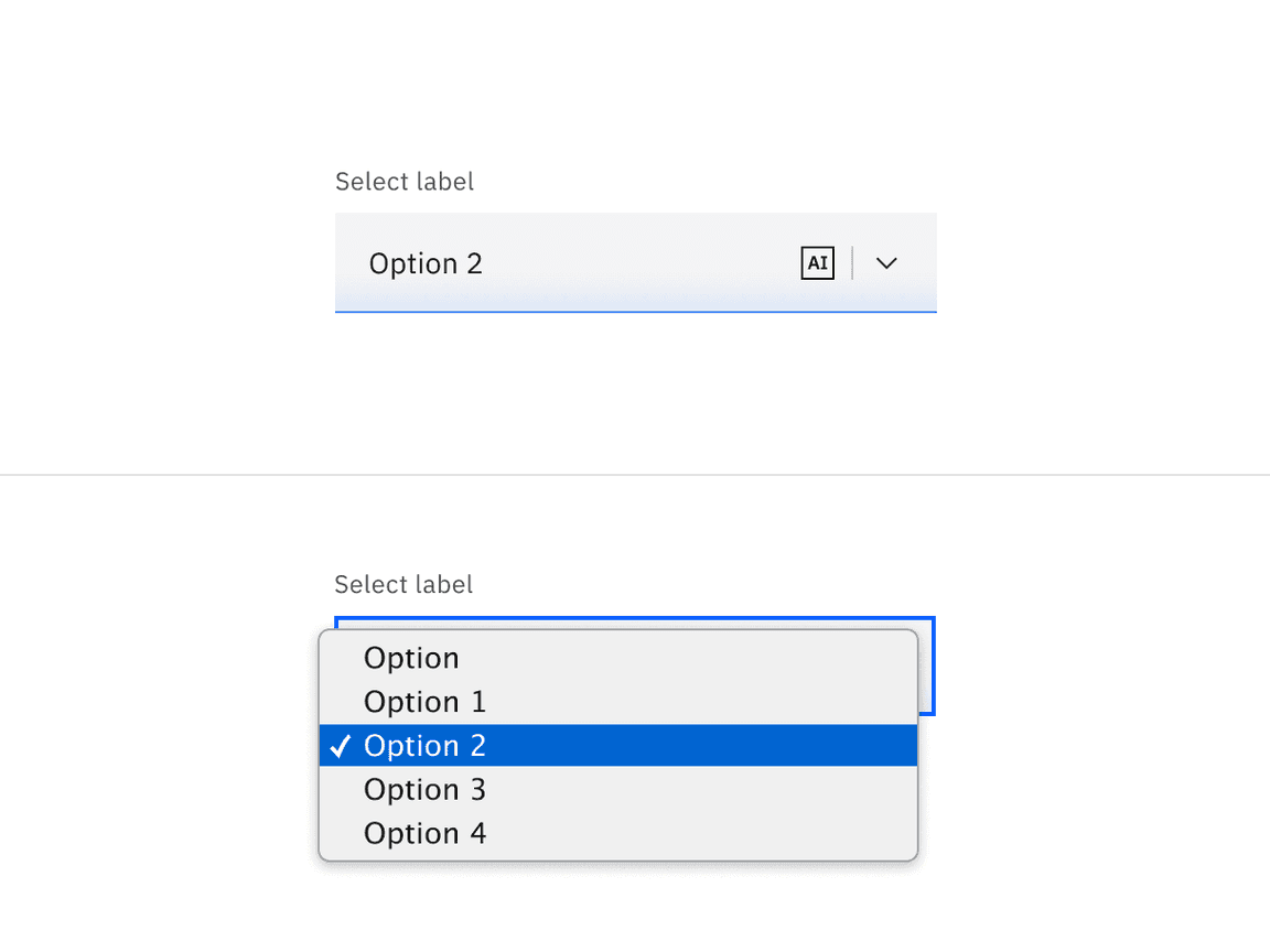
AI presence
Select has a modification that takes on the AI visual styling when the AI label is present in the input. The AI variant functions the same as the normal version except with the addition of the AI label which is both a visual indicator and the trigger for the explainability popover.
For more information on designing for AI, see the Carbon for AI guidelines.
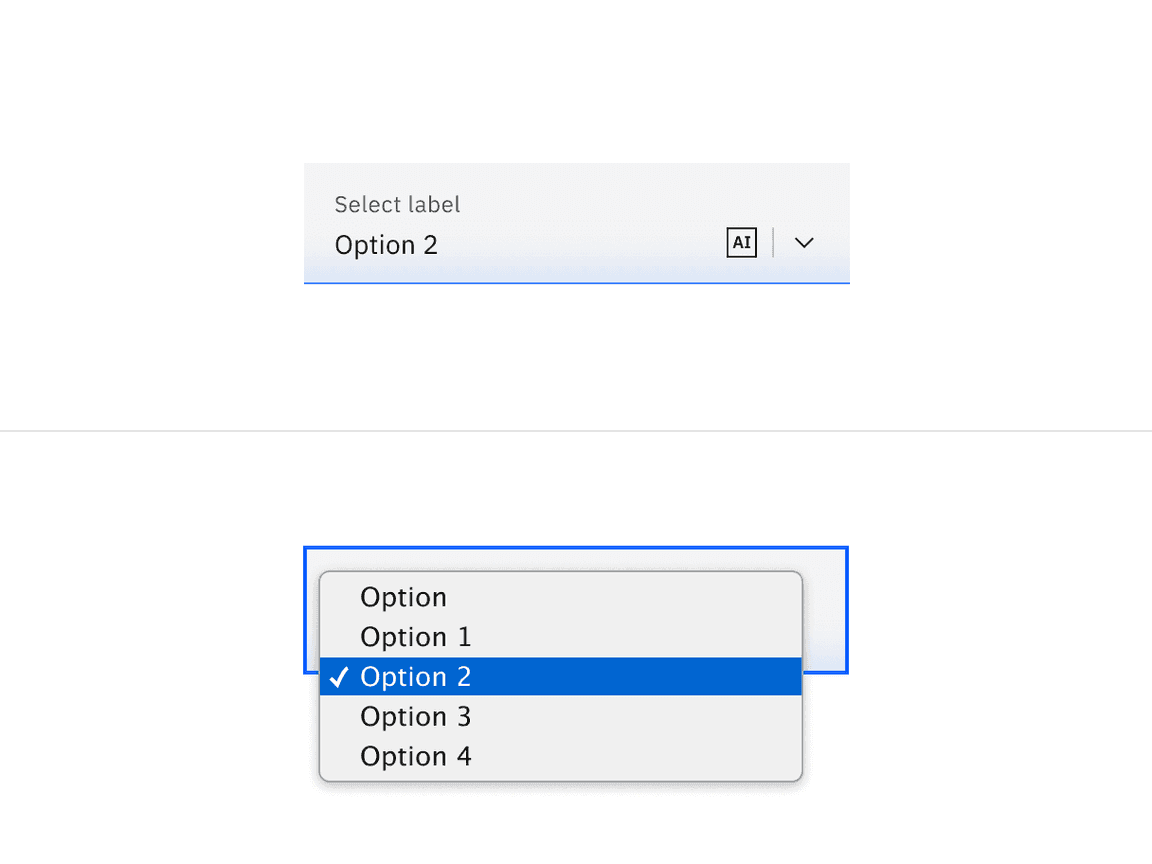
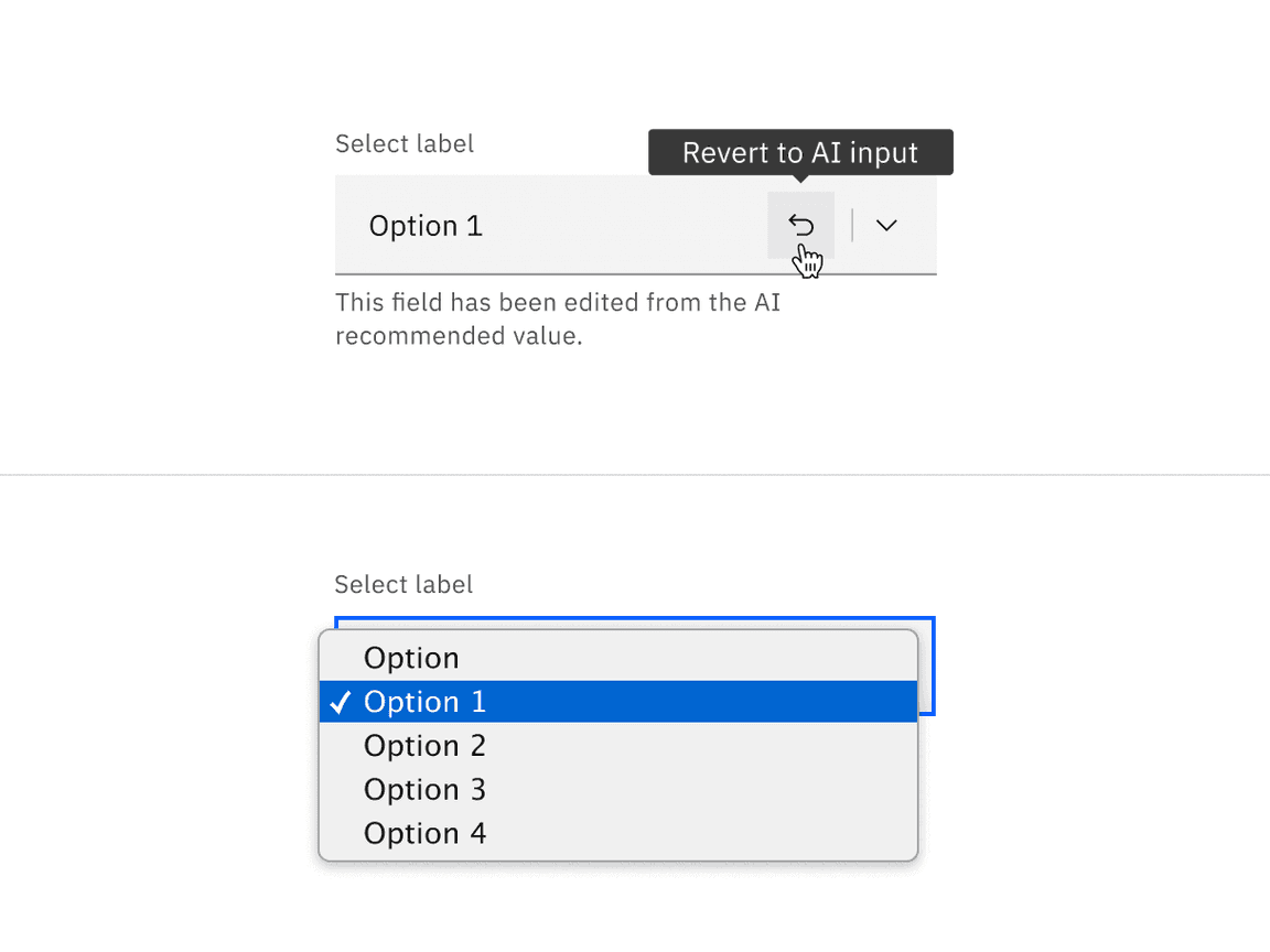
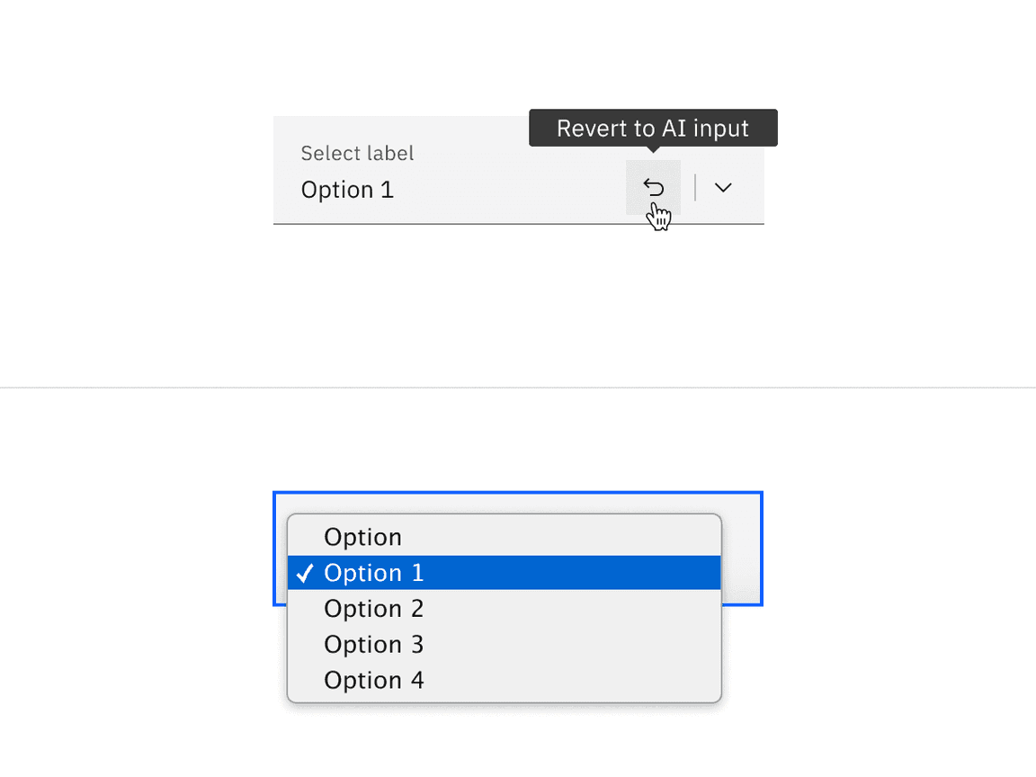
Revert to AI
A select can toggle between the AI variant and the non-AI variant depending on the user’s interaction. If the user manually overrides the AI-suggested content then the input will change from the AI variant to the non-AI variant. Once edited, the user should still be able to switch back to the initially AI generated content via a revert to AI button.
Related
- If there are fewer than three options to choose from, use a radio button group instead.
- If multi-select is necessary, use dropdown instead. Dropdown options are used to take an action, navigating outside of the current context, filtering or sorting existing content.
Feedback
Help us improve this component by providing feedback, asking questions, and leaving any other comments on GitHub.