AI label
No accessibility annotations are needed for AI labels, but keep these considerations in mind if you are modifying Carbon or creating a custom component.
What Carbon provides
Keyboard interactions
The AI labels is the trigger button. The AI label is in the tab order and is activated by pressing
Enter
Space
When the popover contains interactive elements, pressing
Tab
Tab
Esc
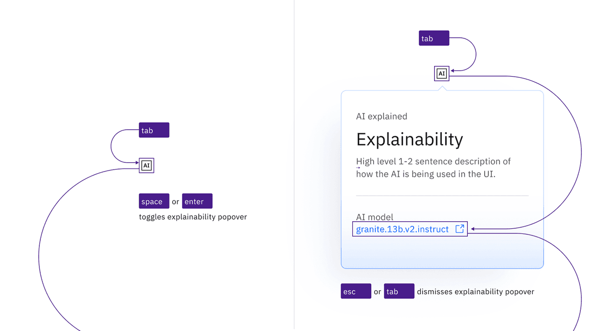
The AI label icon button that triggers the popover is in the page tab order, as are interactive elements inside an open popover.
Input interactions
The AI label can appear inside user inputs, where it adds an additional tab stop. For example, a text input will take focus as normal (the existing value will be selected), and then the AI label will take a second tab stop. If the user clears the existing AI-supplied value, (with the
Delete
revert
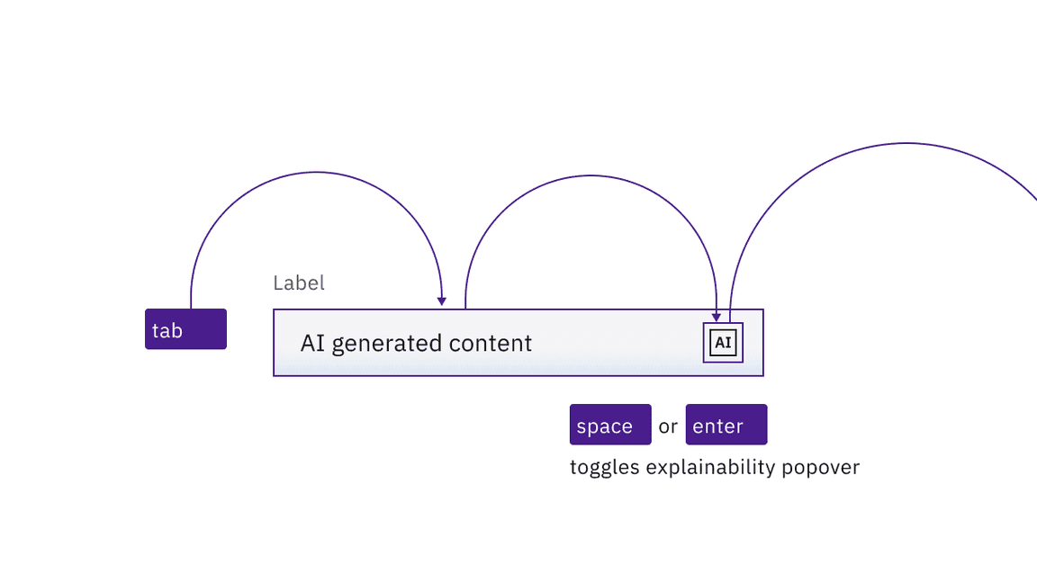
The AI label button is a second tab stop after the initial tab stop for the input.
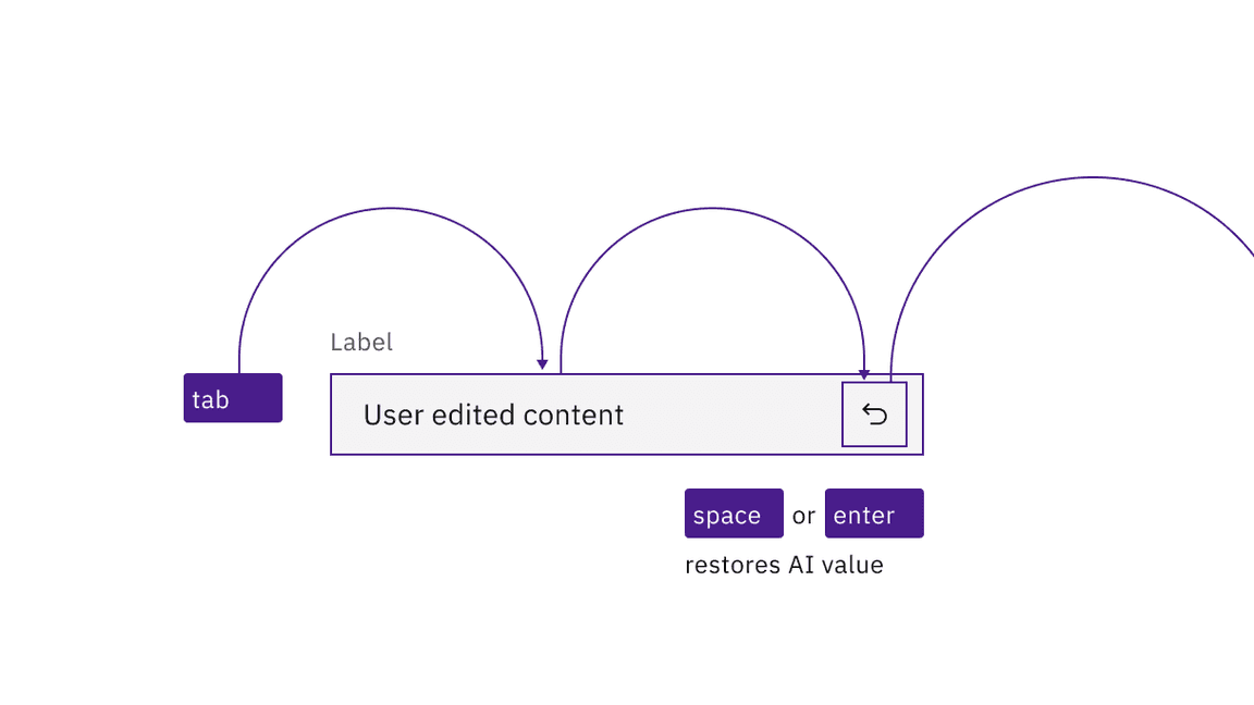
The AI label changes to a “revert” symbol if a user modifies the input value. Activating “revert” restores the prior AI value.
Development considerations
Keep these considerations in mind if you are modifying Carbon or creating a custom component.
- The icon button has .aria-label="AI - Show information"
- The button uses to set toggletip visibility andaria-expandedto handle navigation to the content.aria-controls
Accessibility testing statusFor every latest release, Carbon runs tests on all components to meet the accessibility requirements. These different statuses report the work that Carbon has done in the back end. These tests appear only when the components are stable.
For every latest release, Carbon runs tests on all components to meet the accessibility requirements. These different statuses report the work that Carbon has done in the back end. These tests appear only when the components are stable.
Latest version: | Framework: React (@carbon/react)
| Component | Accessibility test | Status | Link to source code |
|---|---|---|---|
| AI label | Test(s) that ensure the initial render state of a component is accessible. | Passes all automated tests with no reported accessibility violations. | GitHub link |
| Tests that ensure additional states of the component are accessible. This could be interactive states of a component or its multiple variants. | Passes all automated tests with no reported accessibility violations. | ||
| Tests that ensure focus is properly managed, and all interactive functions of a component have a proper keyboard-accessible equivalent. | Test data is either not available or not applicable for this component state. | ||
| This manual testing ensures that the visual information on the screen is properly conveyed and read correctly by screen readers such as JAWS, VoiceOver, and NVDA. | A human has manually tested this component, e.g. screen reader testing. |