Guide
The transition from v10 to v11 includes significant updates and additions to color tokens, theming, size naming, with new components providing better accessibility, collaboration, and efficiency for users.
Design kit
What’s new
- Added new color tokens.
- Introduced layering models: layer set tokens and contextual layer tokens.
What’s changed
- Updated existing color token names to better reflect their usage.
- Updated layer styles with new color tokens.
- Updated text styles with new token names.
- Removal of variants (in favor of new layer and contextual token sets).light
Kit migration
| Design tool | v11 | Migration strategy |
|---|---|---|
| Figma | Update available | The v11 Figma update is available as a new library with all themes in one file. See the Design Kit Figma tab for more information. Teams need to swap out assets from v10 to v11 assets to migrate. The v10 Figma files will not receive continuous updates and will remain permanently on v10. |
| Sketch | Update available | The same Sketch Cloud libraries that were used in v10 have been updated to include the v11 changes. Do not accept the library update until you are ready to work in v11. There are new v10 libraries available for teams that still need them. Note that Sketch kits will not be prioritized or maintained in the future. |
| Adobe XD | Partial update available | Some of the v11 changes have been made in the XD files, available in GitHub. Note that Adobe XD kits will no longer be prioritized or maintained. |
Figma
Migration to the new v11 Carbon libraries will be a manual process from v10. Here are some steps of how to migrate your Text and Color styles from v10 to v11.
- Swap the library from v10 to v11.
- Open the library panel and select the library.v10
- Click the button.Swap library
- Take a screenshot of the styles that didn’t swap.
- Visit the Text or Color styles file inv11.IBM Design Systems
- Duplicate the file and move it to your team’s space.
- Rename the duplicate file to a temporary name.
- Change the names of the text or color styles that didn’t swap in Step 5 to match the name and organization of v10.
- Swap to this temporary library.
- Update the names back to v11 and swap to the actual v11 library.
- Check nested components for text style overrides.
Components
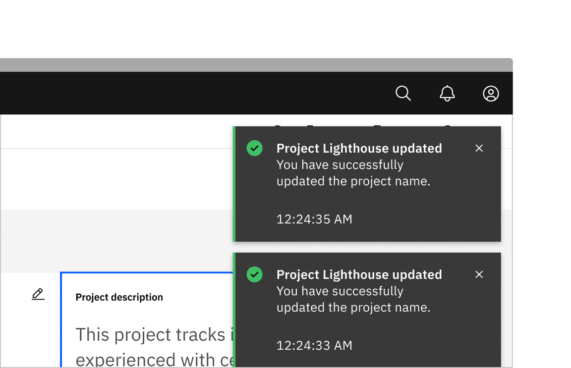
Notifications Breaking
An actionable variant has been added to the notification component. Actionable notifications allow for interactive elements within a notification, like buttons. Actionable notifications can be styled like an inline or toast notification.
See Carbon’s actionable notification usage guidance for more information.
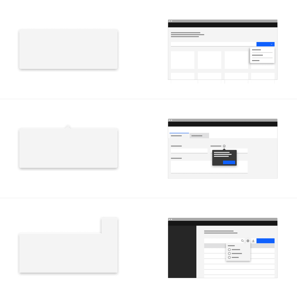
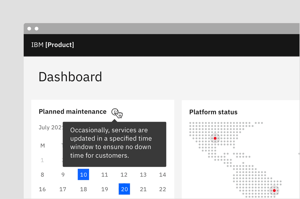
Popover New
Popover is a new component we have added to our system. A popover is a layer that appears above all other content on the page and is used to display additional details for specific elements whether it be text or interactive elements.
See Carbon’s popover usage guidance for more information.
Tooltip Breaking
The tooltip component has been refactored to use the popover component under the hood to improve accessibility.
See Carbon’s tooltip usage guidance for more information.
Toggletip New
Definition and interactive tooltips now use the toggletip component to achieve accessibility standards. Toggletip uses the disclosure pattern to toggle the visibility of a popover. This popover may contain a variety of information, from descriptive text to interactive elements. Further guidance on the toggletip component is coming soon.
See Carbon’s toggletip usage guidance for more information.
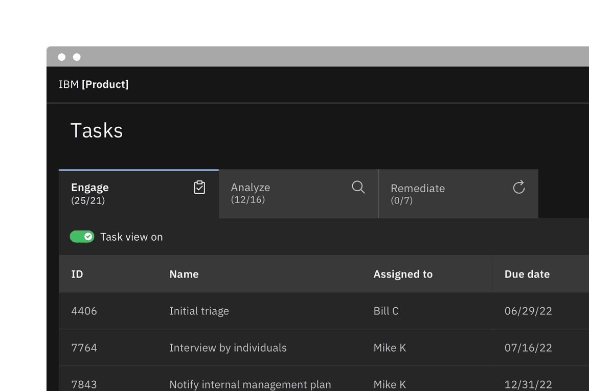
Tabs Breaking
The tab component variant names are changing. Default tabs will become Line tabs and Container tabs will become Contained tabs. There are three new modifiers—tabs with icons, icon-only tabs, and secondary labels. Additionally, there is a new third alignment option for tab that allows for auto-widths where each tab size is determined by the label length.
See Carbon’s tabs usage guidance for more information.
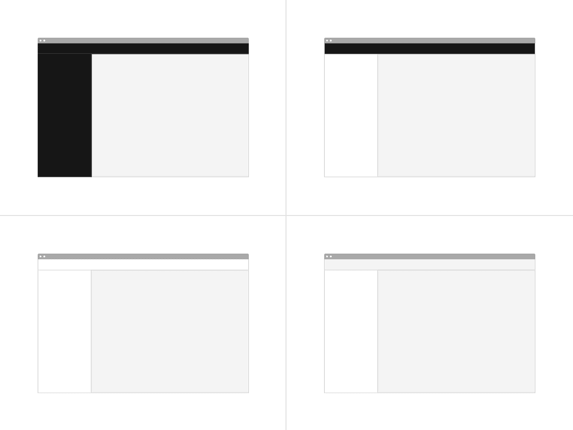
UI shell Updated
The UI shell is now themeable and has been updated to use inline theming. The UI shell uses Carbon theme tokens instead of component specific tokens and the color will follow each themes styles.
Sizing Breaking
All size properties for components have been renamed to be more consistent with the pixel/rem value that it is paired with.
| Size | Height (px / rem) |
|---|---|
| Extra small (xs) | 24 / 1.5 |
| Small (sm) | 32 / 2 |
| Medium (md) | 40 / 2.5 |
| Large (lg) | 48 / 3 |
| Extra large (xl) | 64 / 4 |
| Double extra large (2xl) | 80 / 5 |
Type tokens Breaking
The two v10 type sets—Productive and Expressive—have been blended together to work as a unified collection in v11. As a result of this convergence, type token names have been renamed to better define their relationship to one another and reflect its styling.
See Carbon’s typography guidance for more information.
Compact styles
Some tokens now have a compact designation, meaning the only difference it has with the token of a similar name is a variation in line height.
Body styles
The four body styles stay the same but their names have been updated. The
long
body
short
body-compact
- →$body-long-01$body-01
- →$body-short-02$body-compact-02
Heading styles
Productive and expressive while still a concept used to express different “moments” are no longer used in the type token header names. There are two new classifications—Fixed and Fluid.
Fixed headings
Fixed headings, for the most part take the place of what were the v10 productive headings. The first two v10 expressive headings are also now included in the fixed type set. They are called “fixed” because they do not change sizes across breakpoints and always remain a single fixed size. However, the term fixed is not included in the token name but simply named
heading
- →$productive-heading-03$heading-03
Fluid headings
Fluid headings take the place of the v10 expressive heading. These headings are responsive and the type styles change size at different breakpoints.
- →$expressive-heading-05$fluid-heading-05
Resources
Color tokens Breaking
Existing color tokens have been renamed to better reflect their usage. In addition to renaming existing tokens, new tokens have been added to fill gaps in the color token system and fix complex layering logic.
Color token names
Previously, in v10 many color tokens had numeral endings, now in v11 only layering tokens will have this distinction. All other tokens have been given an adjective descriptor in place of the number ending to help users better understand how a token should be used. The new naming convention is as follows:
[element] - [role] - [order] - [state]
See Carbon’s color overview guidance for more information.
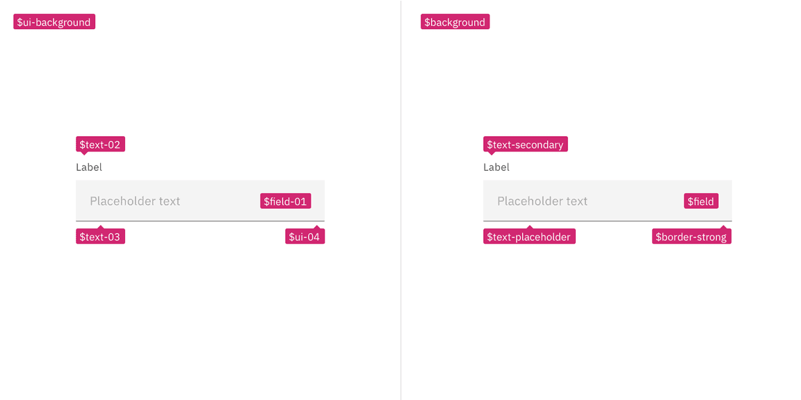
Examples showing v10 tokens on the left and v11 tokens on the right
Layer model tokens New
We have introduced two new types of color token for the layering models—Layering tokens and Contextual layer tokens. The two types of tokens will produce the same visual effect. The difference between them is a technical one and largely a developer concern. In Sketch, and other design tools, designer will only use the layering tokens to design. The layering tokens replace what were the
ui
See Carbon’s color usage guidance for more information.
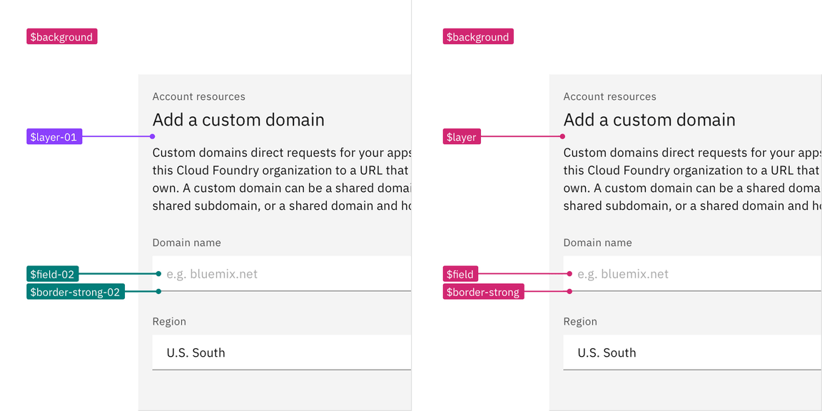
Examples showing layering tokens on the left and contextual tokens on the right
Resources
Theming
Inline theming
Inline theming is available to use in your product. Inline theming is used when a section of a UI needs to have a different theme from the rest of the page and allows themes to be nested within each other without needing custom styles or overrides. In product, a common use-case for inline theming is applying a contrasting theme to a UI shell and side panels.
See Carbon’s inline theming guidance for more information.
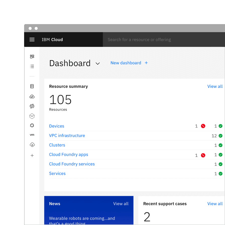
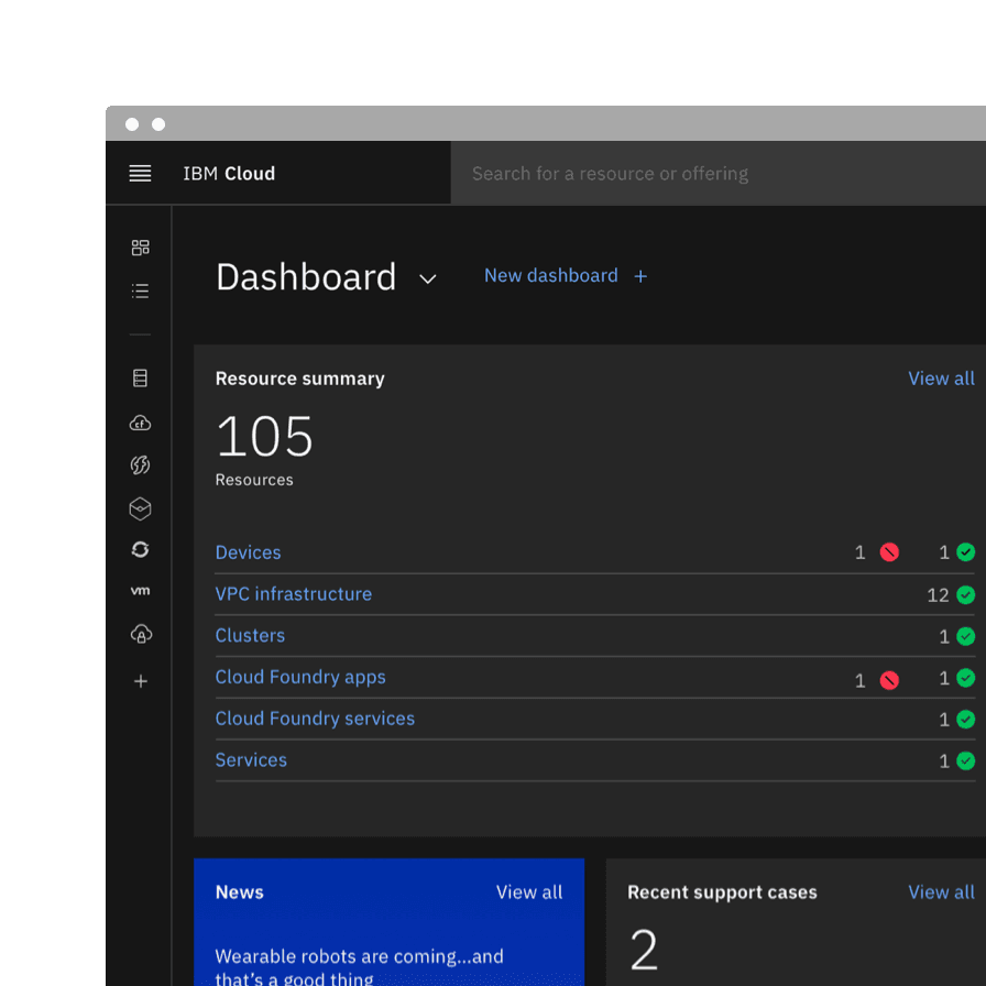
Light or dark mode
Light or dark mode has been newly introduced and is a theme setting that allows the end user to choose a UI that is either predominately light or dark in color. The UI will automatically switch from using light color backgrounds with dark color text to using dark color backgrounds with light color text.
See Carbon’s light or dark mode guidance for more information.