Design kits
Rapidly build beautiful and accessible experiences. The Carbon kit for Figma contains all resources you need to get started.
Overview
Carbon provides separate Figma kits for internal IBMers and external users. To get started, follow the instructions that align with your role in the Internal users or External users sections below.
Internal users
Get the libraries
1. Sign into Figma using IBM SSO
You should be added to the IBM Figma organization automatically once you sign in. You do not need to join or request to join any specific team to access the libraries.
2. Turn on the Carbon themes library
The
(v11) Carbon Design System
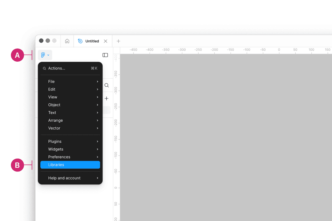
Inside of a design file, navigate to the Main menu panel in the top left of the toolbar (A). Open the menu and select Libraries from the list (B).
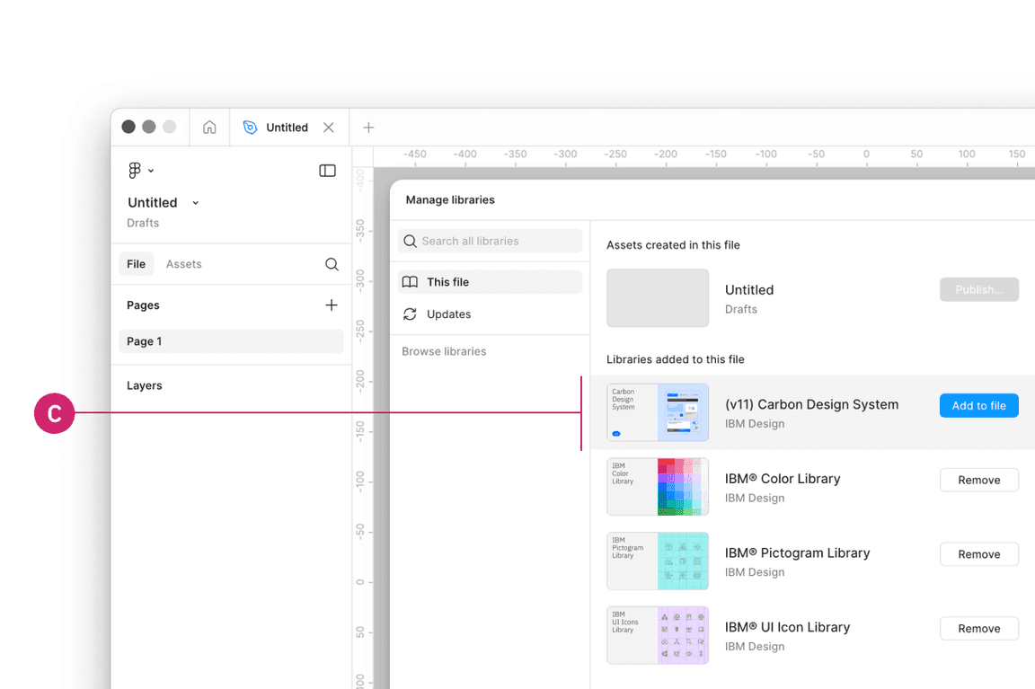
Then in the Libraries modal that appears, find the
(v11) Carbon Design System

3. Turn on IBM Design Language libraries
You can optionally also turn on the following IBM Design Language libraries or visit these view-only links.
- (v11) Carbon Type Sets - IBM Design Language
- IBM® Color Library - IBM Design Language
- IBM® UI Icon Library - IBM Design Language
- IBM® Pictogram Library - IBM Design Language
External users
Get the libraries
1. Sign into Figma
2. Get the theme libraries
The
(v11) Carbon Design System
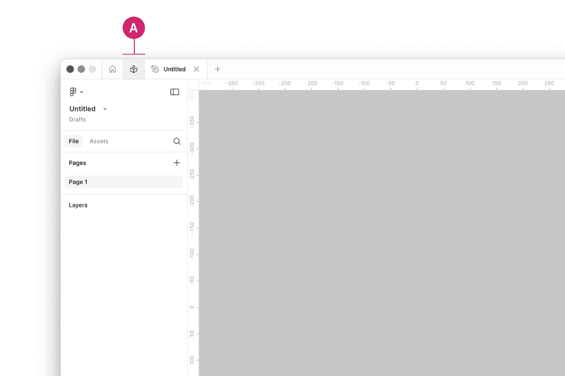
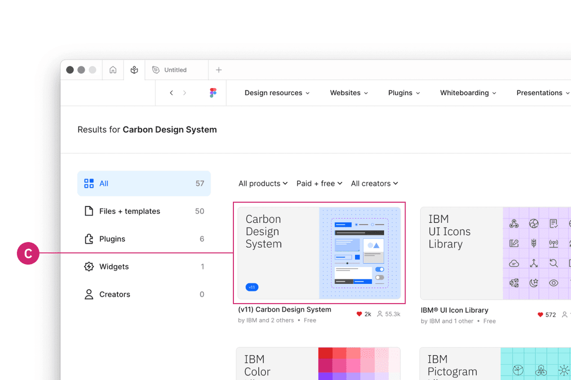
Navigate to the Community icon in the header (A).
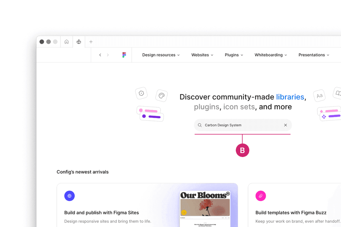
Search for Carbon Design System (B).
See the
(v11) Carbon Design System
3. Duplicate the file of your choice to your workspace
4. Publish as a library to your workspace
To preview the
(v11) Carbon Design System
5. Bring in additional colors and icons
Use these additional IBM Design Language libraries to have access to type sets, color, icons, and pictograms.
Start designing
Components
Included in the library are all of the Carbon components and their variants. To insert a component, go to the Asset panel and find the component you would like to use. Drag it from the asset panel onto the canvas.
View the name of the component in the right sidebar. If the component has variants, you’ll see fields and controls underneath the component name to configure the properties and values of that component set.
For more help on how to use Figma components, see the Figma docs.
Grids and screens
Included in the library is an asset called
Screens
Color variables
The Carbon color tokens are surfaced in Figma using variables. To apply a color variable, select an object. Then in the fill or stroke sections in the right panel, open the menu to select a variable from the Carbon theme libraries or the IBM Design Language libraries. In addition to applying color variables to objects, you can also apply them to text layers.
To learn more about applying color variables in Figma, see the Figma docs.
Text styles
To apply a text style, select a text layer, then in the properties panel, choose a text style from the
(v11) Carbon Type Sets
To learn more about applying text styles in Figma, see the Figma docs.
Feedback
Help us improve this component by providing feedback, asking questions, and leaving any other comments on GitHub.