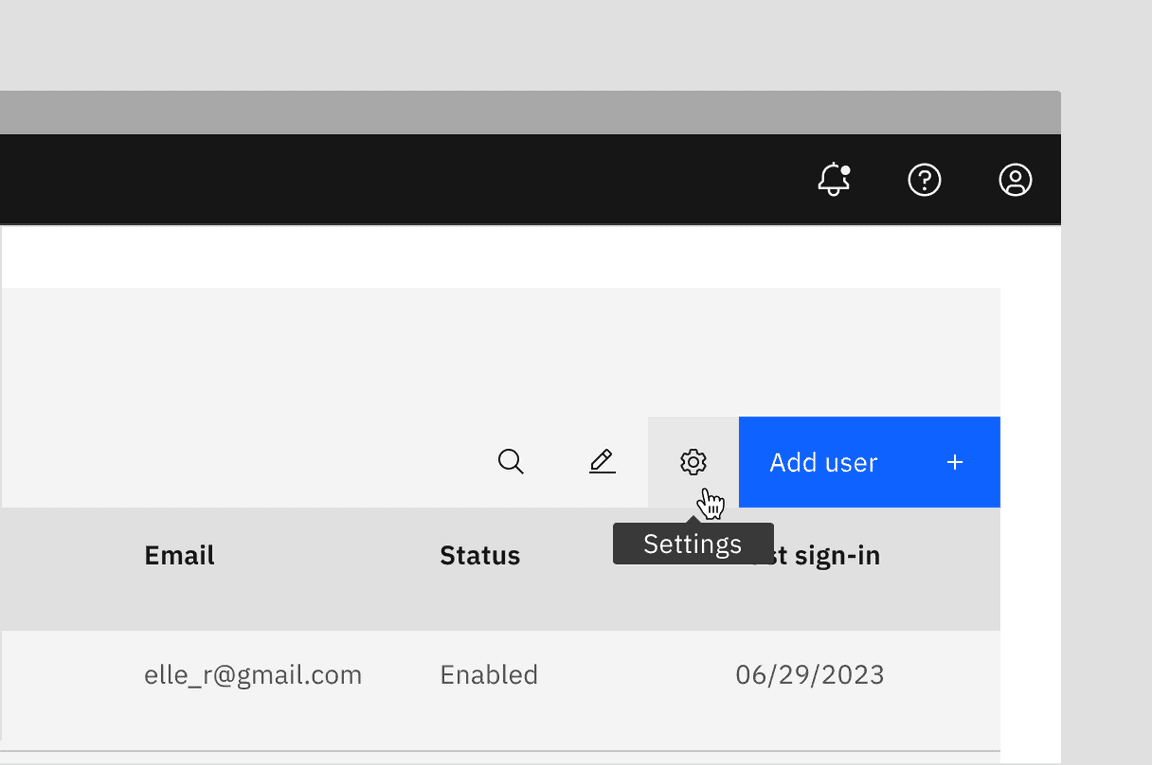
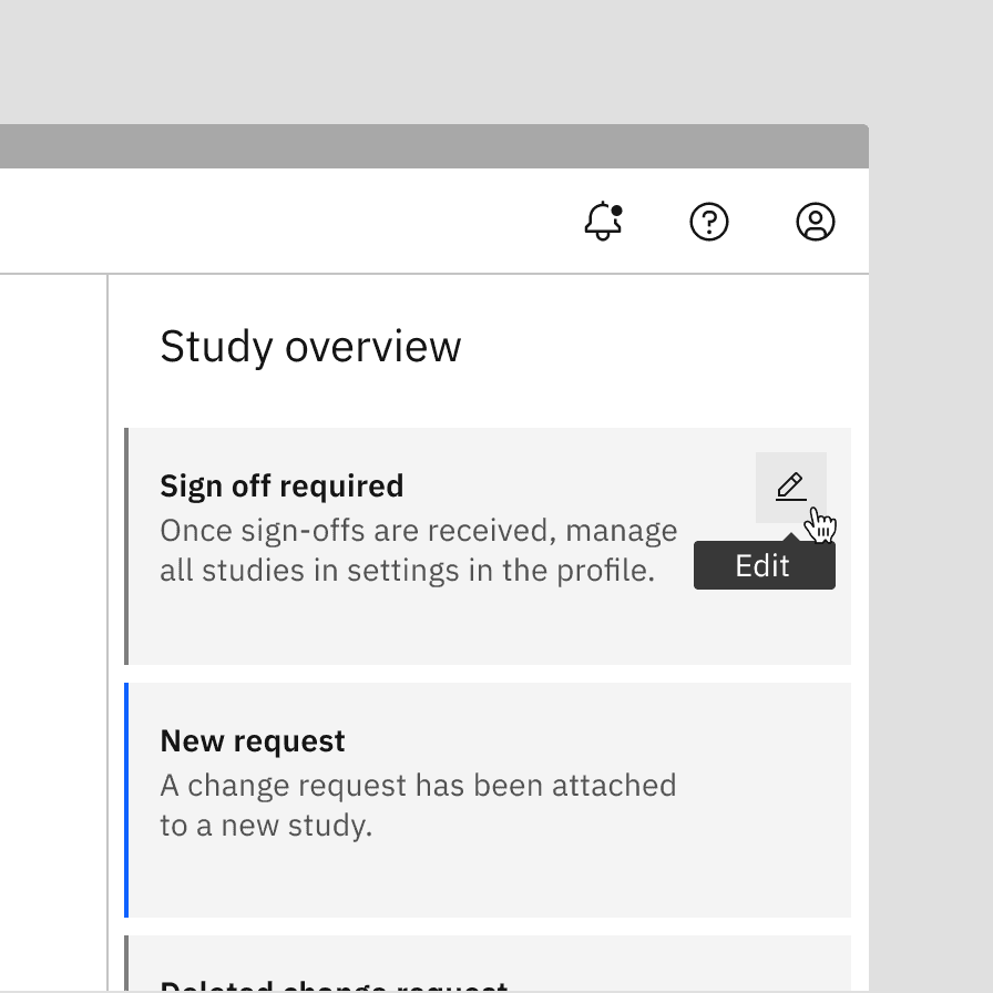
Tooltip
Tooltips display additional information upon hover or focus that is contextual, helpful, and nonessential while providing the ability to communicate and give clarity to a user.
Live demo
This live demo contains only a preview of functionality and styles available for this component. View the full demo on Storybook for additional information such as its version, controls, and API documentation.
Accessibility testing statusFor every latest release, Carbon runs tests on all components to meet the accessibility requirements. These different statuses report the work that Carbon has done in the back end. These tests appear only when the components are stable.
For every latest release, Carbon runs tests on all components to meet the accessibility requirements. These different statuses report the work that Carbon has done in the back end. These tests appear only when the components are stable.
Overview
A tooltip is embedded within other components rather than being used as a standalone component. Since tooltips are embedded within other components, there’s no need to include them again. The only exception is the definition tooltip, which remains a separate component. They provide additional information when a user hovers over or focuses on a UI element and should only be used when necessary to offer quick context without cluttering the interface.
When to use
By default, most components such as icon buttons, icon tabs, sliders, and copy buttons already have built-in tooltips, so there’s no need to add one separately. Customization is allowed but not recommended.
Tooltips can be used to:
- Show names of controls, like icon buttons, that lack visual labels
- Provide additional information for focusable elements, helping users make informed decisions
- Offer more context or explanation for specific elements
- Define a term or provide details for an inline item (definition tooltip)
Definition tooltip
A definition tooltip is used to define terms or give extra help within text. It works well on UI labels, words in paragraphs, or compact spaces like data tables, where extra icons might clutter the interface.
When not to use
Provide critical information
Since a tooltip disappears when a user hovers away, do not include pertinent information for the user to complete their task. Use helper text that is always visible and accessible for vital information, such as required fields.
Include interactive elements
Do not include interactive elements within a tooltip. Interactive elements in tooltips are inaccessible for some users and are hard to use for all users since tooltips do not receive focus. If images, buttons, or links need to be included in supplemental information, use the toggletip component and the disclosure pattern that allows for better tabbing and focus structure, improving the experience for all users.
Do use helper text for pertinent information.
Do not use tooltips for information for a user to complete their task.
Use succinct, directive text.
Do not use interactive elements within a tooltip.
Tooltips versus toggletips
Tooltips and toggletips look visually similar, and both have an interactive trigger. The two components differ of how they are invoked and dismissed and if the user is required to interact with the contents. A tooltip is exposed on hover or focus when you need to disclose brief, supplemental information that is not interactive. A toggletip is used on click or enter when you must expose interactive elements, such as a button, that a user needs to interact with.
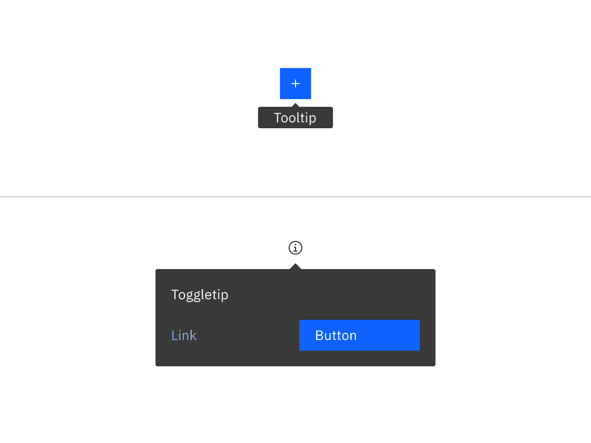
Example of a tooltip versus a toggletip
Formatting
Anatomy
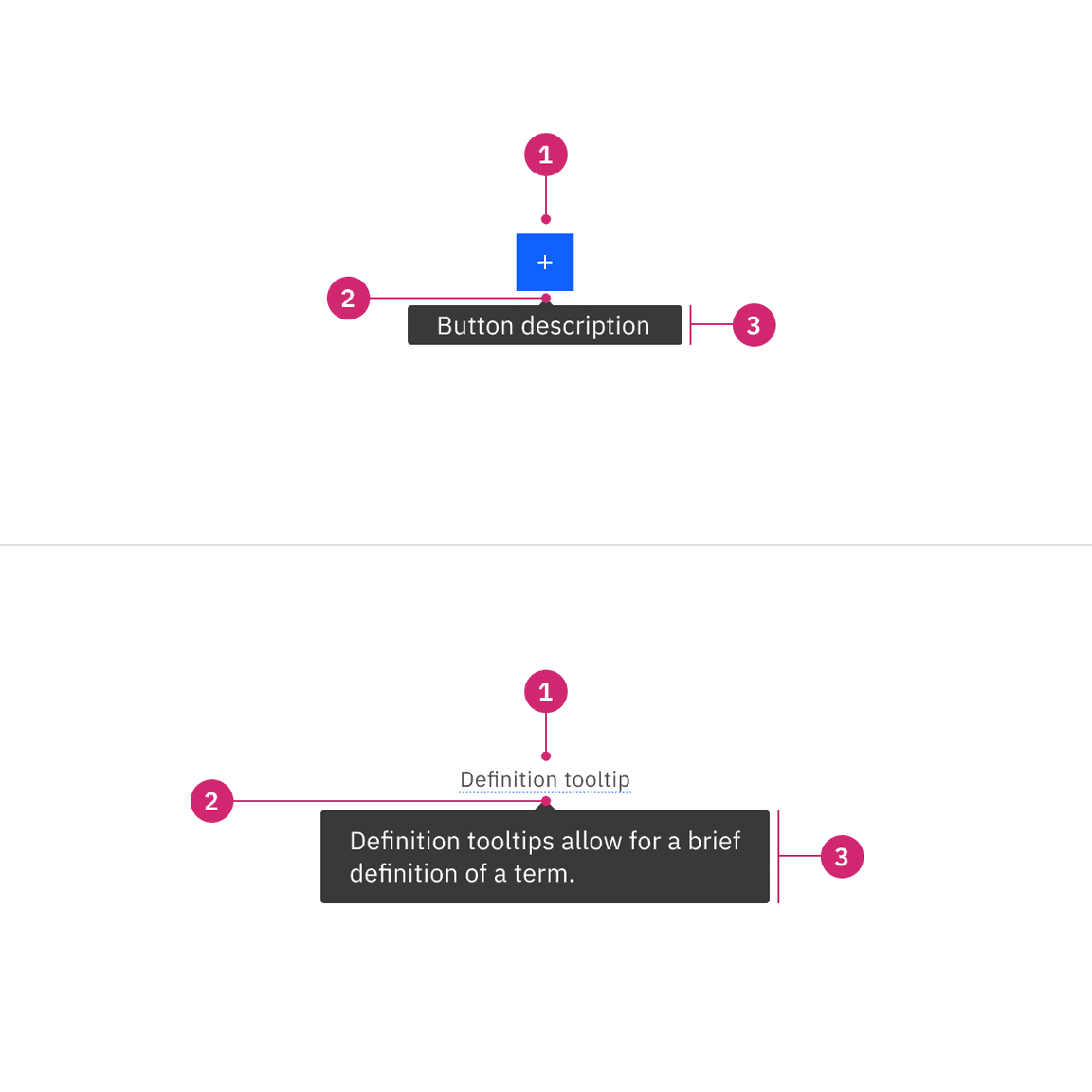
- UI trigger: UI trigger includes any component with integrated tooltips or definition terms with dotted underlines
- Caret tip: Closely associates the container with the related trigger element
- Container: Contains short or brief text
Alignment
The container of the tooltip may be aligned to start, center or end to keep the container from bleeding off the page or covering important information. The UI trigger button and caret tip should be vertically centered with each other to associate the tooltip and the trigger. This is especially helpful when multiple elements are close to each other.
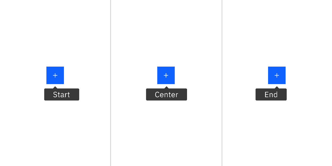
Tooltip containers can be automatically or manually positioned to the start, center, or end
Placement
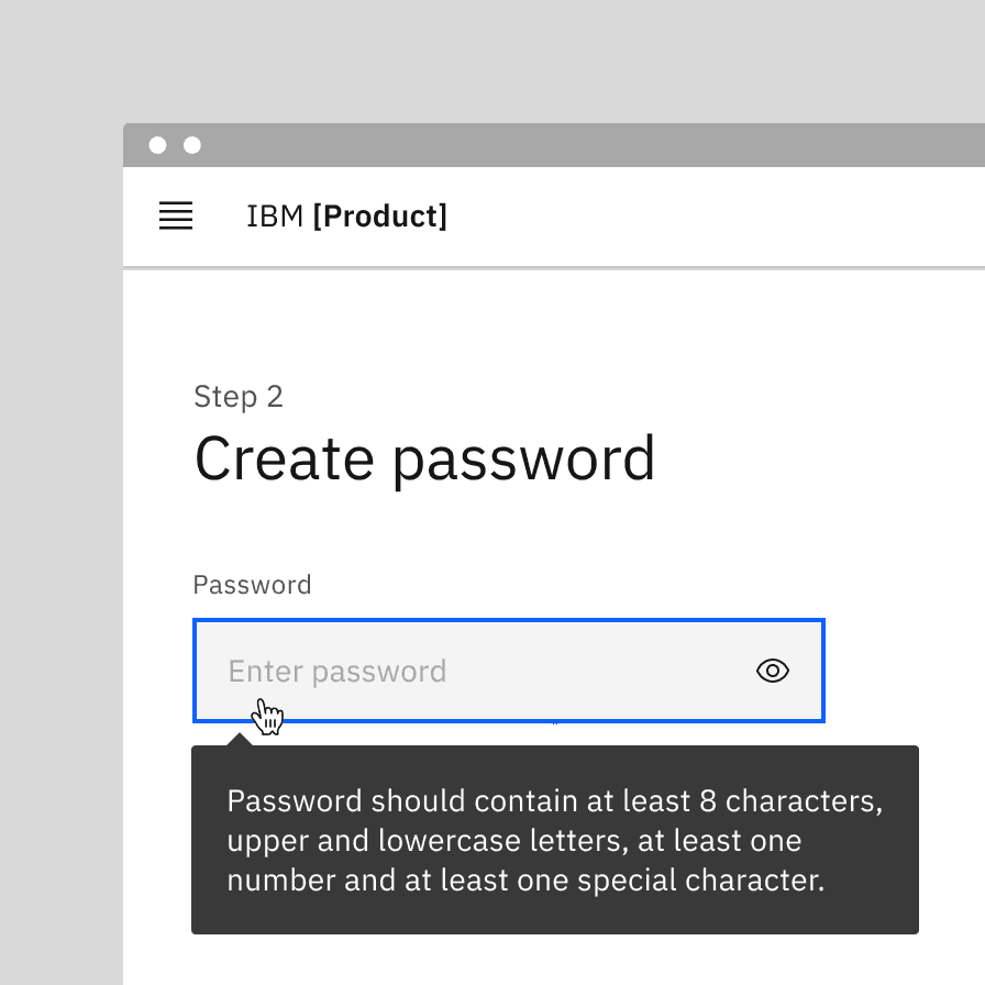
Tooltip directions, by default, are set to auto. Upon opening, tooltips can detect the edges of the browser to be placed in view so the container does not get cutoff. Tooltips can instead use specific directions and may be positioned right, left, bottom, or top of the trigger item. Do not cover related content that is essential to the user’s tasks. Tooltips should not bleed off page or behind other content.
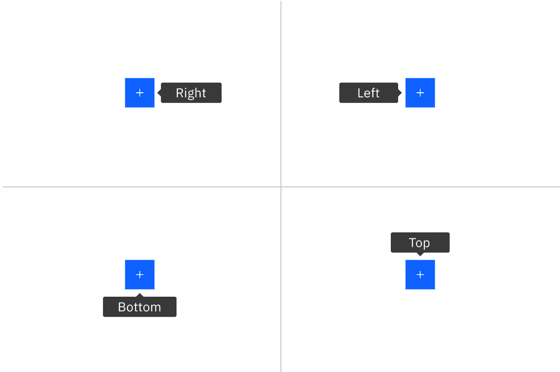
Tooltip containers can be automatically or manually positioned to the right, left, bottom, or top
For definition tooltip, do not obstruct words to the left and right of the trigger word. When the tooltip is active, ensure it overlays other content and is not cut off by other surrounding components or bleeds off the page where some content is not visible.
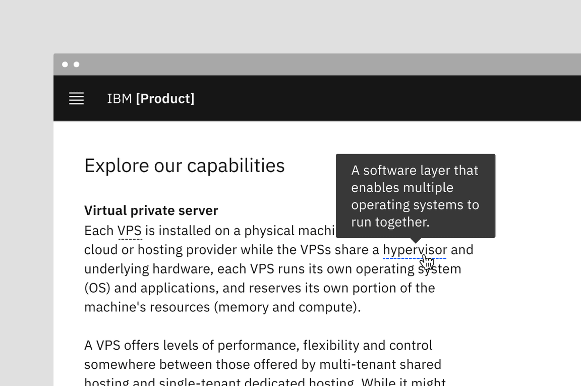
Example of definition tooltip with the popover overlays the text
Content
Main elements
Text
- Should contain relevant, specific content.
- Should not contain essential task instructions since a tooltip is not persistent.
- Tooltips for icon-only components, like icon buttons, should provide a concise one- or two-word description of the button’s function.
- For definitions and instructive tooltips, use sentence-style capitalization and write the text as complete sentences with punctuation unless space is limited.
Further guidance
For further content guidance, see Carbon’s content guidelines.
Behaviors
States
The tooltip component has two states: on (hover and focus) and closed. By default, tooltip is hidden and inactive.
Interactions
Mouse
Tooltips are triggered when the mouse hovers over the UI trigger. The tooltip persists if the mouse remains over the active container or the UI trigger. The tooltip is dismissed by hovering away to another element.
Definition tooltips can use either hover or click interactions, depending on the situation. Users can hover if they need a quick glance at the information. Users can click if they need more time or if the tooltip might be unintentionally triggered.
Keyboard
Users can navigate to the UI trigger and display the tooltip by pressing
Tab
Esc
Related
Popover
Popovers are used as a base layer in some of our components like tooltips, overflow menus, and dropdown menus. For further guidance, see Carbon’s popover component.
Disclosure
Disclosures use popovers as a base layer. Disclosures are comprised of a container, text, and interactive elements. Interactive elements are kept in the tab order of the page. For further guidance, see Carbon’s disclosures pattern.
Toggletip
Toggletip uses the disclosure pattern to toggle the visibility of a popover and can contain a variety of information, from descriptive text to interactive elements. For further guidance, see Carbon’s toggletip component.
Chart tooltip
Chart tooltips appears when a cursor is positioned over an element on Carbon’s data viz charts, such as a data point, icon button, or truncated text. These are inherent behaviors built into our chart components. Refer to chart anatomy to learn more about using tooltips in charts.
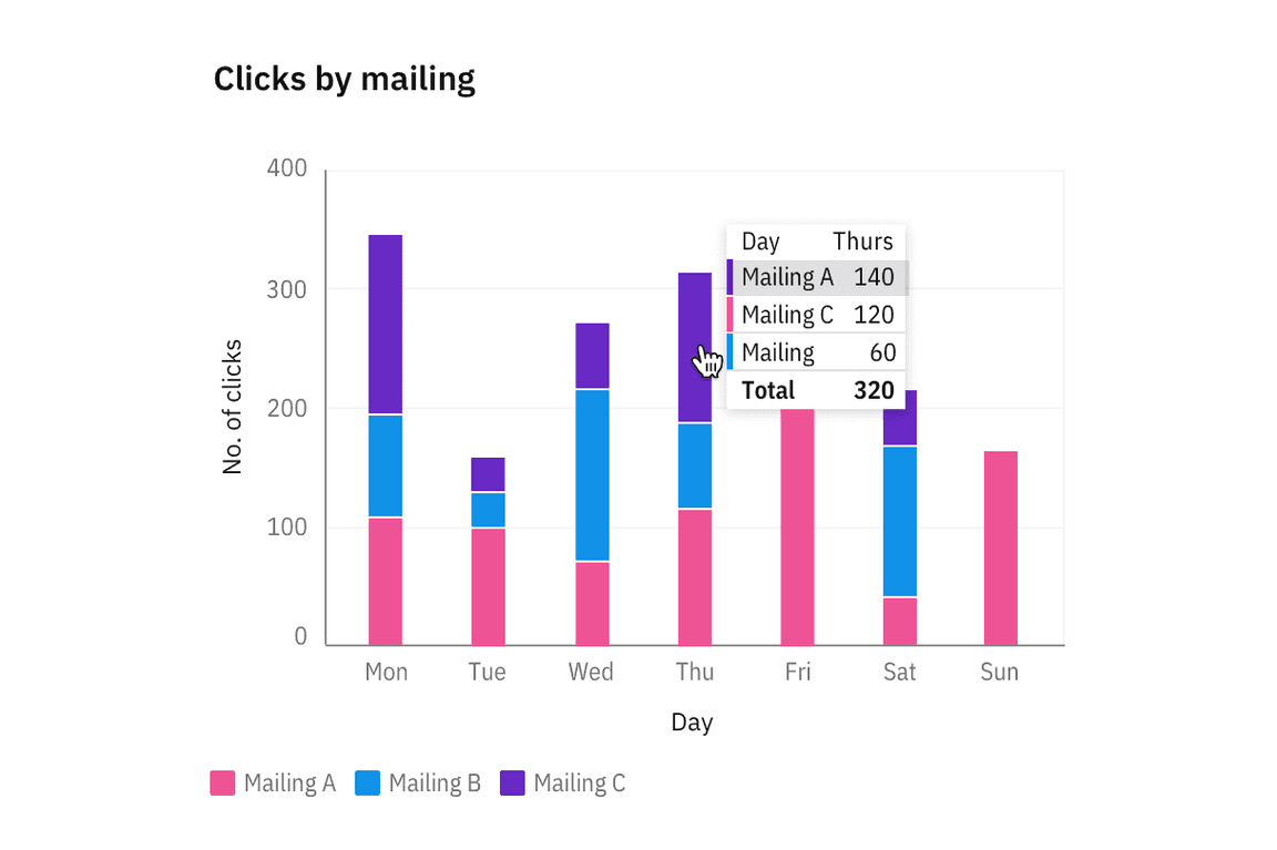
Image of chart tooltips on a line graph
References
Alita Joyce, Tooltip Guidelines (Nielsen Norman Group, 2019)
MDN Web Docs, ARIA: tooltip role (Mozilla: Developer contributors, 2023)
Feedback
Help us improve this component by providing feedback, asking questions, and leaving any other comments on GitHub.