Disclosures
Disclosures are moments that open up on a page and reveal additional information related to the source it is triggered from.
Overview
Disclosures support a wide range of different use cases in product interfaces and are commonly used to reveal more information or details about an element or content on a page. Unlike tooltips, the content expanded by a disclosure may contain interactive elements.
At its core, a disclosure is comprised of two parts—a trigger that the user interacts with by clicking or using their keyboard and the container that opens and discloses the content.
When to use
- Use when disclosing additional content about part of a UI.
- Use when there is a need to include interactive elements in a popover.
- Use to show settings, filtering, or sorting menus that affect sections of a page, for example in data tables, or an entire page.
- Use when displaying content within types of dropdowns, for example profile menus, combo buttons, and menu buttons.
When not to use
- Don’t use to present critical information or request required input needed to complete a workflow. Use the modal component instead.
- Don’t use when the user hasn’t explicitly triggered the popover to open on click.
- Don’t use if the popover needs to have a width larger than six columns.
Best practices
Keep disclosures at a reasonable size
A disclosure should not take up a considerable amount of the size of the screen. Disclosures are meant to be smaller moments that can open on top of different areas of a page. They should not seem like a disruption to the users workflow and should not act as a screen takeover. Keep all content in a disclosure concise and only include information that is necessary. We recommend having a width of six columns or less.
Disclosures should be user initiated
Disclosures should always be triggered to open or close by the user. Disclosures should never open automatically because this could be potentially intrusive to the user’s workflow.
One disclosure should open at a time
If there are multiple instances on a page where a disclosure is present, only one should open at a time to avoid screen clutter and to help the user stay focused on the information being disclosed.
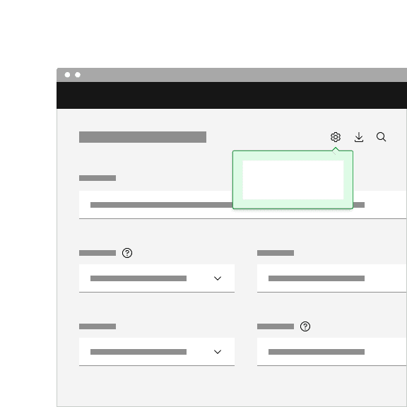
Do have one disclosure open at a time.
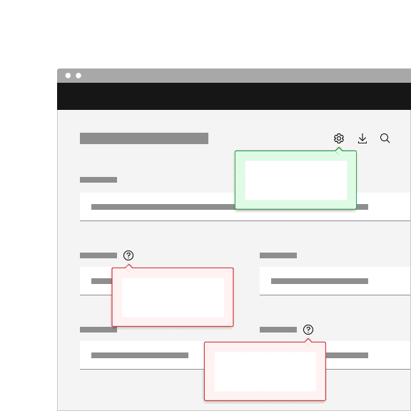
Do not have multiple disclosures open at the same time.
Avoid nesting disclosures
Do not nest one disclosure within another disclosure. Nesting disclosures creates a stacking effect and could confuse the user of where they should be focusing their attention and which disclosure they should be interacting with. Using submenus in a context menu that fly out to the sides is an acceptable way to disclose additional information in a disclosure.
Do not hide critical information within a disclosure
Do not hide important information inside of a disclosure that the user may need in order to complete a task or workflow. Keep critical information at a higher level so the user has better visibility.
Behaviors
Opening and closing a disclosure
To open a disclosure to reveal its content, click the trigger button it is related to. If using a keyboard, press
Enter
Space
To close a disclosure, either click on the trigger button again, click anywhere outside of the open disclosure container or click on the close
x
Esc
Tab
Dismissible action
Depending on the type of content in a disclosure, it can be useful to display a close
x
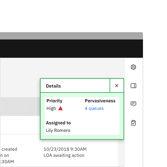
Do place a close icon in the upper right hand corner in an empty space.
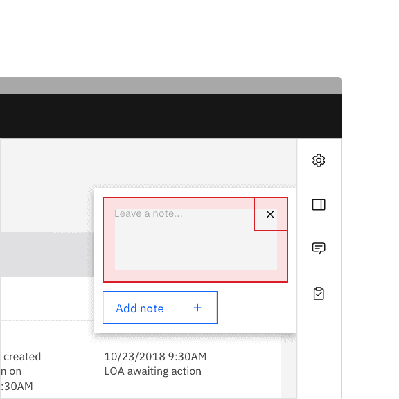
Do not place a close icon inline with interactive elements.
Visual guidance
Trigger button container
A disclosure is controlled by a trigger button. The trigger button can visually change its shape and size depending on the usecase.
The trigger button can use any of our button types and can be set at these three sizes—48px (lg), 40px (md) or 32px (sm).
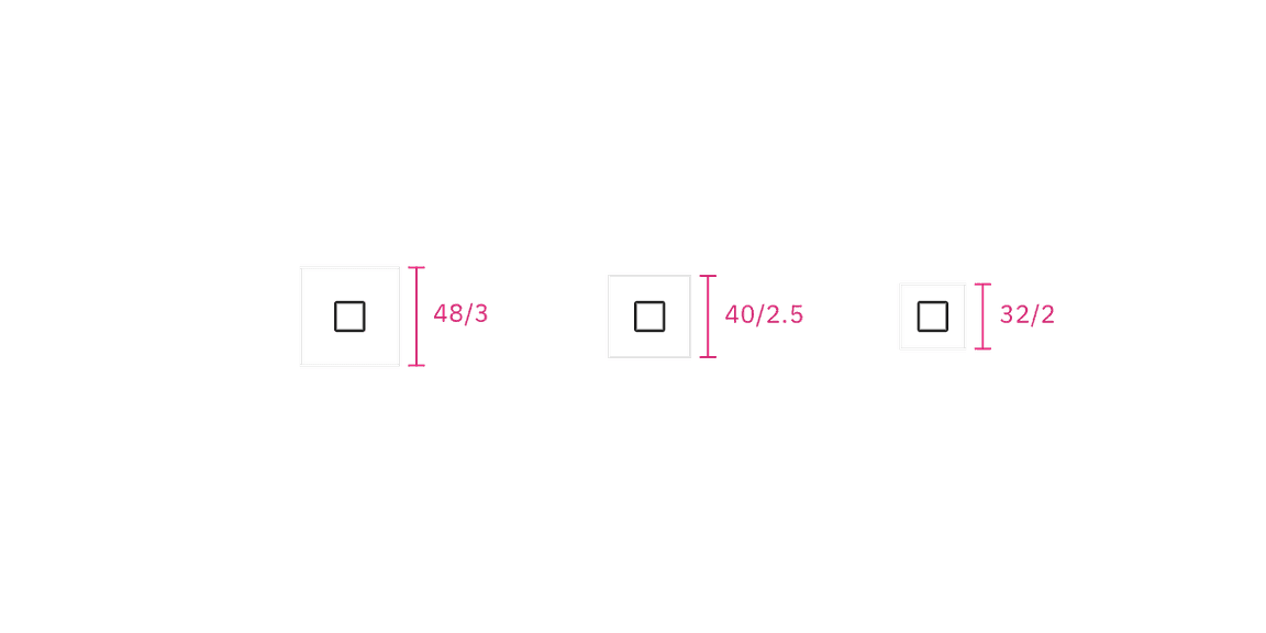
Example of trigger button container height sizes.
Trigger button icon
If a trigger button contains an icon, the icon size should be either 20px or 16px.
Example of trigger button icon sizes.
Popover
A popover component is used as the underlying layer of a disclosure to disclose its content. See the popover component guidance for more information.
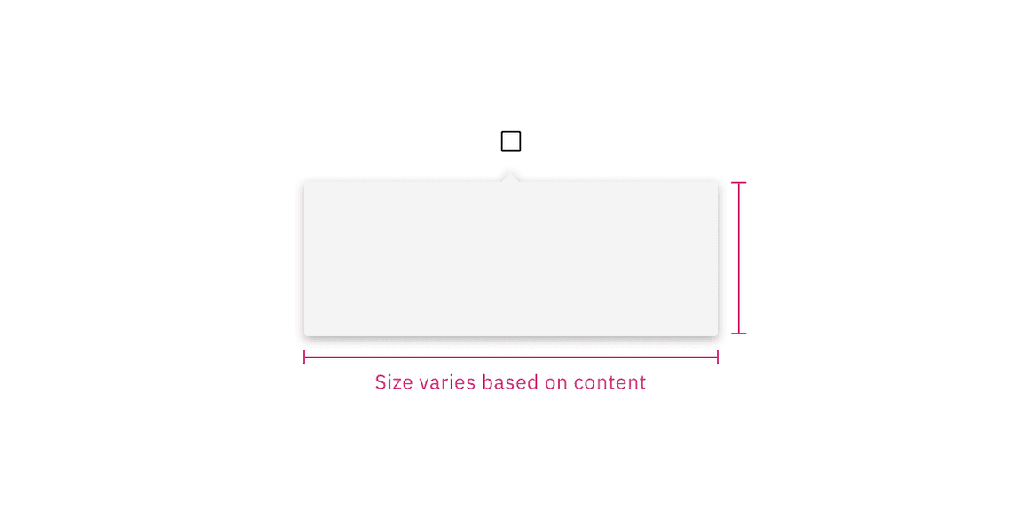
Example of a popover container.
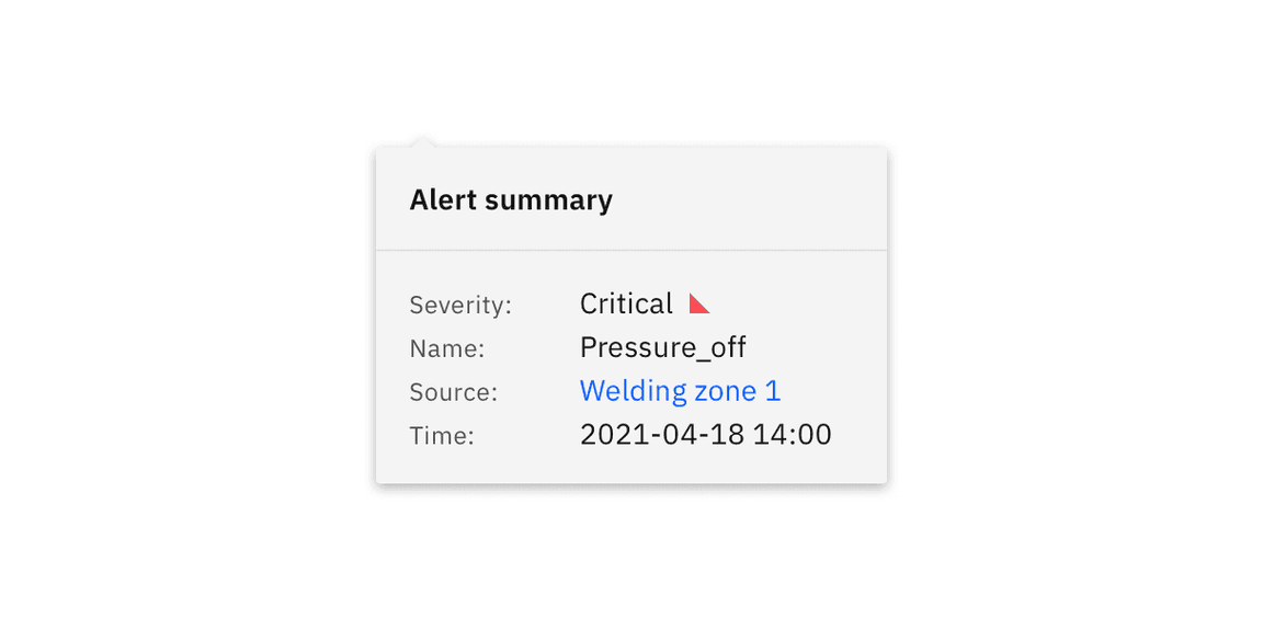
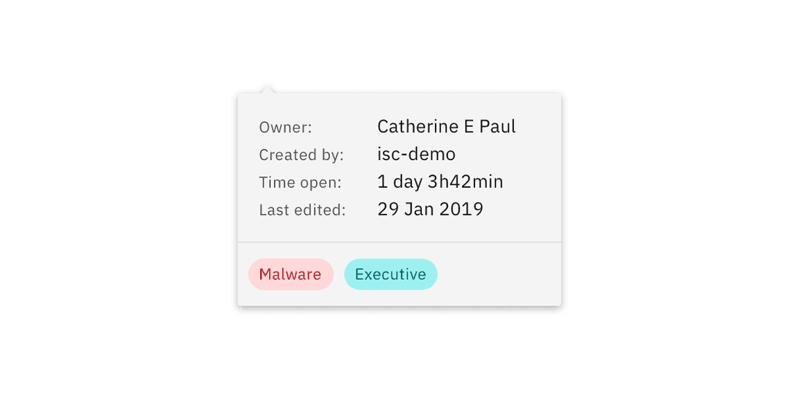
Content
The type of content in a disclosure can vary depending on the use case. A disclosure can be simple and contain solely informational text. In some cases content can be more complex and include a combination of multiple sections and interactive elements. Below are some common examples and best practices of how to show body text, heading text, and footer content in disclosures.
Heading text
Heading text can be placed above body text in a disclosure. Placing the heading text with 0px padding above the body text or adding a divider between the heading text and body text are two different common use cases.
Example of a disclosure with heading text.
Footer content
Footer content can be placed below the body text it is related to. Placing the footer content with 16px padding below the body text or adding a divider between the footer content and body text are two different common use cases.
Example of a disclosure with footer content.
Multiple sections of text
Depending on the use case, you may need a disclosure to show multiple sections of content. Use padding or dividers to visually create sections. Profile menus and context menus typically display multiple sections of content depending on the complexity of the menu.
Example of a disclosure with multiple sections.
Interactive elements
Disclosures allow you to place interactive elements in a popover while still keeping it accessible. Settings and filters often include components like radio buttons and checkboxes that the user can interact with to adjust specific content. Searching within a menu is another common use case of including interactive elements within a popover.
Example of a disclosure with interactive content.
Common use cases
Disclosures are used for a wide variety of use cases. The following variants are a few examples of common disclosures that you may come across frequently in product interfaces.
| Example | Use cases |
|---|---|
| Profile menu | Profile menus are typically part of a UI shell header and can have navigational options related to a user’s account or active session. |
| Settings and filter menus | Settings and filter menus are frequently used within data table toolbars to enable users to adjust content. Filter and sort menus can also be used for filtering large amounts of content on a page or an entire page. |
| Combo button | Combo buttons are used to contain multiple related actions that come with a default, primary action. Additional actions live in the menu. |
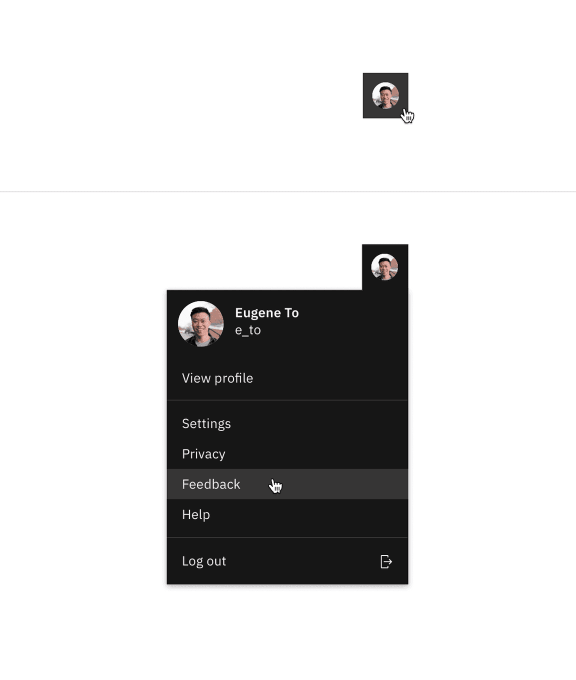
Profile menu
Profile menus follow the disclosure pattern by clicking an icon button that opens a popover. Profile menus are essential to a product’s UI and users rely on it to find global content related to their account, product, and active session information. Profile menus provide a way to log in or out of an account and let users access their settings. Additional links and icons can be added to a profile menu depending on the use case.
See the profile menu pattern for more information.
Anatomy
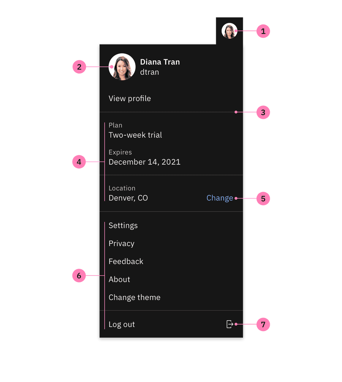
Anatomy of a profile menu.
- Toolbar profile image: A profile image, initials, or icon of a user.
- Menu profile image: A profile image that is paired with high level information about the user, such as a name or handle.
- Section dividers (optional): To group related content by creating visual sections.
- Contextual information (optional): Global information that is related to the account or active session.
- Link (optional): Additional links that are not main menu items. Links can be used for editing, prompting a modal, etc.
- Menu items: The main and most commonly used menu items that are navigational.
- Icon (optional): Additional icons to place inline with menu items.
Structure
A profile menu is made up of two parts—an icon button and a popover. Profile menus support a variety of content that can range in complexity. Some profile menus are simple while other menus may be more complex and require multiple sections of information. Profile menus that are complex may benefit from including interactive elements depending on the use case.
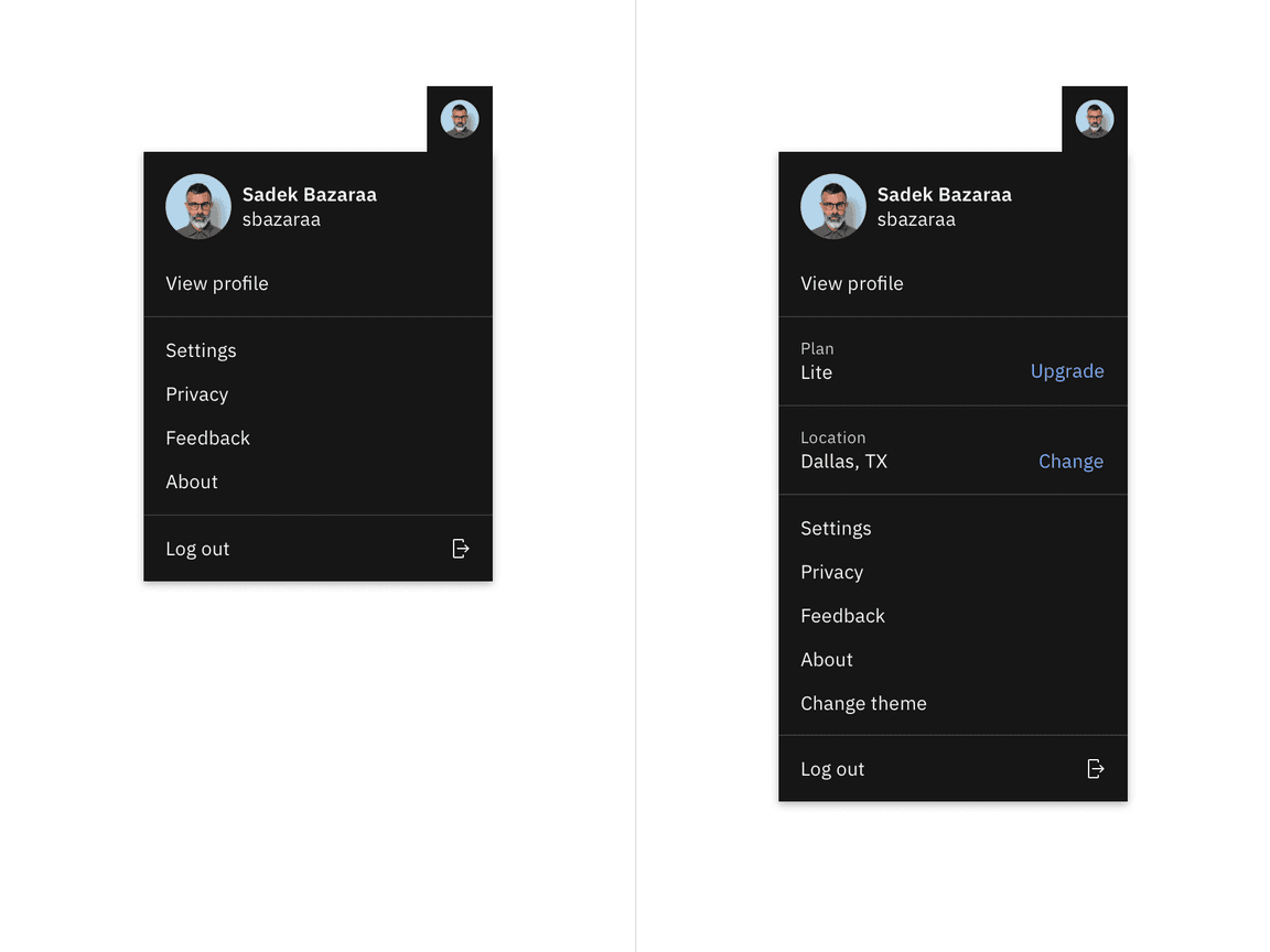
Example of a simple and complex profile menu.
Functionality
Mouse
Clicking the icon button triggers the profile menu to open and reveals information related to the users profile and account. The user can then click on menu items and other interactive elements within the menu. To close the menu, click on the icon button trigger again or anywhere on the page out side of the menu.
Keyboard
- to the icon button trigger to apply focus.Tab
- To open the profile menu press orEnter.Space
- Once opened, focus goes to the first item in the menu.
- To navigate the profile menu items press the andUparrow keys.Down
- To select an item in the profile menu press .Enter
- To close the profile menu press .Esc
Best practices
Use with a global toolbar header
If a product has a global toolbar header and offers login capabilities, use the profile menu. Provide a way for the user to log out of an account, make changes to profile information, or navigate to settings.
Show information that is pertinent to the user account or session
Include sections on a global contextual level that may be helpful to the user to see in the profile menu. For example, indicating the current plan or location with an option to edit or change the current information can be valuable to include in a profile menu depending on the use case.
Add icons and links to help guide the user
When appropriate, pair icons with related menu items or information to indicate the action that will be performed once it is clicked. Provide links next to related menu items or information to specify there are additional quick actions to take, whether it be upgrading an account plan or changing a location. Only add icons and links to a profile menu if completely necessary in order to not overwhelm the user and to reduce visual clutter within the menu.
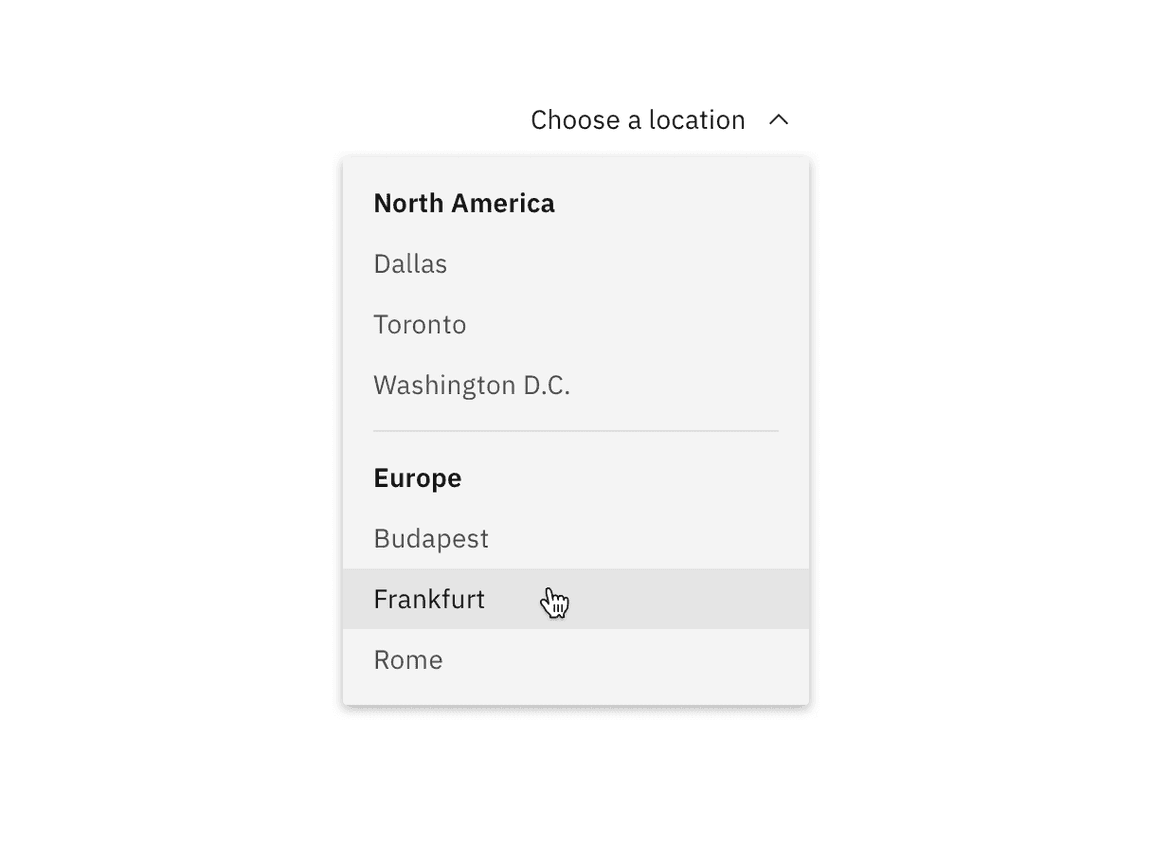
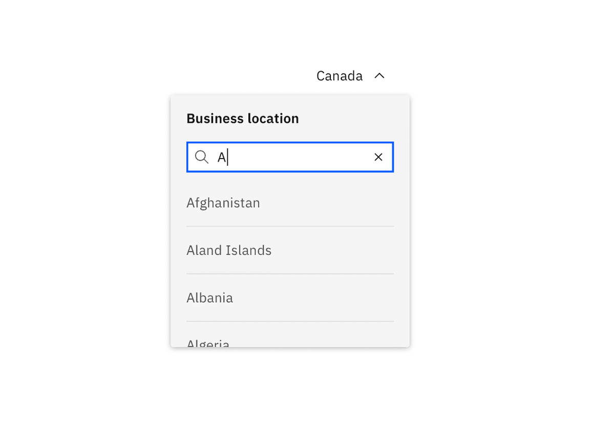
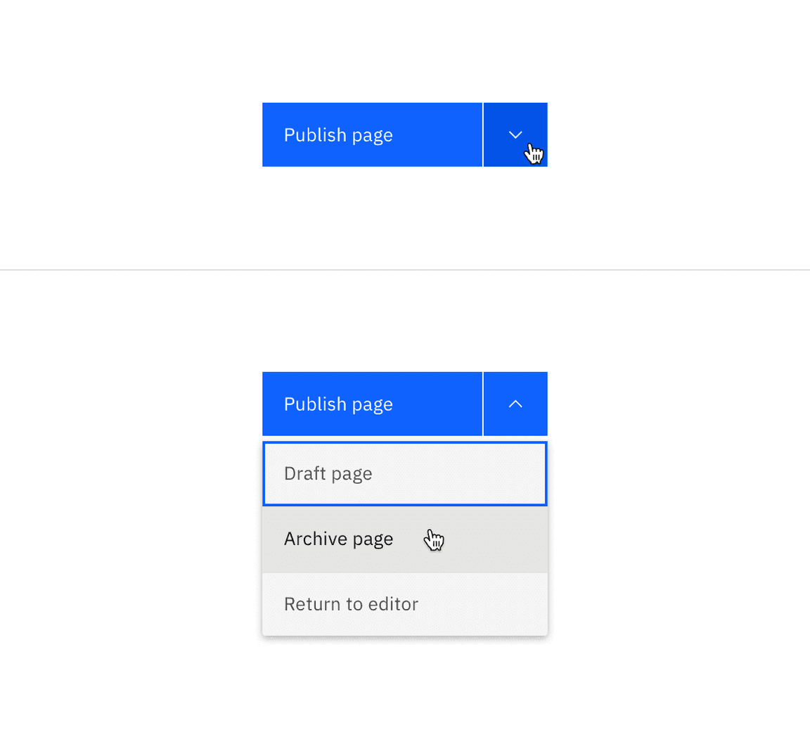
Settings and filter menus
Settings and filters follow the disclosure pattern by clicking an icon button that opens a popover. Interactive elements are often found in settings and filters in order to modify or adjust specific content. The disclosure pattern allows you to nest interactive elements inside of a popover while still being accessible.
Anatomy
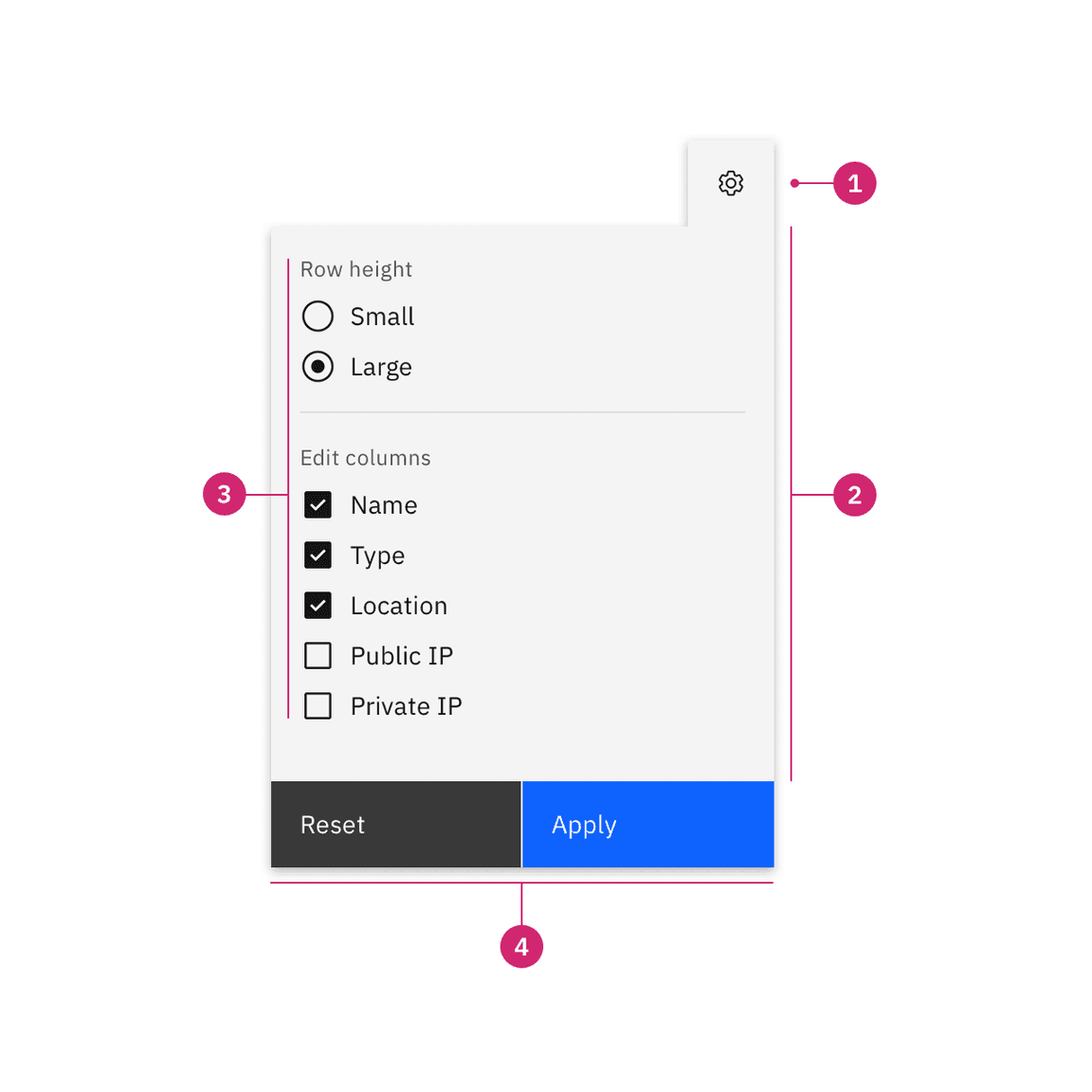
Anatomy of a settings menu.
- Icon button: A trigger to open and close the popover.
- Popover: Uses the popover component as an underlying layer.
- Content area: Area to place text and interactive elements.
- Button group: To cancel or apply changes in settings or filters that affect other content on the page.
Structure
Settings or filter menus are made up of two parts—an icon button and a popover. These types of menus usually contain interactive elements. For example, use buttons to clear filters, use checkboxes, radio buttons, or dropdowns to adjust content and use sets of buttons to reset or apply changes. Content may vary depending on what is being filtered, sorted, or what settings need to be defined.
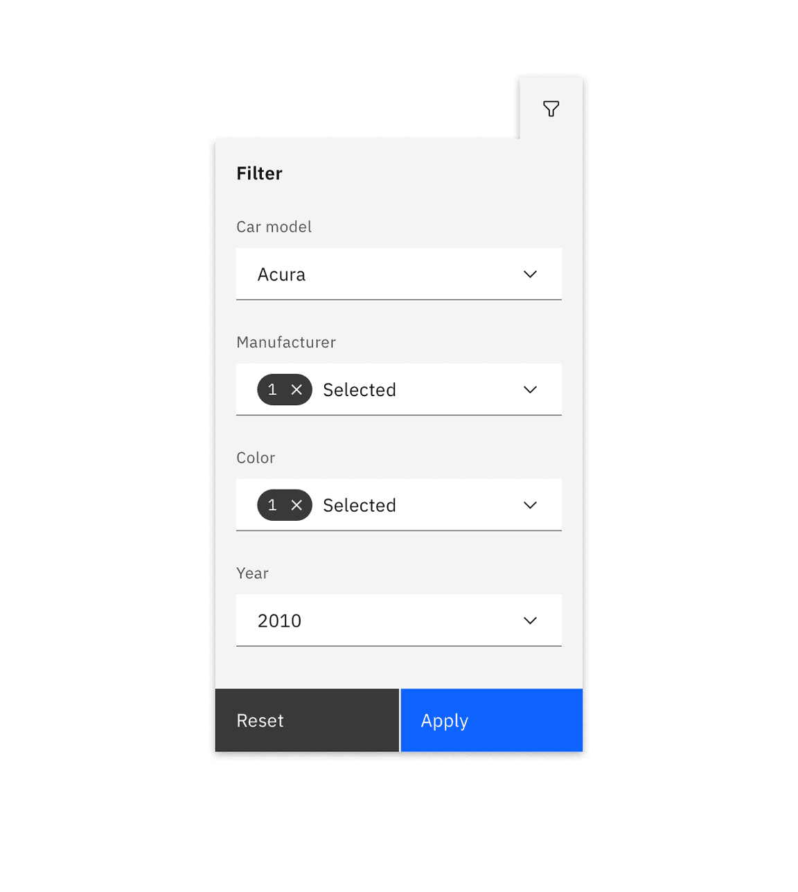
Example of a filter menu structure
Functionality
Mouse
Clicking the icon button triggers the popover to open. Upon opening the menu, the first interactive element in the menu receives focus. To close the menu click on the icon button again, or anywhere on the page outside of the menu.
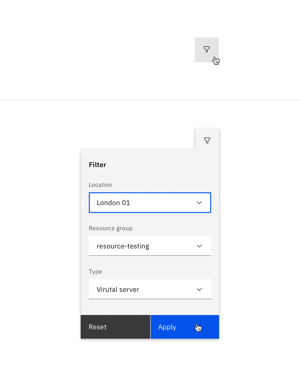
Example of a closed and opened filter menu.
Keyboard
- to the icon button trigger to apply focus.Tab
- To open the settings or filter menu press orEnter.Space
- Upon opening the menu, the first interactive element in the menu receives focus.
- To shift focus to different interactive elements in the menu press the orTab+Shift.Tab
- To close the settings or filter menu press . PressingEscorEnteron a button can also close the menu.Space
Best practices
Use a set of buttons to apply all changes
In some use cases when live filtering is not feasible or the preferred method, use a set of buttons to either reset or apply all selected changes in the settings or filter menu. Once the “Apply” button has been selected, the menu closes and the results are updated.
Don’t overcrowd menus with unnecessary content
Only include content or interactive elements that are necessary. Overcrowding disclosures with too many options or additional content can be distracting to the user.
Include enough space between elements
When placing interactive elements, be mindful of the padding between the interactive element and other content in the disclosure. A good rule of thumb is to keep at least 16px padding between different elements and content.
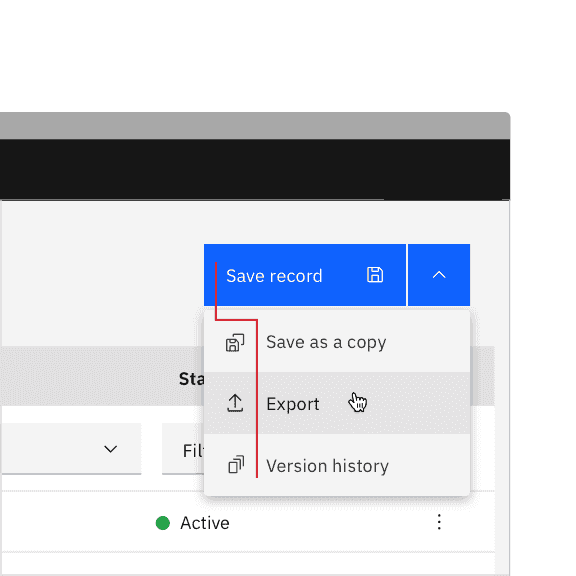
Combo button
A combo button is a type of disclosure pattern and displays a primary default action that discloses a list of additional, related actions to choose from in a popover.
Anatomy
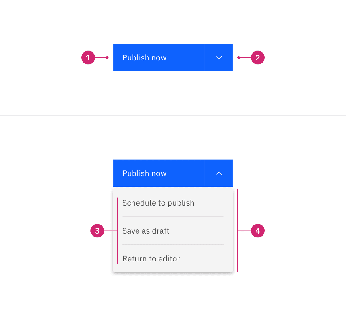
Anatomy of a combo button.
- Primary button: A default action.
- Icon button: A trigger to open and close the popover.
- Content area: A list of additional actions.
- Menu: Uses the popover component as an underlying layer.
Structure
A combo button is made up of three parts—a primary button, an icon button, and a popover. Dividers are shown to visually separate different actions that are related to each other.
Functionality
Mouse
Clicking the primary default action will perform the defaulted action. Clicking the icon button triggers the popover to open and reveals the additional actions to choose from in a menu. Clicking on an action in the menu will perform the action. To close the menu click on the icon button again, or anywhere on the page outside of the menu.
Keyboard
Primary default button:
Tab
Enter
Space
Icon button:
Tab
Enter
Space
Down
Menu: When the menu is opened, focus will go to the first additional action in the menu list. Move between menu actions by pressing the
Up
Down
Enter
Space
Esc
Best practices
Choose a default action
Remember to choose the default, primary action that will be displayed in the primary button so it is not hidden within the menu of additional actions. The primary default action is typically the most commonly used action there is to take.
Use to reduce visual complexity on a page
Combo buttons reduce visual complexity by grouping similar commands together. For example, how navigation menus group together related options to enable conceptual understanding of the site information structure.
Avoid using extra icons
Avoid using extra icons inside of the default, primary button and the additional actions in the menu to reduce visual noise between elements. Keep button labels clear and concise.
Do have only text in the primary default button.
Do not include an icon in the primary default button or next to additional actions.
Accessibility
Screen readers
VoiceOver: Users can trigger a button to open a disclosure popover by pressing
Enter
Space
JAWS: Users can trigger a button to open a disclosure popover by pressing
Enter
Space
NVDA: Users can trigger a button to open a disclosure popover by pressing
Enter
Space
Related
Button
Buttons are clickable interactive elements that are commonly used in disclosures as the trigger to open a popover. There are multiple variants of button that should be used for certain use cases. For further guidance, see Carbon’s button component guidance.
Popover
Popovers are frequently used in disclosures to show additional content. Popovers are also used in components like tooltips, overflow menus, and dropdown menus. For further guidance of how to use a popover, see Carbon’s popover component.
Toggletip
Toggletip uses the disclosure pattern to toggle the visibility of a popover. The popover may contain a variety of information, from descriptive text to interactive elements. Toggletips are triggered on click to disclose the information inside of a popover. For further guidance, see Carbon’s toggletip component guidance.
References
Context menu, Delivering Relevant Tools for Tasks,(Nielsen Norman Group)
Split Buttons,Component definition,(Nielsen Norman Group)
Popup,Component research,(OpenUI)
Enabling Popups,Initial Explainer,(OpenUI)
Disclosure,W3C WAI-ARIA practices,(W3C Working Group Note)
Feedback
Help us improve this pattern by providing feedback, asking questions, and leaving any other comments on GitHub.