Color
Implementing complex color relationships can be challenging. Provided here are some methods and techniques to help solve your product’s color and theming needs.
Implementing layering
There are two ways to implement the layering model in a theme, either by using explicit tokens or contextual tokens. These techniques can be used independently in a product or can be used together. Both methods produce the same visual result, the difference lays in how you develop with them. Designers only need to be concerned with the layering tokens.
The explicit layering tokens are standard design tokens. Each layering token corresponds to a specific layer on the page and is used exactly like any other token from Carbon. Contextual tokens are a special case of layering tokens where the value changes depending on where the token is used on a page. This type of token is incredibly useful for building reusable components that work across layers.
| Token type | Definition |
|---|---|
| Layering tokens | Explicit layerings tokens used to manually map the layering model onto components. They come in sets that pair with individual UI layers. |
| Contextual tokens | Abstract code tokens used to automatically map the layering model onto components depending on where it is used on the page. |
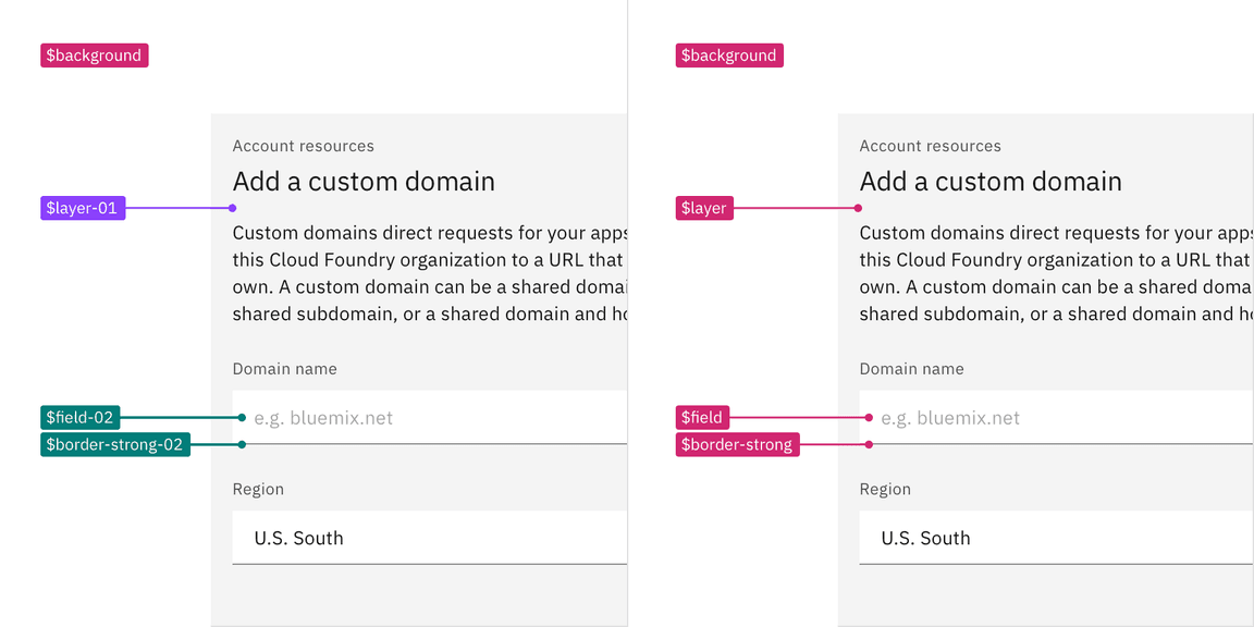
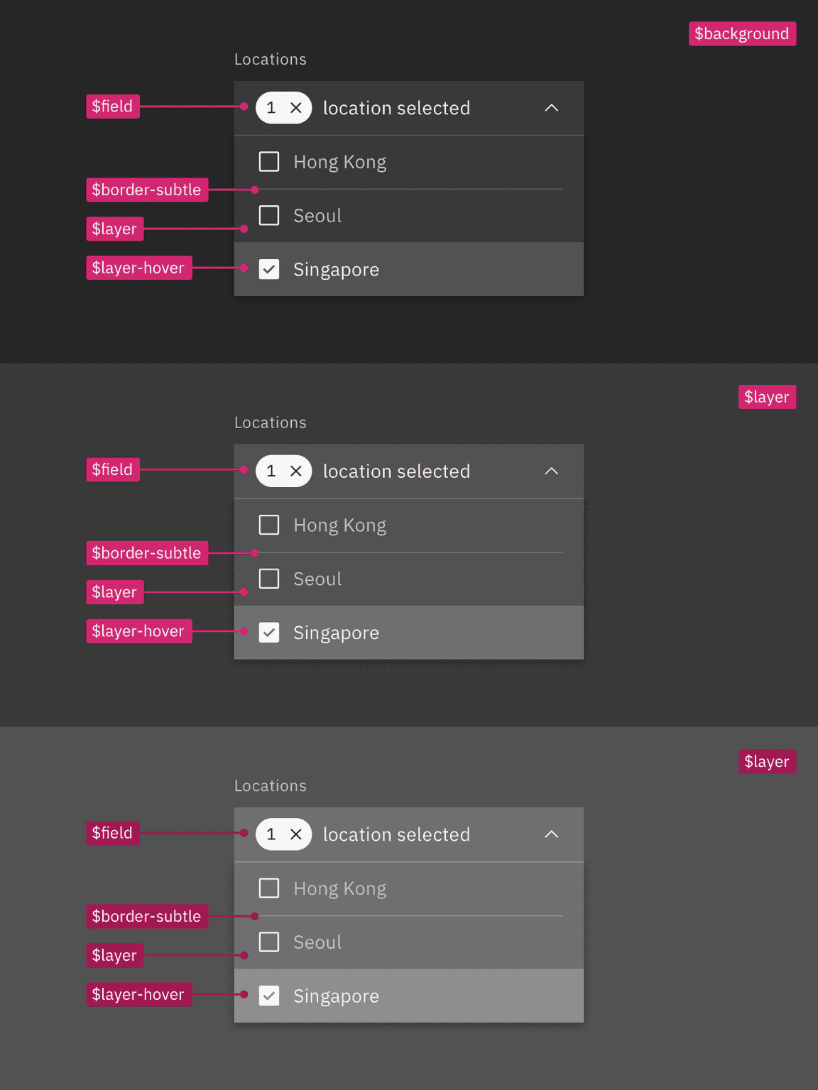
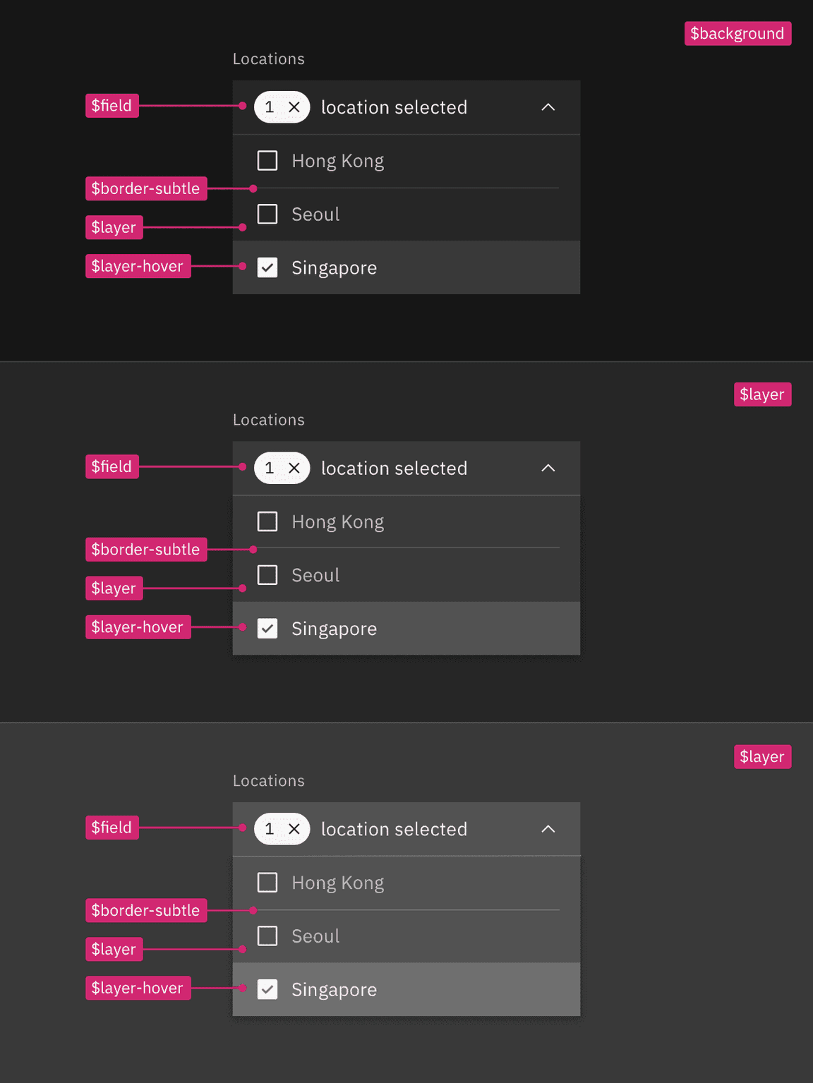
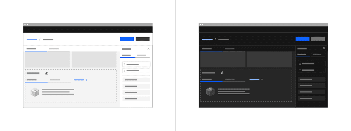
A visual spec using layering tokens (left) versus contextual tokens (right).
Layering tokens
Layering tokens are explicit tokens used to manually map the layering model onto components. They are used just like any other color token, and in fact, are a replacement for the
ui
When to use layering tokens
- As an easy starting point when first working with the layering model, they are exactly like the tokens you already know and love
- When building components that may only need to be on one layer or have only one color variant
How layering tokens work
There are four layers within a theme: base layer, layer 01, layer 02, and layer 03. Layers stack one on top of the other in a set order. Each step in UI color (excluding interaction colors) is another layer and will require the use of a different set of layering tokens.
For more information about how color token migration works, see the migration guide.
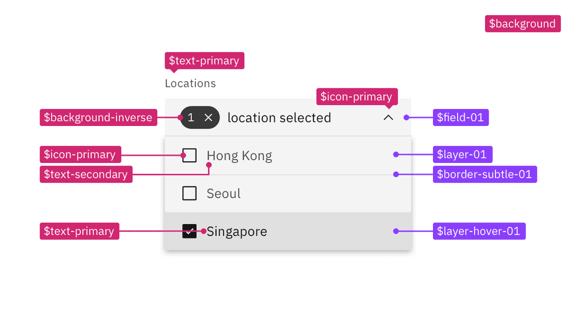
Layer sets
Layering tokens are divided into sets and are identified by a number (-00, -01, -02, -03) attached to the end of token name. Any token with an
-01
background
-00
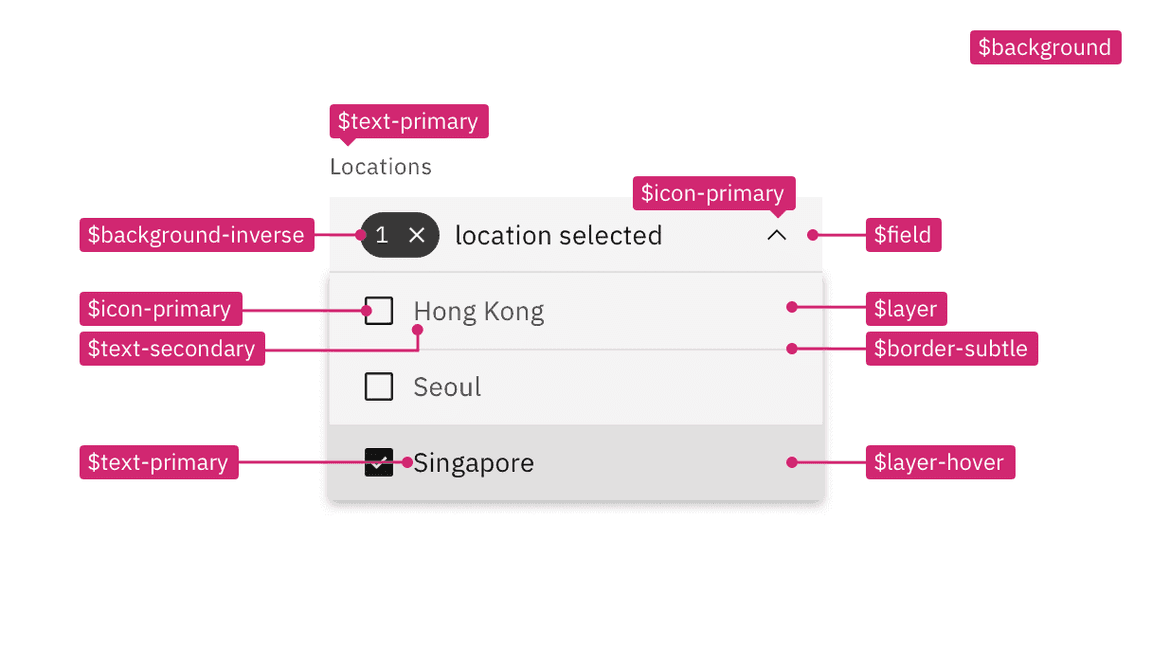
Tokens from the same set are used together when building components. For example, in a dropdown both the input and menu will use tokens from the same set (see image below). In addition to the
$layer
$layer-02
$field-03
$field-03
$border-strong-03
Not all color tokens are part of a layer set. Some tokens groups, like
text
icon
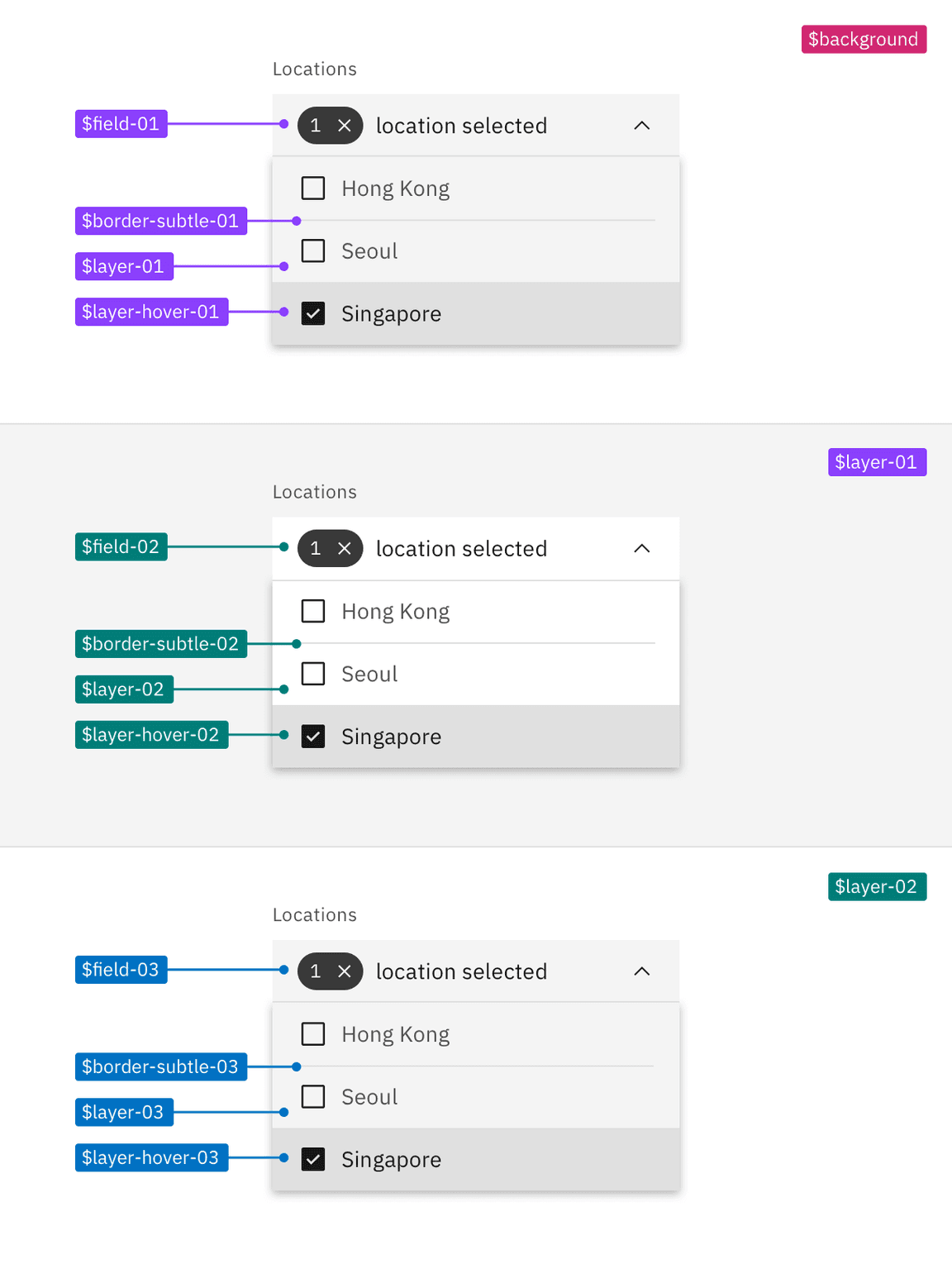
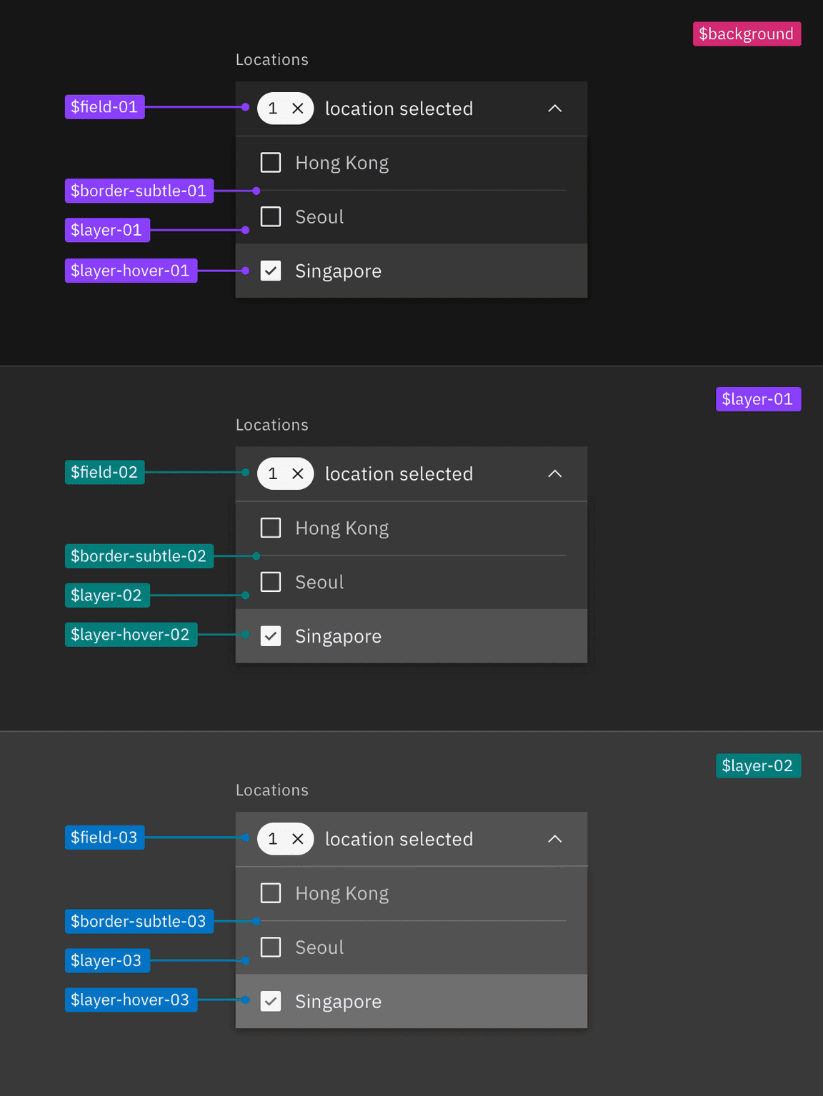
A dropdown using tokens from the four layer sets: base set (magenta), 01 layer set (purple), 02 layer set (teal), and 03 layer set (cyan).
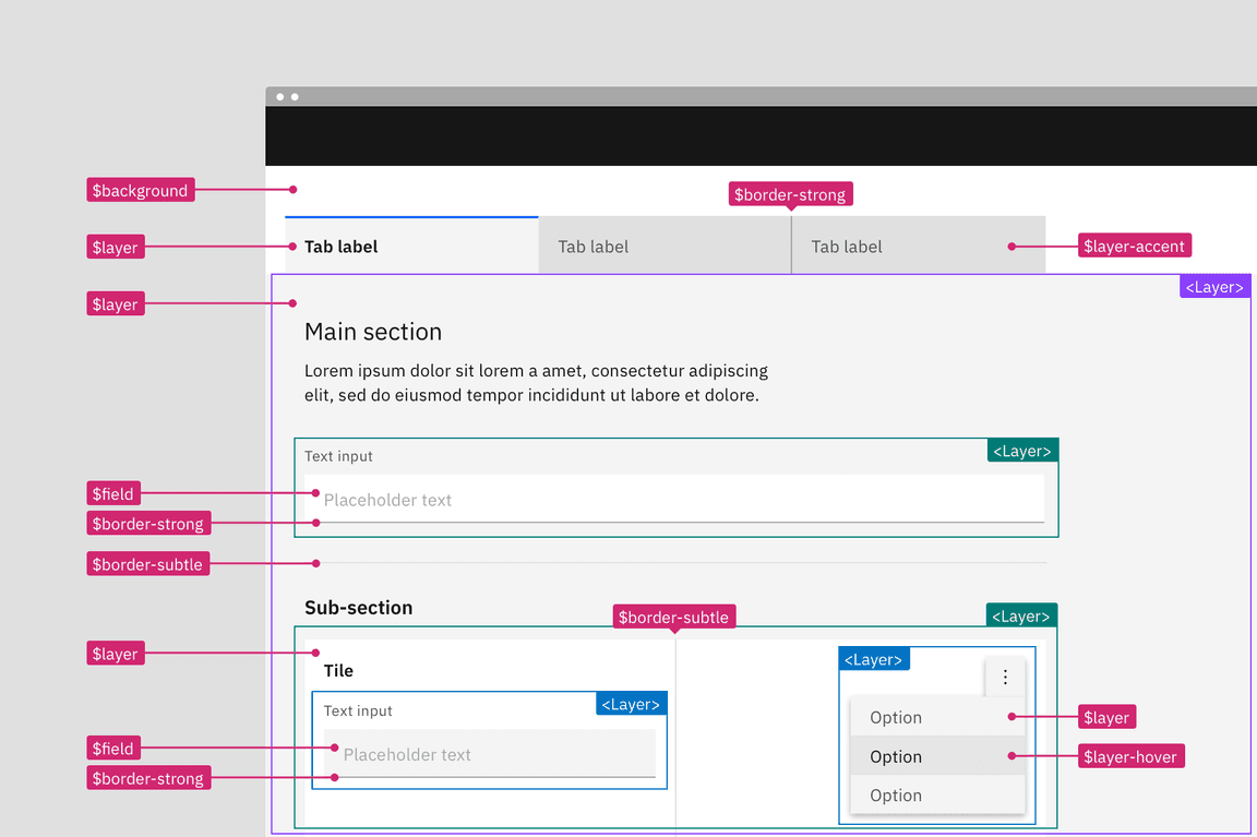
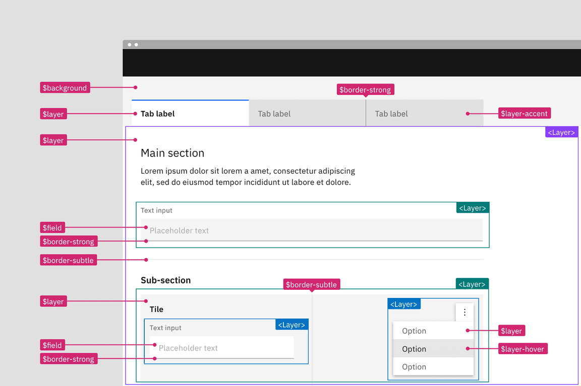
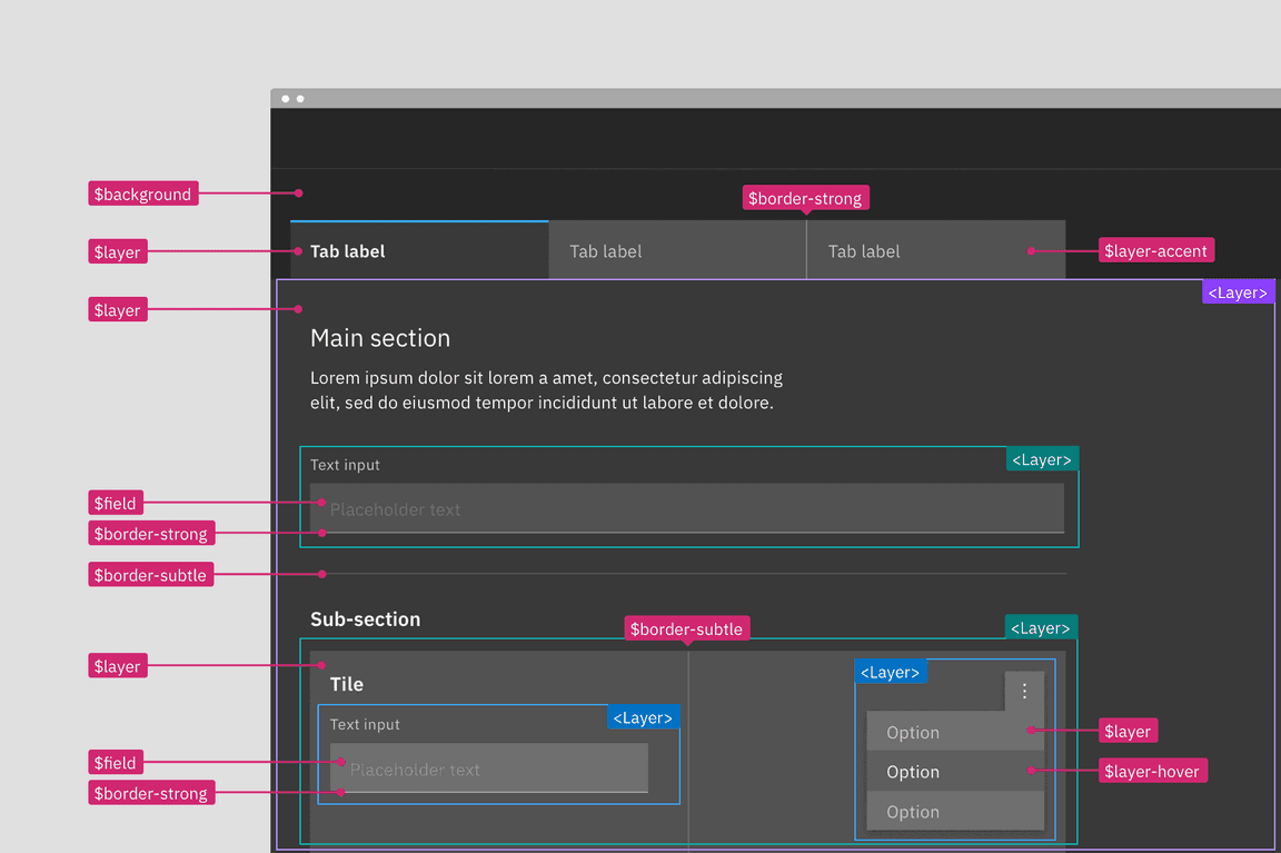
Applying layering tokens in a layout
Referencing the image below, the starting base layer is the page area behind and above the tabs; it uses
$background
$layer-01
$layer-accent-01
$layer
$layer-01
In the tab’s main section, the text input field is placed on top of
$layer-01
$field-02
$border-strong-02
$layer-02
$border-subtle-02
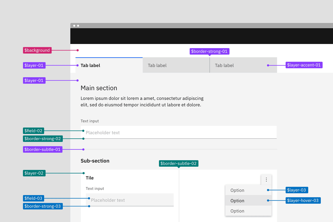
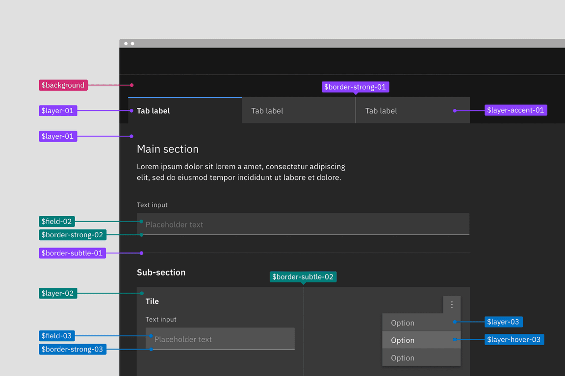
An example layout applying tokens from the four different layer sets: base set (magenta), 01 layer set (purple), 02 layer set (teal), and 03 layer set (cyan).
Building components with layer tokens
Building components with layering tokens works just like how you would have always built component color variations in Carbon. For each layer that a component lives on, a separate component variation must be built using the tokens from that layering set.
Spec each component variant with its corresponding layering set. For elements that are not part of the layer sets like type or icons, apply color tokens as you normally would. Non-layer tokens will be the same across variants because they have enough contrast not to need a change with each layer.
Example component spec in the white theme using the 01 layer set tokens.
Contextual tokens
Contextual tokens are code specific tokens used to automatically map the layering model onto components depending on where it used on the page. A contextual token is aware of what layer it is placed on and will call the correct values for that layer. There is only one set of contextual tokens and they require only one component variant to be built.
Contextual tokens can be used in place of layering tokens. The two types of tokens have similar token names except the contextual tokens do not have the number terminal. Contextual tokens keep the same name no matter which layer it sits on.
When to use contextual tokens
- When building reusable components that need to work across layers.
How contextual tokens work
Layering is still possible using the contextual tokens. However, the value of the token is not fixed per theme like with a normal design token from the layering sets. Contextual tokens have a variable value within a theme that is controlled through the use of a special component called the layer component.
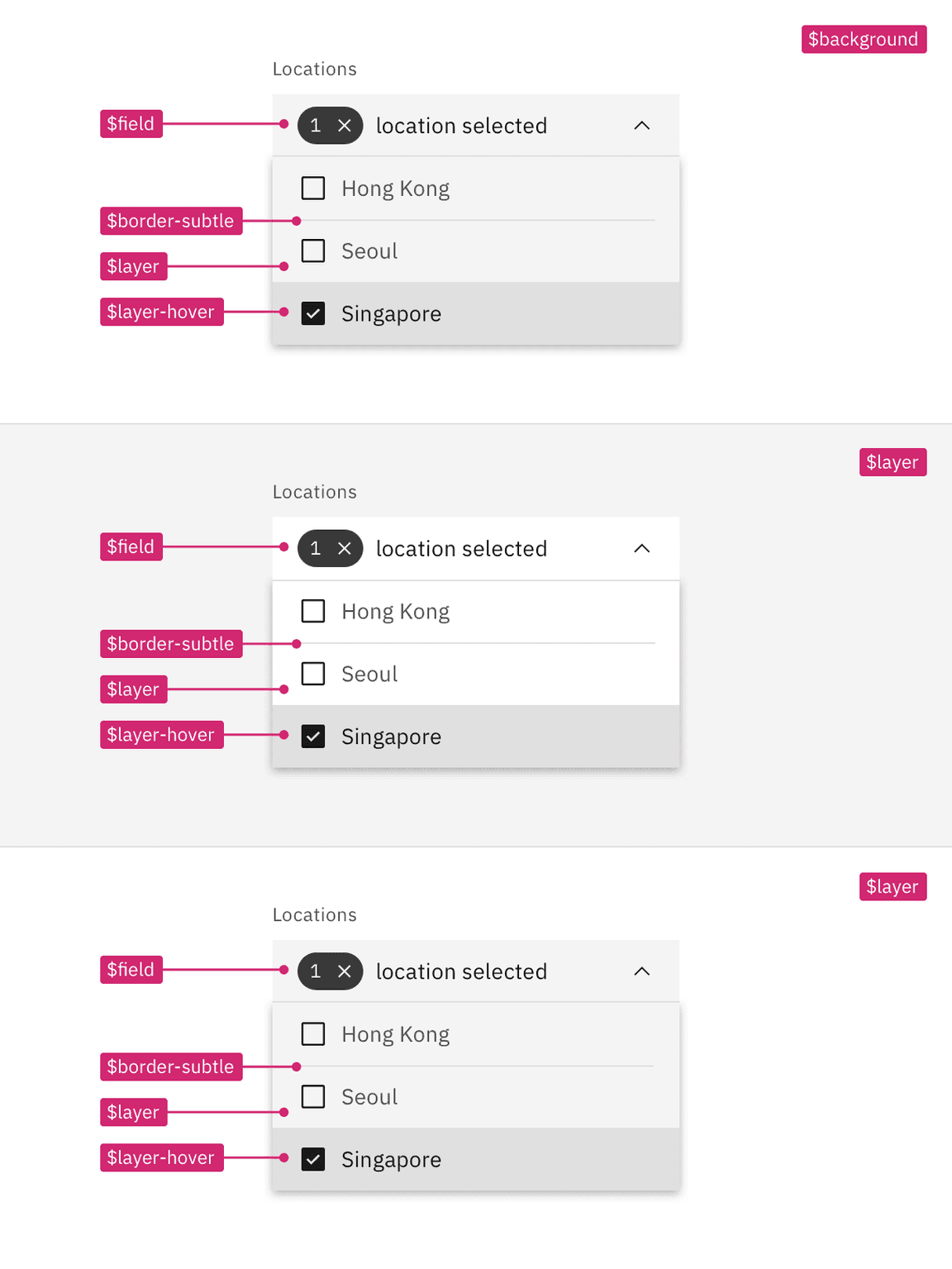
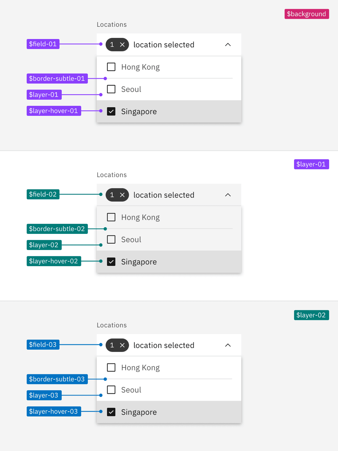
A dropdown across three layers in a theme, all using the same contextual tokens.
Using the layer component
The layer component is used to render a single component on different layers. Components built with contextual tokens when placed inside the layer component will automatically map to the correct layer based on where it sits in the layer structure. Components can be nested inside the layer component up to three level, the last level corresponding to the 03 layer set tokens. By default, tokens use the 01 layer set tokens in the first layer.
For more guidance on the layer component, go to the Storybook.
<Layer><ChildComponent /><Layer><ChildComponent /><Layer><ChildComponent /></Layer></Layer></Layer>
Applying contextual layer tokens in a layout
When applying contextual tokens, there are no layer sets so each layer uses the same tokens but will be wrapped in a different level of the layer component. For example, referencing the image below, the two text inputs are on different layers and they both use the
$field
A layout using contextual tokens within a single theme. The components are wrapped in the layer component to control the visual output: first layer (purple), second nested layer (teal), and third nested layer (cyan).
Building components with contextual tokens
Build a single component as you would normally but apply the contextual color tokens instead of the layer set tokens. Then in your product code wrap the component in the layer component to express the nested layer visuals. Even if the component is never used at other layer levels it is still acceptable and encouraged to use the contextual tokens.
Designing for contextual tokens
Contextual tokens are only available in code and are not a part of the design assets. Designers should use the layer set tokens when creating assets but can include contextual tokens in their specs and redlines. To convert a layer set token to a contextual token, simply drop the numbers at the end of the token name.
Inline theming
Inline theming is used when a section of a UI needs to be a different theme from the rest of the page. Inline theming allows themes to be nested within each other without needing custom styles or overrides.
In product, a common use-case for inline theming is applying a contrasting theme to the UI Shell or side panels. This is especially common in light themed products or light modes. For example, the majority of a page may use the White theme while the UI Shell and the right side panels use an inline Gray 100 theme. This type of theme pairing creates a high contrast moment that can add emphasis and focus to a work flow.
When to use inline theming
Only use inline theming for major shifts in color, like high contrast moments. The more subtle transitions of color in a product are handled within each theme through the layering model tokens. It is unlikely that you’ll need to inline a White theme within the Gray 10 theme or the Gray 90 theme within the Gray100 theme.
How inline theming works
In order to implement inline theming, you must use the Carbon color tokens and themes. For the section of the product you want to inline theme, simply apply the core Carbon tokens like you were doing for the rest of the page, then wrap the targeted section in the Theme component to assign a new theme.
Theme component
The theme component allows you to specify the theme for a page, or a portion of a page. It is most often used to implement inline theming in order to specify what theme a section of the page should render with.
For more guidance on the theme component, go to the Storybook.
<Theme theme="g100"><ChildComponent /></Theme>
Designing for inline theming
When designing for inline theming, you’ll need to pull assets that you want in your frame from other theme library files in Figma. Assets will have the same token names across libraries but will show different values. Specify in the design deliverables which sections of the page will be using an inline theme.
Light or dark mode
Light or dark mode is a theme setting that allows the end user to choose either an UI that is predominately light or dark in color. The UI will automatically switch from using light colors backgrounds with dark color text to using dark color backgrounds with light color text.
When to use modes
Adding the ability to change between a light or dark mode in your product is not required as an IBM product but is highly encouraged. Attention to detail, customization, and being at the forefront of innovation separates IBM over our competitors.
Respecting our users preferences
Most operating system nowadays (ex: MacOS, iOS, Windows, Android and Linux/GNOME 3) support dark and light modes, offering APIs so that websites and application can automatically match users preferred mode. Many users prefer working on dark themed IDEs and using dark mode in their machines.
Creating optimal user conditions
For some users, choosing light versus dark mode is more than an aesthetic choice. While some research shows that unimpaired sighted user preform better in light mode, it also shows that dark mode is better for people with cataract and related disorders. Dark mode emits less light and can therefor reduces eyes strain and help prevent headaches and migraine.
How modes works
The themes use color tokens to interpret which values are needed for each theme. It is the color tokens that allows a UI to so easily switch from one mode to the next. You cannot implement light or dark mode without using color tokens everywhere in your product. Hard coded values will not change when the mode is switched.
Designing for modes
You can build a light or dark mode by using the Carbon themes and color tokens. Your product will need to choose a light Carbon theme (White or Gray 10) and a dark Carbon theme (Gray 100 or Gray 90). All color in your designs and components whether Carbon, PAL or custom made should be redlined using the Carbon color tokens (it would also be to your advantage to use the color token layer styles from the Carbon design asset libraries when designing).
Redlining a design in one theme should be enough and not require duplicate designs. However, products teams may want to have design comps in multiple themes. In Figma, we recommend that you duplicate your files, then swap your current theme library for another. This replaces local instances with matching instances from the other library. For step-by-step instructions, visit this Figma tutorial.
Creating a mode control
Since this is a user preference, you’ll need to add a control somewhere in your product for the user to make a theme mode selection. This is commonly done in a display setting, user profile, or account area. At the moment, the placement and design of this control is up to product teams, further guidance and designs for a mode control in IBM products may be offered in the future.
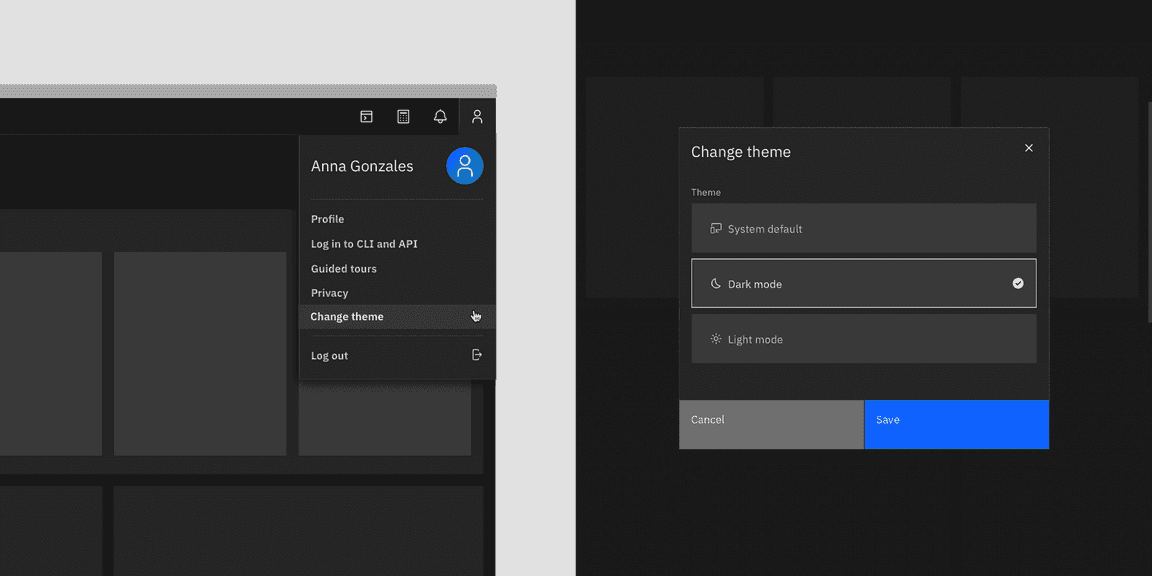
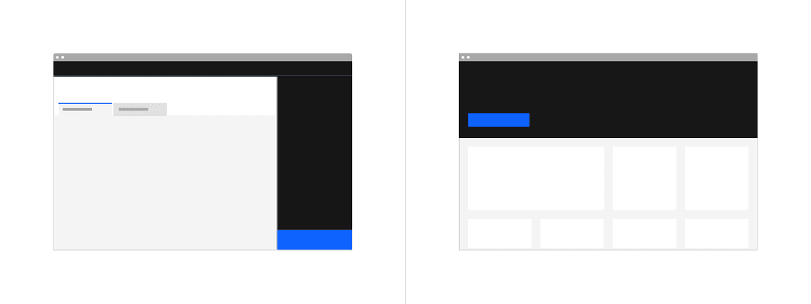
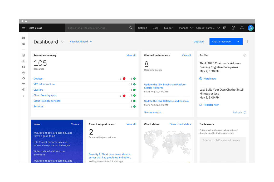
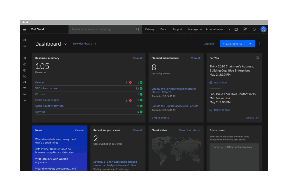
In IBM Cloud (beta), the theme control can be accessed through the user profile panel in the header (left). The “Change theme” link triggers a model where the user can save their theme preference (right).
Inline themes with modes
Mixing themes inline is still allowed with light or dark mode. Mixing inline theme contrast between elements in different modes is also allowed. It is very common for products to have side panels or UI shell elements be high contrast in light mode but low contrast in dark mode. These relationships can be mapped in code using the theme component. Note that smaller components built with an inverse tokens (like tooltip) should remain high contrast when switching modes.
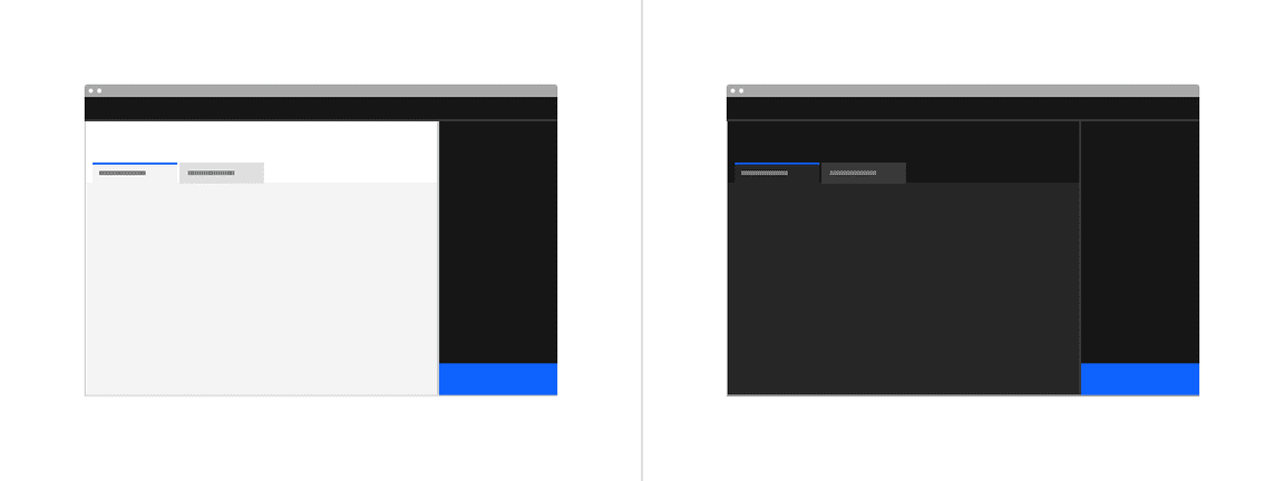
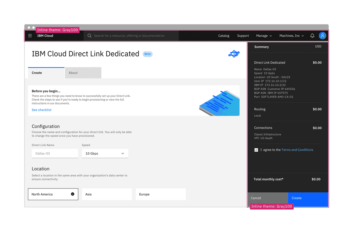
Light mode with an inline theme Gray 100 panel (left) and the dark mode without an inline theme (right)
Consider illustrations
You’ll need to account for illustrations and other imagery like pictograms changing color between modes. Otherwise you may end up having very high contrast images in one mode vs the other. Whenever possible, switch out assets entirely between modes to reflect the theme either by using tokens in the svg code or manually swapping out a png. When not possible, a low effort way to design images for modes is to use transparent backgrounds.
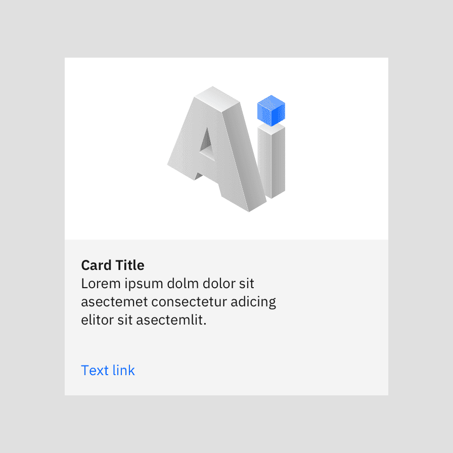
Use light colored assets, tones, and backgrounds for illustrations in the light themes (the best solution)
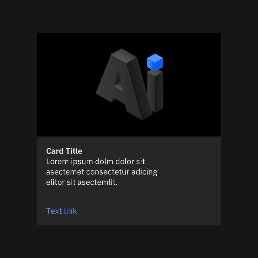
Use dark colored assets, tones, and backgrounds for illustrations in the dark themes (the best solution)
Don’t use images with colored backgrounds when switching between modes because they will appear broken and in high contrast in the opposite mode
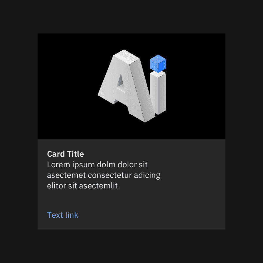
If only one image is available between modes, use an image with a transparent background and swap the container color background to match the mode (acceptable solution)