Fluid styles
Fluid versions of certain familiar components offer alternative stylistic expressions that differentiate them from their default counterparts. The juxtaposition of both fluid and default styling in a user interface manifests the expressive and productive duality that is the cornerstone of the IBM brand.
Overview
When we say that a component is “fluid,” we mean that it becomes a part of a larger, compound component by bleeding to one or more edges of its container. Fluid components never exist in isolation; they are always part of another component or structure, like a modal or form. Fluid is a unique style and particular expression of a component. Alternatively, the more common expression, frequently used in productive spaces, is known as the default style.
Default and fluid components share the same functionality but look visually different and have different alignment rules. The fluid name originates from how these components respond and where they can be placed. Fluid components always hug at least one container edge, moving along with the grid as the container resizes.
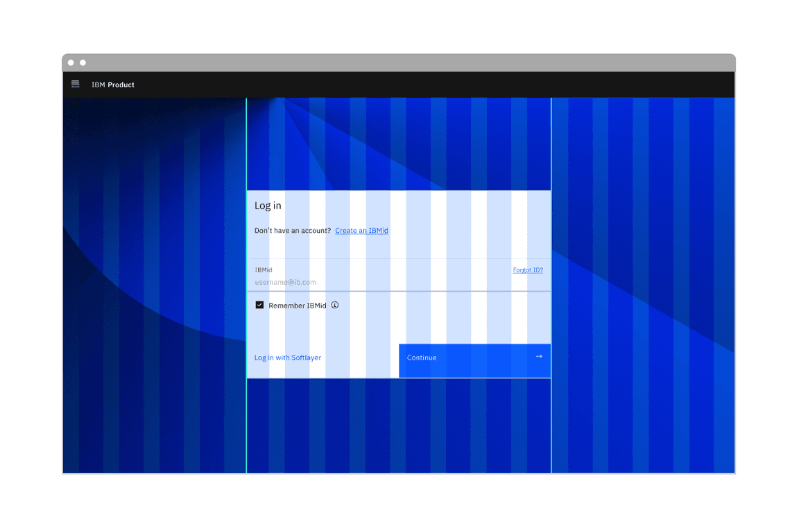
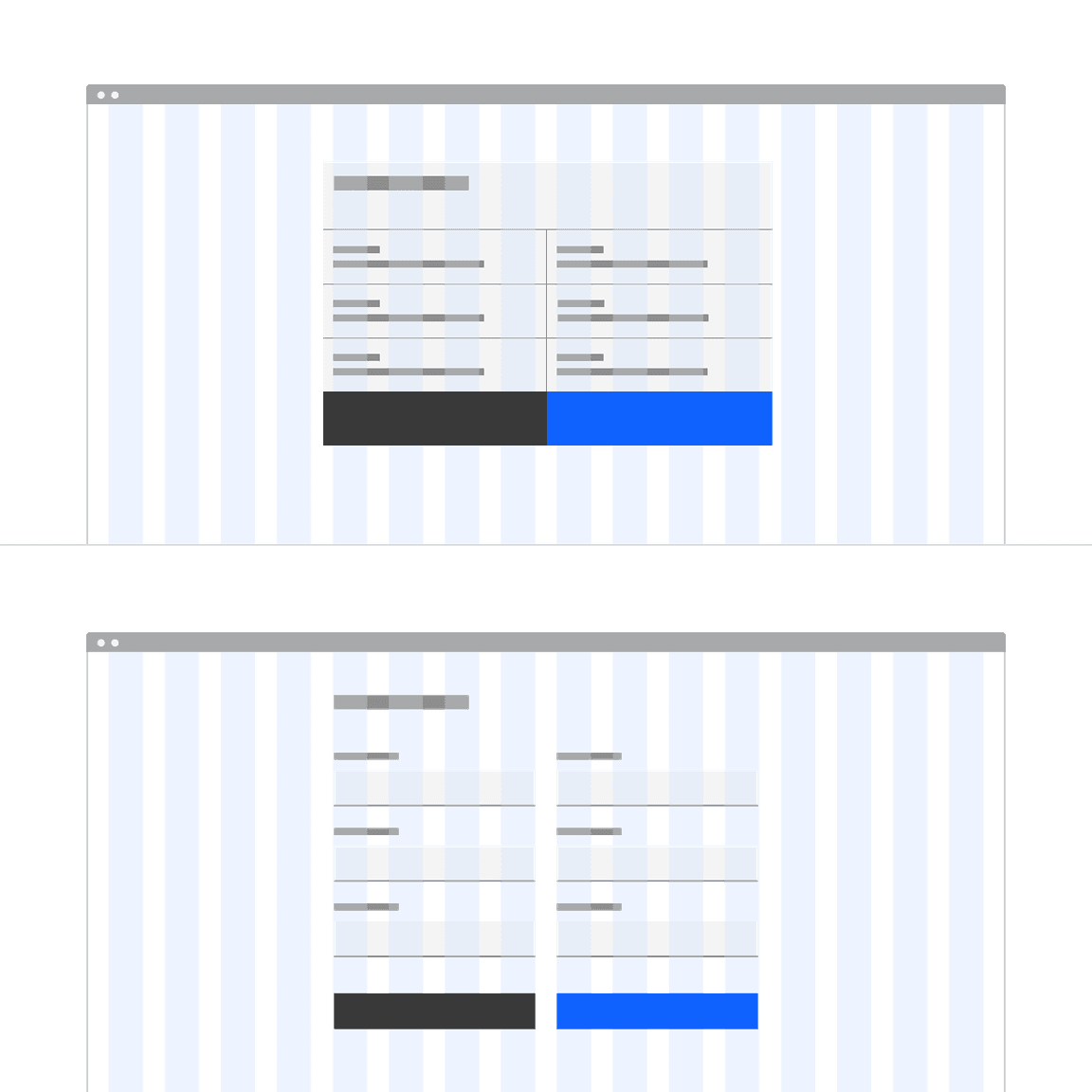
A fluid text input and fluid buttons inside a fluid modal container using the condensed gutter mode.
Key terms
| Term | Definition |
|---|---|
| Fixed width | The width of an element is set to a specific value and does not change as the browser resizes. |
| Fluid width | The width of an element is responsive, often proportionally changing between breakpoints or is set as a percentage of a container. |
| Default style | The primary style and behavior of a component that may respond either in a fluid or fixed-width manner depending on layout and responsive strategy. Default styling is more productive in nature and is most commonly used across product UI. |
| Fluid style | An alternative style and behavior available for certain components that always has a fluid width. Fluid components are percentage-based as they comprise part of a greater whole. Fluid styling is more expressive and is used to create drama and emphasis in an experience. |
| Productive moment | Experiences that keep the user focused and able to complete complex tasks. Productive elements may appear more conservative, confident, and efficient on the whole. |
| Expressive moment | Experiences that create a desired impact or pause in a layout. Expressive elements are often employed in long-form, editorial experiences, when users are learning and exploring. Expressive elements may evoke more personality and emotion. |
When to use fluid styles
- Use in expressive or important moments, to better capture the user’s attention and offer a rhythmic break to the productive experience.
- Use within or attached to compound components.
- Use in spacious layouts where the fluid variants have space to expand and breathe.
When not to use fluid styles
- Don’t use when white space is needed between input components or in dense layouts where smaller components may be preferred.
- Don’t use in hyper-productive moments like a complex form.
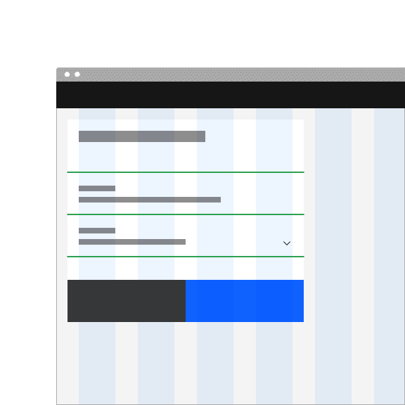
- Don’t use inside accordions or similarly sectioned containers, where the edge of the fluid component aligns to the same edge as the accordion dividers; this creates hierarchical confusion.
Types of fluid components
Not all components come with a fluid style, but each fluid instance has a default counterpart. The most common types components that have a fluid style are inputs, buttons, containers, and forms.
Fluid inputs
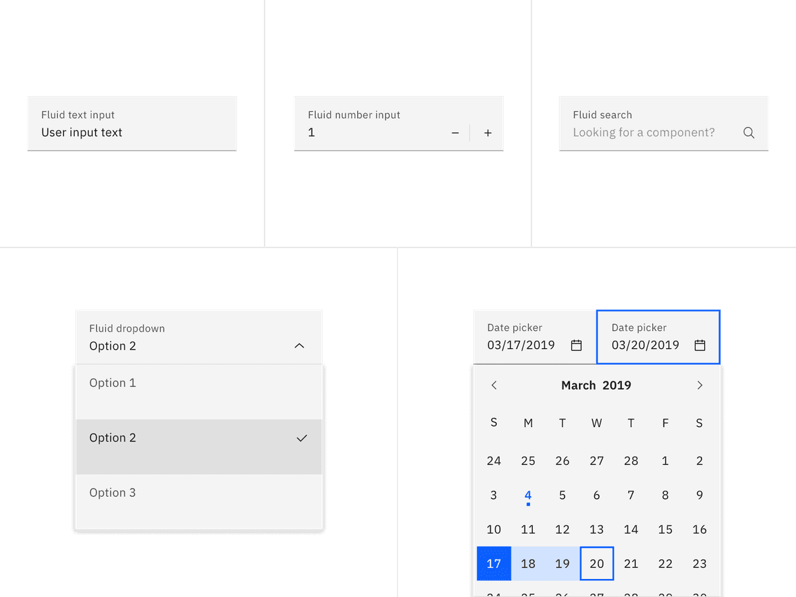
Fluid inputs are an alternative input style with the label placed inside the input field, aligning with the user input text. All text is contained inside the field, unlike the default input, where the label and helper text sit above and below (respectively) outside the field container. Fluid inputs only have one height, at 64px, but have a fluid width that hugs one or more edges of its container. See the individual input components for more guidance on each fluid option.
Fluid buttons
Button alignment determines whether the button is a default or fluid element within a layout. If it is fluid, its width is defined as a percentage (25%, 50%, or 100%) of the container’s width and will often be attached to the bottom of the container. Fluid buttons can never be embedded in the middle of a flow/layout. They must hug at least on edge of a container. Use default buttons if additional options or actions follow below the primary flow and primary action. For more guidance on default versus fluid buttons, see the button component.
Fluid-width default buttons
A default button can have a fixed or fluid width. A fixed-width button is set to the size of the text label with 64px fixed padding on the right side and 16px fixed padding on the left. However, there is a hybrid scenario where a floating default-style button can span a designated number of columns on the responsive column grid, giving it a fluid width. These are called “fluid-width default buttons.”
Fluid-width default buttons are always preferable to fixed-width default buttons in a layout. When possible set the default button container’s relative position to the responsive layout grid and match button width to the width of other elements on the page. Ideally, when using groups of related buttons (not including ghost buttons), they should all be the same width.
Fluid containers
Though not a formal component, fluid and fixed containers are applied in various existing components. Fluid containers, like a modal, calculate their width based on column spans or percentages and will fluctuate in size. Fixed containers, like a side panel, maintain a static width, cannot be collapsed and can exist outside the responsive grid. For more information on grid responsive containers, see 2x Grid.

Fluid forms
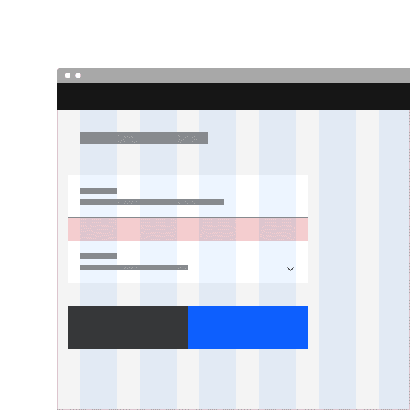
Fluid forms are architectural in that they do not allow vertical or horizontal space between inputs. Fluid forms use the condensed or narrow gutter mode and can hang into the gutter without causing label misalignment. Default forms use a wide gutter mode and align, flush to the grid columns, prioritizing vertical label alignment on the grid.
Fluid forms should only be used for simple, straightforward tasks, and any complex or multi-section forms should use the default style instead. For more guidance on default versus fluid forms, see the form component.
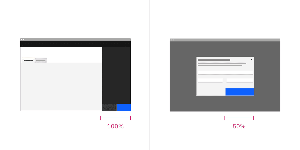
An example showing grid alignment for a fluid form (top) and the default form (bottom).
Designing with fluid
Visual guidance
Alignment
- Fluid components are stacked flush to one another with 0px of padding between them.
- Default components are equally stacked with padding separating each component.
- Fluid components use the condensed or narrow gutter modes while default variants use the wide or narrow gutter mode.
Do stack fluid components flush to one another as they are architectural and should remain a cohesive unit.
Don’t add vertical or horizontal space between fluid components.
Placement
- Fluid components will always bleed to one or more edges of their container.
- Fluid components never exist in isolation; they are always part of another component or structure.
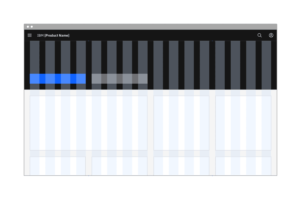
Examples of various ways a fluid component may be attached to its container.
Sizing
- Fluid component width is dependent on its fluid container size or column span. Fluid components can change per breakpoint or according to their defined percentage.
- Default components may have fluid widths to a certain point but will commonly have a max or min width to prevent them from continuously growing.
Accessibility
- Fluid components need a 3:1 border between them when vertically or horizontally stacked.
Best practices
- Fluid components always appear in a container or as a structural unit. Default components may or may not appear within a container and margins will vary according to their location on the grid.
- Together, fluid components comprise fluid containers, whereas default components can either sit on the page, without a container, or inside a container in with inner margins.
- Default and fluid components can be used together in certain hybrid scenarios. The most common pairing is default input components, with fluid buttons in a contained form, like a modal or side panel.
Related
Components
Feedback
Help us improve this pattern by providing feedback, asking questions, and leaving any other comments on GitHub.