Contained list
Contained lists group content that is similar or related and can contain read-only or interactive information.
Live demo
This live demo contains only a preview of functionality and styles available for this component. View the full demo on Storybook for additional information such as its version, controls, and API documentation.
Accessibility testing statusFor every latest release, Carbon runs tests on all components to meet the accessibility requirements. These different statuses report the work that Carbon has done in the back end. These tests appear only when the components are stable.
For every latest release, Carbon runs tests on all components to meet the accessibility requirements. These different statuses report the work that Carbon has done in the back end. These tests appear only when the components are stable.
Overview
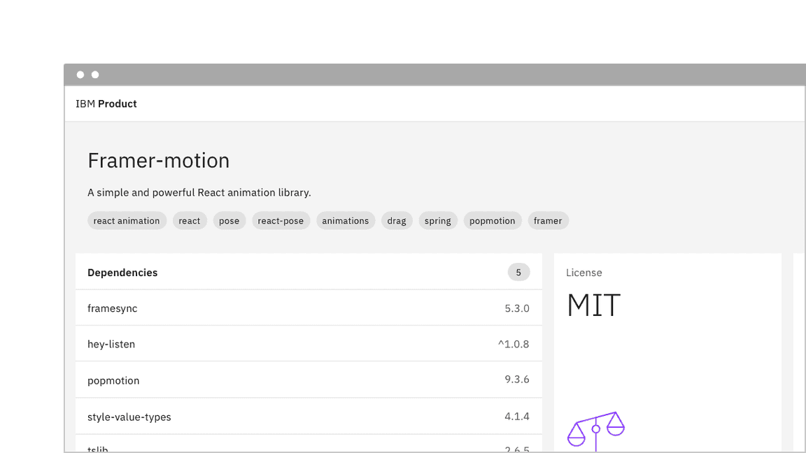
Contained lists are commonly used inside of containers like cards, sidebars, and disclosure situations. These lists have one header column of information with multiple list item rows. Contained lists help you organize related content within smaller spaces within a user interface and allow you to include inline actions and interactive elements.
When to use
- Use on a page inside of small spaces or in disclosure situations.
- Use when including interactive elements or inline actions in a list.
- To logically group items that follow the same content structure.
When not to use
- Do not use if the list content needs to be nested more than one level deep and becomes overly complex and lengthy. For these situations, use the data table component instead.
- Do not use if the list needs to contain multiple column headers, instead use the structured list component.
Variants
| Variant | Purpose |
|---|---|
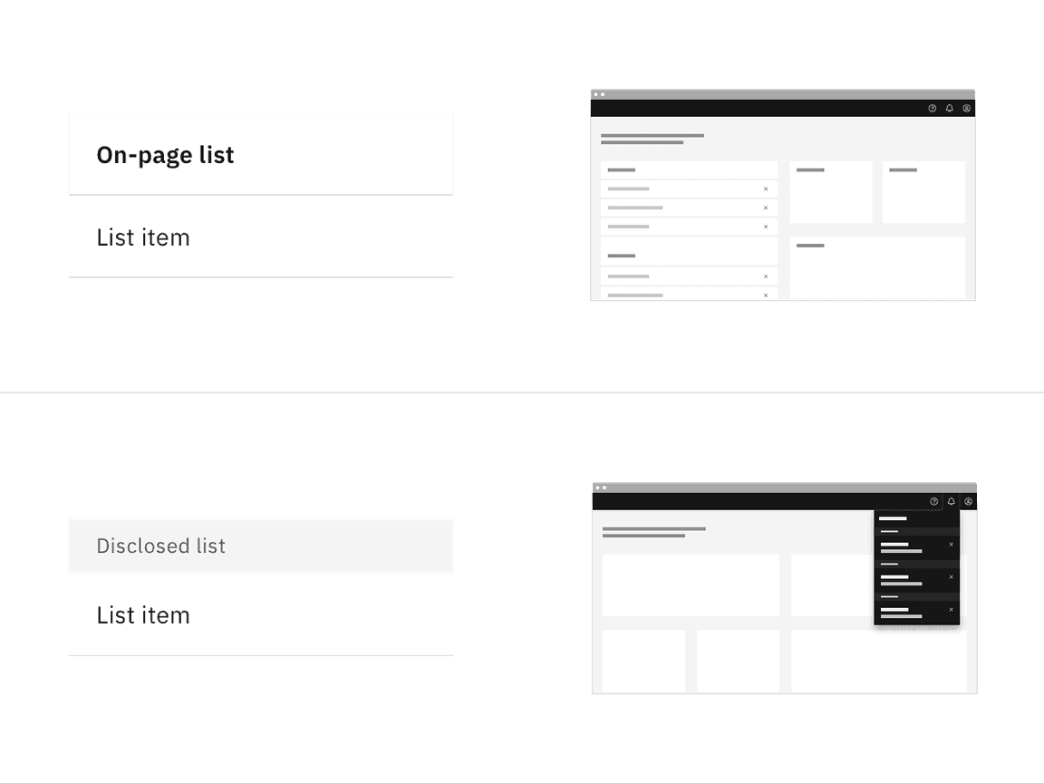
| On-page list | Use this variant when placing the list in a persistent context like the main area in the user interface, such as on a card or in a sidebar. |
| Disclosed list | Use this variant when the list is shown within a temporary context, for example within a popover or layer that is elevated by a drop shadow or border. |
Formatting
Anatomy
Contained lists are made up of a list header area, list title, list item rows, and optional interactive elements.
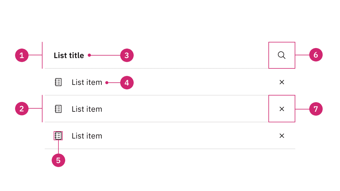
- List header area: Area to group the succeeding list items.
- List item area: Area to group text and elements in a list row.
- List title: Descriptive name for the group of list items.
- List item: The content in a list item row.
- Non-interactive icon (optional): A decorative icon to help visually describe a list item.
- Search icon button (optional): An icon button for search or filtering functionality in the contained list.
- Interactive element (optional): An interactive element in the header or row such as a button, link, icon, tag, or toggle.
Alignment
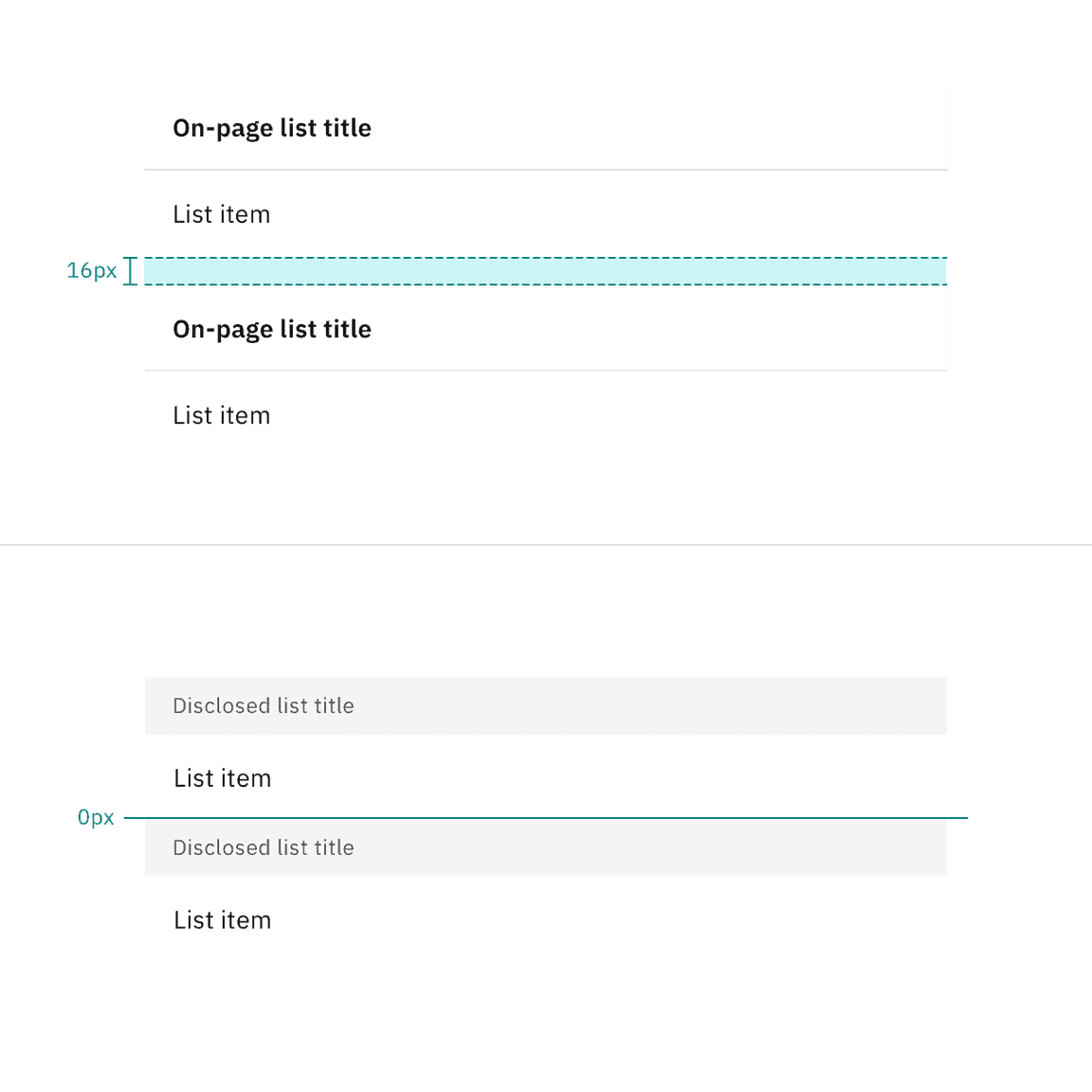
Contained lists can have multiple sections and stack on top of each other. When stacking multiple on-page lists, there should be 16px padding ($spacing-05) between each list. When stacking multiple disclosed lists, stack them to be flush with 0px padding between each other.
Scrolling
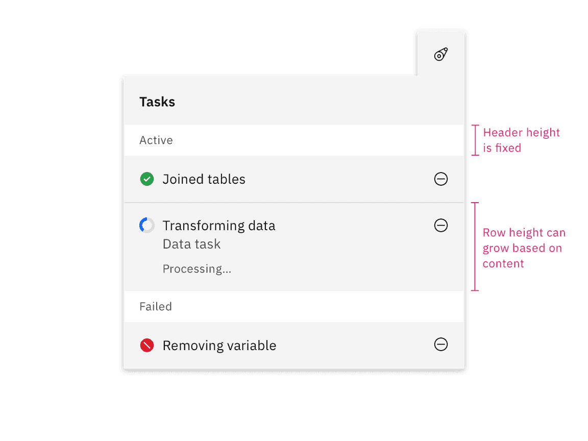
Contained list header areas can be sticky and fixed in place while the list item rows scroll underneath. This functionality is optional depending on the use case.
Content
Main elements
List title
- A list title is a descriptive name for the group of list items.
- List titles should be short and clear, ranging from one to three words to describe the list group.
- Use sentence case capitalization.
List item
- List item text can vary but the structure of the content should be similar per row in the same contained list.
- List item text can have multiple lines of concise content, but should not contain multiple paragraphs of lengthy information.
- Use sentence case capitalization.
On-page list
Use the on-page list variant when placing the list on the general page of a user interface. On-page lists typically appear in smaller spaces, like in a card or sidebars. The on-page list styling has no visible background header with fixed information. If there are scrolling capabilities, the header will remain sticky and have a background layer to differentiate it from the list item rows scrolling beneath it.
Placement
On-page lists should span the entire width of the container they are placed within to make the best use of space and to achieve vertical type alignment with other text and components on the page.
Sizing
The on-page list comes in four height sizes — extra large (64px), large (48px), medium (40px), and small (32px). The large height size is the default size.
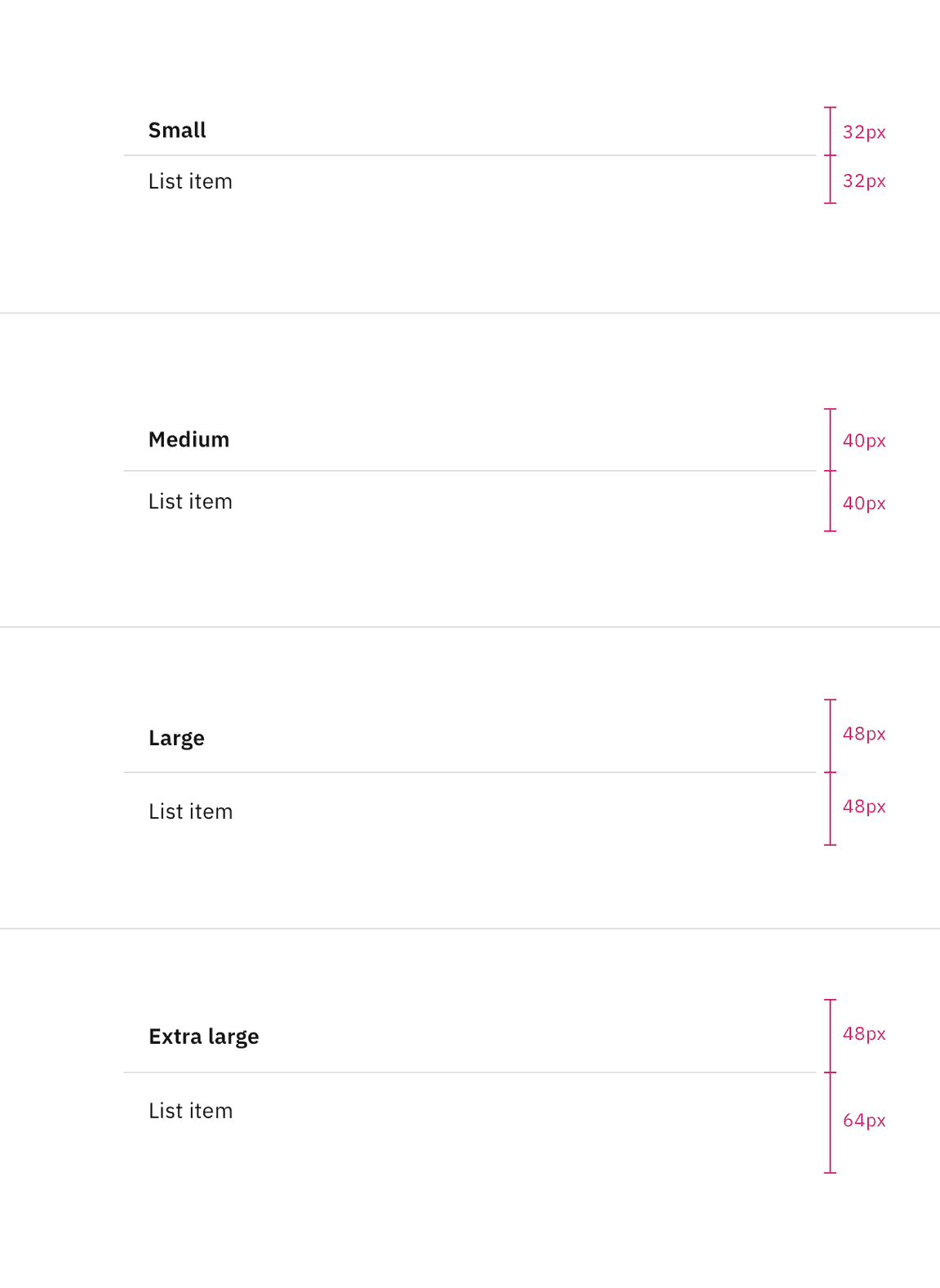
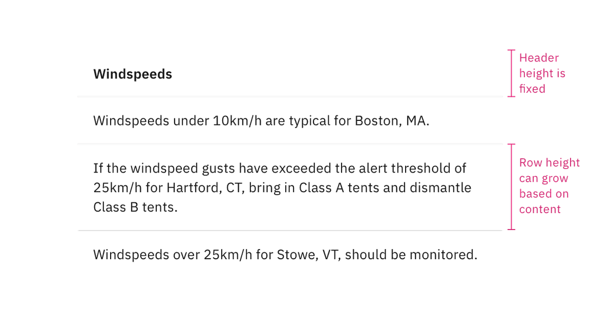
The list header height is always fixed, while list item row heights can vary based on the amount of content in each row. The content in each row is flexible, but by default each list item row height follows the extra large, large, or small height size for one line of content.
Disclosed list
Use the disclosed list variant when placing the list within a temporary context, like a popover or disclosure, which is typically accompanied by an enclosed border or drop shadow. The disclosed list styling has a background layer underneath the header. Each header has a smaller height than the on-page list styling to take up less real estate in the smaller and scrollable spaces it usually appears in.
Placement
Disclosed lists should span the entire width of the container they are placed within to make the best use of space.
Sizing
The disclosed list header has a 32px height and the list item rows by default have a 48px height. The disclosed list often appears in small, restricted places so keeping a shorter height can save valuable space and reduce the amount of vertical scrolling.
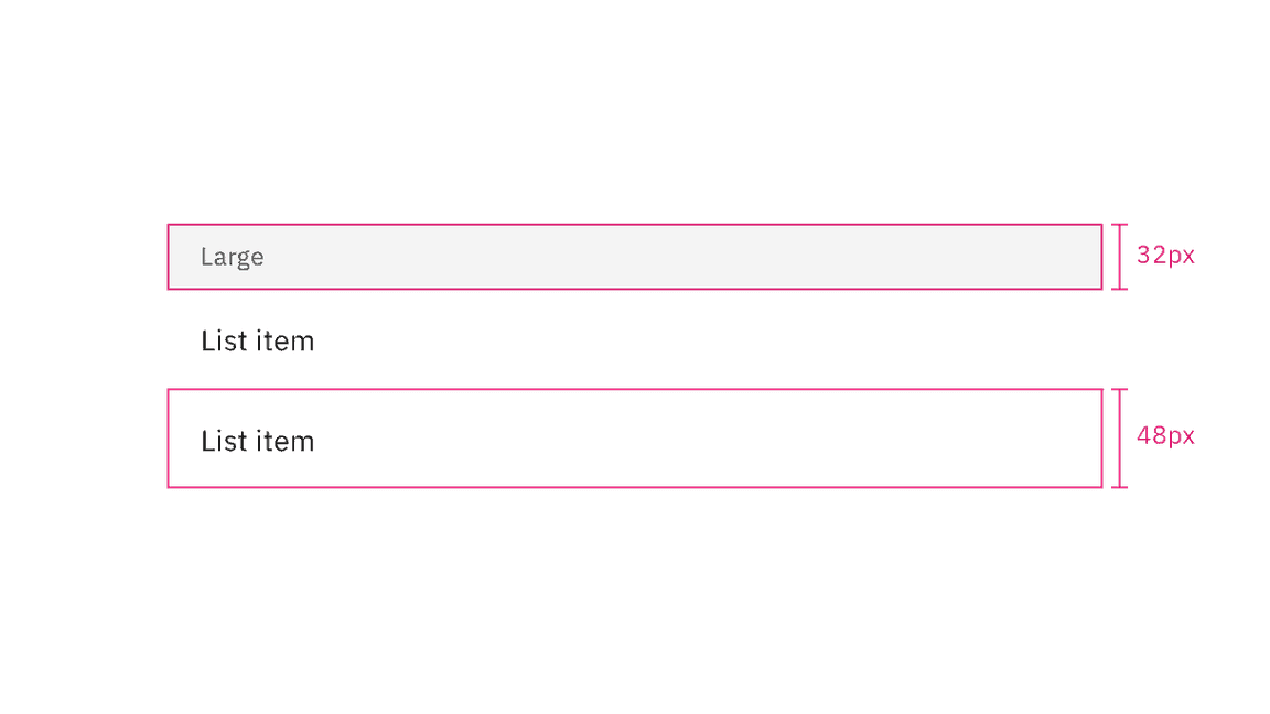
Similarly to the on-page list variant, the list header height is always fixed, while list item row heights can vary based on the amount of content in each row. The content in each row is flexible, but by default each list item row height follows a 48px height for one line of content.
Modifiers
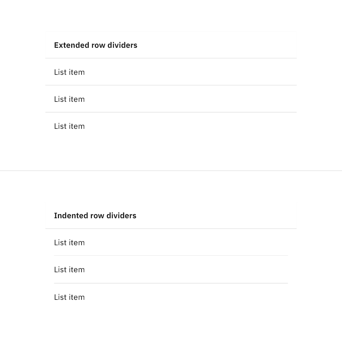
Inset row dividers
Depending on the use case you can inset contained list row dividers. By default, use extended row dividers for row items. Typically indented row dividers are used when placed close to other components that also contain row dividers so they do not collide with each other and create visual tension.
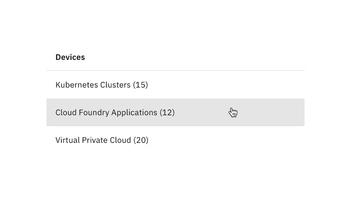
Clickable rows
Contained lists support clickable rows as an optional feature.
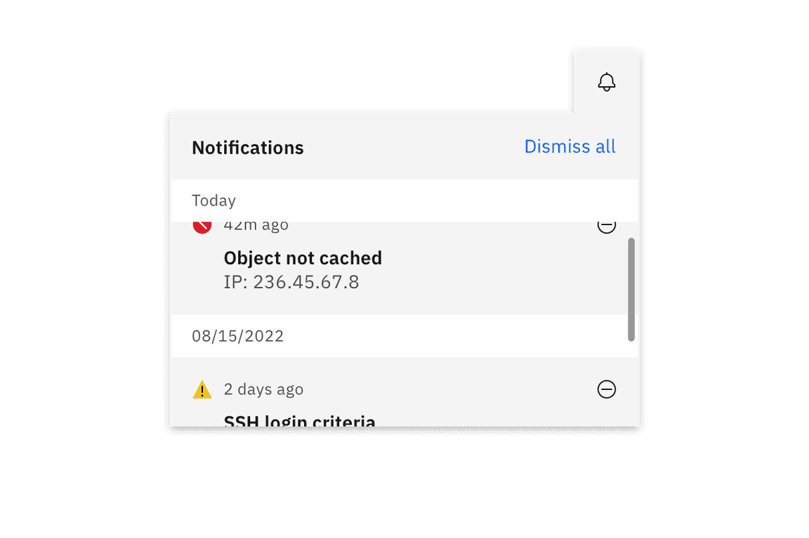
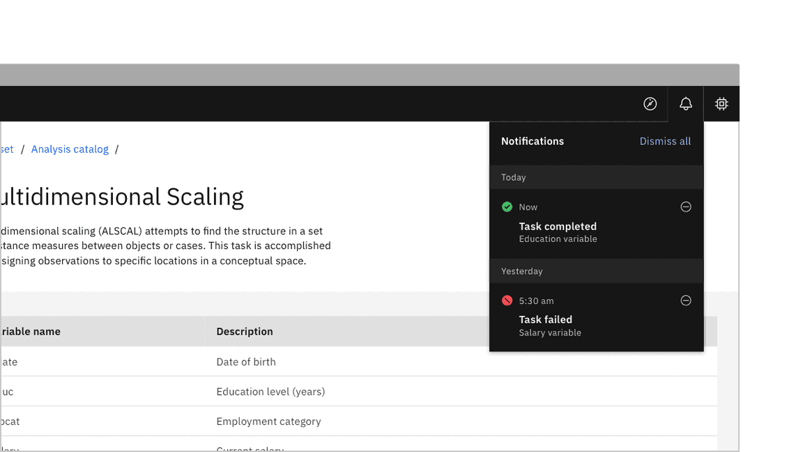
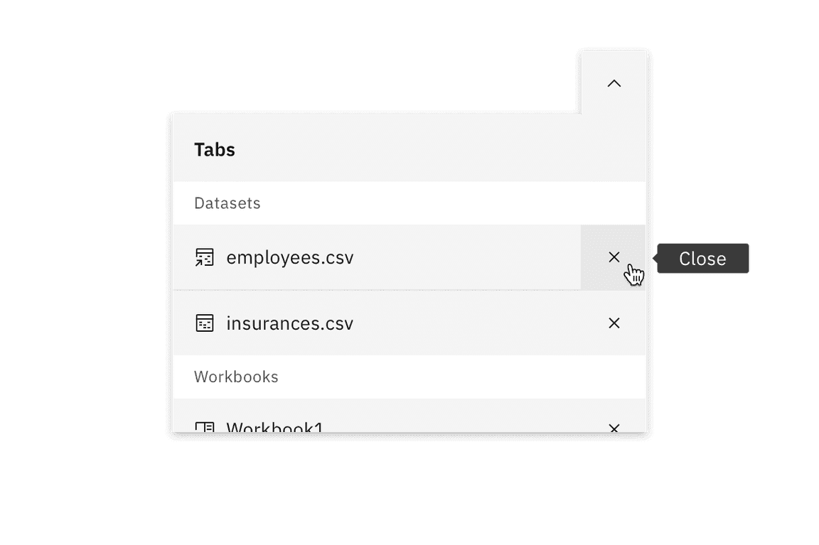
Inline actions
Contained lists can include inline actions, such as closing or dismissing row items in the list.
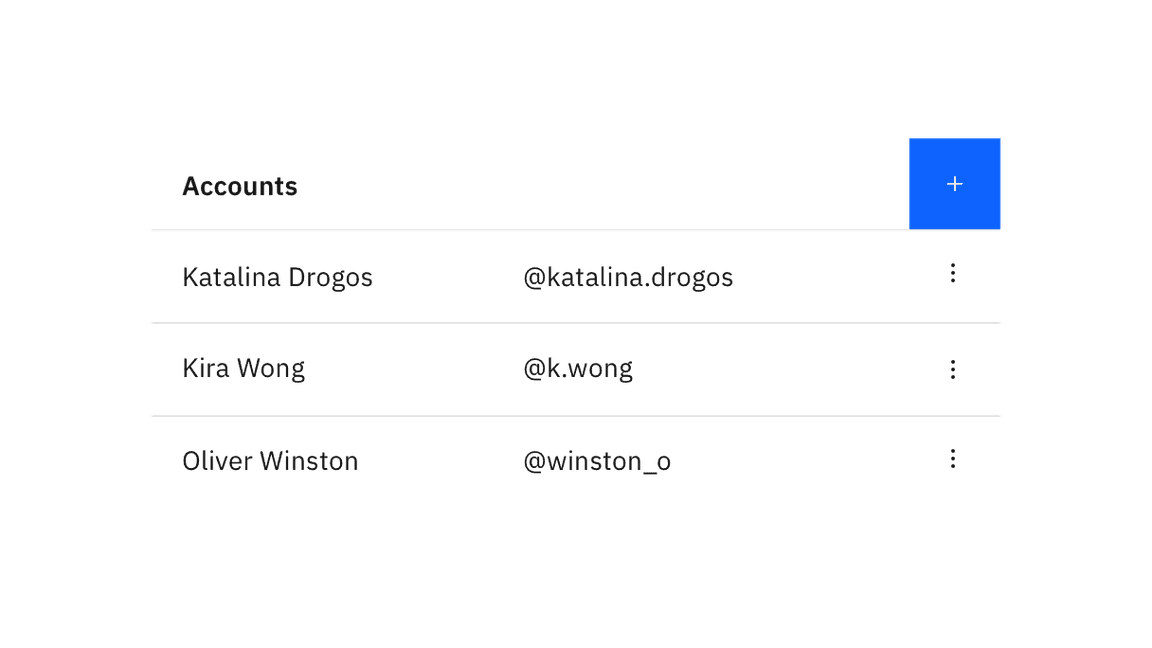
Interactive elements
Contained lists can have interactive elements in headers and rows, such as links, icon buttons, and toggles. Contained lists can also have multiple row columns. Additional row columns act as list item details pertaining to the first list item in the row. If your list has an excess of row columns and needs multiple column headers, we recommend using a data table instead.
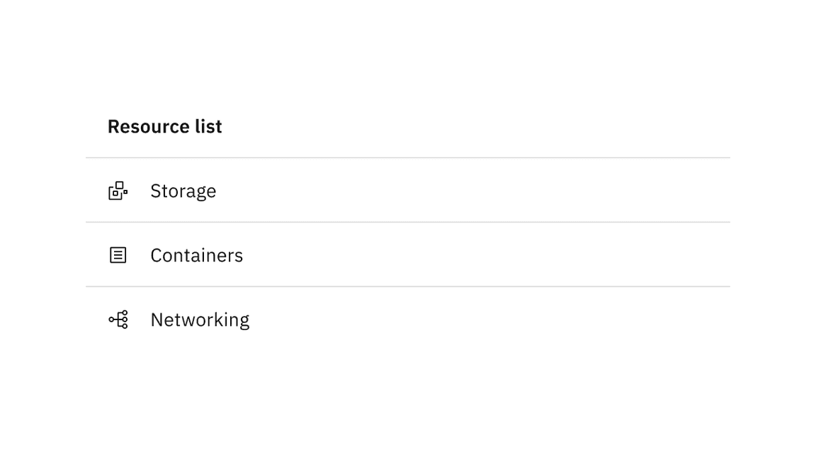
Non-interactive icons
Contained lists can have non-interactive icons positioned before the text in each row to help visually describe the list item, category, or status. These icons are decorative elements and are used for visual purposes only. Icons should typically be the same color as the text in the row unless they are status indicators.
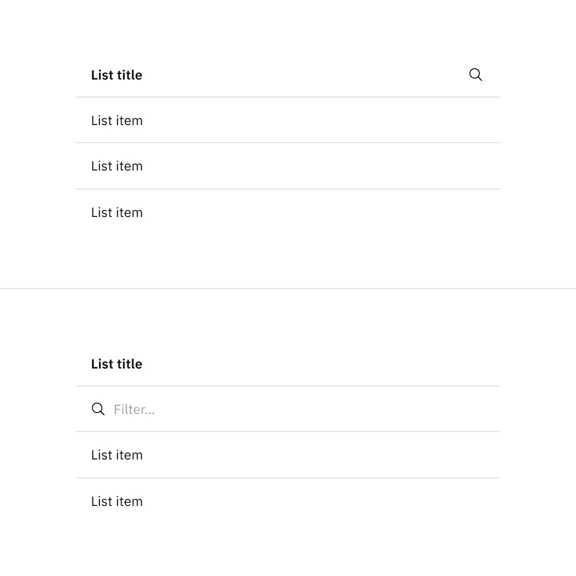
Search and filtering
Contained lists can include a search or filter functionality. The search or filter can collapse and expand in the list header area or stay persistent on the page below the list header area, depending on the use case.
Related
Feedback
Help us improve this component by providing feedback, asking questions, and leaving any other comments on GitHub.