Loading
Loading indicators are used when retrieving data or performing slow computations and help notify users that a process is underway.
Live demo
This live demo contains only a preview of functionality and styles available for this component. View the full demo on Storybook for additional information such as its version, controls, and API documentation.
Accessibility testing statusFor every latest release, Carbon runs tests on all components to meet the accessibility requirements. These different statuses report the work that Carbon has done in the back end. These tests appear only when the components are stable.
For every latest release, Carbon runs tests on all components to meet the accessibility requirements. These different statuses report the work that Carbon has done in the back end. These tests appear only when the components are stable.
Overview
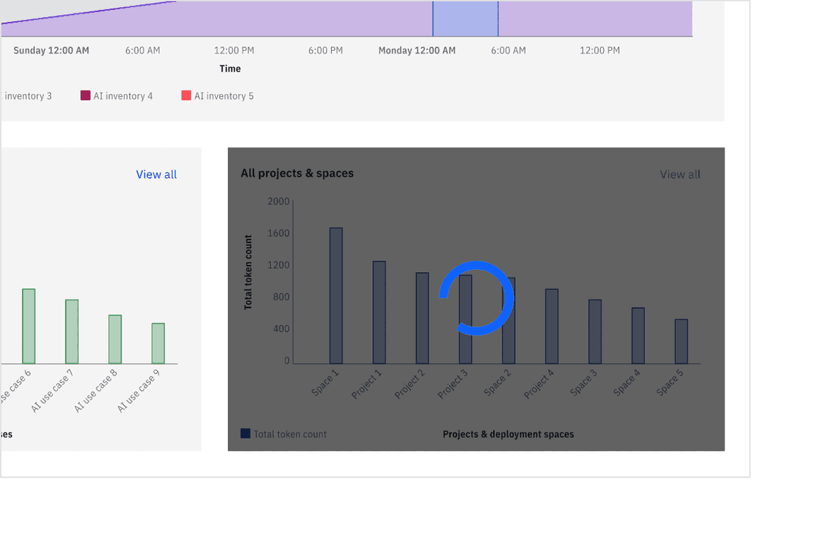
The loading component provides visual feedback indicating a process or action is in progress. It helps set users’ expectations during wait times by signaling that the system is working behind the scenes. Depending on the context, it can be used as a full-page overlay or placed within a specific section or UI element. Use a loading indicator if the expected wait time exceeds three seconds.
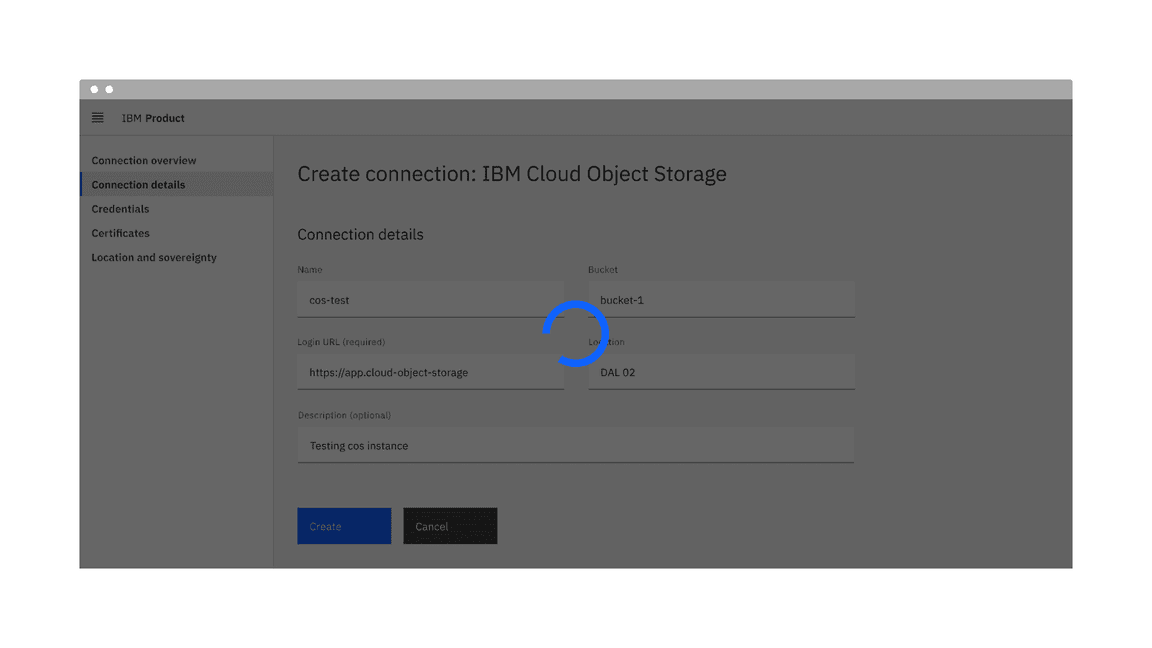
Example of the loading component in a UI
When to use
- Use when retrieving data or performing slow computations to indicate that a request is being processed.
- Use when the entire page or a key section is processing, such as after a user submits or saves data.
When not to use
- Avoid using loading indicators for progressively displaying content; use skeleton states for a better experience.
- Do not use loading indicators if user interaction is required to proceed; use alternatives like tooltips, progress indicators, or notifications instead.
- For full-screen loads, skeleton states are preferred over indicators to create a smoother experience.
- Refrain from using multiple loading indicators simultaneously, as it may overwhelm users.
Formatting
Anatomy
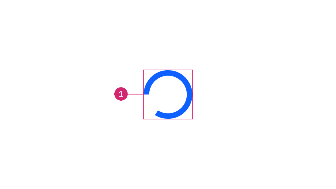
1. Loading indicator: A circular animated icon indicating that a process is underway. It serves as the primary visual cue for the loading state.
Sizing
The loading component is available in two sizes: large and small. The large loading indicator size is the default size.

Large and small sizes of loading component
Large size
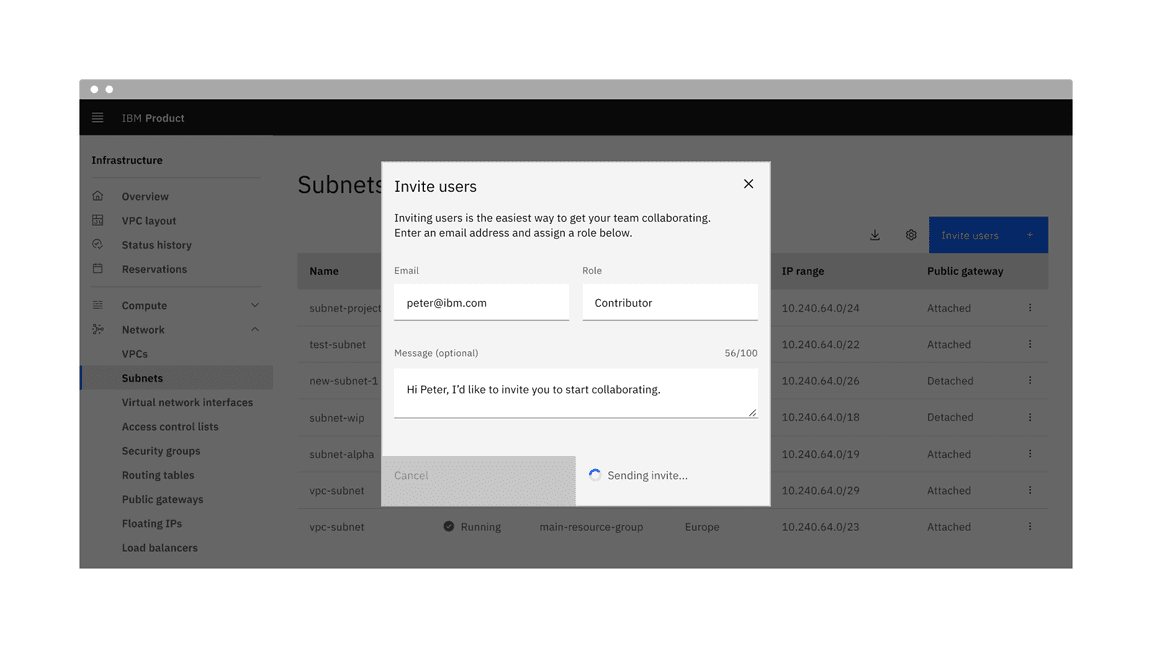
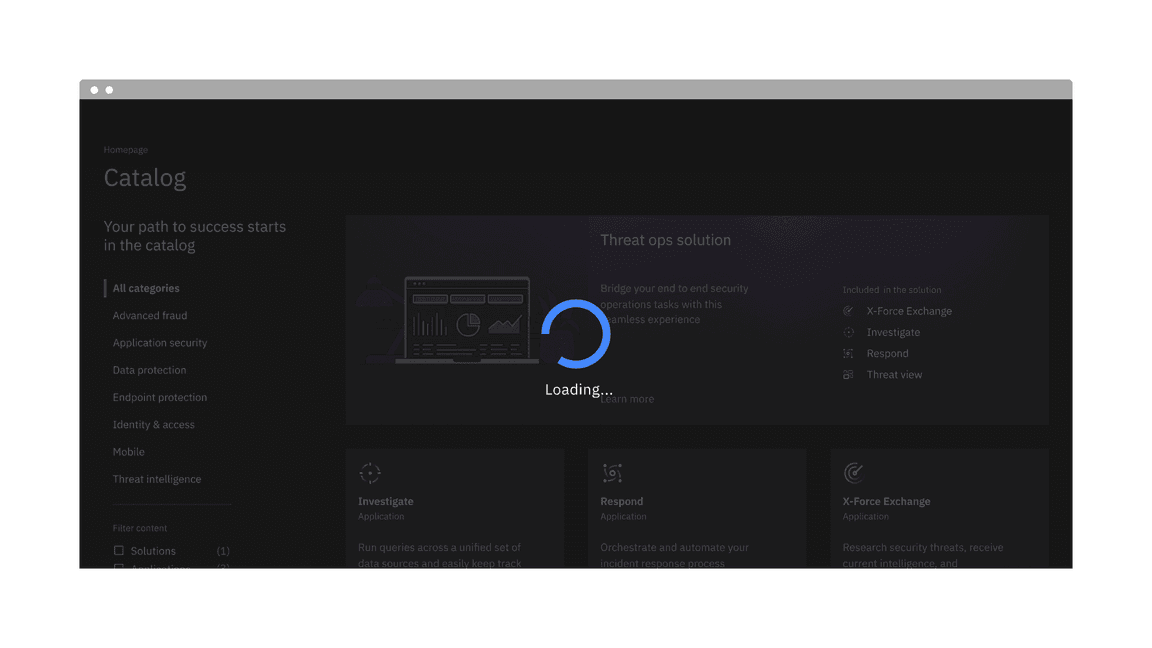
The large loading indicator is most commonly used to display loading in full-screen takeover situations. It can also appear on sections within a page, in modals, and on individual tiles. A background overlay is typically placed behind the large loading indicator so the user cannot interact with the elements currently in the loading state.

Example of the large loading component in a UI
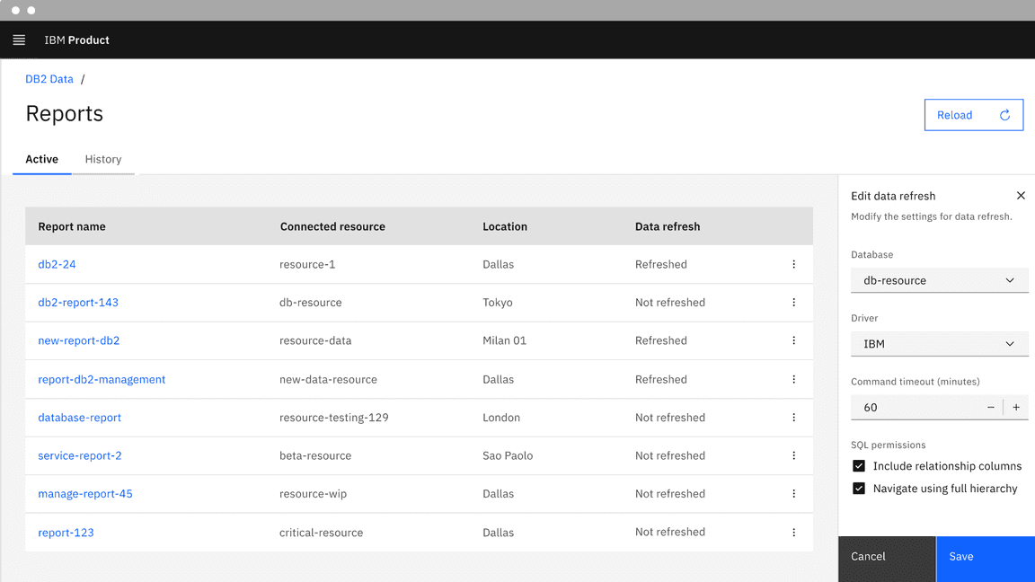
Small size
The small loading indicator is best suited for contextual or localized loading experiences within a specific UI element, particularly in inline loading scenarios. It works well for quick-loading tasks and can be placed within or near the triggering element—such as a button—to indicate that a process is underway. Common examples include saving after clicking on a button, uploading a file, or placing the indicator beside label text to communicate the loading status. For detailed guidance, refer to the inline loading component Usage tab.
Example of the small loading component in a UI
Placement
Large loading placement
The large loading indicator is commonly used for full-screen and component-level loading scenarios. For full-screen loading, place the indicator at the center of the viewport and apply a semi-transparent overlay to signal that the entire interface is inactive.
Example of the large loading indicator placement for full-screen loading with an overlay
When used within a component, such as a modal, tile, or side panel, center the indicator in that space and use an overlay to prevent interaction with the content while it is loading.
Example of the large loading indicator placement for component-level loading with an overlay
Small loading placement
The small loading indicator is ideal for inline or localized loading within elements like buttons or compact content areas. It should appear inline with or adjacent to the related action without using overlays. During the loading state, any related action buttons—such as “Cancel”—should be temporarily disabled. For more information about inline loading, refer to the inline loading component Usage tab.
Example of the small loading indicator placement for inline loading
Content
Main elements
The loading indicator can be paired with an optional label to provide additional context during a loading state.
For large loading indicators, adding a brief status message below the indicator, such as “Loading data…” can help set users’ expectations. The label text is not included by default in the component but can be customized to include it if needed.
Example of the large loading indicator with label text
For small loading indicators, especially in inline use, content should be concise and placed near the related action. For more detailed guidance, refer to the inline loading component’s Content section.
Further guidance
For further content guidance, see Carbon’s content guidelines.
Behaviors
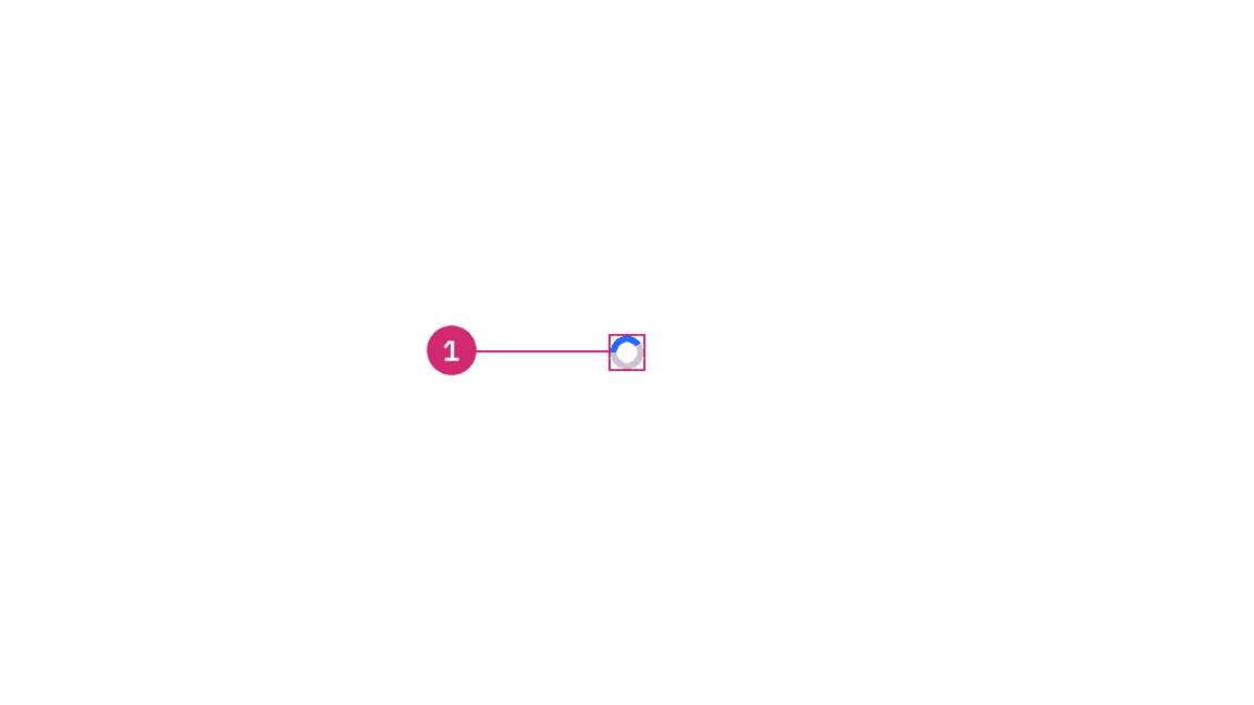
States
The loading component has two states: inactive and active. For detailed visual information about the various states for this component, see the Style tab.
| State | When to use |
|---|---|
| Inactive | The inactive loading state is when no data is being loaded and has no visual indicator. |
| Active | The active loading state indicates that the action is still in progress. |
Interactions
For large loading indicators, a semi-transparent overlay is applied over the page or component, blocking all interaction. During this state, users should not be able to interact with any elements, as the overlay indicates the interface is temporarily unavailable.
For small loading indicators in inline loading scenarios, interactive elements like buttons should be temporarily disabled while loading is in progress. This prevents repeated actions and ensures a smooth user experience. For more guidance, see the inline loading component Interactions section.
Related
Feedback
Help us improve this component by providing feedback, asking questions, and leaving any other comments on GitHub.