List
Lists are vertical groupings of related content. List items begin with either a number or a bullet.
Live demo
This live demo contains only a preview of functionality and styles available for this component. View the full demo on Storybook for additional information such as its version, controls, and API documentation.
Accessibility testing statusFor every latest release, Carbon runs tests on all components to meet the accessibility requirements. These different statuses report the work that Carbon has done in the back end. These tests appear only when the components are stable.
For every latest release, Carbon runs tests on all components to meet the accessibility requirements. These different statuses report the work that Carbon has done in the back end. These tests appear only when the components are stable.
Overview
The list component displays related content in a structured and scannable format. It helps users easily navigate and understand grouped information. Lists can be styled as unordered (bulleted) or ordered (numbered) based on their content hierarchy and importance. They are commonly used for navigation menus, data presentations, and form-related elements.
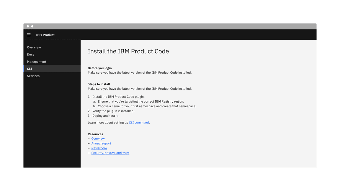
Example of the list component in a UI
When to use
- To display a simple, related set of items.
- To provide structure and clarity in the content.
When not to use
- Avoid using a list for complex data or when advanced features like sorting, filtering, or selection are required. If the content requires multiple columns and rows within a component, consider using a data table instead.
- If a basic hierarchy with tables or dividers is required, use the structured list or contained list components instead.
Variants
| Variant | Purpose |
|---|---|
| Unordered list | Used to display items of equal importance without a specific order. |
| Ordered list | Use to indicate a clear sequence or hierarchy, often used for instructions. |
Formatting
Anatomy
Unordered and ordered lists are both comprised of a marker and a list item.
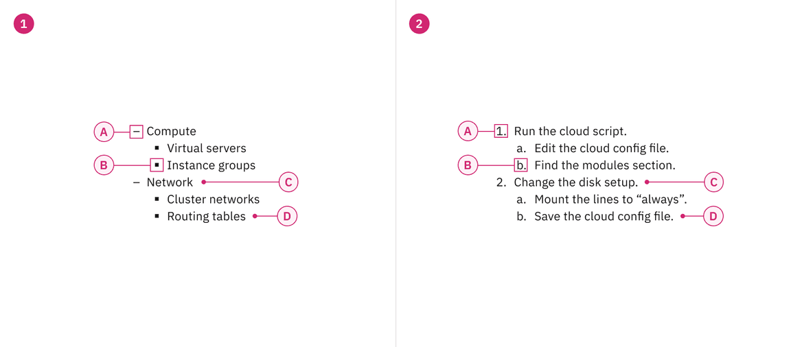
Anatomy of unordered and ordered list variants
1. Unordered list
A. Marker (level 1)
B. Marker (level 2)
C. List item
(level 1)
D. List item (level 2)
2. Ordered list
A. Marker (level 1)
B. Marker (level 2)
C. List item
(level 1)
D. List item (level 2)
Sizing
The list is available in two type sizes: productive and expressive. The productive list utilizes
$body-01
$body-02
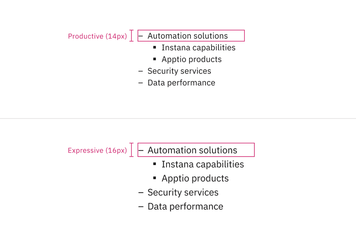
Productive and expressive type sizes for list
Alignment
Lists are typically presented in a vertical format to maintain readability and clarity. Avoid placing individual list items horizontally, as it disrupts grid alignment and reduces readability. However, separate list groups can be placed side by side if they align with grid columns.

Example shows the list with a large number of list items

Do align the list vertically for clarity.

Do not align the list horizontally, as it disrupts readability.
For ordered lists with two-digit (10+) or more digit items, align numbers either left or right to maintain a clear structure without misalignment. By default, numbers are left-aligned, but there is an option to switch between the two.
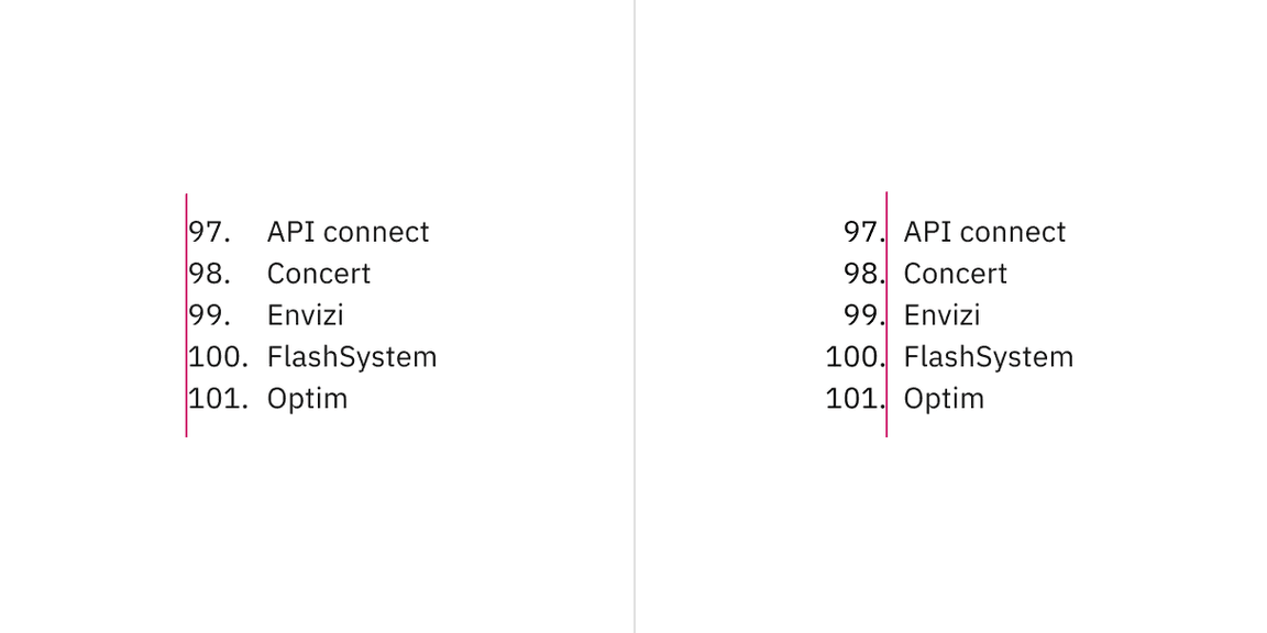
Number alignment in ordered lists for two or more digit items.
Nested items
Lists can include nested items to indicate hierarchy or subcategories, with indentation distinguishing each level.
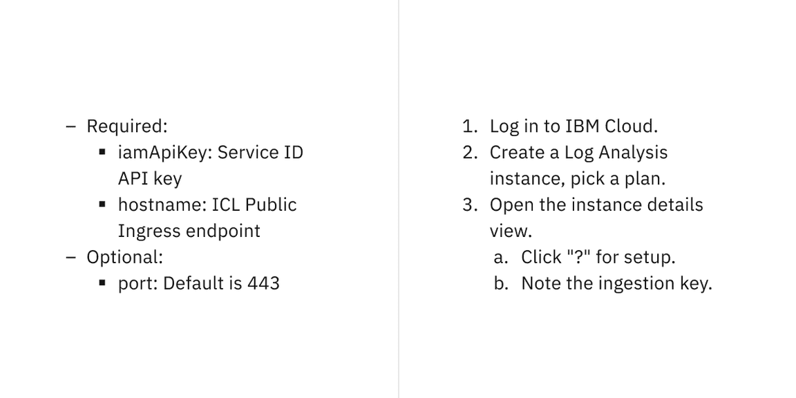
Unordered and ordered lists with nested items
Placement
List items should be concise, aligning with grid columns to maintain a structured layout. Avoid overly long sentences; if content exceeds the available space, it should wrap to multiple lines rather than forcing excessive width.
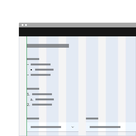
Do align list markers flush with the grid.
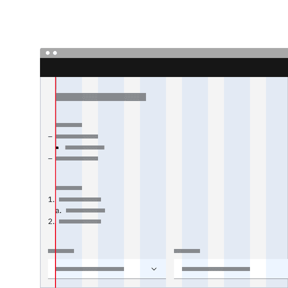
Do not let list markers hang into the grid gutters.
Content
Main elements
List item
- Represents an individual entry within a list.
- Can contain text, links, or other inline elements.
- Supports multi-line wrapping for longer content while maintaining alignment.
- Lists should present simple pieces of information; for complex data, consider using a data table instead.
- Level 1 list items define the main structure, while Level 2 (nested) list items provide hierarchy or subcategories.
- Arrange ordered list items logically, such as ranking by importance, highest to lowest values, or in alphabetical/numeric order.
- Ensure list items are grammatically parallel by maintaining consistent sentence structures (e.g., avoid mixing passive and active voice).
Marker
- Markers should be top-aligned with the first list item for clarity and consistency.
- Unordered list level 1 items are marked with en dashes and level 2 items are marked with squares.
- Ordered list level 1 items are marked with numbers and level 2 items are marked with letters.
Overflow content
Text in a list should wrap below the marker, keeping it top-aligned with the first list item to ensure readability. Truncation should be avoided and text should instead wrap to multiple lines.
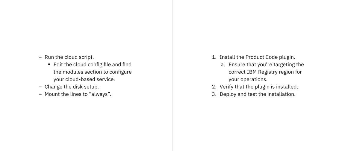
Text wrapping for unordered and ordered lists
Further guidance
For further content guidance, see Carbon’s content guidelines.
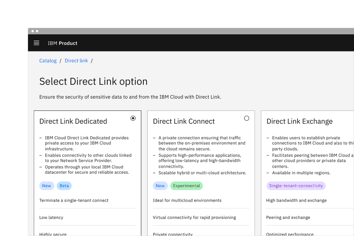
Unordered list
Unordered list is a collection of items presented without a specific order. Each list item begins with an en dash, making it ideal for non-sequential content.
Example of the unordered list variant in a UI
Ordered list
Ordered list is a collection of items presented without a specific order. List item begins with a number, indicating its position, making it suitable for sequential content.
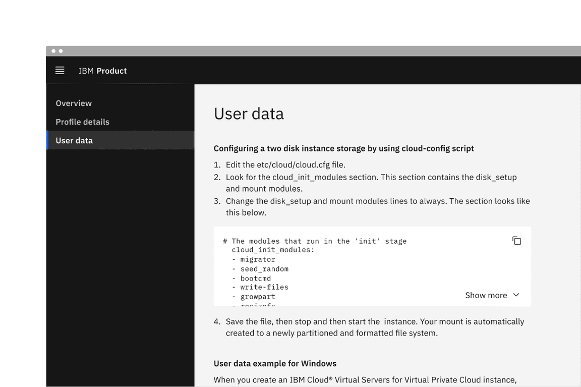
Example of the ordered list variant in a UI
Related
Feedback
Help us improve this component by providing feedback, asking questions, and leaving any other comments on GitHub.