Progress bar
A progress bar provides feedback about the duration and progression of a process, such as a download, file transfer, or installation, to indicate how long a user will be waiting.
- Live demo
- Overview
- Formatting
- Content
- Universal behaviors
- Modifiers
- Accessibility
- Related
- References
- Feedback
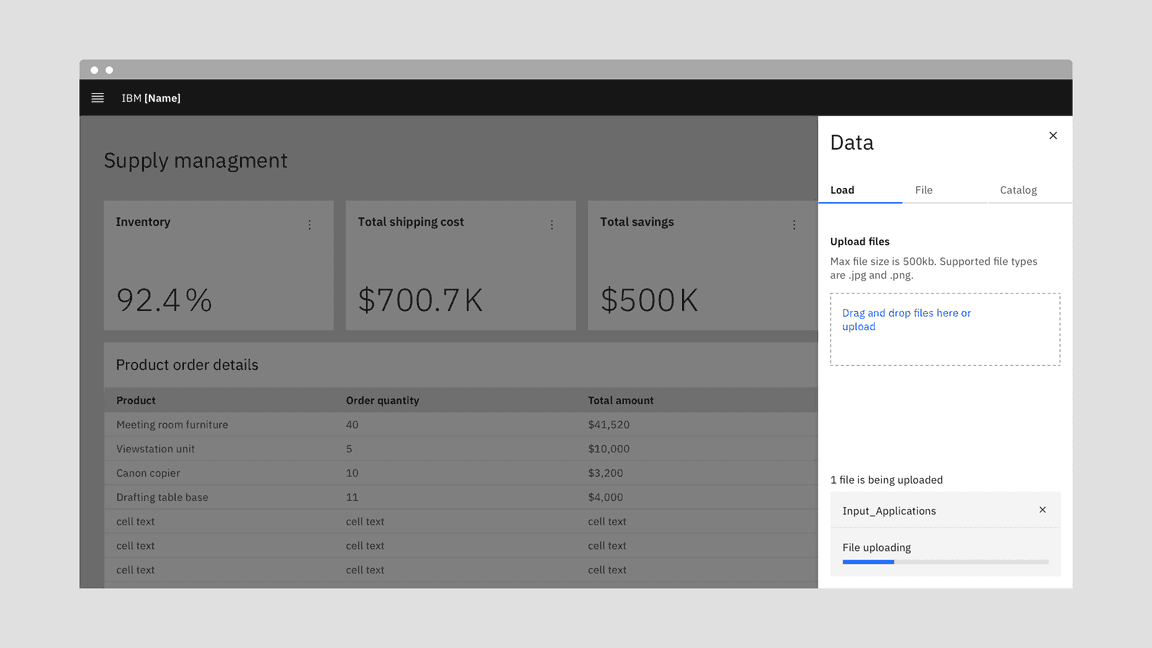
Live demo
This live demo contains only a preview of functionality and styles available for this component. View the full demo on Storybook for additional information such as its version, controls, and API documentation.
Accessibility testing statusFor every latest release, Carbon runs tests on all components to meet the accessibility requirements. These different statuses report the work that Carbon has done in the back end. These tests appear only when the components are stable.
For every latest release, Carbon runs tests on all components to meet the accessibility requirements. These different statuses report the work that Carbon has done in the back end. These tests appear only when the components are stable.
Overview
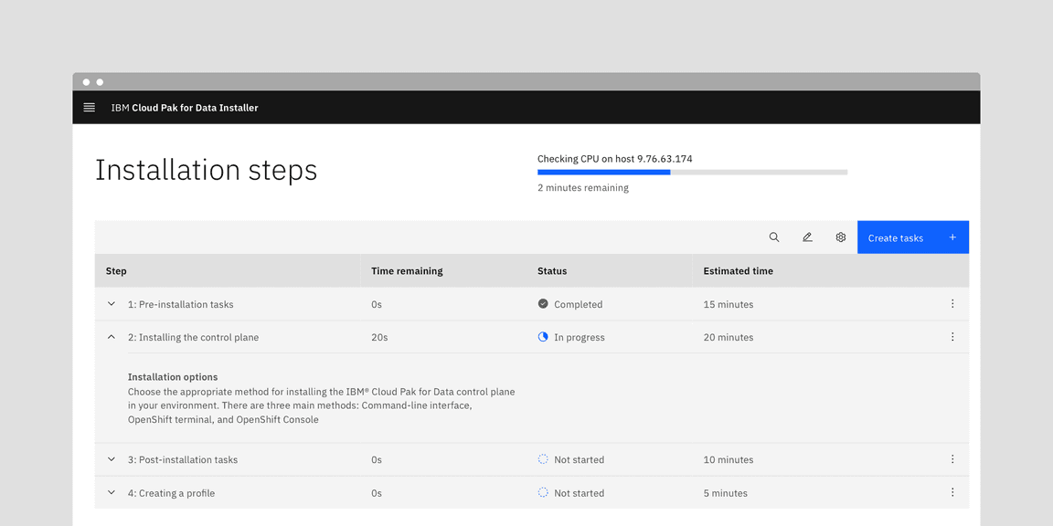
A progress bar indicates that the user’s request has been received and the application is making progress toward completing the requested action. Progress bars inform users about the status of ongoing processes, the estimated time of how long a process will take, or if a request is being executed.
When to use
- For a long operation or a process that can take a considerable or unknown amount of time
- When the process can be described with quantitative information, such as a percentage
- To visually show the progression of a system operation such as downloading, uploading, loading data, submitting a form, or saving updates
- To convey that data is being requested, transferred, or processed
When not to use
- When the load time is expected to display expanded information, use skeleton states instead
- When manual user actions are required to progress, use a progress indicator instead
- When the progress is determined by user actions such as tutorials completed, or storage space, rather than system actions
- If the process takes less than 5 seconds to load, use loading instead.
Variants
A progress bar can either be determinate or indeterminate. The determinate variant is visualized as a track on which a bar fills up from left to right representing the progress. The indeterminate variant is visualized as a track on which a bar is moving along in constant speed, repeating over time.
| Variant | Purpose |
|---|---|
| Determinate | Use determinate progress bars where there is clear information about the progression — they convey exact and qualitative information about the progression. |
| Indeterminate | Use indeterminate progress bars where there is unclear information about the progression — they convey that users’ request, action, or data is being processed at the moment without indicating how long the activity will take. |


Determinate progress bars fill from 0 to 100%.


Indeterminate progress bars move along a fixed track continually until the process is complete.
Determinate progress bar
Determinate progress bars are used when the loading progress can be tracked and translated into a bar indicator which fills the track from 0% to 100% and never decreases in value or resets.
Use a determinate progress bar when the progress can be calculated against a specific goal. For example, when downloading a file of a known size.
Indeterminate progress bar
Indeterminate progress bars are used when the loading progress is unknown or the amount of wait time can’t be calculated.
Once triggered, the bar indicator will quickly and repeatably move from left to right (Carbon reserves back and forth motions for skeletons), while data is being gathered during the first stages of the load. In this scenario, a percentage value would not be present. This bar may change to a determinate indicator if enough information is gathered to calculate the load completion. The final determinate stage of the load is used to visually indicate the completion of the task to the user.
Progress status
It’s best to give the user transparency about the process which usually leads to increased trust in the software or platform. However, it may not be possible to provide progress estimation in certain cases. If progress data is not available, an indeterminate progress bar can be used.
As a more concrete set of examples, there are generally three different major progressions of a system operation: downloading, uploading, and local processing.
Downloading
For downloading actions, it’s usually possible to get a value of progress and update it in real time for a determinate progress bar. Depending on the information reported from a data source, time remaining could be estimated based on how much has been downloaded so far over a time period.
Uploading
Upload actions may be unable to report real time progress status depending on the data source and API configuration. However, always strive to provide users the determinate value whenever it’s possible to inform them about the process.
Data processing
Data processing refers to manipulations of data to produce meaningful information. This can include currency exchange, file generation, data reformatting, or similar operations. Depending on the operation, time estimated or cycles to complete processing could be used to populate a determinate progress bar.
Formatting
Anatomy
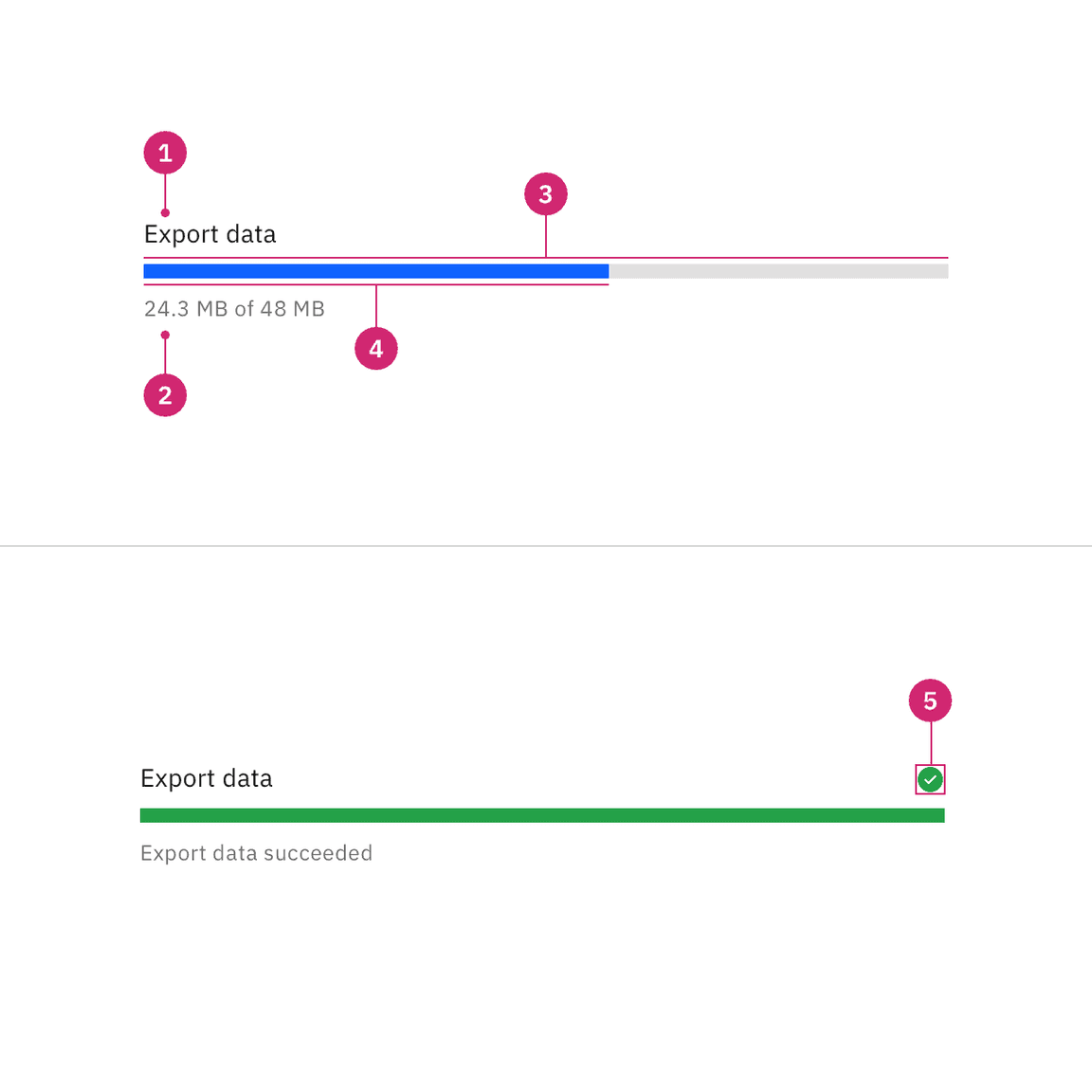
- Label: The text describes the process that the progress bar refers to. The label can be visually hidden, but must be defined in order to be accessible.
- Helper text (optional, except for error): Assistive text to show additional information about the process taking place. For determinate, the text is usually a percentage, fraction, ratio, or numeric value showing progression. Such values are not applicable when a progress bar is indeterminate. A progress bar that receives an error status must convey the problem in the error helper text.
- Track: The static area that the bar indicator moves on top of and acts as a fixed visual reference of what the total length and duration of the process could be.
- Bar indicator: Indicates how much the process has progressed.
- Status icon: Indicates the status of the progress bar, either in error or success status.
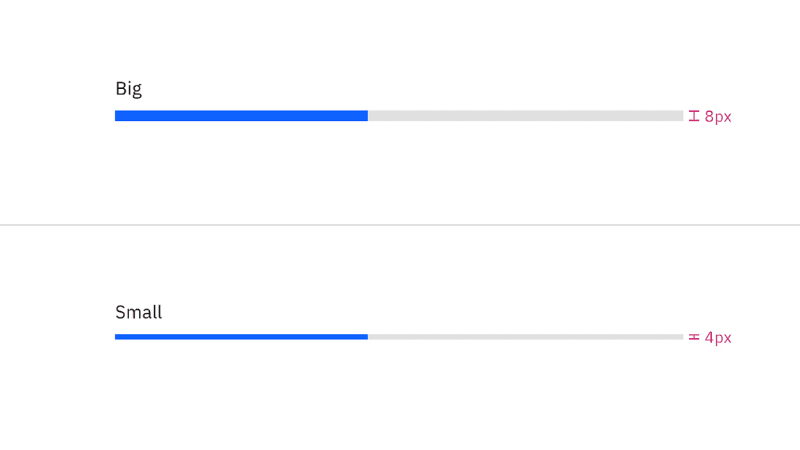
Sizing
Height
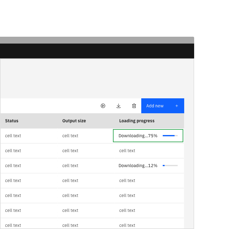
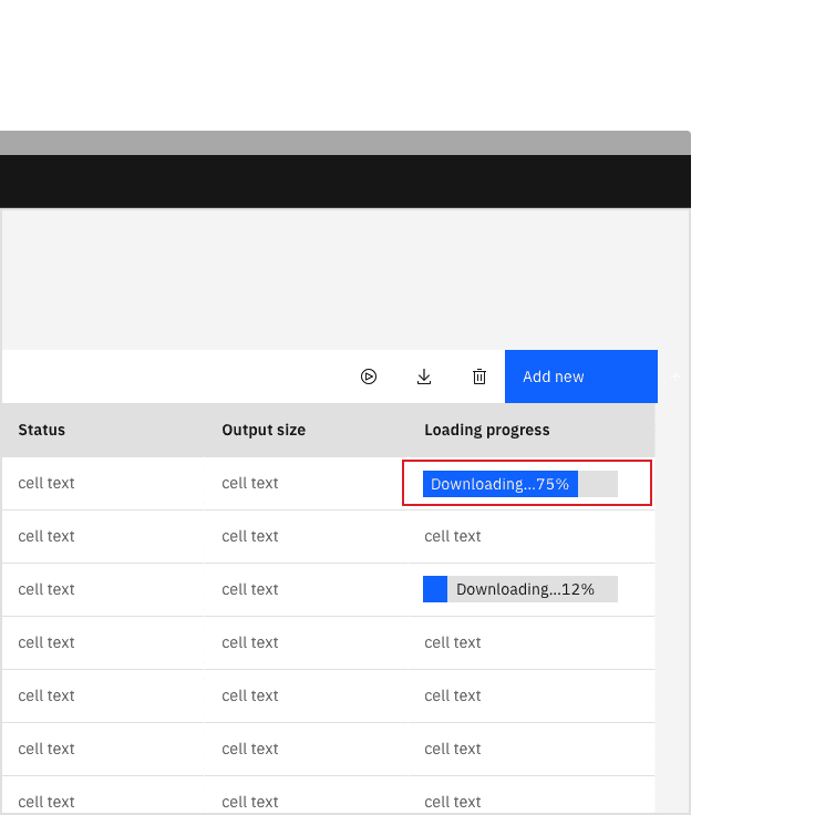
The progress bar is offered in two different sizes—big (8px) and small (4px). The big progress bar height is typically used when there is large amounts of space on a page. The small progress bar height is commonly used when space is restricted and can be placed within cards, data tables, or side panels.
Width
The width of a progress bar can vary based on the content. The minimum width of a progress bar is 48px and keep its width to a maximum of six columns when possible. If the progress bar width is too long, it can reduce readability. Don’t increase the progress bar length to fill the entire width of a window or application.
Do keep a width within six columns.
Do not exceed a width of six columns.
Text alignment
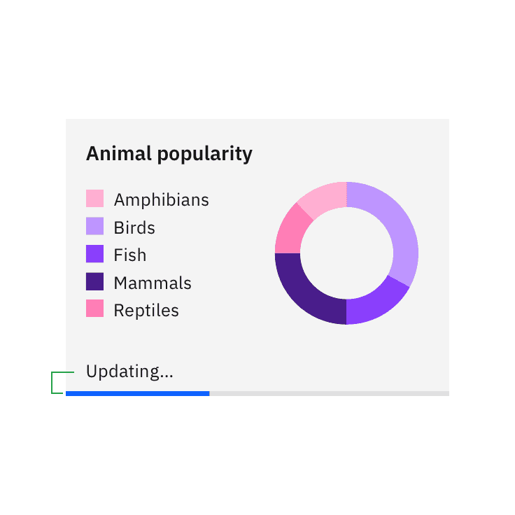
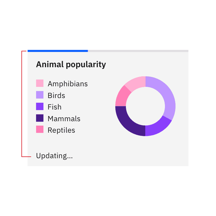
Text alignment depends on the context and area given. Progress bar can have three ways for text alignment: default, inline, and indent. Indent alignment should only be used inside containers, tiles, or side panels which the progress bar will extend to the edges.
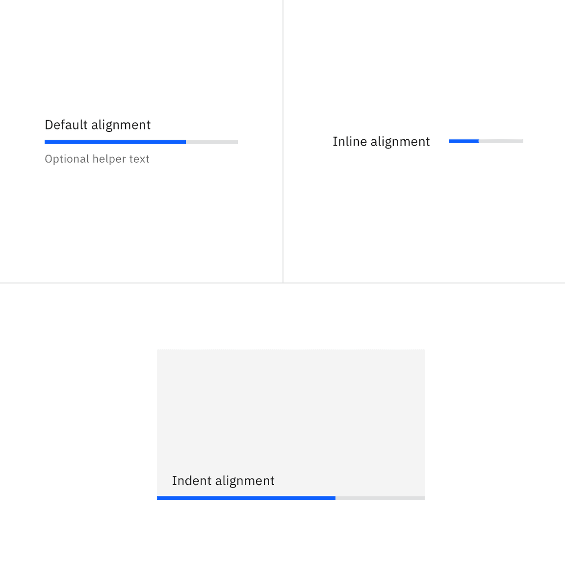
A few common examples of text alignment for progress bars
| Text alignment | Use case |
|---|---|
| Default | Full page, cards, dialogs |
| Inline | Data table |
| Indent | Side panels, cards (usually on dashboard) |
Text placement
Labels should always be placed above the progress bar for readability, and helper text below or beside. Avoid placing text inside the progress bar indicator or track. This visual could cause clutter and inconsistency in text alignment. Meanwhile, placing the text far away from the progress bar could cause confusion in the context.
Do place text close to the progress bar.
Do not embed text into the progress bar.
Do place text close to the progress bar.
Do not place text far away from the progress bar.
Internationalization (RTL)
For RTL (right-to-left) languages, the layout of the progress bar is mirrored for both determinate and indeterminate options. The label is right-aligned, the value is left-aligned, and the fill progresses from right to left. Keep in mind that the placement of the percent sign differs depending on the locale.
Content
Determinate and indeterminate progress bars both have a label and an optional helper text. However, the indeterminate can’t provide the exact, quantitative information about the progression in the optional helper text.
Labels
- Labels inform users what information the progress bar is processing.
- Keep the label short and concise by limiting it to a few words or a single line of text.
- Label text should never change as the progress bar is loading. It also does not need to be updated when the process ends, since the success or error information is provided by the bar indicator color and an icon, along with any helper text.
Helper text
- Helper text is used to show additional information about the process taking place.
- Common use cases of helper text for a progress bar can either be a generic phrase, for example “Fetching assets…”, or it can indicate an exact amount of something to be completed, for example “42/256 items”.
- When indicating a loading percentage, the percentage number should count up as the bar progresses.
Further guidance
For further content guidance, see Carbon’s content guidelines.
Universal behaviors
Statuses
There are three statuses for the progress bar: active, success, and error. These statuses also apply on both indeterminate and determinate progress bars. After the process completes successfully or unsuccessfully, a progress bar can either remain persistent as confirmation or validation, or it can be automatically dismissed depending on what is most suitable for the use case.
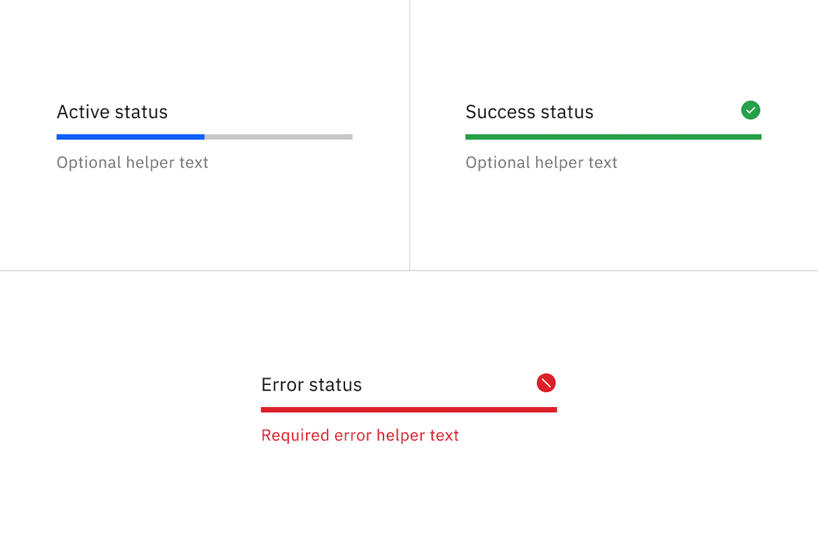
Active
The active status, represented by an animated blue bar indicator, conveys that the action is still in progress.
Success
The success status, conveyed by a full-width green progress bar and checkmark icon, indicates that the action completed successfully.
Error
The error status indicates that the action did not successfully complete. If an error occurs, an inline notification or error handling within the form should appear. As soon as a process fails, the indicator bar’s progress spans full width, turns red, and remains visible. A failed icon is also shown.
The example shows the progress bar with error remains persistent as confirmation inside the image tile.
The example shows the progress bar is automatically dismissed once it’s done uploading.
Interactions
Part of a page
While the progress bar is processing information on part of a page, you can still interact with other elements on the page. When the progress bar finishes processing it can either remain persistent on the page for confirmation or automatically dismiss itself depending on the use case.
The example shows the progress bar is active and separated from other interactive elements.
Inside a container
While the progress bar is processing information that could affect multiple pieces of content within a container, such as a card, depending on the use case, the whole container should become inactive until processing has been completed or the specific section within the container being processed should become inactive until processing has been completed. The user should be able to interact with the rest of the container or page that is unaffected by the progress bar.
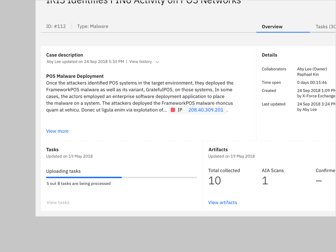
The example shows the ‘View task’ action button is disabled inside the ‘Tasks’ container while the progress bar is active.
Modifiers
Transitions
An indeterminate bar can change to a determinate indicator (finishing from left to right) when enough information is gathered to end the load animation.
Accessibility
- The loading component is implemented using the ARIA 1.1 progressbar pattern.
For determinate progress bar, it outputs an ARIA and usesrole="progressbar",aria-valuemin, andaria-valuemaxto convey the loaded percentage to screen reader users.aria-valuenow
- If the progress bar shows the loading of a specific part or region of the
application, set andaria-busy="true"on the related element to ensure assistive technologies can correctly convey this relation to the user.aria-describedby="[progressbar-id]"
- Only hide the label when it is absolute clear to the user which process the progress bar represents. Note that you are still required to pass an appropriate label which will be read by screen readers.
Related
Components
Pattern
References
- Accessible Rich Internet Applications Working Group, “progressbar” role, (W3C, 2017)
- Katie Sherwin, Progress Indicators Make a Slow System Less Insufferable (Nielsen Norman Group, 2001)
- Jakob Nielsen, Response Times: The 3 Important Limits (Nielsen Norman Group, (Nielsen Norman Group, 1993)
Feedback
Help us improve this component by providing feedback, asking questions, and leaving any other comments on GitHub.