Menu
A menu is a list of interactive options that appears when users interact with an element or perform a specific action.
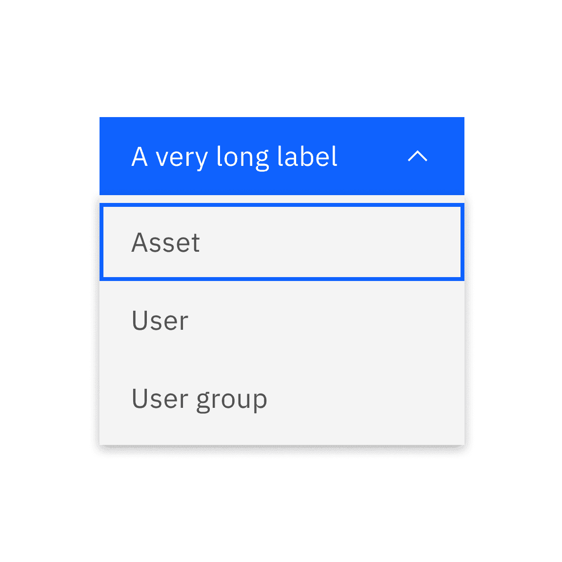
Live demo
This live demo contains only a preview of functionality and styles available for this component. View the full demo on Storybook for additional information such as its version, controls, and API documentation.
Accessibility testing statusFor every latest release, Carbon runs tests on all components to meet the accessibility requirements. These different statuses report the work that Carbon has done in the back end. These tests appear only when the components are stable.
For every latest release, Carbon runs tests on all components to meet the accessibility requirements. These different statuses report the work that Carbon has done in the back end. These tests appear only when the components are stable.
Overview
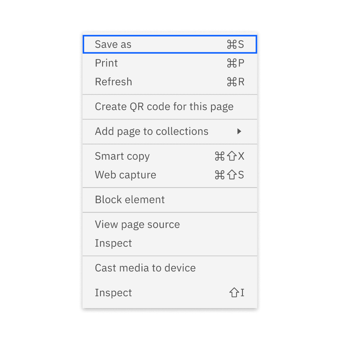
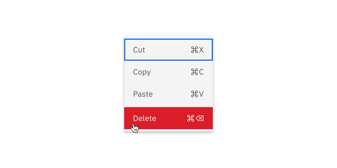
A menu is a disclosure component that appears with a set of actions relevant to a specific control, interface area, data element, or application view. Typically, this context is determined by the user’s current selection prior to invoking the menu. Menus can be opened from components such as menu buttons or through right-clicking.
This guidance will help you understand how to format, structure, and use the menu component effectively.
When to use
Declutter interface
In general, use menus to hide less frequently used or advanced options until users specifically need them. This keeps the interface clean and focused on essential elements.
Context menu
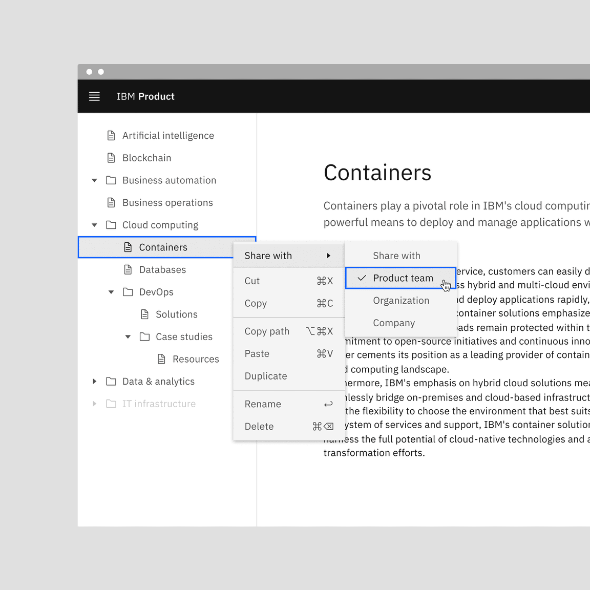
Context menus are triggered by a right-click interaction. A context menu is a defined list of options in a menu that appears above all other content on a page and is related to the selected content or element it was triggered from.
Customizable actions
Menus can speed up interactions for advanced users who are already familiar with the application. These users often rely on shortcuts and context-specific actions to work more efficiently.
When not to use
Form submission
When submitting a form with a static list of options for users to choose from, or when filtering, use a dropdown instead of a menu.
Complex inputs
When many or complex inputs are used collectively, use a popover instead of a menu.
Formatting
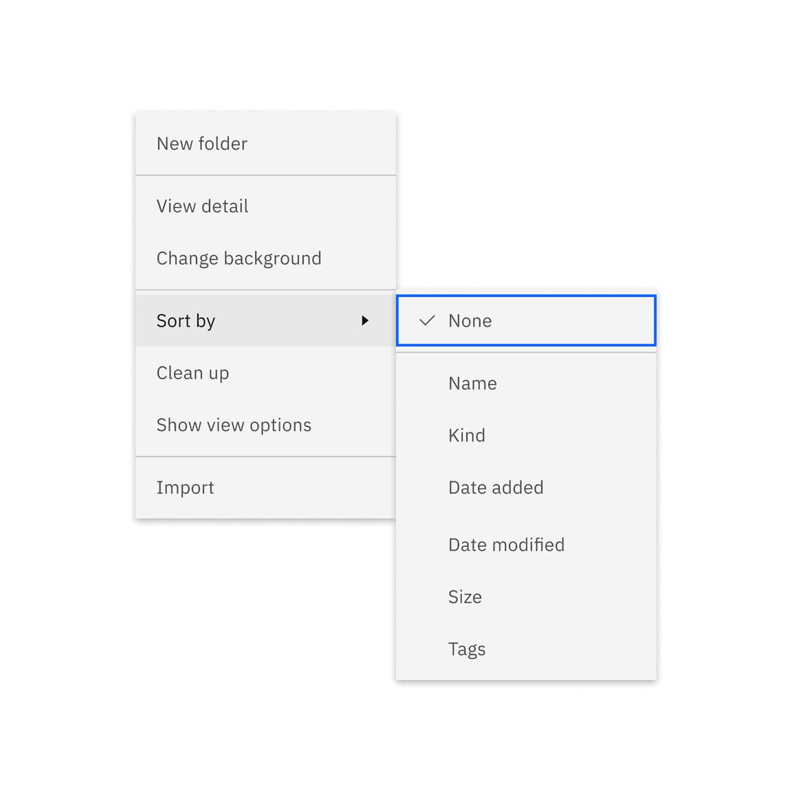
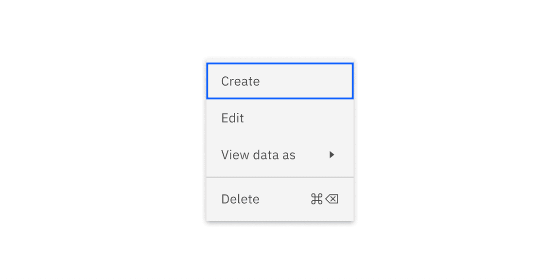
Anatomy
-
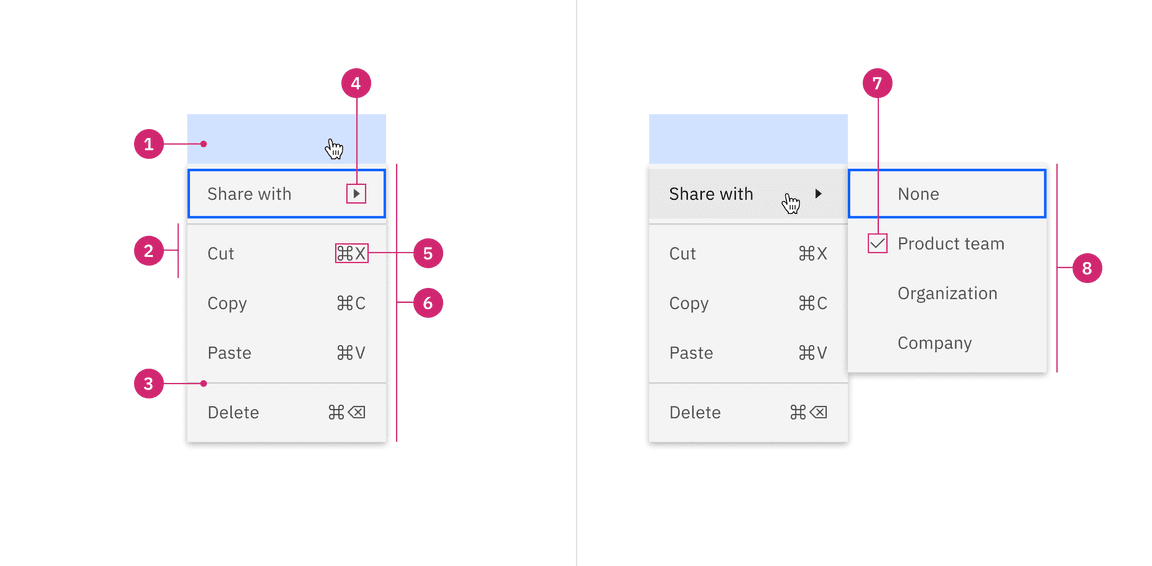
Trigger: Elements that are triggered to display a list of available actions. These menu triggers can include a menu button, a combo button, and an overflow menu within menu buttons. Menus can also be opened when right-clicking on a page or specific element, like a column, or a row.
-
Action item: A menu item that can be activated to apply its action on certain elements. This item can be accompanied by a submenu indicator or keyboard shortcuts.
-
Divider: A rule that indicates different sections within the menu.
-
Submenu indicator: A caret icon that indicates a submenu.
-
Keyboard shortcut: Certain action items may also have keyboard shortcuts.
-
Menu: A container displays the open state and contains a list of actions that can be selected.
-
Selected item: An item that can be selected. The selection can be single or multi-selected.
-
Submenu: A nested level off of the primary level.
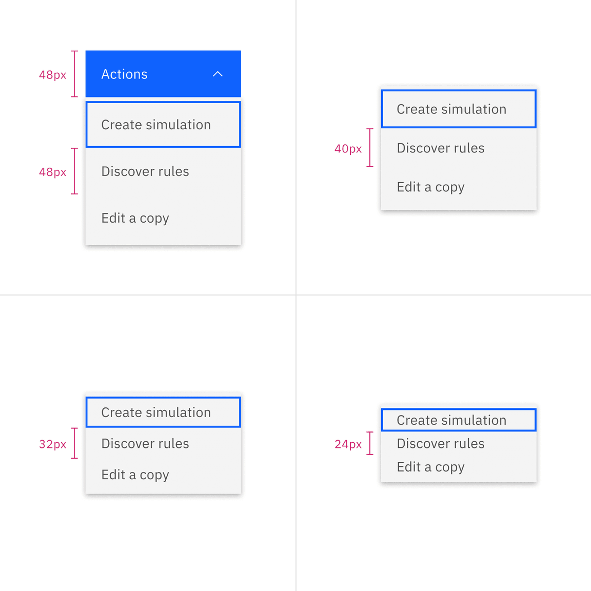
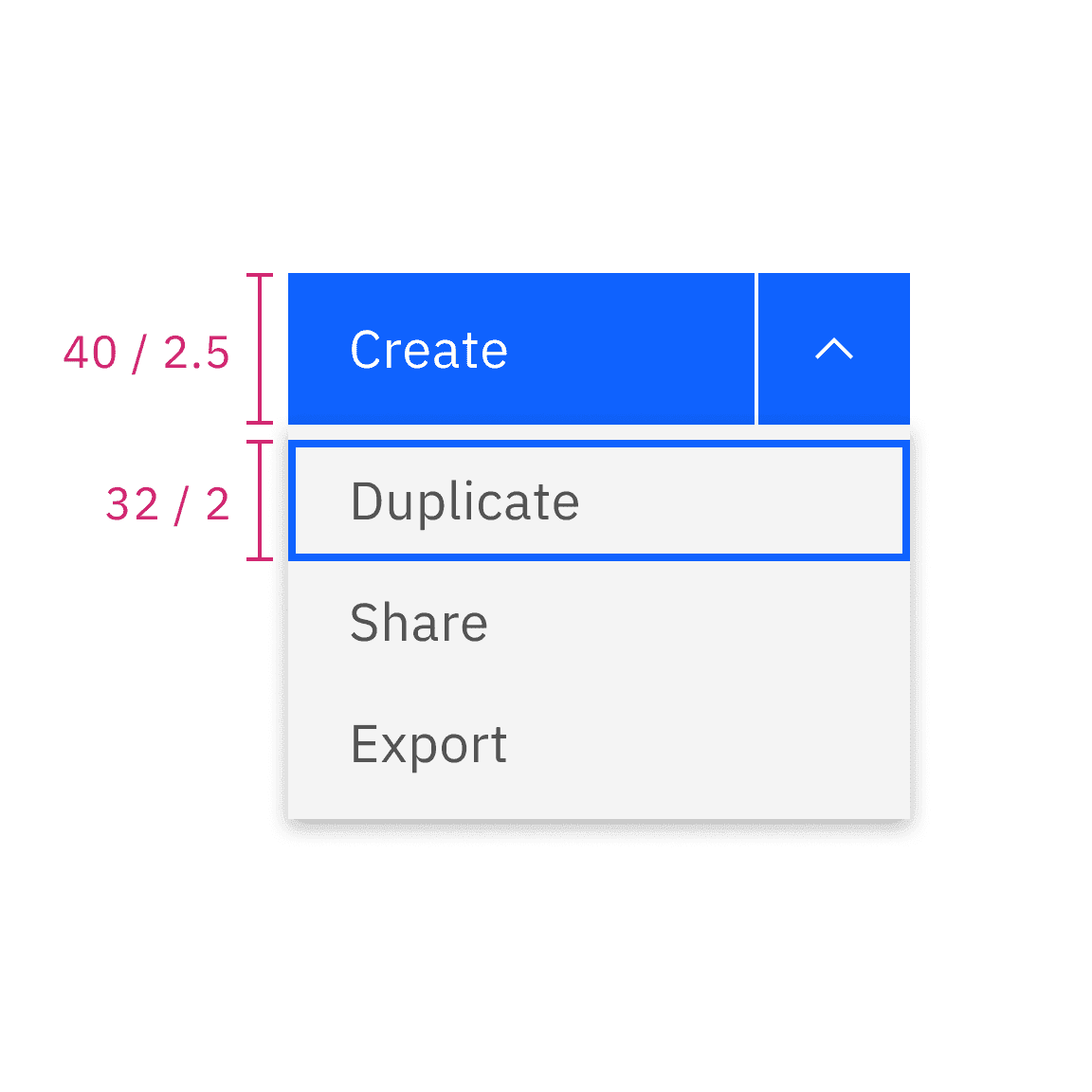
Sizing
Height
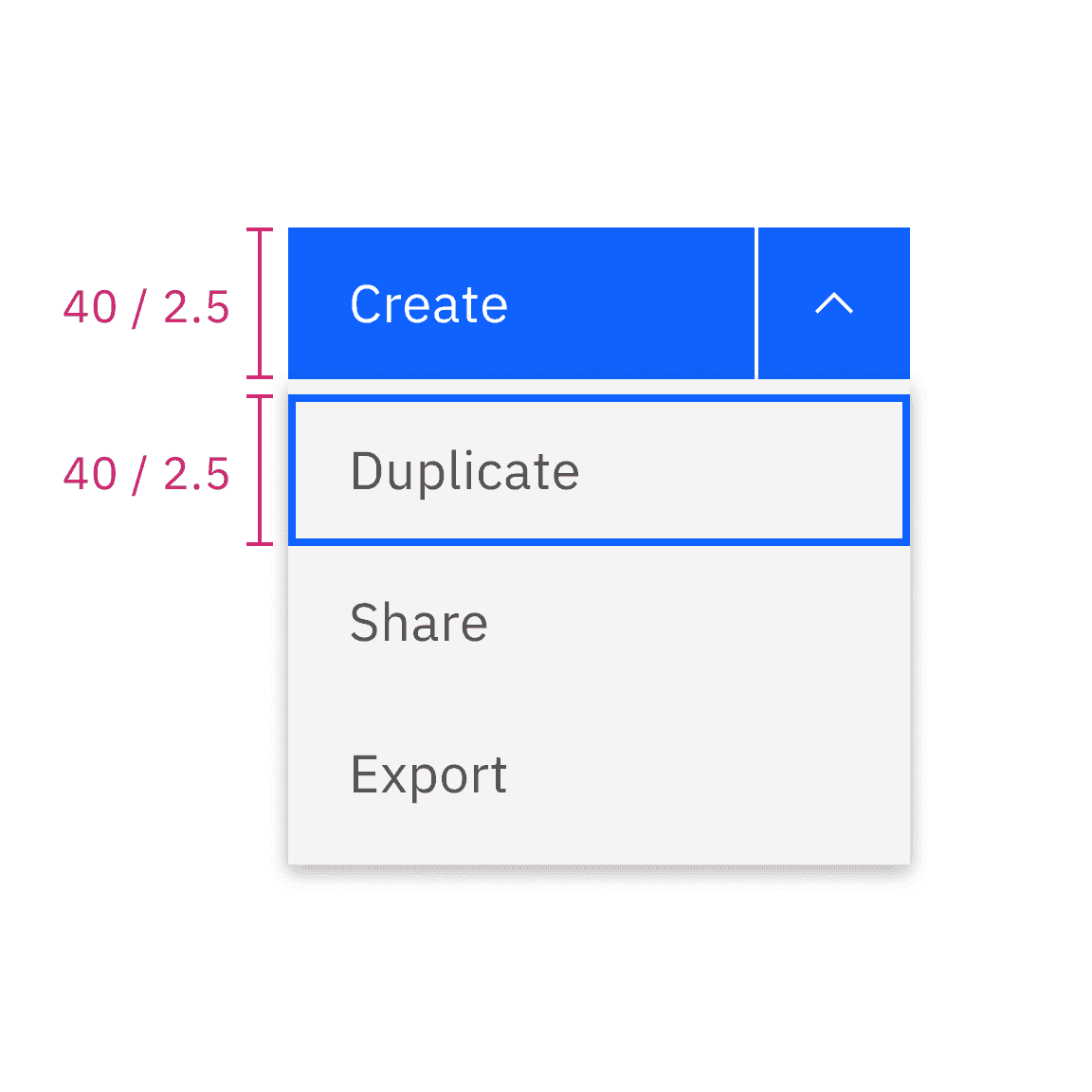
Menu items come in four sizes: extra small, small, medium, and large. See more about size specifications on the style tab. When using a menu button trigger, the height of the menu item (singular) reflects the size of the button being used.
| Size | Height (px / rem) |
|---|---|
| Extra small | 24 / 1.5 |
| Small | 32 / 2 |
| Medium | 40 / 2.5 |
| Large | 48 / 3 |
Do match the height of the menu buttons and the menu
Do not mix the height of the menu buttons and the menu
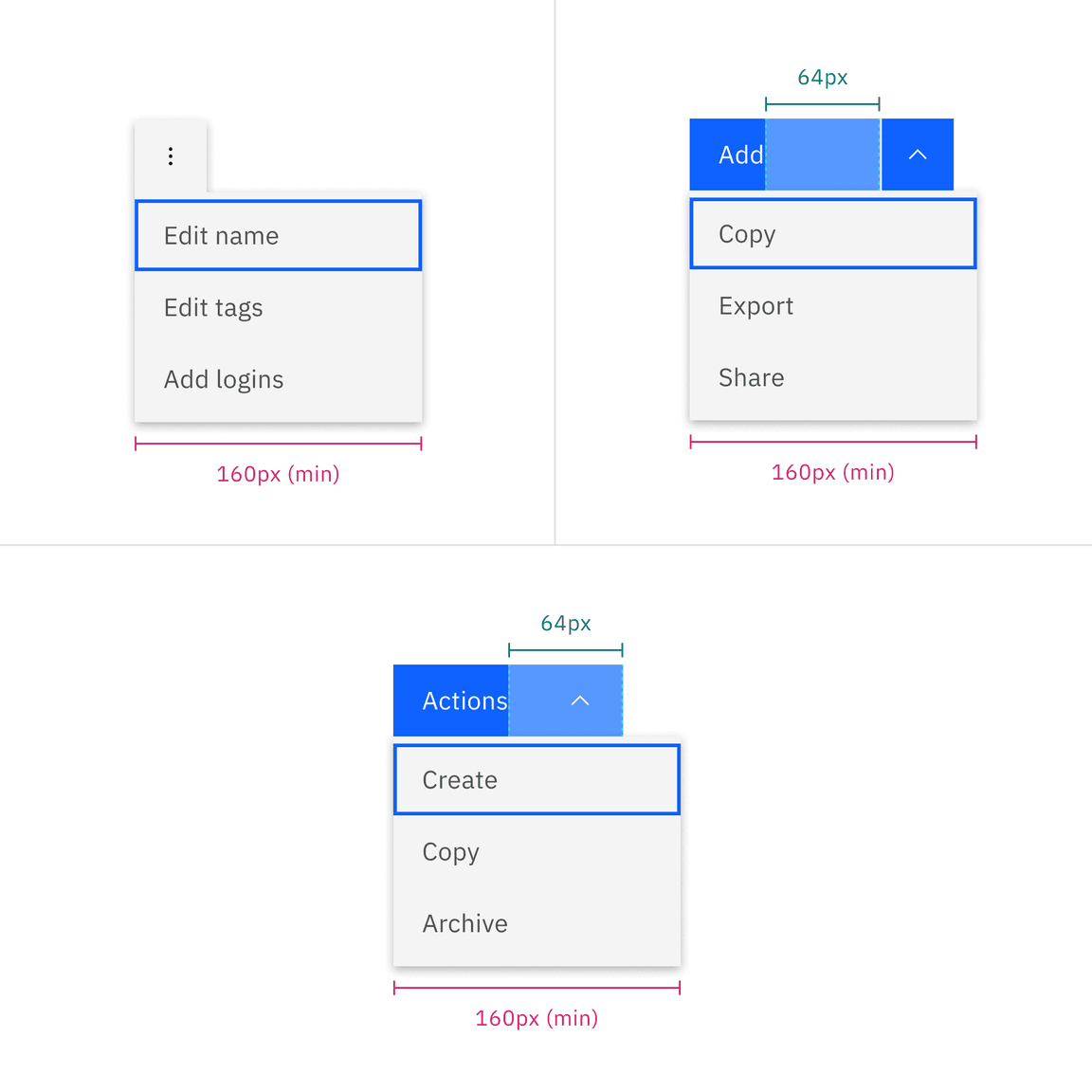
Width
By default, the menu button and combo button follow the button structure style, and the menu maintains a minimum width of 160px to prevent a narrow appearance.
Menu default width when both button label and menu option labels are short
If the menu item labels become longer, the menu button and combo button remain the same size, while the menu component can expand up to a maximum of 288px. Conversely, if the button labels become longer, the menu component should not appear narrower but should extend to match the width of the menu buttons.
If you opt for fluid-width default buttons, both the menu button (or the combo button) and the menu should have the same width.
Do use the minimum width
Do not narrow the menu to fit with other elements
Do match the width when the menu button or combo button label becomes longer
Do not make the menu appear shorter than the menu button or combo buttons
Ghost buttons only adhere to the button style. This is because enlarging the ghost button’s width to match the menu’s width would result in the caret appearing disconnected from its associated button, especially when the menu button is in its closed state.
Do use default ghost button in all cases
Do not use fluid ghost button in any cases
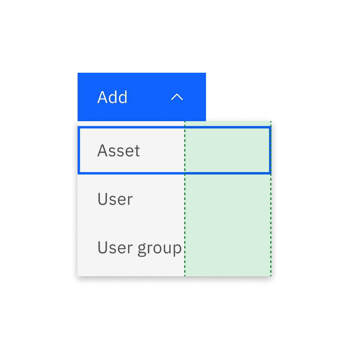
Alignment
Default
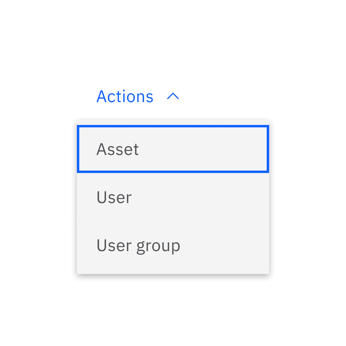
By default, combo button, menu button, or overflow button remains positioned at the top, to the left or right side of the menu when it is open, depending on the available space and layout.
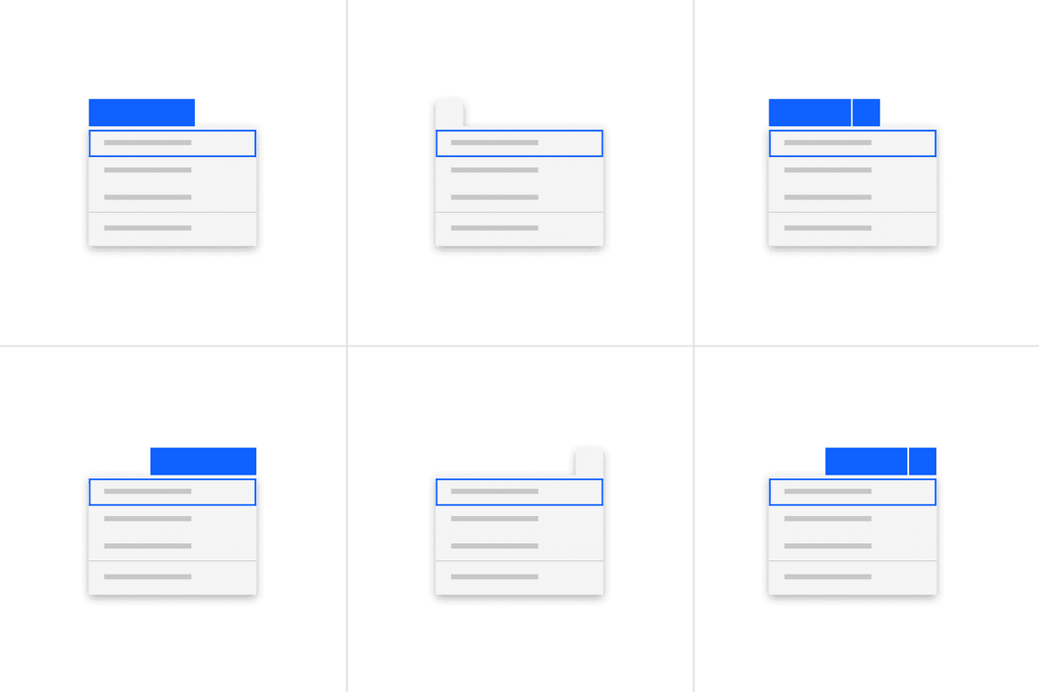
Menu default width when both button label and menu item labels are short
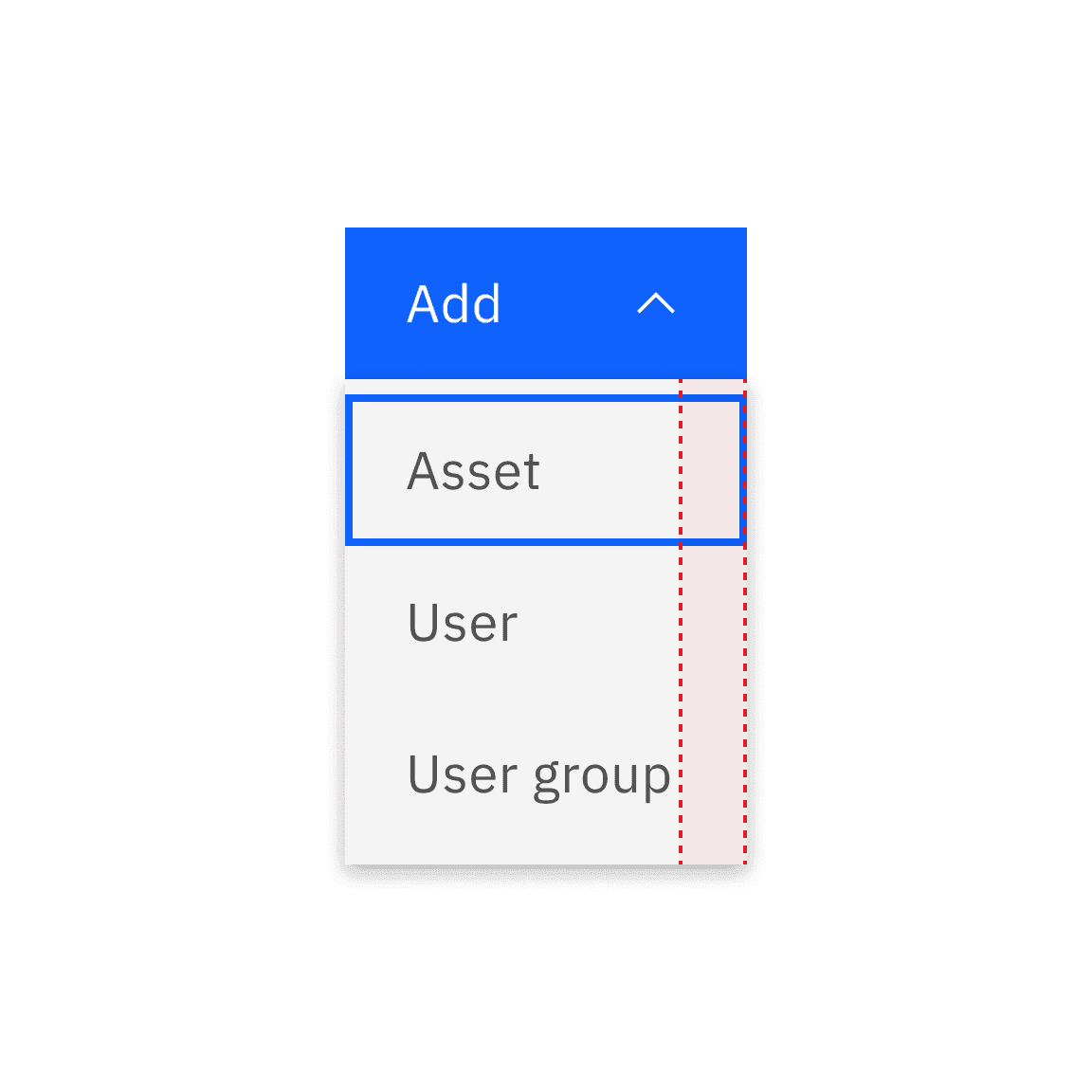
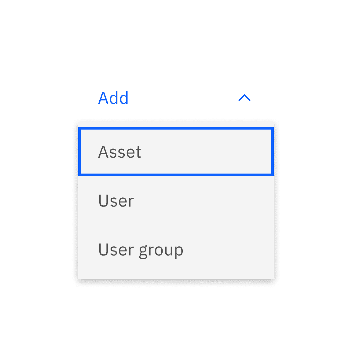
Alternatives
Alternatively, open menus can be positioned at the bottom, to the left or right of its associated menu button trigger, depending on the available space and layout.
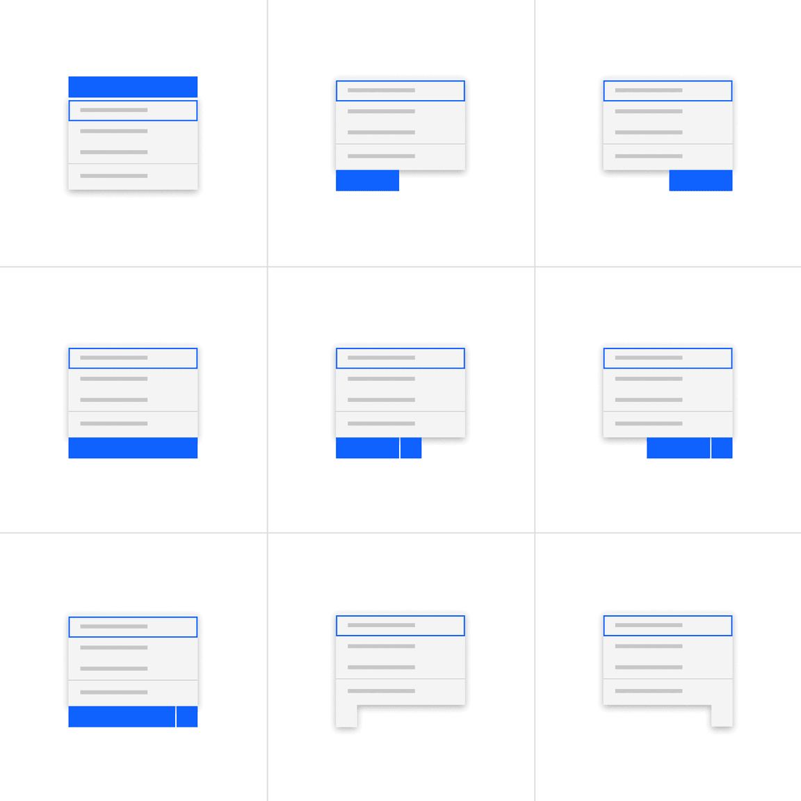
Action items
Ensuring consistent alignment when combining single or multi-select items with non-select items will improve the menu’s readability.
Do create a consistent alignment with unselected and selected items
Do not create mixed alignments with unselected and selected items
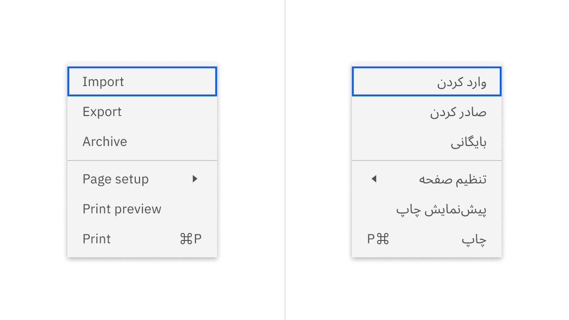
Right to left (RTL)
For RTL (right-to-left) languages, the entire menu is mirrored horizontally, including the direction of the caret and keyboard shortcuts.
Content
Main elements
Overflow
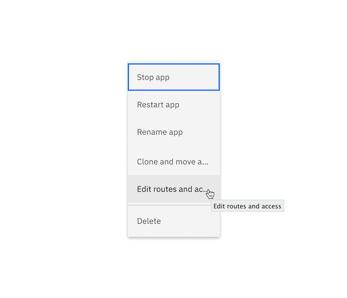
Consider using short and precise labels for menu items. However, when deciding to truncate long menu items, a browser rendered title tooltip will reveal the full text on hover.
Tooltip helps clarify the truncated text
Ordering and grouping
To aid discoverability, arrange menu items in a meaningful sequence that aligns with the order of operations. To help users focus on the most relevant options, place the ones used most often at the top.
When there is a significant amount of menu items, it’s advisable to group them into sections, separated by divider lines.
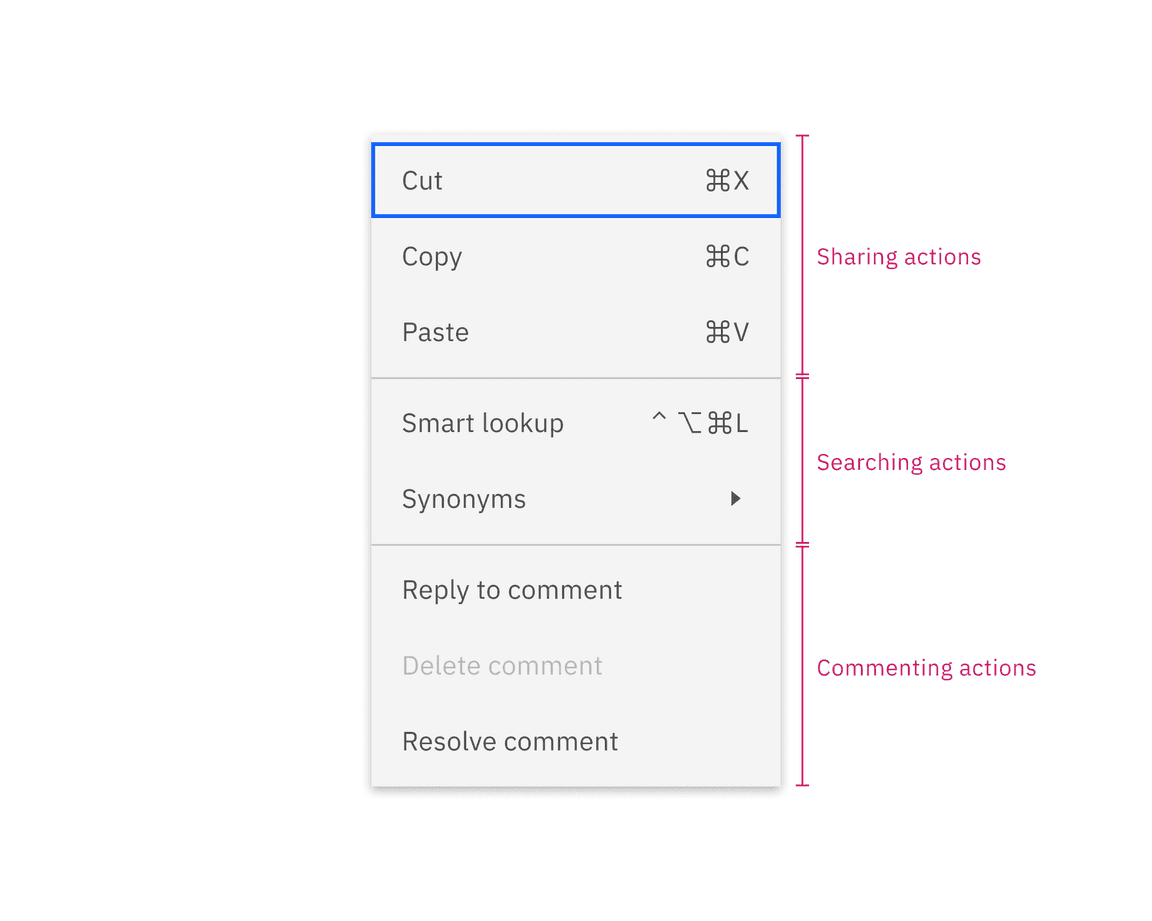
Example shows how menu items are grouped into meaningful sections
Number of items within a menu
Expansive lists of options in menus can overwhelm users. With context menu and overflow menu, keep the list length manageable by including no more than 12 items to help users scan through items easily without having to scroll. With menu buttons, keep the menu list smaller with under 5 items.
Do consider including as few items as possible
Do not overload choices
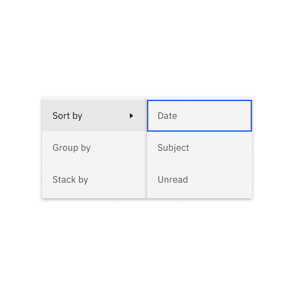
Submenus
A submenu is a menu item with the caret icon on the right, offering additional related commands. While submenus can help tidy up a context menu and make its options clearer, introducing multiple levels of submenus can make the user experience more complex and harder to navigate. Avoid multiple levels of nesting when it comes to submenus.
Actions associated with a shared label
When a term appears in more than two menu items in the same group, consider eliminating the recurring term in the submenu label to help people predict its content and scan easily.
Do omit recurring term
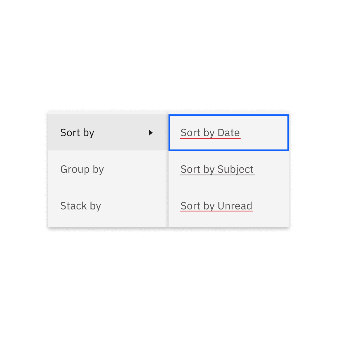
Do not repeat the same term from the submenu trigger
Further guidance
For further content guidance, see Carbon’s content guidelines.
Behaviors
States
Menu items have seven states: enabled, hover, focus, focus and hover, danger hover, danger hover and focus, and disabled. Learn more about states on the style tab.
| State | When to use |
|---|---|
| Enabled | When an action in the list is live but a user is not directly interacting with it. This is commonly referred to as the default or normal state of the component. |
| Hover | When a user’s mouse cursor is hovering over the menu item in menus or submenus. |
| Focus | When a user tabs to or clicks on a menu trigger. This will open up the menu list. The first item in the menu list has the focus state as default. |
| Focus and hover | When an item is in the focus state but the user’s mouse cursor is hovering over the item row. |
| Danger hover | When an action could have destructive effects on the user’s data (for example, delete or remove). |
| Danger hover and focus | When a user tabs to a destructive menu item that has the danger hover state. |
| Disabled | When an action is not able to be performed at a certain time, but will be possible to be performed by that user, at another point in time. Actions that are permissions-based should be hidden if it is never possible for a user to perform that action. |
Interactions
Mouse
Once the menu opens by clicking on a menu button trigger or right-clicking on an area, users can:
- Select or deselect an item by clicking on it
- Hover over the item with the caret icon to reveal additional options or actions from that item
- Click outside of the menu area to close it
Mouse interactions on menu
Keyboard
Once the menu opens by pressing
Return
Enter
- Press andUparrows to navigate between menu optionsDown
- Press orReturnorEnterarrow on the item with the caret icon to reveal additional optionsRight
- Press orReturnon an item to select or deselect itEnter
- Press to close itEscape
Responsive behaviors
Once the menu opens, the first option is highlighted. Users can then move through the list of options to activate or select one item at a time. Once users activate or select a menu item, the menu closes.
Activating a menu item can trigger the following:
- Open a dialog box
- Set a value (which can perform an action or serve as a selected/deselected option in the menu)
- Open a new page (typically in a new window or tab)
- Initiate a new user task (potentially involving multiple steps)
- Save or close something
- Expand a submenu (though this can also occur without activation)
- Undo or redo a user action
- Perform various actions (e.g., editing actions like cut, paste, copy, format; application actions such as checking for updates)
- Open a sidebar or toolbar
- Access an existing page
- Adjust the current window(s) (e.g., minimize, split, arrange, swap)
- No action other than closing the menu
Modifiers
Dividers
Divider lines serve the purpose of categorizing related actions into appropriate sections, while also distinguishing actions that might have a significant impact on the user’s data, such as deleting an app or service.
Keyboard shortcuts
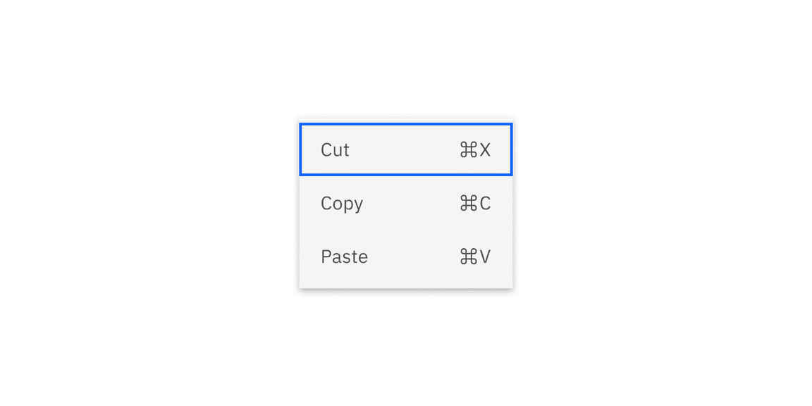
A menu item can display related values, like a caret indicator for accessing a submenu or a keyboard shortcut linked to the action.
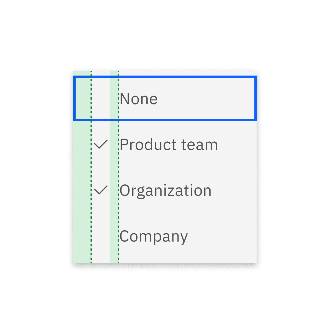
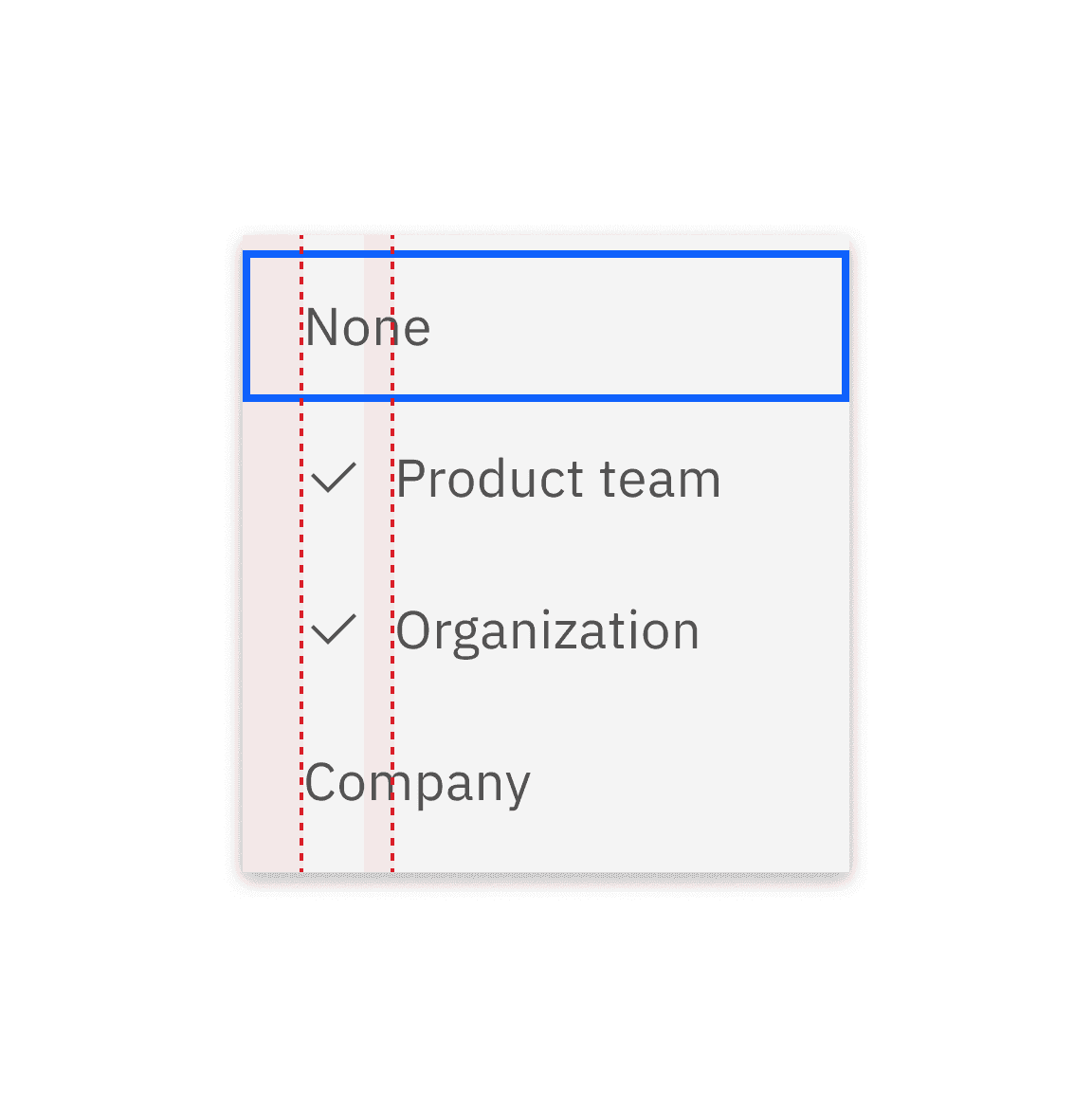
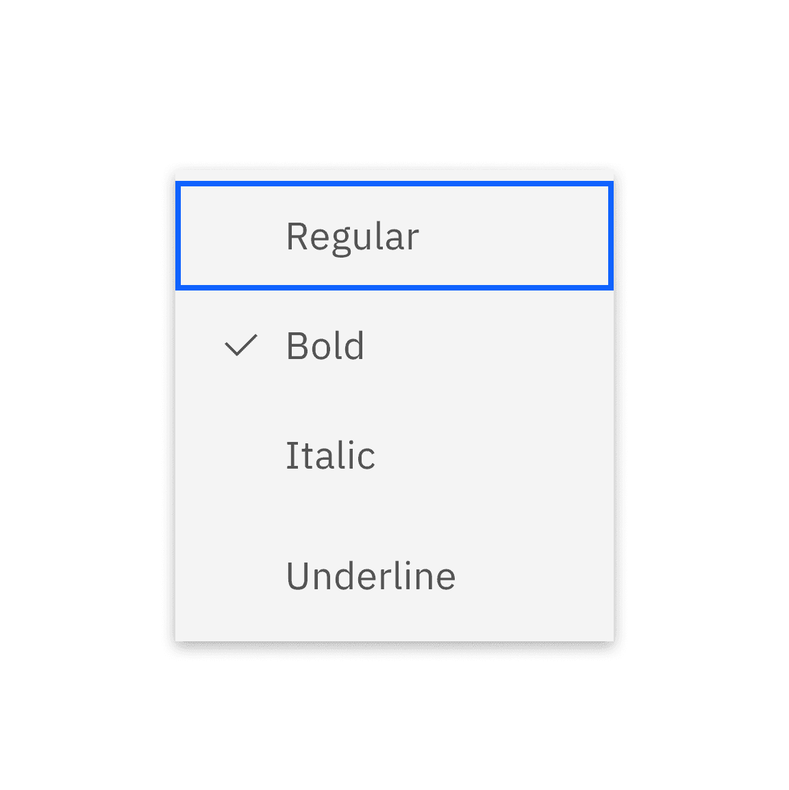
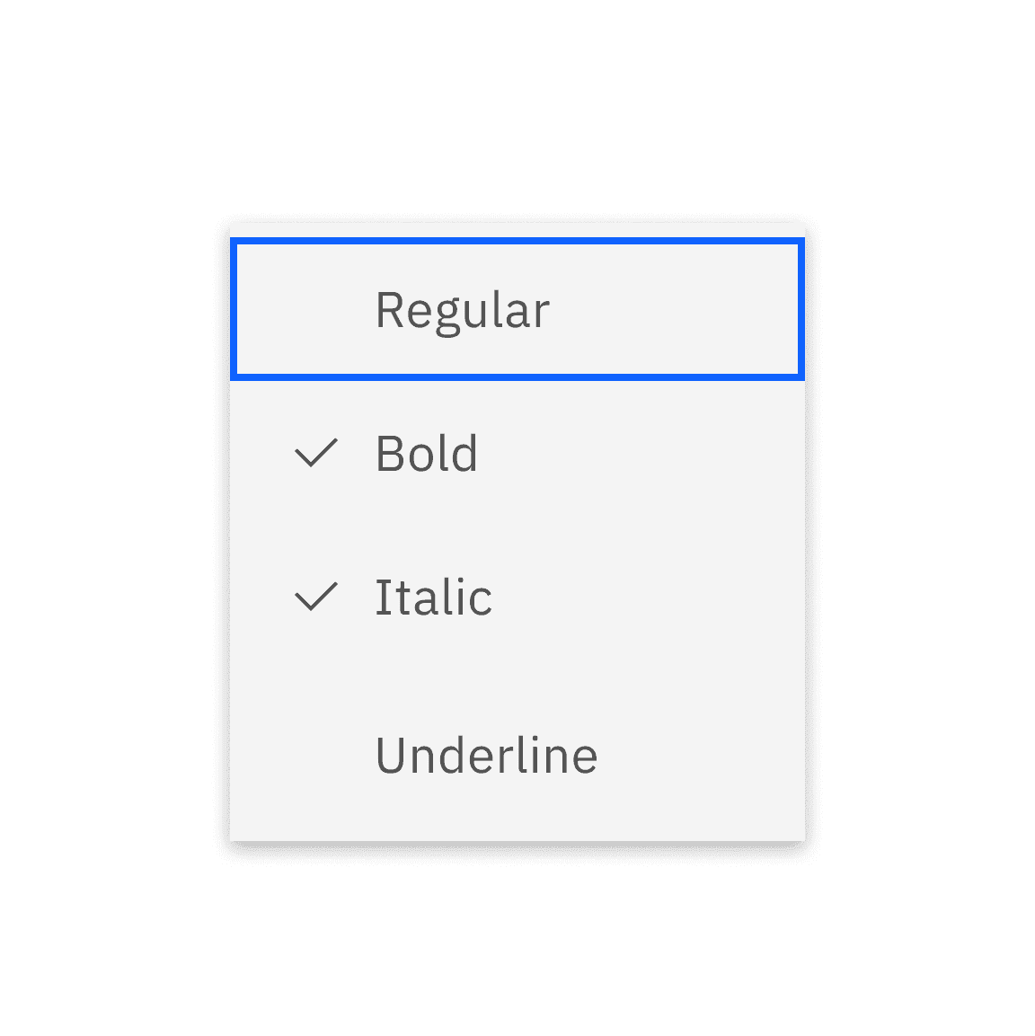
Single-select and multi-select
Single-select or multi-select has the same visual with the checkmark in front of the menu item.
Danger state
A danger hover state can be applied to actions that could cause significant changes, such as delete.
Related
Menu buttons
To understand how to use menus with other specific menu button triggers, see menu buttons.
Dropdown
To understand how the menu component can be used differently from the dropdown component, see dropdown.
Popover
The popover component is visually similar to menu, but is used for different purposes. See popover for more information.
References
-
Anna Kaley, Contextual Menus: Delivering Relevant Tools for Tasks (Nielsen Norman Group, 2019)
-
Michael Villar, Building like it’s 1984: A comprehensive guide to creating intuitive context menus (Height, 2022)
Feedback
Help us improve this component by providing feedback, asking questions, and leaving any other comments on GitHub.