Link
Design annotations are needed for specific instances shown below, but for the standard link component, Carbon already incorporates accessibility.
What Carbon provides
Carbon bakes keyboard operation into its components, improving the experience of blind users and others who operate via the keyboard. Carbon incorporates many other accessibility considerations, some of which are described below.
Keyboard interactions
No annotations for keyboard interactions are needed. All links are in the tab order, and activated with standard keys. Where Carbon links are not persistently underlined, they receive an underline on focus.
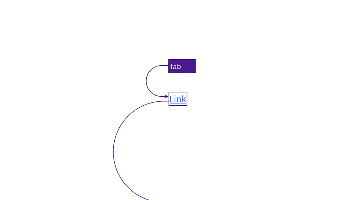
Links are reached by Tab key and activated with the Enter key.
Contrast
Carbon’s link text and visited link text colors meet the minimum contrast requirement of 4.5:1 with its background. Carbon also uses a link color and a visited link color that contrast 3:1 against body text, so that they are distinguishable even without an underline.
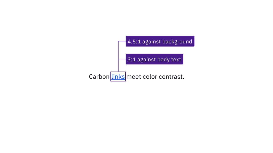
Link text has sufficient contrast with both its background and surrounding body text.
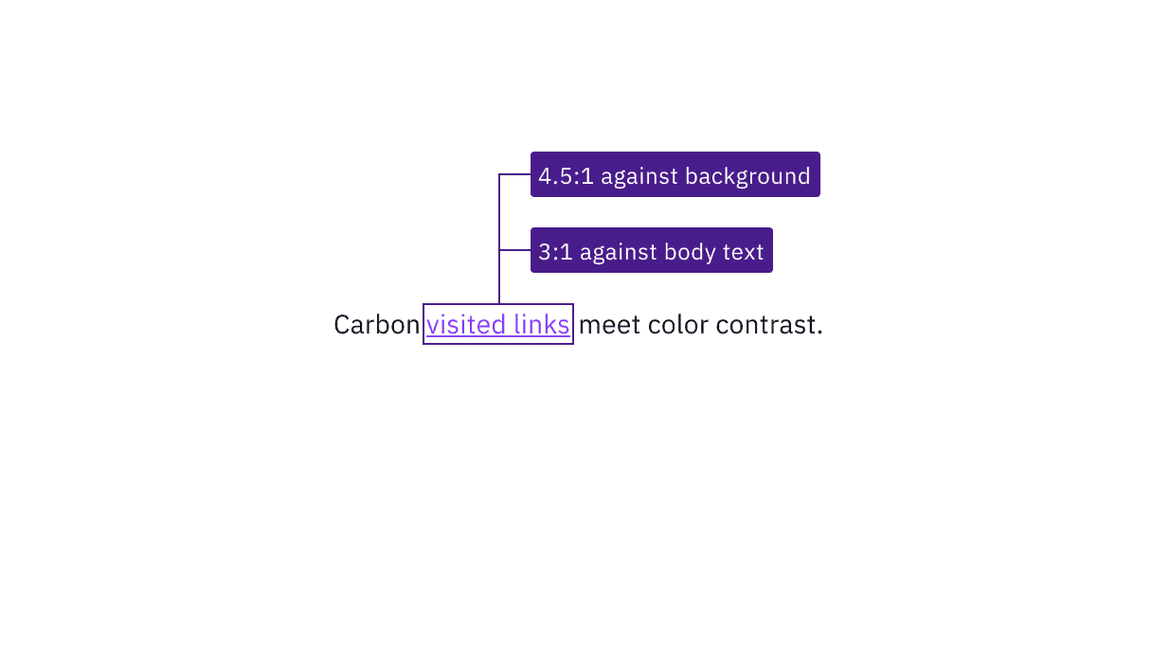
Visited link text has sufficient contrast with both its background and surrounding body text.
Design recommendations
Ensure link context
If your design uses generic link names such as “read more,” consider making them unique. Otherwise, annotate a connection with other text in the design that provides context. This will allow developers to implement in a way that increases accessibility. See the Equal Access Toolkit link text topic.
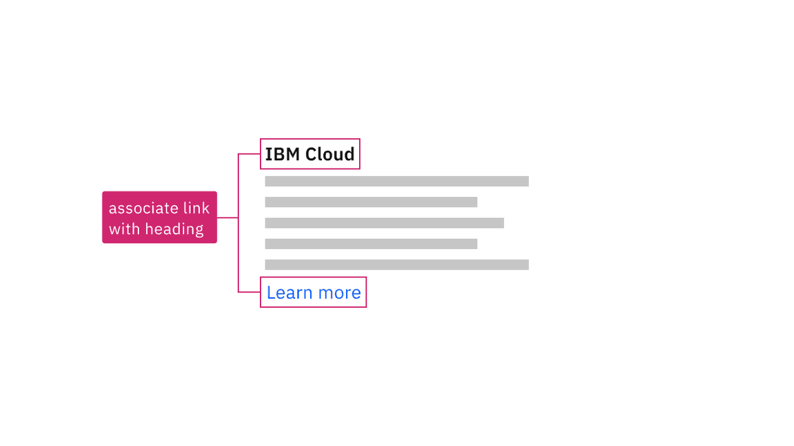
Annotate the connection between generic links and text that gives context.
Development considerations
Keep these considerations in mind if you are modifying Carbon or creating a custom component.
- Associate generic links such as “read more” with other contextual text, using
either oraria-describedby(to concatenate multiple text strings). See the Equal Access Toolkit guidance for more details.aria-labelledby
- See the ARIA authoring practices for more considerations.
Accessibility testing statusFor every latest release, Carbon runs tests on all components to meet the accessibility requirements. These different statuses report the work that Carbon has done in the back end. These tests appear only when the components are stable.
For every latest release, Carbon runs tests on all components to meet the accessibility requirements. These different statuses report the work that Carbon has done in the back end. These tests appear only when the components are stable.
Latest version: | Framework: React (@carbon/react)
| Component | Accessibility test | Status | Link to source code |
|---|---|---|---|
| Link | Test(s) that ensure the initial render state of a component is accessible. | Passes all automated tests with no reported accessibility violations. | GitHub link |
| Tests that ensure additional states of the component are accessible. This could be interactive states of a component or its multiple variants. | Passes all automated tests with no reported accessibility violations. | ||
| Tests that ensure focus is properly managed, and all interactive functions of a component have a proper keyboard-accessible equivalent. | Test data is either not available or not applicable for this component state. | ||
| This manual testing ensures that the visual information on the screen is properly conveyed and read correctly by screen readers such as JAWS, VoiceOver, and NVDA. | A human has manually tested this component, e.g. screen reader testing. |