Data table
Design annotations are needed for specific instances shown below, but for the standard data table component, Carbon already incorporates accessibility.
What Carbon provides
Carbon bakes keyboard operation into its components, improving the experience of blind users and others who operate via the keyboard. Carbon incorporates many other accessibility considerations, some of which are described below.
Keyboard interaction
There are three data table variants with different interactions. Optional features like column sorting can appear in any of the variants. Table pagination is treated as a separate component.
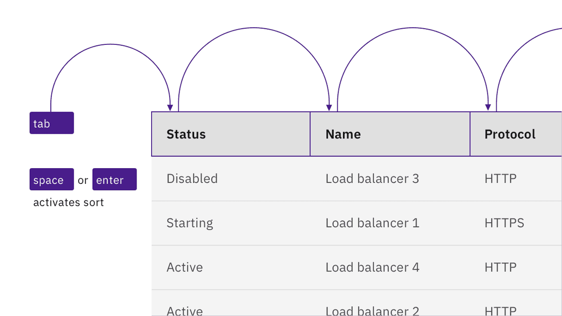
For sortable tables, the column headers are reachable by
Tab
Space
Enter
Controls inside tables
Any interactive controls in data cells are in the tab order and maintain normal keyboard operation. This also applies to expandable table rows, which operate in the same manner as accordions
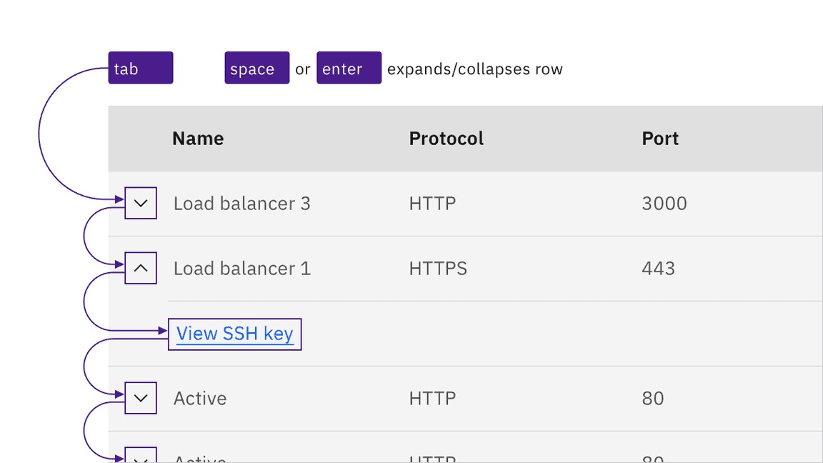
Links, inputs, and other interactive controls inside tables operate by keyboard as normal.
Labeling and updates
If columns are sortable, the sort symbols appear on hover or focus. A sorted column retains an indicator until it is no longer sorted.
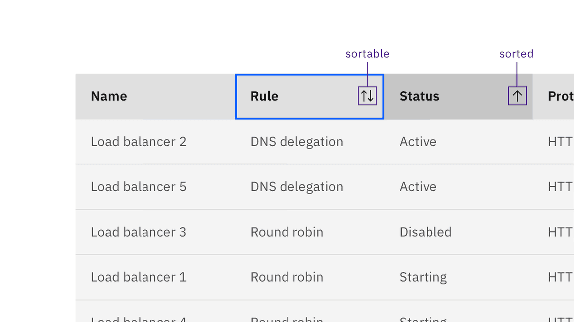
Sort indicators appear on hover and focus. A sorted column is indicated visually.
Design recommendations
Since there is no persistent visual indicator that a table is sortable, designers need to annotate if a table should be implemented with sortable column headers.
Annotate if a table is sortable.
Development considerations
Keep this in mind if you are modifying Carbon or creating a custom component:
- Column sorting indicators are matched programmatically using aria-sort
- Remember to supply an ,aria-labeloraria-labelledbyto thetitlecomponent to comply with accessible namingTable
- See the ARIA authoring practices for more considerations
Accessibility testing statusFor every latest release, Carbon runs tests on all components to meet the accessibility requirements. These different statuses report the work that Carbon has done in the back end. These tests appear only when the components are stable.
For every latest release, Carbon runs tests on all components to meet the accessibility requirements. These different statuses report the work that Carbon has done in the back end. These tests appear only when the components are stable.
Latest version: | Framework: React (@carbon/react)
| Component | Accessibility test | Status | Link to source code |
|---|---|---|---|
| Data table | Test(s) that ensure the initial render state of a component is accessible. | Passes all automated tests with no reported accessibility violations. | GitHub link |
| Tests that ensure additional states of the component are accessible. This could be interactive states of a component or its multiple variants. | Passes all automated tests with no reported accessibility violations. | ||
| Tests that ensure focus is properly managed, and all interactive functions of a component have a proper keyboard-accessible equivalent. | Passes all automated tests with no reported accessibility violations. | ||
| This manual testing ensures that the visual information on the screen is properly conveyed and read correctly by screen readers such as JAWS, VoiceOver, and NVDA. | A human has manually tested this component, e.g. screen reader testing. |