Notifications
Notifications are an important method of communicating with users and providing feedback. They range from granular, inline responses to user actions to system-wide messages.
- Overview
- Designing with notifications
- Notification status
- Notification types
- Considerations when designing
- Accessibility
- Related components and patterns
- References
- Feedback
Overview
It’s important to keep users informed and send notifications when there is an update or status change they should be aware of. Users should always be given appropriate and timely messages to help them understand whether they are moving towards their goal. Ensure your notifications are relevant, timely, and informative.
| Key principle | Definition |
|---|---|
| Relevant | Notifications should be related to the user’s goals and presented in the context of what they are doing |
| Timely | Ensure users are kept up to date with prompt notifications and see critical notifications immediately |
| Informative | Provide users with the context and next steps needed to understand and address the notification |
Be considerate of your users when sending a notification. Notifications that are too frequent or disruptive create negative experiences and drive users from platforms.
Notifications are comprised of status and type. Their status signifies the purpose of the information being conveyed. Notification types allow you to tailor the disruptiveness of the notification to the specific situation. Notification status and type options in Carbon should be combined to create notifications that are relevant, timely, and informative for each use case.
Notification status
- Informational
- Success
- Warning
- Error
Notification type
- Inline
- Toast
- Actionable
- Callout
- Banner
- Notification panel
- Modal
Designing with notifications
When to use
Use notifications to inform users of important status changes and updates. Transparency is a core element of building user trust and is the first of Jakob Nielsen’s 10 usability heuristics. They should be relevant to the user and as minimally disruptive as possible. There are two major use cases for notifications: task-generated and system-generated.
Task-generated notifications
Task-generated notifications are initiated in response to user action during a specific task. They give users direct, immediate feedback. They should be placed in the region of the page the user is working in and be related to the user’s action.
You might send a task-generated notification when:
- A form is successfully submitted
- There is a problem uploading a file
- Credentials can�’t be found
System-generated notifications
These notifications are initiated by the application or system, independent of user action. They provide updates on background system status or out-of-context events that have finished.
You might send a system-generated notification when:
- A user loses network connection
- Planned system maintenance is coming soon
- A new report is ready
- The user’s login session is about to expire
When not to use
Only send notifications where necessary. Confine each notification to the portion of the interface and workflow it is relevant to. Being interrupted creates a frustrating and discouraging experience for users, so this should be limited as much as possible. Additionally, frequent distractions lower productivity and can lead to alert fatigue.
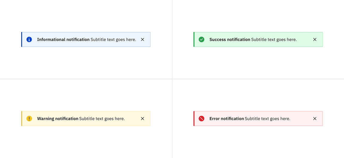
Notification status
Notification statuses are designed to convey the emotional tone of the information being communicated. Each status is associated with a specific color and icon, ensuring a consistent and universal user experience.
Notification status for the inline variant
Deciding what to use
| Status | Usage | Color | Icon |
|---|---|---|---|
| Informational | Provide additional information to users that may not be tied to their current action or task | Blue |
|
| Success | Confirm a task was completed as expected | Green |
|
| Warning | Inform users that they are taking actions that are not desirable or might have unexpected results | Yellow |
|
| Error | Inform users of an error or critical failure and optionally block the user from proceeding until the issue has been resolved | Red |
|
Notification types
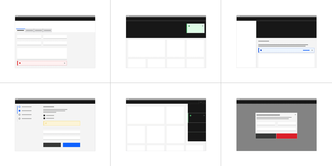
Deciding what to use
| Type | Usage | Duration and interaction |
|---|---|---|
| Inline | Provide users with nondisruptive feedback or the status of an action | Persist until the message is resolved or dismissed by user and may include a ghost button action |
| Toast | Short, time-based messages that slide in and out of a page and provide nondisruptive information. | Toast notifications without actions can disappear automatically or can be dismissed by user. Toast notifications with actions persist until dismissed by user. |
| Actionable | Actionable notifications allow for interactive elements within a notification styled like an inline or toast notification | Persist until action is taken or dismissed by user |
| Callout | Callouts are used to highlight important information, contextually within the contents of the page. | Unlike other notification components, they are not triggered by the user or system. They load with the contents of the page, are persistent, and cannot be dismissed. |
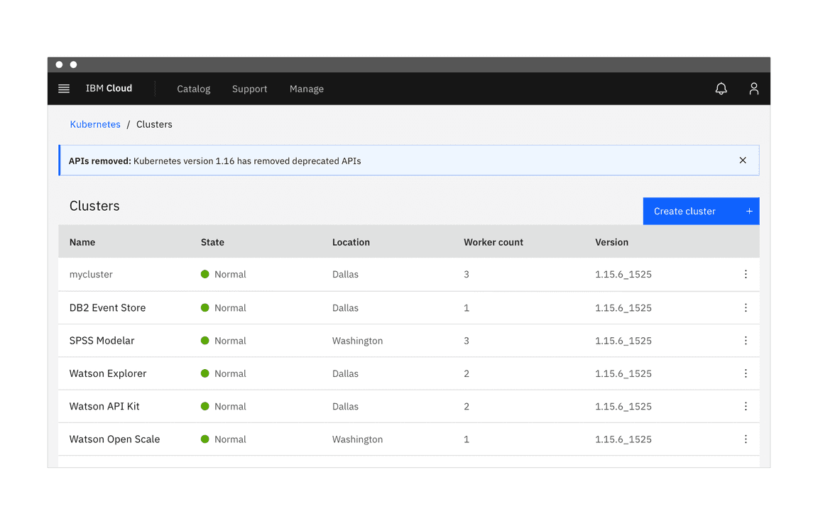
| Banner | System or product level notifications that are not specific to a task | Persist until dismissed by user and may include a ghost button or link |
| Notification panel | Notification center that provides users with system-generated messages | Opened and closed by user |
| Modal | Highly disruptive notifications that provide users with critical information that needs their attention or action | Persist and block tasks until dismissed by user. Modals allow more user action than other notifications and can include other Carbon components. |
Inline notification
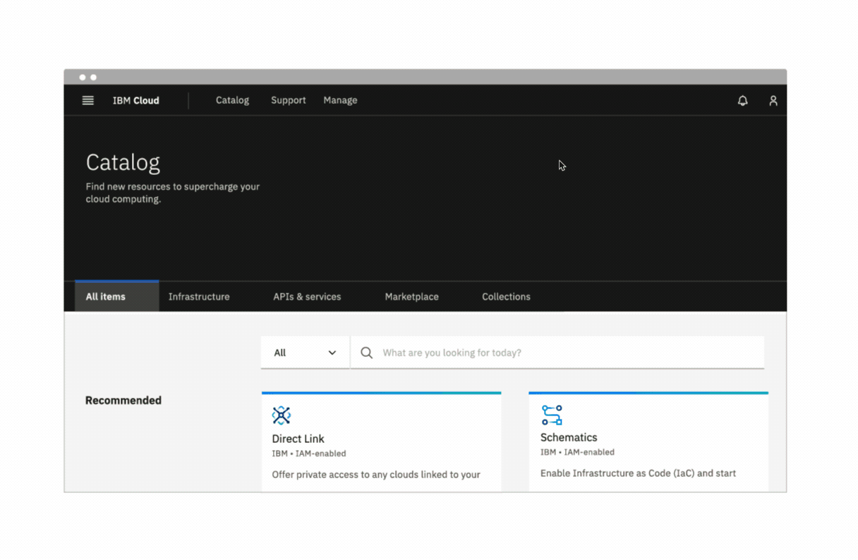
Inline notifications are nondisruptive and confined to a specific area in the UI. Inline notifications display both task-generated and system-generated messages and persist until they are dismissed by the user or the notification is resolved. They are frequently used in conjunction with field-level messages for errors in forms or other input areas.
Carbon offers low-contrast and high-contrast inline notifications. All inline notifications use a color that corresponds with their message intent and can also be accompanied by an icon to reinforce the message intent.
Best practices:
- Place inline notifications near their related items.
- In forms, inline notifications can be placed either at the top or bottom.
- Keep the message under two lines.
- Do not cover other content with inline notifications.
- The notification width varies based on the context and page layout.
- Be descriptive and give users clear next steps.
Low-contrast inline notification
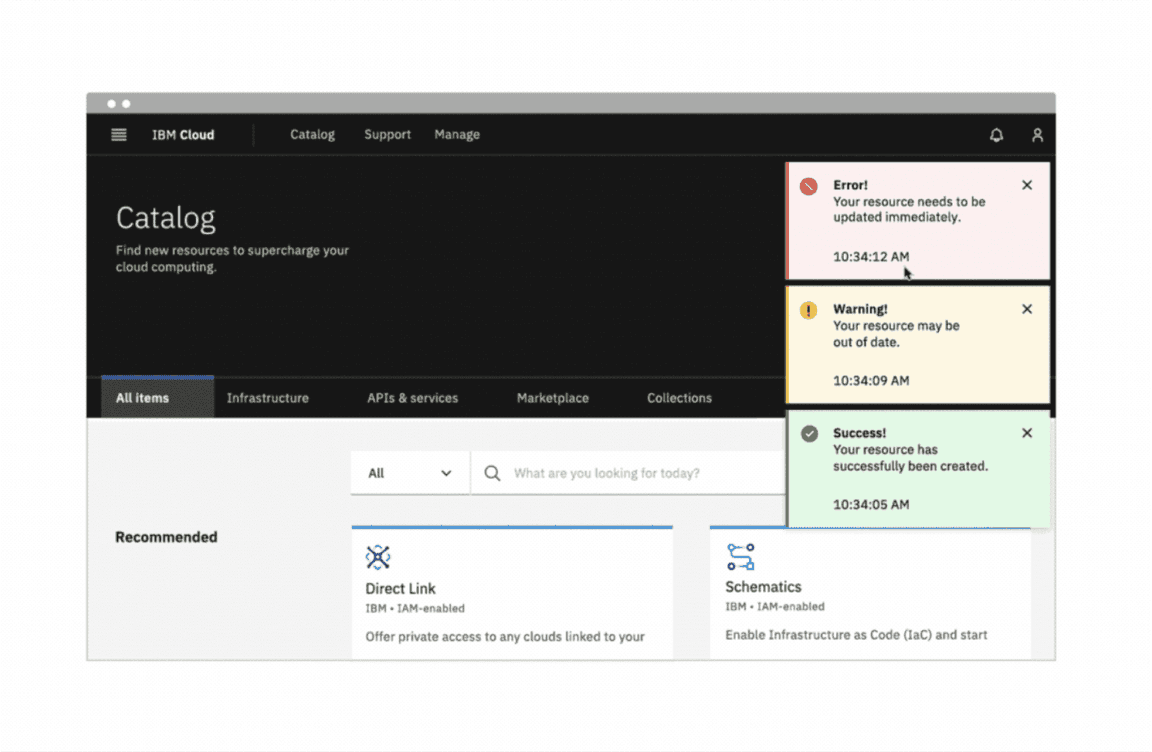
Toast
Toasts are notifications that slide in and out, typically in the top right of the page. They are more disruptive than inline notifications and are best used with system-generated messages that do not correspond to a specific section of the UI.
Carbon toasts can be either low-contrast or high-contrast. Their color should correspond with the message intent and they can also use an icon to convey the message intent.
Example of a toast notification without actions (left) and actionable toast notification (right)
Long messages
Removing the timestamp provides space for a third line of content for longer toast messages. Toasts are intended to be at-a-glance messages confined to a small region of the screen so their messages should not exceed three lines.
Best practices:
- Multiple toasts stack vertically, with the newest appearing at the top of the list.
- Keep messages clear and concise.
- The timestamp is optional and can be removed.
- Toast notifications have a fixed width and should not be expanded to fit the content area.
Actionable
Actionable notifications allow for interactive elements within a notification styled like an inline or toast notification. Actionable notifications, since they require user interaction, take focus when triggered and can be highly disruptive to screen readers and keyboard users.
Actionable notifications styled as inline notifications contain only one ghost button. A small “x” in the top right corner is used to dismiss inline notifications. Including the close button is optional and should not be included if it is critical for a user to read or interact with the notification.
Actionable notifications styled as toast notifications can only contain one tertiary button. If the toast includes an action button, then the notification should remain on screen until the user dismisses it. With the notification remaining open, the user has enough time to interact with the button without the toast closing too soon.
Best practices:
- An actionable notification should persist until user dismisses it, allowing users time to interact with the notification.
- Only one action per notification.
- Limit action labels to two words or less.
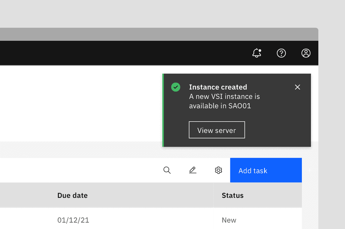
Actionable notification styled as a toast notification
Callout
Callouts are used to highlight important information contextually within the contents of the page, and cannot be dismissed. Unlike other notification components they are not triggered by the user or system, rather they load with the contents of the page. They do not act as a feedback mechanism, they are persistent, and always present on the screen to provide necessary information to the user. Further, since Callouts are intended to offer guidance before users begin a task or take action, they do not include success or error statuses.
Best practices:
- Use to highlight information to help users make good decisions or avoid bad experience.
- Place the callout contextually near an action button, input field or other data to provide information that can influence how they complete the task.
- Avoid overloading a single page with multiple callouts.
- Use sparingly to emphasize information that must not be overlooked.
- Omit the title when it is redundant and might break the flow while reading through the information.
Example of callout influencing a user journey
Banner
Banners take over the top of an interface to show general notifications for the product or system, not a specific task. They persist until they are dismissed by the user. Depending on the message, the user resolving a product or system issue (for example, updating necessary account information), may dismiss the banner. Banners may also persist across multiple sessions.
Best practices:
- Banners should be placed at the top of the content area they relate to.
- Do not cover other content with a banner notification.
- Place system-wide messages directly below the main header or navigation bar.
- Banners are not sticky and should scroll with the other content on the page.
- Only show one banner at a time.
More design iteration and user testing is needed before Carbon solidifies our guidance for banners and creates a banner component. Keep an eye out for refined usage examples in the future. If your team has developed a banner component, consider contributing it to Carbon so that it can be made available to others.
Low-contrast banner notification
Notification panel
Notification panels are helpful for users who receive a large number of system-generated notifications or may need to reference their notifications later. They are used in conjunction with toasts to alert users of notifications as they come in.
Notification panels ensure that users can access and read all notifications without cluttering the screen with many persistent notifications. They also provide a consistent experience to users who need more time to read notifications, use a screen reader, or prefer to limit the notifications they receive.
More design iteration and user testing is needed before Carbon solidifies our guidance for notification panel and creates a notification panel component. Keep an eye out for refined usage examples in the future. If your team has developed a notification panel component, consider contributing it to Carbon so that it can be made available to others.
Best practices:
- Give users the ability to manage notification preferences.
- Don’t send the same notification multiple times if users don’t interact with it.
- List notifications in chronological order.
- Notifications can be grouped by source or urgency.
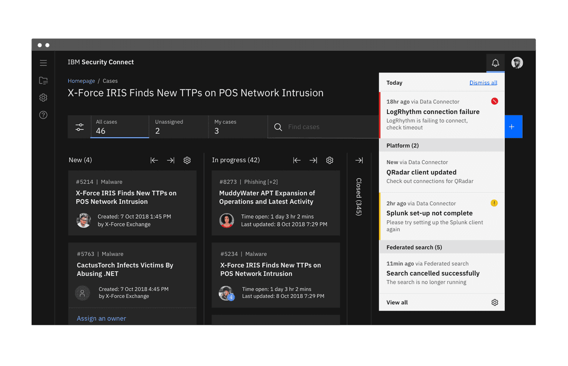
Notification panel with the Gray 100 theme
Modal
Modals interrupt the user and pause their current task. They are highly disruptive to users and should be used sparingly. Only use a modal when the message is critical and needs the user’s immediate attention or action. Modals persist until users engage with them and only disappear when dismissed by the user.
Best practices:
- Only display one modal notification at a time.
- Use modals when you need to immediately interrupt a user’s task.
- Give users clear steps to resolve and dismiss the notification.
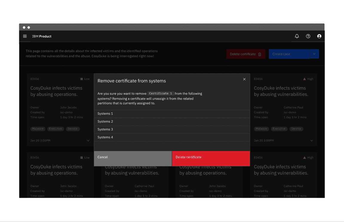
Danger modal notification
Considerations when designing
Notification priority
Notifications range in their priority and therefore should vary in their disruptiveness to users. It is important to match the urgency and priority of the information being communicated to the visual style and behavior of the notification.
Carbon offers two visual styles for inline and toast notifications. The high-contrast style is more visually disruptive and should be used for notifications that are urgent or critical. The low-contrast style is better for supplemental messaging or other low priority use cases. Toast and inline notifications can use different styles, but you should never mix styles within the variations.
General user action
Optional action
Actionable notifications can include a ghost or tertiary button that lets users interact with them. Taking action on these notifications should be optional and should not block the user from continuing with their current task. This action frequently takes users to a flow or page related to the message, where they can resolve the notification.
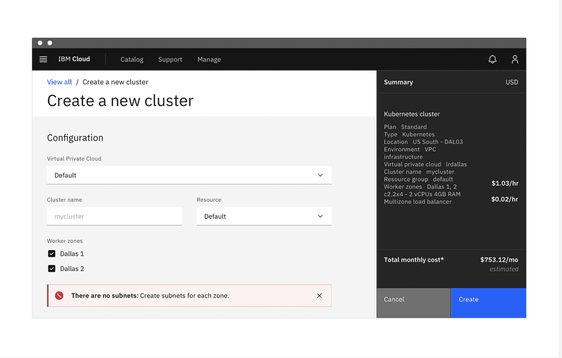
Required action
Some notification patterns must block users from dismissing the notification or continuing with their task until the message has been addressed. This is common in forms when there are errors or empty input fields. Notifications that prevent users from continuing should be relevant to the current task and provide the user with the steps needed to resolve them or continue with their current task.
Blocking users from continuing with a task is disruptive and hinders the overall experience, so these notifications should only be used when it is critical the user sees the notification or the user needs to take action right away.
Notification message
It’s important to consider the user’s context when writing notification messages. Use language that is accessible to the user and that will be easily understood. Use a tone that is appropriate for the situation and notification.
Because task-generated notifications are sent in response to user action, it isn’t necessary to give users extensive background information. Conversely, system-generated notifications are generally not relevant to the user’s current task so you should ensure the user has sufficient context to understand the notification.
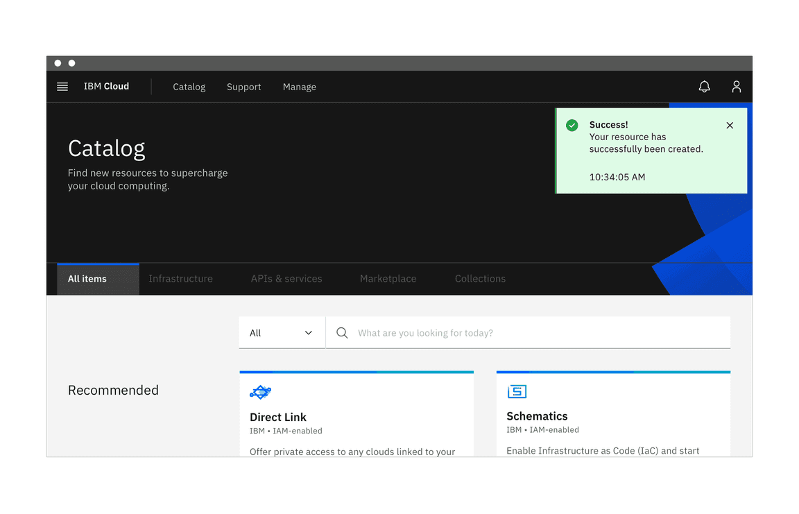
Success! Your resource has been created.
Do use clear and concise language.
503 Service Unavailable
Do not use technical jargon or language unfamiliar to the user.
Script failed to run. Check the log for more detail.
Do ensure users know how to take action if it is necessary.
Instance was not created.
Do not leave users without next steps.
Accessibility
Don’t use notifications that dismiss on a timer for critical or emergency messages. Some users with disabilities need more time to read or interact with messages and timed actionable toasts may not provide sufficient time. WCAG 2.1 success criterion 2.2.4 (AAA)
Users should be able to manage or limit noncritical notifications. This gives users the control to reduce the number of distractions or disruptions they receive, which is particularly helpful for users with cognitive limitations. WCAG 2.1 success criterion 2.2.3 (AAA)
Related components and patterns
Components
The Error state pattern is currently being planned. If you would like to contribute, please see our guidelines for contributions.
References
- Alert Fatigue (Patient Safety Network, 2019)
- Aria Live Regions (W3C, 2017)
- Duncan P. Brumby, Christian P. Janssen, and Gloria Mark, How Do Interruptions Affect Productivity? (Rethinking Productivity in Software Engineering, 2019)
- Kim Flaherty, Indicators, Validations, and Notifications (Nielsen Norman Group, 2015)
- Aurora Harley, Visibility of System Status (Nielsen Norman Group, 2018)
- Jakob Nielsen, 10 Usability Heuristics for User Interface Design (Nielsen Norman Group, 1994)
- Web Content Accessibility Guidelines (W3C, 2018)
Feedback
Help us improve this pattern by providing feedback, asking questions, and leaving any other comments on GitHub.