Accessibility
Visual impairments can include low vision, color blindness, and complete blindness. Carbon components are designed to accommodate the entire spectrum of visual impairment, though designers still need to exercise diligence to ensure that the components are used correctly.
Color contrast
Carbon strives to meet WCAG AA standards across all standard themes in the system, including color contrast ratios.
| Element type | Contrast ratio |
|---|---|
| Standard text | 4.5:1 |
| Large text | 3:1 |
| UI components | 3:1 |
Standard text
Standard text and images of text must have a contrast ratio of at least 4.5:1.
Large text
Large text (at least 24 px regular and light / 19 px semi-bold) must have a contrast ratio of 3:1.
Text against non-static backgrounds
When text is rendered on a gradient background or image, make sure the text color meets contrast standards in all places it appears. This is especially important for parallax applications or animations where text and backgrounds are moving independently of each other.
Visual information used to indicate states and boundaries of UI components must have a contrast ratio of 3:1 against adjacent colors. See IBM checkpoint 1.4.11 Non-text Contrast.
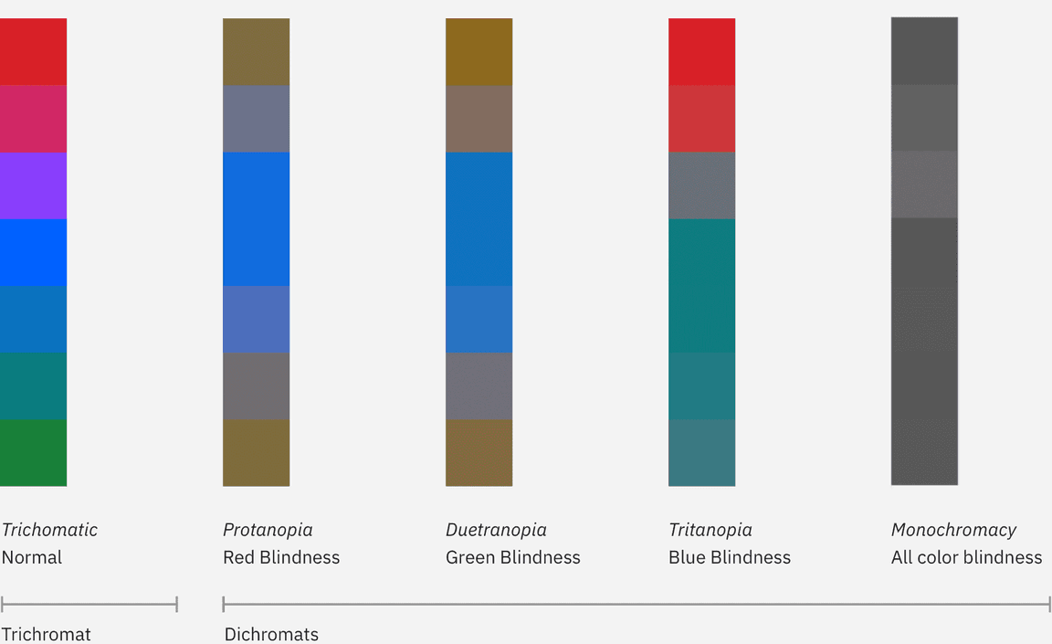
Use of color and color blindness
Don’t rely on color alone to convey meaning. This includes conveying information, indicating an action, prompting the user for a response, or distinguishing one visual element from another. When designing with color, it might help to use a color-blind simulator to review visibility of content. If you’re working in Figma, we recommend the Stark plugin.


