2x Grid
You’ve learned the grid fundamentals, now let’s put them together. A good layout requires careful planning and use of composition, which relies on principles such as hierarchy, scale, proportion, contrast, harmony, rhythm, repetition, and many more.
- UI galleries
- Fit for purpose
- Content hierarchy
- Continuity and contrast
- Grid influencers
- Style models
- Gutter modes
- Mixing gutter modes
- Using grids in Figma
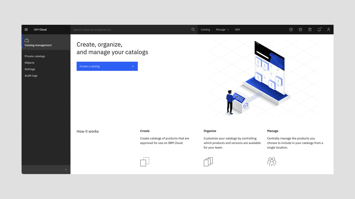
UI galleries
For years, Carbon users have been asking for a gallery of product UI screens for reference and inspiration. There are several ongoing initiatives to catalog screens and we’ll continue to add to this list as more come online.
Fit for purpose
On every page there is a story that ends with a desired action–one that enables a user to achieve a goal or reach an outcome. Proper layouts pull everything together to help users form a mental model of the story, identify relevant content, and pursue their objective.
Always start with the content and user goals. Consider the purpose of the content and the best type of experience to help the user reach their objective. For instance, are you building a long-form reading experience or a multi-step, task-based experience? Each type of experience and purpose will require a different layout.
Content hierarchy
Hierarchy helps users (viewer, reader, audience) navigate complex concepts without getting confused or lost, and ultimately find what they are looking for. Thoughtful application of type styles, components, and patterns will allow content to be communicated and prioritized in different ways. Pay attention also to the size and proximity of content pieces within a component and between components.
Basic scaffolding
In the Overview section, we talked a bit about common screen regions—like the UI Shell, the content area and dialogs. Now we also need to address several common layout patterns within the content area in IBM products.
These repeatable structures lower the cognitive burden for users, by reinforcing key alignments throughout the UI. Below are some examples of structural layout modules that are used widely across products. For more detailed documentation about structural layout modules, check out IBM Product Layouts on the Carbon for IBM Products PAL.
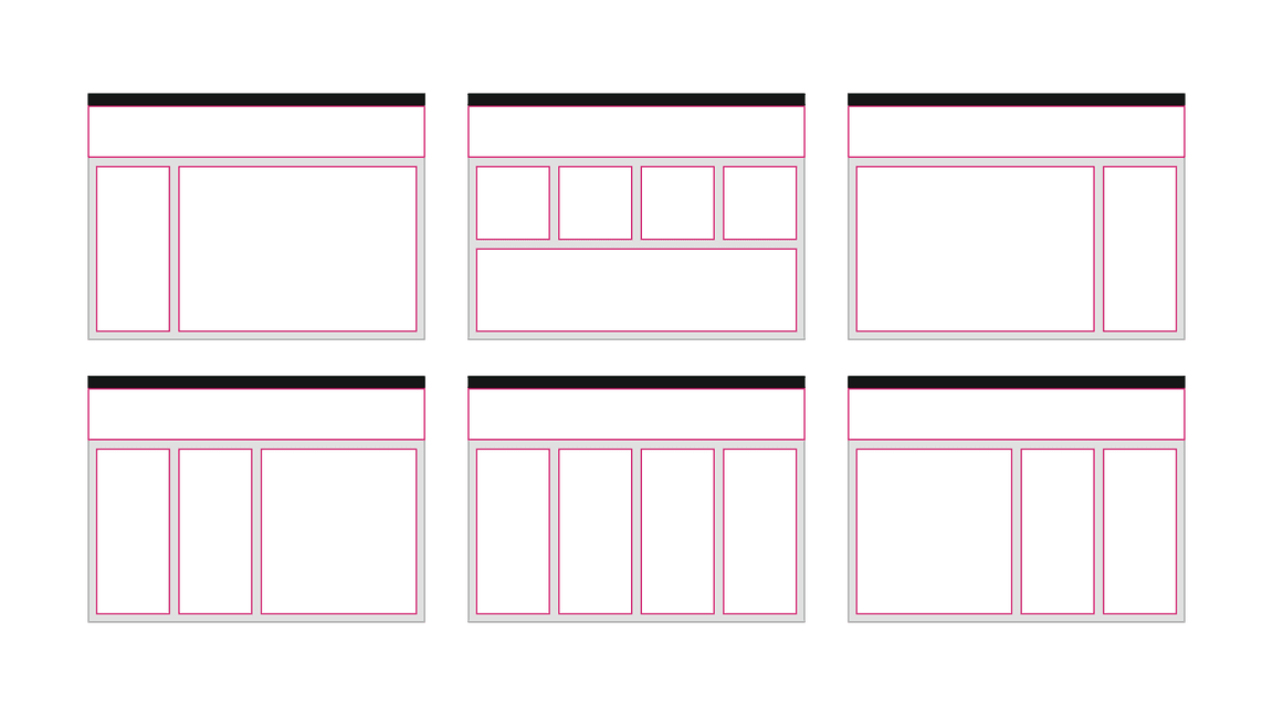
Although gutter width depends on the product, here are some common examples of how product designers use a consistent leadspace size with the 2x Grid to create four-column layout patterns that repeat throughout their products.
Four columns
The four column layout is the backbone of most IBM experiences—not just the IBM.com pages. Software users also like more breathing room as they enter a product, along with consistent typographic alignments, as they navigate deeper. As a result, IBM product UIs rely heavily on the four column structure to ease users into denser content.
Even though there are examples of two- and three-column arrangements in the diagrams above, the type within them often still sits on four columns.
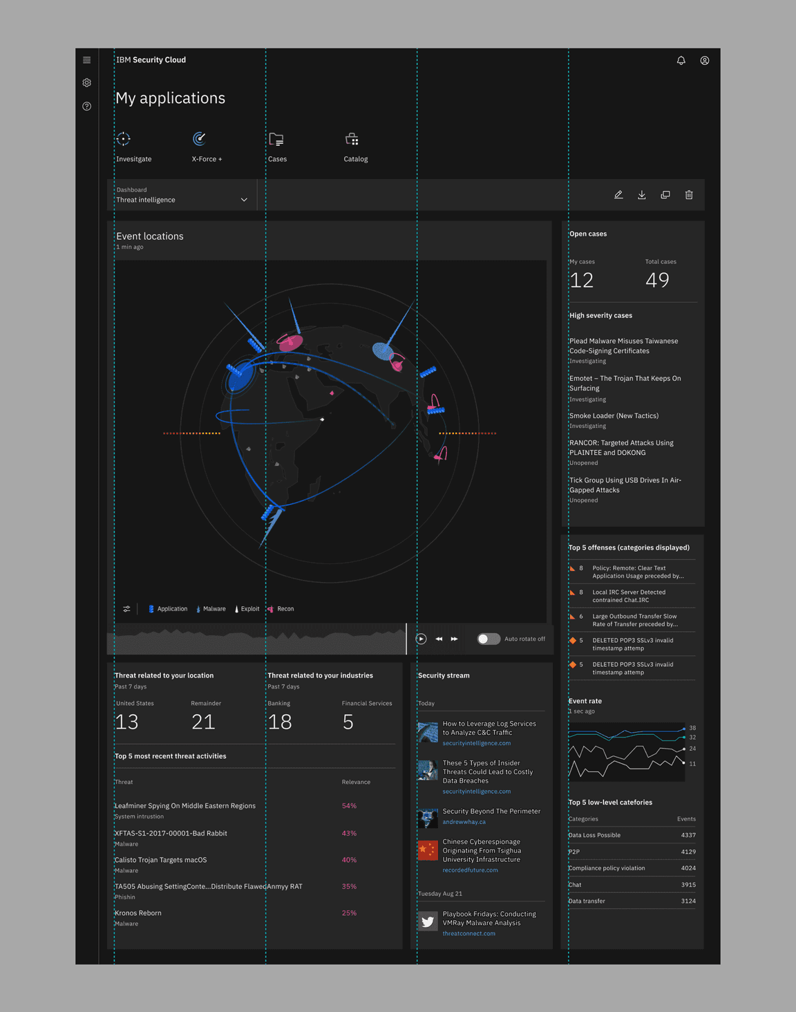
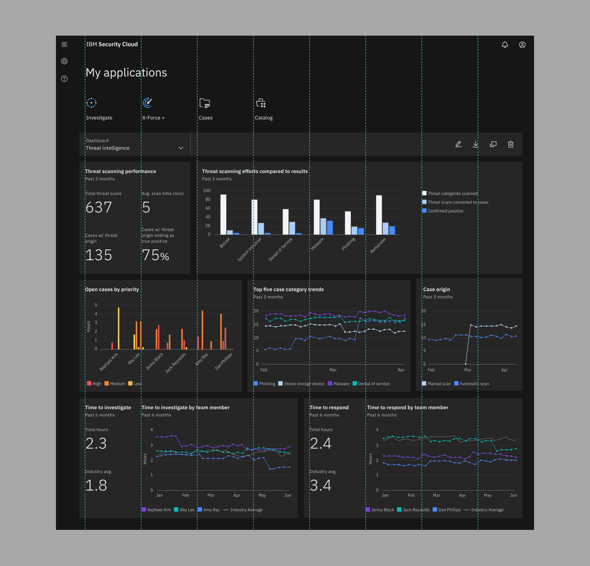
Denser layouts
You can see the four column arrangement in denser layouts too. The leadspace pattern also remains the same, giving users a familiar anchor. However the content has become a lot denser as other column configurations begin to emerge on the fluid 2x grid. The fixed grid also comes into play here in the data visualizations, where content is so dense that fixed spacers (i.e. the mini unit grid) need to be used rather than fluid columns.
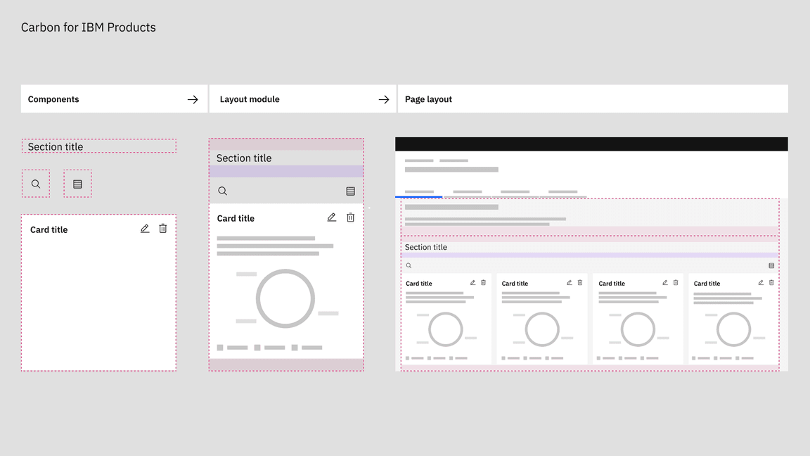
Layout modules and micro layouts
Although Carbon React does not have coded layout modules in its library, the Carbon for IBM Products library (IBMers only) does. These modules are helpful for reference, however they are still in the process of being migrated to Carbon v11.
Layout modules are coded combinations of components, spacing tokens, icons, and type styles packaged as a single grid-aware, unit. The layout-module framework enables designers to build page layouts with greater rigor, quality, and consistency. They are designed to work in tandem with other modules and Carbon components so that they can be quickly arranged into layouts with the confidence that they are consistent with all of our other pages.
These modules along with the overarching page scaffolding above, provide a great example of how product designers should mix and match repeatable layout patterns at both the large and small scales throughout an experience.
Using odd column configurations
The 2x grid starts with 16 columns and encourages designers to divide by two as their content becomes more dense. However, many legacy products used a twelve column grid and in turn, display content in groups of three instead of groups of four.
Although we highly recommend refactoring these UIs to take full advantage of the the 2x grid, we realize that certain products will choose to keep their three column scaffolding. So it’s important to note that this configuration can still be achieved with the 2x grid package.
Continuity and contrast
No component exists on its own. Pay attention to how individual layout components fit into the larger context of both the page type and the broader user journey across the product. Pattern repetition where appropriate is essential to reduce cognitive load, however too much repetition, especially coupled with lack of white space, can lead to monotony.
Continuity
Thinking across an experience
Unlike editorial experiences, products focus more on task completion and continuity across screens, rather than leading a user through stacked modules on a single page. So common geometries and key alignments are especially important across pages, not just down the scroll.
The Cloud team recently did an audit on type alignment in their product leadspaces (IBMers only) in order to streamline their experiences.
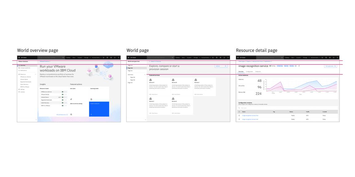
Although the leadspace heights are changing, the typographic alignment from the World overview page into the product keeps the user oriented.
Using Aspect ratios
Aspect ratios also ensure that there is a consistent visual flow as users move through a product. Although images are used much less frequently in products than in digital experiences, aspect ratios come into play often in product with the tile component, which is used frequently in catalogs and dashboards.
Refer back to the aspect ratios section on the 2x Grid Overview tab to see a list of the most commonly used aspect ratios across the Carbon ecosystem. We understand that it’s not always possible for every image or container to be one of these sizes. However it’s important to use them to set the foundation of your layouts, especially in the case of same size tiles.
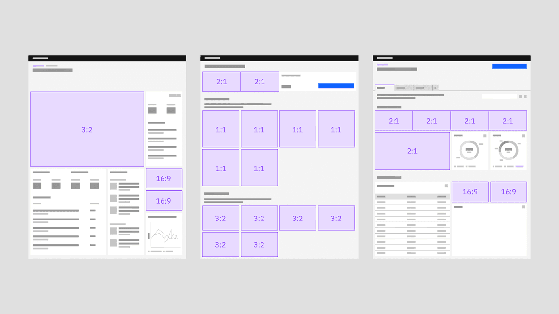
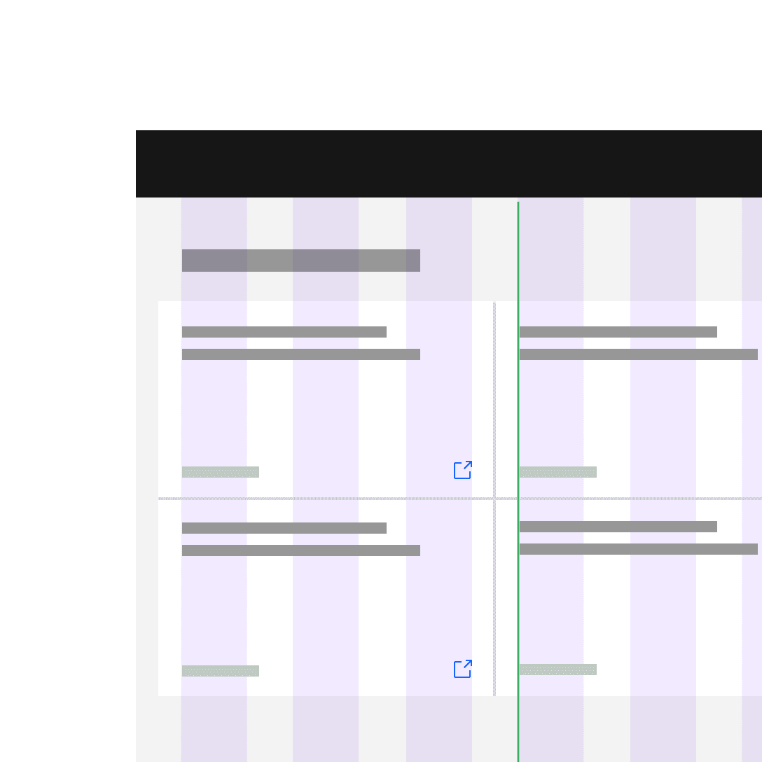
An example of using aspect ratios to drive the layout of your dashboards or catalogs
Adaptive aspect ratios
Bear in mind that tile aspect ratios can change adaptively when the breakpoint changes.
When a commonly used aspect ratio is not appropriate for the layout, it’s also fine to choose a less common aspect ratio or a scaling multiple.
Contrast
Contrast is an effective way to distinguish content pieces, engage users, highlight important information, and express IBM’s brand elements. Juxtaposing text with images, pairing UI components and elements of different sizes, strategic use of the grid, negative space and asymmetry are some of the ways in which you can introduce contrast to a layout.
Despite the technically “correct” use of the 2x grid below, the content on the right becomes overwhelming for the user. By presenting all of the information at the same scale, the user has no sense of hierarchy to orient them.
Combine related information and content types, then space appropriately to highlight dependencies or similarities.
Without proper organization of content and use of space to separate elements, it is difficult to perceive how one content piece relates to another.
Grid influencers
As we mentioned on the Overview page, a grid influencer is a component that condenses a page’s underlying grid when it is incorporated into a UI. It can either appear on the page as the result of a user action, or be part of the product’s page.
Whereas the basic page grid would simply react to the product’s breakpoints—grid influencers affect the grid and its columns, which scale and resize the page content, anytime they are present or engaged.
This grid influencer content originated on the Carbon for IBM Products PAL, but we wanted to bring the relevant portions of it here to reach the maximum audience.
Usage
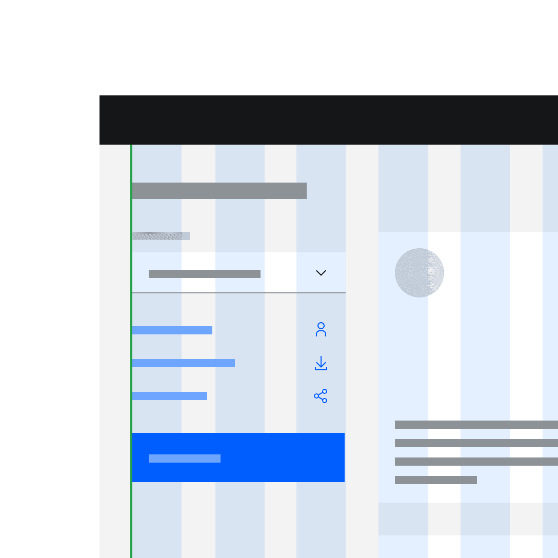
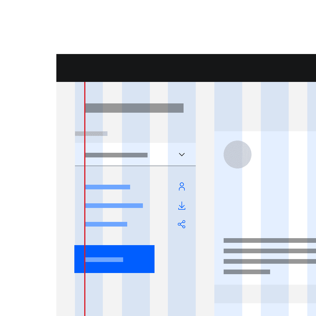
There are two main use cases where the grid may be influenced by content: left navigation and slide-in side panels.
Left-hand navigation
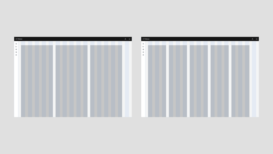
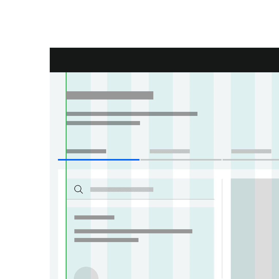
The vast majority of IBM products use the grid influencer variant of the Carbon UI Shell, making the left-hand navigation panel the most common example of a grid influencer in our ecosystem. When opening and closing the left-hand navigation, the number of columns remains the same but responds fluidly to the allotted space.
Slide-in side panels
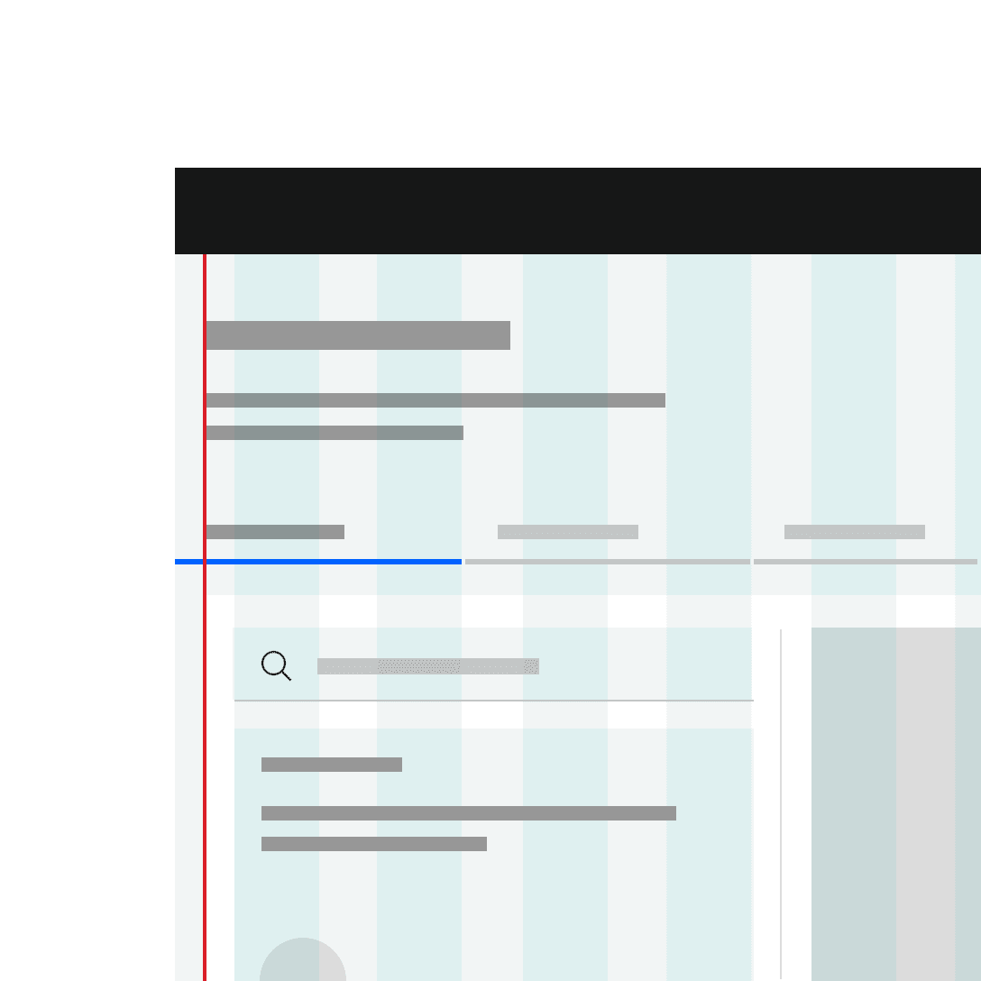
Slide-in side panels are another example of a grid influencer. Slide-in side panels come into play when a user needs to reference the page along with the panel information to complete a task.
Since these slide-in side panels were developed and maintained by Carbon for IBM Products, please visit their site for more in-depth details on side-panel sizes and best practices (IBMers only).
Introducing a slide-in side panel re-sizes the page content, and reduces the number of columns in the grid.
Style models
Style models help designers by simplifying decisions around how foundational design elements should be used. For example, all pages on IBM.com and all screens within IBM product use the 2x Grid, but the 2x Grid supports a wide range of behaviors and usage. The 2x Grid can be left aligned, centered or it can span the maximum width of the browser.
These design decisions should be made consistently based on content needs. Style models connect specific usage combinations to the kind of content they best serve.
In our models, the design elements included are:
- Grid
- Screen regions
- Key components (Masthead, Footer, and Product UI Shell)
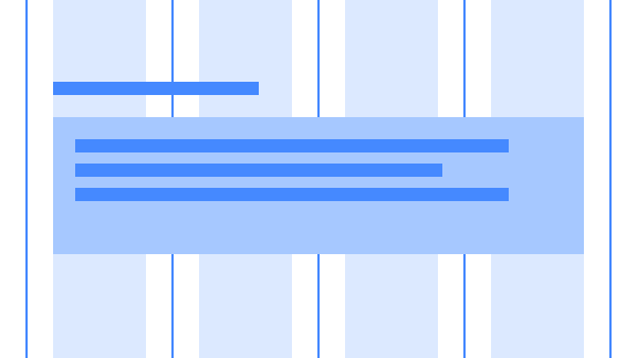
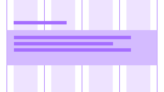
The biggest differentiator between the style models is the grid. Specifically in how the grid behaves above max breakpoint. Below is the 2x Grid at max breakpoint (1584px or 99rem).
Here is a list of recurring style models we have identified across our ecosystem:
| Style models | Usage and examples |
|---|---|
| Editorial model | This default style model is the bread and butter of marketing pages, which represent the majority of IBM.com. The grid in this model centers content for comfortable browsing, and allows for a variety of expressive layouts. Some low-information density product screens, such as the Checkout application, can use this model too. |
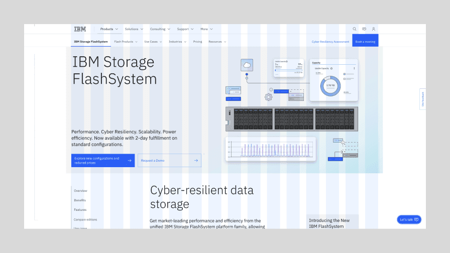
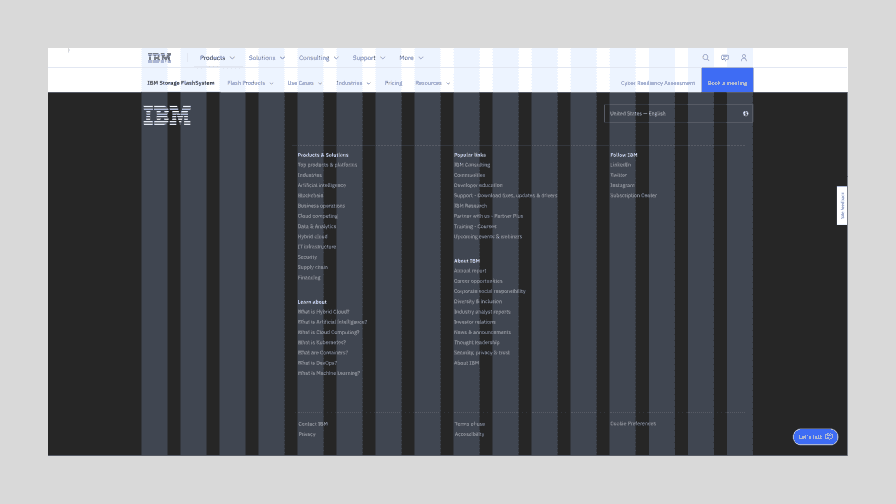
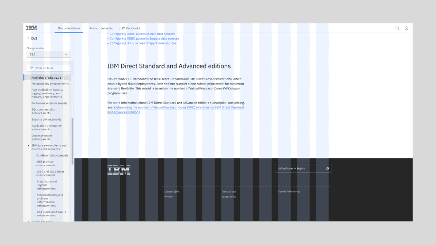
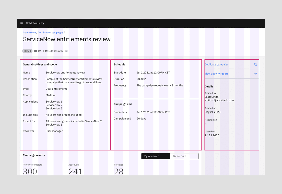
| Product and docs model | For long-form content with deep organizational hierarchy, use the Product and docs model. It anticipates a left-hand navigational panel, and keeps content within a maximum width. Examples of this model include most of IBM product UI, IBM Docs, Cloud Docs, and this site documenting the design system guidance. |
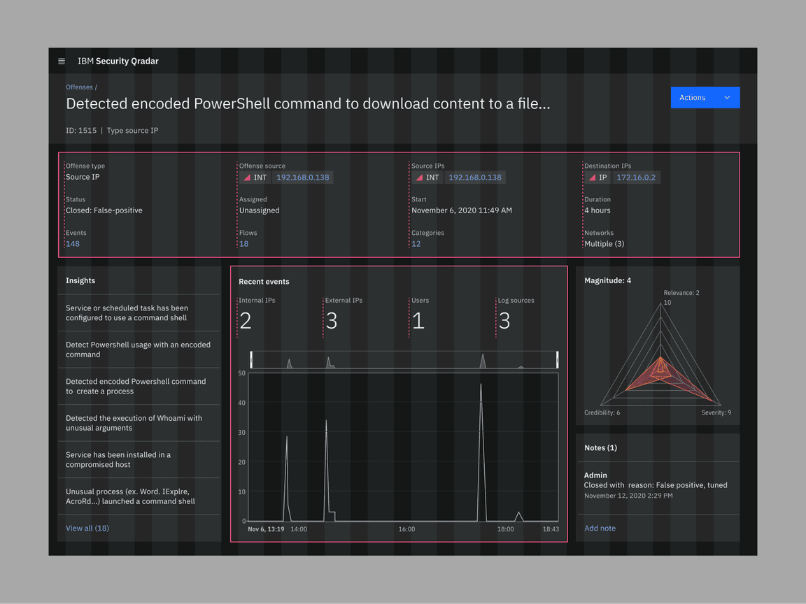
| High-density interface model | Sometimes every inch of the screen needs be used to display information and controls. Complex product interfaces, catalogs and data visualization dashboards typically fall into this category. This model uses the full width of the browser, so the bigger the screen, the more information the user will see. |
2x Grid at Max breakpoint

Once the screen is wider than the max breakpoint, the margins (highlighted in dark blue below) can expand, or columns can be added as needed in increments of two.
Editorial model

Max width maintained, grid is centered in the browser
Product and docs model

Max width maintained, grid is left-aligned in the browser
High-density interface model

Full width, add columns as needed in increments of 2
Style models in IBM.com (editorial)
This difference in grid ripples through everything on page. Below is a visual overview of how the IBM.com masthead and footer will behave above max breakpoints in the appropriate style models. Notice that marketing content on IBM.com uses the Editorial style model and that support documentation on IBM.com uses the Product and docs style model.
The Editorial model in a marketing page on IBM.com.
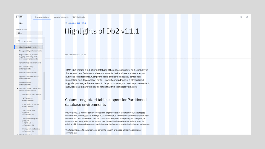
The Product and docs model in the Documentation section of IBM.com.
The footer for the Editorial model on IBM.com.
The footer for the Product and docs model on IBM.com.
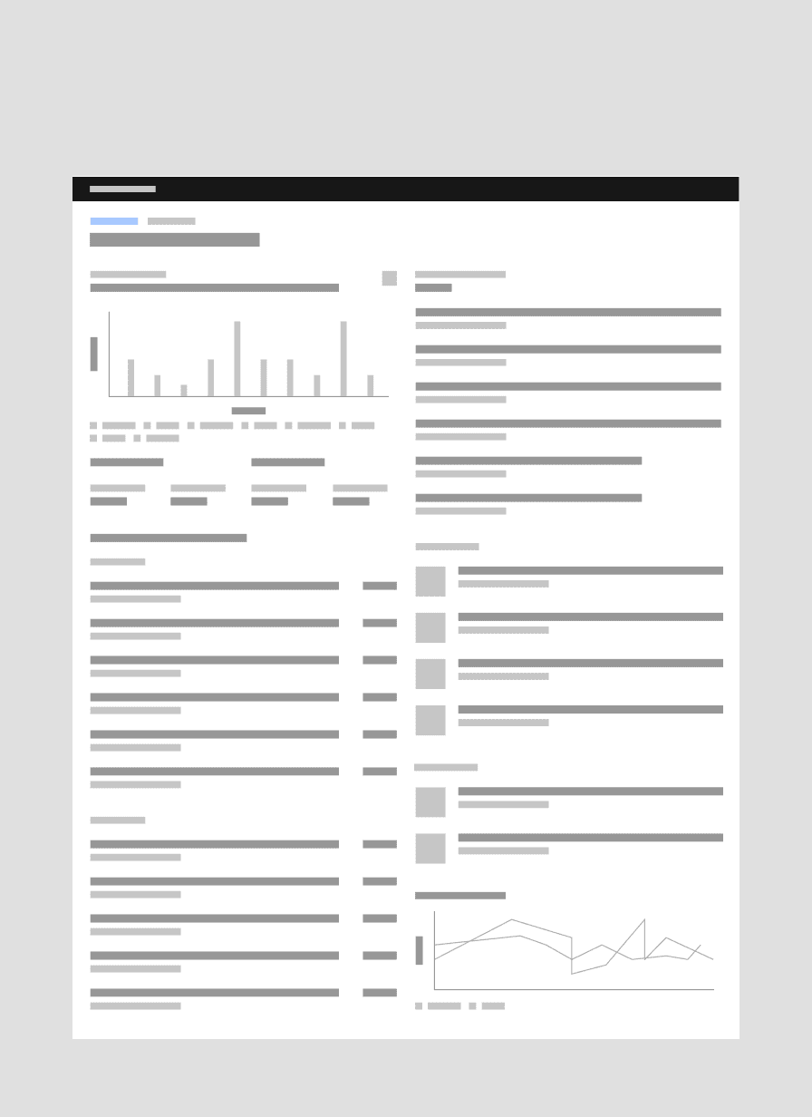
Style models in IBM Software (product)
Editorial and product experiences overlap slightly in that they both can use the product & docs style model. However, only software UI uses the grid influencer variant of the Carbon UI Shell.
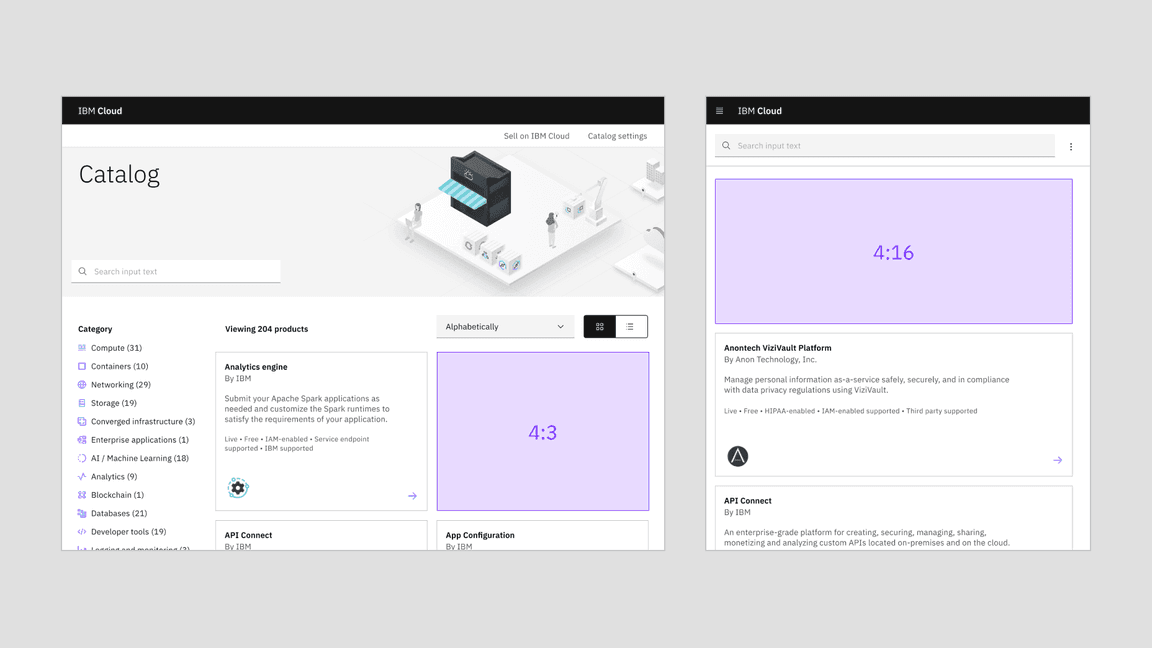
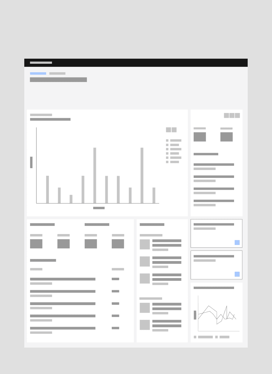
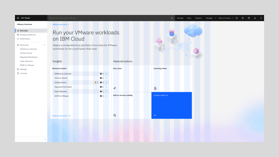
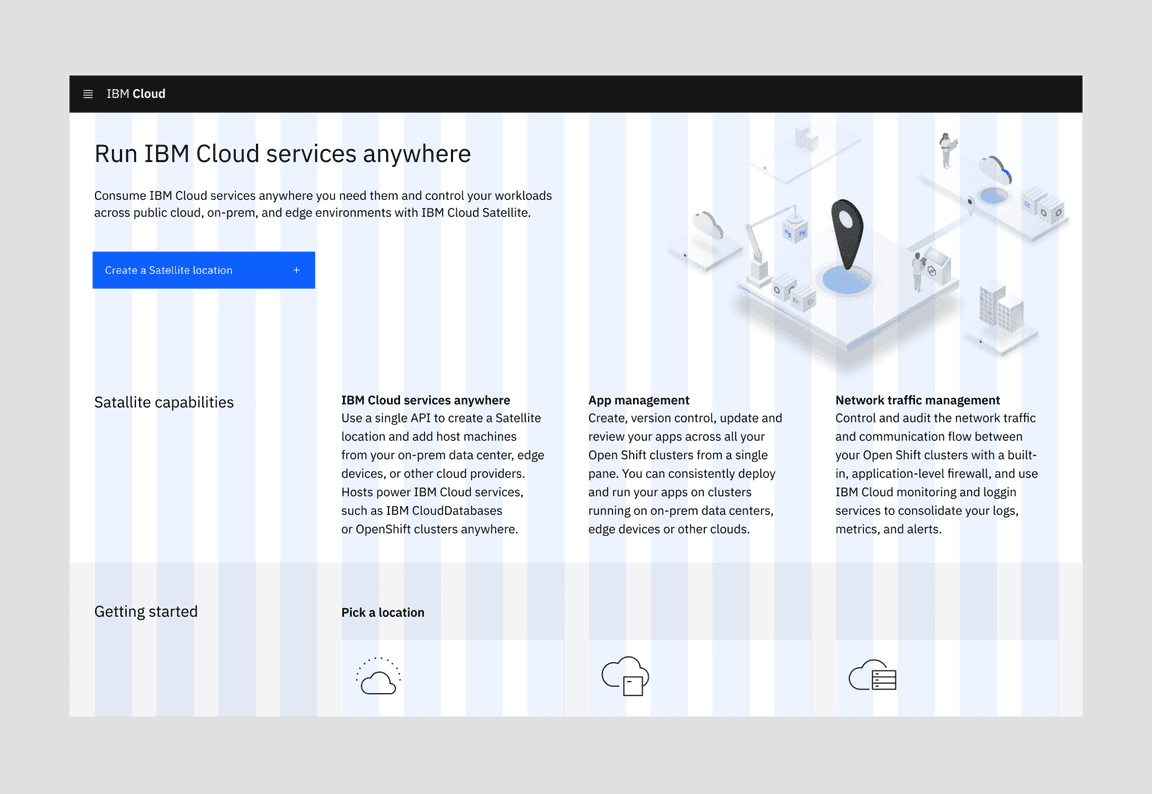
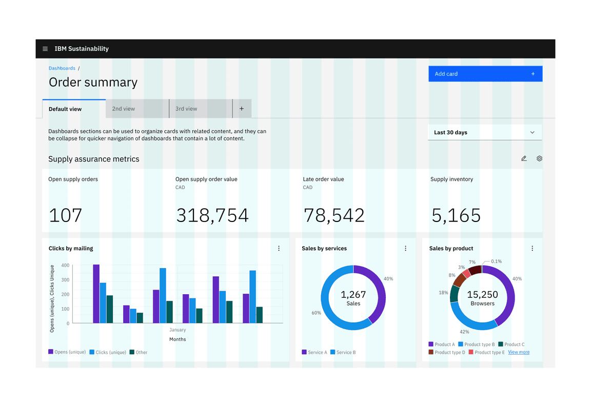
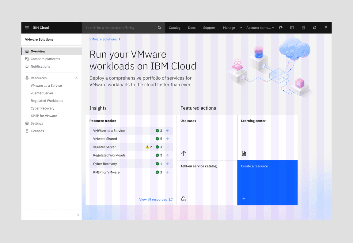
IBM Products can also occasionally use the High-density interface model in order to maximize the use of screen space. By far the most prominent example of this to date in product is the Cloud Catalog.
The Product and docs model in context in an IBM product screen.
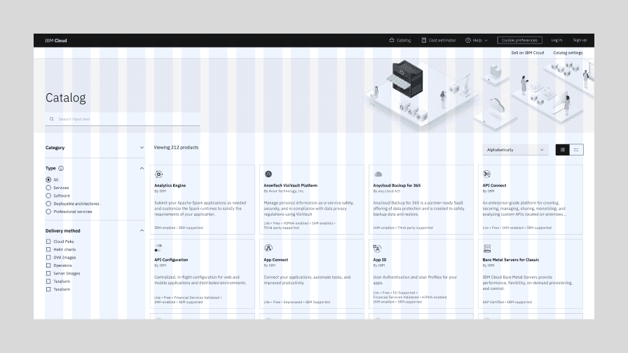
The High-density interface model in context in the IBM Cloud catalog.
Gutter modes
Carbon’s Figma templates have a 32px gutter by default, regardless of breakpoint. The default gutter width is 32px because type blocks (within or without containers) never has less than a 32px gutter. For containers and components, however, there are three different gutter structures: wide (default), narrow and condensed. These three gutter scenarios enable typographic alignment by allowing containers and certain components to “hang” into the gutter.
Wide mode
32px gutter

Narrow mode
16px gutter
Condensed mode
1px gutter
Wide gutter mode
This is Carbon’s default gutter mode, with 16 columns and 32px gutters. In the wide gutter mode, the container edge does not extend into the gutter, so the type within the container does not sit on the columns.
When to use:
Use the wide gutter mode when you are dealing with separate pieces of information with separate destinations. This gutter mode is also good for text-heavy situations, where maximum breathing room helps provide clarity and legibility.
Fixed components with labels such as input fields and dropdowns MUST use the wide gutter mode. So if you’re laying out form fields, this is the gutter mode to use. One overarching rule, (applicable to each gutter mode) is that type never hangs into the gutter. So we don’t want to push label type into the gutter in order to get field type to align to the columns.
Note: this page also includes a left-hand navigation panel in implementation, but we’ve removed it for the simplicity of the example.
Do align type (outside of a container), components, and tiles to the columns.
Do not take type off the column structure to achieve alignment.
Narrow gutter mode
The narrow gutter mode is by far the most common choice in product implementation. The intent here is simply to enable more typographic alignment—so the container, not the type, hangs 16px into the gutter. This allows headings and copy outside of containers to align with the copy within containers and components. This arrangement can easily be mirrored to accommodate languages that read right to left, like Arabic or Hebrew.
When to use:
Use the narrow gutter mode when you’re dealing with separate pieces of information with separate destinations, but would like to save more real estate. This gutter mode will give your compositions a sleeker look and maximize type alignment, within and without containers.
As mentioned above, fixed components with labels, such as input fields and dropdowns, should not hang into the gutter.
Do align components within containers flush to the columns.
Do not hang type into the gutter under any circumstances (note the tabs)
Condensed gutter mode
In order to emphasize the gutters, 1px borders that are darker than the background color (or lighter than the background color in the dark theme), must be added to any tiles or cards. The borders add just enough clarity to the gutters to stand out, while still registering to the user as the background color. The token for these borders is the $border-subtle layer token.
When to use:
When you have separate pieces of information that form a larger picture, like a dashboard or an overview page, that’s a good time to use the condensed gutters. You’ll also see this gutter mode in portals, resource tiles and other introductory UI. See it in action on the IBM Design Language homepage.
As mentioned above, fixed components with labels, such as input fields and dropdowns, should never hang into the gutter.
Do keep all type (inside and outside containers) aligned with the column grid.
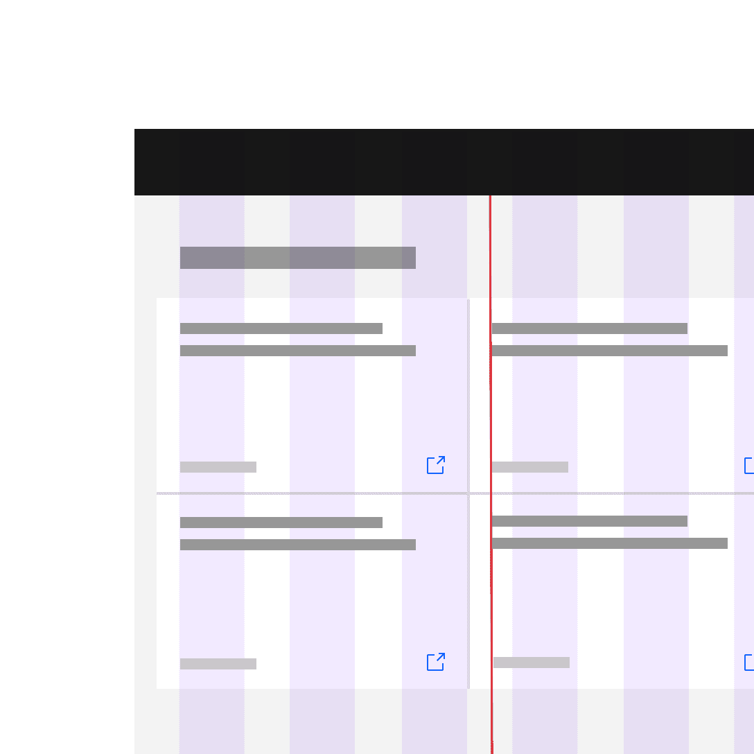
Do not hang type into the gutter under any circumstances.
Mixing gutter modes
Carbon’s Grid components now use CSS Grid with the release of v11.
Nested grids (subgrid)
Grid components can be nested within one another to achieve advanced layout configurations. When a grid is a child of another grid, the child will always be automatically defined as a subgrid. Subgrids should always be contained within a column to ensure that the column amount/definition is properly configured for the subgrid to inherit. Additionally, wrapping subgrids in a column enables you to define responsive parameters for the column (sm, md, etc) that the subgrid will also inherit and be bound to.
Nesting grids allows items within a subgrid to be also aligned to the grid.
Mix and match
Mixing gutter modes is going to be the rule rather than the exception on most platforms—especially since our labeled components (input fields, dropdowns etc.) require a 32px gutter. For instance, in the text input component, the label text doesn’t align to the input text. So basically, both the Narrow gutter mode and the Condensed gutter mode need to be used in conjunction with the Wide gutter mode to accommodate some of our most commonly used components.
We’ve provided a couple of examples below and will keep adding helpful uses cases as we find them.
Using grids in Figma
There are several different ways to use grids to make layouts in Figma ranging from basic to more complex. We recommend that you use the Screen components available in the Assets panel on the left side of your Figma workspace. These are especially handy because they also offer the grid influencer templates.
Once you choose either the Screen or Screen + Grid influencers component, just drag it into your workspace and press control + G to toggle on the grid. Under the Breakpoint property in the Screens section of the Feature panel (to the right) you can choose between the responsive breakpoint variants that Carbon offers.
There are of course, ways to get a lot fancier using Constraints and Auto Layout in conjunction with the Screen component, but we won’t get into that level of detail here.
Screen and Screen + Grid influencers components in Figma