2. Building pages
Now that we have a Vue app using the UI Shell, it’s time to build a few static pages. In this step, we’ll become comfortable with the Carbon grid and various Carbon components.
- Fork, clone and branch
- Install grid
- Add landing page grid
- Build landing page
- Style landing page
- Add repo page grid
- Build repo page
- Style repo page
- Submit pull request
Preview
A preview of what you’ll build:
Fork, clone and branch
This tutorial has an accompanying GitHub repository called carbon-tutorial-vue that we’ll use as a starting point for each step. If you haven’t forked and cloned that repository yet, and haven’t added the upstream remote, go ahead and do so by following the step 1 instructions.
Branch
With your repository all set up, let’s check out the branch for this tutorial step’s starting point.
git fetch upstreamgit checkout -b vue-step-2 upstream/vue-step-2
Build and start app
Install the app’s dependencies (in case you’re starting fresh in your current directory and not continuing from the previous step):
yarn
Then, start the app:
yarn serve
You should see something similar to where the previous step left off.
Install grid
In our last step we added our styles, component and icon packages. Now that we’re building the pages with grid, we need to install one more Carbon package. Stop your development environment (
CTRL-C
yarn add @carbon/grid
In
_carbon.scss
grid-columns-16: true
$feature-flags
$feature-flags: (grid-columns-16: true);
Run
yarn serve
Add landing page grid
Let’s add our grid elements to
LandingPage.vue
In order to use the grid, we need to wrap everything in a
<div class="cds--grid">
<div class="cds--row">
<div class="cds--col-[breakpoint]-[size]">
Our column sizes are specified by the number of columns they’ll be spanning. If we use
cds--col-lg-4
cds--col-lg-8
We’ve included the designs for this tutorial app in the
design.sketch
carbon-tutorial-vue
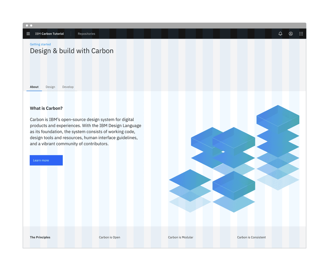
Landing page grid
We’ll break this down into three rows. The first row with the gray background doesn’t appear to need any columns. The second row with the white background looks like it has two columns of different widths. The third row with the gray background looks like it has four columns of equal width.
We’ll make rows like so:
<template><div class="cds--grid cds--grid--full-width landing-page"><div class="cds--row landing-page__banner"><div class="cds--col-lg-16">1</div></div><div class="cds--row landing-page__r2"><div class="cds--col-md-4 cds--col-lg-7">7/16</div><div class="cds--col-md-4 cds--offset-lg-1 cds--col-lg-8">8/16</div></div>
We added a class of
cds--grid--full-width
landing-page
landing-page__banner
landing-page__r2
Also, take notice of the second row. The tab content only covers 7 columns at this large viewport to prevent overly-large line lengths, so we needed to add a 1 column offset
cds--offset-lg-1
cds--col-md-4
Build landing page
We’ll start adding HTML elements and components by row.
First row
In our first row we’ll use a
CvBreadcrumb
We can now add our component to the first row, along with a header, like so:
<div class="cds--row landing-page__banner"><div class="cds--col-lg-16"><cv-breadcrumb noTrailingSlash><cv-breadcrumb-item><cv-link href="/">Getting started</cv-link></cv-breadcrumb-item></cv-breadcrumb><h1 class="landing-page__heading">Design & build with Carbon</h1></div>
You may notice that the styles look off. Don’t worry, we’ll fix these later.
Second row
In our second row we’ll use
CvTabs
CvButton
Modify the second row to use the
Tab
<div class="cds--row landing-page__r2"><div class="cds--col cds--no-gutter"><cv-tabs selected="0"><cv-tab label="About"><div class="cds--grid cds--grid--no-gutter cds--grid--full-width"><div class="cds--row landing-page__tab-content"><div class="cds--col-md-4 cds--col-lg-7">7/16</div><div class="cds--col-md-4 cds--offset-lg-1 cds--col-lg-8">8/16</div></div>
Hold up! If you were to run DAP to check for accessibility violations, you’d see
Multiple navigation landmarks must have unique labels specified with aria-label or aria-labelledby
CvBreadcrumb
CvTabs
<nav>
aria-label
CvBreadcrumb
<cv-breadcrumb noTrailingSlash aria-label="Page navigation">
Same goes for the
CvTabs
<cv-tabs selected="0" aria-label="Tab navigation">
Give yourself a pat on the back if you actually ran the DAP tool. We’ll install the DAP tool in a later step, so don’t worry if you didn’t.
Next, we’ll need to add a styling override to move the tabs to the right on large viewports. Create a file
_carbon-overrides.scss
src/views/LandingPage
.landing-page__r2 .cds--tabs__nav {right: 0;}
Then in
LandingPage.vue
<style lang="scss">@import "./carbon-overrides";</style>
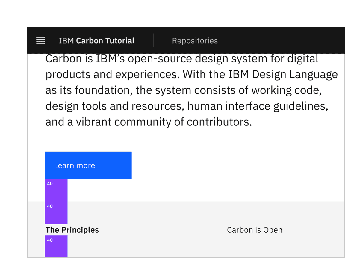
<cv-tab label="About"><div class="cds--grid cds--grid--no-gutter cds--grid--full-width"><div class="cds--row landing-page__tab-content"><div class="cds--col-md-4 cds--col-lg-7"><h2 class="landing-page__subheading">What is Carbon?</h2><p class="landing-page__p">Carbon is IBM’s open-source design system for digitalproducts and experiences. With the IBM Design Language asits foundation, the system consists of working code, design
Now let’s set the image size in the style section of
LandingPage.vue
.landing-page__illo {max-width: 100%;}
Assuming that the second and third tab would have a similar design, we would set them up in the same way. However, since our design specs don’t show those tabs, we’ll leave the code as is.
Third row
The third row will be created in a later tutorial, so we’ll just add the headers for now.
<div class="cds--row landing-page__r3"><div class="cds--col-md-4 cds--col-lg-4"><h3 class="landing-page__label">The Principles</h3></div><div class="cds--col-md-4 cds--col-lg-4">Carbon is Open</div><div class="cds--col-md-4 cds--col-lg-4">Carbon is Modular</div><div class="cds--col-md-4 cds--col-lg-4">Carbon is Consistent</div></div>
Style landing page
We’ve added basic layout styles in
LandingPage.vue
src/styles/_carbon-utils.scss
@import 'carbon-components/scss/globals/scss/vendor/@carbon/type/scss/font-family.scss';@import 'carbon-components/scss/globals/scss/vendor/@carbon/layout/scss/breakpoint.scss';@import 'carbon-components/scss/globals/scss/typography.scss';@import 'carbon-components/scss/globals/scss/vars.scss';
Adding these tokens, mixins etc. here means we can import them with a single line into any component that needs them.
Banner
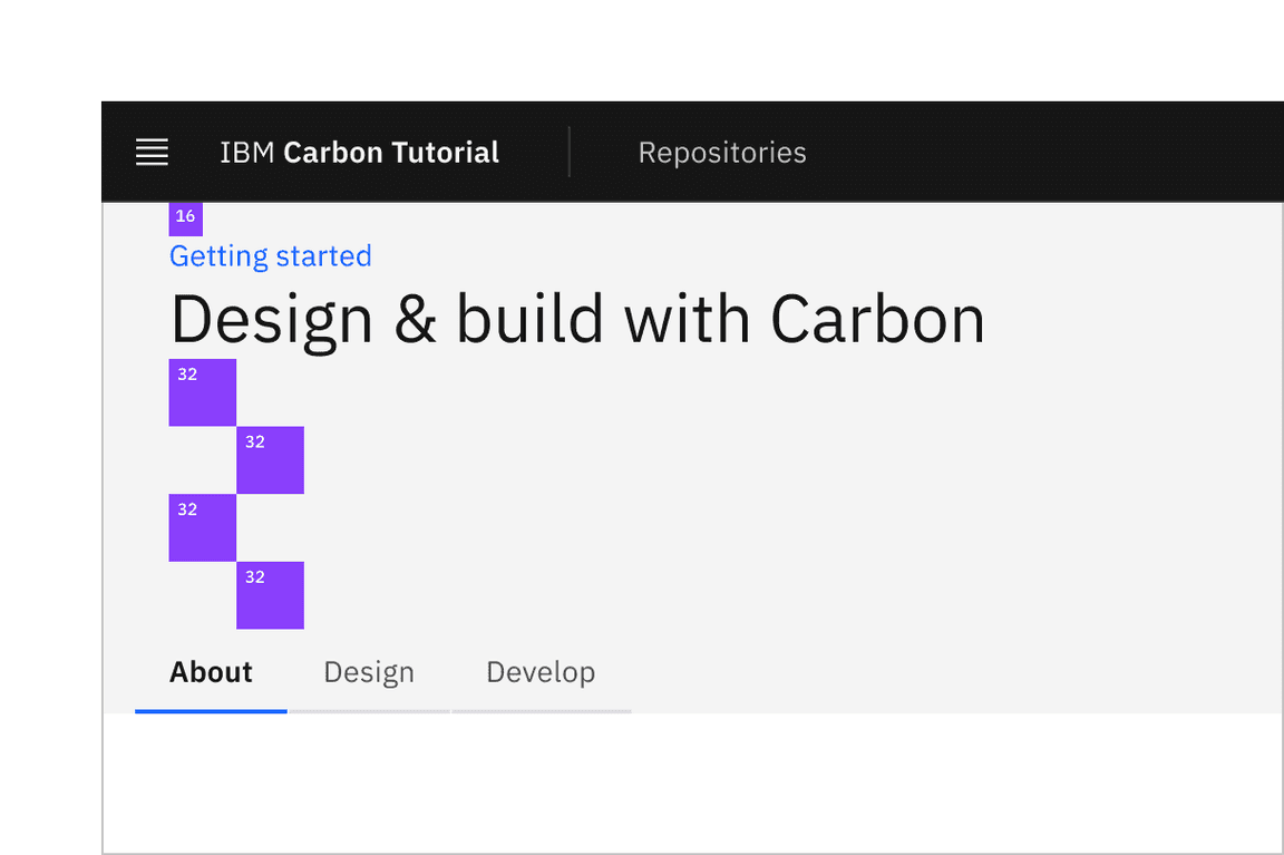
Banner vertical spacing
Back to
LandingPage.vue
@import '../../styles/carbon-utils';
with the other imports and
.landing-page__banner {padding-top: $spacing-05;padding-bottom: $spacing-07 * 4;}
Referencing the spacing token table,
16px
$spacing-05
128px
$spacing-07
128px
8rem
Looking at the design, we need a wall-to-wall light gray background behind the banner and also behind the third row. This is a great opportunity to use a Sass mixin. We could put this at the top of
LandingPage.vue
_mixins.scss
src/views/LandingPage
Add the following in
_mixins.scss
$ui-01
@mixin landing-page-background() {background-color: $ui-01;position: relative;&::before {content: '';position: absolute;left: -$spacing-06;top: 0;
After you have created
_mixins.scss
LandingPage.vue
@import '../../styles/carbon-utils';@import './carbon-overrides';@import './mixins';
Now to use the new mixin, update the
.landing-page__banner
.landing-page__banner {padding-top: $spacing-05;padding-bottom: $spacing-07 * 4;@include landing-page-background;}
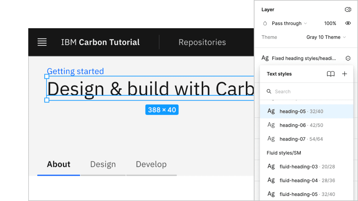
Next, we can see that the
h1
heading-05
Banner heading type
The Sketch symbol naming is consistent with the development Sass tokens to help translate design to development. So, looking up the type token, we know to use
productive-heading-05
.landing-page__heading {@include type-style('productive-heading-05');}
Row two
For our second row, we need to fix the tabs vertical positioning to match the design. By inspecting the tabs component, you can see that the tab height computes to
40px
.landing-page__r2 {margin-top: rem(-40px);}
We also need to adjust our vertical spacing and type treatment. Like before, it’s a matter of using spacing and type tokens like so:
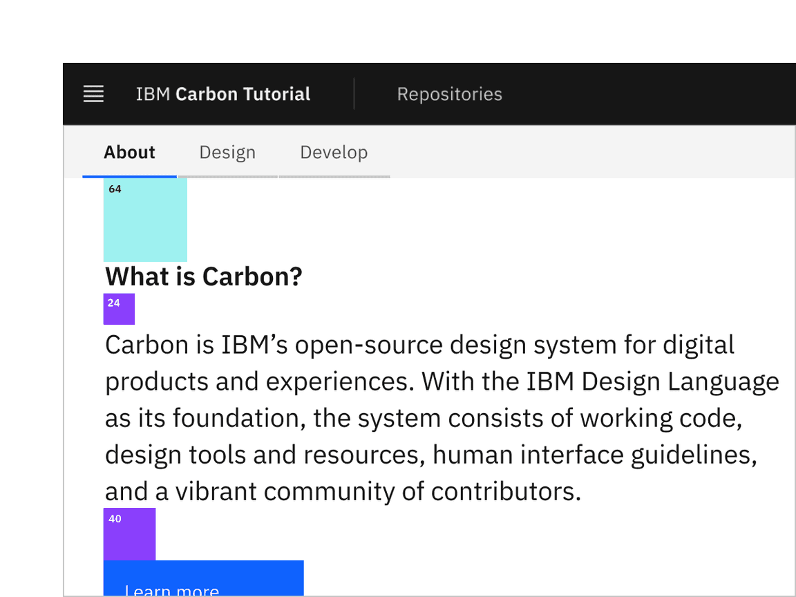
Row 2 vertical spacing
.landing-page__tab-content {padding-top: $layout-05;padding-bottom: $layout-05;}.landing-page__subheading {@include type-style('productive-heading-03');@include font-weight('semibold');}
Row three
Row 3 vertical spacing
Let’s also add some styles for the last row, even though that will get used later in the tutorial. You’ll notice that we get to re-use the
landing-page-background
.landing-page__r3 {padding-top: $spacing-09;padding-bottom: $spacing-09;@include landing-page-background;}.landing-page__label {@include type-style('heading-01');}
Ta-da! You should see a finished landing page! Now we can move on to the repo page.
Add repo page grid
Now in our
RepoPage.vue
<template><div class="cds--grid cds--grid--full-width cds--grid--no-gutter repo-page"><div class="cds--row repo-page__r1"><div class="cds--col-lg-16">Data table will go here</div></div></div></template>
Build repo page
We currently have
RepoPage.vue
CvDataTable
RepoTable.vue
RepoPage.vue
src/views/RepoPage
Build data table
First, let’s pretend we’ve already built our table component and update
RepoPage.vue
Import
RepoTable
RepoPage.vue
<script>import RepoTable from "./RepoTable";export default {name: "RepoPage"};</script>
Then below the import, include the following arrays to pass into the
RepoTable
rows
const headers = [{key: 'name',header: 'Name',},{key: 'createdAt',header: 'Created',},
Next we need to make sure the RepoTable component and these arrays are available to our
RepoPage
export default {name: 'RepoPage',components: { RepoTable },data() {return {headers,rows,};},
Here we used the data method of the component as the values logically are data in our component.
Lastly in the
RepoPage.vue
Data table will go here
<repo-table:headers="headers":rows="rows"title="Carbon Repositories"helperText="A collection of public Carbon repositories."/>
OK. So now our
RepoPage.vue
First create a script section as follows:
<script>export default {name: 'RepoTable',props: {headers: Array,rows: Array,title: String,helperText: String,},
In this component script we:
- Named our new component .RepoTable
- Added component properties for the headers and rows as well as two further properties title and helperText.
- Added the computed properties columns and headers which transform headers and rows into a format convenient for rendering with the CvDataTable components.
Next, let’s create the
RepoTable
<template><cv-data-table :columns="columns" :title="title" :helper-text="helperText"></cv-data-table></template>
Here we pass in the columns, title and helper text. If you view this you will see an empty table with headings.
Next add the rows inside of cv-data-table.
<template slot="data"><cv-data-table-row v-for="(row, rowIndex) in data" :key="`${rowIndex}`"> </cv-data-table-row></template>
Here we use v-for to iterate through the data assigning a key and value to each row. The rendered output may not appear to have changed, although if you inspect using the developer tools you will find three empty rows. Next add the cell data inside the
cv-data-table-row
<cv-data-table-cellv-for="(cell, cellIndex) in row.data":key="`${cellIndex}`">{{cell}}</cv-data-table-cell>
Again we’ve used the v-for directive to iterate through our data adding key, value and the contents of the cell.
The last item we need to add is the description shown in the expanded content. Add the following as a sibling of cv-data-table-cell component.
<template slot="expandedContent">{{ row.description }}</template>
Now you should have a working page rendering the sample content from the rows array.
This component consumes our properties and returns a Carbon
CvDataTable
CvDataTable*
Style repo page
Our styles for the repo page are mostly fine. We just need to update a few vertical spacing issues.
In
RepoPage.vue
<style lang="scss">@import '../../styles/carbon-utils';.repo-page .cds--row {padding-top: $spacing-05;padding-bottom: $spacing-05;}</style>
Congratulations! We’ve now created our static repo page!
Submit pull request
We’re going to submit a pull request to verify completion of this tutorial step.
Continuous integration (CI) check
Run the CI check to make sure we’re all set to submit a pull request.
yarn ci-check
Git commit and push
Before we can create a pull request, stage and commit all of your changes:
git add --all && git commit -m "feat(tutorial): complete step 2"
Then, push to your repository:
git push origin vue-step-2
Pull request (PR)
Finally, visit carbon-tutorial-vue to “Compare & pull request”. In doing so, make sure that you are comparing to
vue-step-2
base: vue-step-2