4. Creating components
With two pages comprised entirely of Carbon components, let’s revisit the landing page and build a couple components of our own by using Carbon pictograms and tokens.
- Fork, clone and branch
- Review design
- Create components
- Use components
- Add styling
- Check accessibility
- Submit pull request
Preview
Carbon provides a solid foundation for building web applications through its color palette, layout, spacing, type, as well as common building blocks in the form of components. So far, we’ve only used Carbon components to build out two pages.
Next, we’re going to use Carbon assets to build application-specific components. We’ll do so by including accessibility and responsive considerations all throughout.
A preview of what you’ll build (see bottom of page):
Fork, clone and branch
This tutorial has an accompanying GitHub repository called carbon-tutorial-nextjs that we’ll use as a starting point for each step. If you haven’t forked and cloned that repository yet, and haven’t added the upstream remote, go ahead and do so by following the step 1 instructions.
Branch
With your repository all set up, let’s check out the branch for this tutorial step’s starting point.
git fetch upstreamgit checkout -b v11-next-step-4 upstream/v11-next-step-4
Build and start app
Install the app’s dependencies (in case you’re starting fresh in your current directory and not continuing from the previous step):
yarn
Then, start the app:
yarn dev
You should see something similar to where the previous step left off.
Review design
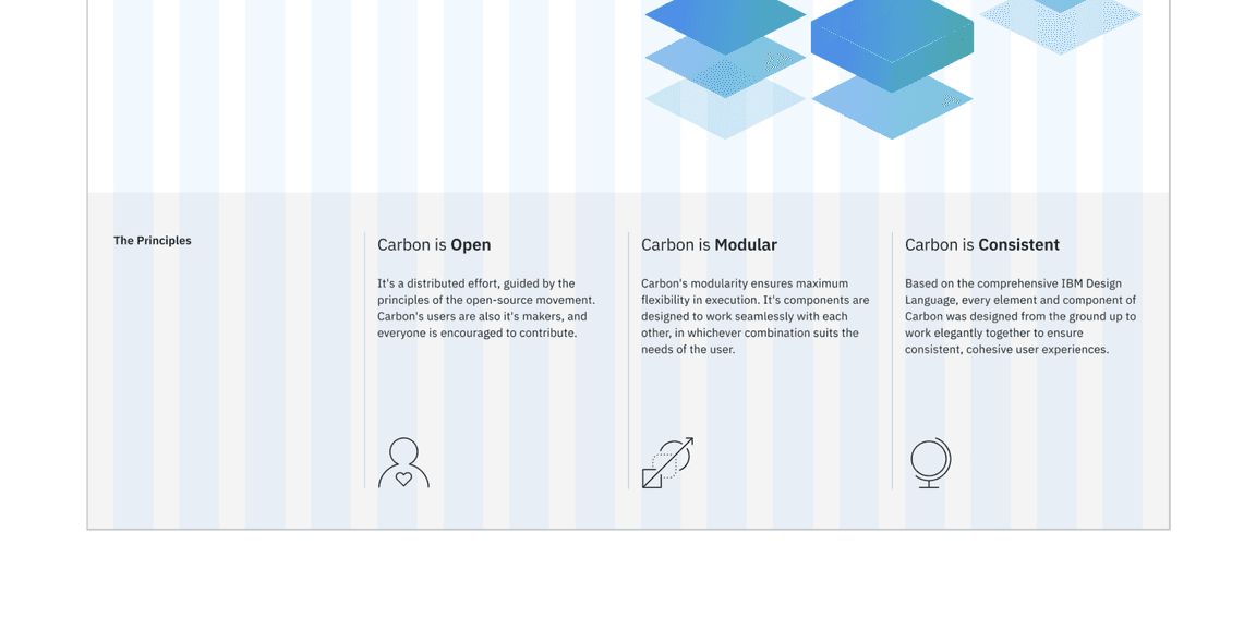
Here’s what we’re building – an informational section that has a heading and three subheadings. Each subheading has accompanying copy and a pictogram. We’ll assume that this informational section is used elsewhere on the site, meaning it’s a great opportunity to build it as a reusable component. As for naming, we’ll call it an
InfoSection
InfoCard
Info section layout
Create components
First we need files for the components, so create an
Info
src/components
Info
Add files
src/components/Info├──_info.scss└──Info.js
Import
_info.scss
app.scss
tutorial-header.scss
@use '@/components/Info/info';
InfoSection component
Let’s create the parent component that includes the “The Principles” heading. That markup currently looks like this in
LandingPage
<Column lg={16} md={8} sm={4} className="landing-page__r3"><Grid><Column lg={4} md={2} sm={4}><h3 className="landing-page__label">The Principles</h3></Column><Columnlg={{ start: 5, span: 3 }}md={{ start: 3, span: 6 }}sm={4}
We want to do a few things when abstracting it to a component. First, we only want this component’s class names; we don’t want to include
landing-page__r3
props
props.className
We’ll also:
- Add component class names like ,info-section, andinfo-cardinfo-section__heading
- We will be using the andGridcomponentsColumn
- Replace withThe Principles{props.heading}
- Replace columns 2 - 4 with {props.children}
Using
props
InfoCard
import { Grid, Column } from '@carbon/react';const InfoSection = (props) => (<Grid className={`${props.className} info-section`}><Column md={8} lg={16} xlg={3}><h3 className="info-section__heading">{props.heading}</h3></Column>{props.children}</Grid>
At this point let’s import our needed styles and add styling for the new class names that we just added.
@use '@carbon/react/scss/type' as *;.info-section__heading {@include type-style('heading-01');padding-bottom: $spacing-08;}
InfoCard component
Next up we’re going to build a component for columns 2 - 4, which currently looks like
<Column md={4} lg={4}>Carbon is Open</Column>
Info.js
const InfoCard = (props) => {return (<Column sm={4} md={8} lg={5} xlg={4} className="info-card"><div><h4 className="info-card__heading">{`${splitHeading[0]} `}<strong>{splitHeading[1]}</strong></h4><p className="info-card__body">{props.body}</p>
In doing so, we:
- Added classesinfo-card
- Used to render the heading, body copy, and iconprops
- Set columns to match the grid
Use components
Nothing is styled yet, but with our components built let’s put them to use. In
LandingPage
import { InfoSection, InfoCard } from '@/components/Info/Info';
Next, we will install the pictograms we will use in the header.
yarn add @carbon/pictograms-react
While we’re at the top of
LandingPage
import {Advocate,Globe,AcceleratingTransformation,} from '@carbon/pictograms-react';
With everything imported, replace the current:
<Grid><Column lg={16} md={8} sm={4} className="landing-page__r3"><Grid><Column lg={4} md={2} sm={4}><h3 className="landing-page__label">The Principles</h3></Column><Columnlg={{ start: 5, span: 3 }}md={{ start: 3, span: 6 }}
With the new components:
<InfoSection heading="The Principles"><InfoCardheading="Carbon is Open"body="It's a distributed effort, guided by the principles of the open-source movement. Carbon's users are also it's makers, and everyone is encouraged to contribute."icon={() => <Advocate size={32} />}/><InfoCardheading="Carbon is Modular"body="Carbon's modularity ensures maximum flexibility in execution. It's components are designed to work seamlessly with each other, in whichever combination suits the needs of the user."
Add styling
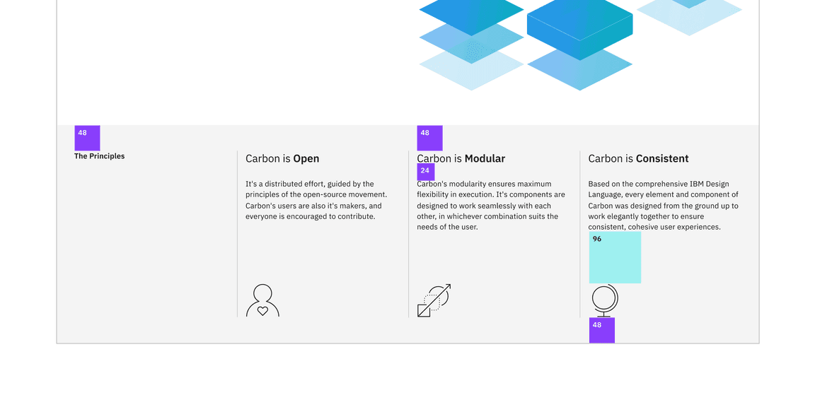
Here’s our design showing the spacing tokens that we need to add. We also need to set type style and borders.
Layout
Starting with layout, import the following carbon styles to
src/components/Info/_info.scss
@use '@carbon/react/scss/spacing' as *;@use '@carbon/react/scss/breakpoint' as *;@use '@carbon/react/scss/theme' as *;
We will then add the following styles to the same file to style our info cards.
.info-card {margin-top: $spacing-09;display: flex;flex-direction: column;padding-left: 1rem;svg {margin-top: $spacing-09;}
Once you save, go ahead and resize your browser to see the responsive layout at the different breakpoints. Make sure to review these color and spacing tokens. There are also a few breakpoint mixins that may be new to you.
Type
Our
InfoCard
.info-card__heading {@include type-style('productive-heading-03');}
Also, the design has the last word in each subheading as bold. To accomplish that, add this helper function after the import in
Info.js
// Take in a phrase and separate the third word in an arrayfunction createArrayFromPhrase(phrase) {const splitPhrase = phrase.split(' ');const thirdWord = splitPhrase.pop();return [splitPhrase.join(' '), thirdWord];}
Then, update
InfoCard
createArrayFromPhrase
const InfoCard = (props) => {const splitHeading = createArrayFromPhrase(props.heading);return (<Column sm={4} md={8} lg={4} className="info-card"><h4 className="info-card__heading">{`${splitHeading[0]} `}<strong>{splitHeading[1]}</strong></h4>
Finally, add the declaration block in
_info.scss
InfoCard
.info-card__body {margin-top: $spacing-06;flex-grow: 1; // fill space so pictograms are bottom aligned@include type-style('body-long-01');// prevent large line lengths between small and medium viewports@include breakpoint-between(321px, md) {max-width: 75%;}
Check accessibility
We’ve added new markup and styles, so it’s a good practice to check Equal Access Checker and make sure our rendered markup is on the right track for accessibility.
With the browser extension installed, Chrome in this example, open Dev Tools and run Accessibility Assessment.
Submit pull request
We’re going to submit a pull request to verify completion of this tutorial step.
Continuous integration (CI) check
Run the CI check to make sure we’re all set to submit a pull request.
yarn ci-check
Git commit and push
Before we can create a pull request, format your code, then stage and commit all of your changes:
yarn formatgit add --all && git commit -m "feat(tutorial): complete step 4"
Then, push to your repository:
git push origin v11-next-step-4
Pull request (PR)
Finally, visit carbon-tutorial-nextjs to “Compare & pull request”. In doing so, make sure that you are comparing to
v11-next-step-4
base: v11-next-step-4