Spatial Charts
Discover spatial patterns and hierarchies, showcasing tree maps, circle packs, and geospatial charts. Explore the interplay of data elements through tree maps, circle packs, and geospatial charts, revealing spatial relationships and hierarchical structures within your data.
Heat maps
A heat map is a two-dimensional visualization in which individual values contained in a matrix are represented as colors. This technique makes it easy to visualize complex data at a glance. When it comes to heat maps, the most common color ranges are expressed in either sequential and diverging color scales according to the type of data represented.
Sequential scales
Sequential scales use a blended progression, typically of a single color, from the lowest contrast to the highest contrast values, representing lows to highs. It’s best practice to use a sequential scale with values that are all positive or all negative. Sequential heat maps can leverage the full range of the palette (from 10–100) to maximize contrast. Please note that the 3:1 minimum contrast requirement does not apply to heat maps.

When cells get extremely small, a white border can hinder the intended effect.
Heat map behaviors
Axis ticks and legend can be used to leverage the chart potential giving the users additional information and dedicated kinds of interaction.
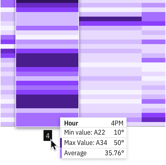
Exploration of a domain axis hover behavior
Divergent scales
Diverging scales show color progression in two directions: dialing down the contrast of the first hue from one end to a neutral color at the midpoint, then increasing the contrast of the second hue to the other end of the scale. The neutral midpoint is often referred to as the “inflection point” (for example, a 0 value midway between -100 and +100).
Divergent scales require three colors for their correspondent values (min, max, and inflection point) and Carbon has provided two approved palettes for divergent visualizations. Although the examples here use the “discrete” (stepped scale) provided by the Carbon palette, divergent heat maps often leverage “continuous” values (gradients) to accommodate situations that require more than 10 values.
Inflection points
While min/max values can be automatically detected from data, inflection points can vary depending on data type. We default to zero in order to accommodate the most common cases and include a feature flag within the code to specify exceptions. The data for a divergent heat map does not need to be symmetrical on either side of the inflection point. For example, the data set could have a zero value between -20 and +100 as well.
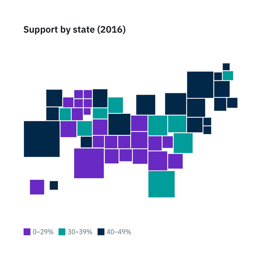
Tree maps
Tree maps can work for visualizing a part-to-whole relationship among a large number of categories—as long as the data is hierarchical and exact comparisons between the categories is not a primary concern.
When dealing with large amounts of data in a constrained space, tree structured nodelink diagrams (like the network diagram shown above), grow too complex to be useful. Tree maps provide an attractive alternative by maintaining a hierarchical structure while displaying rectangular quantities for each category and subcategory via area size.
Divergent tree maps
Divergent tree maps combine Carbon’s divergent color palette with the hierarchical structure of a tree map. Each rectangle has an area proportional to a specified dimension of the data, but the rectangles can also be colored independently according to an additional indicator.
As with heat maps, the diverging palette shows color progression in either direction from an inflection point (for example, a 0 value midway between -10 and +10). In the example below, the inflection point is simply an average. Tourism can be mapped by the number of visitors to a certain country, but the visualization can also compare this data to a yearly average. For instance, even though one country may have a lot of visitors compared to another country, tourism for that country may fall below its annual average.
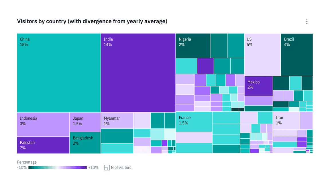
Example of a divergent tree map adding color as a second variable to a basic tree map structure
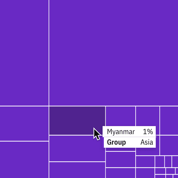
Detail of a tooltip on a basic treemap
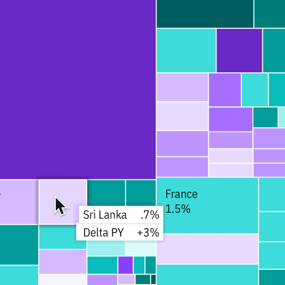
Detail of a comparative tooltip on a divergent tree map
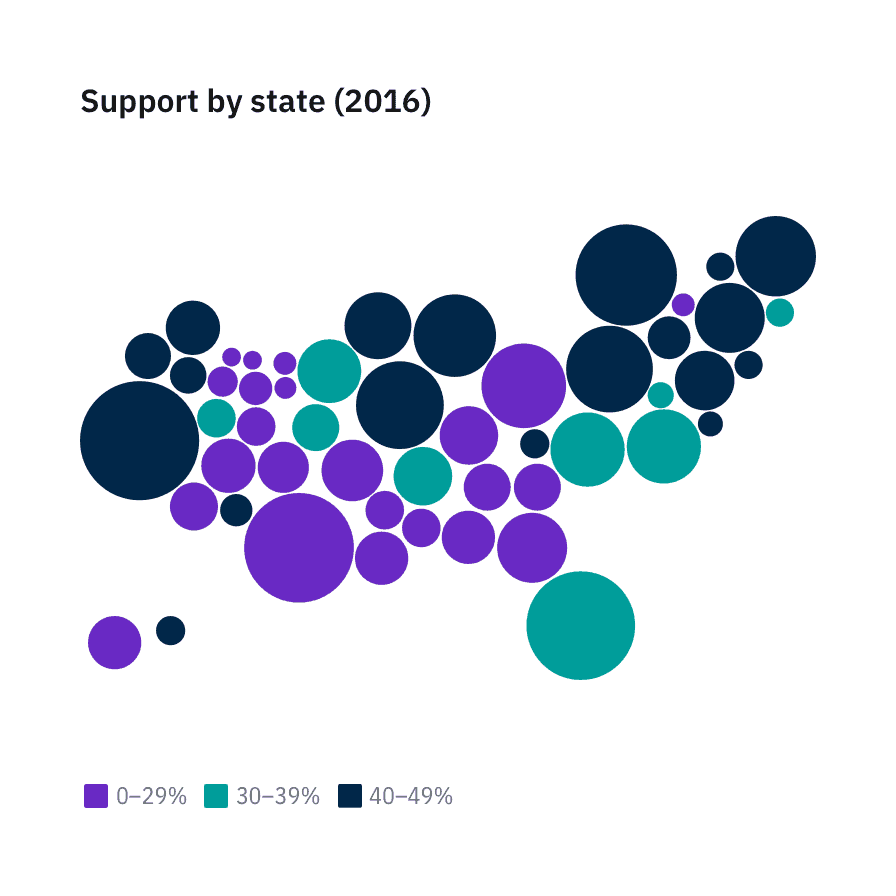
Circle packs
A circle pack is a hierarchical visualization of data. It’s equivalent to a Treemap or a Dendrogram—where each node of the tree is represented as a circle and sub-nodes are represented as circles within a parent. The size of each circle can also be used to represent an additional arbitrary value, such as population or file size. Color may also be used to assign categories or to represent an additional variable. Although they’re not as space efficient, Circle Packs reveal hierarchical structure better than Treemaps.
For Circle Packs with more than two levels of hierarchy, zoom functionality allows users to explore the data without compromising the contrast accessibility of the chart. We advise against disabling the zoom functionality except in cases such as preview charts, cards that expand to full view with the chart, etc.
Geospatial charts
Geographic overlays
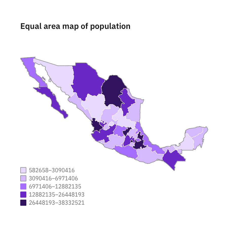
Choropleth map
A map that uses differences in shading, coloring, or the placing of symbols within predefined areas to indicate the average values of a property or quantity in those areas.

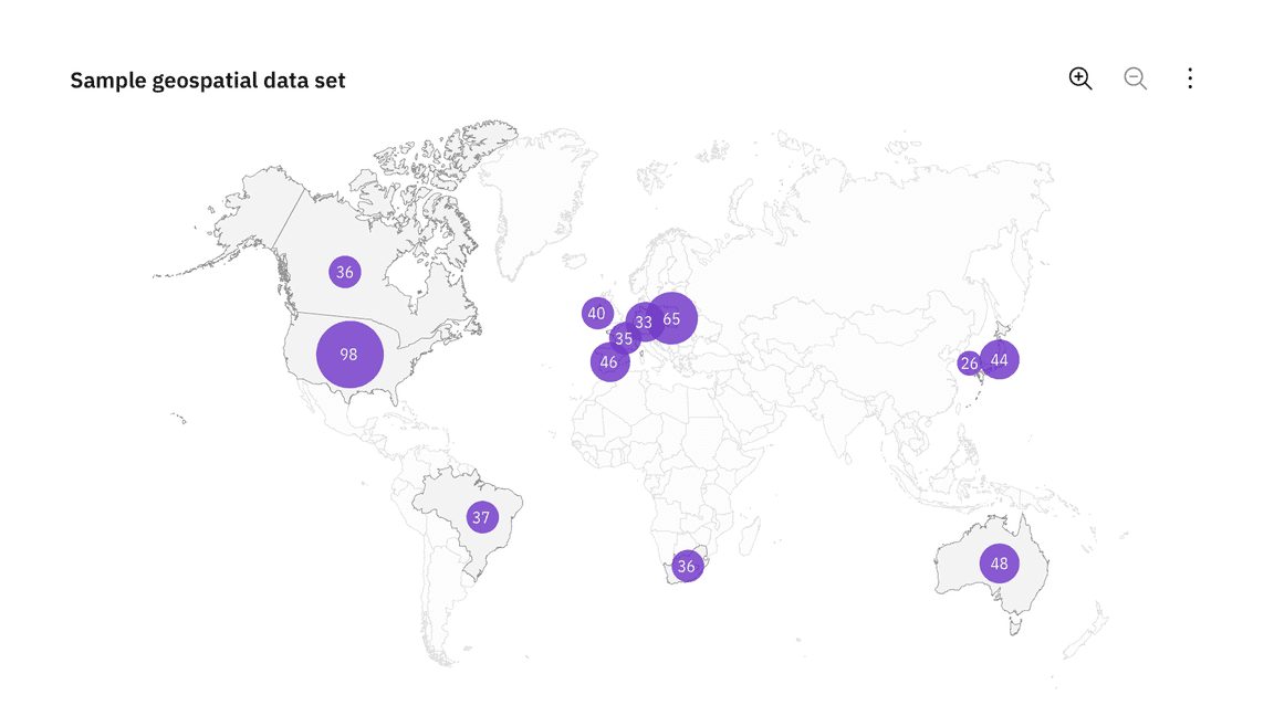
Proportional symbol map
Symbols driven by data are overlaid in geographical regions. A bubble is the symbol most commonly used in this instance—with the area of the circle proportional to its value in the dataset.
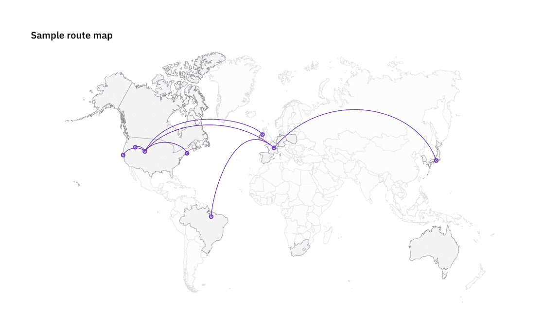
Connection map
Connection Maps are drawn by connecting points placed on a map by straight or curved lines.
While Connection Maps are great for showing connections and relationships geographically, they can also be used to display map routes through a single chain of links. Connection Maps can also be useful in revealing spatial patterns through the distribution of connections or by how concentrated connections are on a map.
Geospatial distortions
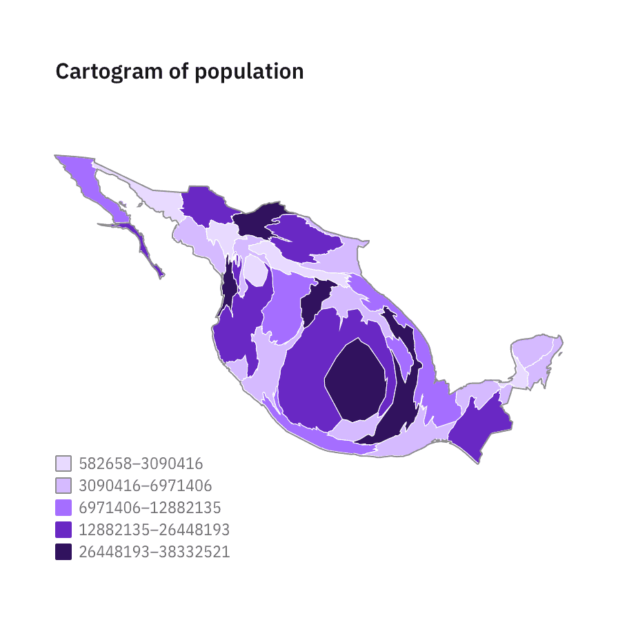
Density-equalizing cartograms
Density-equalizing cartograms are the most common type of cartogram. In this situation the mapping variable takes the place of the land area or distance in the map, causing the map to become distorted in proportion to the substitute variable.
Cartograms are useful for visualizing populations through different lenses — for instance, ethnicities, political parties, or religious affiliation. Carbon does not have a coded component for cartograms but online generators like go-cart.io allow you to upload your own data sets and download an .svg file.
Dorling cartograms
The Dorling Cartogram is a technique for representing data for areas that avoids geography in favor of (normally) a geometric shape that represents the unit areas. Circles are usually chosen since they can be neatly positioned.
As with the density-equalizing cartogram above, the larger the total population, the larger the representation of the country.
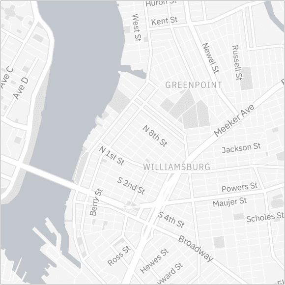
Mapbox
For more dynamic, real-time mapping, Carbon has created four themes using Mapbox. Mapbox is a developer platform used across industries to create custom maps that can be easily integrated into websites and apps. These themes can be used as is, or in conjunction with Carbon-styled data points.
These styles can be used as is, or as a backdrop for other geospatial data sets. For more complex data sets that require the full breadth of the Carbon charts palette, we suggest using either the White or the Gray 100 style for the most accessible results.

Example of a Carbon’s White theme style in Mapbox
Example of a Carbon’s Gray 10 theme style in Mapbox

Example of a Carbon’s Gray 90 theme style in Mapbox
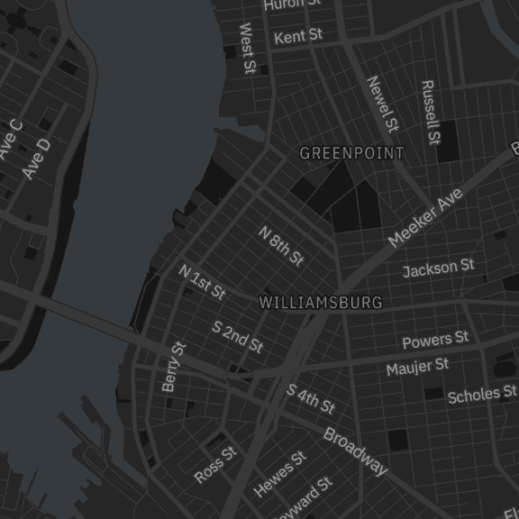
Example of a Carbon’s Gray 100 theme style in Mapbox
Applying the Carbon Mapbox themes
For instructions on how to use Mapbox GL JS please read this Mapbox quickstart documentation.
In addition to the instructions above, when initializing a new map you can apply any of the 4 Carbon themes by providing the stylesheet location to the library.
| Theme | Style sheet location |
|---|---|
| White |
|
| Gray 10 |
|
| Gray 90 |
|
| Gray 100 |
|
<script>mapboxgl.accessToken = 'YOUR_MAPBOX_ACCESS_TOKEN';var map = new mapboxgl.Map({// Applying the G100 theme belowstyle: 'mapbox://styles/carbondesignsystem/ck7c89g8708gy1imlz9g5o6h9',// Include existing options below// ...// ...// ...