Flow Charts
Uncover intricate data relationships and flows, providing valuable insights into complex data sets.
Alluvial/sankey diagrams
Alluvial, or Sankey diagrams, are a type flow diagram designed to show two indicators of a dataset and how records distribute among them, highlighting correlations.
Multiple blocks of two indicators can be placed next to each other creating a wider alluvial diagram but it’s crucial to consider that this specific kind of chart does not show correlations between indicators that are not directly connected. This is usually emphasized using a different set of colors for each block.

Network diagrams
A network diagram is a way of visually representing network architecture. It maps out network structure with a variety of icons and connecting lines. It’s ideal for sharing the layout of a network because the visual presentation makes it easier for users to understand complex connections at a glance. These diagrams are especially useful for isolating problems or when designing a new system.
Building blocks
Carbon Charts offers building blocks for network diagrams in the form of React & Angular components.
Note that Carbon Charts does not provide layouts for diagrams. You can utilize these components alongside graphing libraries (such as elkjs), or by composing your own layouts.
Getting started guides:
Here’s an example using elkjs in react.
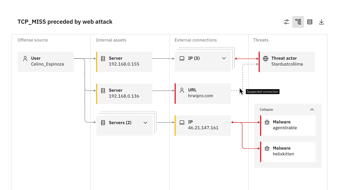
Example of a network diagram in a swimlane graph from QRadar
Node types
This specific network diagram is comprised of parent and child nodes. In the QRadar example, parent nodes convey the story of what happened in an investigation and can be clustered based on relationship type. Child nodes appear under parent nodes and can also be clustered.
Network diagrams use the same scale controls that apply to the rest of the data visualization components, however they appear in a floating tile, enabling the user to zoom and pan simultaneously. It’s also helpful to include the expand and collapse all nodes feature, which gives users the ability to easily navigate between detailed and high-level views of the diagram.
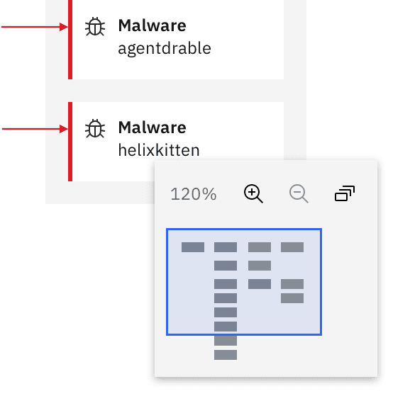
Detail of floating zoom and pan functionality
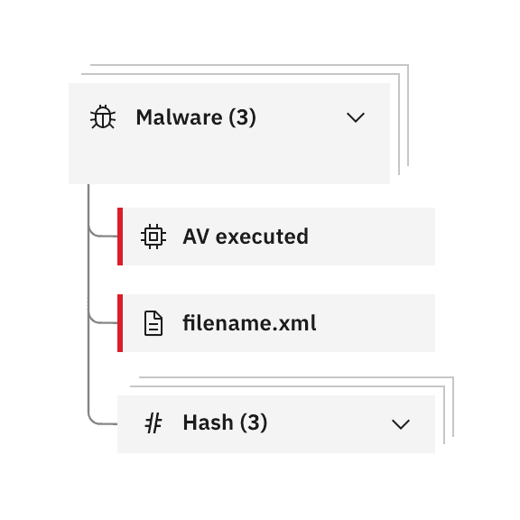
Detail of child nodes clustered underneath master parent cluster
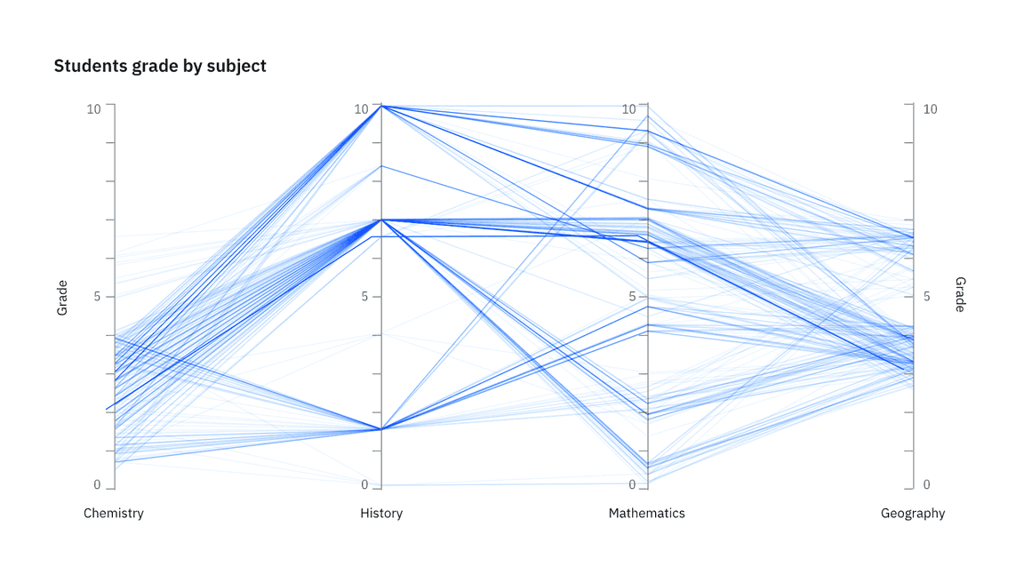
Parallel coordinates
Parallel coordinate charts visualize individual data elements across multiple variables. Each variable corresponds to a vertical axis and each data element is displayed as a series of connected points along the axes.
The parallel coordinate chart is the equivalent of a radar chart with axes — making it preferable for many use cases. Its strength is that each variable can be completely different and even have its own scale (the units can even be different).
Parallel coordinate behaviors
Hover effects that highlight a specific group or axis can be added to enhance basic parallel coordinate charts. These charts can also include interactive features like the brush component. By clicking and dragging along any axis, you can specify a filter for that dimension. The brush component is also used in the updated scatterplot matrix example. See the detail below.
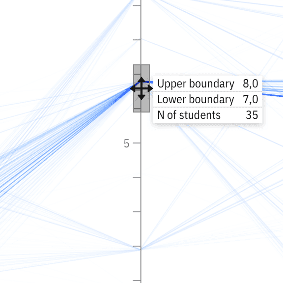
Detail of brush component behavior
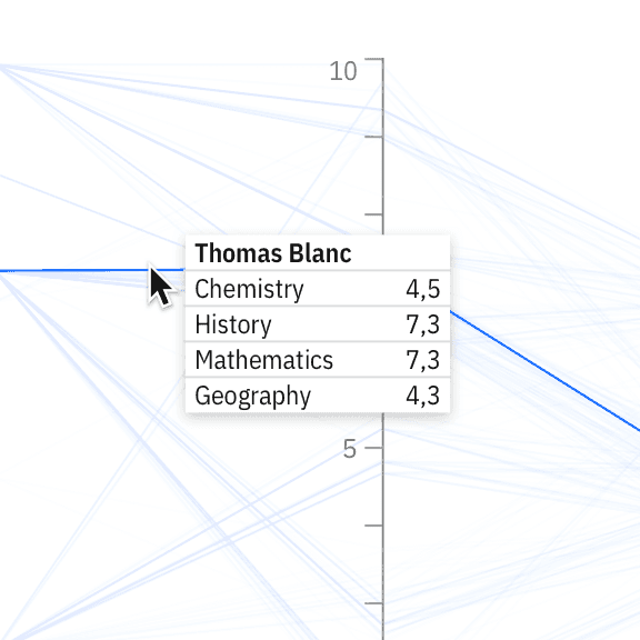
Detail of a comparative tooltip interaction on hover
Tree diagrams
Carbon Charts supports both tree diagrams and dendrograms. Although the two are very similar, dendrograms tend to offer a more responsive layout for varying screen sizes.