File uploader
Color
| Element | Property | Color token |
|---|---|---|
| Heading | text-color |
|
| Description | text-color |
|
| Button | See primary button | |
| Drop zone text | text-color |
|
| Drop zone container | border |
|
| File name | text-color |
|
| File container | background-color |
|
| Delete icon | svg |
|
* Denotes a contextual color token that will change values based on the layer it is placed on.
Interactive states
| State | Element | Property | Color token |
|---|---|---|---|
| Hover | Drop zone text | text-color |
|
| Drop zone container | border |
| |
| Focus | Delete icon | border |
|
| Drop zone container | border |
| |
| Loading | Loader | See inline loading | |
| Uploaded | Checkmark icon | svg |
|
| Invalid | File | border |
|
| Error title | text-color |
| |
| Error message | text-color |
| |
| Warning icon | svg |
| |
| Divider | border-top |
| |
| Disabled | Label | text-color |
|
| Description | text-color |
| |
| Drop zone text | text-color |
|
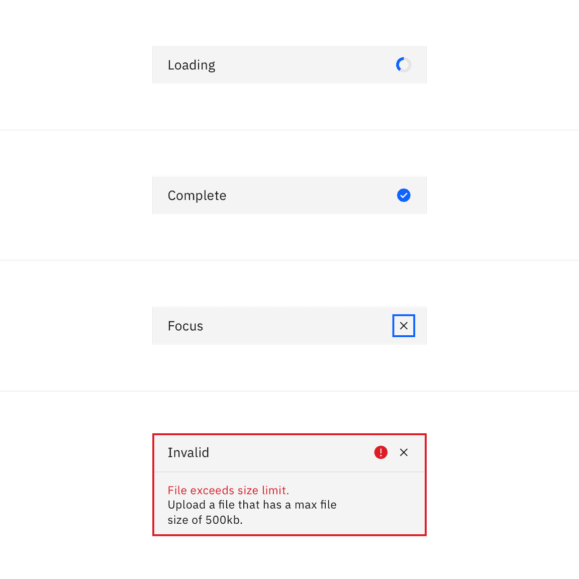
Selected file states: loading, complete, focus, invalid.
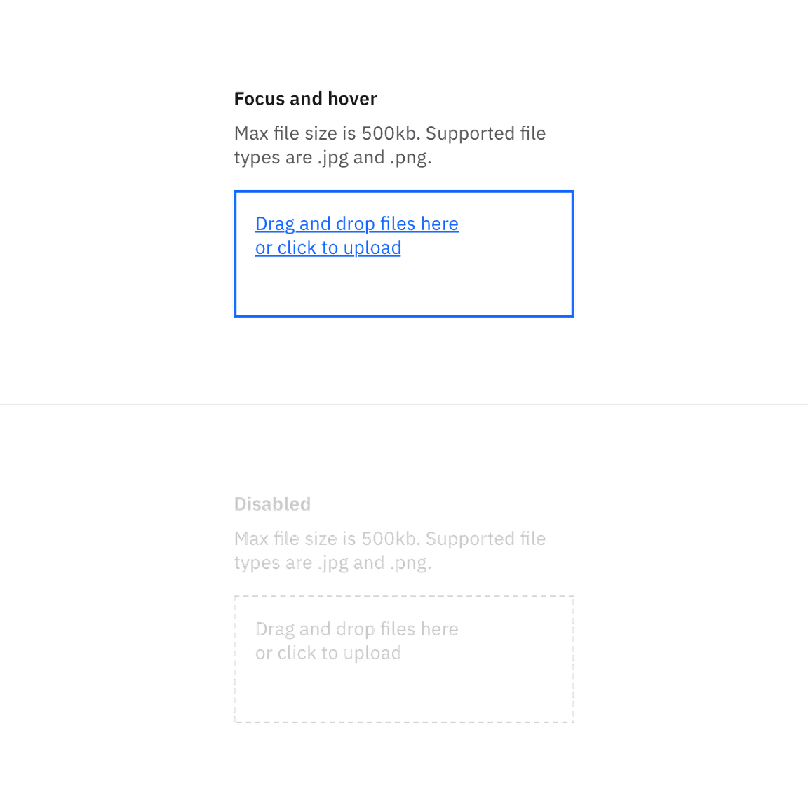
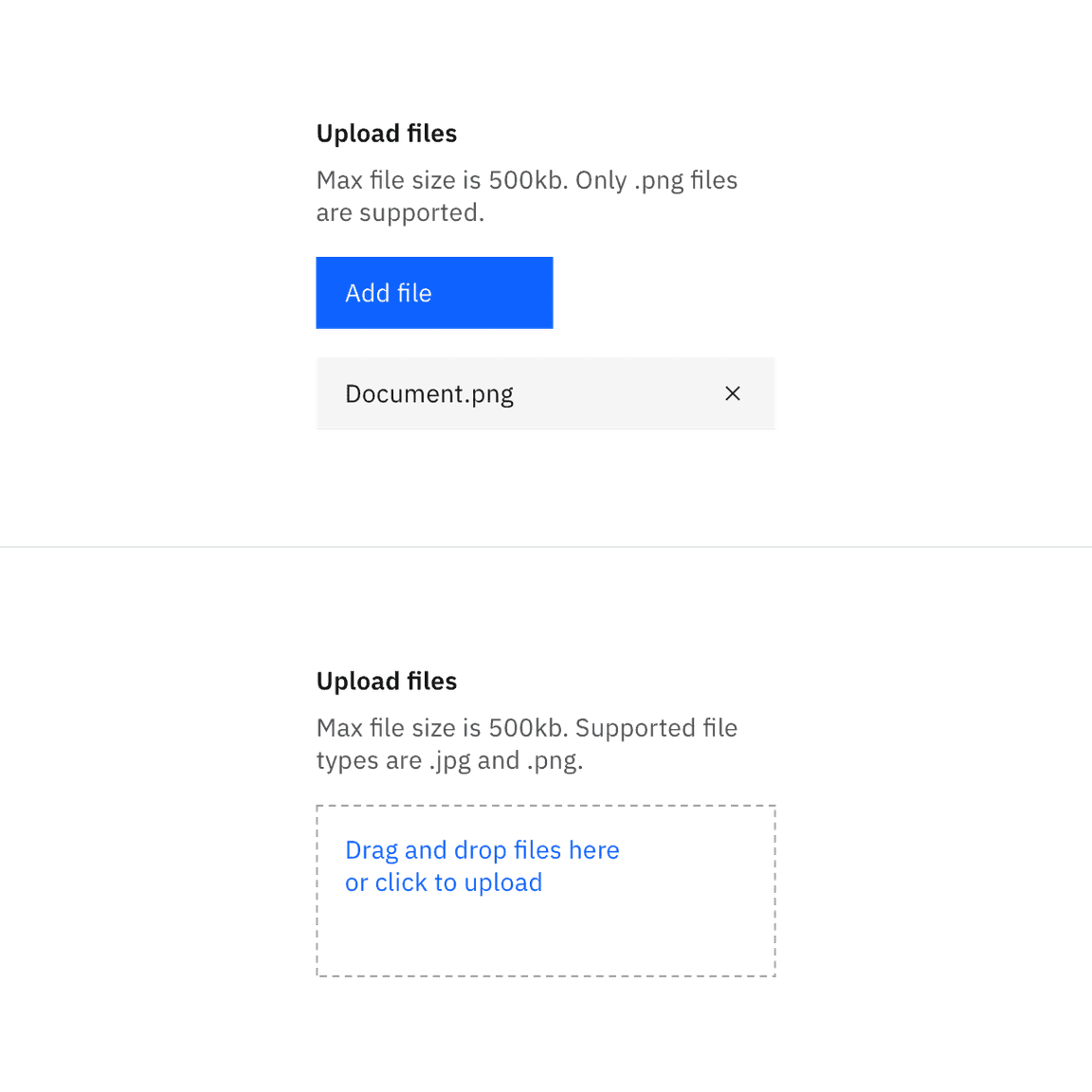
Drag and drop file uploader states.
Typography
The file uploader label and description text should be set in sentence case, with only the first letter of the first word in the sentence capitalized.
| Element | Font-size (px/rem) | Font-weight | Type token |
|---|---|---|---|
| Heading | 14 / 0.875 | SemiBold / 600 |
|
| Description | 14 / 0.875 | Regular / 400 |
|
| Error message | 12 / 0.75 | Regular / 400 |
|
| Drop zone text | 14 / 0.875 | Regular / 400 |
|
| File name | 14 / 0.875 | Regular / 400 |
|
Structure
The width of an uploaded file varies based on the content and layout of a design.
| Element | Property | px / rem | Spacing token |
|---|---|---|---|
| File | width | 288 / 18 | – |
| padding-left | 16 / 1 |
| |
| margin-bottom | 8 / 0.5 |
| |
| padding-right | 16 / 1 |
| |
| Delete icon | height, width | 16 / 1 | – |
| margin-left, margin-right | 16 / 1 |
| |
| Button | See primary button |
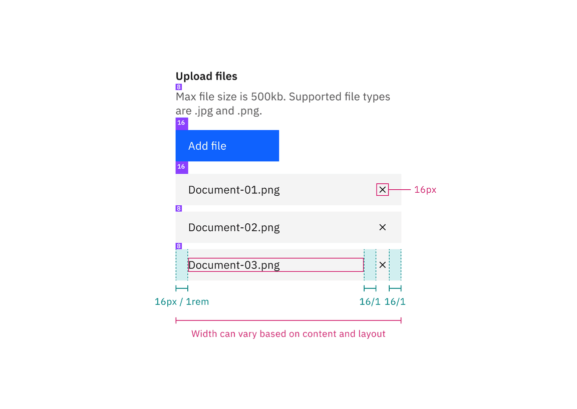
Structure and spacing measurements for file uploader | px / rem
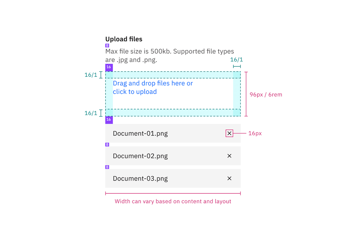
Structure and spacing measurements for drag and drop with multiple file upload functionality | px / rem
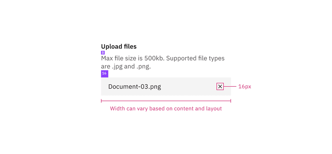
Structure and spacing measurements for drag and drop with single file upload functionality | px / rem
Sizes
The file and button heights should always match.
| Element | Size | Height px / rem |
|---|---|---|
| File | Small (sm) | 32 / 2 |
| Medium (md) | 40 / 2.5 | |
| Large (lg) | 48 / 3 | |
| Button | Small (sm) | 32 / 2 |
| Medium (md) | 40 / 2.5 | |
| Large (lg) | 48 / 3 |
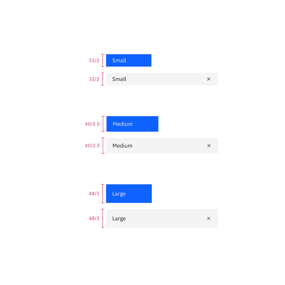
File and button sizes | px / rem