Contained list
Design annotations are needed for specific instances shown below, but for the standard contained list component, Carbon already incorporates accessibility.
What Carbon provides
Carbon bakes keyboard operation into its components, improving the experience of blind users and others who operate via the keyboard. Carbon incorporates many other accessibility considerations, some of which are described below.
Keyboard interactions
The default contained list is not interactive, but several of its variants include keyboard operation. In all interactive variants, the
Tab
Space
Enter
Users tab between any actionable items in the list, regardless of whether each item is clickable or contains an action button (such as ‘delete’). It is possible for multiple tab stops to exist for each list item.
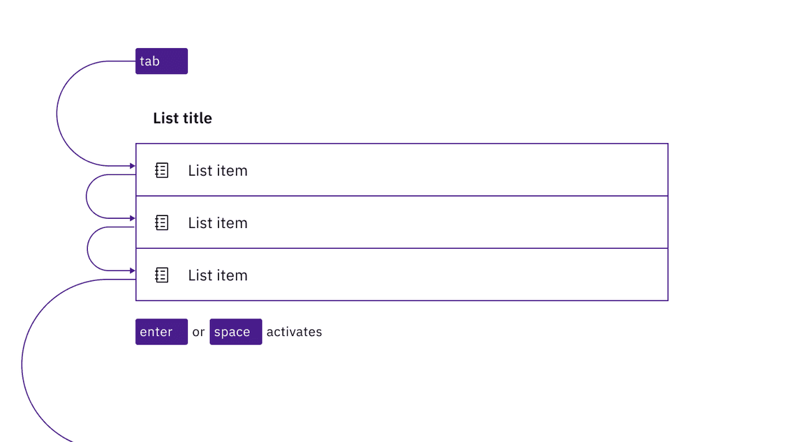
In a clickable contained list, each list item is a tab stop, activated with Enter or Space.
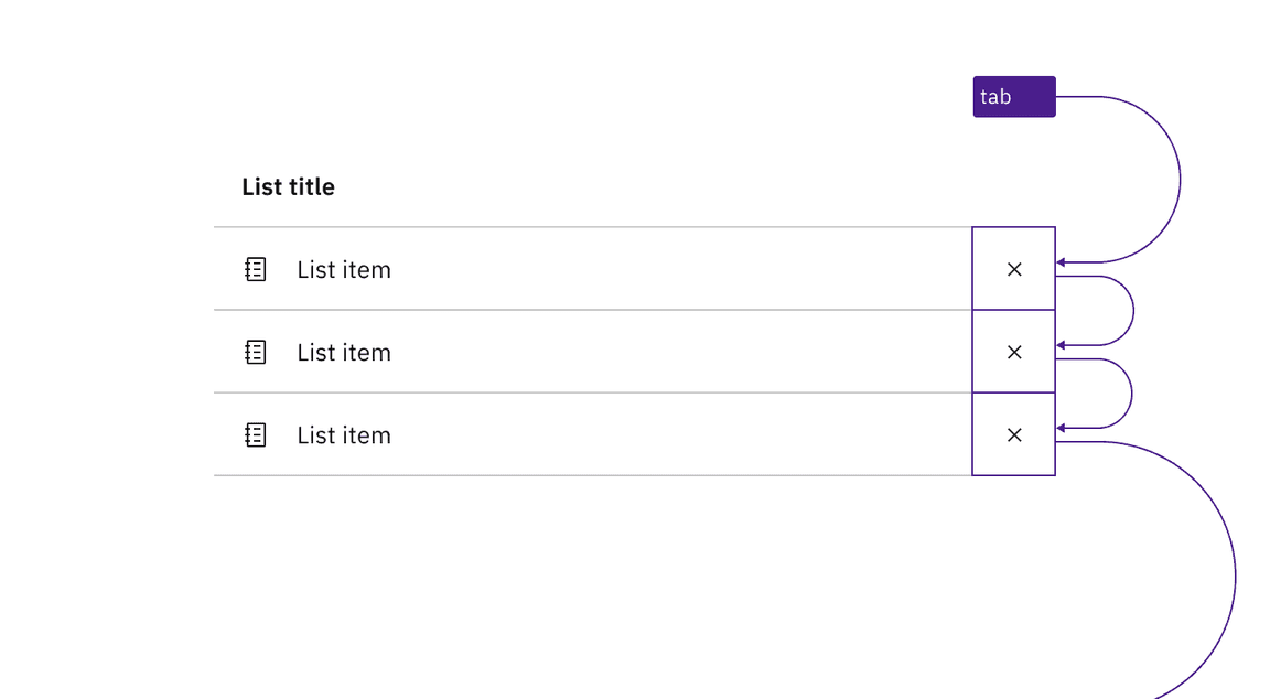
Where a contained list has buttons on each row, the buttons are in the tab order.
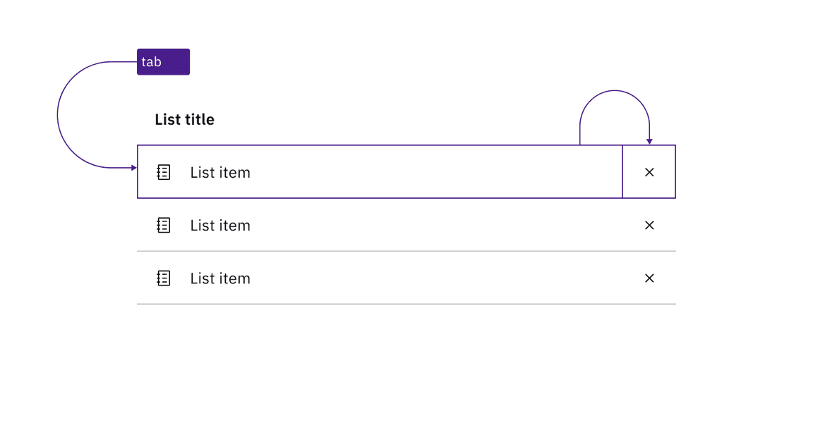
If a contained list contains both clickable rows and action items, there are multiple tab stops on each row.
Design recommendations
Indicate when the contained list is clickable
There is no persistent visual indicator that the list items in a contained list are clickable. To help developers distinguish them from the default contained list in your designs, annotate if each row in a list is intended to be clickable. There is no need to annotate clickable buttons on each row since these are visually identifiable.
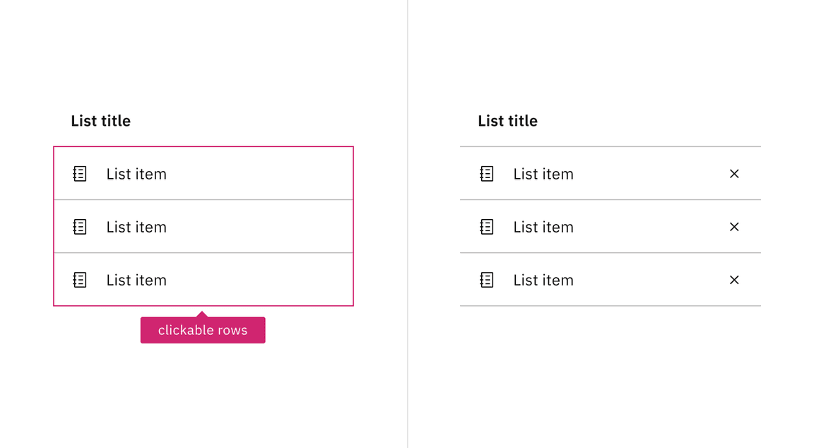
Annotate if the rows of a contained list are clickable. Do not annotate if it is only buttons on each row that are actionable.
Development considerations
Keep these considerations in mind if you are modifying Carbon or creating a custom component.
- The contained list is implemented as a list (usually a ) with each item an<ul>, and the list title associated with the list through use of<li>.aria-labelledby
- Any operable variant, whether a clickable list or a list with action items, is
a implemented as a child of the<button>.<li>
Accessibility testing statusFor every latest release, Carbon runs tests on all components to meet the accessibility requirements. These different statuses report the work that Carbon has done in the back end. These tests appear only when the components are stable.
For every latest release, Carbon runs tests on all components to meet the accessibility requirements. These different statuses report the work that Carbon has done in the back end. These tests appear only when the components are stable.
Latest version: | Framework: React (@carbon/react)
| Component | Accessibility test | Status | Link to source code |
|---|---|---|---|
| Contained list | Test(s) that ensure the initial render state of a component is accessible. | Passes all automated tests with no reported accessibility violations. | GitHub link |
| Tests that ensure additional states of the component are accessible. This could be interactive states of a component or its multiple variants. | Passes all automated tests with no reported accessibility violations. | ||
| Tests that ensure focus is properly managed, and all interactive functions of a component have a proper keyboard-accessible equivalent. | Passes all automated tests with no reported accessibility violations. | ||
| This manual testing ensures that the visual information on the screen is properly conveyed and read correctly by screen readers such as JAWS, VoiceOver, and NVDA. | A human has manually tested this component, e.g. screen reader testing. |