State | Element | Property | Color token |
|---|---|---|---|
Enabled | Text | text color |
|
Button | border |
| |
background |
| ||
Hover | Text | text color |
|
Button | border |
| |
background |
| ||
Focus | Button | border |
|
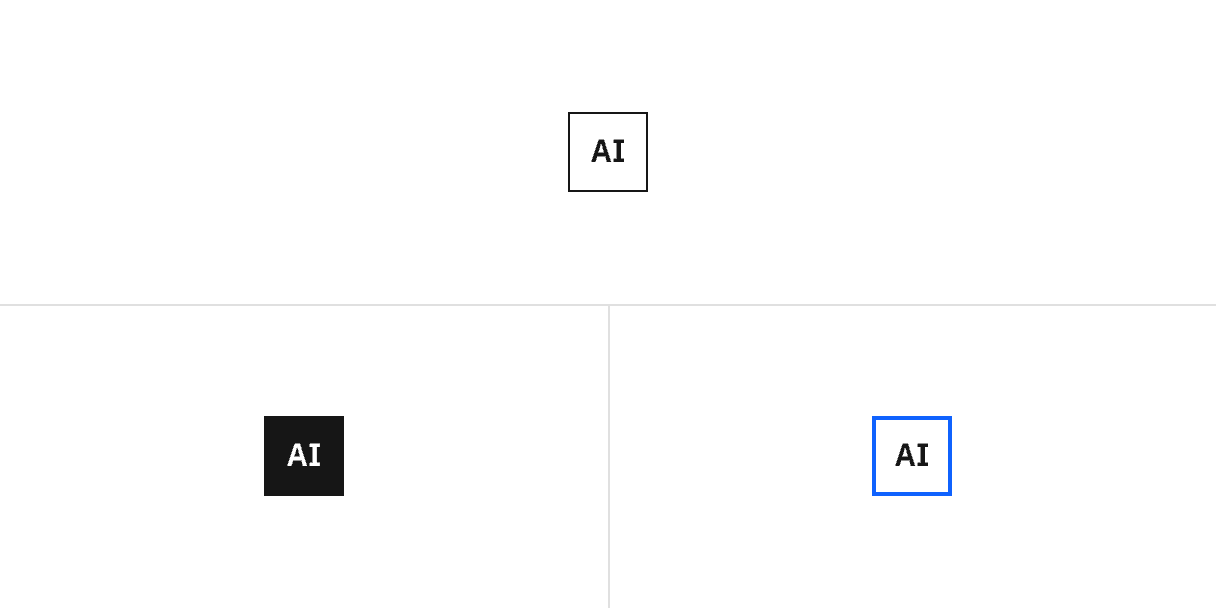
State | Element | Property | Color token |
|---|---|---|---|
Enabled | Text | text color |
|
dot | fill |
| |
Button | background |
| |
Hover | Text | text color |
|
Button | border |
| |
background |
| ||
Focus | Button | border |
|
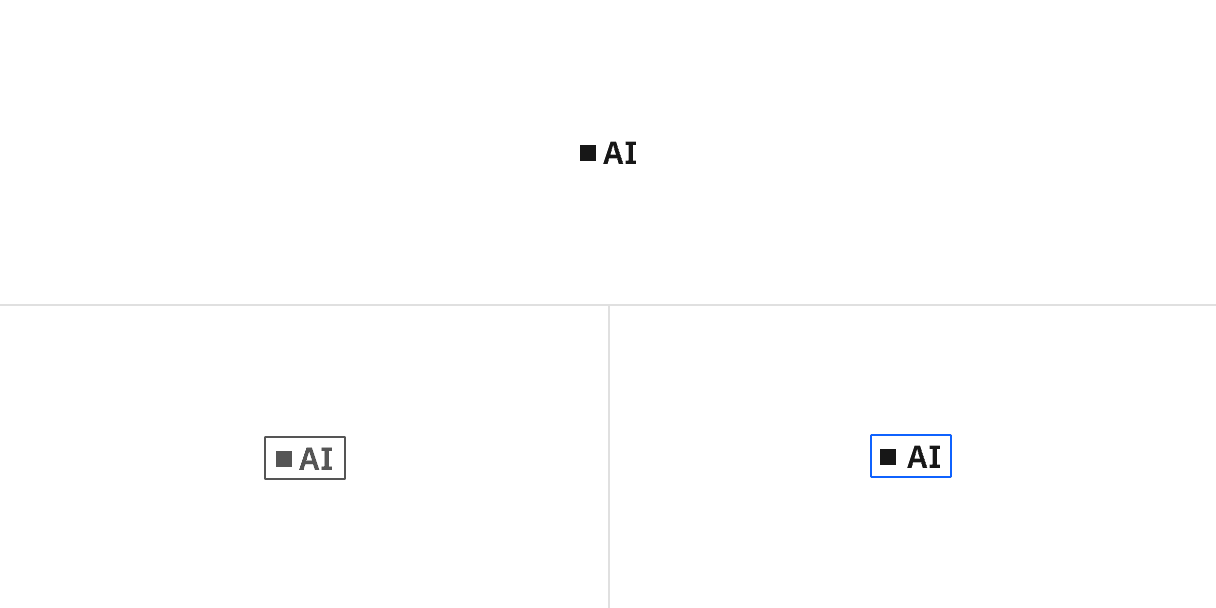
Element | Property | Color token |
|---|---|---|
Popover background | background |
|
linear-gradient: start |
| |
linear-gradient: end |
| |
Popover border | linear-gradient: start |
|
linear-gradient: end |
|
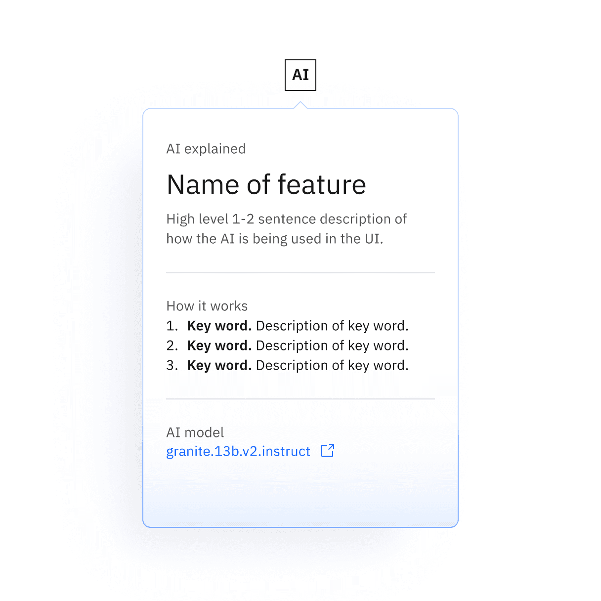
Element | Font-size (px/rem) | Font-weight | Type token |
|---|---|---|---|
Text (xl) | 20 / 1.25 | SemiBold / 600 |
|
Text (sm–lg) | 16 / 1 | SemiBold / 600 |
|
Text (2xs–xs) | 12 / 0.75 | SemiBold / 600 | – |
Text (mini) | 9 / 0.5625 | SemiBold / 600 | – |
Element | Font-size (px/rem) | Font-weight | Type token |
|---|---|---|---|
Text (lg) | 16 / 1 | SemiBold / 600 |
|
Text (md) | 14 / 0.875 | SemiBold / 600 |
|
Text (sm) | 12 / 0.75 | SemiBold / 600 | – |
Element | Font-size (px/rem) | Font-weight | Type token |
|---|---|---|---|
Text | 14 / 0.875 | Regular / 400 |
|
Title | 28 / 1.75 | Regular / 400 |
|
Body | 14 / 0.875 | Regular / 400 |
|
Element | Property | Value | Spacing token |
|---|---|---|---|
Button | border | 1px | – |
height | See sizes | – | |
Text | padding | centered | – |
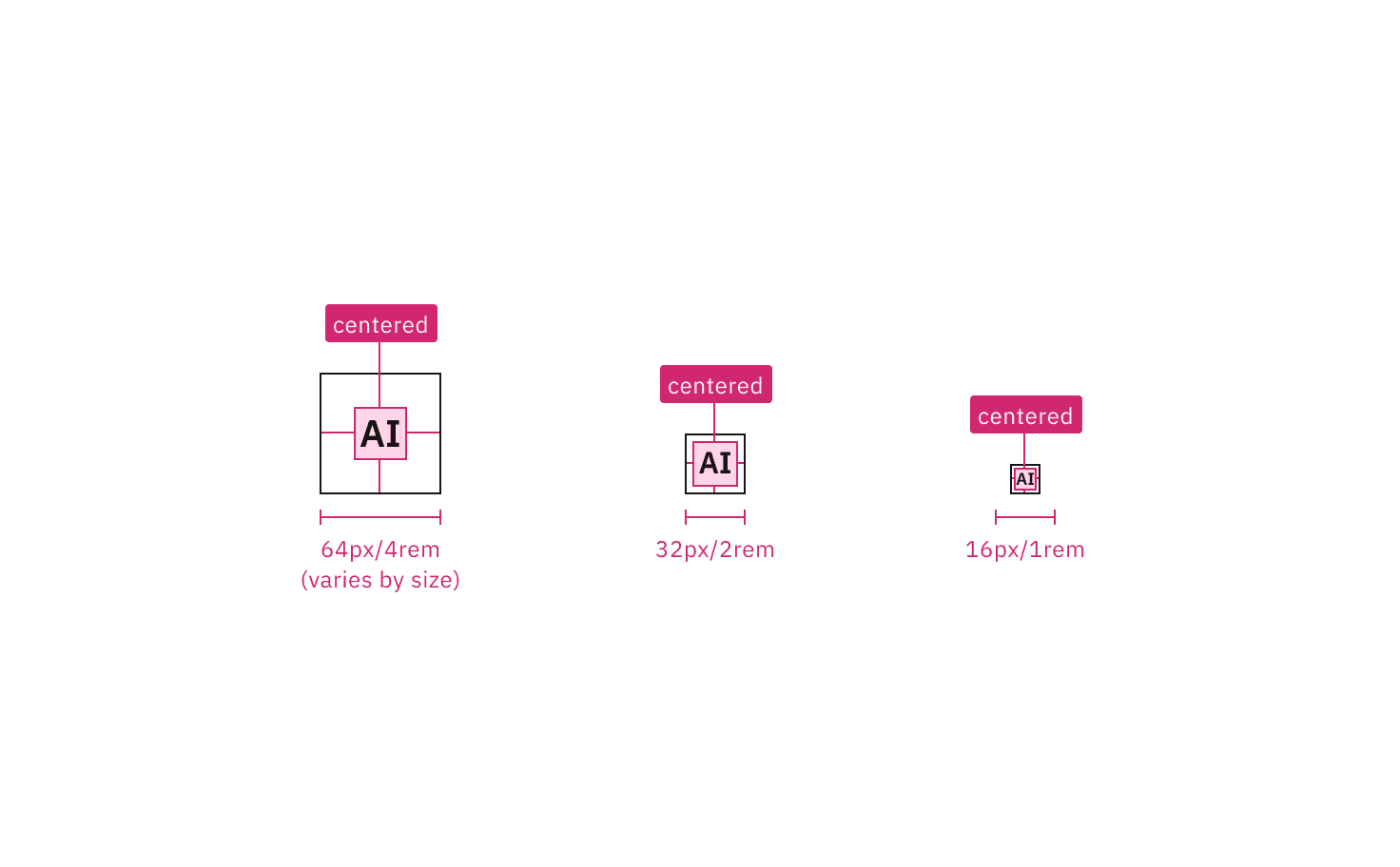
Element | Property | px/rem | Spacing token |
|---|---|---|---|
Text | padding-left | 4px |
|
Button | border | 1px | – |
padding-left, padding-right | 4px |
| |
height | See sizes | – | |
Bullet (sm-md) | height, width | 4px | – |
Bullet (lg) | height, width | 8px | – |
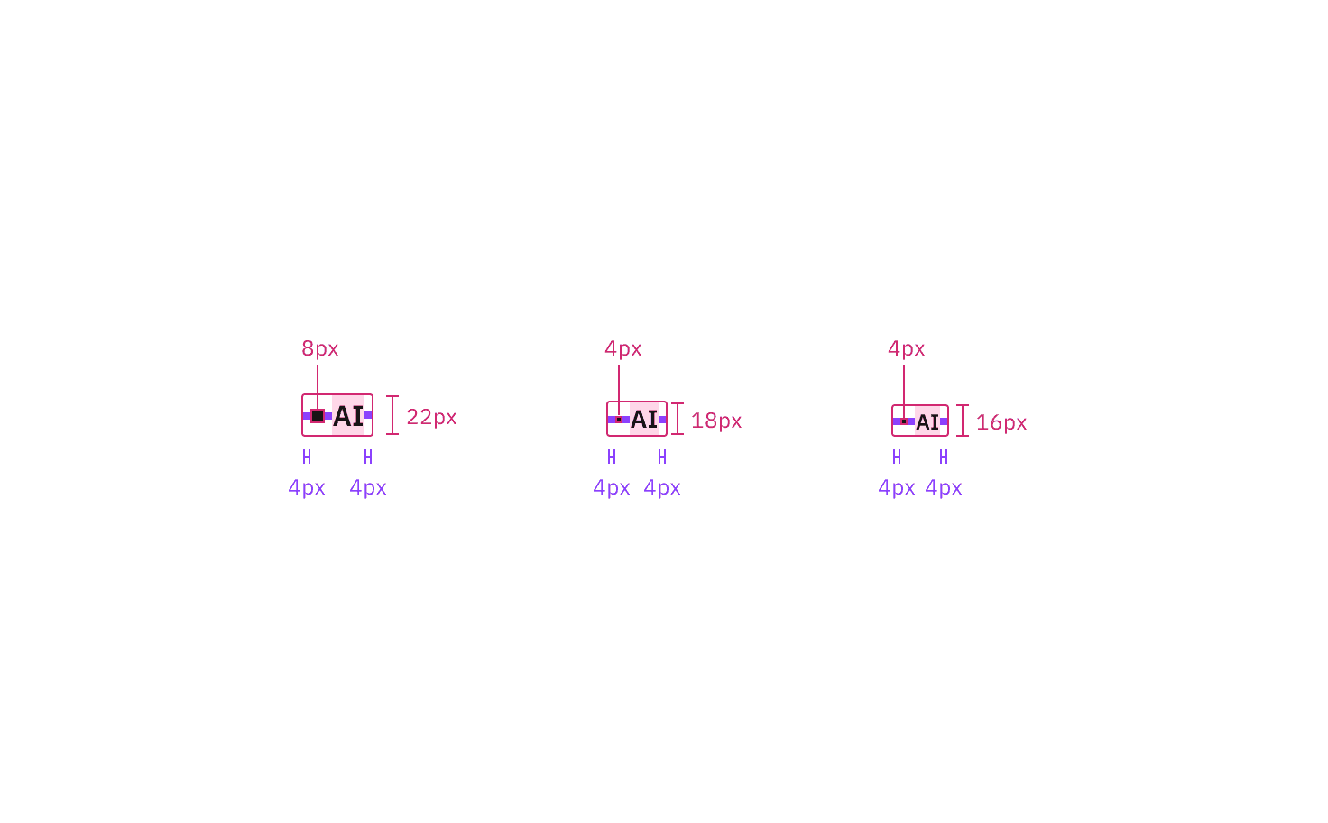
Element | Property | px/rem | Spacing token |
|---|---|---|---|
Container | padding | 24px |
|
Footer | height | 48px | – |
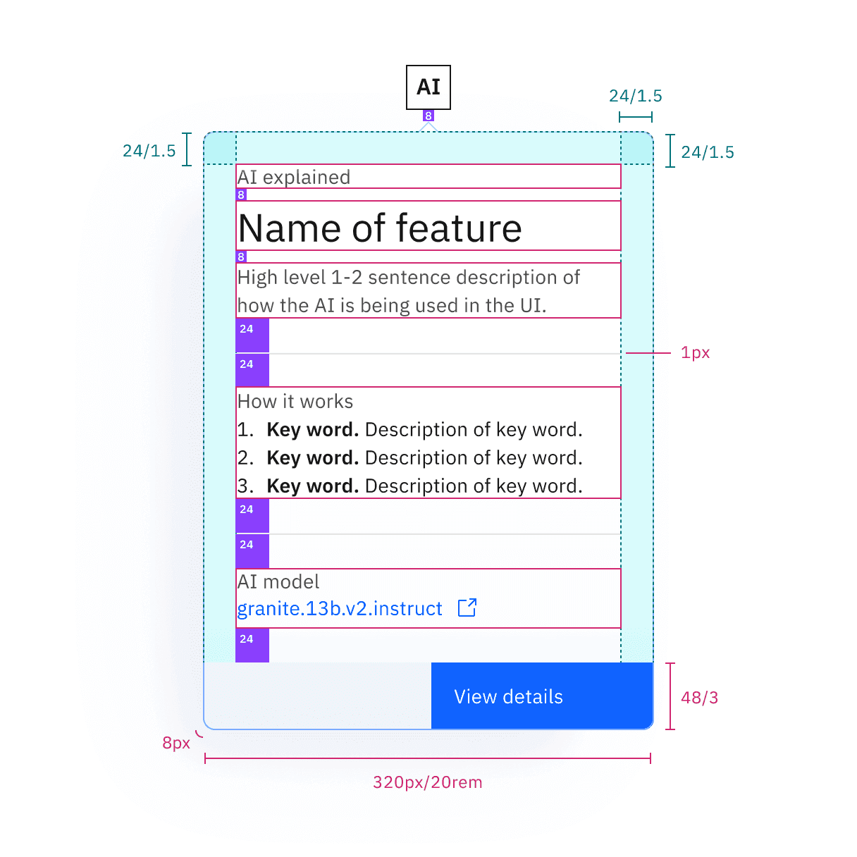
Feedback
Help us improve by providing feedback, asking questions, requesting features, or leaving any other comments on GitHub.