UI shell left panel
No accessibility annotations are needed for UI shell left panels, but keep these considerations in mind if you are modifying Carbon or creating a custom component.
What Carbon provides
Carbon bakes keyboard operation into its components, improving the experience of blind users and others who operate via the keyboard. Carbon incorporates many other accessibility considerations, some of which are described below.
Keyboard interaction
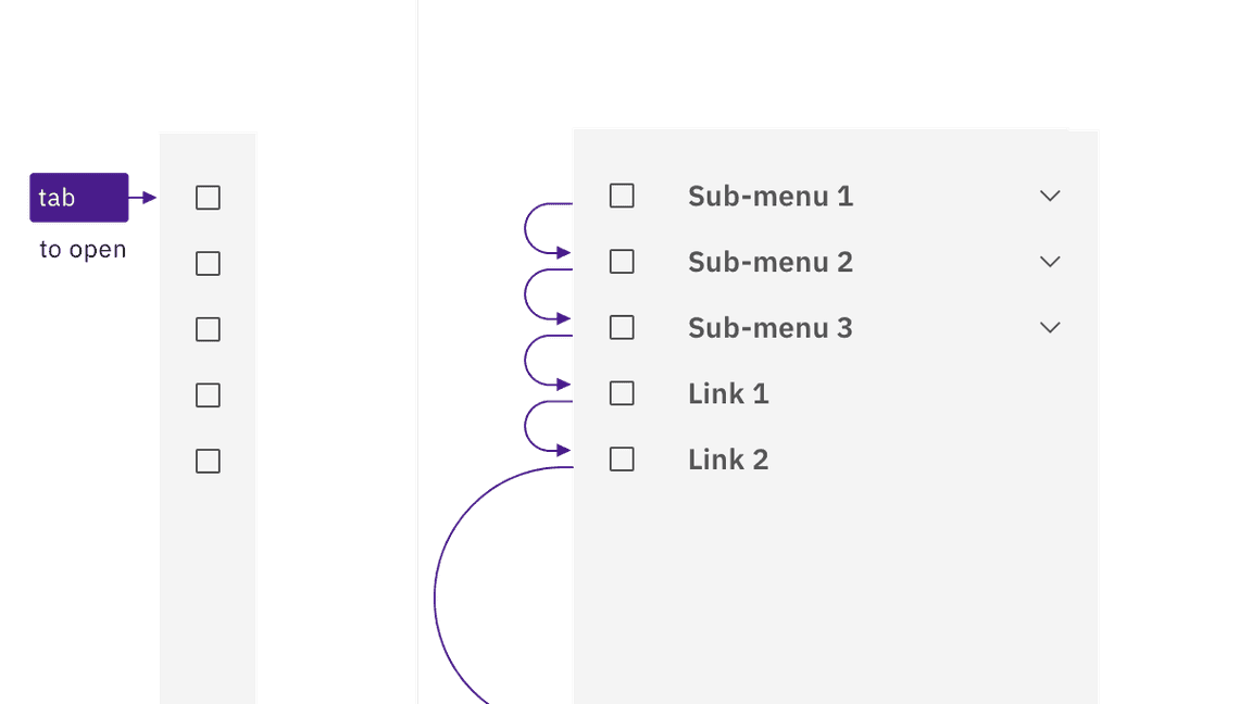
The left panel is comprised of both expandable sections (often called “sub-menus”) and links to content. All items can be reached by
Tab
Space
Enter
Enter
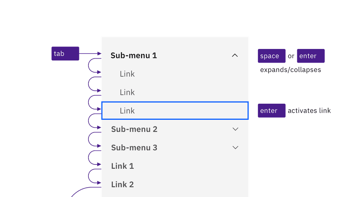
Sub-menus and links are reached by Tab. Space and Enter keys expand/collapse sub-menus, and the Enter key is used to activate links.
Non-persistent left panel
On smaller screens, or if content is zoomed up to approximately 175% magnification, Carbon responsively hides the left panel behind a ‘hamburger’ button, which appears at the start of the UI shell header. Activating the button (with
Space
Enter
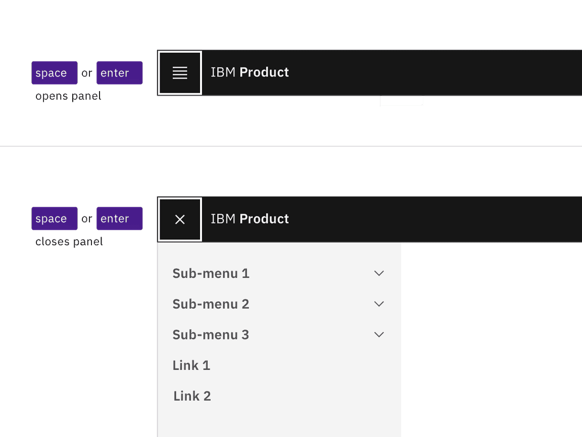
The hamburger button expands and collapses the left panel.
The left panel can also be implemented as a “Side rail” variant, which slides into view from the left side when reached by keyboard or hovered by mouse. Keyboard interaction within the revealed left panel does not change. When users tab out of the left panel, the side rail slides out of view.
The side rail expands on hover or focus, and collapses when not hovered or focused.
Development considerations
Keep these considerations in mind if you are modifying Carbon or creating a custom component.
- The left panel is in a section with<nav>.aria-label="Side navigation"
- All items in the left panel are in a nested structure, which provides additional information to assistive technologies.<ul>
- Each ‘sub-menu’ is implemented as a with<button>.aria-expanded
- Activated links receive an attribute.aria-current="page"
Accessibility testing statusFor every latest release, Carbon runs tests on all components to meet the accessibility requirements. These different statuses report the work that Carbon has done in the back end. These tests appear only when the components are stable.
For every latest release, Carbon runs tests on all components to meet the accessibility requirements. These different statuses report the work that Carbon has done in the back end. These tests appear only when the components are stable.
Latest version: | Framework: React (@carbon/react)
| Component | Accessibility test | Status | Link to source code |
|---|---|---|---|
| UI shell | Test(s) that ensure the initial render state of a component is accessible. | Passes all automated tests with no reported accessibility violations. | GitHub link |
| Tests that ensure additional states of the component are accessible. This could be interactive states of a component or its multiple variants. | Passes all automated tests with no reported accessibility violations. | ||
| Tests that ensure focus is properly managed, and all interactive functions of a component have a proper keyboard-accessible equivalent. | Passes all automated tests with no reported accessibility violations. | ||
| This manual testing ensures that the visual information on the screen is properly conveyed and read correctly by screen readers such as JAWS, VoiceOver, and NVDA. | A human has manually tested this component, e.g. screen reader testing. |