Common actions
Common actions frequently appear across different components and workflows. For platform consistency, these actions should only be applied in the ways described below.
Add
Add inserts an existing object to a list, set, or system. For example, adding a document to a folder.
Hierarchy and placement
Depending on the importance of the add action on the page, the emphasis can be high, medium, or low. For example, a high emphasis action should use a single primary button with all others being secondary.
Considerations
Small adjustments in your messaging will reduce user uncertainty. Consider the following:
- What are the implications of the add action for the user? Are there financial, access, or legal considerations?
- Does the user have the correct permissions for this action?
- Is the action permanent?
- What timeframe will the action take (seconds, minutes, hours, days)?
- What should a user do if the action fails?
- Is this a single or bulk action?
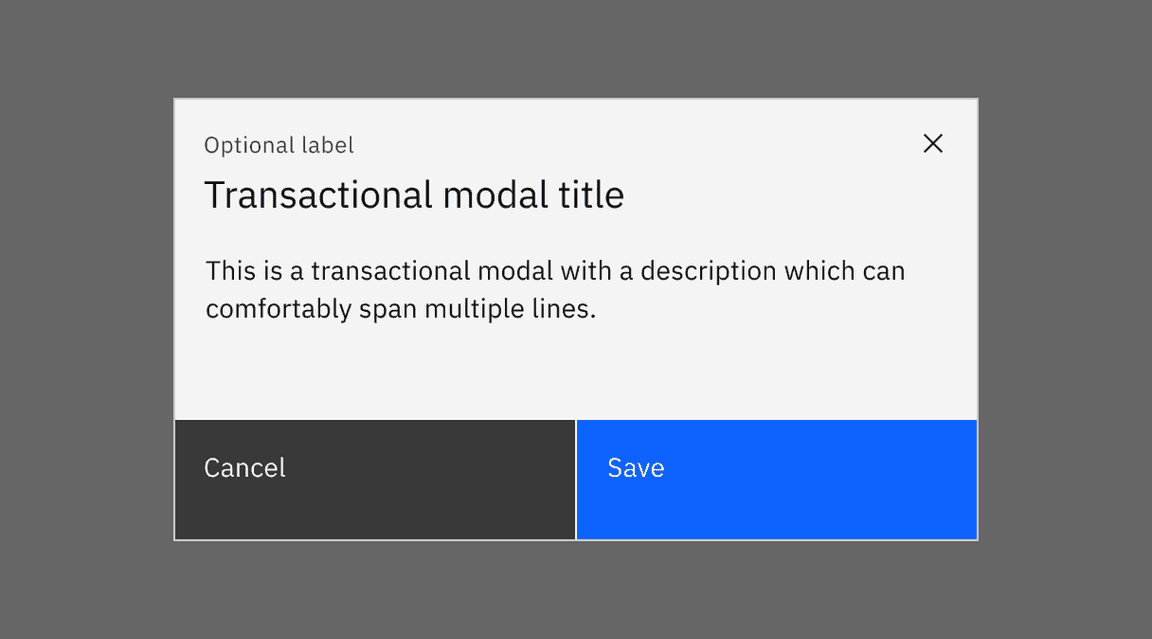
Cancel
Cancel stops the current action and closes the component or item. Warn the user of any negative consequences if the process doesn’t progress, such as data corruption or data loss.
Use a secondary button or a link for cancel actions.
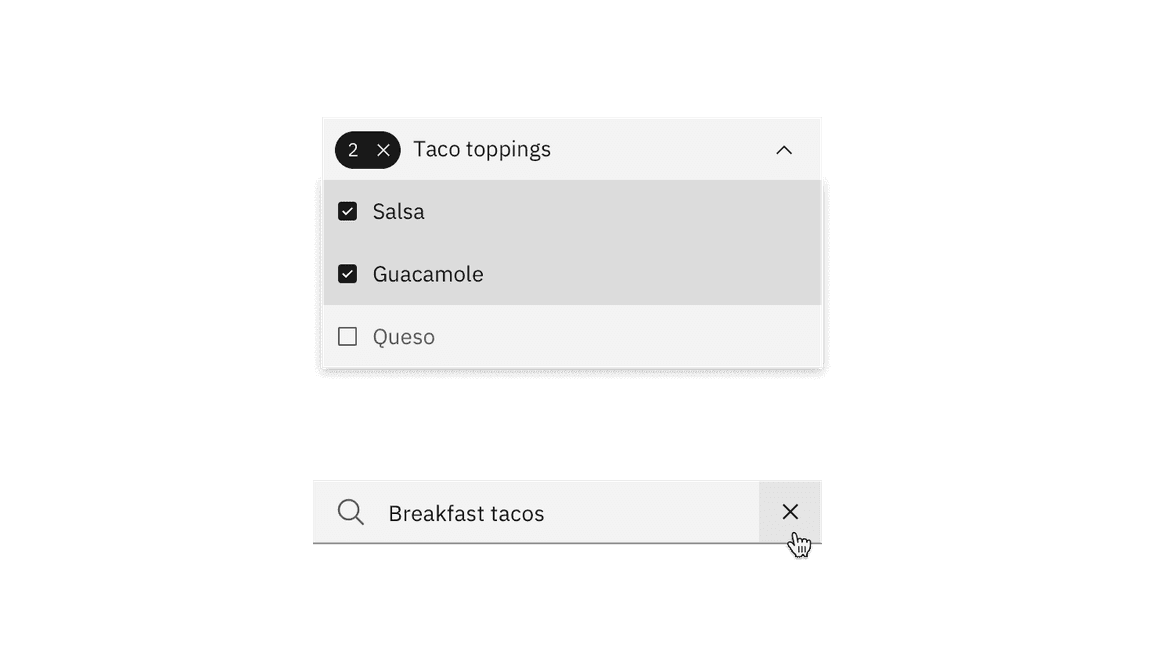
Clear
Clear removes data from a field or removes selections. Clear can also delete the contents of a document, such as a log. For controls that have a default selection or value, such as radio buttons, the default selection or value is reset.
Use the
close
Close
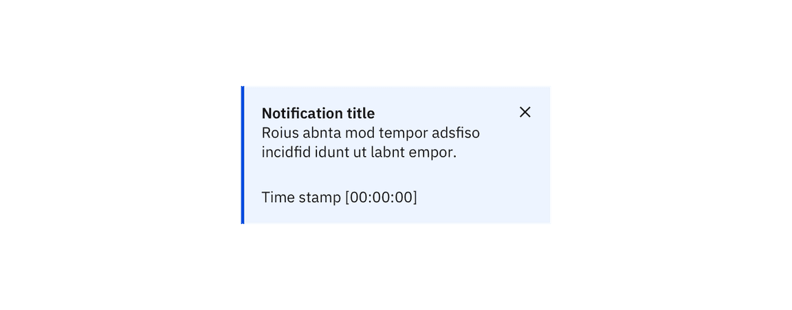
Close terminates the current page, window, or menu. Close is also used to dismiss information, such as notifications.
Use the
close
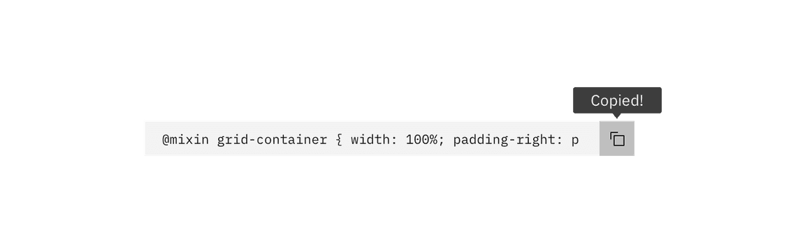
Copy
Copy creates a new identical instance of the selected object(s).
Use the
copy
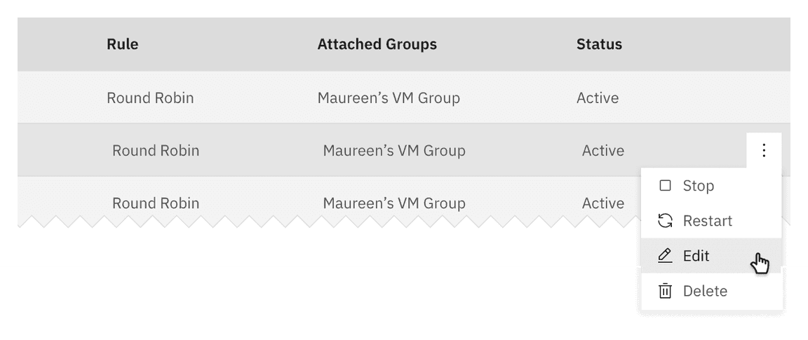
Delete
Delete destroys an object. Delete actions cannot be easily undone and are typically permanent. Warn the user of any negative consequences if an object is destroyed, such as loss of data. Use either the
delete
trash can
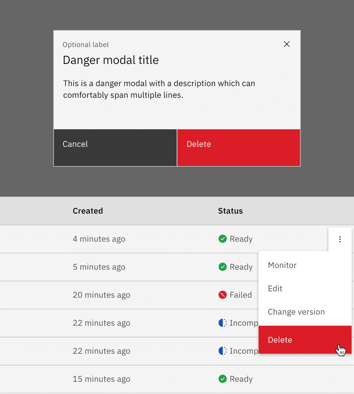
Low-impact deletion
Use when it’s trivial to undo deletion or recreate the data. Delete the data upon click or tap without further warning.
Moderate-impact deletion
Use when an action cannot be undone or the data cannot be recreated easily. This pattern is also useful if you’re deleting more than one thing.
Ask for confirmation of the delete, with guidance about what will occur if they delete.
High-impact deletion
Use when it would be very expensive or time-consuming to recreate data. Also use if the action deletes a large amount of data, or if other important items would be deleted as a result of the action.
In addition to presenting a dialog, have the user type the name of the resource they are deleting (manual confirmation).
Post-deletion
After the user deletes data, return to the page that lists the data deleted. Animate the removal of the data from the list or page and present a success notification.
If the deletion fails, raise a notification to tell the user that deletion failed. Send a second notification on another communication channel, like email, if possible. Animate the data back onto the page if possible.
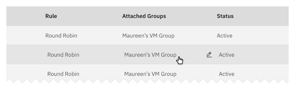
Edit
Edit allows data or values to be changed. Edit commonly triggers a state change to the targeted object or input item.
Offer edit as an option in a menu, or as a button or
edit
Errors
Errors occur when an action or process does not succeed. Error notifications can occupy full pages, form fields, notifications, and modals. Error notifications should provide context of what happened and a clear path to continue.
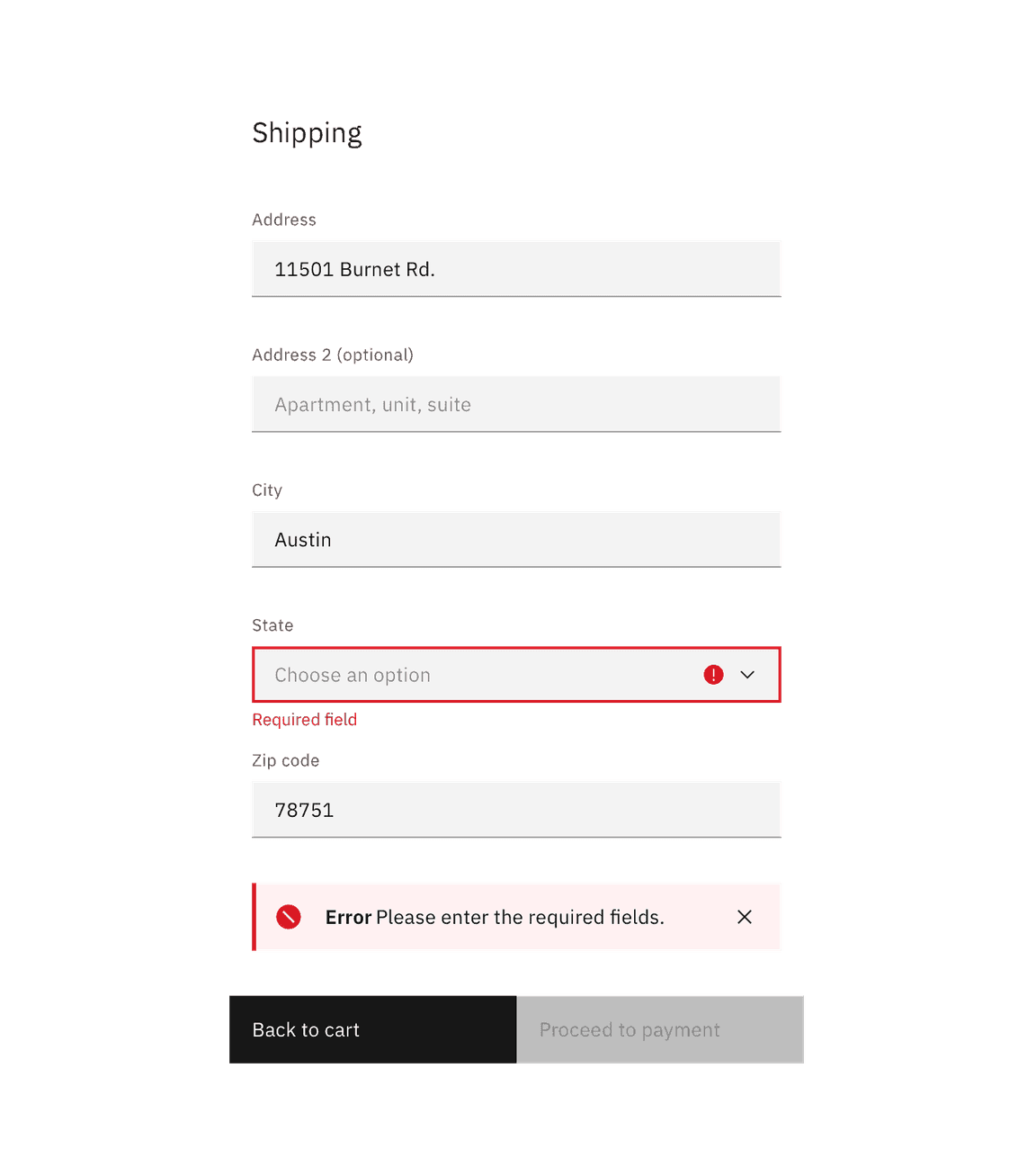
Consider redirecting the user to a previous state, a support page, or offering recommendations. Be honest and helpful.
Some components, like text input and form field errors, are quite small and require more thoughtful approaches to the space and placement of error handling. Consider inline error notifications for these instances.
Content guidelines
Be brief, honest, and supportive. Explain what happened and what the user can do to resolve the error.
For full-page and large modals, keep error messages no longer than three paragraph lines. For form errors, keep error messages no longer than two lines.
Next
Next advances the user to the next step in a sequence of steps, like in a wizard.
Represent next with a button with icon or a standalone
forward
Refresh
This action reloads the view of an object, list, or data set when the displayed view has become unsynchronized with the source.
Use the
refresh
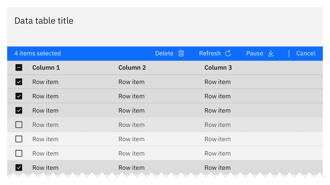
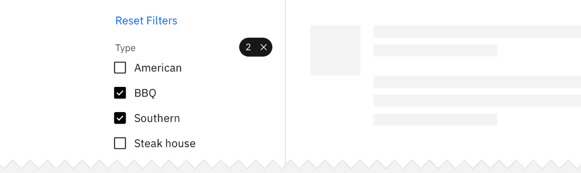
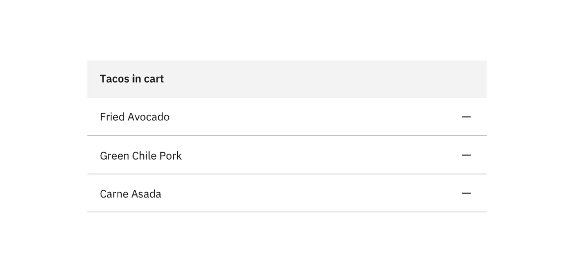
Remove
This action removes an object from a list or item. Remove is distinct from delete, as a removed item is not destroyed. Multiple objects can be removed at once.
Hierarchy and placement
Represent remove as a button or
subtract
Considerations
- What are the implications of the remove action for the user? Are there financial, access, or legal considerations?
- This action can be confused with deleting.
- A user may not have the correct permissions for this action.
- Inform the user if the result is permanent.
- How long will the action take? Seconds, minutes, hours, or days?
- What should the user do if the removal fails?
- Is this a single or bulk action?
Reset
Reset reverts values back to their last saved state. The last saved state includes the values stored the last time the user clicked or triggered Apply.
Reset is typically applied as a link.