2. Building pages
Now that we have our app using the UI Shell, it’s time to build a few static pages. In this step, we’ll become comfortable with the Carbon grid and various Carbon components.
- Fork, clone and branch
- Add landing page grid
- Build landing page
- Style landing page
- Add repo page grid
- Build repo page
- Push to GitHub
Preview
A preview of what you’ll build:
Fork, clone and branch
This tutorial has an accompanying GitHub repository called carbon-tutorial-web-components that we’ll use as a starting point for each step. If you haven’t forked and cloned that repository yet, and haven’t added the upstream remote, go ahead and do so by following the [step 1 instructions](previous step.
Branch
With your repository all set up, let’s check out the branch for this tutorial step’s starting point.
git fetch upstreamgit checkout -b step-2 upstream/step-2
Build and start app
Install the app’s dependencies (in case you’re starting fresh in your current directory and not continuing from the previous step):
pnpm i
Then, start the app:
pnpm dev
You should see something similar to where the previous step left off.
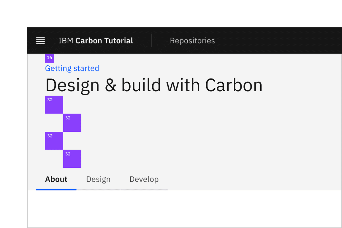
Add landing page grid
Let’s add our grid elements to our
LandingPage
In order to use the grid, we need to wrap everything in a
<cds-grid>
<cds-column>
The CSS Grid is a 16 column grid. We will specify the span of a
<cds-column>
sm
md
lg
<cds-column sm="4" md="8" lg="8"/>
First in
main.js
import '@carbon/web-components/es/components/grid/index';
Then in
index.html
LANDING PAGE
<cds-grid class="page page-landing" full-width><cds-column class="page-landing__banner" span="100%"> 1 </cds-column><cds-column class="page-landing__r2" span="100%"><cds-grid full-width><cds-column class="page-landing__tab-content" sm="4" md="4" lg="7">7/16</cds-column><cds-column sm="4" md="4" lg="span:8 start:9"> 8/16 </cds-column></cds-grid>
Then import the grid styles in
style.scss
@use '@carbon/styles/scss/grid';
We’ve included the designs for this tutorial app in the
design.figma
carbon-tutorial
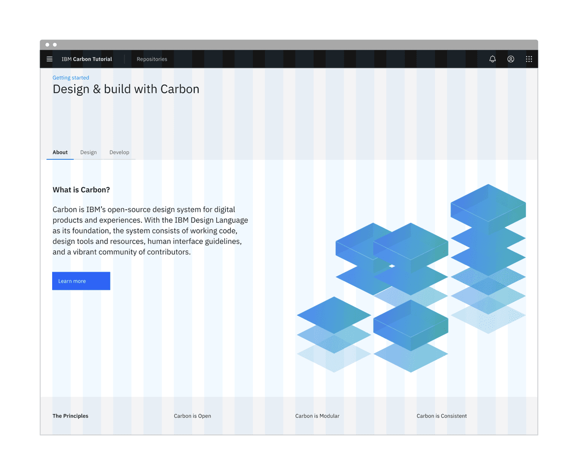
Landing page grid
Build landing page
We’ll start adding HTML elements and components by row.
First row
Banner vertical spacing
In our first row we’ll need a
Breadcrumb
import '@carbon/web-components/es/components/breadcrumb/index';
We can now add our component to the first row, replace the content of the
div
page-landing__banner
<cds-breadcrumb noTrailingSlash aria-label="Page navigation"><cds-breadcrumb-item><a href="./">Getting started</a></cds-breadcrumb-item></cds-breadcrumb><h1 class="page-landing__heading">Design & build with Carbon</h1>
Second row
In our second row we’ll need
Tabs
Button
import '@carbon/web-components/es/components/tabs/index';
The tabs come next going inside
page-landing__r2
<cds-grid>
<cds-tabs value="about" class="page-landing__tabs"><cds-tab id="tab-about" value="about" target="panel-about">About</cds-tab><cds-tab id="tab-design" value="design" target="panel-design">Design</cds-tab><cds-tab id="tab-develop" value="develop" target="panel-develop">Develop</cds-tab></cds-tabs>
Each of the
cds-tab
target
Wrap the subgrid element immediately after the closing
</cds-tabs>
<div class="page-landing__tab-panels"><div id="panel-about" role="tabpanel" aria-labelledby="tab-about">... grid element is here</div></div>
Replace the content of the first column
7/16
<h3 class="page-landing__subheading">What is Carbon?</h3><p class="page-landing__p">Carbon is IBM’s open-source design system for digital products andexperiences. With the IBM Design Language as its foundation, the systemconsists of working code, design tools and resources, human interfaceguidelines, and a vibrant community of contributors.</p><cds-button>Learn more</cds-button>
The second column content
8/16
<imgclass="page-landing__illo"src="./tab-illo.png"alt="Carbon illustration"width="640"height="498" />
The
tab-illo.png
public
After the closing
</div>
id="panel-about"
page-landing__tab-panels
<cds-grid full-width><cds-column span="100%"><div class="page-landing__tab-content"><p class="page-landing__p">Rapidly build beautiful and accessible experiences. The Carbon kitcontains all resources you need to get started.</p></div></cds-column>
and
<div id="panel-develop" role="tabpanel" aria-labelledby="tab-develop"><cds-grid full-width><cds-column span="100%"><div class="page-landing__tab-content"><p class="page-landing__p">Carbon provides components and styles for all. Whether using Vanilla,Web Components, React, or another reactive library, you can build withCarbon.</p>
Third row
Here we replace all four columns entirely adding some offsets for medium and large column sizes after the first column.
<cds-column class="page-landing__label" sm="4" md="2" lg="4">The principles</cds-column><cds-columnclass="page-landing__title"sm="4"md="span:6 start:3"lg="span:4 start:5">Carbon is open
Style landing page
Page and tab layout
For consistent vertical spacing across page add the following SCSS.
@use '@carbon/styles/scss/breakpoint' as *; /* add near top of file */.page :where(.page-landing__banner, .page-landing__r2, .page-landing__r3) {padding-inline: $spacing-06;margin-inline: 0;@include breakpoint-up(md) {margin-inline: -1 * $spacing-05;}
First row
Row one styling is fairly straight forward with some typography and positional adjustment so to align it with our other content.
.page-landing__banner {padding-block: $spacing-05 $spacing-13;background: $layer-01;box-shadow: $spacing-06 0 0 $layer-01, -1 * $spacing-06 0 0 $layer-01;}.page-landing__heading {@include type-style('productive-heading-05');
Second row
The styling for the second row adds further layout and typography changes. It also positions the image and prevents it from causing horizontal overflow. In order to make use of the Carbon SCSS mixin
breakpoint-down
@use
.page-landing__illo {max-width: 100%;float: inline-end;height: auto;}@include breakpoint-down(md) {.page-landing__illo {max-width: 528px;
Third row
.page-landing__r3 {padding-block: $spacing-09;background: $layer-01;box-shadow: $spacing-06 0 0 $layer-01, -1 * $spacing-06 0 0 $layer-01;}
Ta-da! You should see a step 2 complete landing page! Now we can move on to the repo page.
Build repo page
Add a grid to contain our content
Now in our
repositories
REPOSITORIES PAGE
<cds-grid class="page page-repositories" full-width><cds-column class="repo-page__r1" span="100%"> REPOSITORIES PAGE </cds-column></cds-grid>
Add a minimal amount of styling to move our content away from the edge of the page in
style.scss
.repo-page__r1 {padding-block: $spacing-05;}
Adding a table
Before we can add the table we need to import the web component. As this is only used in our
repositories.html
repos.js
import '@carbon/web-components/es/components/data-table/index.js';
We need to include this file in
repositories.html
main.js
<script type="module" src="/repos.js"></script>
Next we add the table header and column titles to replace the text
REPOSITORIES PAGE
<cds-table expandable><cds-table-header-title slot="title">Carbon Repositories</cds-table-header-title><cds-table-header-description slot="description">A collection of public Carbon repositories.</cds-table-header-description><cds-table-head><cds-table-header-row>
The table header should already be visible on the repositories page.
Now we can add the rows replacing
Table body goes here
<cds-table-row><cds-table-cell>Repo 1</cds-table-cell><cds-table-cell>Date</cds-table-cell><cds-table-cell>Date</cds-table-cell><cds-table-cell>123</cds-table-cell><cds-table-cell>456</cds-table-cell><cds-table-cell>Links</cds-table-cell></cds-table-row><cds-table-expanded-row>Repo description</cds-table-expanded-row>
Using HTML templates
With the app running we can see that the repositories page now hosts a table. However, it is not realistic to populate a table with hard coded data way so we’ll refactor to build the table from data.
This involves the use of HTML Templates, take a look at W3 Schools if you need a quick refresh.
In
index.html
<cds-table-body>
Table body goes here
Then before the end of the html tag and after the body closing tag add the following to define our table row template.
<template id="template--table-row"><cds-table-row><cds-table-cell key="name">Repo 1</cds-table-cell><cds-table-cell key="created">Date</cds-table-cell><cds-table-cell key="updated">Date</cds-table-cell><cds-table-cell key="openIssues">123</cds-table-cell><cds-table-cell key="stars">456</cds-table-cell><cds-table-cell key="links">Links</cds-table-cell></cds-table-row>
Next in
repos.js
// cds-table-row datalet data = [{name: 'Repo A',created: 'Date',updated: 'Date',openIssues: 123,stars: 456,links: 'Links',
Next we create the function
updateTable
const updateTable = () => {const tableRowTemplate = document.querySelector('template#template--table-row');const tableBody = document.querySelector('cds-table-body');if (tableBody && tableRowTemplate) {tableBody.innerHTML = '';// iterate over data and render rowsdata.forEach((row) => {
Verify that the table rows are being generated by changing the data and running the app.
Congratulations! We’ve now created our static repo page!
Push to GitHub
That is it you are done. Just one more push to save your completion of step 2.
Git commit and push
First, stage and commit all of your changes:
git add --all && git commit -m "feat(tutorial): complete step 2"
Then, push to your repository:
git push -u origin step-2