Toggle
The following page documents visual specifications such as color, typography, structure, and size.
Color
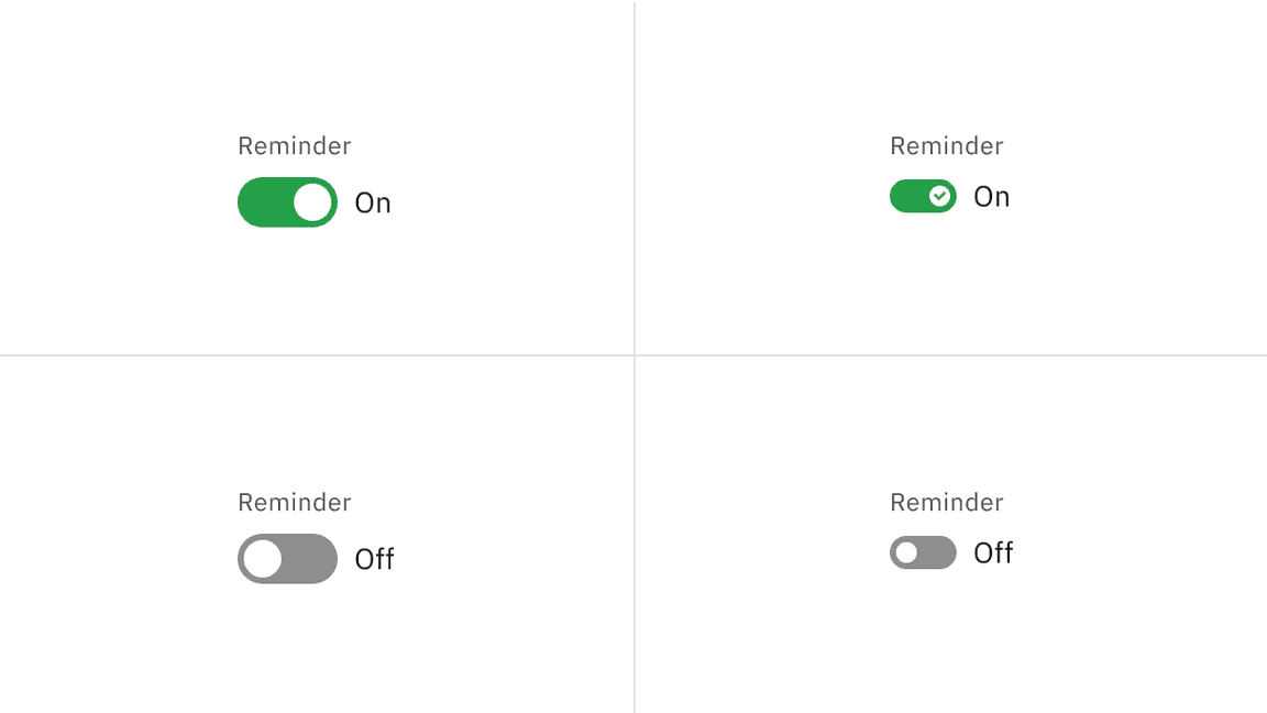
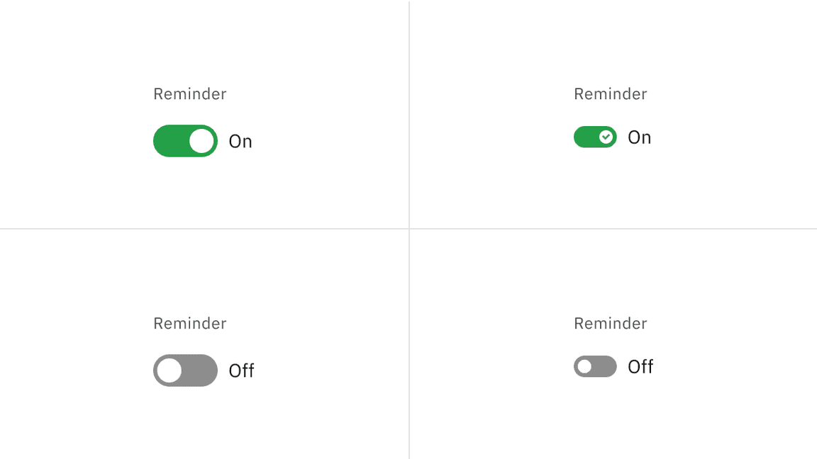
Both the default and small toggle variants share the same color and interactive state properties.
| Element | Property | Color token |
|---|---|---|
| Label text | text-color |
|
| State text | text-color |
|
| Background (off) | background-color |
|
| Handle (off) | background-color |
|
| Background (on) | background-color |
|
| Handle (on) | background-color |
|
| Checkmark | fill |
|
Interactive state color
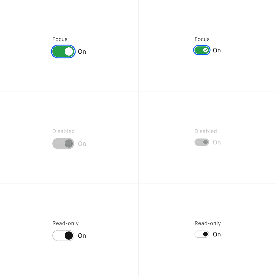
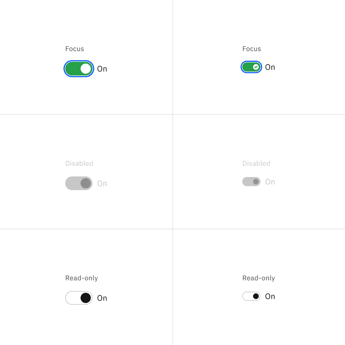
The default and small toggle can be switched on and off across focus, disabled, and read-only states.
| State | Element | Property | Color token |
|---|---|---|---|
| Focus | Toggle | border |
|
| Disabled | Label text | text-color |
|
| State text | text-color |
| |
| Background | background-color |
| |
| Handle | background-color |
| |
| Checkmark | inner fill |
| |
| Read-only | Label text | text-color |
|
| State text | text-color |
| |
| Background | background-color | transparent | |
| Border | border |
| |
| Handle | background-color |
|
* Denotes a contextual color token that will change values based on the layer it is placed on.
Typography
Toggle labels should be set in sentence case, with only the first word in a phrase and any proper nouns capitalized, and no more than three words.
| Element | Font-size (px/rem) | Font-weight | Type token |
|---|---|---|---|
| Label text | 12 / 0.75 | Regular / 400 |
|
| State text | 14 / 0.875 | Regular / 400 |
|
Structure
Default toggle structure
| Element | Property | px / rem | Spacing token |
|---|---|---|---|
| Toggle | width | 48 / 3 | – |
| height | 24 / 1.5 | – | |
| Handle | height, width | 18 / 1.25 | – |
| Label text (feature flag) | margin-top, margin-bottom | 8 / 0.5 |
|
| Label text | margin-top, margin-bottom | 16 / 1 |
|
| State text | margin-left | 8 / 0.5 |
|
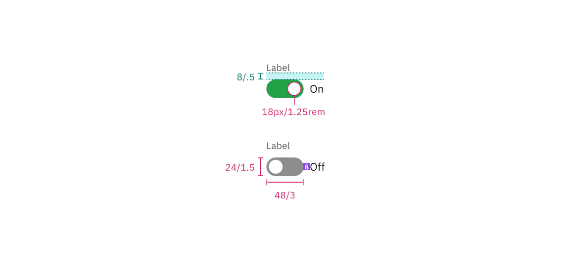
Structure and spacing measurements for default toggle with a feature flag enabled | px / rem
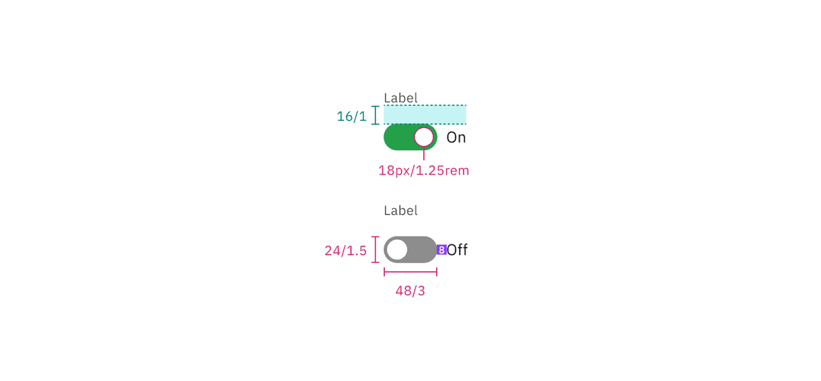
Structure and spacing measurements for default toggle with a feature flag disabled | px / rem
Small toggle structure
| Element | Property | px / rem | Spacing token |
|---|---|---|---|
| Toggle | width | 32 / 2 | – |
| height | 16 / 1 | – | |
| Handle | height, width | 10 / 0.625 | – |
| Label text (feature flag) | margin-top, margin-bottom | 8 / 0.5 |
|
| Label text | margin-top, margin-bottom | 16 / 1 |
|
| State text | margin left | 8 / 0.5 |
|
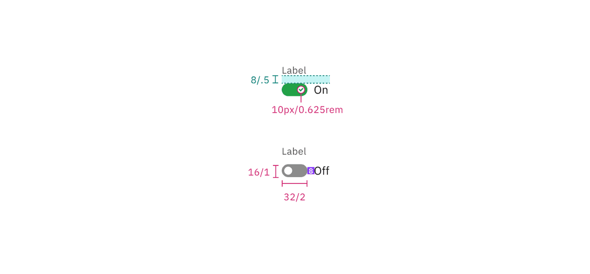
Structure and spacing measurements for small toggle with a feature flag enabled | px / rem
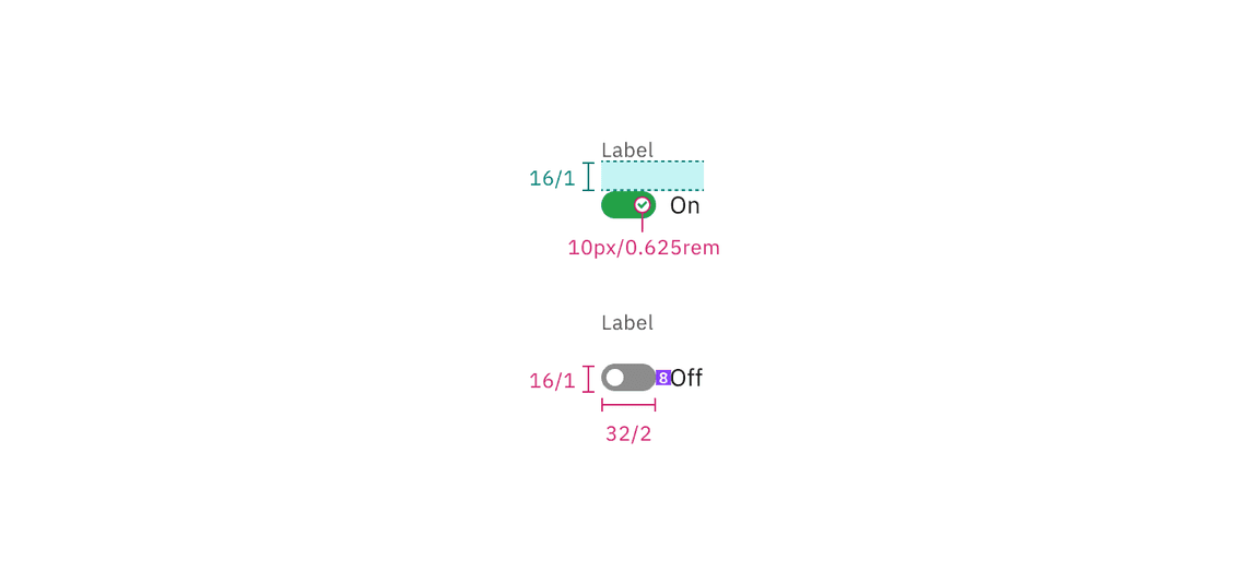
Structure and spacing measurements for small toggle with a feature flag disabled | px / rem
Size
| Size | Height (px / rem) |
|---|---|
| Small (sm) | 16 / 1 |
| Default | 24 / 1.5 |
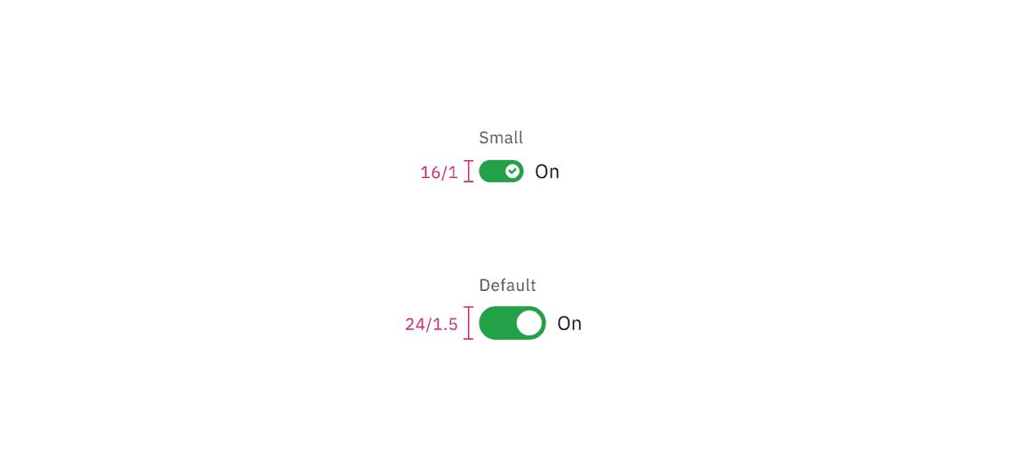
Default and small sizes of toggle | px / rem
Feedback
Help us improve this component by providing feedback, asking questions, and leaving any other comments on GitHub.