Text input
The following page documents visual specifications such as color, typography, structure, size, and AI presence.
Color
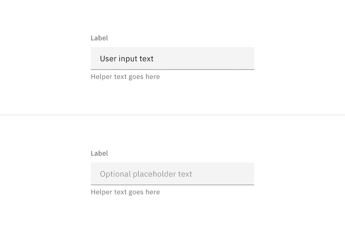
Text input color
| Element | Property | Color token |
|---|---|---|
| Label | text-color |
|
| Field text | text-color |
|
| Placeholder text | text-color |
|
| Helper text | text-color |
|
| Field | background-color |
|
| border-bottom |
|
* Denotes a contextual color token that will change values based on the layer it is placed on.
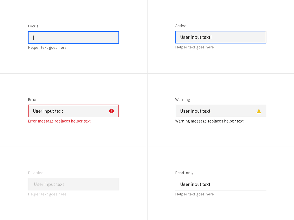
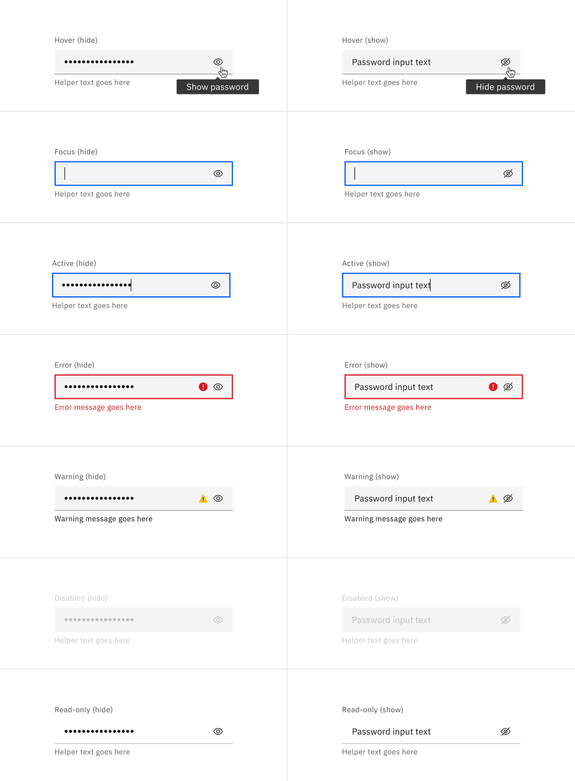
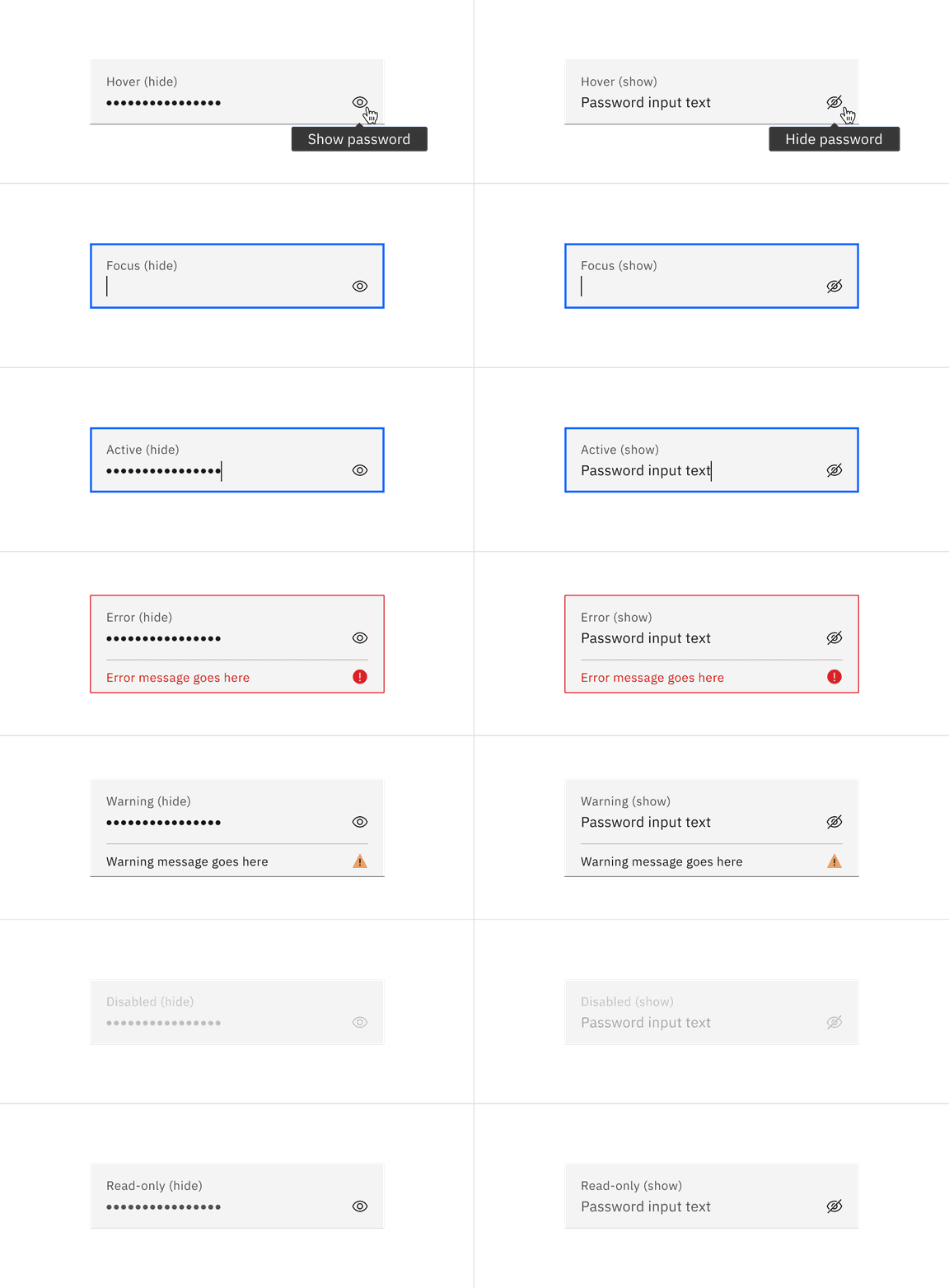
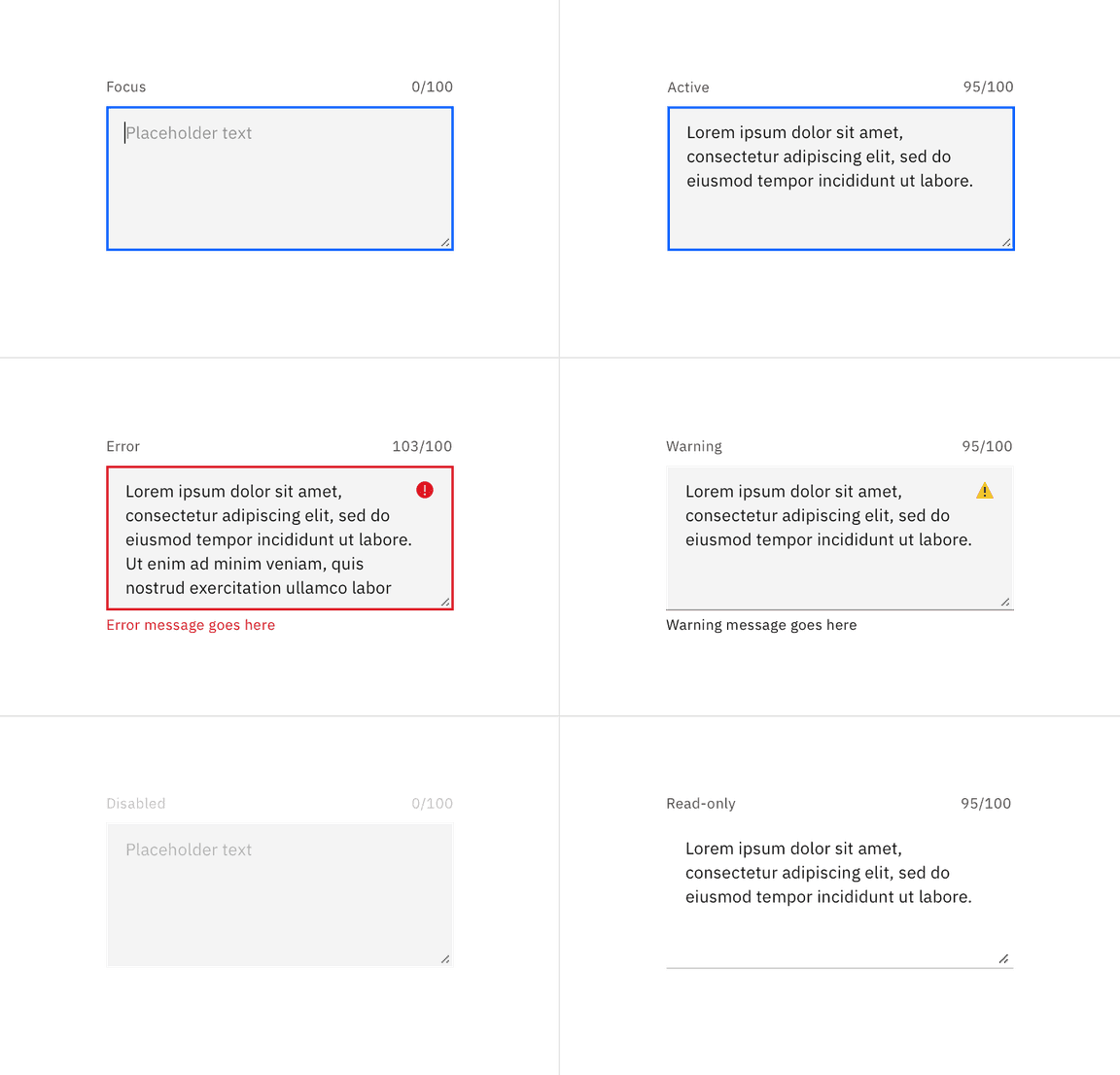
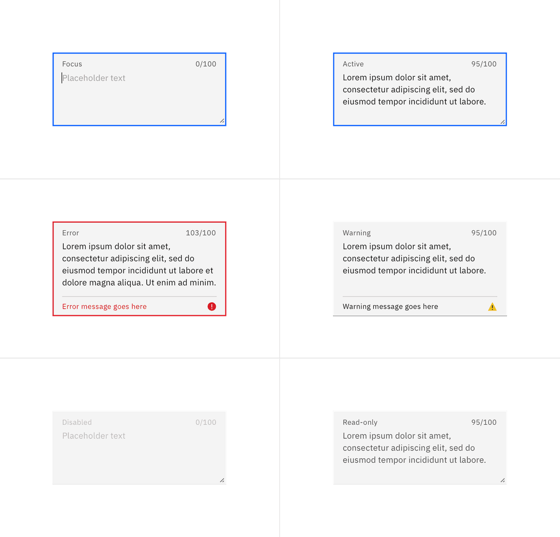
Interactive state color
| State | Element | Property | Color token |
|---|---|---|---|
| Focus | Field | border |
|
| Invalid | Field | border |
|
| Error message | text-color |
| |
| Error icon | svg |
| |
| Warning | Warning message | text-color |
|
| Warning icon | svg |
| |
| Disabled | Field | background |
|
| Field (default) | border-bottom | transparent | |
| Field (fluid) | border-bottom |
| |
| Field text | text-color |
| |
| Read-only | Field (default) | background | transparent |
| Field (fluid) | background |
| |
| Field text (default) | text-color |
| |
| Field text (fluid) | text-color |
| |
| Field | border-bottom |
|
* Denotes a contextual color token that will change values based on the layer it is placed on.
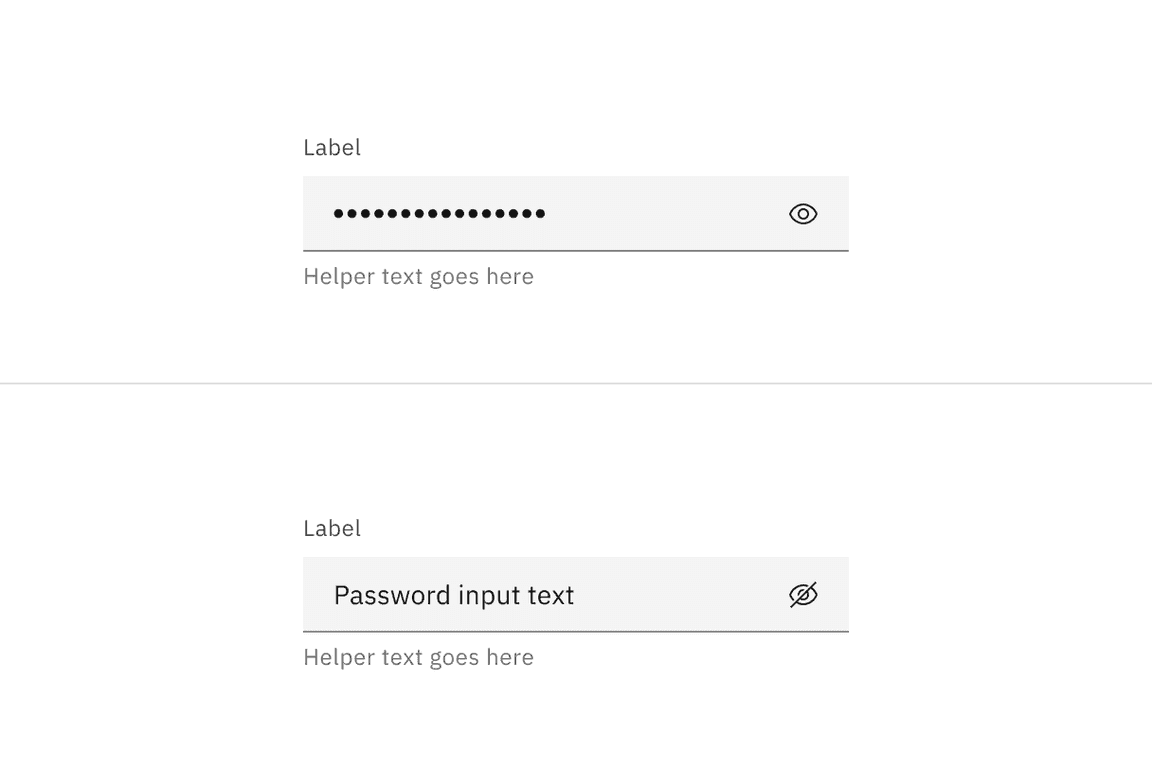
Password input color
| Element | Property | Color token |
|---|---|---|
| Label | text-color |
|
| Field text | text-color |
|
| Placeholder text | text-color |
|
| Helper text | text-color |
|
| Field | background-color |
|
| border-bottom |
| |
| View icon | svg |
|
* Denotes a contextual color token that will change values based on the layer it is placed on.
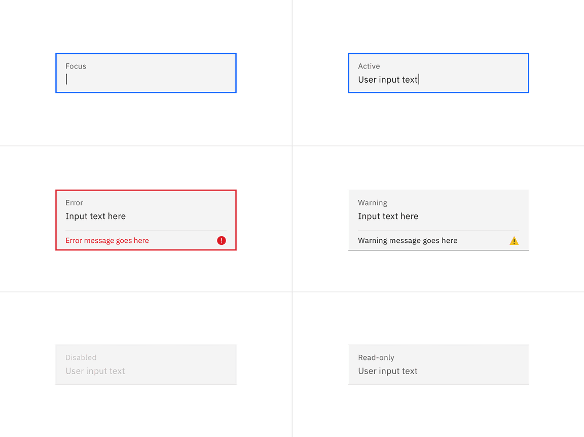
Interactive state color
| State | Element | Property | Color token |
|---|---|---|---|
| Hover | View icon | svg |
|
| Focus | Field | border |
|
| Invalid | Field | border |
|
| Error message | text-color |
| |
| Error icon | svg |
| |
| Warning | Warning message | text-color |
|
| Warning icon | svg |
| |
| Disabled | Field | background |
|
| Field (default) | border-bottom | transparent | |
| Field (fluid) | border-bottom |
| |
| Field text | text-color |
| |
| Read-only | Field (default) | background | transparent |
| Field (fluid) | background |
| |
| Field text (default) | text-color |
| |
| Field text (fluid) | text-color |
| |
| Field | border-bottom |
| |
| View icon | svg |
|
* Denotes a contextual color token that will change values based on the layer it is placed on.
Text area color
| Element | Property | Color token |
|---|---|---|
| Label | text-color |
|
| Field text | text-color |
|
| Placeholder text | text-color |
|
| Helper text | text-color |
|
| Field | background-color |
|
| border-bottom |
|
* Denotes a contextual color token that will change values based on the layer it is placed on.
Interactive state color
| State | Element | Property | Color token |
|---|---|---|---|
| Focus | Field | border |
|
| Invalid | Field | border |
|
| Error message | text-color |
| |
| Error icon | svg |
| |
| Warning | Warning message | text-color |
|
| Warning icon | svg |
| |
| Disabled | Field | background |
|
| Field (default) | border-bottom | transparent | |
| Field (fluid) | border-bottom |
| |
| Field text | text-color |
| |
| Read-only | Field (default) | background | transparent |
| Field (fluid) | background |
| |
| Field text (default) | text-color |
| |
| Field text (fluid) | text-color |
| |
| Field | border-bottom |
|
* Denotes a contextual color token that will change values based on the layer it is placed on.
Typography
Text input labels and field text should be set in sentence case, with only the first word in a phrase and any proper nouns capitalized. Text input labels should be three words or less.
| Element | Font-size (px/rem) | Font-weight | Type token |
|---|---|---|---|
| Label | 12 / 0.75 | Regular / 400 |
|
| Field text | 14 / 0.875 | Regular / 400 |
|
| Helper text | 12 / 0.75 | Regular / 400 |
|
| Invalid and warning message | 12 / 0.75 | Regular / 400 |
|
Structure
Default text input structure
| Element | Property | px / rem | Spacing token |
|---|---|---|---|
| Label | margin-bottom | 8 / 0.5 |
|
| Helper text | margin-top | 4 / 0.25 |
|
| Field text | padding-left, padding-right | 16 / 1 |
|
| Field | border-bottom | 1px | – |
| Focus | border | 2px | – |
| Invalid | border | 2px | – |
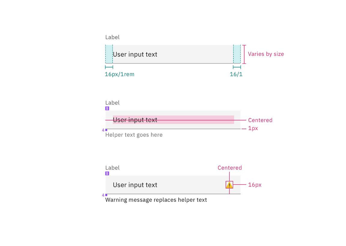
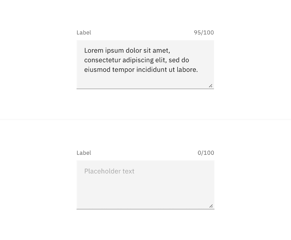
Structure and spacing measurements for default text input | px / rem
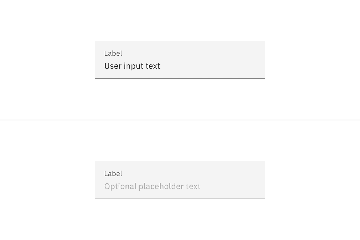
Fluid text input structure
| Element | Property | px / rem | Spacing token |
|---|---|---|---|
| Label | padding-bottom | 4 / 0.25 |
|
| Field | height | 64 / 4 |
|
| padding-left, padding-right | 16 / 1 |
| |
| padding-top, padding-bottom | 13 / 0.8125 | – | |
| border-bottom | 1px | – | |
| Focus | border | 2px | – |
| Invalid | border | 2px | – |
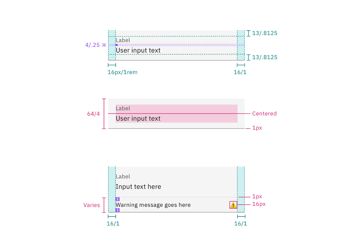
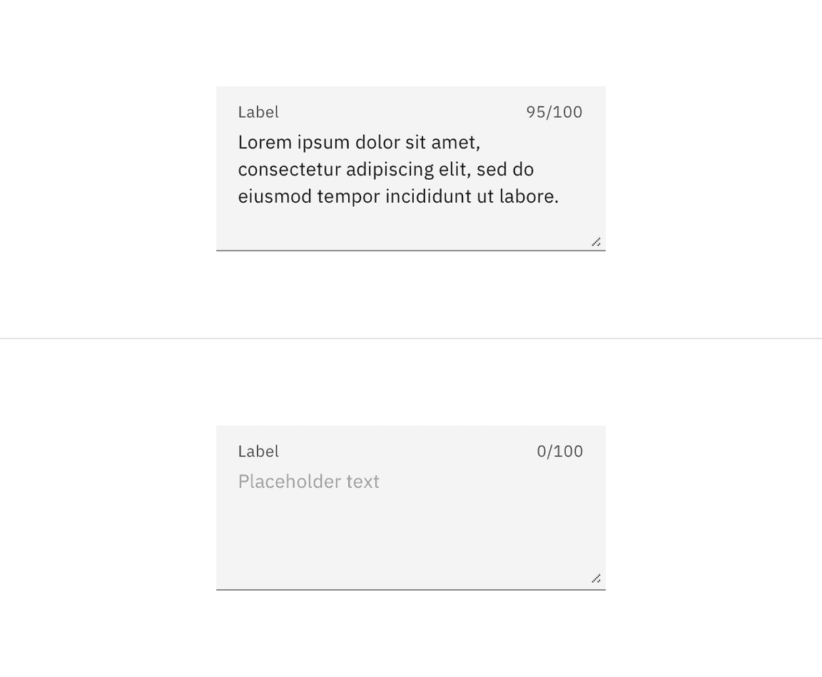
Structure and spacing measurements for fluid text input | px / rem
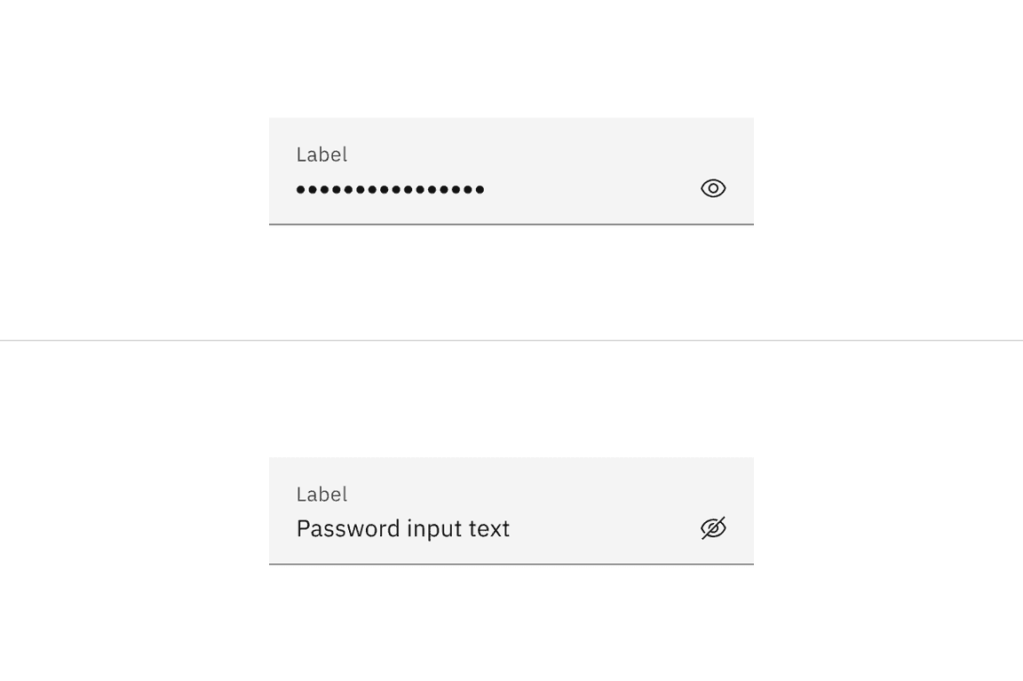
Default password input structure
| Element | Property | px / rem | Spacing token |
|---|---|---|---|
| Label | margin-bottom | 8 / 0.5 |
|
| Helper text | margin-top | 4 / 0.25 |
|
| Field text | padding-left, padding-right | 16 / 1 |
|
| Field | border-bottom | 1px | – |
| Focus | border | 2px | – |
| Invalid | border | 2px | – |
| View icon | padding-left, padding-right | 16 / 1 |
|
| State icon | padding-left | 16 / 1 |
|
| padding-right | 8 / 0.5 |
|
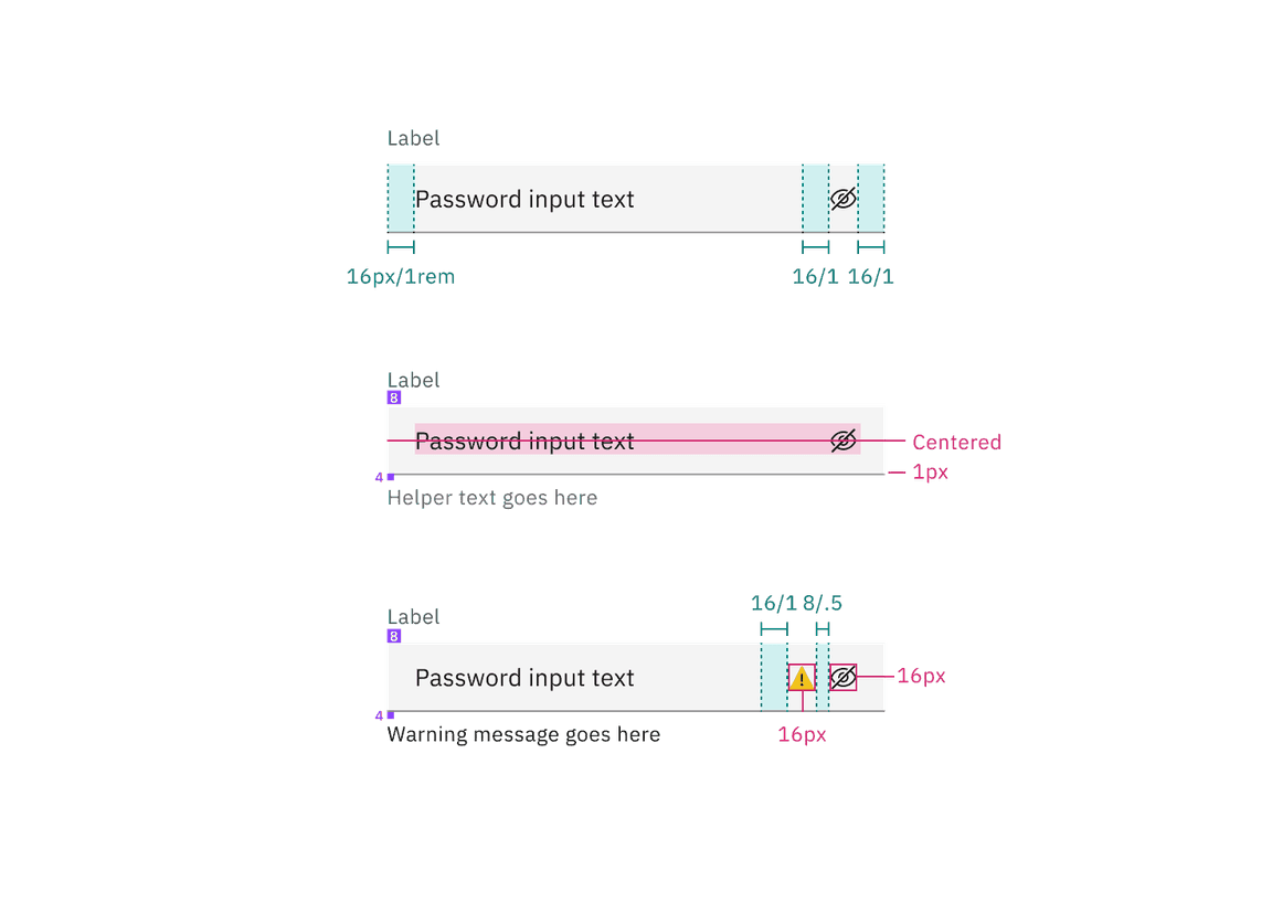
Structure and spacing measurements for default password input | px / rem
Fluid password input structure
| Element | Property | px / rem | Spacing token |
|---|---|---|---|
| Label | margin-bottom | 8 / 0.5 |
|
| Helper text | margin-top | 4 / 0.25 |
|
| Field text | padding-left, padding-right | 16 / 1 |
|
| Field | border-bottom | 1px | – |
| Focus | border | 2px | – |
| Invalid | border | 2px | – |
| View icon | padding-left, padding-right | 16 / 1 |
|
| State icon | padding-left, padding-right | 16 / 1 |
|
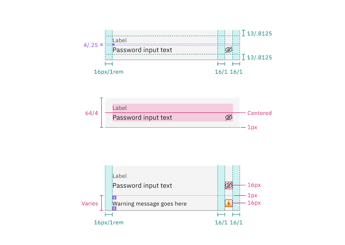
Structure and spacing measurements for fluid password input | px / rem
Default text area structure
| Element | Property | px / rem | Spacing token |
|---|---|---|---|
| Label | margin-bottom | 8 / 0.5 |
|
| Field | height | varies | – |
| padding-left, padding-right | 16 / 1 |
| |
| padding-top, padding-bottom | 11 / 0.6875 | – | |
| border-bottom | 1px | – | |
| Focus | border | 2px | – |
| Helper text | margin-top | 4 / 0.25 |
|
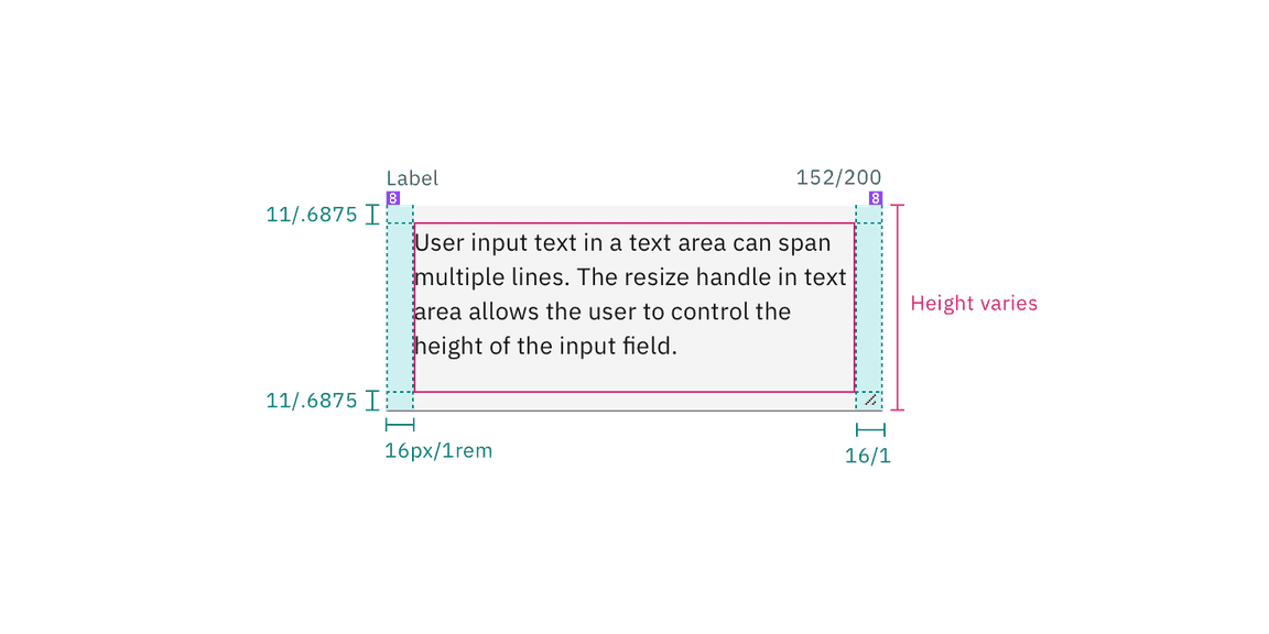
Structure and spacing measurements for default text area | px / rem
Fluid text area structure
| Element | Property | px / rem | Spacing token |
|---|---|---|---|
| Label | margin-bottom | 4 / 0.25 |
|
| Field | height | varies | – |
| padding-left, padding-right | 16 / 1 |
| |
| padding-top, padding-bottom | 11 / 0.6875 | – | |
| border-bottom | 1px | – | |
| Focus | border | 2px | – |
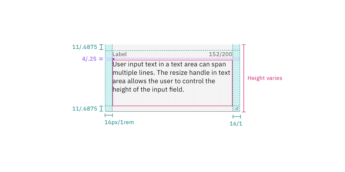
Structure and spacing measurements for fluid text area | px / rem
Size
These sizes apply only to the default style of text and password input.
| Element | Size | Height (px / rem) |
|---|---|---|
| Input | Small (sm) | 32 / 2 |
| Medium (md) | 40 / 2.5 | |
| Large (lg) | 48 / 3 |
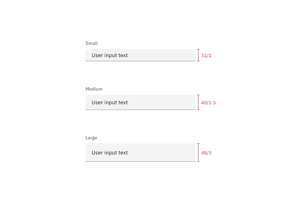
Text input default style sizes | px / rem
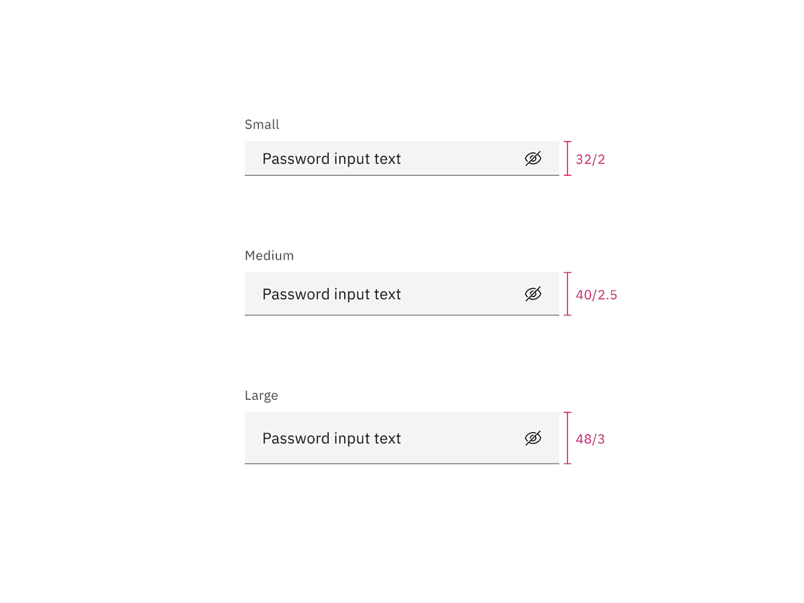
Password input default style sizes | px / rem
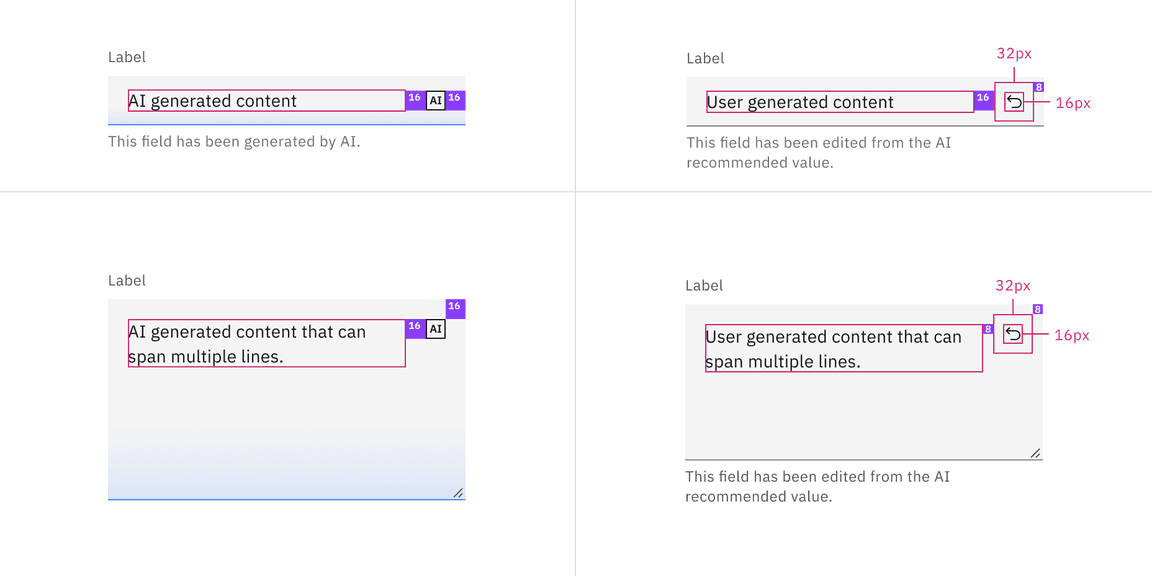
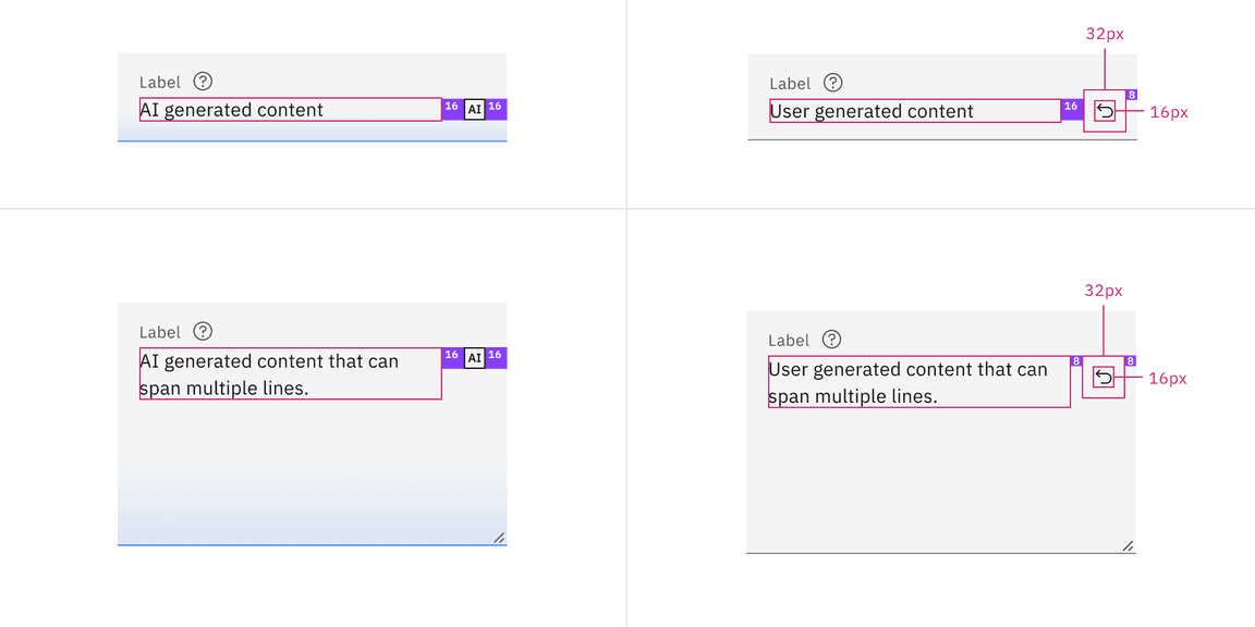
AI presence
The following are the unique styles applied to the component when the AI label is present. Unless specified, all other tokens in the component remain the same as the non-AI variant. For more information on the AI style elements, see the Carbon for AI guidelines.
| Element | Property | Token / Size |
|---|---|---|
| Linear gradient | start |
|
| stop |
| |
| Field | border-bottom |
|
| background color |
| |
| AI label | size | mini |
* Denotes a contextual color token that will change values based on the layer it is placed on.
Feedback
Help us improve this component by providing feedback, asking questions, and leaving any other comments on GitHub.