Progress indicator
The following page documents visual specifications such as color, typography, structure, and size.
Color
A progress indicator step may be complete, current, or not started. The following table describes the color tokens used for each of these states.
| Element | Property | Color token |
|---|---|---|
| Complete icon | fill |
|
| Current icon | fill |
|
| Not started icon | fill |
|
| Active step line | background-color |
|
| Inactive step line | background-color |
|
| Label | text color |
|
| Helper text | text color |
|
* Denotes a contextual color token that will change values based on the layer it is placed on.
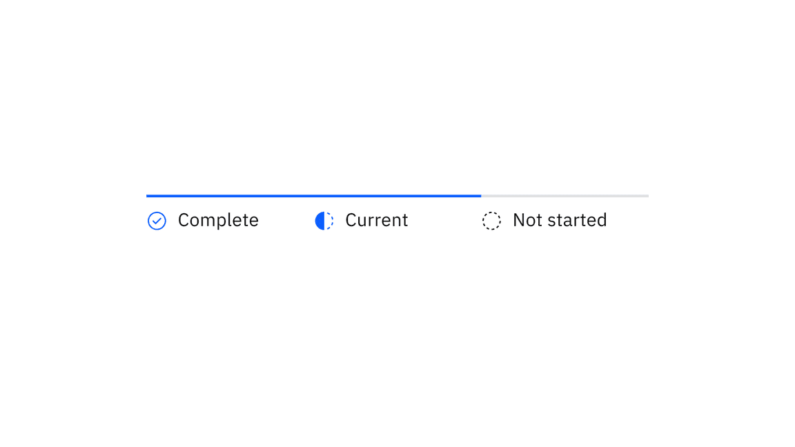
Examples of completed, current, and future steps for progress indicator
Interactive states
| Element | Property | Color token |
|---|---|---|
| Step: focus | border |
|
| Label: hover | text color |
|
| Icon: error | fill |
|
| Icon: disabled | fill |
|
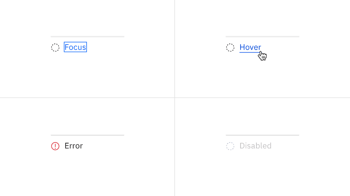
Examples of focus, hover, error, and disabled states for progress indicator
Typography
Labels should be one to two words only, with a limit of 16 characters total per label. All labels should be set in sentence case.
| Element | Font-size (px/rem) | Font-weight | Type token |
|---|---|---|---|
| Label | 14 / 0.875 | Regular / 400 |
|
| Helper text | 12 / 0.75 | Regular / 400 |
|
Structure
All icons can be found in the icons library.
| Element | Property | px / rem | Spacing token |
|---|---|---|---|
| Step | min-width | 128 / 8 | – |
| Icon | height, width | 16 / 1 | – |
| margin-top, margin-right | 16 / 1 |
| |
| Label | margin-top | 16 / 1 |
|
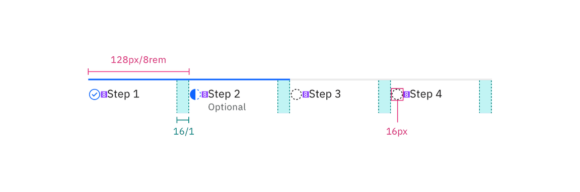
Structure and spacing measurements for progress indicator | px / rem
Feedback
Help us improve this component by providing feedback, asking questions, and leaving any other comments on GitHub.