Loading
The following page documents visual specifications such as color, typography, and size.
Color
| Element | Property | Color token |
|---|---|---|
| Large indicator | stroke |
|
| Small indicator | stroke |
|
| background-color |
| |
| Page overlay | background-color |
|
* Denotes a contextual color token that will change values based on the layer it is placed on.


Typography
Label text is not included with the loading indicator by default. If including text, it is recommended to use
body-compact-01
Size
There are two loading indicator sizes: large and small. For more information about specific use cases for each loading indicator size, see the sizing section on the Usage tab.
| Element | Size | Height (px/rem) |
|---|---|---|
| Indicator | Large (lg) | 88 / 5.5 |
| Small (sm) | 16 / 1 |
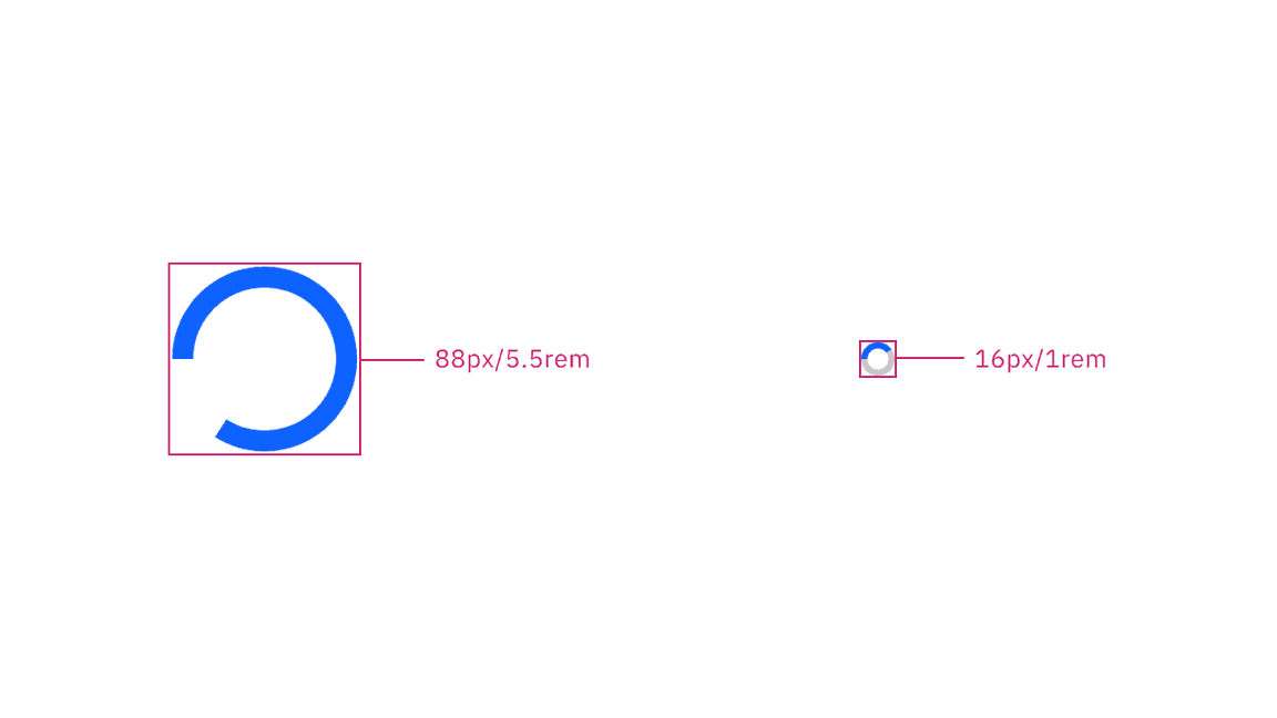
Large and small indicator sizes
Feedback
Help us improve this component by providing feedback, asking questions, and leaving any other comments on GitHub.