Content switcher
The following page documents visual specifications such as color, typography, structure, and size.
Color
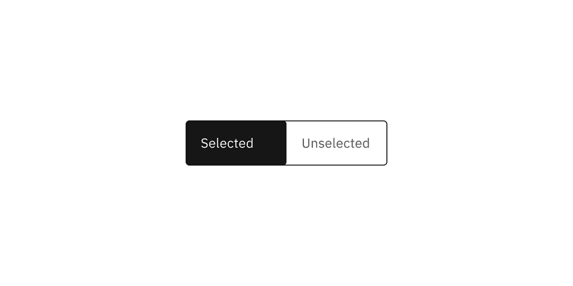
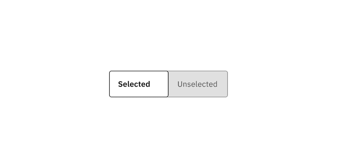
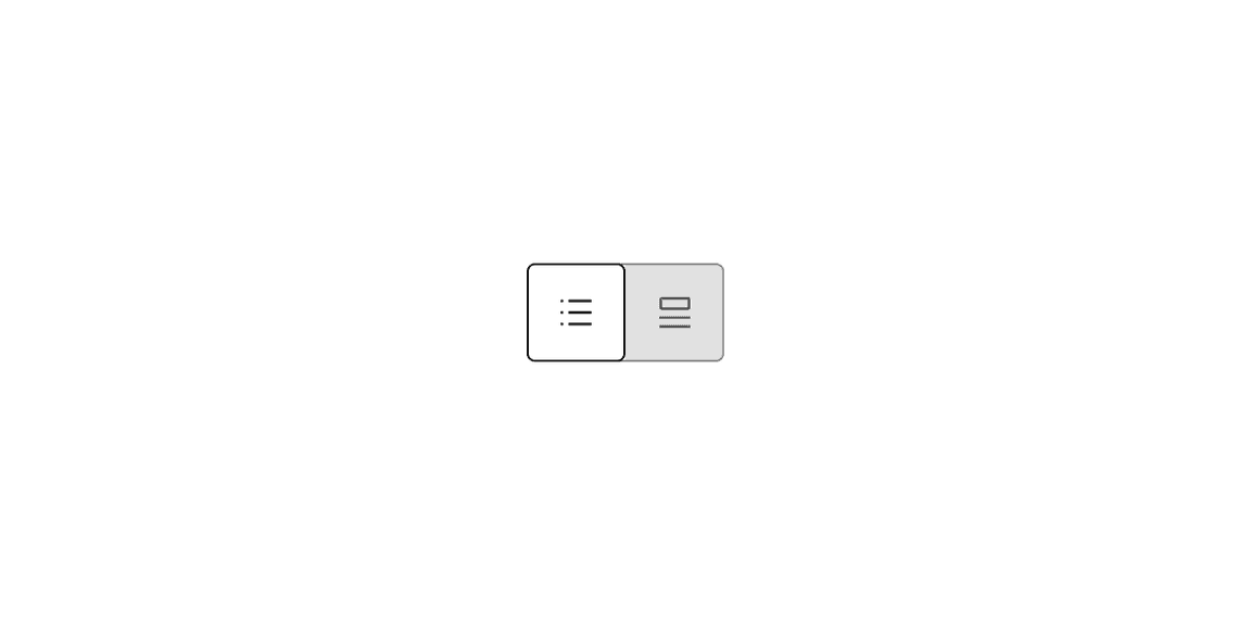
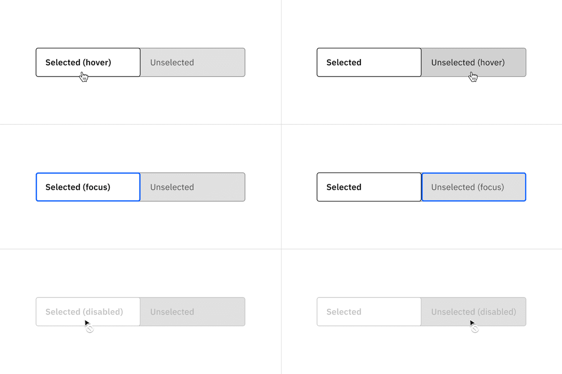
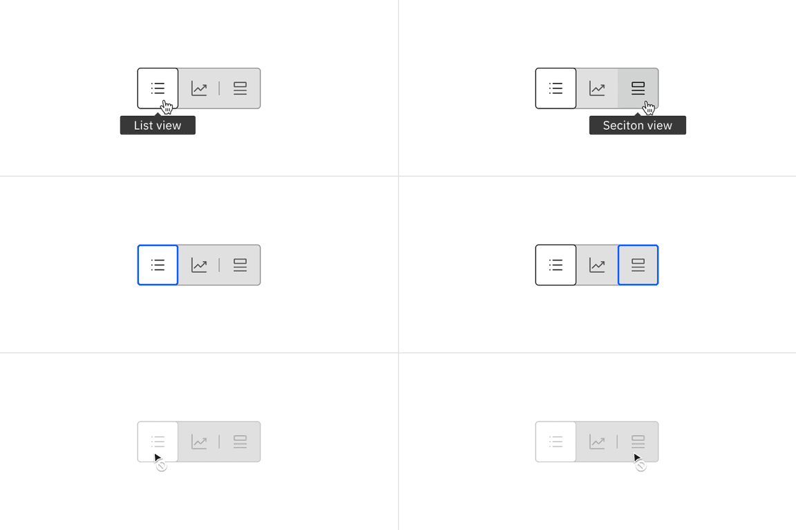
Content switchers have two main enabled states: unselected and selected.
High contrast color
| Type | Element | Property | Color token |
|---|---|---|---|
| Unselected | Container | background-color | transparent |
| Text | text-color |
| |
| Icon | svg |
| |
| Border | border |
| |
| Divider | border |
| |
| Selected | Container | background-color |
|
| Text | text-color |
| |
| Icon | svg |
|
* Denotes a contextual color token that will change values based on the layer it is placed on.
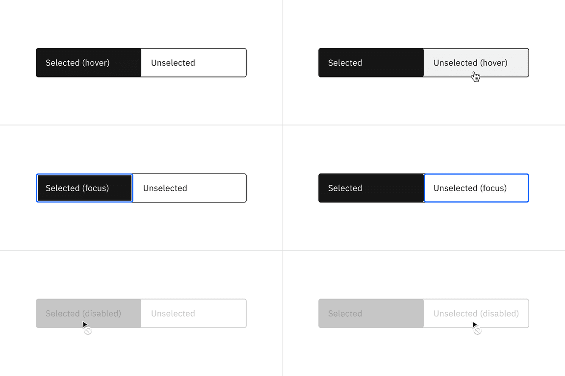
High contrast interactive state color
| Type | State | Element | Property | Color token |
|---|---|---|---|---|
| Unselected | Hover | Container | background-color |
|
| Label text | text-color |
| ||
| Icon | svg |
| ||
| Border | border |
| ||
| Focus | Container | background-color | transparent | |
| Label text | text-color |
| ||
| Icon | svg |
| ||
| Border | border |
| ||
| Disabled | Container | background-color | transparent | |
| Label text | text-color |
| ||
| Icon | text-color |
| ||
| Border | border |
| ||
| Divider | border |
| ||
| Selected | Focus | Container | background-color |
|
| Label text | text-color |
| ||
| Icon | svg |
| ||
| Border | inner-border |
| ||
| Disabled | Container | background-color |
| |
| Label text | text-color |
| ||
| Icon | text-color |
|
* Denotes a contextual color token that will change values based on the layer it is placed on.
Low contrast color
| Type | Element | Property | Color token |
|---|---|---|---|
| Unselected | Container | background-color |
|
| Text | text-color |
| |
| Icon | svg |
| |
| Border | border |
| |
| Divider | border |
| |
| Selected | Container | background-color |
|
| Text | text-color |
| |
| Icon | svg |
|
* Denotes a contextual color token that will change values based on the layer it is placed on.
Low contrast interactive state color
| Type | State | Element | Property | Color token |
|---|---|---|---|---|
| Unselected | Hover | Container | background-color |
|
| Text | text-color |
| ||
| Icon | svg |
| ||
| Focus | Border | border |
| |
| Disabled | Container | background-color |
| |
| Text | text-color |
| ||
| Icon | text-color |
| ||
| Border | border |
| ||
| Divider | border |
| ||
| Selected | Focus | Container | border |
|
| Disabled | Container | background-color |
| |
| Text | text-color |
| ||
| Icon | svg |
| ||
| Border | border |
|
Typography
Content switcher label text should be set in sentence case, with only the first word in a phrase and any proper nouns capitalized. The label text should not exceed three words.
High contrast typography
| Element | Font size (px/rem) | Font weight | Type token |
|---|---|---|---|
| Text: unselected | 14 / 0.875 | Regular / 400 |
|
| Text: selected | 14 / 0.875 | Regular / 400 |
|
Low contrast typography
| Element | Font size (px/rem) | Font weight | Type token |
|---|---|---|---|
| Text: unselected | 14 / 0.875 | Regular / 400 |
|
| Text: selected | 14 / 0.875 | SemiBold / 600 |
|
Structure
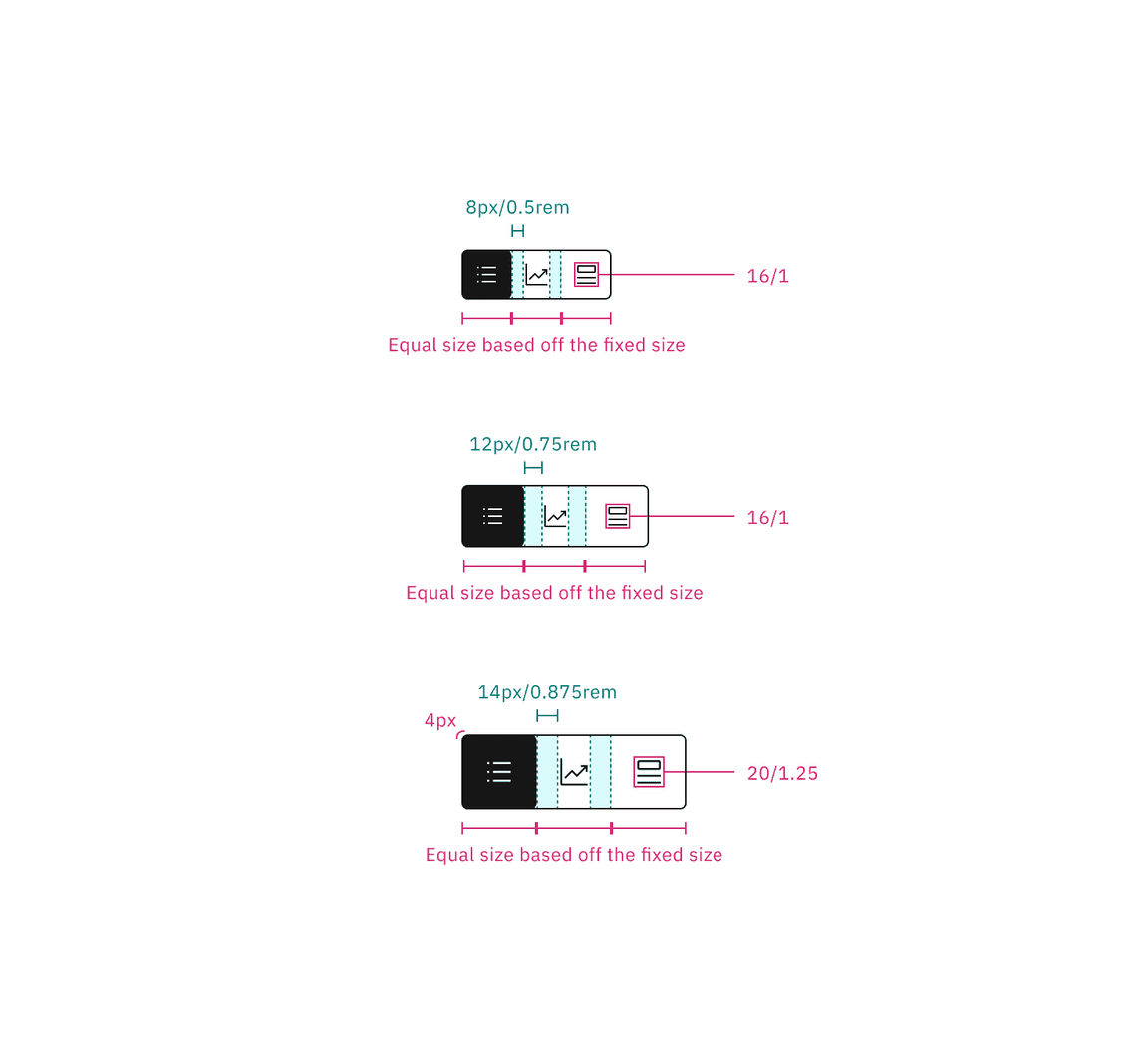
Content switchers must have at least two options for the user to choose from. Each container that makes up the content switcher is equal in size.
| Element | Property | px / rem | Spacing token |
|---|---|---|---|
| Container | corner radius | 4px | – |
| Label text | padding-left, padding-right | 16 / 1 |
|
| Icon (sm) | padding-left, padding-right | 8 / 0.5 |
|
| Icon (md) | padding-left, padding-right | 12 / 0.75 |
|
| Icon (lg) | padding-left, padding-right | 14 / 0.875 | – |
| Divider | border | 1px | – |
Default structure
The width of a text container is determined by the length of the longest label text within its content switcher.
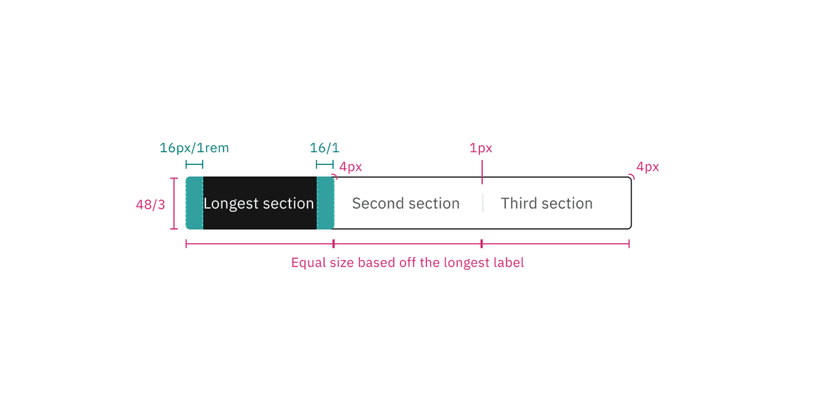
Structure and spacing measurements for the text content switcher | px / rem
Icon structure
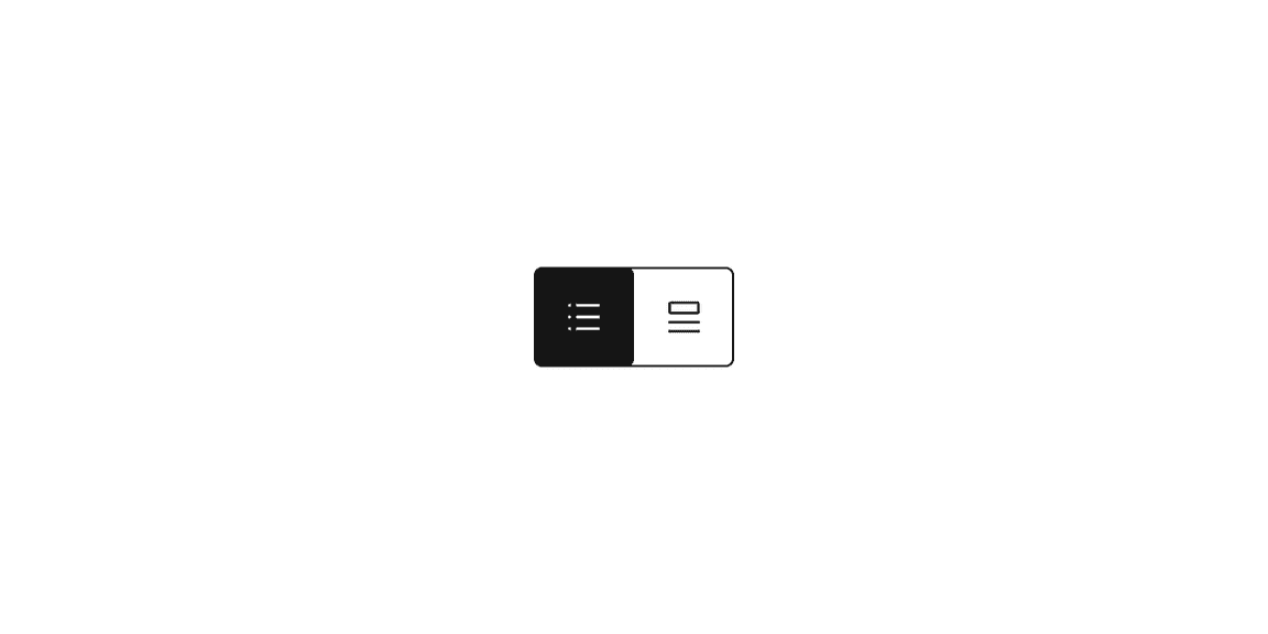
The width of an icon container is determined by the fixed size within its content switcher.
Structure and spacing measurements for the icon content switcher | px / rem
Size
There are three content switcher sizes—small (32px), medium (40px), and large (48px).
| Element | Size | Height (px / rem) |
|---|---|---|
| Container | Small (sm) | 32 / 2 |
| Medium (md) | 40 / 2.5 | |
| Large (lg) | 48 / 3 | |
| Icon | Small (sm) | 16 / 1 |
| Medium (md) | 16 / 1 | |
| Large (lg) | 20 / 1.25 |
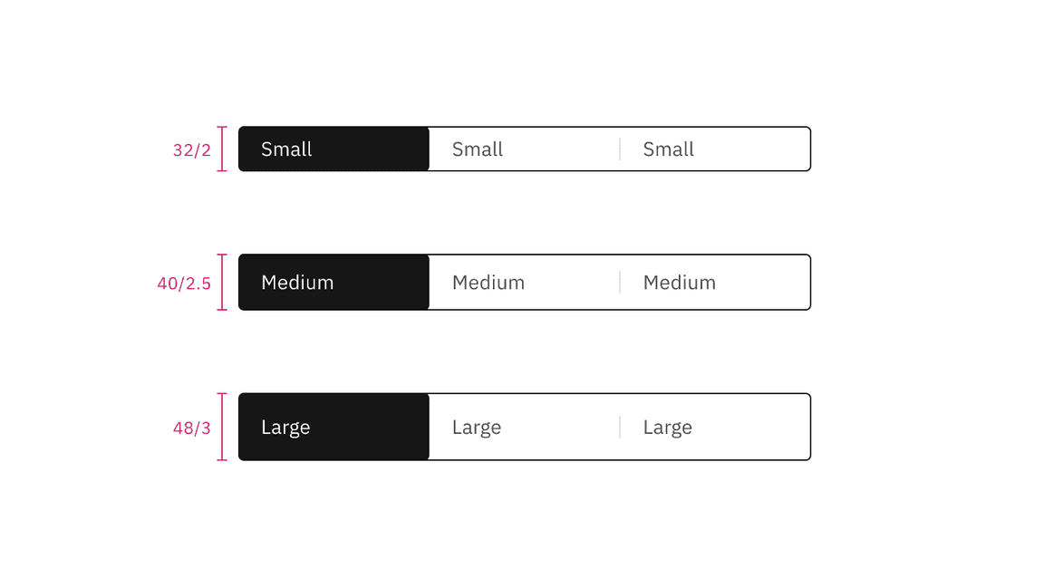
Default content switcher sizes | px / rem
Icon content switcher sizes | px / rem
Feedback
Help us improve this component by providing feedback, asking questions, and leaving any other comments on GitHub.