UI shell right panel
No accessibility annotations are needed for the UI shell right panel, but keep these considerations in mind if you are modifying Carbon or creating a custom component.
What Carbon provides
Carbon bakes keyboard operation into its components, improving the experience of blind users and others who operate via the keyboard. Carbon incorporates many other accessibility considerations, some of which are described below.
Keyboard interaction
The switcher button is the last item in the UI shell header. Activating the button (with
Space
Enter
Tab
Enter
Esc
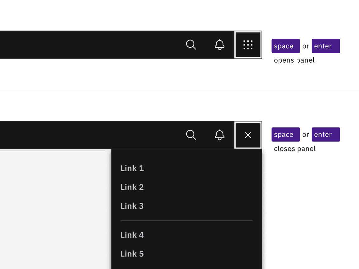
Activating the switch button with Enter or Space toggles the display of the right panel.
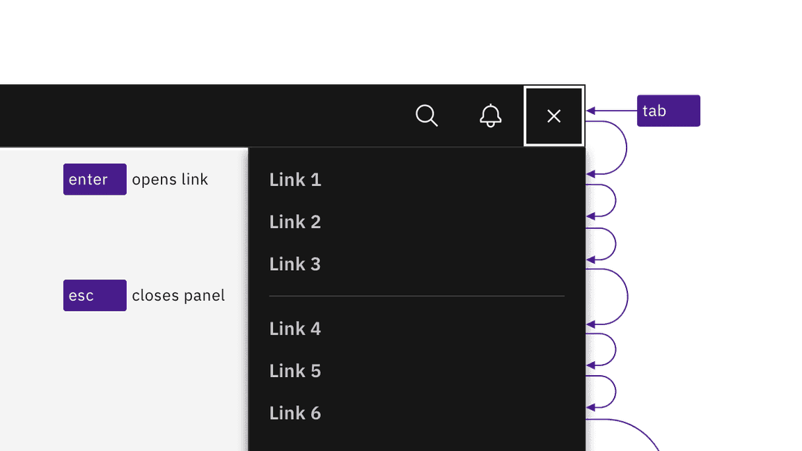
Links are reached by Tab and activated by Enter key. Activating links or pressing Esc key closes panel.
Design recommendations
Annotating the switcher button name
When necessary, designers may need to change the icon-only switcher button’s name to match the right panel’s scope. Depending on the context of the design, common button names include “Switch site” or “App switcher”.

Annotate a name change to the switcher button if needed in your design.
Development considerations
Keep these considerations in mind if you are modifying Carbon or creating a custom component.
- The right panel is in a section.<nav>
- All links in the right panel are in a structure, which provides additional information to assistive technologies.<ul>
Accessibility testing statusFor every latest release, Carbon runs tests on all components to meet the accessibility requirements. These different statuses report the work that Carbon has done in the back end. These tests appear only when the components are stable.
For every latest release, Carbon runs tests on all components to meet the accessibility requirements. These different statuses report the work that Carbon has done in the back end. These tests appear only when the components are stable.
Latest version: | Framework: React (@carbon/react)
| Component | Accessibility test | Status | Link to source code |
|---|---|---|---|
| UI shell | Test(s) that ensure the initial render state of a component is accessible. | Passes all automated tests with no reported accessibility violations. | GitHub link |
| Tests that ensure additional states of the component are accessible. This could be interactive states of a component or its multiple variants. | Passes all automated tests with no reported accessibility violations. | ||
| Tests that ensure focus is properly managed, and all interactive functions of a component have a proper keyboard-accessible equivalent. | Passes all automated tests with no reported accessibility violations. | ||
| This manual testing ensures that the visual information on the screen is properly conveyed and read correctly by screen readers such as JAWS, VoiceOver, and NVDA. | A human has manually tested this component, e.g. screen reader testing. |